What You’ll Do
The Spry framework is a JavaScript library that allows you to use built-in HTML, CSS, and JavaScript code to create widgets, add special effects, and integrate HTML or XML data in your Web pages.
A spry widget is a page element, such as a menu bar, tabbed or collapsible panels, or form validation, that provides added functionality without all the scripting. A widget consists of three different parts: structure, behavior, and styling. A widget structure is HTML code that defines the structure of the widget. A widget behavior is JavaScript that specifies what happens to a widget when an event occurs. Widget styling is CSS code that determines the look of the widget.
You can insert a built-in spry widget, Dreamweaver takes care of all three aspects of the widget. It provides the HTML, CSS, and JavaScript as well as the style of the widget, which you can modify to suit your own needs. For example, you can edit menu items, modify panels, and change the appearance of the page. The CSS and JavaScript files related to the widget are named with the same name as the spry widget, and stored in a SpryAssets folder in your site.
Dreamweaver also includes built-in spry effects that allow you to apply visual effects, such as highlighting information or creating transitions, to elements on a page. You can apply one or more effects, such as a fade, highlight, blind up and down, slide up and down, grow and shrink, shake, and squish, to create a dynamic user experience.
In this chapter you’ll learn how to insert and work with spry widgets, and add spry effects to elements on your Web pages with minimal or no knowledge of JavaScript. If you have a strong knowledge of JavaScript you can create your own spry widgets or effects.

DW 10.1
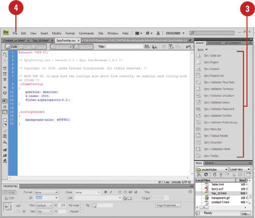
Dreamweaver provides a wide variety of spry widgets you can insert in your Web pages. Some of the widgets include page region definition, tables, menu bars, form validation, and panels to store data in a compact space. When you insert a spry widget, Dreamweaver creates a SpryAssets folder (on first use) in your local root site to store the widget, data, and any spry effects. The CSS and JavaScript files related with the widget are named with the same name as the spry widget and also stored in a SpryAssets folder. If you want (which is not recommended), you can change the default folder location where Dreamweaver saves and stores your spry assets.
 Open the Web page you want to insert a spry widget.
 Click to place the insertion point where you want to insert the spry widget.
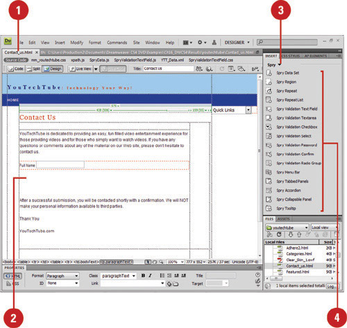
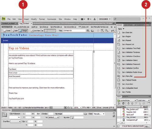
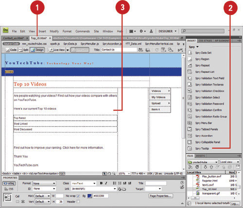
 Click the Spry tab on the Insert panel, or click the Insert menu, and then point to Spry.
 Click the spry widget you want to insert:
• Spry Data Set. Access HTML (New!) or XML data for regions, tables, or lists.
• Spry Region. Creates an area to wrap around objects, such as tables and repeat lists.
• Spry Repeat. Creates a duplicate region.
• Spry Repeat List. Creates an ordered, unordered, definition list, or drop-down list.
• Spry Validation. Create form validation for a text field or area, check box, password (New!), confirm (New!), or radio group (New!).
• Spry Menu Bar. Creates a set of navigational menu buttons.
• Spry Tabbed Panels. Creates a set of panels to store data in a compact space.
• Spry Accordion. Creates a set of collapsible panels to store large amounts of data in a compact space.
• Spry Collapsible Panel. Creates a set of collapsible panels to store data in a compact space.
• Spry Tooltip. Creates a tooltip (New!) for page elements.
 If prompted, specify widget or input tag accessibility attribute options; the widget options vary depending on the widget.
 Click OK. If prompted, click Yes or No to add a form tag.
Click the Sites menu, and then click Manage Sites.
Select the site you want to change, and then click Edit.
Click the Advanced tab.
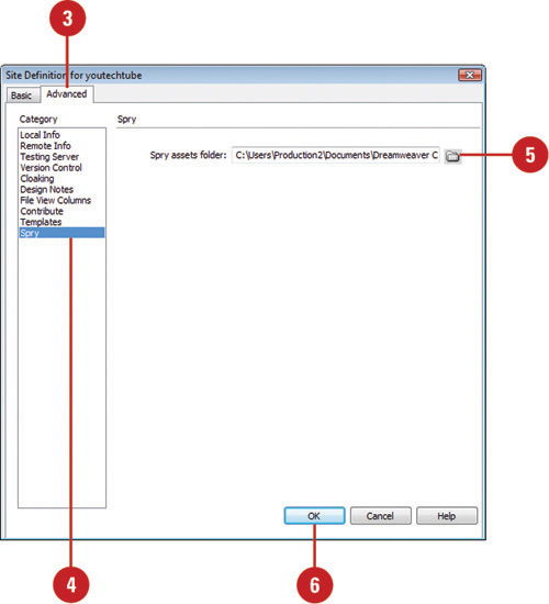
Click the Spry category.
Enter a path and folder name to the location where you want to store spry assets, or click Browse to select a folder location.
Click OK.
 Click Done.
DW 10.1
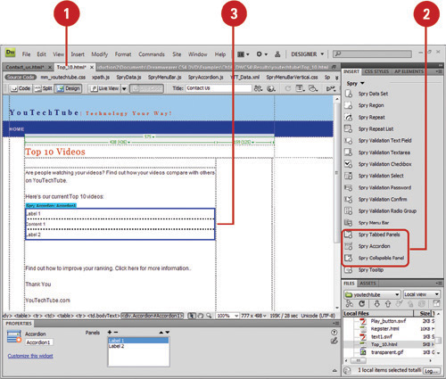
After you insert a spry widget, you can select and edit the widget to customize it for your specific needs. You can edit the parameters and options for a spry widget or modify the style, or appearance, of a spry widget using CSS. Before you can edit a spry widget, you need to select it first by pointing to the widget until you see the widget’s blue tabbed outline and then clicking the widget’s tab in the upper left corner.
Open the Web page with the spry widget you want to edit.
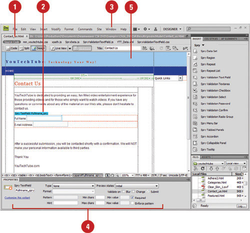
Point to the widget until you see the blue tabbed outline, and then click the widget tab to select it.
Click the Window menu, and then click Properties to display the Properties panel.
Specify the options you want in the Properties panel for the selected widget; the options vary depending on the widget you select.
Make changes to the content of the widget in the Design window.
Did You Know?
You can edit the style of a spry widget in the related CSS file. You can open the CSS file located in the SpryAssets folder, make the changes you want, and then save it, or open the CSS panel and change the CSS styles for the spry widget.
Open the Web page with the spry widget you want to edit.
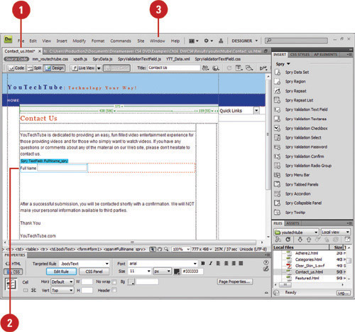
Click in the part of the spry widget you want to change.
Click the Window menu, and then click Properties to display the Properties panel.
Specify the options you want in the Properties panel for the selected widget.
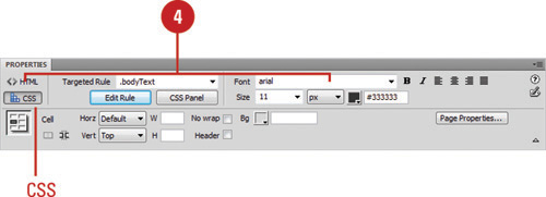
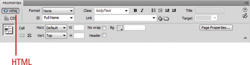
• CSS. Click CSS to change cascading style sheet options in the CSS Styles panel. Click the Target Rule popup to change the current style.
• HTML. Click HTML and then use the normal formatting options, such as: Format, Font, Size, Bold, Italic, and alignment and spacing buttons.
A spry panel widget allows you to store content in a compact space using tabs. Dreamweaver provides three different types of spry panels: accordion, collapsible, and tabbed. Each spry panel type provides a tab-like interface that displays content when a visitor clicks a tab. The differences between the spry panel types lies in the display and style of the tabs. If you have a large amount of content, the accordion panel is your best bet. Try each one to see which one works best with the content you want to display.
Open the Web page you want to insert a spry widget, and then click to place the insertion point where you want it.
Click the Spry tab on the Insert panel, or click the Insert menu, point to Spry, and then select the spry panel element you want:
• Spry Tabbed Panels. Creates a set of panels to store data in a compact space.
• Spry Accordion. Creates a set of collapsible panels to store large amounts of data in a compact space.
• Spry Collapsible Panel. Creates a set of collapsible panels to store data in a compact space.
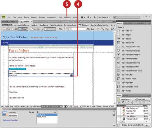
Select the panel widget.
Point to a tab, click the eye icon (if available) to edit the panel contents, or select the panel contents and edit it.
Click the Window menu, and then click Properties to display the Properties panel.
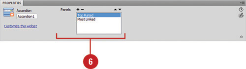
Specify the options you want in the Properties panel for the selected widget; the options vary depending on the widget. Some of the options include:
• Panel Order. Click the Up or Down Arrow buttons.
• Default Panel. Click the Default Panel popup, and then select the panel you want.
• Delete Panel. Select the panel, and then click the Minus button.
• Animate Panel. Select the panel, and then select or clear the Enable Animation check box.
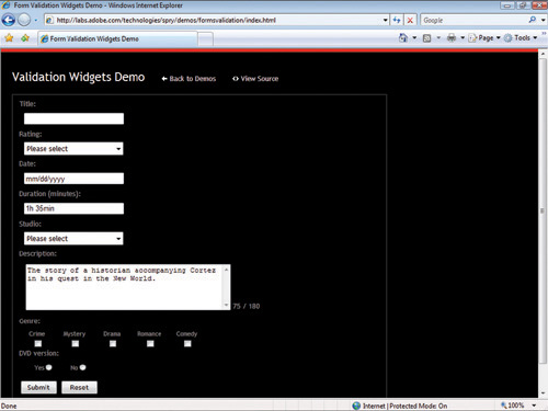
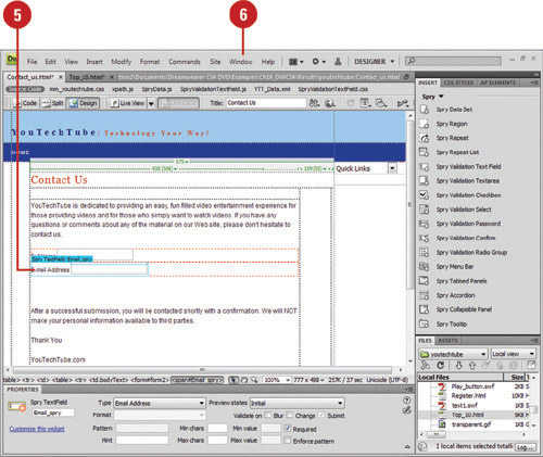
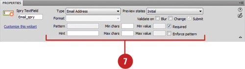
A spry validation widget allows you to determine whether information or data in a form is valid or invalid. Dreamweaver provides several types of spry validation elements: text field, text area, select (from a drop-down menu), and check box. When you insert a spry validation element, the Input Tag Accessibility Attributes dialog box opens, requesting information and options to make the form object accessible to the visually impaired. After you insert a spry validation element, you can use the Properties panel to specify the validation options you want; each element provides different validation options.
Open the Web page you want to insert a spry widget, and then click to place the insertion point where you want it.
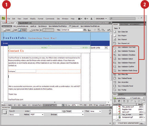
Click the Spry tab on the Insert panel, or click the Insert menu, point to Spry, and then select the spry validation element you want:
• Spry Validation Text Field. Creates a text box that displays valid or invalid states when a visitor enters text or doesn’t enter text as a required field.
• Spry Validation Textarea. Creates a text area that displays valid or invalid states when a visitor enters text or doesn’t enter text as a required field.
• Spry Validation Checkbox. Creates a check box that displays valid or invalid states when a visitor selects or doesn’t select a check box.
• Spry Validation Select. Creates a drop-down menu with a list of options divided into sections that displays valid or invalid states when a visitor selects an element in the list.
• Spry Validation Password. Creates a password text field that enforces password rules (New!).
• Spry Validation Confirm. Creates a text or password field that displays valid or invalid states (New!).
• Spry Validation Radio Group. Creates a group of radio buttons with validation support (New!).
Specify the Input Tag Accessibility Attributes dialog box options you want.
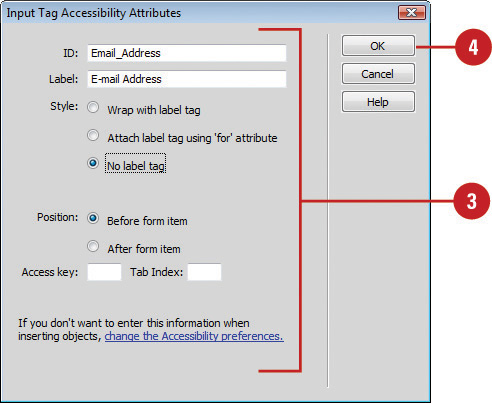
Click OK.
Select the panel widget.
Click the Window menu, and then click Properties to display the Properties panel.
Specify the options you want in the Properties panel for the selected widget; the options vary depending on the widget. Some of the general options include:
• Initial State. Indicates the state when the page loads in the browser or when the form is reset.
• Focus State. Indicates the state with the insertion point.
• Valid State. Indicates the state when the visitor entered information correctly.
• Required State. Indicates the state when the visitor fails to enter information.
• Minimum or Maximum Number of Characters State. Indicates the state when the visitor has not entered enough characters or entered to many characters.
• Minimum or Maximum Value State. Indicates the state when the visitor has entered a value that is less or greater than the allowed value.
A spry menu bar widget allows you to create a set of navigational menus that come with submenus. A menu bar makes it easy for visitors to navigate to different parts of your site in the same way they choose commands in a program, such as Dreamweaver. You can insert two types of menu bars: horizontal or vertical. You can link a menu item to a specific place or execute a script. In addition, you can add tool tips to provide a short description of menu items for visitors.
Open the Web page you want to insert a spry widget, and then click to place the insertion point where you want it.
Click the Spry tab on the Insert panel, or click the Insert menu, point to Spry, and then click Spry Menu Bar.
Important
If your page contains Flash content, the DHTML layers used to create the menu bar may cause problems.
Click the Horizontal or Vertical option.
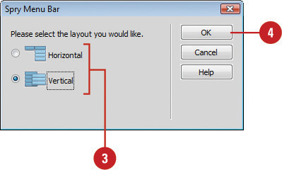
Click OK.
Select the panel widget.
Click the Window menu, and then click Properties to display the Properties panel.
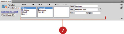
Specify the options you want in the Properties panel for the selected widget:
• Add Main Menu. Click the Plus (+) button above the first column, and then rename the menu in the Text box.
• Add Submenu. Select a main menu item, click the Plus (+) button above the second column, and then rename the menu in the Text box.
• Delete Menu. Select the main menu or submenu item you want to delete, and then click the Minus (-) button.
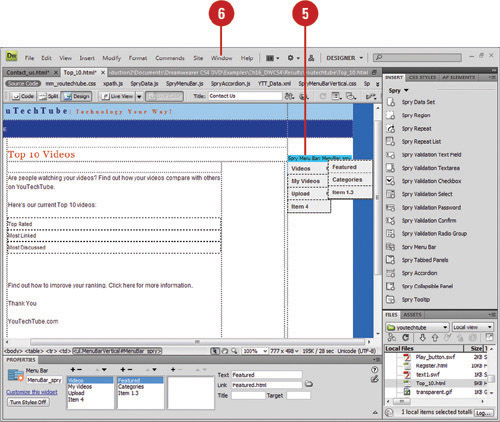
• Change Menu Order. Select the menu item you want to reorder, and then click the Up or Down buttons.
• Link Menu. Select the menu item you want to apply a link, and then type the link in the Link box or click the Browse button to select a file.
• Add Tool Tip. Select the menu item you want to create a tool tip, and then type the text for the tool tip in the Title text box.
• Target. Enter one of the following options:
• _blank. Opens the linked page in a new window.
• _parent. Loads the linked document in the immediate frameset of the active document.
• _self. Loads the linked document in the same browser window (default).
• _top. Loads the linked document in the topmost window of a frameset.
• Styles. Click the Turn Styles Off button to disable the styling of a menu bar, which is helpful to see the HTML structure of the widget. Click the Turn Styles On button to enable it again.
With the spry tooltip widget (New!), you can add screen information for elements on a web page. When you hover over an element, a tooltip with information about the element, a title or short description, appears for a short period of time or until you stop hovering over the element. A spry tooltip consists of a container, page element, and JavaScript. When you insert a spry tooltip, a container appears with a blue tab on top and a placeholder sentence inside. You can add formatting for a tooltip by using standard CSS styles. When you display the tooltip, by default, it appears 20 pixels down and to the right of the cursor.
Open the Web page you want to insert a spry tooltip, and then select the full tag element you want to add a tooltip.
Click the Spry tab on the Insert panel, or click the Insert menu, point to Spry, and then click Spry Tooltip.
A container with a placeholder sentence for the tooltip appears. The container displays a blue tab with the Spry Tooltip name.
Select the placeholder text, and then enter the tooltip text that you want.
Select from the following options in the Properties panel:
• Name. Specifies a name for the tooltip container.
• Trigger. Identifies the elements that triggers the tooltip.
• Follow Mouse. Causes the tooltip to follow the mouse.
• Hide on Mouse Out. Keeps the tooltip open as long as the mouse is hovering over the tooltip (even if the mouse leaves the trigger). Helpful for selecting links in a tooltip.
• Horizontal or Vertical Offset. Specifies the tooltips horizontal or vertical position in relation to the mouse. The offset value is in pixels.
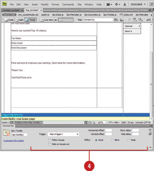
• Show Delay. Specify the delay in milliseconds before the tooltip appears after the tooltip has been triggered.
• Hide Delay. Specify the delay in milliseconds before the tooltip disappears after the tooltip has been triggered.
• Effect. Specify the type of effect you want when the tooltip appears. The Blind option acts like a window blind to display and hide the tooltip. The Fade option fades the tooltip in and out.
Open the Web page with the spry tooltip.
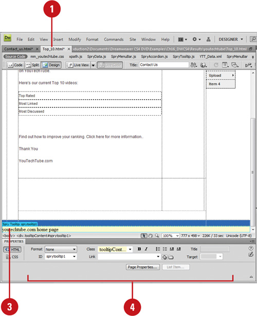
Hover over or place the insertion point in the tooltip content on the page.
Click the tooltip’s blue tab to select it.
Modify the text in the tooltip or change the tooltip options in the Properties panel.
A spry data set allows you to provide interactive data to visitors on your site. The data on the page changes based on the visitors’ selections. For example, you can select an option in one part of a page, and then display other content somewhere else on a page without requiring a full-page refresh. To use data sets to create a dynamic page, you need to take a few steps. First, you identify one or more data sets (HTML (New!) or XML source files) that contain the data you want to use. Next, you insert one or more spry data objects to display the data on a page. When a visitor opens the page in a browser, the data set loads like a normal table containing columns and rows.
Open the Web page you want to use.
Click the Spry tab on the Insert panel, or click the Insert menu, point to Spry, and then click Spry Data Set.
Click the Select Data Type popup, and then click HTML.
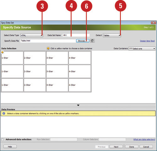
Enter a name for the spry data set or use the default one, ds1.
Click the Detect popup, and then select the type of HTML elements in your data source that you want to detect.
Click Browse, navigate to and select the HTML data file, and then click OK.
To use a sample feed on your test server, click the Design Time Feed link.
In the Data Selection window, click one of the yellow arrows with the element for your data container. You can also select an ID from the Data Containers popup.
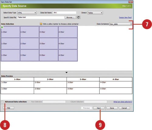
 If you want to specify CSS data selectors, select the Advanced data selection check box, and then enter a data selector, such as .product, to filter the data.
 Click Next to continue.
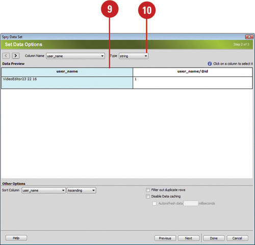
 Select the column you want to use in the Data Preview window.
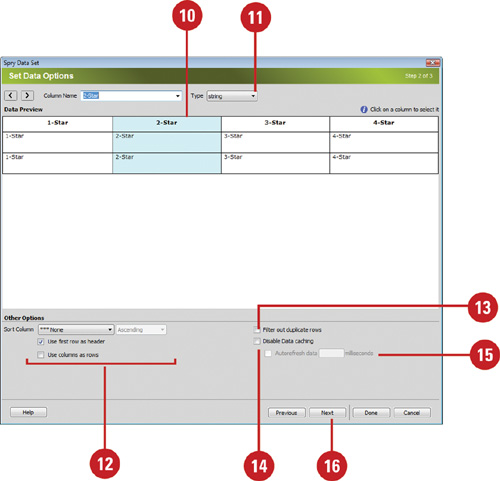
 If you want to validate the data to be a specific type, click the Type popup, and then select a data type.
 If you want to sort the data as it loads, click the Sort Column popup, select a sort option, click the Direction popup, select the direction you want, and then select or clear the sort check boxes.
 Select the Filter Out Duplicate Rows check box to eliminate any duplicate columns.
 Select the Disable Data Caching check box to load data directly from the server, otherwise it caches it on your local computer.
 Select the Auto Refresh Data check box, and then enter a interval value in milliseconds to refresh the data from the server.
 Click Next to continue.
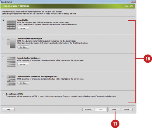
 Select a display option for the data, and then click Set Up to specify how you want to layout the data.
• Insert Table. Creates a dynamic Spry Table.
• Insert Master/Detail Layout. Creates a master region on the left that updates information in the detailed region on the right.
• Insert Stacked Containers. Creates a stacked repeating container structure for data.
• Insert Stacked Containers with Spotlight Area. Creates a stacked repeating container structure (2 columns) with a spotlight area (for a picture).
• Do Not Insert HTML. Creates a data set without inserting a data layout.
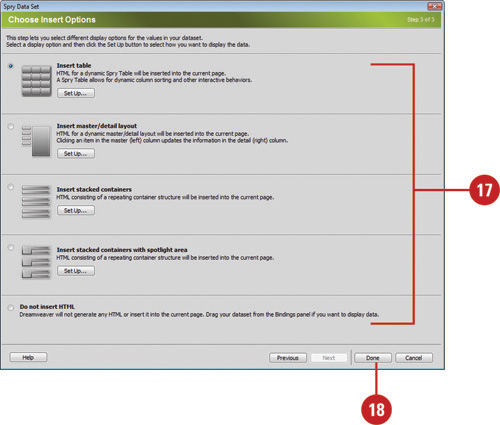
 Click Done.
Open the Web page you want to use.
Click the Spry tab on the Insert panel, or click the Insert menu, point to Spry, and then click Spry XML Data Set.
Timesaver
If you don’t have an XML data set, you can get a sample at www.adobe.com/go/learn_dw_spryframework.
Click the Select Data Type popup, and then click HTML.
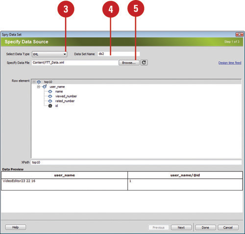
Enter a name for the spry data set or use the default one, ds1.
Click Browse, navigate to and select the XML data file, and then click OK.
To use a sample feed on your test server, click the Design Time Feed link.
Click Get Schema to populate the Row Elements panel.
Select the element that contains the data you want to display. The element typically is a repeating node with one or more subfields.
The XPath text box shows the data found in the data set. A preview of the data set appears in the Data Preview window.
Click Next to continue.
Select the column you want to use in the Data Preview window.
If you want to validate the data to be a specific type, click the Type popup, and then select a data type.
If you want to sort the data as it loads, click the Sort Column popup, select a sort option, click the Direction popup, and then select the direction you want.
Select the Filter Out Duplicate Rows check box to eliminate any duplicate columns.
Select the Disable Data Caching check box to load data directly from the server, otherwise it caches it on your local computer.
Select the Auto Refresh Data check box, and then enter an interval value in milliseconds to refresh the XML data from the server.
Click Next to continue.
Select a display option for the data, and then click Set Up to specify how you want to layout the data.
Click Done.
Open the Web page with the spry XML data set you want to view.
Click the Window menu, and then click Bindings to display the Bindings panel.
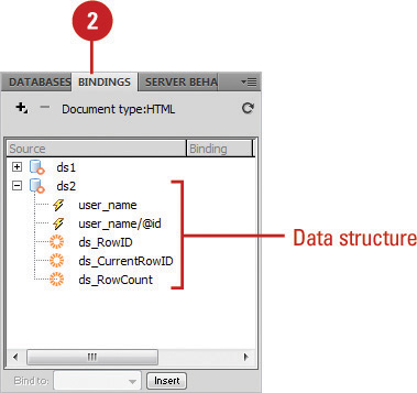
The spry XML data set appears, displaying the structure of the data.
After you identify the data sets (HTML or XML source files) you want to use, you can insert one or more spry data objects to display the data on a page. A spry data object is enclosed in a spry region on a page, so you need to insert one first or let Dreamweaver do it for you. You can create a region or a repeated region. There are two types of regions: a region and a detail region. A spry region is a page section that wraps around data objects. A spry detail region updates data based on changes made in a master table object (also known as a spry table) somewhere else on a page. A repeat region is a data structure you can format to display your data. A repeat region is useful for elements you want to repeat within a page layout, such as a gallery of images.
Open the Web page you want to insert a spry region, and then click to place the insertion point where you want it.
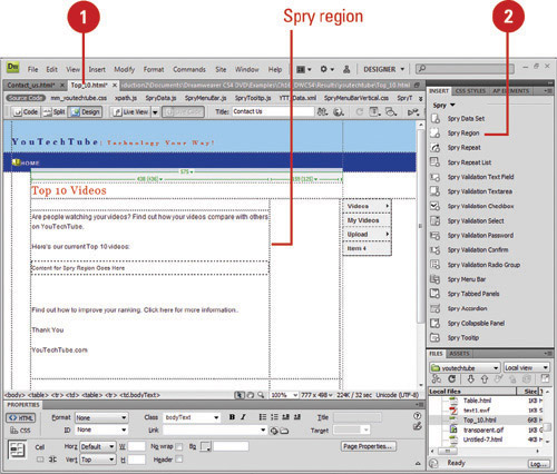
Click the Spry tab on the Insert panel, or click the Insert menu, point to Spry, and then click Spry Region.
Select the DIV or SPAN option.
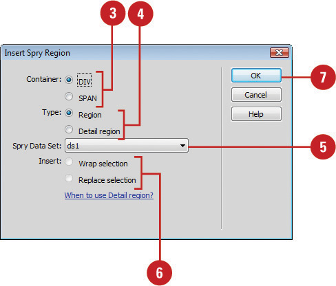
Click the Region or Detail Region option to specify the type of region you want to insert.
Click the Spry Data Set popup, and then select the data set you want to use.
Click the Wrap Selection option to insert a new region around an object, or the Replace Selection option to replace an existing region for an object.
Click OK.
Dreamweaver inserts a region placeholder on your page.
You can replace the placeholder with spry data objects, such as a table or repeat list, or with dynamic data from the Bindings panel.
Open the Web page you want to insert a spry region, and then click to place the insertion point where you want it.
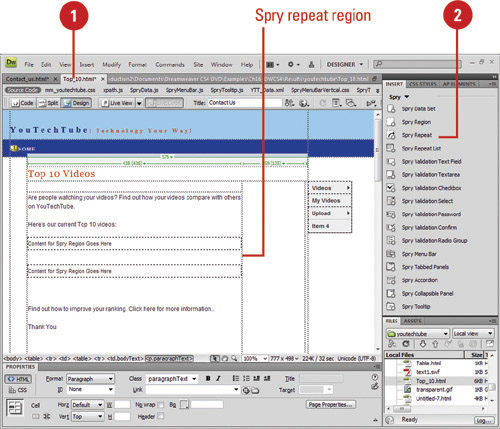
Click the Spry tab on the Insert panel, or click the Insert menu, point to Spry, and then click Spry Repeat.
Select the DIV or SPAN option.
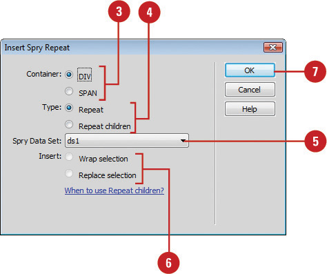
Click the Repeat or Repeat Children option to specify the type of region you want to insert.
Use the Repeat Children option when data validation is done for each line in a list at the child level.
Click the Spry Data Set popup, and then select the data set you want to use.
Click the Wrap Selection option to insert a new region around an object, or the Replace Selection option to replace an existing region for an object.
Click OK.
Dreamweaver inserts a region placeholder on your page.
You can replace the placeholder with spry data objects, such as a table or repeat list, or with dynamic data from the Bindings panel.
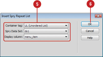
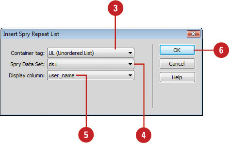
A spry data object, such as a repeat list, displays data from a spry data set. A spry data object is enclosed in a spry region on a page, so you need to insert one first. If you don’t, Dreamweaver inserts one for you. The repeat list data object allows you to display your data as an ordered list, an unordered (bulleted) list, a definition list, or a drop-down list.
Open the Web page you want to insert a spry region, and then click to place the insertion point where you want it.
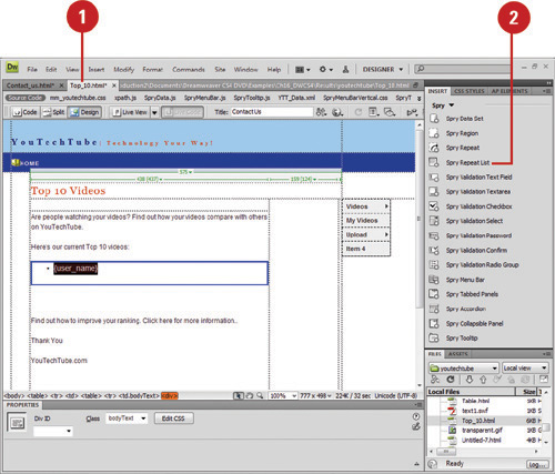
Click the Spry tab on the Insert panel, or click the Insert menu, point to Spry, and then click Spry Repeat List.
Click the Container Tag popup, and then select the tag you want to use: UL (Unordered List), OL (Ordered List), DL (Definition List), or SELECT (Drop-down List).
If you choose the SELECT (Drop-down List) option, you also need to select a display column and value column (the value sent to the background server).
Click the Spry Data Set popup, and then select the data set you want to use.
Click the Display Column popup, and then select the column you want to display.
Click OK.
Dreamweaver inserts a repeated region in your page.
Each spry widget is associated with a CSS and JavaScript file. The CSS file contains all the styling for the widget and the JavaScript file provides all the functionality for the widget. For example, the files associated with the Validation Radio Group widget are called SpryValidationRadio.css and SpryValidationRadio.js). When you insert a widget in a saved page, Dreamweaver creates a SpryAssets folder in your site and saves the associated files in it. If you want to customize the styling for a spry widget, all you need to do is open the CSS file in the SpryAssets folder, make the changes you want, and then save it.
Click the File menu, click Open, navigate to the SpryAssets folder in your site, select the CSS file for the widget that you want to change, and then click Open.
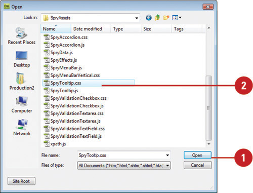
The CSS file becomes available in the SpryAssets folder after you use it on a web page.
Locate the CSS rule for the part of the widget that you want to change.
The available CSS rules vary depending on the spry widget.
Make the changes you want.
You can also make changes to a CSS file in the CSS Styles panel.
Click the File menu, and then click Save to save your changes.
Click the File menu, and then click Close.
See Also
See Chapter 9, “Working with CSS Rules” on page 226 for more information on changing CSS styles.
Dreamweaver goes a step further with spry widgets that allows you to add special effects to page elements. A spry effect is useful for highlighting information or creating an animated transition. You can use the Behaviors panel to add a variety of spry effects including fades, highlights, blinds, slides, shakes, and squishes. You can combine more than one effect to an element to create a unique display. If you no longer want to use an effect, you can quickly remove it.
Open the Web page with the element you want to apply a spry effect.
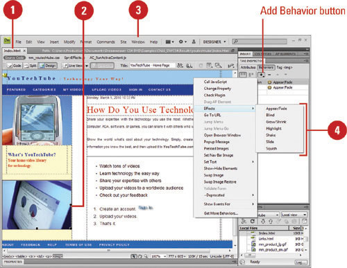
Select the element on the page you want to change.
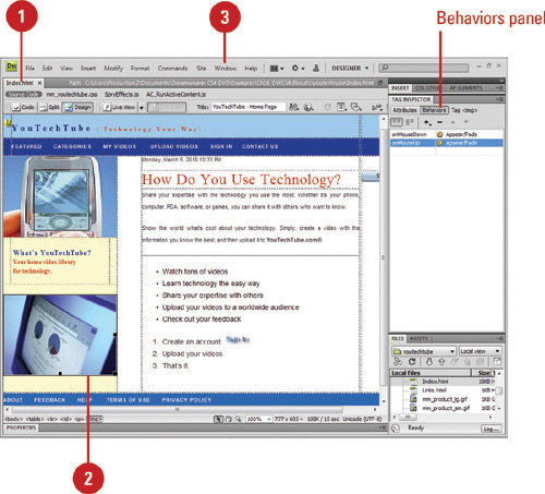
Click the Window menu, and then click Behaviors to display the Behaviors panel.
Click the Add Behavior button (plus sign), point to Effects, and then select the effect you want:
• Appear / Fade. Makes the element appear or fade away.
• Highlight. Changes the element background color.
• Blind. Displays the element with a window blind effect.
• Slide. Moves the element up or down.
• Grow / Shrink. Makes the element increase or decrease in size.
• Shake. Makes the element shake from left to right.
• Squish. Makes the element disappear in the upper left corner.
Specify the options you want for the selected spry effect; the options for the effect vary depending on the one you select.
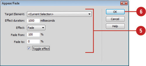
Click OK.
Open the Web page with the effect you want to remove.
Select the element on the page with the spry effect.
Click the Window menu, and then click Behaviors to display the Behaviors panel.
Select the effect you want to remove in the Behaviors panel.
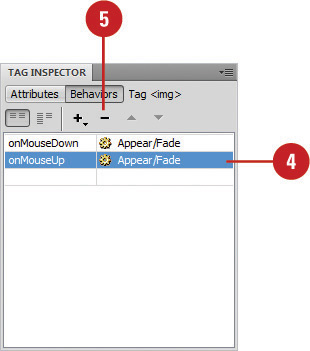
Click the Remove Event button in the subpanel title bar.
You can also right-click (Win) or control-click (Mac) the behavior, and then click Delete Behavior.
Did You Know?
Applying a spry effect adds code to your Web page file. When you apply a spry effect, Dreamweaver adds code to the document that initiates and identifies the SpryEffects.js file, which provides the executable code to perform the effect. Do not remove or modify this code in Code view.
You can add multiple effects to an element. Select the element you to which want to apply multiple effects, open the Behaviors panel, click the Add Behavior button (plus sign), point to Effects, select the effect you want on the submenu, select the element’s ID from the target element list, or select <Current Selection>, specify the other options you want, and then click OK.
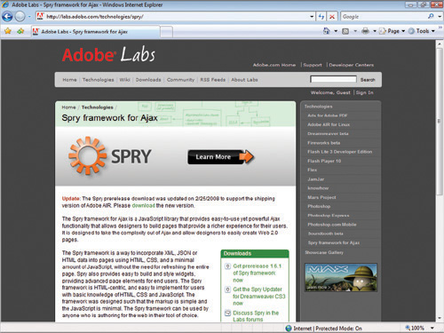
Before you add Spry widgets, you need to download and link the latest required Spry Framework files from the Adobe Labs Web site (http://labs.adobe.com/technologies/spry/). When you unzip the Spry Framework files, you also get some samples and demo files that show you by example how to use a spry widget.
In addition to spry widgets, there are also other widgets available that work with Dreamweaver (New!). You can browse for widgets on the Adobe Exchange web site, which you can quickly access from Dreamweaver. Click the Browse for Web Widgets from the Extend Dreamweaver menu on the Applications bar.