Chapter 12
Mobile Banking
This chapter departs from the format of the book somewhat. So far the book has referred heavily to e-commerce, social media, lifestyle, productivity applications, and games. This chapter focuses specifically on the rapidly emerging field of mobile personal finance and mobile banking. In keeping with the Pet Shop theme, you can imagine you formed your own Pet Shop Bank—maybe to save for Fido’s retirement? Although these patterns are placed in the context of mobile banking, these same patterns and considerations apply just as readily to any long forms and complex workflows that deal with high-stakes data entry in a security-conscious environment.
12.1 Pattern: Login Accelerator
The Login Accelerator pattern enables accelerated mobile login using a short code, facial recognition, or voice imprint while providing an acceptable level of security.
How It Works
Some banks offer the customer the option to add the device to the list of “approved” devices by installing a special code on the device in a form similar to that of a browser cookie. The customer also sets up a second level of authentication in the form of a four - to six-digit numeric code, a picture of his face, a voice imprint, or some other mechanism that involves less typing than the typical username/password combination.
Example
To set up an accelerated login, some mobile banking apps, such as Chase (see Figure 12-1), force the customer to set up two-factor authentication. The first part of the authentication (the first “factor”) is the login and password to get into the Chase app; the second part of authentication is the access to the e-mail or a phone already registered to the customer, verified via a one-time setup token that is e-mailed or sent via SMS.
Figure 12-1: The Chase mobile banking app uses two-factor authentication.

After the code is received and accepted by the device, and the two-factor authentication is complete, the mobile phone device becomes “authorized,” and the person can use the app for mobile banking. To accelerate the login, the app can also remember the username to save the customer the time and effort of typing it each time he wants to access the app. The user tells the app to remember the username by tapping the Save User ID check box on the login screen, as shown in Figure 12-2.
Figure 12-2: The Login Accelerator in the Chase app saves the User ID.

In contrast to Chase, the USAA bank app enables the customer to set up a Login Accelerator using a combination of username, password, and his existing PIN without waiting for external confirmation by e-mail or text. After the initial authentication, the customer has the option to enable login using just his four-digit PIN simply by going to the Setting screen—note the instructions to that effect that appear in a faux metal box on the login screen (see Figure 12-3).
Figure 12-3: The USAA banking app uses a Login Accelerator with a four-digit pin called Quick Logon.
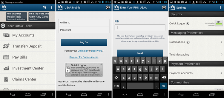
True to its name, after the Quick Logon is turned on, the customer can access the app quickly just by entering the four-digit pin (see Figure 12-4).
Figure 12-4: After the initial setup, the Login Accelerator in the USAA Banking app allows customers to login quickly.

The method to unlock the app is not limited to a four-digit code. The Android 4.0 Ice Cream Sandwich Nexus phone features a facial-recognition phone unlock mechanism, which is accurate and impressive.
After the customer sets up the mug shot of his face under various light conditions and angles, he can activate the facial recognition feature. To unlock the phone, all the customer has to do is…turn it on. The Power button is located in the top-left corner, so to turn on the phone, the person has to hold the phone a certain way, facing him. The built-in, front-facing camera is positioned at just the right angle to start taking a video of the person’s face. As soon as the owner is recognized, the phone unlocks automatically, without requiring the customer to do anything further (see Figure 12-5). In the words of Peter Morville, the design “dissolves in behavior.”
Figure 12-5: The Login Accelerator pattern in Android 4.0 Nexus uses facial recognition.

When and Where to Use It
Any time you have a login and username, consider whether you want your customer to type them in every time she needs to access her data. Whenever you can, give your customer the option to store the password and username on the phone for medium-security apps such as social networking, lifestyle, and personal information management. For apps such as e-commerce, delay the authentication for as long as possible, preferably until the checkout flow.
For frequent-use, high-security apps such as mobile personal finance, strongly consider using some kind of a Login Accelerator scheme to make login easier.
Why Use It
If logins are tedious on the desktop web, they are ten times more so on mobile, where tiny keyboards and fat fingers get in the way of typing a long e-mail username and password precisely. Often, the customer must switch the keyboard several times to type in special characters in the username and password—every time the app times out. In short, logins make apps hard to use. And to quote Steven Krug in Don’t Make Me Think (2005, New Riders), “if people find something hard to use, they just don’t use it as much.” Login Accelerator enables a fast, secure mobile login that drastically lowers the login barrier.
Unfortunately, some of the worst offenders in this regard are pure HTML 5 apps such as Yahoo! Mail. Until recently, Yahoo! Mail was unable to save either the username or the password, forcing its customers to type 20 or 25 characters any time they needed to check e-mail, which could typically be 10 or 15 times a day. A recent update to the Yahoo! Mail app features a native implementation that automatically saves the username, but there is still no option available to save the password or accelerate the login in any way (see Figure 12-6).
 Figure 12-6: A lack of login accelerators in Yahoo! Mail makes it tedious and hard to use.
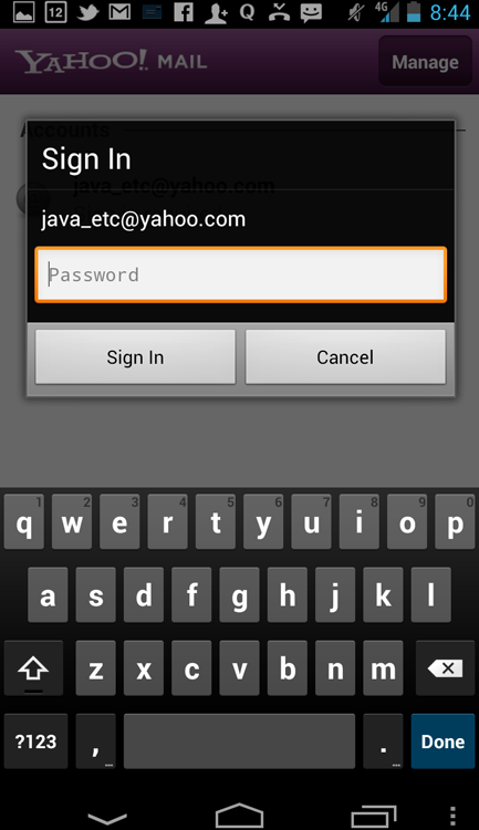
Speculatively, this inability to accelerate the login cuts down on the actual use of the Yahoo mail app. This is certainly true in my case.
Other Uses
 One of the most intriguing ideas in recent years has been to use a physical token with near field communication (NFC) as a Login Accelerator. For example, imagine an NFC chip imbedded in an article of personal jewelry, such as a ring, used to unlock the phone on its own or in combination with some other form of authentication, such as a four-digit code or facial or voice recognition. This kind of a “decoder ring” would operate via an NFC chip and be more user-friendly than the RSA token many people use today to log in to a virtual private network (VPN). The security would be provided by the passive presence of the ring in the vicinity of the mobile device: If the ring is nearby, the mobile device detects the unique NFC signal and enables access. If the device is moved away from the ring (lost or stolen), the mobile device requires a more lengthy back-door access through a username/password authentication mechanism and alerts the owner to its location and a possible break-in attempt. NFC chips are now small enough to allow them to be placed in all sorts of small personal articles and even implanted subcutaneously. For the ultra-rich or people requiring this sort of permanent higher-level security, getting implanted with an NFC chip may be a worthwhile investment.
Pet Shop Application
Recall that you’ve already seen a four-digit code used instead of the password during the registration process described in the previous chapter in Figure 11-4. This current example pushes the envelope still further, with the voice recognition unlock mechanism. Imagine that during the registration the app asked the customers to set up the voice password in response to a simple challenge question, such as, “What is your favorite restaurant?” and the unique voice modulations of the owner were recorded to be used later as the means of identification. The app also sets up a four-digit code to be used as a backup.
When the app is launched, it immediately enters the voice recognition unlock mode, indicated by the oscilloscope display. The person speaks the password, and the app unlocks—no need to push anything more. In loud or quiet environments, the person also has the option to tap the Cancel button, and enter the four-digit backup code (see Figure 12-7).
Figure 12-7: This experimental form of the Login Accelerator pattern could be used as a voice recognition password in the Pet Shop Bank app.

But why stop using voice at the level of the identification of the security for an individual app? As discussed in Chapter 7, “Search,” voice-driven commands can be used with the help of a digital personal assistant (such as whatever Siri counterpart Google creates) to do routine tasks such as open apps. What if the app’s name was used as a password and all you had to do was tell your phone to launch the app—the security of voice recognition handled directly by the Android OS? You can even get clever with the app’s nickname, recognizing preset phrases such as “Show me Mack’s accounts” (Mack being the name of the dog) to authenticate the voice modulations and the passphrase together to open the Pet Shop Bank app.
Obviously, unless Mack’s retirement at a private tropical island was at stake, you don’t need this level of security. It’s included only as a demonstration and to make the point: High security does not need to be a hassle. This technology is already here and this “future” design pattern is already in use; it’s just not, in the words of William Gibson “evenly distributed” (“The Science in Science Fiction” on Talk of the Nation, NPR, November 30, 1999).
Tablet Apps
Two-factor authentication provides a unique opportunity for tablet devices. As described in Chapter 17 of Designing Search (2011, Wiley), based on brilliant research done by Marijke Rijsberman, tablets, especially larger ones, are still expensive and rare enough to be considered “family devices.” Although this may change in the future with every person on the planet having a tablet, the reality on the ground is that a large tablet is a shared alpha device, which means multiple family members take turns using it, much like the television sets in the 1950s or family PCs in the ’80s and ’90s. Unfortunately, the Android OS is not well suited to multi-person use because as of the date of this writing, it does not provide multiple logins as part of the operating system. Thus it is up to the designers of the individual apps to introduce a login or profile system.
It is both a challenge and an opportunity to create profiles in a family-friendly environment. One great model for this is Wii’s Miis—a low-security, family-friendly profile system developed by Nintendo. Miis are styled to look like individual family members and retain gaming statistics and other profile attributes associated with individuals. Since Designing Search was published, Microsoft Kinect went a step further in identifying the individual family members by height and movement style, creating an amazing automatic Login Accelerator system that dissolves in behavior.
Because families often use large tablets for gaming, it makes sense to look at gaming systems for best practices in profile identification and management. Take the time to explore whether your app will be used by various family members. If so, consider providing facial or voice recognition, which could be as simple as speaking your name to activate your own profile and unlock the app. This is a simple system even a four-year-old can use.
Providing individual profiles makes particular sense for a shared large tablet because those devices are used primarily inside the home (where it’s easy and comfortable to speak out loud your own name) and are rarely taken out of the building.
 Caution
Facial recognition is good when you are out in the public during the day in your civilian clothes. But what if you need to use your phone at night, in your bat-cave, when you are wearing your superhero disguise? (See Figure 12-8.)
Figure 12-8: Don’t forget to provide back-door access.
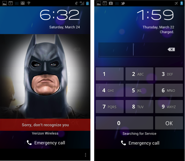
Your customers may not all have lives as interesting as Bruce Wayne, but there are always circumstances in which the shortcut method of access set up through Login Accelerator does not work. Be sure to provide a back-door access that allows for the usual username/password combination in case they need to unlock the app “the long way.”
Related Patterns
12.2 Pattern: Dedicated Selection Page
When the customer needs to make a selection from a list, the Dedicated Selection Page (also known as a Full Screen Picker) is a great alternative to the Drop Down pattern, which you can read about in Chapter 10, “Data Entry.”
How It Works
When the customer needs to select a value from a long list, she taps the selector control, and a dedicated page of values opens. After the customer selects the value on the dedicated selection page, the page closes and the system again displays the form with the selection shown in the selector control. This selection is often accompanied by the “sliding” motion transition left-to-right to the dedicated selection page and then right-to-left to get back to the form. This sliding motion transition led some designers to call this pattern “a slider” (not to be confused with the Android Slider pattern covered at the beginning of Chapter 10).
Example
One example of such a dedicated selection page comes from the Chase mobile banking app. To select a recipient for the bill pay app, for example, the customer navigates to the separate dedicated page where recipients are listed. (See Figure 12-9.)
Figure 12-9: The Chase mobile banking app includes a Dedicated Selection Page for bill pay recipients.
After the customer selects the recipient, the system navigates back to the form page.
When and Where to Use It
Any time you have a large list to select from, consider using the Dedicated Selection Page pattern. This pattern is especially handy when you need to manage the list or have other controls such as a Scrubber to navigate quickly to the appropriate selection. Other considerations for using the dedicated page include customizing the dedicated selection page completely with colors, fonts, and styles of your choice. The simple drop down select control in Android enables only limited customization of the look and feel.
Why Use It
Selecting from a long list is a common task, as discussed at length in Chapter 10. As digital lives become more and more complex, lists of selections likewise get longer and more complex. The Dedicated Selection Page pattern enables a straightforward selection mechanism and empowers the designers to take advantage of the full screen width and full array of selection tools and navigation tabs.
A simple transfer of funds from a person’s own checking account to her own savings account (known in the industry as a me-to-me transfer) makes a simple example to demonstrate the use of the Dedicated Selection Page pattern in the mobile banking environment. In the course of the me-to-me transfer, the Dedicated Selection Page pattern makes it easy to display a dynamic set of accounts and their values reliably without resorting to some funky JavaScript or other client-side coding languages. For example, if Checking Account A is chosen as a From account, you do not want to show Checking Account A as a possible selection for the To account. The Dedicated Selection Page pattern makes it easy to dynamically remove a value from the list or even perform more involved list manipulation according to complex business rules by taking a trip to the server before displaying the dedicated selection page.
Other Uses
It’s easy to imagine this pattern extended to the Text Box with Atomic Entities pattern (refer to Chapter 10). For example, in one alternative design , the page that shows the entire list is also searchable via a simple search box on the top of the Dedicated Selection Page. This arrangement enables the Dedicated Selection Page to be browsed (by scrolling the list) as well as searched, similar to the way contacts can be browsed or searched in the Contacts app.
The Chase app (refer to the dedicated selection page in Figure 12-9) enables list management and displays the list. There is an additional button on the top of the list that enables a customer to add a new Payee if she does not already see her Payee in the list.
Pet Shop Application
Figure 12-10 shows how the pattern looks when it’s used for a me-to-me account selection in the Pet Shop Bank app. The design implementation in the figure enables the customer to select her desired account by searching or simply by scrolling through the list of accounts.
Figure 12-10: Dedicated Selection Page with a search box is used for me-to-me account transfers in the Pet Shop Bank app.

It also enables customers to easily limit the size of the list by typing in a few characters of the account name in the search box on the top of the page. The search box is fixed, and the account list scrolls below it. The keyboard does not display unless it is called for by tapping inside the search box.
Tablet Apps
For most tablet apps, the Dedicated Selection Page pattern is overkill. However, you can still use the cool features of the pattern in a lightbox pop-up or similar device. Unfortunately, most tablet apps do not take the time to do this; as a result the form interface quickly starts to look overly large and cartoony, especially on larger tablets. For more tips on implementing list selection on a tablet in both orientations, see Chapter 14, “Tablet Patterns.”
Caution
Don’t overuse this pattern. If you have a simple static list of manageable size, without any dynamic additions, you do not need a Dedicated Selection Page pattern. A simple select can be an effective device that has a nice property of staying in the context of the current page (because it opens in a lightbox) without yanking the customer out of the flow completely, as a Dedicated Selection Page does. One thing to consider before using a Dedicated Selection Page is whether the strings in the list wrap two or more times when you use only the middle 80 percent of the page, as in a Select control. If the strings do wrap or you absolutely must have custom treatment of the selections, go ahead and use the Dedicated Selection Page pattern. Otherwise, you may be better off with the simple Drop Down control.
For example, the Chase app includes an excellent approach—it uses a Dedicated Selection Page for a more complex flow of selecting a recipient (refer to Figure 12-9) and a simple Drop Down select control for choosing the From Account (shown in Figure 12-11).
Figure 12-11: The Chase app uses a simple Select for the From account in the Bill Pay flow.

Related Patterns
12.3 Pattern: Form First
When filling out a long form on the mobile device, many designers first try to copy the desktop web form. Although this has the advantage of being the most intuitive and obvious choice, this pattern typically results in longer flows that require more page views and more taps than alternative approaches in this chapter.
How It Works
When the customer needs to enter some data, he is first shown a form. All subsequent complex data entry screens return the person back to the form before going onto the next data entry.
Example
One example of this pattern is the USAA internal transfer—also called me-to-me transfer (see Figure 12-12). To enable transfer of funds from checking to savings, the customer is first shown a form with blank values. As the customer goes into the Dedicated Selection Pages (as discussed earlier in this chapter) the customer always returns to the form page but now with the appropriate account selections filled out.
Figure 12-12: The USAA mobile banking app uses the Form First pattern for me-to-me transfers.

With the verification page (discussed later in this chapter), the entire me-to-me transfer flow is eight screens as shown in the figure. Although this pattern generally works well for mobile devices, it’s obviously a bit long; it’s the longest flow pattern in this chapter.
When and Where to Use It
When your customers have a long form to fill out without many Dedicated Selection Pages, this is a good pattern to use. However, with the one or more Dedicated Selection Pages, this flow becomes a bit long.
Why Use It
Copying a desktop web form structure is a natural reaction for designers. Likewise, this form pattern is simple to use and understand for most customers that have used similar constructs on the web.
Other Uses
Any form can be considered a good candidate for this “default” pattern. Other form flow patterns in this chapter can be considered as optional improvements on this basic design.
Pet Shop Application
In the Pet Shop Bank, you can use a simple variation of this pattern that is also going to take up the same number of pages—eight in total (see Figure 12-13).
Figure 12-13: These wireframes show the Form First me-to-me transfer in the Pet Shop Bank app.

The idea behind this pattern is simple: a copy of the standard desktop web form with dedicated selection pages used instead of the pickers and spinners. Using this mobile design pattern, the me-to-me transfer flow looks like this:
Note the Verification pattern screen, which is recommended for use with the Form First pattern. In contrast with USAA, which uses the Toast Alert as a verification mechanism, the Pet Shop App uses a dedicated verification page. Read more about the Verification-Confirmation design pattern later in this chapter.
Tablet Apps
The Form First pattern is the primary pattern you should use for tablets as long as you don’t take up the entire large screen for the Dedicated Selection Page. However, most apps don’t take the time to create Dedicated Selection Pages in a pop-up or lightbox, creating long tablet flows where entire screens constantly slide in and out of view, using the entire large surface area of the tablet—frequent large-scale transitions within the same form can be distracting.
I’ve heard customers describe a typical Form First flow in a large tablet app for a large banking client as “underpowered,” “childish,” and “very long” mainly due to multiple large-scale transitions to and from the Dedicated Selection Pages. A better approach is to use the standard Drop Down control (covered in Chapter 10) for account selections or lightboxes for Dedicated Selection Pages as discussed in Chapter 14.
Caution
Be aware of how long the flows are. If your flow is six screens or longer, consider using one of the other patterns in this chapter.
Related Patterns
12.6 Pattern: Verification-Confirmation
12.4 Pattern: Dedicated Pages Wizard Flow
This Dedicated Pages Wizard Flow can be called a “Mobile First” pattern (after a term coined by Luke Wroblewski) because it is entirely optimized for the small screen.
How It Works
The entire form is never shown to the customers. Instead they see a series of mobile-optimized pages with only the appropriate controls for data entry. Usually, at the end of the Dedicated Pages Wizard Flow pattern, the customer is presented with the verification page and a confirmation page.
Example
One great example of this pattern frequently overlooked is field extraction that happens automatically on the Android in the horizontal orientation of the device (see Figure 10-35 in Chapter 10, “Data Entry”). Thus, a long form consisting entirely of text fields in the vertical orientation turns into a succession of individual field entry pages optimized with the on-screen keyboard—a Dedicated Pages Wizard Flow.
Unfortunately, the pattern breaks quickly when it encounters a Select control in the middle of the form. Notice the last button in Figure 12-14 turns into Done, and the next screen shows the original form in the horizontal orientation. But why break the flow so abruptly? Would it not make sense to continue with the pattern until the entire form is completed?
Figure 12-14: The extraction of text fields turns them into Dedicated Pages, but this pattern breaks when it encounters a Select control in the Calendar app.

A better, more complete example of the Dedicated Pages Wizard Flow in a vertical orientation comes from the PayPal app running on the Apple iPhone (see Figure 12-15).
Figure 12-15: The PayPal app’s Send Money function on the Apple iPhone uses the Dedicated Pages Wizard Flow.
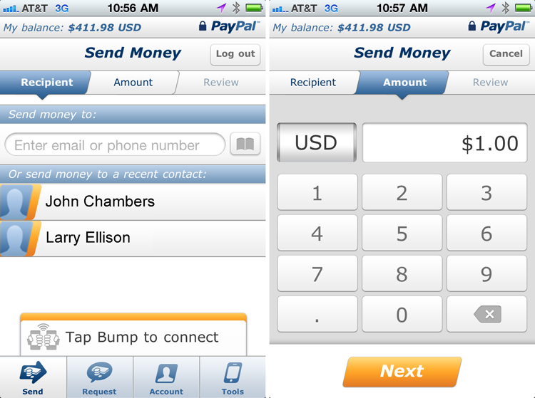
Note also the breadcrumb on the top of the page, which is a nice modification of this pattern that helps customers understand where they are in the flow.
When and Where to Use It
Consider using this pattern whenever you have a short form with all fields required and where the fields utilize various specialized controls and customized keyboards, including one or more Dedicated Selection Pages.
Why Use It
The Dedicated Pages Wizard Flow pattern is ruthlessly optimized for mobile: Only the essential fields are included, which speeds up the data entry and guides the customer down the most efficient narrow selection path. This is a true “mobile first” way to implement a form and can be effective in keeping your customers in the flow. (Note: Discussion of flow is outside the scope of this book. For the seminal book on the topic, read Flow: The Psychology of Optimal Experience by Mihaly Csikszentmihalyi, 2008, Harper Perennial Modern Classics.)
Other Uses
You can use any short form with all fields required with this pattern. It also works if the field is optional, but be sure to provide a Skip functionality.
Some wizard flows are not dedicated—that is, the pages have two or more fields and do not automatically launch a keyboard. For example, the registration flow for creating a new Google ID that’s shown in Figure 12-16 is not dedicated.
Figure 12-16: The form for creating a Google ID has a common (non-dedicated) wizard flow.

There is little evidence that breaking up the form this way provides any benefit whatsoever, but neither does it appear to hurt (see Luke Wroblewski’s 2010 workshop Mobile Input at Design4Mobile in Chicago, http://static.lukew.com/MobileInput_LukeW.pdf).
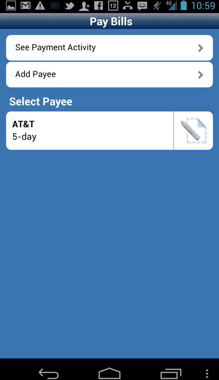
Pet Shop Application
For the Pet Shop Bank, you can imagine using this flow as a way to perform a fast me-to-me transfer with a minimum of fuss. The person selects the From account and the To account and then enters the amount using a dedicated screen with a numeric keyboard (see Figure 12-17).
Figure 12-17: This wireframe shows the tightly efficient Dedicated Pages Wizard Flow pattern for a me-to-me transfer in the Pet Shop Bank app.

The customer sees a verification page followed by a confirmation. The entire flow is accomplished in only four screens and the bare minimum of taps and keystrokes. This is a “steamroller express” pattern; to see why, contrast it with the much longer eight-screen Form First design pattern covered previously in this chapter.
Note that a Verification Page mobile design pattern (that enables the customer to review the entire transaction before tapping the final Transfer button) is recommended with this flow. Note also the use of the Breadcrumb mobile design pattern, showing the customer which step of the workflow she is on and how many steps remain. The Breadcrumb design pattern enhances the Dedicated Pages Wizard Flow pattern nicely.
Tablet Apps
Tablet apps do not need this level of specificity unless the pattern is used entirely inside a lightbox.
Caution
At first glance the Dedicated Pages Wizard Flow appears to be the sublime mobile perfection of a form that Man has been seeking since the days of the Greek statues. Should you create a Dedicated Pages Wizard Flow for every mobile banking flow on your site? Not so fast.
On mobile devices, nothing comes free. That includes the Dedicated Pages Wizard Flow mobile design pattern, which completely breaks down when used for longer forms. The primary idea behind this pattern is a dedicated page for each form element. If you have five or more form elements, the flow starts to become too long. Another issue is the inability of the Dedicated Pages Wizard Flow pattern to discern between optional elements (Memo) and required elements (Amount). Using this pattern, each element gets its own entry page with the appropriate keyboard and is likely to be perceived as “required.” Even if the customer understands that she doesn’t need to enter anything, each form element at least requires her to look at the additional page and click Continue to skip it.
So, is there another pattern you can use if you have five or more elements on the page and many optional fields? Glad you asked. One of the most versatile, yet under-used, patterns is the Wizard Flow with the Form pattern that’s covered in the next section. And, as a bonus, this pattern dispenses with the need for a separate verification page.
Related Patterns
12.5 Pattern: Wizard Flow with Form
This is the optimal mobile design pattern for use with the Dedicated Selection Page pattern.
How It Works
When the flow includes one or more Dedicated Selection Pages, they are presented first as a wizard. After the customer makes the choices needed for the Dedicated Selection Pages, he is presented with a form that contains the remaining elements.
Example
One excellent example of this pattern is the Chase Bill Pay flow mentioned previously in the Dedicated Selection Page pattern section. The system first presents the customer with a Dedicated Selection Page for selecting a Payee. The dedicated selection page is needed because of the complex functionality of adding payees on-the-fly that is also available. After the Payee is successfully selected, the system presents the customer with a form containing both required (Amount, From account) and optional elements (Memo) (see Figure 12-18).
Figure 12-18: The Chase app Bill Pay feature uses the Wizard Flow with Form pattern.

The example in Figure 12-18 includes an additional verification page. That is not strictly necessary to use with this pattern because the final form acts as its own verification page of sorts.
When and Where to Use It
Any time your flow has one or more Dedicated Selection Pages, consider putting them first in the flow instead of the form, thus creating the Wizard Flow with Form pattern.
Why Use It
The reason for using this pattern is simple: It saves one tap and one page view compared to the Form First pattern for each Dedicated Selection Page. This pattern is the most flexible of all available approaches to filling out mobile forms.
This mobile design pattern combines the best features of the web forms, such as the flexibility of having optional fields and multiple input fields, with the vastly improved usability of mobile-optimized dedicated selection pages.
Another benefit of this pattern is the option to dispense completely with the verification page. With the Wizard Flow with Form pattern, the form page acts as a final editable verification page, dispensing with a need to have any additional pages. Of course, you can always add a verification page after the form if you must have it (refer to Figure 12-18).
Other Uses
The Wizard Flow with Form pattern also makes editing much easier than most other patterns. Instead of going through the entire flow again, the customer edits only the fields he needs. For example, in the Pet Shop Application section, to edit the To account, the customer taps the corresponding field in the form and the form navigates to the dedicated To account page. As soon as the customer selects the new To account value, the system immediately navigates back to the form without needing to go through the entire From account > To account > Amount flow again.
Pet Shop Application
The me-to-me transfer in the Pet Shop Bank is straightforward (see Figure 12-19) and adds only one extra tap versus the Dedicated Pages Wizard Flow (see the “12.4 Pattern: Dedicated Pages Wizard Flow” section).
Figure 12-19: This wireframe for the me-to-me transfer uses the Wizard Flow with Form in the Pet Shop Bank app.

At the same time, this pattern allows for optional fields, such as Memo, to be shown. When compared with the Form First pattern, Wizard Flow with Form saves three taps and three intermittent views of the partially competed form screen. It also saves an additional tap because it dispenses with the need to have a Verification screen. Because the form is seen only once and never disappears off screen, it makes its own effective verification screen, mostly dispensing with the need to have another.
Tablet Apps
This pattern is also a bit of overkill for most tablets, especially the larger ones. The crux of the pattern is the most efficient use of the Dedicated Selection Pages, which is rarely necessary on the tablet. Indeed, taking up the entire large tablet screen with the selection list is a bit unwieldy, unless you decide to use search or more complex functionality involved with the dedicated selection. So, for most Tablet forms, instead of using mobile patterns, consider using the popover/lightbox selection pattern to house the list of selections.
Caution
Consider if you need to have dedicated selection screens. If you do, use the pattern in this section, Wizard Flow with Form; otherwise, if the selections can be performed using a simple Drop Down select control, consider using a simple Form First pattern instead.
If you do decide to skip a separate verification page, make sure you provide a Done button that removes from the screen any keyboard that pops up; doing so allows the customer an unobstructed view of the entire filled-out form before he taps the commit button. Actually, it’s a bad practice and an antipattern to go to the next field if it’s not required in any mobile form, and particularly in mobile banking where stakes are high and distractions must be kept to a minimum.
Unfortunately, the Chase app does exactly that—the Next keyboard button after the Amount field takes the customer to the Memo field (see Figure 12-20), which few banking customers would ever want or need to fill out. Yet this action of the Next keyboard button actually makes it look as though Memo is required. Worse yet, the keyboard displays the carriage-return character, which makes it difficult to exit the onscreen keyboard view (discussed in Chapter 10). Another drawback is that after the customer finally clicks off screen to dismiss the soft keyboard, the Memo field remains highlighted with a thick, bright, orange line, drawing attention to the one useless piece of information on the screen and away from the all-important Next button.
Figure 12-20: It’s an antipattern to use a Next keyboard button that goes to a nonrequired Memo field in high-stakes flows.

Instead, a better approach, as shown in the high-def mock-up in Figure 12-21, is for the Amount keyboard button to say Done and close the keyboard, so the customer would see the entire form screen.
Figure 12-21: In this proposed fix for the flow in Figure 12-20, the Done keyboard button closes the keyboard and places the highlight on the Next button.
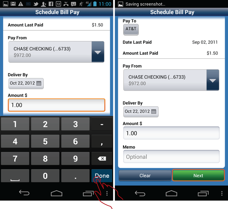
If, at this point, the customer decides he wants to enter something in the Memo field, he can tap that field and enter the keyboard view again. The orange highlight is now in its proper place—around the Next button.
Related Patterns
12.6 Pattern: Verification-Confirmation
Whenever you have a form with a complex, emotional, or valuable transactional payload, you need to have a verification and confirmation of the action. This pattern deals with the best practices of this essential element.
How It Works
When the form is complete and ready for submission, the system presents one last screen for customers to verify the information before they tap the final commit button. After customers tap the commit button, the system presents the confirmation page, showing the details of the committed transaction.
Example
One example of the Verification-Confirmation pattern is the Chase Bill Pay Flow, which presents the verification and confirmation pages in turn (see Figure 12-22).
Figure 12-22: This is how the Verification-Confirmation pattern looks in the Chase app Bill Pay flow.
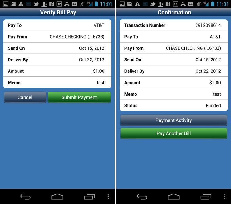
The buttons on the final confirmation screen outline the most common actions the customer might take immediately following the transaction. It is common to see the primary next action button (Pay Another Bill in this case) as one that returns the customer to the beginning of the original flow, especially if this happens to be the “money flow” for the company. For example, PayPal makes its commission every time you send money to someone; so naturally, it’s taken the time to optimize the verification/confirmation part of the Send Money flow to put the customer back at the beginning of the Send Money flow (see Figure 12-23) to ostensibly send more of their hard-earned cash to someone else. Note that the PayPal app’s confirmation page is implemented as a lightbox for just this purpose.
Figure 12-23: The confirmation implemented as a lightbox in the PayPal app returns the customer to the beginning of the flow.

When and Where to Use It
Any time you have a flow that involves money, such as banking or e-commerce checkout, customers expect some sort of a Verification-Confirmation pattern.
Why Use It
Verification enables the customer to make sure she did not miss anything or accidentally mistype something in the fat-fingered mobile apps world. This is especially important due to frequent interruptions and auto-corrects that might creep up during data entry. The extra verification page provides visual confirmation that the system interpreted the data entry correctly.
Other Uses
Sometimes, you can dispense with the separate verification page for short forms. See the “12.5 Pattern: Wizard Flow with Form” section earlier in this chapter for more information.
Pet Shop Application
You’ve seen the verification page in most of the designs in this chapter. It’s a straightforward design, so it’s not necessary to replicate it here.
Tablet Apps
For tablets, verification on a separate dedicated screen may seem like overkill. However, sometimes, especially for large financial transactions, it is appropriate to dedicate the entire separate page just for the verification screen. This is done for the purposes of “waking up” the customer to ensure her full attention on the task.
Effective confirmation on a tablet can be done as a lightbox (as in PayPal) or as a separate page. It is less important than the verification page because by then the “deed is done.” The number and desirability of the next actions in large part dictate the extract implementation of the final confirmation page.
Caution
Although this pattern looks trivial, it is far from that. To begin with, most people have trouble differentiating between the words verification and confirmation. As a result, unless your design makes absolutely clear that the transaction is not done, people may misinterpret the verification page as a confirmation page. In other words, upon seeing the verification page they think that they are “done” and do not press the final commit button (which might be something like Place Order, Submit Payment, or Transfer) and exit the flow instead.
Almost 30 percent of the 25 participants in one massive usability test for a major Internet retailer made the same mistake in a long checkout flow. When these people saw the verification page, the design of the page suggested to them that they were done. This, as you can imagine, is a dangerous and nasty usability problem. Think about it: The customers determined to hand over their money, instead stopped short due to confusion—nothing can be more unfortunate for the retailer. And think about the customer frustration when they wait for weeks for goods that never arrive!
The bad news is that this problem can be difficult to diagnose. Look for unusually high percentages of people abandoning the shopping cart or unfinished transactions. One of my clients, a major U.S. bank, saw transaction abandonment in the 20 percent range, which is acceptable (though highly unwanted) for sending someone money, but it’s too high for me-to-me transfers. Seeing unrelated transactions like this that have similar abandonment rates is a good clue that there’s something going on other than people simply changing their minds. If you are at all in doubt, run qualitative usability tests on your system. Don’t forget to check in with your customer support. Are people calling in to ask, “Where is my shipment?”—that’s a good clue you screwed up your verification page.
One of the most common mistakes in this pattern is placing the final commit button below the fold. The combination of the final commit button below the fold and the bad copy on the top of the page (such as a page title of Verification) is a real conversion killer. The solution is to place the final commit button both on the top and the bottom of the page and name the page with a “transitional” name such as Review Your Order or Checkout. Amazon.com is an excellent example of an effective Verification-Confirmation pattern (see Figure 12-24).
Figure 12-24: The Amazon.com app’s checkout process is an excellent example of the Verification-Confirmation pattern.
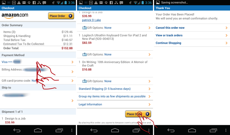
You can give your verification pages even stronger “incomplete” titles, equipped with an ellipsis, such as “One More Step…” and “Are you Sure?” Make your final commit button large and bright with a highly contrasting color. For example, Amazon.com’s, final commit button is a highly saturated yellow.
Related Patterns
All patterns in this chapter
12.7 Pattern: Near Field Communication (NFC)
Telecoms and mobile phone manufacturers have long been promising mass-market mobile near field communication (NFC). With a brand-new Galaxy Nexus S, the first NFC-enabled smartphone on the market, consumer mobile NFC has suddenly become the new reality.
How It Works
NFC is a short-range connectivity technology. Connecting with NFC usually initiates apps or other systems within the device. NFC enables easy access to these applications by touching two NFC-enabled devices to one another or touching an NFC-enabled device to an NFC “tag.”
Example
One shining example of the use of NFC in the U.S. market is Google Mobile Wallet. When it’s time to pay, the customer unlocks the wallet using a four-digit PIN and taps the mobile device to the pay terminal. The timer runs until the payment information is captured by the terminal (see Figure 12-25).
Figure 12-25: Google Mobile Wallet uses the NFC pattern.
Despite the apparent simplicity, there are many issues with the current NFC flow of the Google Wallet app:
- Security of the wallet app
- Customers’ understanding of how the app works
- How to show which card is being used.
Security of the Wallet App
With the new doorway into the phone’s innards, security is likely to be paramount. How is the access to the NFC chip’s impressive capabilities maintained? If you use the app for NFC-enabled Foursquare access, you may not even need a password. For Google Wallet, the app uses a decidedly iPhone-esque four-digit PIN screen, as shown in Figure 12-26.
Figure 12-26: NFC Google Mobile Wallet maintains security through a four-digit login PIN.

I guess the thinking behind this design at Google HQ was that if a four-digit code can be used to unlock the ATM machine so the customer can get $300 at a time, this same security ought to be sufficient for a phone wallet. This may be the case, but if you dig a bit deeper, you discover a host of important questions.
For example, when the NFC-enabled app is launched, how long does it stay active? The ATM PIN is only active while the transaction is occurring. If the customer pauses for more than 20 or 30 seconds, the standard-issue Diebold ATM boots the customer from the system. Although an ATM can be considered to be a crude version of “mobile technology,” strictly speaking the ATM machine can virtually guarantee your physical presence at a particular location (in front of a specific ATM). The ATM can also guarantee to command your complete attention. You cannot, for example, check your Facebook alerts while also taking the money out of the ATM.
In contrast to an ATM, on the smartphone you are dealing with the infinitely more complex device and multivaried mobile environment. For example, on the mobile phone, the customer may launch the app in preparation for payment while waiting in line. This is tantamount to someone entering his PIN while waiting in line for an ATM. Should you allow it?
If you do allow it, how long do you allow the app to stay active? Five minutes? Four? Or until the phone is shut down? How about multitasking? Should you allow the customer to check his e-mail while his digital wallet is “hanging open”?
How about the four-digit PIN? Most consumers might use for their digital wallet the same four numbers they use to withdraw money out of the ATM. That seems logical, if somewhat simple-minded.
How about using the same 4-digit PIN for the mobile wallet and the ATM as they use to unlock their phone? Now that seems like a decidedly terrible idea because anyone getting access to the phone now also has access to the digital wallet and the ATM. Yet most people will not hesitate to use the same code because remembering several separate, but not identical four-digit codes and remembering when to use each one, is a chore.
Customers’ Understanding of How the App Works
Wave here! Tap there! Why is it that the simplest technology often seems the most complicated? It’s easy to miss the simple step of explaining how things work to the customer when it seems so obvious. Take a look at the Google Wallet home screen in Figure 12-25, for example. A naïve customer might ask, “How do I use this?” From the engineering standpoint for which Google is so famous, this seems obvious—just wave the dang thing over the payment terminal already!
However, from the customers’ standpoint, the last thing they want is to look like a fool with their stupid, shiny, new NFC phone, “that doesn’t even work,” while they fumble for “real money” in front of their friends or significant other.
Just search for Google Wallet on YouTube and watch some of the videos. People are unsure. This NFC thing is new, and people don’t know what to do with it. Until a new technology enters the consumer consciousness, you need an Inukshuk, which is an Inuit User Experience term coined by the incomparable Jared Spool to indicate content that provides little factual information. The sole purpose of Inukshuk content is to cradle the customer in the luxury of care and comfort. Inukshuk is a little human touch in the information-dense digital universe. “Someone has been this way. They have used this. It works. You won’t look like an idiot. You won’t lose money. It’s alright. Let me show you.”
How much better a newcomer’s experience would be if Google took care to include just one tiny Inukshuk. One additional button—How to Pay—as shown in my wireframe in the later “Pet Shop Application” section can make a difference. Fortunately, the NFC functionality is currently limited, which gives you plenty of real estate, even on the tiny mobile screen.
A How to Pay section would also be the perfect place to educate the consumer about security, timeout, and other useful considerations. It would also be a great place to introduce the inevitable complete money movement functionality, such as Bill Pay, Person-to-Person payments, and Inter-Account (also called me-to-me) transfers. This Inukshuk can always move to the Settings screen after the customer reads the content and accomplishes a few successful scans, or could be turned off with a Don’t Show Again switch.
How to Show Which Card Is Being Used
Lastly, there is an important question of default identities. Today, most of us have multiple online identities. In my case, I have a small business. Sometimes I act on my own, as Greg Nudelman, and sometimes I act as a corporate entity and the CEO of my company, DesignCaffeine, Inc.
Unless you can be sure that your customers will be carrying two NFC-enabled phones, each with a different digital “identity” and a different digital wallet, they will have a need to determine, quickly and with a high degree of precision, which of their identities is currently selected on the device (and which of the credit cards will be presented to the NFC reader).
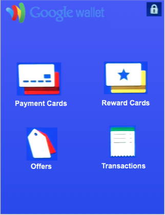
Unfortunately, Google Wallet does not make that easy. Can you tell which credit card has been selected in the home screen referred to in Figure 12-25? Actually, you cannot tell from only the home screen. You must drill down into the Payment Cards screen, as shown in Figure 12-27.
Figure 12-27: To see which credit card is selected for payment, a Google Wallet customer needs to drill down to the Payment Cards screen.

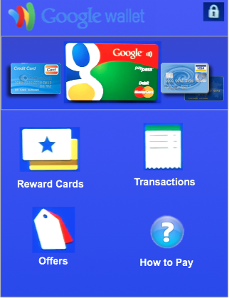
NFC makes it easy (almost too easy!) to send the right message but as a wrong person. Thus showing the default identity setting, user ID, credit card, and so on is important. Fortunately, a carousel navigation pattern like the one shown in the Pet Shop wireframe in Figure 12-29 would make a default credit card easy to see and change.
Figure 12-29: The Pet Shop Bank app Mobile Wallet solves some current UX issues.
When and Where to Use It
Most of the apps currently using NFC are just “testing the water” because the NFC technology is still young. Consider using NFC any time your customers would benefit from connecting their physical and virtual worlds, such as for social media check-ins, point-of-sale m-commerce (mobile commerce), getting more information, and meta data about many kinds of physical objects.
Why Use It
NFC has the power to connect mobile devices to every manufactured object and landmark, thereby forever binding the physical and virtual worlds and delivering on the promise of Bruce Sterling’s “Internet of Things” (Shaping Things, 2005, The MIT Press)—readily available meta data, social media data, expiration date, manufacturing history, and much more about every object in our environment. Besides replacing completely QR codes, banking cards, ATMs, advertising, identity cards, and cash as you know it, there are many other uses of NFC that have not even been invented yet.
Other Uses
Consider all your NFC-enabled functions as “nice to have” but also implement a robust and tried alternative in case the customer who wants to interact with your NFC smart tag did not run out and purchase a Galaxy Nexus S yesterday. Make sure you take care of your existing customers while making things a bit smoother for new folks.
For example, say your app can use NFC for checking in at a location. Consider that many of your customers may not yet have NFC-enabled phones. Should you still provide the service to these folks? If you want more than six people to show up, the answer is a very emphatic Yes.
You can marry the old and the new by combining the tried and true QR Code with an embedded smart NFC tag. To let customers know that there are two ways to interact with the tag, start by embedding the standard NFC “wave” symbol into the QR code to indicate dual functionality. See the example in Figure 12-28.
Figure 12-28: The NFC-enabled QR Code tag combines the QR Code with NFC technology.

This tag design makes it clear that NFC-enabled devices can simply tap the QR code sticker, whereas those who carry Android phones without the NFC chip can scan the tag with the QR Code Reader. This way all of your potential customers can take full advantage of your service. Needless to say this approach may not work for mobile banking (unless it’s a one-time QR code generated on the screen during the checkout); it is presented here as merely another application of the NFC technology.
Pet Shop Application
As discussed earlier, two important improvements are added to the design of the Google Wallet: a “How to Pay” button and a carousel navigation pattern to make it easy to see and change the default credit card. The resulting Pet Shop Bank Wallet design is shown in the hi-def wireframe in Figure 12-29.
Figure 12-29: TThe Pet Shop Bank app Mobile Wallet solves some current UX issues.
In this version, swiping across the cards at the top changes the card to the next one in the wallet; and double-tapping any card brings up the entire card list with thumbnails. In addition, a tap-and-hold brings up a menu that enables customers to see the list or add a new card. Implementing double-tap and tap-and-hold should make this virtually fool-proof while not interfering with the primary action of swiping across to get to the next card. The carousel is meant to be similar to viewing the actual stack of cards inside a physical wallet. Of course, this needs to be tested in the field to ensure that virtual foolproofness.
You might say that that I’ve taken a beautiful, clean home screen designed by Google and made it a mess. And you would be right. The biggest take-away here is that until some of these questions are figured out, NFC can be quite messy where user experience is concerned.
Tablet Apps
Don’t forget tablets, especially the smaller ones. Currently, there are no tablet devices on the market capable of NFC interaction out-of-the-box. However, NFC is definitely going to be a near-future tablet development. That said, I imagine little difference in interaction with an NFC terminal between a 7-inch tablet and a mobile device. All the same considerations discussed here still apply.
Caution
NFC on mobile devices is still fairly nascent technology. Here are the key points to consider as you design your own NFC-enabled app.
Design for Evildoers
Don’t forget to carefully design the experience that the evildoer that stole your customer’s phone and is actually trying to break into the NFC app will have to endure. Should the app lock up after three tries? Ten tries? Should you give the customer a progressively longer cooling-off period after three unsuccessful tries, iPhone-style?
These are not straightforward questions, and the answer just might be, “It depends.” If the app is used to get onboard a commuter train, perhaps a 2-minute timeout with 10 tries to lock up might be the right answer. But if the app happens to be a digital wallet, 2 minutes for a timeout and 10 tries for a lock-up might be a bit long.
Security, PINs, and timeouts all bear careful consideration in the design of your ideal encounter of the NFC kind. Some field-testing is certainly necessary to pinpoint possible issues.
Is This Thing On?
NFC functionality is always on by default. Few people give any consideration to this. Like the cell phone signal, NFC is continually transmitting and receiving even when the phone is “dark”—that is on standby. Should this be the case, or should the customer have some control over where and how NFC is presented? Should the NFC tag determine which app to call when the NFC signal is obtained, or should the customer have some control over which app is launched? And should the mobile device confirm with a customer before launching that app, and what it will do? Or will it allow the customer to profess to the entire world his new adoration of Bed Bath & Beyond on Facebook with a single foolhardy tap? How does a consumer (or, more properly, an actor in the NFC service) smoothly and naturally determine the extent of the role he wants to play without going all the way to the advanced settings in the Beyond department?
It’s only a matter of time until complete strangers will try to “bump” or “wave” your customers’ phones, often without their permission. If the goal is to avoid dropping the NFC down into the same technological dead end to which previous near-field attempts such as Bluetooth have been relegated, designers and developers must give careful consideration to the question, “Is it on?” Does the app need to be active to interact with the external NFC tag? What if the app is active but runs in the background in the multitasking mode? Does the phone need to be turned on, or can it be on standby? What information, if any, can be requested by the NFC terminal? How does a customer control what will be sent and to whom? What can be obtained from the customer’s phone without his permission? How hard or easy it is to connect to something that carries the NFC signal?
Sometimes, the rapid pace of mobile technology adoption reveals more questions than answers. But that’s exactly the mystery that makes Android mobile and tablet UX design so intriguing.
Related Patterns
12.1 Pattern: Login Accelerator.