
Lesson Files | Lessons > Lesson_05 > 05_AFS Group Presentation.ppt Lessons > Lesson_05 > 05_AFS Group Presentation_PPT.pdf Lessons > Lesson_05 > 05_Table.doc Lessons > Lesson_05 > 05_AFS Group Presentation_FINAL.key |
Time | This lesson takes approximately 90 minutes to complete. |
Goals | Open a PowerPoint presentation with Keynote Use Pages to change a Word document into an iWork-compatible format and add its content to a Keynote presentation Modify and enhance imported content Enhance and animate chart graphics Export a Keynote presentation to PowerPoint and PDF files |
Because Keynote was built from the ground up to take advantage of the powerful graphics features in Mac OS X, one of its big strengths is its rich media playback capability and expert handling of text, animation, and charts.
Another of Keynote’s strengths is how well it handles Microsoft PowerPoint files. PowerPoint is a common format, and on any given project chances are good that some of your collaborators used PowerPoint to create and distribute their presentations.
Fortunately, Keynote imports and exports Microsoft PowerPoint files effortlessly, which makes it easy to use Keynote’s expanded graphics features to enhance PowerPoint charts, tables, and other visual elements.

In this lesson, we’ll import and modify an existing PowerPoint presentation about the global performance of a fictitious Australian investment company. We’ll enhance slides and content to improve the overall appearance of the presentation and work more extensively with charts and animation.
The goal in this lesson is to improve the appearance of charts and data, making them clearer and more interesting to the audience. You’ll also learn how to animate charts, so you can control how the information is presented to the audience.
Importing a PowerPoint presentation into Keynote allows you to modify and edit the content. The conversion process is as easy as opening a file.
If necessary, open Keynote.
Choose File > Open.
Navigate to the file 05_AFS Group Presentation.ppt.
Click Open.
Keynote imports the PowerPoint file and gives it a name identical to the original but with the .key extension. The original PowerPoint document remains unmodified on your hard drive.
A warning dialog may appear to inform you of any conversion errors.
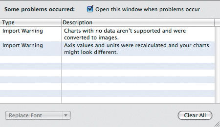
Depending upon the fonts installed on your system and a few other factors, you may see two error warnings. These errors are minor and will result in slight cosmetic changes to some of the charts. You’ll be changing the appearance of the charts in this exercise, so the error warnings don’t present a problem.
If necessary, close the warnings window by clicking the red close button.
Choose File > Save As. Name the file 05_Presentation Stage 01.key, and save it to your hard drive.

The first slide in your financial presentation could benefit from animation to immediately capture your audience’s attention. Let’s apply some built-in animations to enhance your slide.
A build can animate an individual element on a slide, but you can choose to synchronize or interleave builds, so that multiple animations occur simultaneously. In the Build inspector, you can activate multiple movements that bring a presentation to animated life.
In the slide navigator, choose slide 1.

Select the Build inspector and click the Build In button.
Select the logo on the canvas.
From the Effect pop-up menu, choose Scale. From the Direction pop-up menu, choose Down.
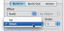
From the Effect menu, choose Convergence.
The logo shrinks, and then the white box appears over the background. This creates a dramatic way to reveal the company’s logo and can add some excitement to the start of the presentation.
Currently, the two animations happen sequentially when you click. Sometimes this is desirable, such as when revealing lines of text on a slide. In this example, you are animating the logo to reveal it on the slide. However, in this example, it is desirable to have the animations occur simultaneously to create a highly customized and attractive introduction to the corporate logo.
At the bottom of the Build inspector, click More Options.

The Build Order drawer allows you to adjust the timing of build animations.
From the Build Order list, select Item #1.
From the Start Build menu, choose “Automatically after transition.”

From the Build Order list, select Item #2.
From the Start Build menu, choose “Automatically with build 1.”
Click the slide thumbnail in the inspector to preview the animation.
Because you synchronized your animations, they happen concurrently. Now, let’s create a transition to the next slide.

Click the Slide Inspector button and then click Transition.
From the Effect menu, choose 3D Effects: Doorway and set Duration to 1.50 s.
To preview the animation, in the Inspector, click the slide thumbnail.
The logo is dramatically revealed on the slide.

Press Command-S to save your document.
Now that we’ve successfully animated the first slide, let’s enhance the remaining charts. The skills you’ll acquire will be useful for more than just financial presentations, because charts are commonly used to represent all types of data.
Whether you import a chart or create a new one, the chart’s data is always editable. This allows you to make changes or updates as new information becomes available.
In the slide navigator, choose slide 2.

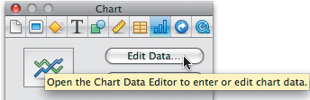
On the canvas, select the chart.
Select the Chart inspector and click Edit Data.
The Chart Data Editor opens. The information is partially cut off, so let’s resize the window.
Drag the control at the lower-right corner of the Chart Data Editor to enlarge the window. You can now view all of the financial data, and you’re ready to modify it.
Click the Add Row button eight times to add rows for two years of quarterly financial data.
Drag the vertical scroll bar so that you see the last row of empty data.
Enter data for the Australia and AFS Global columns as shown in the following figure. (While you’re typing, notice how easy it is to update the data in this chart you imported from another application. It’ll make it go faster.)

Close the Chart Data Editor.
Charts are intended to make data more comprehensible; but when a chart has a lot of information, it can easily become cluttered. When that happens, you may want to reduce the number of labels on a chart to simplify it.
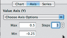
In the Chart inspector, click the Axis tab, and from the Format pop-up menu, choose Percentage.

In the Value Axis fields, enter the data values shown in the following figure to give the y-axis of the chart a more legible range of values:
In the Category Axis (X) area of the Chart inspector, set the “Label every” value to 4 categories.
This reduces the number of labels on the x-axis so that only the first month of each year is labeled.
Click the text box in the x-axis to select it.
In the format bar, change the font size to 14 points.
Click the legend near the top of the slide, and drag it so that it is horizontally centered on the slide canvas.

Yellow alignment guides will appear when the text is centered.
Now that the text on the slide looks better, let’s enhance the data.
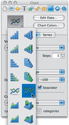
Keynote offers several 3D chart styles and options in the Graphic inspector that can be applied to improve the readability of a chart. To help the viewer better understand the data, you will change your chart to 3D. You will also enhance its appearance to more closely match your slides.
Keynote allows you to display most charts using two- or three-dimensional perspective. Which one you choose is really a matter of personal taste. In some cases, 3D charts are clearer because the illusion of depth can increase the viewer’s understanding of the relationships between data values. Fortunately, Keynote quickly changes charts from one chart type to another.
On the canvas, click the chart to select it.
Select the Chart inspector. Click the Chart Type icon to open a pop-up menu.
Choose a 3D line chart (the fifth icon in the second column).
The conversion may take a few seconds. When finished, let’s enhance the chart to make it more readable and match your other slides.

In the Chart inspector, click the Chart button.
The 3D Scene pane of the Chart inspector lets you adjust the graphic 3D properties of the chart, such as depth, angle, and shadows.
Modify the lighting style, chart depth, and viewing angle of the chart by using the 3D scene controls. You can adjust the size of the chart by pulling the selection handles at the chart border. Adjust them to suit yourself.
Examine the viewing angle, as well as depth and shadow settings. Be sure you haven’t accidentally changed the meaning of the chart with a perspective error (see sidebar).
A Matter of Perspective
One of the most common ways to affect the perception of data in a chart is to change the viewing angle and 3D scene settings. You can use the four-way arrowhead that appears when the chart is selected to adjust the viewing angle, and the complete controls in the Chart inspector to control depth and lighting. Notice how the two charts here present the same information in very different lights. In the chart on the right, the altered viewing angle makes the chart more truthful as it is easier to tell which line indicates higher performance. The angle of the chart on the left makes the value of the purple line seem much lower than it actually is.

Before
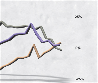
After

Now that we’ve made the chart easier to understand, let’s improve its appearance. By matching the colors of your chart to the colors in the logo and slide background, we’ll get a more unified design.
In the chart, double-click the purple line.
Select the Graphic inspector.
Notice that the Fill color well matches the purple in the chart.
Click the color well to open the Colors window.
Click the magnifying glass icon to activate the color sampler. Click a reddish-orange area in the logo to match the bar color.

Change the other two lines of the chart to match the gold in the logo and the bright blue in the background, as in the following figure:
Check the chart to make sure it’s clear and easy to read; then close the Colors window.
Press Command-S to save your work.
You can compare your presentation with the file 05_Presentation Stage 02.key in the Lesson_05 folder.
Adding movement to a slide can be an effective way to grab your audience’s attention and control the flow of information. Now that the chart is built, let’s animate it to reveal the slide data one series at a time.
Select the chart on slide 2. Then select the Build inspector.
From the Effect pop-up menu, choose Grow.
From the Delivery menu, choose By Series. This option will animate each element in the chart, first the gridlines and then each data series.
Set the Duration to 2.00 s.
To preview the animation, in the Inspector, click the slide thumbnail.
Notice how the background and grid wipes onto the screen first. Generally, you’ll want this part of the chart already on the page, so you’ll remove it from the animation.
Choose 2 from the “Build from” menu. This starts the animation with the second element on the slide, your first data series.
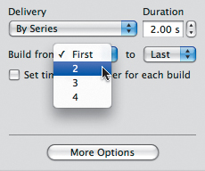
Leave the “Build to” pop-up menu set to Last. The animation will continue through the last data series.
Select the Slide inspector and click Transition. Then choose the following options:
Transition Effect—3D Effects: Twist
Direction—Left to Right
Duration—2.00 s
Twistiness—1.0
You’ve now created a gentle but dynamic slide transition. You can click the slide thumbnail in the Inspector to show the preview again.
Tip
As we saw in Lesson 3, Keynote offers an extensive library of slide transitions. Take some time experimenting with different transitions until you find ones that you prefer.
Slide transitions help signify a change of information. Use them tastefully, and try to limit yourself to only a few styles of transitions in a presentation.
Press Command-S to save your document.
The title text on all of your slides should be adjusted slightly to improve its appearance. When you adjust the line spacing, the text boxes will be more aesthetically pleasing, as they will match the height of the logo. Many viewers find slides easier to comprehend when you use alignment to visually balance the information.
At the top of the slide, select the text box.
In the format bar, click the “Choose the line spacing” button and choose 0.9.
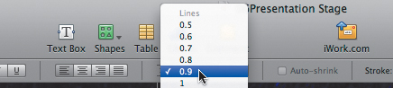
Examine the text at the top of the slide. You’ll notice that the height of the text box now more closely matches the height of the logo.

Repeat the formatting for slides 3 through 7 using the method described in steps 1 and 2.
A chart is not the only object that can be animated in Keynote. In this exercise, we’ll use a build animation to reveal the contents of a table.
In the slide navigator, choose slide 3.
The row heights in the table are all slightly different, but you can easily fix them.
Click the table to select it.
Select the Table inspector and click Table.
Set the Row Height value to 120 px.

Let’s change the font to match the one used in the rest of your presentation.
Command-click the cells that contain dollar values and percentages.
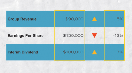
A yellow border indicates the selected cells.
In the toolbar, from the Font Family pop-up menu, choose Arial.
Select the Build inspector and then choose the following options from the Build In tab:
Effect—Flip
Direction—Top to Bottom
Delivery—By Row
Duration—1.00 s
The table is animated. You can click the slide thumbnail in the Inspector window to preview it again.
Next, let’s add a transition to the following slide.

Select the Slide inspector and click Transition. Then choose the following options:
Transition Effect—3D Effects: Twist
Direction—Left to Right
Duration—2.00 s
Twistiness—1.0
You can click the slide thumbnail in the Inspector window to preview the 3D transition again.
Press Command-S to save your document.
You have successfully animated information on the table using a build and created a transition to the next slide. Next, let’s use a build to reveal information in a bar chart.
You can set up a column chart so that one data series is revealed at a time. You also can use 3D perspective to improve your profit chart’s readability.
In the slide navigator, choose slide 4.
Select the chart on the canvas. Then select the Chart inspector.
From the Chart Type pop-up menu, choose the first 3D Column chart.

The chart is rendered in 3D, but in a flat red color, which you will change later in this exercise.
Select the Build inspector and click Build In. Then choose the following options:
Effect—Rotate & Grow
Delivery—Cascade
Duration—2.00 s

The Rotate & Grow effect is designed to dramatically reveal information in a chart. By setting the delivery to Cascade, the information will be revealed progressively when you click or press a key.
Choose More Options.
In the Start Build pop-up menu, choose “Automatically after prior build.”
Select the Slide inspector and click Transition. Then choose the following options:
Transition Effect—3D Effects: Twist
Direction—Left to Right
Duration—2.00 s
Twistiness—1.0
To change the dull red bars back to your eye-catching red, click a series in the chart to select it. All of the columns are selected.
Select the Graphic inspector; then click the Fill color well to open the Colors window.
With the magnifying glass, select the reddish-orange in the logo to color the chart.

The chart now has a more unified look as its color and style matches other elements in your presentation. You can click the slide thumbnail in the Inspector window to preview the transition again.
Press Command-S to save your document.
Your next slide breaks out investment percentages, so it’s best displayed as a pie chart. You can make this information appear more dynamic by revealing one slice of the pie at a time. Before you animate the chart on slide 5, let’s give it some 3D pizazz.
Pie charts displayed in 3D are more dynamic than those presented in 2D.
In the slide navigator, choose slide 5.
Select the chart on the canvas. Then select the Chart inspector.
From the Chart Type pop-up menu, choose the 3D Pie chart.

The chart is rendered in 3D, but it is small and its colors ought to be more harmonious. First, let’s resize and position the chart.
Option-drag the resize handle in the upper-right corner of the pie chart toward the upper-right corner of your screen. Release the mouse button when the pie chart fills the empty area at the bottom of the slide.
Select the chart legend and drag it to the right of the chart. Next, select the pie chart and position it near the left edge of the slide.
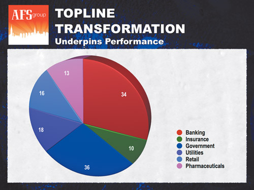
With the chart still selected, drag the four-way arrowhead to adjust the viewing angle as desired.
Increase the 3D depth of the chart by dragging the Chart Depth slider to the right.
In the Chart inspector, select the Show Bevel Edges checkbox.
This makes the individual pie wedges easier to see.
Shift-click the legend.
Both the chart and the legend are now selected.
In the format bar, change the font to Arial Narrow, change the style to Bold, and set the point size to 24.
Because the size and style of the text changed, the chart layout requires readjustment.
Now that the chart is further extruded and angled, reposition the chart and legend on the slide to improve the composition. You can use the following figure for reference:

The current pie chart uses a lot of similar colors (notice how often blue or purple is used). Let’s add more colors to differentiate the pie wedges.
Select the chart.
In the format bar, click the Chart Colors button. The Chart Colors window opens.
From the “Series fill type” pop-up menu, choose 2D Image Fills.
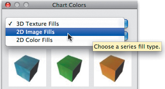
The next menu offers several fill types that you can explore later on your own. For this chart, leave it set to Bright.
Note
Keynote offers several fill types for charts. You used a 3D texture in Lesson 2 and will explore other options throughout these lessons. While you’ll usually apply 3D texture fills to a 3D chart, you are free to use fill types in any combination.
Click the Apply All button to use the chosen color palette.

Close the Chart Colors window when you’re finished changing colors.
Now that the pie chart looks good, you can animate it to slowly reveal each piece of the pie.
Select the chart; then, in the Build inspector, click Build In. Choose the following options to create a build animation for the pie chart:
Effect—Z Axis
Delivery—Cascade
Duration—2.00 s

The Z-axis effect reveals information with a zoom. By choosing Cascade, all of the pie wedges will be revealed sequentially when the build is triggered.
Click the More Options button.
From the Start Build menu, choose “Automatically after prior build.”
For Delay, choose 0.5 s.
Select the Slide inspector and click the Transition button. Then choose the following options:
Transition Effect—3D Effects: Twist
Direction—Left to Right
Duration—2.00 s
Twistiness—1.0
You can click the slide thumbnail in the Inspector window to preview the animation again.
Press Command-S to save your document.
You can compare your presentation to the file 05_Presentation Stage 03.key in the Lesson_05 folder.
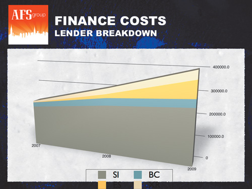
Not only can you change the style of a chart to make it appear 3D, but you can also change the entire method of charting. By switching the manner in which your costs data is presented, you can increase the clarity and effectiveness of your presentation.
Because changing the charting method results in an entirely different look for a chart, you will often have to make many adjustments to improve its appearance.
In the slide navigator, choose slide 6.
Select the chart on the canvas.
Control-click (or right-click) the chart, and choose Chart Type > 3D Stacked Area.
The chart should be reset to the default style because it appears cluttered.
Choose Format > Reapply Master to Selection.
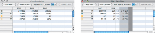
An area chart is designed to show information from left to right in chronological order, unlike your original chart, which was read from bottom to top. Because you are changing the type of chart, let’s also reorder and format the chart data.
With the chart selected, in the format bar, click the Edit Data button.
The Chart Data Editor opens.
Click the column data labels and drag them to change their positions so that they are ordered, from left to right, 2007, 2008, and 2009. Close the Chart Data Editor.
Open the Chart inspector and click Chart.
In the 3D Scene controls, increase the depth of the chart by dragging the Chart Depth slider to the right.
In the Format bar, click the Y Axis value menu and choose Show Axis on Right.
Select the chart and adjust the viewing angle of the chart as desired using the four-way arrowhead.
Shift-click the legend so that both the chart and legend are selected.
In the format bar, change the font to Arial Narrow, change the style to Bold, and set the point size to 24.
If necessary, adjust the borders of the legend so that it fits on a single line.
Drag the legend to center it on the page. Use the alignment guides as visual references.

Resize the chart so it fills up the slide’s area.
To resize, drag the selection handles at the edges and corners of the chart.
Change the colors in the area chart using the Chart inspector.
Use the techniques you learned in “Adding Chart Colors” to change the chart to the Bright 2D Image Fills. This way both charts will be similarly colored.

Let’s look at one more type of animation. This one gives the illusion of the data area growing to its current state.
In the Build inspector, click Build In. Choose the following values:
Effect—3D Effects: Grow
Delivery—By Series
Duration—1.50 s
From the “Build from” pop-up menu, choose 2; leave the “Build to” pop-up menu set to Last.
Choose More Options.
From the Build Order list, choose Chart Series.
From the Start Build pop-up menu, choose “Automatically after prior build.”
Select the Slide inspector and click Transition. Then choose the following options:
Transition Effect—3D Effects: Twist
Direction—Left to Right
Duration—2.00 s
Twistiness—1.0
You can click the slide thumbnail in the Inspector window to preview the animation.
Press Command-S to save your document.
You have successfully formatted and animated the area chart. Let’s learn how to import content from a Microsoft Word document to finish out the presentation.
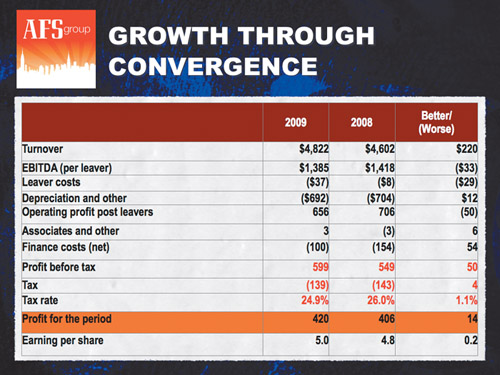
While building your financial presentation, let’s say you discover that some budget information needs to be replaced with new data. Replacing existing content is common when collaborating on a group presentation. New slide content may come in multiple formats, but one common format is as a Microsoft Word file. Although Keynote cannot open a Word document, Pages can.
We’ll explore Pages—the word processing and page layout application in iWork—in detail later in this book. For now, let’s use it just to do this one useful thing: import a Word document containing a table so you can use it in Keynote.
Open Pages by clicking its icon in the Dock or opening it from your Applications folder.

The Template Chooser appears with a list of available Pages templates.
Click the “Open an Existing File” button.
Navigate to the project folder for the lesson and open 05_Table.doc.
The file opens in Pages as an untitled document. The original Word document remains unaltered on your hard drive.
Click the table to select it, and copy it to the Clipboard by pressing Command-C.

Return to Keynote.
In the slide navigator, choose slide 7.
You’re going to replace the table in the slide with the table you just copied in Pages.
Select the table in the current slide and press Delete.
Choose Edit > Paste (or press Command-V) to add the new table.

The new table should be resized and modified.
Drag the table to position it on the page. Drag the selection handles to adjust its size. Position the table in the slide using the pop-up alignment guides as a visual reference.
In the format bar, change the font to Arial Narrow and the point size to 24 points.
Select the Slide inspector and click Transition. Then choose the following options:
Effect—3D Effects: Doorway
Duration—1.50 s
Press Command-S to save your document.
You can compare your presentation to the file 05_Presentation Stage 04.key from the lesson folder.
Not only is it easy to bring PowerPoint presentations into Keynote, it’s just as easy to save presentations that you can share with PowerPoint users or others who don’t have Keynote installed on their computers. Two common formats are a PDF file or a PowerPoint file—although it’s important to note that neither the PDF nor the PowerPoint file format supports all of the animation and display features that Keynote offers.
Note
We’ll explore many other options for publishing and exporting a presentation in the next lesson. For example, one way to share an animated presentation with users who don’t have Keynote is to create a QuickTime movie using the Manual Advance option.
To save a copy of your presentation as a PowerPoint (.ppt) file to share it with PowerPoint users, simply use the Save As dialog.
Choose File > Save As or press Command-Shift-S.
In the Save As field, modify the filename for the document (if desired).
In the Where pop-up menu, select the location where you want to save the PowerPoint file. Click the disclosure triangle to the right of the Save As field if the file browser isn’t visible, and navigate to the desired folder.
Select the “Save a copy as” checkbox and choose PowerPoint Presentation.
Note
You can choose File > Save As, then select the checkbox next to “Save copy as.” From the pop-up menu you can choose Keynote ’08 to save a version of the presentation that is compatible with iWork ’08. Some features of your presentation may be disabled if they are new to Keynote ’09.
More Info
You’ll learn how to share your slides as PDF files in Lesson 6.
Click Save.
A new PowerPoint file is created.
If you just want to quickly send a PDF or PowerPoint version of your presentation via email, Keynote gives you a shortcut. The revised file formats used in iWork ’09 are ready for email with no additional preparation.
With your Keynote presentation open, choose Share > Send Via Mail > PDF or PowerPoint. Your computer will switch to Mail or open it and automatically attach the exported file.
Address the email message to the recipient.
Enter a subject and message for the email.
In the From menu, choose which account to use.
Click Send to deliver the message (you must be connected to the Internet).