
4. Windows 8 Applications
Windows 8 applications share common traits that make them ideal software for the variety of devices that Windows 8 runs on. They are fast and fluid and adapt easily to different display resolutions and modes. They respond to multiple forms of input and complex touch manipulations, and they provide a consistent user experience with a standard place for application-wide commands and guidelines for context menus.
In the last chapter, you learned about XAML, the unique declarative language that provides the capability to separate design from development and provides a powerful, extensible UI. In this chapter, you learn how to apply the combination of XAML and code to address the various traits that are unique to Windows 8 applications. Many of these traits are available and configurable through XAML.
Layouts and Views
Windows 8 applications adapt to various layouts and views. These include the orientation of the device (portrait or landscape) and the filled or snapped state when applications are running side-by-side. The Visual Studio 2012 built-in templates provide guidance to manage many of these transitions automatically. An easy way to test layout changes even if you don’t have a tablet or accelerometer is by using the built-in simulator.
The Simulator
Access the Chapter 4 Windows8Application source from the book website at http://windows8applications.codeplex.com/.
Instead of debugging the application on your local machine, which is the default, use the debug target drop-down to select the simulator instead. You can see this selection in Figure 4.1.

Figure 4.1. Choosing the simulator for debug
The simulator makes it easy to test different scenarios such as screen resolutions and orientation. It even provides touch emulation if you are developing on a machine that doesn’t directly support touch. The simulator will provide a graphic that looks like a tablet complete with a Windows Key. A set of icons on the right side provide different functions. From top to bottom, these functions are
1. Mouse Mode—Use the pointer as a regular mouse.
2. Touch Emulation—Use the pointer as a touch surface. Click the mouse button to emulate a tap.
3. Touch Emulation Pinch and Zoom—This allows you to test pinch and zoom. Simply hold down the left mouse button and scroll the mouse wheel to zoom in or out (you can do the same thing in Mouse Mode by holding down Ctrl and then scrolling the mouse wheel).
4. Touch Emulation Rotate—Use this mode to emulate a touch rotation. Hold down the left mouse button and scroll the wheel to rotate in either direction.
5. Rotate 90 Degrees Clockwise—This emulates flipping the tablet between portrait and landscape mode.
6. Rotate 90 Degrees Counterclockwise—This emulates flipping the tablet between portrait and landscape mode.
7. Change Resolution—Emulate a different resolution. The resolution is simulated so you can emulate a higher resolution than you have available.
8. Set Location—Enter latitude, longitude, altitude, and margin of error to emulate a location for the simulator.
9. Screenshot—This handy feature takes a snapshot at the current simulator resolution.
10. Configure Screenshot—This allows you determine whether the screenshot copies to the clipboard and/or saves to a file and sets the save location.
11. Help—General help for the simulator.
The simulator offers a variety of options. For this example, set the resolution to 1366 × 768. You should see the general application and some groups and group items, as shown in Figure 4.2. The simulator actually works by creating a remote desktop connection back to the device you are running the application on (as opposed to creating a virtual machine). This allows you to actually test the application on your own machine using the various touch inputs and form factors.
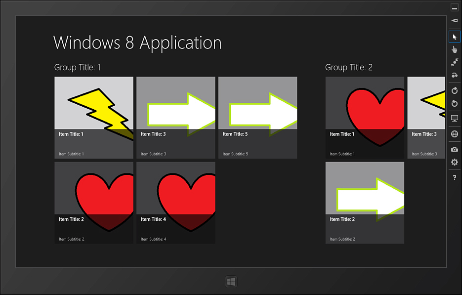
Figure 4.2. Sample application running inside the simulator
Now, with the application in focus (you can click or tap a blank area of the application to ensure it is focused), hold down the Windows Key and press the period (.). This will switch the application to the snapped view. If you have any other Windows 8 applications running, the next application will appear in the fill portion of the screen (the larger segment); otherwise, it will remain empty while the current application shrinks to fit the snapped portion, as shown in Figure 4.3.

Figure 4.3. The application in the snapped view
The snapped view is a special compressed view used to provide at-a-glance information while another application has the primary focus. The vertically-oriented ListView control is the perfect control to use for this view instead of the horizontally-oriented GridView. The snapped view is only available when the width is at least 1366 pixels. Any smaller resolution such as 1024 × 768 will not allow the snapping feature. The snapped view is a fully functional view of your application but is always limited to 320 pixels in width. This is enough resolution to provide plenty of functionality and happens to be a common width for smartphones.
In addition to the snapped view, there is a 22 pixel-wide splitter that the user can use to unsnap the application by dragging it across the screen. This leaves exactly 1024 pixels for the remaining screen, so the filled view will have 1024 × 768 pixels available (1366 – 320 – 22 = 1024), which is the minimum resolution recommended for Windows 8 applications.
You’ll notice in the sample application that the screen changed when you switched to a snapped view. Instead of a horizontal grid with items filling out rows and columns, it changed to a vertical list. This makes it easier to navigate and select items in the narrow snapped view. What is more interesting is how the application made the change. Built into the Grid Application template is XAML and code that takes advantage of a powerful class called the Visual State Manager.
The Visual State Manager
The Visual State Manager (VSM) is the key to success with separation of concerns between the design and UI/UX experience and program logic in Windows 8 applications. It works in conjunction with data-binding to help separate UI logic and concerns from the rest of your application.
The Visual State Manager handles the logic of states and transitions for controls. Controls are not limited to custom controls or control templates. The VSM works equally well for managing the state of pages and user controls as well. The target of the VSM is always an element that derives from the Control class, which includes controls like Page and UserControl, and the location of the VSM should always be the root of the template for the control. In the Windows8Application project, you’ll find the element VisualStateManager.VisualStateGroups nested inside of the main grid of the GroupedItemsPage.xaml file.
The VSM defines groups, states, and optional transitions. A group is a set of mutually exclusive states. As the name implies, groups create an association between related states. In the application example, the page has several common states within the same group called ApplicationViewStates. These states include
• FullScreenLandscape—When the application is running in full screen mode and the tablet is in the landscape orientation
• Filled—When the application is taking the larger space beside another snapped application
• FullScreenPortrait—When the application is running in full screen mode and the tablet is in the portrait orientation
• Snapped—When the application is running in the 320 pixel-wide snapped mode
It is important that the states are mutually exclusive because the VSM only allows one state within a group at a given time. The groups represent a contract for the behavior of the page. You are given a set of states that the page will honor and must manage the page within the context of those states. The states are managed through a base class that the page inherits from. The VSM allows you to customize what happens to the visual appearance of the page in a given state.
To see how the states are managed, open the Common folder and examine the LayoutAwarePage class. The class is provided as part of the project template and hooks into the ViewStateChanged event that fires any time the orientation or snapped mode changes. The event handler simply interrogates the new view state and converts it to a string and then instructs the VSM to go to that state:
VisualStateManager.GoToState(layoutAwareControl, visualState, false);
Note that there is no UI logic in the state change. This is how the UI logic is kept separate from the application logic. The application logic simply manages the state. The UI changes for a state are declared in XAML using storyboards. If you use multiple groups for a control, you in effect have multiple storyboards executing against that control at the same time.
An important rule for groups is that they must be orthogonal to each other. Although a control can exist in multiple states (exactly one state for each group), the groups should not overlap which visual aspects they impact. This is a rule that cannot be enforced by the control contract because you are able to create whatever storyboards you like within a given state. Failure to follow this rule, however, can lead to unexpected results.
Groups are containers for related, mutually exclusive states. What is a state? A state has both a logical and physical definition. Logically it indicates a mutually exclusive status for the control. Physically it is the set of visual elements and attributes that represent the state. What is important about states is that they allow you to decouple the details of how the control appears in a given state from the state itself. In code, you can simply set the control to a given state and then let the VSM take care of how that state appears. This not only makes it easier to test and implement the control but also to extend and/or customize the control.
Take a look at the GroupedItemsPage.xaml file. A single group is defined without a name, and the first state is declared like this:
<VisualState x:Name="FullScreenLandscape"/>
The state is empty. This means the default XAML is sufficient to render the UI for that state. If you take a look at the XAML, you’ll see a SemanticZoom control is defined in the first row of the grid (you’ll learn more about semantic zoom later in this chapter). There is also a ScrollViewer declared for the same row but with its Visibility set to Collapsed so it won’t render. This contains a ListView control that is used for the snapped view.
Now take a look at the declaration for the Snapped state. This is shown in Listing 4.1. There is a single Storyboard control with several animations. These animations aren’t used for motion but instead take advantage of the fact that animations can change the value of dependency properties. The VSM uses animations to set the values of properties on controls (the reason why will be explained shortly).
Listing 4.1. The Definition for the Snapped State
<VisualState x:Name="Snapped">
<Storyboard>
<ObjectAnimationUsingKeyFrames
Storyboard.TargetName="backButton"
Storyboard.TargetProperty="Style">
<DiscreteObjectKeyFrame KeyTime="0"
Value="{StaticResource SnappedBackButtonStyle}"/>
</ObjectAnimationUsingKeyFrames>
<ObjectAnimationUsingKeyFrames
Storyboard.TargetName="pageTitle"
Storyboard.TargetProperty="Style">
<DiscreteObjectKeyFrame KeyTime="0"
Value="{StaticResource SnappedPageHeaderTextStyle}"/>
</ObjectAnimationUsingKeyFrames>
<ObjectAnimationUsingKeyFrames
Storyboard.TargetName="itemListScrollViewer"
Storyboard.TargetProperty="Visibility">
<DiscreteObjectKeyFrame KeyTime="0"
Value="Visible"/>
</ObjectAnimationUsingKeyFrames>
<ObjectAnimationUsingKeyFrames
Storyboard.TargetName="semanticViewer"
Storyboard.TargetProperty="Visibility">
<DiscreteObjectKeyFrame KeyTime="0"
Value="Collapsed"/>
</ObjectAnimationUsingKeyFrames>
</Storyboard>
</VisualState>
In this example, the Back button and title styles are both changed. The SemanticZoom control is set to Collapsed so that the control and its children will disappear, and the ScrollViewer is set to Visible so it will appear with its content (when a control is Collapsed, it is no longer rendered within the visual tree; if it is Visible, it will be rendered even when the opacity is set to 0 or the color is Transparent). The animations will run for as long as the visual state is valid. When the state changes, the Storyboard will be stopped, and the properties will return to their default values (or the new values defined by the Storyboard controls for the new state).
The VSM uses Storyboard controls because they have the highest precedence for setting the value of a dependency property. Understanding how to manage states is as simple as understanding Storyboard controls. When your control goes to a specific state, the VSM will stop any Storyboard controls for other states within the same group (remember, states in a group are mutually exclusive) and then begin the Storyboard defined for the target state.
It is a best practice to set an initial state when the control is initialized to get the control on the “state graph” or in the collection of valid states. The LayoutAwarePage class does this in the StartLayoutUpdates method. Note the call to GoToState before exiting the method.
Transitions add flexibility to the Visual State Manager by allowing control over how a control moves (or transitions) between states. You can specify a transition to be applied any time the control moves to a specific state or restrict the transition only when moving to a state from another state. This is a very powerful feature.
The simplest transition uses the existing storyboard values and creates an interim animation to move between them. You simply specify a generated duration of time, and the Visual State Manager will take care of the rest. You can also create your own transition storyboards. The Visual State Manager will stop any transition storyboards as soon as the control has transitioned to the new state. It does not stop the state storyboards until the state changes.
Semantic Zoom
The main screen of the sample application arranges all of the items into groups. You might find that some lists end up holding a large number of items that may span dozens of groups. Although the built-in controls are designed to perform well with large amounts of data, it can be cumbersome for the user to navigate from one end of the list to another. To solve this problem, you can use a concept known as semantic zoom.
Semantic zoom is a technique that allows the user to zoom out from a list and navigate it at a higher level using an interface you provide. This is not a visual zoom because as the user zooms out, the actual interface changes. In the Windows8Application example, if you zoom out on the initial view either by touching two fingers to the tablet surface and drawing them apart or by holding down the Ctrl key and scrolling your mouse wheel or pressing the + or - keys, you will see the entire grid fade into a set of titles with group names.
The new view fades in when you zoom out, and disappears to be replaced by the detailed grid list when you zoom in. The zoomed-out view is shown in Figure 4.4. In this view, it is easy to see the full list of available groups. If you tap any of the groups, you will automatically zoom back in with the focus on the items for that group.

Figure 4.4. The zoomed-out view
This is a powerful feature and can be implemented in many different ways. A feed reader application might show the feed names and allow the user to zoom into the details. An application that manages contact lists could show the first letter of the last name, allowing you to quickly jump to the section of names that holds the contact you are looking for. Conceptually you are simply providing two different views based on the level of detail the user chooses to navigate at.
You implement semantic zoom using the SemanticZoom control. Open up the GroupedItemsPage.xaml file in the Windows8Application example. Find the SemanticZoom control. The SemanticZoom.ZoomedInView is the typical view that users will use to navigate your application. For this example, I simply took the default template, added the SemanticZoom control, and moved the GridView into the ZoomedInView section. When the user zooms out, the view switches to the SemanticZoom.ZoomedOutView. For this view, I created a set of tiles based on Microsoft’s quickstart at http://msdn.microsoft.com/en-us/library/windows/apps/xaml/hh781234.aspx.
You may also wish to download the Windows 8 SDK Samples SemanticZoom example from http://code.msdn.microsoft.com/windowsapps/GroupedGridView-77c59e8e.
I simply updated the definition to include the title for the group. You can see the definition for the tile in the MyStyles.xaml dictionary file. I also used the OnNavigatedTo event to wire in the data source for the GridView. Take a look at the code-behind file named GroupedItemsPage.xaml.cs, and you will find the following method:
protected override void OnNavigatedTo(NavigationEventArgs e)
{
this.DefaultViewModel["Groups"] = e.Parameter;
this.groupGridView.ItemsSource =
this.groupedItemsViewSource.View.CollectionGroups;
base.OnNavigatedTo(e);
}
The code simply takes the set of groups from the CollectionViewSource defined in XAML and sets this as the source for the GridView in the ZoomedOutView. That’s all there is to using the control. The control itself will handle responding to the user’s “pinch and zoom” gestures (you can also hold down the Ctrl key and either scroll the mouse wheel or press the + or - keys) and swap between the various views. When the user taps on a particular item in the ZoomedOutView, the control will automatically switch to the ZoomedInView with the selected group in focus.
Microsoft provides the following guidelines for using SemanticZoom:
• Use the correct touch target size for elements that are interactive (you learn more about touch targets in the next section).
• Provide a suitable and intuitive region for the zoom.
• Use appropriate context for the view, for example:
• Use group names for items in a grouped collection.
• Use sort orders for ungrouped collections.
• Use pages to represent collections of documents.
• Limit the number of pages or screens in the zoomed-out view to three so the user can quickly jump to content.
• Ensure that the pan direction is the same in both zoom levels.
• Don’t use the zoom to change the scope of content (for example, showing one set of items in the zoomed-in view and another set in the zoomed-out view).
• Don’t set a border on the child controls—if you need a border, only set it on the SemanticZoom control itself.
Read the full guidance online at http://msdn.microsoft.com/en-us/library/windows/apps/hh465319.aspx.
The SemanticZoom and GridView controls do a great job of handling default input and user interactions for you. There are often times when you are constructing your own controls and UIs that you must handle the input yourself. It’s important to understand how Windows 8 applications handle different input events and what the expected behaviors for those events are. You learn more about handling user input in the next section.
Handling User Input
User input is an important component of WinRT applications. Windows 8 provides a touch-first experience and supports multiple methods of input. Touch-first means that your applications are designed to fully accommodate touch and don’t contain elements that are only valid using the mouse, keyboard, or other methods. The touch approach is different from traditional input for several reasons.
Windows 8 provides multi-touch support, so you must be able to respond to more than one contact point on the screen. Your application must respond to manipulations and be designed for targets or areas of the application that will respond to touch because touch is not as precise as a mouse pointer. There is a much larger margin of error when you are dealing with the size of a fingertip compared to the traditional mouse-controller pointer.
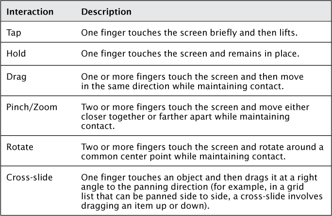
Touch enables the user to interact with the device in several ways. Table 4.1 provides a list of common interactions and how they are invoked.
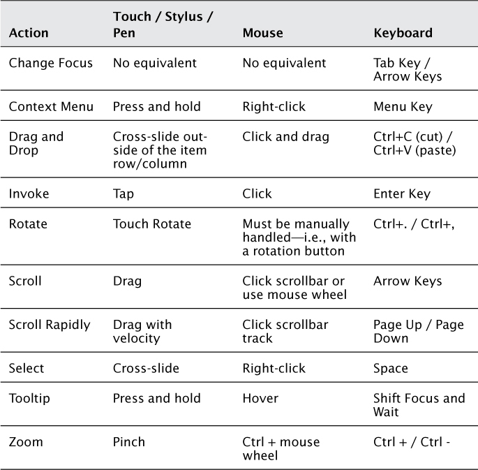
You will find many of the Windows 8 controls have built-in support for the standard interactions. Although Windows 8 provides a touch-first experience, it is also important to support other methods of input including the stylus or pen, mouse, and keyboard. Table 4.2 shows some common actions and how they are invoked using different modes of input.
One way the Windows 8 platform makes it easier to deal with events from multiple input devices is by surfacing a set of pointer events that are device-independent. Pointer events will fire in response to touch, stylus, mouse, or keyboard input. To see an example of this, open the Touch application. This application demonstrates various touch interactions.
Pointer Events
The sample application display is divided into two columns. The left column is a simple list that shows various touch events as they happen. The right column contains a graphic that uses shapes, images, and a symbol font. The grid that contains the graphic is set up to respond to various touch manipulations so you can pinch, zoom, rotate, and slide the graphic.
Compile, deploy, and run the application. You may want to use the simulator so you can experiment with different types of interactions including touch. You should see quickly that there are several events that fire regardless of the input used:
• Tapped—Fired based on a touch, stylus tap, or mouse click.
• Double-Tapped—Fired based on a double finger or stylus tap or a double mouse click.
• Pointer Pressed—Fired based on a touch, stylus tap, or mouse click.
• Pointer Moved—Fired based on a drag using either the finger, stylus, or mouse with the left button held down.
• Pointer Released—Fired when the finger or stylus is raised or when the left button on the mouse is released.
These events embody the vast majority of user interactions outside of scrolling and navigation. When you code using these core events, you ensure your application is responding consistently to user feedback from a variety of input devices. There are, however, a few pointer events that don’t make sense for touch. The PointerEntered and PointerExited events fire when the pointer moves into the region listening to the event or exits the region. Both the mouse and stylus can fire these events because the cursor is continuously tracked even when it is not engaged (that is, the left mouse button is pressed or the stylus is in contact with the touch surface). There is no equivalent for touch because the events only recognize when contact is made.
This should enforce the concept of “touch-first.” If you design a major feature of your application based on the events that only respond to mouse and stylus input, you will lose the ability for users to interact on touch devices. Any type of interaction that is specific to a particular form of input should provide a way to perform the same interaction using other inputs. You’ll see an example of this when you learn about manipulations in the next section.
Manipulation Events
A manipulation is a touch event that involves one or more fingers. It begins when the first contact is made and ends when the last contact is released. A tap is a simple form of manipulation that involves a touch, a very brief hold, and a release. A pan is a more complex manipulation because it involves a touch, a drag or movement in the panning direction, and then a release. Pinch and zoom are even more complex manipulations that respond to the change in distance between multiple touch points.
Manipulations must take into account inertia. For touch to be intuitive, it should factor the velocity of the user interaction. For example, a slow pan is a precise way to slowly move through a list. If the user begins panning very rapidly, the implication is that they are trying to scroll through large amounts of data at once. The inertia of the pan should allow the list to keep scrolling even when the user lifts his finger, like spinning a wheel.
Manipulations can provide a large volume of data in a short period of time, so they are not enabled by default. To enable a control to begin tracking manipulations, you should set the ManipulationMode property. This is set to All for the Grid element named TouchGrid in the MainPage.xaml file. The possible values are defined by the ManipulationModes enumeration. The list of modes and their meaning is in Table 4.3.
Table 4.3. ManipulationModes Values

Rails mode refers to an optimization to improve the touch experience when the user can pan in multiple directions. Instead of following the user’s touch direction exactly when they are panning horizontally or vertically, which could result in some “drift” in the perpendicular direction, the rails will lock the scroll direction when the finger is within a specific zone or rail. Any motion within that zone will lock to strict vertical or horizontal scrolling, while motion outside of that zone will handle the motion in all directions. To learn more about rails, read the guidelines for panning online at http://msdn.microsoft.com/en-us/library/windows/apps/hh465310.aspx.
You can set a specific manipulation mode through XAML simply by defining it on the element as in the example. If you wish to combine specific manipulations, you must programmatically set the value. This example combines the scale and rotation modes but does not apply inertia:
TouchGrid.ManipulationMode = ManipulationModes.Rotate |
ManipulationModes.Scale;
You track manipulations by handling the ManipulationDelta event. This event fires throughout the manipulation and provides you with several data points. You are able to track changes in scale, rotation, and translation (drag) at both the cumulative (since the manipulation began) and delta (since the last manipulation event was fired) levels. In the example, the Grid element has a CompositeTransform applied to it. This is a transformation that allows scaling, rotation, and translation. The scale and translations are applied incrementally during the manipulation, and the rotation is applied based on the cumulative amount:
Transformation.ScaleX *= e.Delta.Scale;
Transformation.ScaleY *= e.Delta.Scale;
Transformation.TranslateX += e.Delta.Translation.X;
Transformation.TranslateY += e.Delta.Translation.Y;
Transformation.Rotation += e.Delta.Rotation;
This example is straightforward because it simply applies the manipulations directly to the grid. You will see it responds quite well to rotating, pinching, and zooming, as well as dragging. It also responds to inertia. If you flick the grid in a direction with a lot of velocity, the graphic will fly off the visible display. To reset the grid back to its original values, simply double-tap the display. The event handler will clear or reset any manipulations:
Transformation.ScaleX = 1.0;
Transformation.ScaleY = 1.0;
Transformation.TranslateX = 0;
Transformation.TranslateY = 0;
Transformation.Rotation = 0;
You can use the data from the manipulations to respond in whatever way makes sense for your application, whether it is by directly manipulating the onscreen element or performing some other function. It is important that you provide equivalent functionality for other forms of input. For example, the common way to handle pinch and zoom with the mouse is by using the scroll wheel; the keyboard method is to hold down the Ctrl key and use + and - to zoom in or out.
Mouse Support
The mouse support in this example is implemented by responding to the PointerWheelChanged event. This is another “abstracted” event, although it is most likely going to be fired by the wheel on a mouse. In fact, the actual property you inspect to see which direction the wheel was turned has “mouse” in the name. Take a look at the TouchGrid_PointerWheelChanged_1 event handler in the MainPage.xaml.cs file, and you’ll see the code checks the MouseWheelDelta property to determine whether to increase or decrease the scale:
var factor = e.GetCurrentPoint((UIElement)sender)
.Properties.MouseWheelDelta > 0
? 0.1 : -0.1;
Transformation.ScaleX += factor;
Transformation.ScaleY += factor;
If you use a mouse or run the simulator in mouse mode, you’ll find that scrolling the mouse wheel will have the same effect as pinch and zoom. To be more consistent with the SemanticZoom control, you may want to implement the effect only when the user is holding down the Ctrl key while scrolling. Of course, it is also important to provide keyboard support. The next section explains how this is done for the same action (pinch and zoom).
Keyboard Support
Keyboard support is implemented using the KeyDown and KeyUp events. Multiple keys may be pressed at the same time, so the combination of events gives you the flexibility to track whatever key combinations are important to you. In the Touch example, you are able to scale the graphic by holding down the Ctrl key and then pressing + or -.
For the key events to work, the control they are attached to must have focus. This is usually done by either clicking an element or navigating to it with the pointer, tab, or arrow keys. Focus is not automatically set. Because the Grid element does not have a way to programmatically set focus, the key events for this example were placed on the ListBox control. To set the events directly on the Grid, you can create a custom Control or UserControl that contains a Grid as the main element. The Control class supports the Focus method and allows you set focus in code to successfully listen for key press events. You can use this technique for any of the base controls that don’t directly support setting focus.
The first step is to wait until the ListBox control is loaded and set the focus so it can begin listening for key press events:
private void EventList_Loaded_1(object sender, RoutedEventArgs e)
{
EventList.Focus(FocusState.Programmatic);
}
The next step is to track the state of the Ctrl key. When the key is pressed, a flag is set inside of the event handler for the KeyDown event:
if (e.Key.Equals(VirtualKey.Control) && !_isCtrlKeyPressed)
{
_isCtrlKeyPressed = true;
AddWithFocus("Ctrl Key pressed.");
}
When the key is released, the flag is reset:
private void EventList_KeyUp_1(object sender, KeyEventArgs e)
{
if (e.Key.Equals(VirtualKey.Control))
{
_isCtrlKeyPressed = false;
AddWithFocus("Ctrl key released.");
}
}
Finally, if either the + or - key is pressed while the Ctrl key is held down, the scale is adjusted accordingly. Listing 4.2 shows the code for the full KeyDown event handler.
Listing 4.2. An Event Handler for Keyboard Support
private void EventList_KeyDown_1(object sender, KeyEventArgs e)
{
if (e.Key.Equals(VirtualKey.Control) && !_isCtrlKeyPressed)
{
_isCtrlKeyPressed = true;
AddWithFocus("Ctrl Key pressed.");
}
else if (_isCtrlKeyPressed)
{
var factor = 0d;
if (e.Key.Equals(VirtualKey.Add))
{
factor = 0.1;
}
else if (e.Key.Equals(VirtualKey.Subtract))
{
factor = -0.1;
}
Transformation.ScaleX += factor;
Transformation.ScaleY += factor;
}
}
The application now provides full support for all input methods, including touch, mouse, and keyboard.
Visual Feedback
Microsoft recommends that you provide visual feedback for all touch interactions in your application. Visual feedback gives users an indication of how the application is expected to work and helps identify content in the UI that will respond to interactions. All of the built-in controls for the Windows 8 platform provide touch feedback out of the box. If you build a custom control, you must provide the feedback on your own.
The guidelines for touch feedback include
• All controls must provide feedback.
• Even brief contact should provide feedback to help verify the touch interface is working, to show that a target was missed, and to indicate when an element does not respond to touch.
• Feedback should be immediate.
• Feedback should be restricted to the control or element that was touched.
• Feedback should not distract users from their intended actions.
• Panning or dragging should not trigger feedback.
• Targets should follow the touch contact throughout the duration of a manipulation.
• If the target is not moved, the touch should be tethered using a dashed line to the target to indicate the manipulation is associated with that target.
When the user touches and holds a UI element, contextual information should display based on the duration of the hold. A short hold that lasts less than 200 milliseconds should display a simple tooltip for clarification of actions. A long hold that lasts about 2 seconds should provide an information pop-up or a detailed list of available commands.
To see an example of an interaction, tap and hold any tile on your Start menu. Some items will show a brief tool tip that provides a more detailed description of the tile. You will also notice that the tile slides down briefly and exposes a check mark. This action is intended as guidance for how to select the tile. It is demonstrating the cross-slide action.
Now touch the tile, but instead of holding, slowly drag it down (this is the right angle to the pan direction for the Start menu). A gray checkmark will appear. Drag the tile further, and the checkmark will highlight. When you release the tile, it is selected. Repeat the action to unselect the tile. That is how to use cross-slide for selection, and the control itself provided a visual cue for the threshold. You can also start to drag the tile down and then drag it back to its original position to cancel the action.
Finally, touch the tile and drag it down—only this time keep dragging it even after the checkmark highlights. You will eventually cross the threshold. When that happens, the tile will snap to your finger, the Start menu will zoom out slightly, and the remaining tiles will move farther apart. This is the mode you can use to move the tile to a new position on the start menu. These interactions are summarized in Figure 4.5.
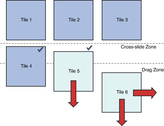
Figure 4.5. Cross-slide and drag
In the example, Tile 4 has already been selected. Tile 5 is being dragged. Because it has not crossed the threshold, it will only move vertically, and the checkmark is shown as a hint for the selection action. If the tile is dragged back, it will snap into place without being selected. Tile 6 was dragged beyond the threshold and can now be rearranged and moved in all directions.
Targeting
Targeting refers to building your UI elements to maximize touch interactions. There are several factors involved in creating successful targets. The first is to create targets that are large enough to contact. An extremely small target is difficult to select and will increase user error (not to mention frustration). Guidelines suggest your smallest target be 9 millimeters on the shortest side (48 pixels on a 135 pixel-per-inch display) and that all targets have a minimum padding of 2mm (about 10 pixels) between them.
If a target is dragged less than 2.7 millimeters (about 14 pixels), the interaction should be handled as a tap. A greater distance should be handled as an actual drag. If you support the cross-slide action, the selection action begins when the user passes that threshold. The selection will change to a drag after the user moves the element 11 millimeters (about 60 pixels).
In addition to the visual target, which is the element you can see, there is an actual target that represents an area around the element that will still respond to touch. It is recommended that the visual target is about 60% the size of the actual target. The actual target can also provide a visual cue. To see this in action, go to the Start menu and look at your account information. An example is shown in Figure 4.6.
Figure 4.6. Account information
The picture and text provide a visual target. Now click anywhere within an imaginary rectangle that is large enough to contain both the text and the picture. The account information will highlight and reveal the actual target you can click to open the context menu for your account. You can see this in Figure 4.7.

Figure 4.7. Account information with actual target highlighted
Another important aspect of targeting is to minimize the risk of critical errors. An element that has serious consequences should be grouped separately from other, more commonly used elements to avoid accidental activation. For example, if you have add, edit, and delete icons, you might consider grouping the add/edit icons together and placing the delete icon farther away to reduce the likelihood that the user accidentally taps it.
Context Menus
Context menus are short menus that provide clipboard commands (cut, copy, and paste) or custom commands, typically on objects that cannot be selected. They provide a short menu of commands. Context menus should never contain more than five commands. You can read the guidelines for context menus online at http://msdn.microsoft.com/en-us/library/windows/apps/hh465308.aspx.
The guidelines for context menus are to have short command names, use sentence capitalization (that is, “Clear list” instead of “Clear List”), and have a separator between related commands. The commands must be contextually relevant and should be ordered by importance with the most important commands at the bottom. If you are providing clipboard commands, they should always use the text and order:
• Cut
• Copy
• Paste
Context menus should be placed close the items they relate to and are often invoked by tapping or holding an item. In the Touch example, a context menu is attached to the ListBox control that lists the touch events. It is triggered by the DoubleTapped event.
The event handler defines a short block of code that creates a PopupMenu object, adds a command, and then waits for a response. It is also possible to create a context menu in XAML by using the Button.ContextMenu property. The contents include a ContextMenu with a list of MenuItem controls. The user can dismiss the menu by either selecting a command or moving the focus off the menu (for example, tapping or clicking another area of the application):
var contextMenu = new PopupMenu();
contextMenu.Commands.Add(new UICommand("Clear list",
args => _events.Clear()));
var dismissed = await contextMenu.ShowAsync(
e.GetPosition(EventList));
The UICommand takes a short name for the command and a delegate that is called when the command is selected. You can separate commands by adding an instance of the UICommandSeparator class to the list of the commands:
contextMenu.Commands.Add(new UICommandSeparator());
The commands will appear in the order they are added. You can query the return value of the ShowAsync method to determine what caused the menu to be dismissed. Some controls automatically provide context menus. For example, text selection provides a set of commands to cut, copy, and paste. Your application will likely provide a variety of commands that don’t fit the narrow guidelines for the context menu. These commands most likely belong in the Application Bar.
The Application Bar
The application bar is a special control that is used to display commands to users on demand. It is not always visible by default, and the user must either swipe from the top or bottom edge of the screen or right-click to make it display. It is also possible to cause it to display programmatically. The application bar contains commands that are based on context—these can be global commands such as returning to the home page or commands specific to selected items.
In the Windows8Application example, a common UserControl provides application bar functionality. This provides a central location for the functionality and prevents duplicate code and XAML (you can place a separate application bar on every page if you like). You can host an application bar on the top, bottom, or both the top and bottom of the display. When the user swipes a second time or invokes an action, the application bar dismisses itself automatically. The application bar is implemented using the AppBar control.
Figure 4.8 shows the application bar for the main page before any item is selected. The Add and Home actions are disabled because there is no group selected and the user is already on the home screen. The application bar is defined using the Page.BottomAppBar element (you can use the Page.TopAppBar element for commands to appear on the top of the display).

Figure 4.8. The application bar with commands disabled
Any application bar element must contain an AppBar control that will then host the XAML for the layout of your commands. Here is the definition from GroupedItemsPage.xaml:
<Page.BottomAppBar>
<AppBar x:Name="AppBar" Margin="10,0,10,0">
<local:ApplicationCommands x:Name="AppBarCommands"/>
</AppBar>
</Page.BottomAppBar>
The XAML references a reusable UserControl. To see the definition of the layout for the application bar, open the ApplicationCommands.xaml file. You will see the commands displayed in the designer on a light gray background. The Delete command is a button on the left margin, and the Add and Home commands are on the extreme right margin. These are placed in Grid control for layout.
You’ll notice the commands are defined using a static resource:
<Button x:Name="Delete" HorizontalAlignment="Right"
Style="{StaticResource DeleteAppBarButtonStyle}"
Click="Delete_Click_1"/>
This resource is defined in the Common/StandardStyles.xaml file that is generated by the project template. These styles contain some of the most common commands. Each style provides a default icon and description. For example, the following XAML defines the help command (all of the styles target the Button control and are based on the AppBarButtonStyle resource):
<Style x:Key="HelpAppBarButtonStyle" ...>
<Setter Property="AutomationProperties.Name" Value="Help"/>
<Setter Property="Content" Value=""/>
</Style>
If you don’t see a style that matches the icon you need, you can simply create a new resource. It is not recommended that you manipulate the resources in the StandardStyles.xaml file without understanding what you are doing as this could potentially break the functionality of the application. To be safe, you can add your own dictionary to host the new styles and reference it from the App.xaml file (see MyStyles.xaml). Let’s assume you are building an application that displays news articles and want to provide a command to change the font size. First, define a style for the new command:
<Style x:Key="FontAppBarButtonStyle" TargetType="Button"
BasedOn="{StaticResource FontBarButtonStyle}">
</Style>
You can set an automation property (this is a unique identifier that helps with UI automation, used in various forms of testing and for accessibility) and name for the command:
<Setter Property="AutomationProperties.AutomationId"
Value="FontAppBarButton"/>
<Setter Property="AutomationProperties.Name" Value="Font"/>
The last step is to locate the icon. If you have artistic skills or a designer on team, you may want to create the icon yourself. However, a more practical way is to take advantage of the built-in icons available for Windows 8 in the Segoe UI Symbol font. To browse the font, open the Windows 8 Start menu and type charmap. In the results pane, click charmap.exe. This will launch a tool that allows you to explore various fonts on your system. Select the Segoe UI Symbol font and scroll near the bottom. You will see quite a few icons. Figure 4.9 shows the icon that probably makes the most sense for a font command.

Figure 4.9. How to select an icon using charmap.exe
Note the code at the bottom. You can use this to set the symbol in your style by copying the portion after the plus (+) sign:
<Setter Property="Content" Value=""/>
Now you’ve got a style you can reference from anywhere.
If you look at the control for the application bar in the designer, the buttons will appear in a large rectangle. This is the default design view for a control. You can change the design surface by using the d: extension in XAML. For example, if you want to see the control appear in the designer with a particular width, use d:DesignWidth=”1024” after the xmlns:d declaration. If you want the designer to emulate a tablet and show the tablet chrome, simply add the declaration d:ExtensionType=”Page”. This will cause the designer to render the tablet chrome as well as allow you to select various controls and visual states. It is a little trick to provide enhanced functionality to the design-time experience.
The code for the application bar control handles disabling or enabling icons based on selection. You can look at the ApplicationCommands.xaml.cs file to see the logic. For example, the delete command should only display if an item is currently selected:
var selected = App.CurrentItem;
Delete.Visibility = selected == null ?
Visibility.Collapsed : Visibility.Visible;
You can see an example of the Delete command in the application bar in Figure 4.10. Notice that the Add command has been completely removed because it doesn’t make sense in the context of a single item.

Figure 4.10. The application bar with enabled commands
The implementation of the Delete command is a bit more complex. To prevent the user from accidentally deleting an item, it will show a confirmation to the user. If the user confirms the action and is on the detail page, the command will go back to the previous page as the current item will no longer exist after it is deleted. The dialog is set up like this:
var msg = new Windows.UI.Popups.MessageDialog("Confirm Delete",
string.Format("Are you sure you wish to delete the item "{0}"",
App.CurrentItem.Title));
The OK command is set up with a delegate that removes the current item from its group and then checks the current page to see if it needs to navigate back. You can take a look at the App.xaml.cs file to see the logic used to capture the page:
App.CurrentGroup.Items.Remove(App.CurrentItem);
if (App.NavigatedPage == typeof(ItemDetailPage))
{
((Frame)Window.Current.Content).GoBack();
}
The Cancel command will simply dismiss the application bar, so no delegate is passed to it:
msg.Commands.Add(new Windows.UI.Popups.UICommand("Cancel"));
The resulting dialog is shown in Figure 4.11.

Figure 4.11. A confirmation dialog
The AppBar control can be programmatically opened or closed by setting the IsOpen property. The default behavior of the application bar is to disappear when the user interacts with the page anywhere outside of the application bar. If you set the IsSticky property to true, the application bar will remain until the user explicitly dismisses it using a right-click, Ctrl+Z, or the swipe gesture.
It is important to follow the guidelines for an application bar when you are organizing your command and controls. These guidelines are summarized in the following list:
• Global commands should be placed to the right.
• Commands should be separated on the left and right edges.
• Similar commands should be grouped together with separators.
• Context-specific commands should appear farthest to the left and appear or disappear as needed.
• Critical commands should be separated from other commands by extra space to avoid accidental activation.
• Do not use the application bar for settings—these are activated through the Settings charm.
• Do not use the application bar for search unless the search has a special context—instead, use the Search charm.
• Do not use the application bar for sharing content—use the Share charm instead.
• If the application bar becomes too crowded, you can move some commands to the top or bottom and extend commands with context menus.
Read the most current MSDN guidelines for application bars online at http://msdn.microsoft.com/en-us/library/windows/apps/hh465302.aspx.
Run the application again and practice adding and deleting items. One thing you should notice is what you get “for free” from the built-in grid controls. When you add or remove an item, it doesn’t simply appear or disappear. As the existing items shift, they animate to their new locations in a fast and fluid motion. This all happens automatically as the result of you manipulating the underlying collections.
The application bar is not only limited to icons and commands. It might make sense to host other information in the application bar area. Examples include a status indicator (if you own a Windows Phone, you are familiar with the action of using an application bar to see the signal strength and remaining battery) or a thumbnail (take a look at Internet Explorer in Figure 4.12 and notice how it uses the application bar to facilitate switching between tabs or adding a new one).

Figure 4.12. A creative use of the application bar in IE 10
Icons and Splash Screens
You may have noticed that the Windows8Application launches with a custom green splash screen. This serves two purposes: first, to affirm that I am at heart a developer and not a designer, and second, to demonstrate how you can customize the various icons and logos associated with your application.
To customize your tile and splash screen, double-click the Package.appxmanifest file to open package dialog. The settings for your icons and splash screen are on the Application UI tab, as shown in Figure 4.13. Here you can determine how and when the application name is displayed and what colors are used. You can provide logos for various tile configurations (the small logo is used in the zoomed-out view for the Start menu) as well as a splash screen logo and background color.
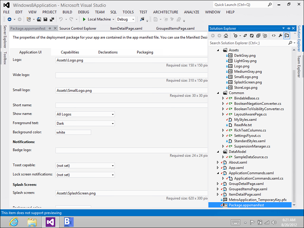
Figure 4.13. The Application UI tab for the package dialog
The dialog provides tips for the correct size. All of these items may be dynamic as well. You’ll learn about how to provide a custom splash screen with your own elements in Chapter 5, Application Lifecycle. You’ll learn about tiles and toast notifications in Chapter 7, Tiles and Toasts.
About Page
Information about your application, including settings, preferences, and the about page, should be accessed using the Settings charm. When you access settings, a Permissions option is always available that displays the application title, version, and publisher, as well as the list of permissions provided to the application. If you recall in Chapter 2, Getting Started, you had to provide permission for the application to use your web camera.
The first step to building pages that will display as part of the Settings charm is to create a class to facilitate panning the control in from the margin. This is known as a flyout and is not available “out of the box” for XAML applications. The class is quite simple to build and wraps the control in a Popup so it can overlay the edge of the application. Under the Common folder, you’ll see the definition for the SettingsFlyout class that is in Listing 4.3 under the Windows8Application. There are two standard sizes for charm flyouts—narrow (346 pixels wide) and wide (646 pixels wide.)
Listing 4.3. The SettingsFlyout Class
class SettingsFlyout
{
private const int _width = 346;
private Popup _popup;
public void ShowFlyout(UserControl control)
{
_popup = new Popup();
_popup.Closed += OnPopupClosed;
Window.Current.Activated += OnWindowActivated;
_popup.IsLightDismissEnabled = true;
_popup.Width = _width;
_popup.Height = Window.Current.Bounds.Height;
control.Width = _width;
control.Height = Window.Current.Bounds.Height;
_popup.Child = control;
_popup.SetValue(Canvas.LeftProperty,
Window.Current.Bounds.Width - _width);
_popup.SetValue(Canvas.TopProperty, 0);
_popup.IsOpen = true;
}
private void OnWindowActivated(object sender,
Windows.UI.Core.WindowActivatedEventArgs e)
{
if (e.WindowActivationState ==
Windows.UI.Core.CoreWindowActivationState.Deactivated)
{
_popup.IsOpen = false;
}
}
void OnPopupClosed(object sender, object e)
{
Window.Current.Activated -= OnWindowActivated;
}
}
Take a look at About.xaml for the design. The Settings pages have a white background. The Grid is defined with transitions that provide the animated effect for the text to “fly-in” with the rest of the control. The special SettingsBackButtonStyle is a copy of the BackButtonStyle provided with the template and modified for display on the white background.
There are two commands wired into the page. The first command simply dismisses the parent (the SettingsFlyout class) and returns to the application settings. You must include a using statement for Windows.UI.ApplicationSettings for this to work:
private void Button_Click_1(object sender, RoutedEventArgs e)
{
if (this.Parent.GetType() == typeof(Popup))
{
((Popup)this.Parent).IsOpen = false;
}
SettingsPane.Show();
}
The second command is triggered by a HyperlinkButton that is linked to my blog. It uses the Launcher class to open the Uri. This allows the Windows 8 platform to determine what application is registered to handle the Uri (most likely Internet Explorer 10) and then either pass the Uri to the application, or launch the application first.
private async void HyperlinkButton_Click_1(object sender,
RoutedEventArgs e)
{
await Windows.System.Launcher.LaunchUriAsync(
new Uri("http://csharperimage.jeremylikness.com/"));
}
The final step is to actually register the new page with the Settings charm. When your application is launched you must hook into the CommandsRequested event on the SettingsPane object. This will fire when the Settings charm begins building the list of options after it is selected by the user. The registration is done in App.xaml.cs:
SettingsPane.GetForCurrentView().CommandsRequested +=
App_CommandsRequested;
The event handler is passed a Request object that contains a list of commands. You can add your command to this list to make it display when the Settings charm is invoked:
var about = new SettingsCommand("about", "About", (handler) =>
{
var settings = new SettingsFlyout();
settings.ShowFlyout(new About());
});
args.Request.ApplicationCommands.Add(about);
Launch the application and try it for yourself. The About page is shown in Figure 4.14. To view it, simply swipe from the right side of the screen or hover your mouse pointer in the lower-right corner until the charm bar displays. Tap the Settings charm, and you’ll see the new About command has been added in addition to the built-in Permissions command. Tap the About command, and you will see the new page animate into view.

Figure 4.14. The About page
You will use a similar technique to provide actual application settings and user preferences. You will learn more about storing and retrieving values in Chapter 5, and a detailed approach to handling application settings can be found in Chapter 6, Data.
Sensors
Touch input is not the only type of input that Windows 8 applications can process. Many Windows 8 devices contain special sensors that provide information like the physical orientation of the tablet or GPS coordinates. The Windows Runtime contains special APIs that allow you to tap into these sensors and build applications that respond to events like shaking the tablet, tilting the tablet, or providing contextual information based on the user’s location. This section contains a brief overview of the available sensor APIs.
If you have a device with one of these sensors present, you can download and run sample applications that use the sensors from Microsoft’s developer center. The following link will take you to a page to download a set of samples that includes a project for every sensor listed here (look for samples with Accelerometer, Gyrometer, Sensor, and Location in the title): http://code.msdn.microsoft.com/windowsapps/Windows-8-Modern-Style-App-Samples
Accelerometer
The accelerometer provides information about the effect of gravity on the device across various axes. The API provides a current reading and generates an event when the reading changes. The event provides information about the acceleration in the X, Y, and Z planes. The code in Listing 4.4 demonstrates how to obtain a reading.
Listing 4.4. Reading Values from the Accelerometer
async private void ReadingChanged(object sender,
AccelerometerReadingChangedEventArgs e)
{
await Dispatcher.RunAsync(CoreDispatcherPriority.Normal, () =>
{
AccelerometerReading reading = e.Reading;
ScenarioOutput_X.Text = String.Format("{0,5:0.00}",
reading.AccelerationX);
ScenarioOutput_Y.Text = String.Format("{0,5:0.00}",
reading.AccelerationY);
ScenarioOutput_Z.Text = String.Format("{0,5:0.00}",
reading.AccelerationZ);
});
}
You can learn more about the accelerometer and run a sample application by reading the MSDN documentation found at http://msdn.microsoft.com/en-us/library/windows/apps/windows.devices.sensors.accelerometer.aspx.
Compass
The compass sensor, when present, provides a heading based on either True North or Magnetic North. True North is the direction to the geographic North Pole; Magnetic North is the direction to the magnetic north pole. The magnetic pole is not always in the same location because it shifts in response to changes in the Earth’s magnetic core. Listing 4.5 shows how to read the compass headings.
Listing 4.5. Reading Compass Headings
async private void ReadingChanged(object sender,
CompassReadingChangedEventArgs e)
{
await Dispatcher.RunAsync(CoreDispatcherPriority.Normal, () =>
{
CompassReading reading = e.Reading;
ScenarioOutput_MagneticNorth.Text =
String.Format("{0,5:0.00}",
reading.HeadingMagneticNorth);
if (reading.HeadingTrueNorth != null)
{
ScenarioOutput_TrueNorth.Text =
String.Format("{0,5:0.00}",
reading.HeadingTrueNorth);
}
else
{
ScenarioOutput_TrueNorth.Text = "No data";
}
});
}
You can learn more about the compass sensor online at http://msdn.microsoft.com/en-us/library/windows/apps/windows.devices.sensors.compass.aspx.
Geolocation
The geolocation API aggregates information from a variety of sources to provide an estimated location to your application. The information may come from the Windows Location Provider that uses a combination of Wi-Fi triangulation and IP address data to determine location, or it may come from sources like a built-in GPS device. The API draws on this information to provide the most accurate representation of location available.
Listing 4.6 demonstrates the use of the API to obtain information about the latitude and longitude of the device along with the estimated accuracy of the reading.
Listing 4.6. Obtaining Information About the Device Location
Geoposition pos = await _geolocator.GetGeopositionAsync()
.AsTask(token);
ScenarioOutput_Latitude.Text = pos.Coordinate.Latitude.ToString();
ScenarioOutput_Longitude.Text = pos.Coordinate.Longitude.ToString();
ScenarioOutput_Accuracy.Text = pos.Coordinate.Accuracy.ToString();
You can learn more about the geolocation API online at
http://msdn.microsoft.com/en-us/library/windows/apps/windows.devices.geolocation.aspx.
Gyrometer
The gyrometer sensor provides information about angular velocity or how the device is being rotated. Like the other sensors, it provides an API to obtain the current reading as well as an event that fires when the reading changes. Listing 4.7 shows how to interpret the results from that event.
Listing 4.7. Reading the Gyrometer
async private void ReadingChanged(object sender,
GyrometerReadingChangedEventArgs e)
{
await Dispatcher.RunAsync(CoreDispatcherPriority.Normal,
() =>
{
GyrometerReading reading = e.Reading;
ScenarioOutput_X.Text = String.Format("{0,5:0.00}",
reading.AngularVelocityX);
ScenarioOutput_Y.Text = String.Format("{0,5:0.00}",
reading.AngularVelocityY);
ScenarioOutput_Z.Text = String.Format("{0,5:0.00}",
reading.AngularVelocityZ);
});
}
You can learn more about the gyrometer online at http://msdn.microsoft.com/en-us/library/windows/apps/windows.devices.sensors.gyrometer.aspx.
Inclinometer
The inclinometer provides the pitch, roll, and yaw values of the device. This allows you to understand the orientation of the device relative to the ground (or more specifically, the direction that gravity is acting on the device). You use this sensor to determine if the device is twisted or tilted. For an explanation of pitch, roll, and yaw, refer to this article on the NASA website at http://www.grc.nasa.gov/WWW/K-12/airplane/rotations.html.
Listing 4.8 demonstrates code that reads the pitch, roll, and yaw values for the device.
Listing 4.8. Reading the Inclinometer
async private void ReadingChanged(object sender,
InclinometerReadingChangedEventArgs e)
{
await Dispatcher.RunAsync(CoreDispatcherPriority.Normal,
() =>
{
InclinometerReading reading = e.Reading;
ScenarioOutput_X.Text = String.Format("{0,5:0.00}",
reading.PitchDegrees);
ScenarioOutput_Y.Text = String.Format("{0,5:0.00}",
reading.RollDegrees);
ScenarioOutput_Z.Text = String.Format("{0,5:0.00}",
reading.YawDegrees);
});
}
Learn more about the inclinometer online at http://msdn.microsoft.com/en-us/library/windows/apps/windows.devices.sensors.inclinometer.aspx.
Light Sensor
The ambient light sensor detects the quality and intensity of light in the device’s environment. This enables your application to adjust the display, such as reducing the brightness when the user is in a dark environment. Reducing the brightness of the display can prolong the battery life for the device.
Listing 4.9 demonstrates reading values from the light sensor.
Listing 4.9. Reading the Light Sensor
async private void ReadingChanged(object sender,
LightSensorReadingChangedEventArgs e)
{
await Dispatcher.RunAsync(CoreDispatcherPriority.Normal,
() =>
{
LightSensorReading reading = e.Reading;
ScenarioOutput_LUX.Text = String.Format("{0,5:0.00}",
reading.IlluminanceInLux);
});
}
You can learn more about the light sensor online at http://msdn.microsoft.com/en-us/library/windows/apps/windows.devices.sensors.lightsensor.aspx.
Orientation Sensor
The orientation sensor provides a matrix that represents rotation and a Quaternion that can be used to adjust the user’s perspective within an application. Unlike the simple orientation sensor that was used earlier in this chapter to change from portrait to landscape modes, the full orientation sensor is typically used in games to render the graphics differently based on the orientation of the tablet. A Quaternion is specific notation used to describe orientations and rotations.
Listing 4.10 illustrates how to obtain orientation readings.
Listing 4.10. Reading the Orientation
async private void ReadingChanged(object sender,
OrientationSensorReadingChangedEventArgs e)
{
await Dispatcher.RunAsync(CoreDispatcherPriority.Normal,
() =>
{
OrientationSensorReading reading = e.Reading;
// Quaternion values
SensorQuaternion quaternion = reading.Quaternion;
ScenarioOutput_X.Text = String.Format("{0,8:0.00000}",
quaternion.X);
ScenarioOutput_Y.Text = String.Format("{0,8:0.00000}",
quaternion.Y);
ScenarioOutput_Z.Text = String.Format("{0,8:0.00000}",
quaternion.Z);
ScenarioOutput_W.Text = String.Format("{0,8:0.00000}",
quaternion.W);
// Rotation Matrix values
SensorRotationMatrix rotationMatrix = reading.RotationMatrix;
ScenarioOutput_M11.Text = String.Format("{0,8:0.00000}",
rotationMatrix.M11);
ScenarioOutput_M12.Text = String.Format("{0,8:0.00000}",
rotationMatrix.M12);
ScenarioOutput_M13.Text = String.Format("{0,8:0.00000}",
rotationMatrix.M13);
ScenarioOutput_M21.Text = String.Format("{0,8:0.00000}",
rotationMatrix.M21);
ScenarioOutput_M22.Text = String.Format("{0,8:0.00000}",
rotationMatrix.M22);
ScenarioOutput_M23.Text = String.Format("{0,8:0.00000}",
rotationMatrix.M23);
ScenarioOutput_M31.Text = String.Format("{0,8:0.00000}",
rotationMatrix.M31);
ScenarioOutput_M32.Text = String.Format("{0,8:0.00000}",
rotationMatrix.M32);
ScenarioOutput_M33.Text = String.Format("{0,8:0.00000}",
rotationMatrix.M33);
});
}
You can learn more about the orientation sensor online at http://msdn.microsoft.com/en-us/library/windows/apps/windows.devices.sensors.orientationsensor.aspx.
Summary
This chapter focused on the unique layouts and behaviors that define Windows 8 applications. You learned about the Visual State Manager and the role it plays in separating presentation logic from your application code, explored the simulator to emulate features like location and touch, and learned how to manage various orientations and view formats. The SemanticZoom control was introduced as a way to enable the user to quickly navigate through large data lists.
You learned the various nuances of touch input and how to manage it from the Windows 8 environment. A sample application demonstrated how to provide mouse, keyboard, and touch actions to invoke various commands, as well as how to enable and monitor manipulation events. You explored how the main example application provides a custom splash page and tiles, handles commands within the application using the AppBar control, and provides an About page through the Settings charm.
Windows 8 devices have the option of providing various sensors that obtain information about orientation, ambient light, acceleration, and location. There are a variety of APIs you can use to test for the presence of a sensor and obtain readings to enhance your application. These sensors allow you to respond to changes in the environment as well as provide contextual information to the user.
The development environment and project templates helped jumpstart a fairly comprehensive sample project that contains grouped items and provides functionality to navigate, add, and delete items. Under ordinary circumstances when you jump to other applications and leave the main application running, the current state will be preserved in memory, and swapping back to the application will return you to the same spot. There is no guarantee that it will remain in memory and the Windows Runtime can terminate your application.
Customers will expect to return to the same spot they left before the application was terminated. In the next chapter, you will learn about the Application Lifecycle and how to detect when your application is being suspended and when it is either returned to in memory or terminated and re-launched. You will also learn how the applications preserve the application state so that you can restore it and provide a seamless experience to the end user.