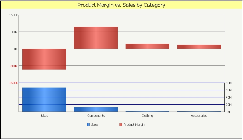
There are cases when I need to display two metrics on one single graph; the matter gets complicated if the two have very different values, such as an absolute number and a percentage, or—generally speaking—when the values of one metric fall in a range different from the values of the other. We have seen that most of the times the numbers are displayed as series on the Y axis; so we have a minimum number and a maximum number on the left vertical margin of the graph (Y1). If the second metric has minimum and maximum values that do not fall into the first metric range, we can create a second Y axis and have the new minimum and maximum values displayed on the right margin of the chart (Y2). Let's see it with a practical example. We want to picture the sales amount from the resellers and the real product margin that each category of products has scored. We know from the previous chapters that we lost money on Bikes…
Create a new report with the following objects:
- The Product Category attribute on rows
- The Sum SalesAmount from FactResellerSales metric on columns
- The Sum ProductMargin from FactResellerSales metric on columns
When you run it in the grid view you'll see that the numbers are different from each other: the first column ranges from 521K to 66M while the other has a negative minimum value.
In Grid View, select View | Graph View menu:
- From the Graph Type window, choose the default Vertical Bar:Clustered and click on OK.
- The resulting graph is not very meaningful; the losses on bikes are barely visible. So, we go to the Graph | Graph Type menu.
- In the Graph Type window, we scroll down the Vertical tab and select the next-to-last one Vertical Bar:DualAxis Absolute.
- In this case we have a double grid: horizontal blue lines correspond to numbers on the right and the black to the numbers on the left. Now it is easier to spot the losses but still difficult to read, so we bring up the Graph Type window once again.
- This time, we select the last Vertical type labeled Vertical Bar:Bipolar Absolute.
- The two metrics are now pictured one above the other, with the horizontal lines clearly pointing to the left and right axis labels.
In MicroStrategy, the first metric is the one that is used to generate the left Y labels; in our example from 0 to 70M. The second column is then scaled to fit into this range. Clearly, smaller numbers are likely to disappear. So we use a dual axis graph, with Y1 labels on the left and Y2 labels on the right, and the two sets of columns proportional to their own scales. In this particular chart, there is an added complication: the negative Bikes value. We need space below zero to create the Product Margin columns, so we choose another type of dual axis graph, where we have two zero baselines, generating actually two separate bar charts one above the other.
Try this:
- Go to Graph | Graph Options menu and select Vertical Bar options | Dual Y Options from the left tree.
- There is a shopping cart with a button in the middle labeled <>, click on it and then Apply.
- See that the order of the metrics is inverted; now Product Margin has more importance and drives the left labels.
- Now move the Split Position slider to
30and click on Apply. - See now the upper bars have more vertical space than the lower ones.
By playing with these two settings you can give more visibility to one metric and try to draw attention to the most important numbers; see the following image: