
Chapter 3: Data Binding in WPF
In This Chapter
 Understanding dependency properties
Working with binding modes
Defining an example binding object
Making sense out of data
Data binding allows data from your application objects (the binding source) to be displayed in your user interface elements (the binding target). What this means is that you can bind a Textbox’s Text property (for example) to the Name property of an instance of your Car class. Depending on the binding mode used when setting up the relationship, changes in the Text property value of the Textbox can automatically update the underlying Name property of your Car object (and vice versa) without requiring any additional code.
It’s no mystery these days that most applications deal with data. As a WPF developer, you have full creative reign on how data is presented and how information entered by your user can be validated and used to update your underlying objects. One of WPF’s strengths is its rich data binding support. This chapter walks you through the details.
Getting to Know Dependency Properties
Data binding happens when you set up a relationship between a binding source property and binding target property. The binding target object must be a DependencyObject, and the target property must be a DependencyProperty.
Understanding dependency properties is crucial to obtaining a firm grasp on WPF technology. Dependency properties are found in objects that inherit from DependencyObject. At its root, a dependency property extends the functionality of a regular property that already exists on a CLR object by adding a set of services that is also known as the WPF Property System. (Together, DependencyObject and DependencyProperty make up this property system.) Dependency properties can have their values determined by multiple input sources, meaning that their values can be obtained through a Style or a data binding expression. Dependency properties act like regular properties, but they allow you to set values based on the following:
A default value: These are predefined on the property.
A calculated expression (similar to CSS expressions in the web world): This can be a data binding expression or a reference to resources defined in the application.
Data binding: This actually is built upon the preceding Bullet1 using binding expressions on the binding source object.
Property value inheritance: Not to be confused with object inheritance, property value inheritance allows values set on parent properties to be propagated down to its children. For instance, if you set FontSize values on the Window element (the root element), child elements such as TextBlock and Label automatically inherit those font property values. You can see another example of this by reviewing the concept of Attached Properties introduced in Chapter 1 of this minibook.
Styling: Each style typically contains setters to set one or more property values.
The WPF property system also provides built-in property value change notification and property value validation functionality, which I review in the section “Editing, Evaluating, Converting, and Visualizing Your Data,” later in this chapter.
At the end of the day, dependency properties give the developer the capability to set property values directly in XAML as well as in code. The advantage to this is that you can keep your code clean and leave initializing object property values to XAML.
Exploring the Binding Modes
You have full control over how the binding relationship you create behaves. Multiple types of binding modes are available to you in WPF. These include the following:
The OneTime binding mode is used when you want the source property to only initially set the target property value. Subsequent changes to the source property are not reflected in the target property. Similarly, changes to the target property are not reflected in the source property.
The OneWay binding mode is typically used for read-only behaving properties. In this binding mode, data from the source property sets the initial value of the target property. Subsequent changes to the source property will automatically update the binding target property value. Conversely, any subsequent changes made to the target property value are not reflected in the source property.
The OneWayToSource binding mode is essentially the opposite of the OneWay binding mode. In this binding mode, data from the source property initializes the target property value. Subsequent changes to the source property value will not update the target property. However, updates to the target property value will automatically update the source property value.
The TwoWay binding mode merges the functionality of the OneWay and OneWayToSource binding modes. In this binding mode, the source property value initializes the target property value. Subsequent changes to the source property value update the target property value. Similarly, updates to the target property value will update the source property value.
Investigating the Binding Object
Bindings can be defined using code or XAML. Here you begin with the XAML version. In order to see how to bind data to your UI elements, you first define a test set of data to work with.
 The complete solution is available at
 www.csharpfordummies.net in the chapter downloads under BindingSample1.
Defining a binding with XAML
Just follow these steps to create a binding with XAML:
1. Create a new WPF Application project and name it BindingSample1.
2. Define a simple Car class by adding a new Class to your solution named Car.cs and code it as follows:
using System;
using System.Collections.Generic;
using System.Linq;
using System.Text;
namespace BindingSample1
{
public class Car
{
private string _make;
public string Make
{
get { return _make; }
set { _make = value; }
}
private string _model;
public string Model
{
get { return _model; }
set { _model = value; }
}
public Car() { }
}
}
3. In MainWindow.xaml, replace the grid with one that defines a double column and single row grid; then add a label in each grid cell, like this:
<Grid>
<Grid.ColumnDefinitions>
<ColumnDefinition></ColumnDefinition>
<ColumnDefinition></ColumnDefinition>
</Grid.ColumnDefinitions>
<Grid.RowDefinitions>
<RowDefinition></RowDefinition>
</Grid.RowDefinitions>
<Label x:Name=”lblCarMake” Grid.Row=”0” Grid.Column=”0”
Content=”{Binding Path=Make, Mode=OneTime}” />
<Label x:Name=”lblCarModel” Grid.Row=”0” Grid.Column=”1”
Content=”{Binding Path=Model, Mode=OneTime}” />
</Grid>
Take a look at the Content dependency property value. The information contained within the curly braces defines the binding for the content to be displayed in the labels. I describe what this Binding expression means in the next section, but first you need some data to bind to.
4. Open the MainWindow.xaml.cs code-behind file and create a method called GenerateData that instantiates a Car object and assigns it to the DataContext of the window, like this:
private void GenerateData()
{
Car car1 = new Car() { Make = “Athlon”, Model = “XYZ” };
this.DataContext = car1;
}

DataContext defines the root object relative to which all child elements obtain their values (as long as the DataContext value on the child elements isn’t directly set via XAML or code — this property is an example of property value inheritance; its value is obtained from its parent element unless otherwise specified).
5. Call the GenerateData() method in the MainWindow constructor method (public MainWindow()), immediately following InitializeComponents() call.
Now, looking back to the XAML file (MainWindow.xaml), the first label lblCarMake will bind to the DataContext’s Make property. The value is retrieved from the property specified in the binding’s Path component. Similarly, the second label lblCarModel will bind to the DataContext’s Model property as specified in the binding expression’s Path property. Each of these bindings is using a OneTime mode, which means the label content will be bound only once, regardless if the underlying object property being bound to changes.
The Path component of the XAML Binding expression simply tells the XAML processor to take its value from a specific property of its DataContext. The Path value can also express properties that are nested, such as in the case of nested complex objects. In these cases, you use dot notation to reach the desired property, such as Property.SomeObject.SomeOtherProperty.
6. Run the application.
You can see that the labels now display the Make and Model of the Car object that was assigned to the DataContext of the window. (See Figure 3-1.)

Figure 3-1: Data binding to properties of a Data-Context.
Defining a binding with C#
You can also use C# to define bindings. To demonstrate this, remove the Content attribute entirely from both labels in the XAML file. The label markup should now resemble the following:
<Label x:Name=”lblCarMake” Grid.Row=”0” Grid.Column=”0” />
<Label x:Name=”lblCarModel” Grid.Row=”0” Grid.Column=”1” />
Modify the GenerateData() method in MainWindow.xaml.cs to implement the Binding definitions in code. To do this, you must instantiate Binding objects directly. The constructor of the Binding object takes in the string Path value. Use the BindingOperations class to apply the Binding to the Content dependency property of your labels.
BindingOperations is a helper class provided to you by WPF. It has static methods that give you the power to add and clear data binding definitions on application elements.
The following code shows you how to define the Binding objects, and assign the binding to the Content of the labels:
private void GenerateData()
{
Car car1 = new Car() { Make = “Athlon”, Model = “XYZ” };
Binding makeBinding = new Binding(“Make”);
makeBinding.Mode = BindingMode.OneTime;
BindingOperations.SetBinding(lblCarMake,
Label.ContentProperty, makeBinding);
Binding modelBinding = new Binding(“Model”);
modelBinding.Mode = BindingMode.OneTime;
BindingOperations.SetBinding(lblCarModel,
Label.ContentProperty, modelBinding);
this.DataContext = car1;
}
Run the application and observe that it runs the same way as when the bindings were defined using XAML.
 Dependency properties are typically defined with the suffix “Property,” but you only see them this way navigating MSDN documentation and accessing them through code. In XAML, you specify dependency property attributes by dropping the “Property” suffix on the name.
Editing, Validating, Converting, and Visualizing Your Data
In the preceding section, you got a taste of binding syntax and saw data appear on the screen. This section builds on this knowledge and shows you a simple example of updating data, from user interface elements as well as updating the user interface with changes happening to objects behind the scenes.
The complete solution is available on the web in the BindingSample2 project.
To do this, follow these steps:
1. Create a new WPF Application project and name it BindingSample2.
Reuse the Car class that you created in BindingSample1 (Note: If copying and pasting this class, ensure you change the namespace of the class to BindingSample2.)
In this example, you display the make and model of a Car object (the DataContext) in TextBox controls. This enables you to edit the values of the Car properties. You will also use a TwoWay data binding mode so that changes made from the user interface will be reflected in the underlying Car object, and any changes made to the Car object from code-behind will be reflected in the user interface.
2. Define two buttons, one that shows a message box containing the current value of the DataContext, the other that forces changes to the DataContext through code-behind.
In MainWindow.xaml, replace the Grid content with this:
<Grid>
<Grid.ColumnDefinitions>
<ColumnDefinition></ColumnDefinition>
<ColumnDefinition></ColumnDefinition>
</Grid.ColumnDefinitions>
<Grid.RowDefinitions>
<RowDefinition></RowDefinition>
<RowDefinition></RowDefinition>
</Grid.RowDefinitions>
<StackPanel Orientation=”Horizontal” Grid.Row=”0” Grid.Column=”0”>
<Label Content=”Make” />
<TextBox x:Name=”lblCarMake” VerticalAlignment=”Top”
Text=”{Binding Path=Make, Mode=TwoWay}”
Width=”200” Height=”25” />
</StackPanel>
<StackPanel Orientation=”Horizontal” Grid.Row=”0” Grid.Column=”1” >
<Label Content=”Model” />
<TextBox x:Name=”lblCarModel” VerticalAlignment=”Top”
Text=”{Binding Path=Model, Mode=TwoWay}”
Width=”200” Height=”25” />
</StackPanel>
<Button x:Name=”btnShowDataContextValue”
Click=”btnShowDataContextValue_Click”
Content=”Show Current Data Context Value”
Grid.Row=”1” Grid.Column=”0”/>
<Button x:Name=”btnChangeDataContextValue”
Click=”btnChangeDataContextValue_Click”
Content=”Change Data Context Value with Code-Behind”
Grid.Row=”1” Grid.Column=”1” />
</Grid>
3. In the code-behind file, MainWindow.xaml.cs, add the following methods:
private void GenerateData()
{
Car car1 = new Car() { Make = “Athlon”, Model = “XYZ” };
this.DataContext = car1;
}
private void btnShowDataContextValue_Click(object sender,
RoutedEventArgs e)
{
Car dc = this.DataContext as Car;
MessageBox.Show(“Car Make: “ + dc.Make + “ Car Model: “
+ dc.Model);
}
private void btnChangeDataContextValue_Click(object sender,
RoutedEventArgs e)
{
Car dc = this.DataContext as Car;
dc.Make = “Changed Make”;
dc.Model = “Changed Model”;
}
4. In the constructor for MainWindow(), ensure that you call the GenerateData() method immediately following the InitializeComponents() call.
5. Run this application.
You see that the values from the DataContext display properly in the TextBox controls. Feel free to change the values in the TextBox controls. For instance, change the Make value to Athlon X, and the model to ABC. When you finish with your edits, click the Show Current Data Context Value button. The changes you made to the values in the TextBox are now reflected in the underlying DataContext object. (See Figure 3-2.)
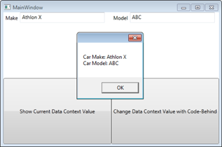
Figure 3-2: Editing data using a TwoWay binding mode.
6. Click the OK button to get rid of the message box.
If you look in the Click event handler of the Change Data Context Value With Code-Behind button (btnChangeDataContextValue_Click), you will note that the DataContext Car object properties will be changed to ChangedMake and Changed Model, respectively.
7. Click the Change Data Context Value With Code-Behind button.
Hmmm. Nothing is happening. What is up with that? If you click the Show Current Data Context Value button, you see the properties have in fact been changed. Because you’re using a TwoWay binding, your settings should automatically update your UI, right? Wrong! This is where another feature of WPF, the concept of INotifyPropertyChanged, comes into play.
INotifyPropertyChanged is a simple interface that allows your objects to raise an event that notifies its subscribers (namely your application) that a property value on the object has changed. Client applications subscribe to these events and update the user interface with the new values only when changes occur.
A similar interface exists for collections as well — the INotifyCollectionChanged interface. WPF also provides a generic class called ObservableCollection<T> that already implements INotifyCollectionChanged for you. When creating an ObservableCollection or your own collection that implements INotifyCollectionChanged, you need to ensure that the objects that will be contained within the collection also implement INotifyPropertyChanged interface.
The INotifyPropertyChanged interface contains a single event that must be implemented. This event is called PropertyChanged, and its parameters are the object that owns the property that has changed (the sender), and the string name of the property that has changed.
8. Open your Car class and have it implement the INotifyPropertyChanged interface.
The interface is located in the System.ComponentModel namespace (add using System.ComponentModel to the top of your class) Implementing this interface adds the following event to the Car class:
public event PropertyChangedEventHandler PropertyChanged;
In order for the application to be notified of the changes that occur in Car objects, the PropertyChanged event must be fired each time a property value has changed.
9. To implement this in the Car class, create a helper method called NotifyPropertyChanged that takes in a string property name and fires the PropertyChanged event for the object instance and the name of the property that has changed, like this:
private void NotifyPropertyChanged(string propertyName)
{
if (PropertyChanged != null)
{
this.PropertyChanged(this,
new PropertyChangedEventArgs(propertyName));
}
}
Checking to see if PropertyChanged is not null essentially means you’re checking to see whether anyone is listening (subscribed) to the PropertyChanged event.
10. Modify the Set methods in each of the public properties on the Car object to call the NotifyPropertyChanged helper method each time the property value has changed; edit the public properties like this:
public string Make
{
get { return _make; }
set {
if (_make != value)
{
_make = value;
NotifyPropertyChanged(“Make”);
}
}
}
public string Model
{
get { return _model; }
set {
if (_model != value)
{
_model = value;
NotifyPropertyChanged(“Model”);
}
}
}
11. Run the application again.
Now when you click the Change Data Context Value with Code-Behind button, the changed values get reflected automatically in the TextBox elements. This is due to the combination of the TwoWay binding mode as well as the implementation of INotifyPropertyChanged. (See Figure 3-3.)
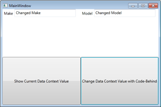
Figure 3-3: TwoWay Data Binding with INotify-Property-Changed.
Validating data
It’s good practice to validate any input provided to you from the user. People aren’t perfect, and some people can be downright malicious. WPF provides a built-in framework for data validation and error notification. It’s available to you through the implementation of the IDataErrorInfo interface on your classes.
You can add validation to the Car class you already created in BindingSample2 from the preceding section.
The complete solution is available on the web in the BindingSample2-Validation project.
Just follow these steps to add validation to your Car class:
1. Open the Car.cs file and edit the class to also implement the IDataErrorInfo interface, like this:
public class Car : INotifyPropertyChanged, IDataErrorInfo
Implementing this interface adds the following methods to the Car class:
public string Error
{
get { throw new NotImplementedException(); }
}
public string this[string columnName]
{
get { throw new NotImplementedException(); }
}
2. Edit the Get method of the Error property to return null.
Now it’s time to add some validation rules to the properties of the Car object. The Car Make and Model properties should enforce the rule that they must always be at least three characters in length. The public string this[string columnName] method is used by the DataBinding engine to validate the properties of the object as they are changed, based on the name of the property (which is what they mean by columnName in the method signature). This method returns any error messages related to the property being edited.
3. To define and enforce these rules, edit the public string this[string columnName] method like this:
public string this[string columnName]
{
get {
string retvalue = null;
if (columnName == “Make”)
{
if (String.IsNullOrEmpty(this._make)
|| this._make.Length < 3)
{
retvalue = “Car Make must be at least 3 “ +
“characters in length”;
}
}
if (columnName == “Model”)
{
if (String.IsNullOrEmpty(this._model)
|| this._model.Length < 3)
{
retvalue = “Car Model must be at least 3 “+
“characters in length”;
}
}
return retvalue;
}
}
In MainWindow.xaml, the Make and Model properties are bound to TextBox controls in the user interface.
4. To enable the text being entered into the TextBoxes to be validated against the constraints defined on the underlying property, edit the binding expressions in each TextBox like this:
<TextBox x:Name=”txtCarMake” VerticalAlignment=”Top”
Text=”{Binding Path=Make, Mode=TwoWay,
UpdateSourceTrigger=PropertyChanged,
ValidatesOnDataErrors=True,
ValidatesOnExceptions=True}”
Width=”200” Height=”25” />
<TextBox x:Name=”txtCarModel” VerticalAlignment=”Top”
Text=”{Binding Path=Model, Mode=TwoWay,
UpdateSourceTrigger=PropertyChanged,
ValidatesOnDataErrors=True,
ValidatesOnExceptions=True}”
Width=”200” Height=”25” />
UpdateSourceTrigger identifies when the validation calls take place. In this example, validations occur as the text is changing, and is fired off when the underlying object property fires the PropertyChanged event.
ValidatesOnDataErrors is what enables the IDataErrorInfo validation method to be called on the property.
ValidatesOnExceptions will invalidate the TextBox if the underlying data source throws an exception, like when, for instance, you have an integer property and the user enters a string — WPF automatically throws the exception that the input string was not in the correct format.
5. Run the Sample and remove all text from the Make and Model TextBox controls.
You see that the TextBox controls are now rendered in red; as you enter text back into the TextBox, as soon as you reach three characters, the red stroke disappears. Figure 3-4 shows the Make text box in an invalid state.

Figure 3-4: Simple Data Validation using the IData-Error-Info interface.
The red stroke is sufficient to indicate that an error has occurred, but it’s of little use to the users as they’re not informed of the details of the error. A simple way to display the error is to add a tooltip on the TextBox. Do this by adding a Style resource to your Window that defines a style that will trigger the tooltip when the data is in an invalid state.
6. Add the following XAML directly below the Window tag at the top of MainWindow.xaml, like this:
<Window.Resources>
<Style x:Key=”errorAwareTextBox” TargetType=”{x:Type TextBox}”>
<Style.Triggers>
<Trigger Property=”Validation.HasError” Value=”true”>
<Setter Property=”ToolTip”
Value=”{Binding RelativeSource={x:Static RelativeSource.Self},
Path=(Validation.Errors)[0].ErrorContent}”/>
</Trigger>
</Style.Triggers>
</Style>
</Window.Resources>
7. Add a Style attribute to your TextBox Style, like this:
Style=”{StaticResource ResourceKey=errorAwareTextBox}”
Now when you run the application and remove the text out of the TextBox controls, the TextBox displays a tooltip with the actual error message. (See Figure 3-5.)
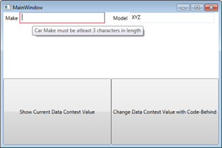
Figure 3-5: Displaying error messages using Styles.
Converting your data
WPF provides you the capability to cater your user interface to be intuitive for the user. Sometimes this means allowing them to enter data in different formats that make sense to them, giving you the responsibility of translating their data entry into a format allowable by your data source. The same is true vice versa; you want to translate data from your data source into a more intuitive form for the user. A popular use-case for this type of conversion is the string representation of a date value, or if you want to display a red or green circle instead of the values True or False.
WPF makes converting data easy by providing a simple interface to implement called IValueConverter. This interface contains two methods:
Convert: This method obtains values from the data source and molds them to the form to be displayed to the user onscreen.
ConvertBack: This method does the opposite — it takes the value from the user interface and molds it into a form that the data source expects.
It is important to note that with these methods, you’re not held to the same data type as the value being bound. For instance, your data source property being bound can be a Date data type, and the Convert method can still return a string value to the user interface.
To demonstrate this feature, create a new WPF application project called BindingSample3. This project is a dashboard application that can show the status of servers on the network. In this project, you implement two user controls, RedX and GreenCheck. You also create a value converter named BooleanToIconConverter that converts a Boolean False value to display the RedX control and converts a True value to display the GreenCheck control. These values indicate whether the server is available.
A user control is a collection of reusable XAML. It can be made up of any number of elements and is implemented with the same rules as when you implement a normal Window (for instance, you can have only one root element). You can also define properties (including dependency properties!!) on user controls.
Project is available on the web under BindingSample3.
Follow these steps to create your sample:
1. Create a new WPF application named BindingSample3.
2. Add a new User Control to the project; name it GreenCheck.xaml.
3. Replace the XAML found in GreenCheck.xaml with this XAML:
<UserControl x:Class=”BindingSample3.GreenCheck”
xmlns=”http://schemas.microsoft.com/winfx/2006/xaml/presentation”
xmlns:x=”http://schemas.microsoft.com/winfx/2006/xaml”
xmlns:mc=”http://schemas.openxmlformats.org/markup-compatibility/2006”
xmlns:d=”http://schemas.microsoft.com/expression/blend/2008”
mc:Ignorable=”d”
d:DesignHeight=”50” d:DesignWidth=”50”>
<Canvas x:Name=”CheckCanvas” Width=”50.4845” Height=”49.6377”
Canvas.Left=”0” Canvas.Top=”0”>
<Path x:Name=”CheckPath” Width=”43.4167” Height=”45.6667”
Canvas.Left=”0” Canvas.Top=”1.3113e-006”
Stretch=”Fill” Fill=”#FF006432”
Data=”F1 M 19.0833,45.6667L 43.4167,2.16667L 38,
1.3113e-006L 19.0833,42.5833L 2.41667,25.3333L 0,
27.9167L 17.4167,44.25”/>
</Canvas>
</UserControl>
 You’re not expected to come up with things like the
 CheckPath off the top of your head. (The path is what describes how the check mark is drawn.) In the Expression Suite, you find designer tools that allow you to draw items in a graphics program and export your final graphics in a XAML format. Expression Design was the tool used to create the user controls in this example.
4. Add another user control to the project; name it RedX.xaml.
5. Replace the XAML in the RedX.xaml file with this XAML:
<UserControl x:Class=”BindingSample3.RedX”
xmlns=”http://schemas.microsoft.com/winfx/2006/xaml/presentation”
xmlns:x=”http://schemas.microsoft.com/winfx/2006/xaml”
xmlns:mc=”http://schemas.openxmlformats.org/markup-compatibility/2006”
xmlns:d=”http://schemas.microsoft.com/expression/blend/2008”
mc:Ignorable=”d”
d:DesignHeight=”50” d:DesignWidth=”50”>
<Canvas Width=”44.625” Height=”45.9394”>
<Path x:Name=”Line1Path” Width=”44.625” Height=”44.375”
Canvas.Left=”0” Canvas.Top=”0” Stretch=”Fill”
Fill=”#FFDE0909”
Data=”F1 M 0,3.5L 3.5,0L 44.625,41L 42.125,44.375”/>
<Path x:Name=”Line2Path” Width=”43.5772” Height=”45.3813”
Canvas.Left=”0.201177” Canvas.Top=”0.55809” Stretch=”Fill”
Fill=”#FFDE0909” Data=”F1 M 3.7719,45.9394L 0.201177,
42.5115L 40.353,0.55809L 43.7784,2.98867”/>
</Canvas>
</UserControl>
6. Add a new class called BooleanToIconConverter.cs.
7. Add the following using statement to your class:
using System.Windows.Data;
8. Have the BooleanToIconConverter inherit the IValueConverter interface. In the Convert method, if the value passed in is True, have it return a new instance of the GreenCheck user control. If the value passed in is False, have the Convert method return an instance of the RedX user control.
Here’s the code for the BooleanToIconConverter class:
using System;
using System.Collections.Generic;
using System.Linq;
using System.Text;
using System.Windows.Data;
namespace BindingSample3
{
public class BooleanToIconConverter : IValueConverter
{
public object Convert(object value, Type targetType,
object parameter,
System.Globalization.CultureInfo culture)
{
if (value != null)
{
bool boolValue = (bool)value;
if (boolValue)
return new GreenCheck();
else
return new RedX();
}
return value;
}
public object ConvertBack(object value, Type targetType,
object parameter,
System.Globalization.CultureInfo culture)
{
throw new NotImplementedException();
}
}
9. Add a new class called ServerStatus.cs that has three properties: the Server name, a Boolean indicator if the server is up, and a number of currently connected users.
This will be the data class used in the application. Here is the code for ServerStatus.cs:
public class ServerStatus
{
private string _serverName;
public string ServerName
{
get { return _serverName; }
set { _serverName = value; }
}
private bool _isServerUp;
public bool IsServerUp
{
get { return _isServerUp; }
set { _isServerUp = value; }
}
private int _numberOfConnectedUsers;
public int NumberOfConnectedUsers
{
get { return _numberOfConnectedUsers; }
set { _numberOfConnectedUsers = value; }
}
public ServerStatus() { }
}
10. In MainWindow.xaml.cs, create a GenerateData() method (call it immediately following the InitializeComponent() method in the Window constructor) that will initialize a list of a few ServerStatus objects and make that list the DataContext of the Window.
Here’s the code:
private void GenerateData()
{
ServerStatus ss = new ServerStatus() {
ServerName = “HeadquartersApplicationServer1”,
NumberOfConnectedUsers = 983,
IsServerUp = true
};
ServerStatus ss2 = new ServerStatus()
{
ServerName = “HeadquartersFileServer1”,
NumberOfConnectedUsers = 0,
IsServerUp = false
};
ServerStatus ss3 = new ServerStatus()
{
ServerName = “HeadquartersWebServer1”,
NumberOfConnectedUsers = 0,
IsServerUp = false
};
ServerStatus ss4 = new ServerStatus()
{
ServerName = “HQDomainControllerServer1”,
NumberOfConnectedUsers = 10235,
IsServerUp = true
};
List<ServerStatus> serverList = new List<ServerStatus>();
serverList.Add(ss);
serverList.Add(ss2);
serverList.Add(ss3);
serverList.Add(ss4);
this.DataContext = serverList;
}
11. Save and build your application.
You do this step so that the user control classes that you’ve defined are available to your XAML files.
12. In MainWindow.xaml, replace the XAML with the XAML found in the following code segment.
<Window x:Class=”BindingSample3.MainWindow”
xmlns=”http://schemas.microsoft.com/winfx/2006/xaml/presentation”
xmlns:x=”http://schemas.microsoft.com/winfx/2006/xaml”
xmlns:local=”clr-namespace:BindingSample3”
Title=”MainWindow” Height=”400” Width=”525”>
<Window.Resources>
<local:BooleanToIconConverter x:Key=”BooleanToIconConverter” />
<DataTemplate x:Key=”ServerTemplate”>
<Border BorderBrush=”Blue” Margin=”3” Padding=”3”
BorderThickness=”2” CornerRadius=”5” Background=”Beige”>
<StackPanel Orientation=”Horizontal”>
<Label Content=”{Binding
Path=IsServerUp,
Converter={StaticResource BooleanToIconConverter}}” />
<StackPanel Orientation=”Vertical”
VerticalAlignment=”Center”>
<TextBlock FontSize=”25” Foreground=”Goldenrod”
Text=”{Binding Path=ServerName}” />
<TextBlock FontSize=”18” Foreground=”BlueViolet”
Text=”{Binding Path=NumberOfConnectedUsers}” />
</StackPanel>
</StackPanel>
</Border>
</DataTemplate>
</Window.Resources>
<Grid>
<Grid.ColumnDefinitions>
<ColumnDefinition />
</Grid.ColumnDefinitions>
<Grid.RowDefinitions>
<RowDefinition />
</Grid.RowDefinitions>
<ListBox x:Name=”lstServers” Width=”490” Height=”350”
ItemsSource=”{Binding}” Grid.Row=”0” Grid.Column=”0”
ItemTemplate=”{StaticResource ResourceKey=ServerTemplate}” />
</Grid>
</Window>
The first thing to note in MainWindow.xaml is that the namespace for the local assembly (BindingSample3) was added to the Window (identified by the namespace definition in the Window tag with the prefix local). This enables you to instantiate classes that are defined in the current assembly in XAML, such as BooleanToIconConverter.
xmlns=”http://schemas.microsoft.com/winfx/2006/xaml/presentation”
xmlns:x=”http://schemas.microsoft.com/winfx/2006/xaml”
xmlns:local=”clr-namespace:BindingSample3”
Title=”MainWindow” Height=”400” Width=”525”>
<Window.Resources>
<local:BooleanToIconConverter x:Key=”BooleanToIconConverter” />
In the Window resources, you initialize an instance of your BooleanToIconConverter, which is available to you through the local namespace.
<local:BooleanToIconConverter x:Key=”BooleanToIconConverter” />
The next Window resource that is defined is a data template. This data template provides a way to look at the data associated with a server’s current status. The data template is defined as follows:
<DataTemplate x:Key=”ServerTemplate”>
<Border BorderBrush=”Blue” Margin=”3” Padding=”3”
BorderThickness=”2” CornerRadius=”5” Background=”Beige”>
<StackPanel Orientation=”Horizontal”>
<Label Content=”{Binding
Path=IsServerUp,
Converter={StaticResource BooleanToIconConverter}}” />
<StackPanel Orientation=”Vertical”
VerticalAlignment=”Center”>
<TextBlock FontSize=”25” Foreground=”Goldenrod”
Text=”{Binding Path=ServerName}” />
<TextBlock FontSize=”18” Foreground=”BlueViolet”
Text=”{Binding Path=NumberOfConnectedUsers}” />
</StackPanel>
</StackPanel>
</Border>
</DataTemplate>
In Chapter 1, I state that one of the main reasons to adopt WPF as a user interface technology is its data visualization flexibility. Data templates enable you to represent data contained in an object using any number of XAML elements. The world is your oyster, and you can get as creative as you want to relay application information to your user in the most usable, intuitive fashion using data templates.
Analyze the ServerTemplate data template. This data template represents the display of an instance of a ServerStatus object. Look at the Label element in the data template:
<Label Content=”{Binding Path=IsServerUp,
Converter={StaticResource BooleanToIconConverter}}” />
The Content property of the label is bound to the Boolean IsServerUp property of the ServerStatus object. You’ll also notice that there is another component to the binding expression, called Converter. This is where the Boolean value (IsServerUp) gets passed into the BooleanToIconConverter and is rendered as the RedX or the GreenCheck user control, depending on its value.
The rest of the data template simply outputs the server name of the ServerStatus object in yellow and the number of connected users in blue-violet.
Within the Grid on the window, a ListBox control is defined that displays a list of servers on the network. Look at the definition of the ListBox:
<ListBox x:Name=”lstServers” Width=”490” Height=”350”
Grid.Row=”0” Grid.Column=”0”
ItemsSource=”{Binding}”
ItemTemplate=”{StaticResource ResourceKey=ServerTemplate}” />
WPF provides a number of controls called ItemsControls that allow you to bind collections of objects to them. Examples of ItemsControls are ListBox and ComboBox (among others). Collections are bound to an ItemsControl through the ItemsSource attribute. A data template can also be applied to each object being bound through the ItemsControl ItemTemplate attribute.
Through Property Value inheritance, the ItemsSource of the ListBox is defaulted to the DataContext of Window. The empty {Binding} element simply states that it will use the current binding of its parent, which uses recursion up the element tree until it reaches a place where a binding is set. Remember that in the GenerateData, you’re setting the DataContext binding to the list of Servers to the Window itself, so the ListBox will inherit that list as its ItemSource.
The data template that was defined in resources to describe a ServerStatus object will be used to render each object being bound. You see this through the ItemTemplate attribute that uses the StaticResource that points to the ServerTemplate that was defined in resources.
Now when you run the application, you see the ServerStatus data presented in a visually pleasing way! (See Figure 3-6.)

Figure 3-6: Rendering a collection of data using a value converter and data templates.
Finding Out More about WPF Data Binding
This chapter is not meant to be inclusive of all functionality possible through WPF’s amazing data binding support. Other aspects of WPF data templates worth looking into include these concepts:
DataTemplateSelector: This is a base class that allows you to render a data template based on some logical condition.
Using data templates as a means to provide data adding/editing capabilities to the user.
Switching a data template at runtime at the preference of the user. This allows users to switch a data template at will. For instance, in a ListBox, you may only display summary information; however, you can provide a button in your data template that will enable users to switch between the summary template and a more detailed template on demand.