
The UX Five-Second Rules
The five-second rules are a set of guidelines designed to assist researchers who wish to use the method to test their designs. They are written with an emphasis on the opportunities and limitations afforded by the providers of online tools but are also applicable for moderated test sessions. The guidelines address the viability of the method for specific types of research inquiries, as well as how to properly design, structure, and execute different test formats. Specific strategies are provided for creating the different test components, including the instructions given to participants, images that are shown, and questions that participants are asked to answer.
Keywords
Test format; guidelines; survey methods; writing; instructions; image optimization; writing questions; question order; open-ended feedback
This set of guidelines offers recommendations on how to effectively construct and conduct online five-second tests, using the tools currently available. They are intended to help the researcher:
• Determine when it is the correct method to use
• Design a test according to the type of data that needs to be collected
While all of the tools reviewed for this book accommodate the basic characteristics and components of the original method (see Chapter 1), each has its own unique set of features, technical capabilities, and limitations. The goal of these guidelines is to provide design research strategies that the researcher can implement regardless of which specific tool is chosen.
2.1 Proper Use of the Method
A classic advertising slogan stressed the importance of always having “the right tool for the right job.” UX and design researchers inherently understand the importance of this concept; while budget and resources will always loom large in decisions on research, generally speaking the method employed will depend on the goals of the researcher. Unfortunately, another old saying goes: “If all you have is a hammer, everything looks like a nail.” As noted in Chapter 1, in many cases, the five-second test has become a victim of its own perceived simplicity and relative cost-effectiveness. Whether it’s due to a lack of resources, laziness, or a misunderstanding of what the method is good for, many researchers are opting to use the five-second test as a quick-and-dirty substitute for other types of research that require either longer exposure times or formal interaction with an actual working system or prototype.
Chapter 1 also discussed the emphasis on the perceptual cues and the human capacities in short-term memory that are inherent in five-second tests. These limitations immediately disqualify the method as a means of testing many aspects of UX and visual design. In perhaps the most obvious example, positioning a five-second test around the usability of a page or web site is doomed from the start. Usability speaks to the ability to successfully complete tasks within the context of realistic scenarios; by definition, this requires some degree of meaningful interaction with a working site or a prototype. In a five-second test, a question such as “How would you get information about the highlighted product?” limits the user’s options to only what’s perceptible in a screenshot, when the task may in fact be easily completed after hovering over the highlighted product and initiating a contextual help box.
In short, five-second testing can test many things, but not everything. As a planning strategy, the rule of thumb should be obvious: The five-second test is the wrong choice for anything requiring more than five seconds’ worth of exposure in order to provide a meaningful answer. While application of this rule should be fairly straightforward, there are a number of instances in which appropriateness of the method should be called into question, and alternative approaches should be considered.
Reading Text
Always remember that five-second testing is designed to gauge what the viewer can perceive and recall within a very short amount of time. With a time restriction understood at the outset, the participant’s cognitive systems will instinctively race to take in as much of the overall design as possible—perceiving colors and sizes of elements, establishing visual patterns, filling the short-term memory with whatever small amounts of information can be retained—before the visual is taken away. When text is included within the context of an entire web page design, only the text which receives special formatting (extra large fonts, bold or italicized styling, complimentary use of white space, etc.) has a chance of being noticed in a span of 5 s. All other text will undoubtedly be ignored.
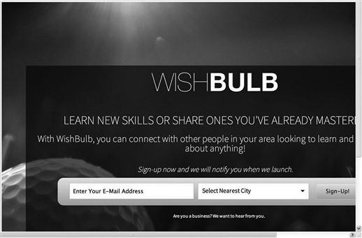
Consider the example of a test for the landing page for a skill-sharing service (Figure 2.1). The test instructions noted only that “This is a sign-up page for a new web application.” After posing three questions related to the service offered and the background image, the test asked: “Do you have any suggestions on the copy?” The “copy” in this case refers to 46 words in the middle of the page, promoting the service and explaining its general benefit. With all of the other elements competing for attention within the limited amount of exposure time, it is extremely unlikely that any respondent will have enough time to even notice this text, much less internalize, comprehend, and consider it fully enough to render a meaningful opinion (especially when memory capacity has been already been spent answering other questions).
Reading involves additional, higher level cognitive processes that are better tested by other methods that are not subject to a time limit. However, it could be argued that there are ways to ask about “copy” or “content” without requiring actual reading. Some tests have taken the approach of asking “Does this web site make you want to read on?” or “Would you like to read it further if you had the chance?” However, these questions imply a greater interest in the overall design of the site or page (i.e., “Is the design appealing enough to make you want to explore it further?”). Focusing on whether the “copy” is interesting or engaging would require some level of meaningful attention, which cannot be accomplished within a five-second test.
There is one viable use of the method in cases involving reading: the testing of slogans or taglines for marketing or public relations purposes. Short sentences or phrases of no more than 10–12 words can be read and internalized adequately within a five-second time frame, giving respondents ample opportunity to provide their interpretation of, opinion about, and/or reaction to them. This approach requires that the test be fairly precise in approach and execution. To illustrate, consider the case of a business wanting to test a slogan for a new product:
• The test instructions should specify that the participant will be required to read as part of the test: “You are about to view a slogan proposed for a specific business. Read it carefully in the time provided.” This sets the proper expectation and helps ensure that the participant is focused on the task.
• The test image containing the slogan should be removed entirely from the design context. Simple black text on a white background, in large letters and using a common font style like Helvetica or Times New Roman, will help ensure that the slogan is as easy to read as possible, and that the participant isn’t biased by a like or dislike of the font style or color.
• Questions should be limited to those measuring interpretation of, opinion about, or reaction to the slogan; for example: “What type of product or service comes to mind when you see this slogan?,” “How catchy would you say the slogan is?,” or “What does the slogan mean to you?” To test whether the slogan is memorable, you could also ask respondents to recreate the slogan as best they can. (This approach is most effective when the question is asked last in a sequence—it would prove how memorable the slogan really is.)
Design Comparisons
A test focusing on a web site for a provider of elderly care services (Figure 2.2) asked participants the following questions:
Q1. “What services does the company on the right provide?”
Q2. “What services does the company on the left provide?”
Q3. “Which one is more professional? Why?”
Q4. “Which one would you feel more comfortable contacting? Why?”
Q5. “What would be your preferred method of contact for either company?”

Based on these questions, the goals of the researcher appear to be determining (a) which design option more effectively emphasizes the services offered by the company, (b) which design is more professional-looking and visually pleasing, and (c) which design more effectively positions the company as a trusted services provider. It is possible for these three goals to be achieved by running individual tests for each option, then analyzing and comparing the results. They are next to impossible to achieve when two options are presented side-by-side in a single test.
As already noted, the five-second test leverages the primary perceptual cues given by a visual stimulus. The demand on short-term memory is high enough when considering a single design. When attention is divided between two design options, the viewer does not have enough resources to handle the more complex processes involved in comparison (evaluating the characteristics of each, discerning the differences between them, forming an opinion based on two sets in visual input, etc.). Additionally, presenting two large page designs simultaneously necessitates scrolling on the part of the respondent, which further impedes the ability to retain any detail about what is presented. In short, testing two complex images—those containing multiple visual elements (e.g., web pages) or a high degree of visual detail (e.g., photographs)—simply puts too much demand on the participant to allow for a meaningful comparison within 5 s.
However, in the same way the method may be modified to test slogans and taglines, it can be viable for comparing very simple design elements, like logos or icons. Again, certain test safeguards need to be in place:
• The test instructions must specify that two options will be presented, and that a comparison will be required as part of the test: “You are about to view two options for a logo design. Compare the two as best you can before answering the questions.” This will set the proper expectation and help prevent confusion when the options are presented.
• The test image must accommodate the two options in a single view, without requiring the participant to scroll. The options should be in close proximity to each other, so that minimal eye movements are required to move back and forth between them. Nonintrusive labels (e.g., “A” and “B”) may be added in order to reference each option while answering the questions.
• Questions should be limited to the respondents’ perception of the options or the emotional response(s) they elicit. These can be framed either as open questions or closed questions, but the researcher should be aware of the potential limitations of each. Open questions (“How do you describe the difference(s) between the logos?”, “How does one logo compare to the other?”) will encourage longer and potentially more robust responses, but with each question asked, responses may become less precise due to memory fade. Closed questions (“Which option best conveys the value of ‘confidence’?”, “Which logo do you prefer?”) are easier for respondents to answer and will provide more easily quantifiable data, but could increase the likelihood of habituation, a reflexive repetition of answers that will be discussed further in Section 2.6.
Predicting Future Behavior
It is not uncommon for a test to ask respondents to predict their future behavior, based on solely the image they viewed. Indeed, 16% of the tests analyzed for this book contained questions along the lines of “Would you hire this company?” or “Would you sign up for this service?” These were usually asked at the end of a question sequence, seemingly in an attempt to generate some sense of security for the business stakeholders—i.e., “if a certain percentage of people indicate that they would take some positive action based on our web site design, then our design decisions must be good ones.” (One especially optimistic test actually asked: “Would you use this product if you saw successfully aggregated news and content at the top, and if the site was much better designed?”)
Upon closer inspection, inquiries like these aren’t really seeking to predict future behavior so much as to gauge perceived trust and/or credibility. At a subliminal level, the question “Would you hire this company?” really means “Is this company trustworthy?” Likewise, “Would you sign up for this service?” really means “Have we established enough credibility to make you buy what we’re selling?” Five-second tests can be used to test a design for perceived trust and credibility (this will be discussed in far more detail in Chapter 4), but the first step in getting data toward that end is to recognize the difference between (a) a design that elicits a sense of trust in those that view it and (b) a design that will actually prompt a future action or behavior by those who view it. In the case of the latter, neither the five-second test nor any other nonpredictive UX or design research method is going to provide viable results.
Testing Home and Landing Pages
Finally, a few words should be said on the appropriateness of the method with respect to testing home or landing pages. Chapter 1 noted that the originators of the method discouraged its use for evaluating home page designs, instead limiting its scope to determining whether the purpose of a content page is obvious. From a functional standpoint, the main purposes of a home or landing page are generally universal: (a) to give users high-level information about a site and (b) to provide a means of getting to the more specific content areas within the site. Under the original method guidelines, responses received to the question “What is the purpose of this home page?” would be largely predetermined, and the point of testing for purpose becomes fairly meaningless, so the cautions of the method originators (Perfetti, 2013) were well founded.
However, Chapter 1 also noted that the online tool providers are positioning the method as being “ideal” for testing home or landing pages. Researchers appear to be willing to take the bait—nearly half of the tests analyzed for this book were focused on these types of pages. However, fewer than 10% of those tests contained questions directly relating to the page’s function or purpose, indicating at least some degree of understanding on the part of those testing home pages that the method may have something to offer beyond what was originally intended.
Consider the example of an actual home page test, which asked the following three questions:
This test clearly does not speak to the page’s purpose, but one could argue that these are perfectly reasonable questions to ask after five seconds’ worth of exposure to a home or landing page design. Rather than explicitly emphasizing the page’s purpose, this test represents a quest for useful data that may help guide other specific aspects of the page’s visual design, such as:
• which elements of the page stand out in general memory;
• whether specific visual targets on the page are easily discerned or remembered;
• whether the design of a page elicits a specific emotional response;
• whether the design communicates values that the designer wishes to be represented.
A more detailed examination of specific test focuses and formats will be provided in Section 2.2. The central point here is that the five-second test can indeed be used for evaluating home pages for certain types of data unrelated to the purpose of the page.
2.2 Test Format
With the research questions established, the method options considered, and the decision reached that a five-second test is appropriate for the research, it’s time to consider which test format is most appropriate. There are a number of different formats for five-second tests, each of which has its own set of guidelines, limitations, and opportunities for customization. Sometimes the need is for factual information about a specific facet within a design; other times there is a need to know what type of reaction a design elicits. The important point here is that knowing what you want to achieve—or, what you want the data to tell you—will help determine which format to use, keep the test focused, and assist in the crafting of the remaining test components. It will also help filter out unnecessary or irrelevant questions, which could frustrate or annoy your respondents, increase abandonment rates and/or nonresponse answers, and jeopardize your data.
Memory Dump Tests
The most basic of five-second tests, the “memory dump,” is just that: an emptying of the respondents’ short-term memory, resulting in a list of things remembered about a design. This test approach aligns almost exactly with the original intent of the method (as described in Chapter 1) and can help confirm whether specific elements stand out in support of the business goals—or, conversely, it can help identify elements that need design attention. For instance, take the example of a company that wishes to reduce phone traffic for its call center by driving online users to their web site’s chat function (Figure 2.3). If the results of a memory dump test show that people do not remember seeing a link to chat, but do remember seeing the support phone number and links to help articles, the design of the page may need to be reconsidered.

While the mechanics of this approach are the same when using online tools as they are when using the original “in-person” approach, there is a key difference in execution. Whereas participants in the lab are free to write down everything they remember, the online tools usually provide a finite number of individual response boxes (typically no more than five) in which respondents can enter their answers. The result is a list of items that is not as broad as it might be if respondents were free to note everything they can remember, but which does identify the “top things remembered” consistently by respondents. (Theoretically a single question can ask the user to note everything they remember in a single response box; however, due to character limitations and the fact that single line response boxes encourage shorter responses, this is neither practical nor recommended.)
As in all five-second tests, the “reverse Polaroid” effect is very much in play in memory dump tests. However, with no targeted questions guiding the responses (as in other test types), results can be expected to follow a specific pattern of specific-to-general. Using the current example of the online support page, the first two items reported will likely identify specific targets on a page, such as “the company name” or “the phone number in the upper right corner.” As memory fade takes hold, subsequent responses will likely refer to general site attributes, such as “the clean, modern design” or “the layout of the Email Us form,” and/or attitudinal comments such as “the page was too crowded—create some space so it’s easier to read.” (Section 2.6 will describe an experiment that illustrates this tendency in more detail.)
Since there are no questions eliciting specific types of feedback, many of the rules pertaining to the formulation of questions (number, order, wording, etc.) do not apply for memory dump tests. However, it is important that the test instructions set the proper expectation before the test image is shown—i.e., that participants should remember as much as they can about what they see, and that they will be asked to document the things they remember most vividly.
Target Identification Tests
This format focuses on specific “targets”—visual elements or information—in a design. Questions in this type of test aim to directly challenge a respondent’s recall of one or more targets—unlike the memory dump, in which the obviousness of a specific target is gleaned through analysis of the test data. As a result, the researcher can learn not just whether a target is noticeable, but also whether specific aspects of that target are memorable. For the online support page example, possible questions in a target identification test might be:
• “Where was the phone number for contacting the call center located?”
• “Between what hours is phone support available?”
• “Where on the page was the link to the chat functionality?”
As noted in the memory dump test, respondents seem to have a natural tendency toward reporting specifics about a design first; however, the cognitive demands of recall and the effects of memory fade mean that the window for getting useful answers about specific targets is smaller than it is for other types of data. Consequently, the chances for getting useful results using this format are increased when the test is focused on a singular target. In addition, the individual test components—the instructions, number of questions, order of questions, etc. (all of which will be discussed further in this chapter)—are much more impactful to the outcome of target identification tests than in attitudinal or memory dump tests, so these tests must be designed with greater care.
Attitudinal Tests
This format focuses on what people like, believe, or perceive about a design. It is very much in line with traditional survey methodology, in that the data will reveal matters of opinion, such as aesthetic appeal, the emotional response, or degree of satisfaction that a design elicits, the degree to which a design conveys trustworthiness and/or credibility, and (harkening back to method’s original intent) whether a page’s purpose is perceived as being evident or obvious. For the online support page example, an attitudinal test might include questions such as:
• “What word(s) would you use to describe look and feel of the page you just saw?”
• “In your opinion, how well does the design emphasize the availability of chat to contact online support?”
• “Rate the overall visual appeal of the design on a scale of 1–10: 1=‘not at all appealing,’ 10: ‘extremely appealing’. ”
As with other types of surveys, care must be taken with respect to formation of instructions and questions, so as to minimize bias and the reporting of false data. However, this approach differs from most surveys in that the opinions are based on an immediate response to a specific visual, rather than stored knowledge about a product, service, behavior, or issue. The effects of memory fade are of course still in play, but are not as acute in this type of test—forming and expressing personal opinions about a design does not require as much recollection of design specifics, so the likelihood of nonresponses is comparatively low.
Mixed Tests
The vast majority of tests analyzed for this book used a “mixed” format—i.e., using components of more than one of the other test formats. By definition, this represents an “unfocused” approach that likely reflects either (a) a research goal that is not sufficiently specific or (b) a researcher that does not fully understand the limitations of the method. For our online support group example, a mixed test could look like this:
• “List one or two specific things you remember most about the page you just saw.” (from the memory dump test)
• “What word(s) would you use to describe look and feel of the page you just saw?” (from the attitudinal test)
• “Where on the page was the link to the chat functionality?” (from the target identification test)
Results yielded in a mixed test are likely to be—well, mixed. This is not to say definitively that a mixed test will provide suboptimal data, but it does mean that the test needs to be constructed with careful attention to the other rules outlined in this chapter. For instance, the potential impact of question order can be illustrated in the test described above. If the memory of a design is sharpest when the first question is asked, it makes sense to ask target questions first. In the mixed test described here, by the time the respondent gets to the question about the location of the chat link, (s)he is less capable of recalling specifics about the design, thereby increasing the likelihood of a nonresponse. Some degree of useful data can be expected from the mixed test format, especially for the first one to two questions (followed by some likely drop-off as more questions are added). However, in keeping with good research practice, better results will be obtained by creating separate tests for each individual question.
2.3 Avoiding the Nonresponse
The main selling point of the five-second test method, and of using online tools to facilitate it, is that you can get specific feedback about a design quickly and fairly effortlessly. It is therefore very dispiriting to receive the results of a test and see multiple instances of empty or “I don’t know” responses. (Experience has shown that in crowdsourced tests, respondents are more than willing to communicate the “I don’t know” response in more creative ways.) Design and user experience research can be difficult to justify from a time and resource standpoint—results like this undercut the research effort and make the job much more difficult. It is therefore critical that precautionary actions be taken to minimize the likelihood of “empty data,” so that the researcher has not wasted his/her time.
For our purposes, the “pass” and “I don’t know” answers are considered to be forms of nonresponse—i.e., an instance where the required information is not obtained from a potential respondent. This differs somewhat from the definition commonly used in survey research, which specifies the absence of representation in a sample due to factors beyond the control of the researcher (Fowler, 2002)—e.g., the inability to contact potential respondents; the inability to persuade respondents to cooperate in a survey; and/or “not-able” factors, such as illness or language barriers. Regardless of any differences in definition, the two share the major negative consequence: unusable responses that reduce sample size, introduce the possibility of bias into the results, and/or result in wasted time, effort, and resources.
At first glance, five-second tests would appear to be insulated from many of the “factors beyond the control of the researcher” noted in the definition. For example, they presume a captive audience motivated in some way to provide feedback: in lab tests, participants have been specifically recruited (and likely compensated) for their participation, while participants in crowdsourced tests have likely come to an online testing site with the possibility of compensation, or to “do a good deed” for a fellow researcher in need of data. In either case, by the time the test is administered, contact has been made successfully, some level cooperation has been secured, and “not able” factors have been overcome. (In fact, the far more likely possibility in a crowdsourced five-second test is a lazy, frustrated, and/or disinterested participant using a nonresponse as an easy means of moving on to something else).
Five-second tests are also very likely to be free of any emotional factors that could contribute to nonparticipation. In traditional surveys, emotional influence on responses is a reason why the inclusion of nonresponse options is considered—they allow respondents to indicate that they have not given any substantive thought to a particular issue, do not wish to give their opinions about a controversial subject, or do not have enough factual knowledge about a given topic to answer in an informed way. Conversely, participants in five-second tests are focused on an impersonal experience, based exclusively on the reaction to a common visual stimulus, and thus are not likely to activate emotional triggers that might cause hesitation.
The main issues seen in five-second tests lie not in the uncontrollable factors, but rather in research approaches and test structures that encourage nonresponses. As an example, one of the tests analyzed for this book involved the home page for an online retail outlet selling quinceneara dresses (Figure 2.4).

Included among the test questions was: “What is the quality of the dresses sold here?” At a micro level, this question has several things going against it—not the least of which are ineffective wording, referencing a test image that lacks examples upon which to form a basis of opinion, and the fact that it was included in a mixed test format. At a macro level, the problem is that the nature of the question almost guarantees a nonresponse. Conceptually, commenting on the quality of a dress would require some level of interaction with the garment itself—it needs to be held, examined, worn, and “experienced.” It is simply not reasonable to ask a person to render an opinion on item quality based on a visual exposure to the home page of a web site—and certainly not when that exposure is limited to a mere 5 s. By asking such a question, the researcher has wasted much of what limited opportunity exists for getting meaningful feedback.
The quinceneara test is a somewhat egregious example of ensuring wasted time and effort by not giving enough thought to the test. In most cases, the risk of getting nonresponses can be tied to the type of test you choose to run. For instance,
• “In a memory dump test (in which respondents are simply listing as many things as they can remember about what they saw), it’s virtually impossible to get an “I don’t know” answer—everyone is likely to remember and report something about what they saw. The number of items remembered will vary from person to person, and the likelihood of a nonresponse will increase with each response requested, but you’ll rarely, if ever, get a completely “empty” set of answers.”
• “Likewise, people are very rarely without an opinion or attitude about how a design makes them feel or react, so attitudinal tests inherently discourage the nonresponse.”
• “Tests that ask for factual data about a design are trickier—given the limitations of a five-second exposure, a respondent might legitimately not know where on a screen a specific button was located, or remember the words of a web site tagline or marketing slogan. The factors impacting the ability to test for factual data using this method are many and will be studied further in subsequent sections in this chapter.”
To a certain degree—especially in online unmoderated tests—the data delivery mechanism can also impact the likelihood of nonresponses. In online surveys, the risk can be mitigated somewhat by using response constructs that employ radio buttons or checkboxes instead of text-entry boxes. Another possibility is to not include nonresponse options but require that the question be answered before proceeding—however, this approach increases the risk of a participant providing “junk data” just to get out of the survey. In the current crop of five-second test tools, the only option for submitting an answer is to enter text in a box, meaning that the possibility of the “I don’t know” or “I can’t recall” response cannot be eliminated.
The easiest way to minimize the likelihood of the nonresponse—and this is a theme that this book will revisit often—is to continually refine the questions before formally launching the test. Pilot testing with friends, colleagues, and associates will help indicate the relative risk of nonresponse and (together with the rest of the rules) help identify any corrective actions to take before the formal launch. Keeping this rule firmly in mind from the start can not only help ensure useful data but can also help stretch the limits of what can be done with the method, as we’ll see in more detail later on.
2.4 Instructions
Generally speaking, instructions serve two basic purposes:
1. To facilitate the completion of specific tasks
2. To provide necessary information relevant to the completion of a task
Writing proper instructions for five-second tests is very much a balancing act. You don’t want to give away the questions that you’re going to be asking, but you also want to give participants enough reasonable expectation so they provide the kind of data you’re looking for. Instructions that are too general will not encourage the retention of specifics, which is important for certain test formats; on the other hand, instructions that are too specific will jeopardize the ability to provide feedback on the “big picture” of a design, which is important for other test formats.
Writing the Instructions
Recalling the original structure of the test as applied in the lab environment (see Section 1.2), readying participants for a five-second test involves a moderator employing a two-step process. First, preparatory instructions establish the test context by communicating the reasons why the research is being conducted. Second, test instructions inform participants of the test procedure—i.e., that an image will be displayed for 5 s, and that (s)he should try to remember as much as possible of what is displayed. In the age of unmoderated testing, there is no moderator to explain the test protocols and answer questions if the participant requires additional explanation. It is therefore incumbent upon the researcher to ensure that the instructions strike the proper balance of brevity and detail, reduce the likelihood of response bias, and adequately “set the table” for the participant to provide useful feedback.
At this point, a distinction needs to be made between two types of instructions that exist when using unmoderated test tools. The preparatory instructions are provided upon launch of the test tool and typically describe the tool and how it will be used—these are not unique to any single test, are typically hardcoded into the tool UI, and usually cannot be altered. The focus of this section will be on the writing of the test instructions, which include any necessary information the participant requires before viewing the test image. These are unique to each test and are the sole domain of the researcher or test planner, who (regardless of whether the test is moderated or unmoderated) is responsible for making sure that the test instructions are:
• Clear: Each sentence should represent a single concept or idea. Words should be chosen carefully and tested repeatedly, so that they are understood the same way by all who read them.
• Concise: Instructions cannot be perceived as lengthy. In most cases, instructions should be limited to only one or two short sentences.
• Sufficient: Instructions should establish realistic expectation(s) about what is going to be presented (Redish, 2012). It’s sometimes advantageous to create specific contexts in order to set expectations; however, proper instructions refrain from presenting unnecessary or unrealistic contexts (more on this topic later in this section).
• Appropriate for the test format: Section 2.2 noted that the format is important in ensuring that the data is appropriate and useful. Proper instructions indicate the format in such a way that participants will understand what types of data they will be asked to provide.
Considerations by Test Format
Recall that the goal of the memory dump test is to determine which elements stand out in a design. Since this format does not include questions that reference specific elements or delve into participant opinions about them, the instructions need not go beyond what the method originators used—a simple statement about the process that is to occur. (This is also the best strategy for mixed tests.) Possible variations include:
• “You will have 5 s to view the image. Afterward, you’ll be asked a few short questions.”
• “You’ll see a screen for a few seconds—try to remember as much as you can about what you see.”
• “After viewing a design for 5 s, be prepared to tell us what you recall about it.”
Note the wording of the calls to action in these examples. They are reflective of a trend mentioned previously: namely, those respondents tend to focus on and report specific design elements first. Instructions that prompt the participant to “remember as much as you can” or to “let us know what parts jumped out at you” will virtually guarantee that specific elements—logos, messages, buttons, colors, etc.—will be reported as the “things remembered.” This approach will not work for attitudinal tests, which contain opinion-centered questions that require the participant to recall, consider and comment on the design as a whole entity. For this test format, setting the correct expectation in the instructions means putting the participant in the proper frame of mind for delivering opinion-based responses. A slight alteration to the memory dump instructions is one way to accomplish this:
• “You will have 5 s to view the image. Afterward, you’ll be asked a few short questions about your general reaction to the design.”
• “You’ll see a screen for a few seconds—pay attention to the general aesthetic and visual appeal of the design.”
• “After viewing a design for 5 s, we’ll ask for your opinions on its look and feel.”
Instructions are a little trickier in target identification tests, because the focus is on the participant’s ability to comment on one or more specific elements. Most research methods warn strongly against wording tasks or questions in ways that lead the participants to the answers, in order to see if participants can find the answer(s) themselves (and to help prevent biased or unrealistic data). However, because this particular method requires that the design be removed from view after 5 s, sometimes it’s necessary to reference the target in the instructions, so that the participant has enough time to view and consider it. If, for example, a target ID test contains questions solely about a web site’s navigation bar, it is probably better to reference the bar in the instructions, so that the participant will seek out and focus attention on the bar for the full 5 s. On the other hand, if you want to know whether a design facilitates finding a specific target instantly, it’s better to not reference it in the instructions. To reiterate an earlier point, it’s all about the research goal(s) and knowing what you want to learn.
“Imagining” the Context
In addition to setting expectations and facilitating the completion of tasks, good instructions intend to put participants at ease prior to the actual test launch, the better to receive useful data. A common way of doing this in five-second tests is to ask participants to put themselves in a specific context, usually by using the words “imagine” or “pretend” (24% of the tests analyzed for this book featured instructions that did so). When used properly, context statements can add realistic “color” to the instructions and ground participants in a situation of relative familiarity. Consider the instructions for a test about the design of a poster ad: “Imagine that you are standing on the street and a bus drives past. You see an advertisement on the back.” This is a fairly effective use of a context statement—pretty much anybody can relate to this scenario, and its inclusion may assist in putting the respondent in a better frame of mind to answer the subsequent test questions.
However, this strategy becomes a problem when instructions include unnecessary or unrealistic contexts:
• An unnecessary context adds no value or practical assistance to the participant’s ability to answer the test questions, regardless of the format used. For example, actual tests have included instructions such as “Imagine that you are looking at the following page” and “Imagine you found this site using a search engine.”
• An unrealistic context occurs when a participant is asked to imagine a situation to which (s)he cannot relate, thereby risking participant hostility or indifference to the test. The chances of this happening are greatest when the participant population has not been recruited against a specific persona or profile, as in crowdsourced testing. Consider this example: “Imagine that you’re researching software vendors for your bank.” If the test’s participants consist solely of bank employees or software purchasers, this context statement has some validity. In a crowdsourced test, however, the likelihood of the sample containing bank employees or software purchasers is likely to be low, placing most participants into a situation to which they will have trouble relating.
Context statements need not be universally accessible in order to be useful, but they rarely work well as instructions in and of themselves. Note that most of the “imagine” examples above contain no indication of the test format—they simply place participants in a context without any indication of what kinds of responses will be asked of them. Supplementing a context statement with an indication of test format can help alleviate any potential negative impact of an unrealistic context. “Imagine that you’re researching software vendors for your bank” becomes more accessible (and less easily dismissed) when combined with “You’ll be asked for your opinion about the web site’s color scheme.”
2.5 Page/Image Visibility
Imagine being asked to give your opinion on a book after reading only the first sentence, or to rate a movie based solely on the opening credits, or to describe Van Gogh’s “Starry Night” after only a glimpse at the painting’s top left corner. Exercises in futility, to say the least—yet that is exactly what played out in nearly half of the tests analyzed for this book. Unfortunately, examples such as that shown in Figure 2.5 are all too typical in five-second tests.

The instructions for this test asked participants to compare four logo variations, to consider that the logo options are intended to represent a web development business, and to remember each logo’s assigned number when answering the three test questions. Think about the sequence of events that plays out in this test:
1. The test image is presented, and the participant gets grounded in the initial view, taking in that which is visible.
2. The participant realizes that scrolling will be required to view the rest of the image.
3. The participant homes in on the vertical scrolling mechanism, moves the mouse, clicks and holds the mouse button, and preforms the scroll.
4. The participant gets grounded in the new view, taking in that which is visible.
5. The participant realizes that more scrolling will be required to view the rest of the image.
Having spent the better part of the allotted 5 s manipulating the screen, the participant is then asked to answer the following questions:
This test example has a number of big deficiencies, but the most egregious by far is the burden placed on the participant to simply view the logo options under consideration. A person cannot comment meaningfully on that which cannot be seen or is made too difficult to see. Any interference in a participant’s ability to view a test image in its totality greatly increases the likelihood of getting nonresponses to test questions, even in a test as basic as a memory dump.
Does Scrolling Influence Ability to Recall a Target?
While image scrolling has a negative impact in all test formats, the greatest effect is in target identification tests and in mixed format tests that include target identification questions. In most instances (or unless prompted otherwise), participants are inclined to internalize specific elements first. The process of scrolling an image inhibits this inclination.
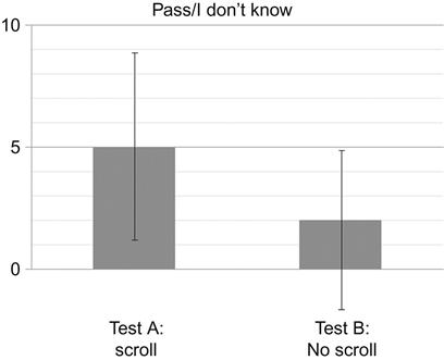
However, one could argue that as long as the test target(s) are visible before scrolling is necessary, it shouldn’t matter whether a large image is used or not. To test this argument, the author conducted a set of tests to see whether the likelihood of nonresponse answers increases when using a large image that requires scrolling. Two separate tests were performed using product pages from the web site of a toy distributor, each with a different brand/product highlighted on the page (Figure 2.6). In each test, participants were given the same standard instructions: “You are about to see a page from the web site of a product distributor. You will be asked one question about what you see.” After viewing the page for 5 s, the question was asked: “What is the specific brand highlighted on the page?” In both tests, the target brand information was visible in the view when the image was presented. However, in Test A, the full page was presented at 960×2914, such that vertical scrolling would be accommodated in the test window (even if the participant didn’t use it). In Test B, the page was cropped at the bottom, eliminating the possibility of scrolling.

(For the purposes of this experiment, it did not matter whether the participant identified the corporate parent company or the individual toy brand as the “specific brand” highlighted; remember, the focus of the test was on whether there was any difference in the number of nonresponses.)
The results (Figure 2.7) indicate that large images that require scrolling do in fact increase the likelihood of nonresponses. In Test A, 5 of 21 answers were nonresponses. Because these were unmoderated tests, there is no way of knowing whether there were outside influences or distractions in play, but it makes sense that at least some participants spent valuable time scrolling the page, at the expense of discerning or retaining any specific visual elements. In Test B, with the image fully visible and the possibility of scrolling is removed, only 2 of 21 answers were nonresponses. This is indicative of a group of participants able to devote full attention to the totality of the image without the temptation of scrolling.
Creating the Test Image
The lack of control inherent in unmoderated testing means that the researcher has to be thoughtful about how the image is presented within the test. Consideration must be given not only to the design that will be presented but also to the technologies (especially screen resolutions) used by the likely testers. If, for example, you are creating a crowdsourced test, and you know that more than half of the world’s computer users are using resolutions larger than 1024×768, providing a test image at those dimensions will be nonscrollable for a significant portion of your respondents. (Doing an Internet search on “browser display statistics” should provide a number of current resources to reference as you consider the technologies of who might be taking your tests.) Ultimately, however, it is the responsibility of the researcher to ensure that the image used in the test eliminates (or at least keeps to an absolute minimum) the effects of scrolling.
For in-person lab testing, it’s a simple matter of knowing what monitor will display the test image and customizing the image to fit the screen resolution. In the case of unmoderated tests, most of the online tool providers offer two ways of submitting the test image. Firstly, a web page URL can be entered into a box, and the tool will automatically create a screen capture of the entire page; however, this approach will not scale the page down to fit within a single view (even if it did, there would likely be a quality degradation that would make the image unsuitable for test purposes). Alternatively, a precreated image (usually in jpg, .png, or .gif format) can be uploaded to the tool. This option gives the researcher far greater control over scrolling, but usually requires that some resizing take place before uploading. Cropping and scaling are the two most common ways of resizing images; each should be considered carefully for the potentially negative impacts on how test images are presented and, thus, the likelihood of nonresponses:
• Cropping (as used in the toy brand experiment outlined in this section) will preserve the image detail necessary to provide a realistic view of the design but provides only a segment of the image at the cost of losing the context of the image as a whole.
• Scaling will retain the entirety of the image but could degrade the image detail so much that the image becomes too distracting to elicit meaningful feedback. (If one or the other does not suffice, combining the techniques may provide an acceptable balance of preserving context and presenting discernible detail.)
If resizing is required, be mindful of the instructions and test questions before deciding which method to use. For example, if the image is cropped, the instructions should specify to participants that only a portion of the entire page or design is being displayed. In this way, the participant is less likely to be confused when the image is presented, and more attention can be paid to what is visible, rather than wondering what is missing. The main concern is to make sure that the participant is put in the best position possible to meaningful feedback about the design.
2.6 Number of Questions
Best practices touted by the leading online survey tool providers (Johnson, 2012; McKee, 2013) consistently state that surveys are most effective when they are short, clear, and to the point. SurveyMonkey further reports that participants of their online surveys require no more than 5 min for the average participant to complete, and that this can be achieved with about 10 questions (Chudoba, 2011). Five-second tests would appear, then, to have a lot of built-in advantages as a means of getting a lot of usable data quickly. If that were indeed the case, we would not need to pay so much attention to minimizing nonresponses to test questions. To be sure, there are a number of interrelated factors that need to be examined (and will be in subsequent sections of this chapter), but the number of questions asked is indeed a factor that needs to be considered.
In keeping with their narrow research goals, the original test requirements of Perfetti et al. (see Chapter 1) contained two information requests:
The researchers understood that there’s a limit to the amount of information one can reasonably expect from a test participant after only 5 s of exposure to a design. However, this lesson appears to have been lost (or was never really learned) by those who use the online testing tools of today. Of the tests analyzed for this book, 80% contained three or more questions, with the largest percentage by far (37%) containing five questions, the maximum number usually provided by the UsabilityHub tool.
Which is not to say that a test consisting of five questions is inherently less effective than a test consisting of two questions—that would be an unfair generalization. The thing to remember is that this type of test puts into play specific memory dynamics that impact how many questions can or should be asked. Test participants don’t want to feel their time is being wasted, they don’t want to be confused, and they don’t want to roll their eyes in disbelief thinking, “Are you really asking me that?” Being brief, clear, and to the point means understanding how much information the participant is reasonably capable of providing, and asking the minimum number of questions required to extract that information.
The Ticking Clock
As noted in Chapter 1, the number of things a person can memorize and recall at any given time is a subject of ongoing debate. In one of the most frequently cited papers in psychological research, Miller (1956) put the “magic number” at seven, plus or minus two. (Obviously some people can memorize more, others less, but seven appeared to be where most of the “magic” happened.) Subsequent research has put the number as high as ten and as low as four. For our purposes, the exact number is irrelevant—the points that need to be made are (a) that the brain cannot retain very much new information in the short term and (b) that the cognitive tasks involved in completing a five-second test will have an eroding effect on what is memorized.
Recall what occurs during the “reverse Polaroid” effect: once an image is removed from view, the perceptual processes cease, putting a larger burden on the memory processes. In five-second tests, the acts of reading, understanding, and responding to questions place additional burden on the cognitive processes in play, which contribute further to memory fade. It follows that for each question asked in a test, the increased cognitive load reduces the amount of working memory that the participant has to comprehend and respond to those questions, lessening his/her ability to answer them with precision. This “ticking clock” is in place regardless of the test format; however, it is more pronounced in target identification and in mixed tests that contain target identification questions, so the number of questions in these formats should be kept as low as possible.
Can the Number of Questions in a Test Predict What Types of Answers Are Received?
Some degree of memory drop-off has to be expected for most participants as a test precondition. The question then is how much specificity can a researcher expect over the course of a test containing five questions (the usual maximum in a five-second test)? The author devised an experiment to determine whether the types of answers given could be predicted, using the front page of a tourism site for a major US city as the subject. Participants were instructed to view the page and be prepared to name five things they remembered about it (this is very much in line with the original intent of the testing model of Perfetti et al.). After viewing the page, participants were asked:
• Q1. “What is the first thing you remember about the design?”
• Q2. “What is the second thing you remember about the design?,” etc.
It was expected that the responses would get increasingly abstract with each question asked, and that at some point, the likelihood of getting a usable answer would be low.
The results (Figure 2.8) show that participants overwhelmingly responded to the first two “things remembered” questions with a specified or implied visual target—usually the name of the city or the slogan for Q1, followed by a reference to a specific photo or a call to action (“get a free booklet,” “book travel online,” etc.) for Q2. Starting at Q3, the precision of the responses begins to change rapidly, shifting more toward references to look and feel and other general site attributes (“the color scheme,” “web 1.0 looking,” “Lots of text I didn’t read,” etc.). By Q4, about half of all respondents did not provide an answer with any specificity, electing instead to either pass on the questions or explicitly state “nothing” or “I don’t remember.”
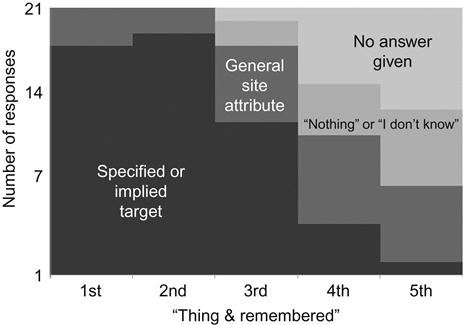
To further gauge the specific-to-general trend, the test was replicated using the tourism site of a different city. Results (Figure 2.9) showed trends that were highly similar to those seen in the first test.

In fact, the combined results of the two tests produced only one respondent who referenced a specific or implied target in all five responses.
It is notable that in both tests, controls were put in place to minimize memory fade—the instructions set the expectation up-front that recall was going to be required, and the wording of the questions was repetitive to minimize the cognitive processing needed to access that recall. Nonetheless, the results indicate that, even in an exercise as “abbreviated” as a five-second test, there is a point at which users will stop giving useful data.
Is There a “Magic Number” of Questions?
Five-second tests are by and large “self-limiting”—i.e., given the nature of the tests themselves, the practicality of asking only a few questions is fairly self-evident. Additionally, most online testing tools allow no more than five questions per test. So for anyone insisting on a magic number, it is almost certainly as few as possible, but “no more than five.”
In truth, the real answer depends—as it so often does in UX or design research—on how focused the test is, and what responses can be expected given the realities of working memory and the impact of memory fade on it. If the purpose of a test is focused on the memorability of general design attributes, up to five questions can be asked with reasonable confidence that (a) the test will be completed with usable answers and (b) the instances of nonanswers will be low. Likewise, if the test is focused on getting attitudinal data, up to five questions can be asked with reasonable confidence. Tests highly focused on the memorability of details or the identification of specific targets should be limited to only two or three questions per test. If more than three questions are used, factors such as question order will increase in importance.
There is an additional potential benefit to reducing the number of questions in a target identification test. Any remaining available response mechanisms can be used to get data unrelated to the targets, such as emotional response data (how the participant felt about the design) or demographic data, which can be very useful in crowdsourced tests or tests where the participant pool has not been screened against a persona or profile.
2.7 Order of Questions
If using fewer questions is usually better, it might be assumed that the order in which those questions are presented is not very important. On the contrary, research has shown that disregarding the order in which information is structured and presented in surveys, questionnaires, and interviews can have significant impact on the responses received (Brace, 2013), and five-second tests are not immune. Suboptimal question order was identified as a “violation” in 38% of the tests analyzed for this book, even in cases when the test contained only two questions.
It is beyond the scope of this book to summarize the large body of research regarding question ordering (e.g., McFarland, 1981; Bradburn and Mason, 1964; Boyle et al., 1993). Rather, researchers using the five-second test would do well to be reminded of a few of the cornerstone guidelines, how they apply to five-second tests, and how the unique characteristics of the method raise additional issues related to question order.
Priming and Habituation
Priming occurs when the answer to any question is influenced by a prior question (Brace, 2013). Mentioning something in one question can make people think of it while they answer a later question, when they might not have thought of it if it had not been previously mentioned. Section 2.4 noted the risk of this bias occurring with instructions that “tip off” the participant, but this can occur between questions as well, even when the test contains only two questions. Researchers need to be aware of the influence that prior questions can have in their five-second tests, write their tests accordingly, and interpret the responses with an eye on the possible effects.
Habituation (How Habituation Can Negatively Affect Your Survey Reponses, 2011) occurs when respondents give the same answer, or very similar answers, repeatedly in a series of questions, out of laziness, disinterest, or simply without really considering it. For example, consider a survey participant that is asked to assign a 1–10 rating to a very long list of options. (S)he may give more forthright and considerate answers early on, but put forth less effort as fatigue sets in and the dynamic of assigning a rating becomes repetitive. For the five-second tester, this might not appear to be a concern, as the inherently limited number of questions makes it less likely that fatigue or disinterest would be allowed to take hold. However, especially with crowdsourced tests, motivation for active engagement and thoughtful consideration as questions are answered could be very low. Researchers need to be aware of the potential impacts on responses and monitor the questions they ask, so that the participants remain engaged and involved in the test.
Memory Fade and Test Format
Interviews and surveys typically begin with the more general questions relating to the topic, before working through to the more specific or detailed subject matter (Brace, 2013). This practice establishes rapport and comfort level with the participant, and also grounds him/her in the dynamics of the method. However, participants in this type of research scenario are typically giving answers about a topic or issue about which they have prior knowledge, or about previous experience taking place more than a few minutes prior to the survey—in other words, experiences that leverage long-term memory in order to recall and respond.
As we’ve seen, five-second tests work almost entirely within the realm of short-term memory. Only a very limited number of details about the displayed design are likely to be retained in 5 s, and researchers would do well to consider how question order can help leverage that limited retention before it starts to fade. Consider this very simple two-question test example:
Q1. “What are one or two words you would use to describe the look and feel of the site?”
Q2. “What words or phrases do you remember from the web site?”
Since people tend to think more when asked the earlier questions in a series and thus give more accurate answers to them, it makes sense that the best chance of getting accurate answers to factual questions (Q2) would be achieved by asking it first in the sequence. (Reversing the order may also reduce the risk of receiving nonresponses and lessen the likelihood of priming effects). However, there is an argument for keeping the recall question as Q2: with the participant having used up some short-term memory resources providing a response for Q1, whatever words or phrases are remembered for Q2 are truly memorable.
Another consideration is the test format (see Rule #2). In a mixed test, the likelihood of nonresponses is reduced when target questions, which require more short-term memory resources, are grouped together and asked before attitudinal questions. Consider this mixed test example from the corpus of tests analyzed for this book:
Q1. “What was the name of the company who owns this site?”
Q2. “What was most prominent when you first viewed the page?”
Q3. “What did you like most about the design?”
Q4. “What was most off-putting about the design of this web site?”
Q5. “Can you name some of the products this company appears to sell?”
Leaving aside the potential priming effects Q1 may have on Q2, notice how the test starts with a target identification question, then proceeds with three perceptual or attitudinal/opinion questions before returning to a final target question. By asking for recall of the company’s products last, memory fade makes the likelihood of getting an “I don’t know” or “I can’t remember” response much greater. A more optimal order for reducing the number of nonanswers would be:
Q1. “What was the name of the company who owns this site?”
Q2. “Can you name some of the products this company appears to sell?”
Q3. “What was most prominent when you first viewed the page?”
Q4. “What did you like most about the design?”
Q5. “What was most off-putting about the design of this web site?”
Does Question Order Impact the Ability to Recall Specific Targets?
Even when a test does not use a mixed format, question order should be looked at carefully. As previously noted, target identification questions place the most demand on a participant’s short-term memory, and as a result, the impact on someone’s ability to recall details through even a small sequence of questions is acute. Memory fade takes over, even when the test sets the expectation up-front that target recall is going to be required.
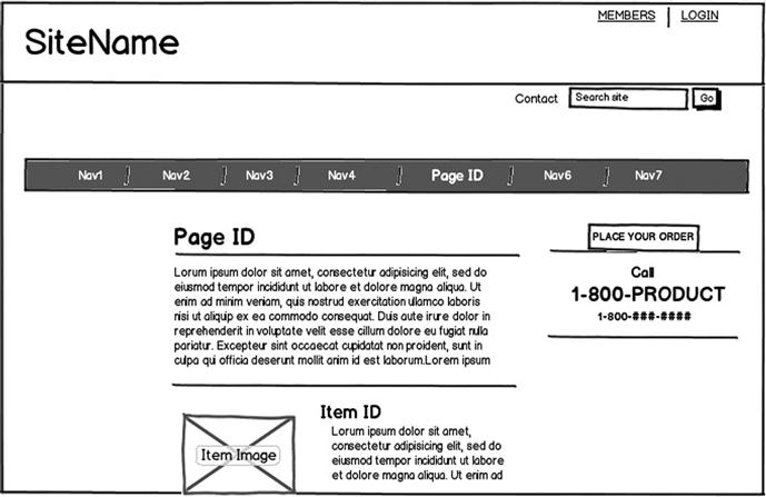
The author devised an experiment to test the concept that the ability to recall a specific visual element is impacted by the position of the recall question in the test. For this experiment, the same basic page layout (Figure 2.10) was modified for use in three different tests.
While the site name, product focus, color scheme, and text content were changed in each test instance, the design template remained the same. Because the test populations were crowdsourced using the UsabilityHub.com karma points feature, there were no controls in place for keeping a participant from taking part in both tests. For this reason, changing the visual details within a consistent design template was considered adequate for illustrating the point (admittedly, using the same design but changing the order would have been a more optimal research approach).
The instructions were designed to set an expectation up-front that the participant would be asked to remember specific visual targets in the design: “After viewing the webpage, you will be asked to identify specific things about it.” Finally, the same five questions were asked in each test:
1. “What is the name of the site?” (target=SiteName)
2. “What specific page of the overall site was shown?” (target=pageID)
3. “What is the item highlighted for sale on the page?” (target=itemID)
4. “How would someone place an order?” (target=call 1-800-product)
5. “Please briefly state the mission or purpose of the site.” (nontarget question)
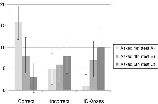
The research focus was on the question about the SiteName target—because of the larger text size and the prominent location in the upper left corner, this visual element was assumed to be the most easily perceived and remembered within a five-second span. The position of the site name question in the sequence was expected to influence the number of correct responses per test:
• In Test A, it was asked as the first question in the sequence (as shown above). The expectation was that the number of correct responses would be high, and that the number of nonresponses would be low.
• In Test B, the order of the four target questions was reversed, with the “SiteName” question moving to fourth in the sequence. The expectation was that memory fade would cause the number of correct responses to decrease, with the number of nonresponses increasing.
• In Test C, the reversed order of the questions was retained, but the nontarget “mission/purpose” question was moved to third in the sequence. The expectation was that the insertion of a “distracter” question in the middle of the test would cause the number of correct responses to the “SiteName” question to be even lower than in Test B.
The expectations were validated by the results (Figure 2.11). When recall of the site name was asked as the first question (Test A), 16 of 22 respondents correctly identified the site name. When asked as the fourth question (Test B), it went down to 8 of 22. The addition of the distractor question (Test C) lowered the number to 3 of 22. At the same time, the instances of “pass” and “I don’t know/remember” went up just as steadily: when the site name question was asked first (Test A), only one respondent provided a nonresponse; when asked as the last question (Test C), 10 did so.
It is notable that upon reviewing the data for the “1-800-product” target question, the ordering effect was confirmed in the numbers of both correct responses and nonresponses (Figure 2.12). When asked as the first question (Test B), 10 of 21 respondents correctly referenced the 1-800 number information, with 5 passing or saying “I don’t know.” When asked as the second question (in Test C), only 5 answered correctly, with 10 providing a nonresponse. When asked as the fourth question (in Test A), the results were 4 of 22 correct and 12 of 22 nonresponses.

These results underscore the caution the researcher must use when reporting test results. For example, executive managers who value brand retention above all else would be encouraged by the results of Test A (16 of 22 correctly identified the site name) but discouraged by the results of Test C (3 of 21). Likewise, sales managers who want to be sure the means of placing an order is prominent and memorable would likely panic after hearing the results of Test A (4 of 22 correct) but might be optimistic with the results of Test B (10 of 21 correct). More than anything, these results indicate that question order impacts the nature of the responses given, which could lead to false conclusions in how the test data is interpreted.
2.8 Writing the Questions
Murphy’s Law states that “anything that can go wrong will go wrong.” A common extension of this principle into the fields of writing, communication, and instructional design holds that “anything that can be misunderstood will be misunderstood.” The way a question is worded will impact the meaning and intent of the question to the respondent and determine whether all respondents interpret the question the same way. Even subtle changes in question wording can affect the answers that people provide.
As with question order, there is a multitude of research and literature on the specifics of writing questions correctly, and it is beyond the scope of this book to delve into that research in any detail. However, before elaborating on some of the wording conditions commonly seen in five-second tests, a few key general points should be reiterated:
• Respondents who don’t understand the questions will likely become alienated from the test and make little to no effort to respond accurately (see Section 2.3).
• The guiding principles for writing questions should always be relevance, clarity, precision, and a laser-like focus on what is intended to be learned (see Section 2.4).
• Use clear, simple language that respects the limitations of the method and its execution, is easily and correctly understood by the reader, and serves as a valid measure of what the researcher wants to learn (Redish, 2012).
• Design the questions to be good measures. Good questions maximize the relationship between the answers recorded and what the researcher is trying to measure (Fowler, 2002).
• Continuously pilot test the questions. Every question should be fine-tuned to reduce the likelihood of misunderstandings and misleading data (see Section 2.4).
Primed to Repeat
A surprisingly frequent mistake made in writing questions for five-second tests is priming the participant to simply repeat information given in the instructions. Section 2.4 discussed the importance of “proper” instructions, and that what makes instructions “proper” in a five-second test depends largely on (a) the test format and (b) the nature of questions that the participant will be asked to answer. Similarly, the researcher must ensure that the wording of the questions—especially the first one—considers the information that the participant has already been given in the instructions. Asking a question that encourages a simple repetition of previously stated information risks being a wasted effort, as in the following examples from actual tests:
These questions are not bad questions in and of themselves. Their presence suggests that each researcher seeks to confirm whether the product or service being offered is apparent and understood—a key objective of the five-second test. However, when the instructions contain a context statement (as on these examples), questions like these act as perfect setups for a simple restatement of that context:
By not considering the wording of the question relative to the instructions, the researcher has squandered the point at which the participant’s short-term memory is sharpest, the recall of details is most vivid, and the likelihood of getting useful data is highest.
There are two remedies for this condition, both of which require close attention to how the instructions and the questions work together. First, leave the wording of the questions alone but rewrite the instructions so that they are context-free. Using the first example, if the wording of the instructions is changed to some variation of “Remember as much as you can about the webpage you are about to see,” responses to the question “What in particular is this site about?” will tell you whether or not the product or service is apparent. Unfortunately, despite the inclusion of the phrase in particular, the risk of a very general answer (e.g., “The site is about weddings”) remains relatively high.
To get a better result, leave the wording of the instructions alone, but the rewrite the questions—including a reiteration of the context—so that they encourage the desired specificity:
By repeating the context within the question, you’ve beaten participants to the punch, so to speak—they should understand implicitly that a more specific answer is desired, and that recall of a specific detail will be required in order to deliver it.
Begging the Yes/No Answer
Previous sections of this book have noted the dangers of the yes/no question in five-second tests. This is an example of a dichotomous question, in which there can be only one of two answers (true/false is another example). As we’ve seen, they can be very tempting to use in five-second tests. They are popular with researchers because they are simple in concept, easy to ask, and lend themselves to easy coding and analysis of responses. Participants appreciate them because they are easy to understand and respond to with no more than three letters involved in submitting an answer, more short-term memory resources remain available for recall over a series of questions.
However, in five-second tests, they must be used with caution. Yes/no questions often force participants to choose between options that may not be that simple and may lead to participants deciding on an option that doesn’t truly reflect their feelings. This is typically not a problem in attitudinal tests, where such answers act merely as validations of a respondent’s opinion—either “yes, this statement does align with my opinion of the design” or “no, it does not.” Conversely, for factual questions about what the participant saw in a test, yes/no data can be notoriously unreliable. Consider these examples from actual tests:
• “Did you notice the two buttons at the bottom of the page?”
• “Did you see where to buy the product?”
• “Did you find the information about downloading the mobile app?”
A diligent researcher would not be satisfied with the yes/no answers that these questions encourage. A more effective approach would be to reword the questions so that the participant must provide information that validates whether the answer is yes or no. This can be done by simply taking the journalistic approach of asking who, what, when, where, why, and how:
Specific vs. General
A rule of thumb given by several of the online tool providers is: the more specific the questions are, the better. When considering how test questions are worded, a clear distinction should be made between a question that is specific and a question that is unambiguous. All questions should strive to have clear and accurate wording (i.e., be unambiguous), but specificity should be determined by knowing exactly what the researcher needs to learn (Rule #1) and what wording approach will best attain the desired result. In some cases, it’s more useful to word questions more generally.
Consider this example, offered by one tool provider as a “simple, clear, specific” test question: “Did you see the free shipping offer?” (This question, of course, begs the yes/no answer, but we’ll leave that aside for the time being.) The wording itself is indeed simple, clear, and unambiguous. The intent of the research, however, is less clear. One possibility is that the researcher wants to know merely if the design of the offer stands out visually (i.e., is noticeable) on the page; another is that (s)he wants to know whether a specific aspect of the offer (e.g., that shipping is free) is obvious. In each case, using the specific wording approach recommended by the tool will yield yes/no data that, as we’ve already seen, should be viewed with skepticism. On the other hand, wording the question more generally could provide data that tells the “true” story:
• In the case of design visibility, an alternate strategy is to ask the more general, “Name something that stands out visually on the page.” The number of responses that mention the shipping offer will indicate whether the offer stands out visually.
• In the case of detail memorability, a general wording approach might ask, “What do you remember about the page specific to shipping?” Responses will help indicate whether the “free” aspect is remembered.
Vanity Checks
Designers make conscious decisions about what they include in a design—they want to set moods and expectations, emphasize particular elements, etc. Whether or not a design meets those goals is an opinion based on perception. Borrowing from the old saying, qualities like these are very much in the eye of the beholder. By including “vanity check” questions in a test, the researcher is seeking validation that the design will be perceived favorably by those who view it.
A good number of five-second test questions are devoted to validating the perceptual decisions made by designers, but of course “can you validate this decision?” cannot be asked in an actual test. There are other ways to measure first impression, reaction to look and feel, perceived clarity, etc. The good news is that there’s generally a low risk of nonresponse answers to vanity check questions—giving an opinion on how a design is perceived is usually nonthreatening for the participant and easy to deliver. The challenge is to optimize wording strategies that result in more precise and usable data. Consider the following validation questions common in five-second tests and the strategy suggestions for getting the best results for each:
“What is your initial reaction to this page?” or “What was your first impression of the design?” This is a very natural “kick-off” question for a five-second test, regardless of format. Designers want to know what kinds of reactions their designs elicit, and what kinds of judgments are being made as a result (Chapter 3 will go into much greater detail about testing for emotional response). It is definitely a question worth asking for finished or near-finished designs, and asking it in these ways will usually result in useful responses. However, because the question is worded broadly, the responses may be inconsistent in nature and more time-consuming to categorize efficiently. To illustrate, the first impression feedback for the home page of an educational financing web site (Figure 2.13) was an almost equal mix of:
• Single-term descriptors (“energetic,” “cluttered”)
• Judgment statements (“It’s bad,” “no clear message”)
• Factual comments (“has a lot of font-based elements,” “multiple colored words”)
• Explanatory remarks (“It takes time to find where to focus,” “I had trouble understanding where I should look first”)

To get consistency in “first impression” data, word the question to prompt the desired data format. If you want to end up with a list of descriptors, ask the question: “What adjective immediately came to mind when the design appeared?” If you want a set of explanatory remarks for feedback, this way: “Explain your first thought when you first saw the page.”
“Does the site look/seem professional?” There are two problems with using this question as written: first, of course, is the begging of the yes/no answer, which will result in relatively weak, meaningless data (unless there’s a landslide either way). The second problem lies in the use of the word “professional,” when more than likely what the researcher really wants to know is whether the design is perceived as being of high quality (attractive, engaging, and/or appropriate for the product, service, or company it represents).
This question would benefit from a rewrite that includes two corrective actions: the use of adjectives more specific to the quality that needs to be measured and employing a scale and numerical values for the response data: “Rate the attractiveness of the design on a scale from 1 to 10, where 10=extremely attractive and 1=extremely unattractive.” In fact, you could use this approach to devote an entire test to design “quality,” with each question focused on a specific aspect (however, you would need to guard closely against habituation).
“Is the product/service offering clear?” or “Is it clear what this business is about?” This question is a commonly used variation on the “professional look” question. Here again, confirming the characteristic is reduced to a simple yes/no choice, which provides no real insight as to whether the product or service is in fact readily apparent. Alternatively, using the wording “What is the product or service offered?” provides a way of measuring site intent with more precision and accuracy. A high percentage of correct responses will indicate that the product or service is clear; a high percentage of incorrect responses will indicate that it is not.
“Describe the design in a couple of words” or “Give me a few words that describe the page.” Despite their initially benign appearance, these questions represent possible examples of question ambiguity. When asking questions like this, researchers are typically trying to compile a list of adjectives or descriptors that confirm a positive overall perception (“professional,” “contemporary,” “modern”) or indicate a problematic one (“dull,” “robotic,” “boring”). Used “as is,” these questions will produce a good number of descriptors; however, many respondents will instead supply short phrases that deviate from the desired data format and are not particularly useful (e.g., “it’s OK,” “looks fine,” “nothing special,” “it stinks”). Rewriting the question to read “Which two adjectives best describe the web site?” does more to ground the participant in exactly the type of response that the researcher wants. (Chapter 3 will outline an experiment in which changing the wording in this way more than doubled the number of test responses that provided two descriptors.)
Two Questions in One
This is a common condition in five-second tests. Standard survey design research preaches the importance of not asking compound questions (Kuniavsky, 2010), or questions that more than ask one question at a time. Sometimes this takes the form of “double-barrel” questions, which combine separate concepts in a single inquiry (e.g., “How much confidence do you have in your senator’s ability to influence domestic and foreign policy affairs?”). Other times, it takes the form of consecutive questions, the second usually serving as a means of elaborating on the first:
• “What did you like? What changes would you make?”
• “Would you trust this site with your credit card? Why or why not?”
The same “one question at a time” rule applies in five-second tests, regardless of whether they are administered in person or using an online tool. Combining questions in this way can lead to responses that are difficult to interpret. They are especially important in the online scenario, in which the text-entry response mechanisms encourage brevity in the writing of answers, then enforce it by setting character limits.
2.9 Asking About Prominence
At first glance, asking a test participant to identify the most prominent element in a design seems reasonable. The question lends itself perfectly to the “view and react” mechanics of a five-second test—indeed, the skeptic might argue that identifying the most prominent element on a page is one of the few findings that the five-second test can deliver with any reliability. (That’s probably why “understanding what customers remember most about your site” is touted as a key advantage of the method, and why the question is frequently included in online tools as a default or suggested question.)
The key to this question’s viability, however, lies in whether or not asking it makes sense within the context of the design being tested. In a proper design context, asking the “most prominent” question can help confirm whether a page’s purpose is obvious or can help designers understand trends in viewer perception in the presence of competing elements. In an improper design context, asking it risks doing little more than taking up space that could be used to ask something that would deliver more useful data.
Before proceeding further on this topic, an important distinction must be made. While they may imply the same general concept, asking “What is the most prominent element on the page?” is not the same as asking “What did you notice first on the page?” What one considers to be the most prominent item on a page can be changed based on reflection and further consideration of the design as a whole. What one notices first is not subject to further consideration—if answered truthfully, what is noticed first may not be what is determined to be the most prominent. When asking a participant the “most prominent” question, understand that the answer may not necessarily be what was noticed first.
The Case of Visual Dominance
Unless a design is in its very early stages of elaboration, it’s likely that a good deal of thought has been given to which element is intended to be the most prominent. Hopefully, the decision has been made with the page or site’s business goals in mind, e.g., if a design’s primary goal is to enhance brand recognition, it should ensure that the brand logo or product name is the most prominent visual element. In such cases, asking the “most prominent” question most likely serves to confirm an explicit design decision, rather than to uncover something that is not already known or suspected. So, when visual dominance of a specific element is taken to the extreme, it becomes, in effect, a throwaway question.
Consider the example shown in Figure 2.14. The hi-res photo of the sunset has everything going for it in terms of visual prominence:
• it takes up a very large portion of the available space;
• it is positioned advantageously near the top;
• it stands in stark contrast to the subdued “light” font and the effective use of gray and white space on the rest of the page;
• as if size and position weren’t enough to ensure prominence, the visual radiance of the setting sun acts as a visual beacon for the viewer, all but commanding the viewer to look at it.

To assess the photo’s prominence in this page design, it was tested in two separate five-second tests:
• When the “most prominent” question was asked as the first and only question in the test, 29 of 37 responses cited the photo.
• When it was asked as the third question in a sequence (testing the effects of memory fade), 31 of 37 responses cited the photo.
The results (Figure 2.15) indicate that, even with the impact on short-term memory caused by the presence of additional questions, the photo’s visual dominance all but ensures that it is the most prominent element on the page.
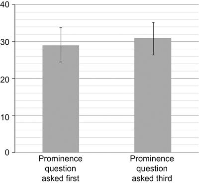
So what useful data has the designer gained by asking the question within this particular context? One could argue (rather convincingly), not very much. With visual dominance making the answer this predictable, the design goals become irrelevant. A quick distribution of the design around the office, or to friends and family, would likely have provided the same results, so asking the question in a formal test with actual or representative customers amounts to a waste of time and effort.
The Case of Visual Distribution
On the other hand, there’s the case of a design in which the elements cause visual attention to be more distributed (Figure 2.16):
Here, a number of potential candidates are competing for prominence within the space:
• Two hi-res photos of an attractive and smiling person have specific advantages working in their favor. The smaller photo has the advantage of position in the upper left corner (numerous eyetracking studies confirm the “F-pattern” effect, in which viewers typically scan from left to right, starting in the upper left corner). The larger photo benefits from size, the visual inference of motion toward the center of the page, and the presence of secondary elements (e.g., the curling lines and green circles icons “emanating” from them).
• The product name “BabbaBox” also benefits from positioning on the left side of the page, as well as from the visual contrast against the light background and from the use of a very large font size.
• Perhaps less visually jarring (but still noteworthy), the orange box at the top provides a noticeable color contrast against the greens and browns used elsewhere on the page. It also contains “call to action” language that hints at a potential benefit for the viewer (“Win a free annual membership”).
The effects of this visual competition are apparent when this design is tested using the same approach used in the example of visual dominance (Figure 2.17):
• In the single question test, 27 of 38 responses cited the “boxes” or “girl with the boxes” as the most prominent element. (The “BabbaBox” text was the most frequently cited of the other candidates, but all received at least 3–4 responses.)
• In the three-question test, 22 of 38 responses cited the larger photo—again, with a varied distribution among the other elements.

If the purpose of the page is to reinforce the brand or product recognition via the woman and her green boxes, the results provide confirmation that the design choices were good ones. If the purpose is to get people to sign up with the site via the free membership contest, the results suggest that the design should be reconsidered. The overall point is that when prominence is less easily predicted, asking the question has more validity and makes the test responses more meaningful.
Why the Five-Second Test Is Appropriate for Measuring Prominence
Chapter 1 explained how the five-second test is an ideal method for measuring visual perception in design. As the two examples used in this section have shown, visual prominence is the result of a number of perceptual factors—space, proximity, color, size, contrast, similarity, etc.—working together to establish the clear recognition of design elements and to facilitate focus, attention, and distinction. Five seconds is adequate for focusing on perception and limiting the introduction of other cognitive processes, which could alter what is perceived as prominent.
To measure how prominence might be impacted by these other processes, each of the previous designs were tested in an unmoderated “click test,” in which participants were asked simply to view the image and click on what they considered to be the most prominent element, with no time restrictions. In both cases, the results were not nearly as predictable as they were in the five-second tests (Figures 2.18 and 2.19).


A closer look at the test data reveals that in each case, participants took considerably longer than 5 s to click on an element—an average of 9 s for the “boxes” design, and 16 s for the “sunset” design. Of course, given the unmoderated nature of the tests, there was no opportunity to determine whether any uncontrolled factors (e.g., computer performance or connectivity issues) accounted for the longer times. However, it’s reasonable to assume that, with no time restriction and a reduced reliance on sensory input, participants felt free to spend time visually “exploring” the entire design and giving deliberate thought to the different elements before responding. Results using this method, therefore, would appear to be driven more by consideration than by sensory reaction, which runs counter to the true nature of prominence. (In fairness, the longer visual consideration occurring in a click test is more representative of what would occur in real life, so click test data might be a useful supplement to results received from a five-second test.)
2.10 Open-Ended Feedback
In most types of UX and design research, open-ended feedback is very often the goose that lays the golden egg. Getting participants to articulate their opinions in their own words allows them to reveal their likes and dislikes on their unique personal terms, within their own cognitive frameworks and often opens the door to new discoveries and considerations not considered previously. It’s also a researcher’s natural instinct to ask for it: having put a participant through a series of specific questions, asking for qualitative thoughts and opinions promises to add more color and “life” to the more structured responses.
However, harnessing the value of such feedback is difficult when there is no mechanism in place for maintaining control. In moderated sessions, the facilitator is there to guide the response and discussion, focus on the specific elements and contexts noted, and get a user back on track if the response wanders into unrelated areas. In unmoderated sessions, where the participant is free to provide only the level of detail that (s)he feels like providing, it’s far more challenging to get a useful response.
The restrictive nature of unmoderated five-second testing tools compounds these difficulties—e.g., the uncustomizable response fields provided by the online testing tools. It is generally acknowledged that the size of a text-entry box will affect the amount of response that is given. The single line text-entry boxes provided by the online tool providers subliminally encourage brevity in the writing of answers, then enforce it by setting character limits. For the more focused questions we’ve seen so far, this is mostly not a problem, but given the more elaborative nature of the open-ended response, it makes the likelihood of getting useful data that much more challenging.
Still, researchers continue to ask for it. The corpus analyzed for this book show that roughly 9% of all tests ask for open-ended feedback in some way—usually as the last question in a four to five question sequence. As we’ll see further in this section, the return on the effort usually isn’t very high.
Roads to (Practically) Nowhere
Researchers generally use two approaches to asking for open-ended feedback in five-second tests—each of which, unfortunately, discourages elaborative thinking and provides an easy “path of least resistance” for moving closer to the end of a test.
First, there’s the “anything you care to tell me?” strategy, as in:
This type of question has the good intention of giving the participant free rein to provide any information—good, bad, or indifferent—that (s)he thinks the researcher should know and promises to reveal insights that the researcher does not anticipate. However, when the question is posed this way, most respondents tend to gravitate toward indifference. Experimentation with this approach shows that most respondents will “pass,” “skip,” answer in some form of “no,” or simply provide a restatement of an earlier qualitative answer (e.g., “see my earlier comments”).
The second strategy is the request for change or improvement recommendations, which can be posed in several ways. The most common approaches are:
Each of these questions suffer from one of the deficiencies discussed in Section 2.8, i.e., wording questions that beg the “yes” or “no” answer. It’s worth stating again: when a question is worded in this way, it discourages the participant from giving the matter any further thought. As a researcher, the questions you ask should be focused on challenging the participant to provide something potentially useful, even if it ends up being a restatement of a previous comment. Anything that resonates with the participant enough that (s)he will bring it up again is likely to have some value, but you have to ask for it correctly to increase the chances of getting it.
• “What change(s) would you make to the layout or design of this page?”
• “What if anything would you change to improve the design?”
This approach is only nominally better than the first. In each case, the easy pathway to the “no” answer has been merely replaced by an easy pathway to the “nothing” answer. The second example is especially egregious in this regard—inclusion of the phrase “if anything” gives the respondent an easy “out” for moving on to something else.
Finally, there’s the more authoritative:
Researchers who use this approach appear to understand the limitations facing them. The unmoderated nature of the tests means that there is no control in place for guiding the respondent toward a useful answer, and the single line text-entry response box provided by online test tools encourages brief responses. By asking the respondent to highlight a single aspect of the design, rather than the entirety of it, the researcher has given some incentive for providing a thoughtful response (albeit at the expense of more elaborative descriptions that open-ended feedback typically provide). In simpler terms, getting something is better than getting nothing.
Seldom Worth the Effort of Asking
Responses to open-ended feedback questions in a five-second test—regardless of the wording or the position of the question in the order—can be expected to be one of the following types.
Brief suggestions about a specific element existing on—or missing from—the page. For example:
• “Maybe move icons up just a little further above the fold.”
• “Include a one sentence statement that instantly defines what the site does.”
These are the types of responses you’re hoping for. Each focuses on a specific aspect of the design and speaks to what the respondent would consider to be an improvement. While each lacks the “why?” factor that is so important in open-ended feedback, they provide potentially important indications of areas that can be included in other forms of analysis and/or testing. Unfortunately, of the tests analyzed for this book, only about 20% of responses provide even this minimal level of detail. (Of course, there’s nothing stopping you from asking “why is that?” if you have a subsequent question available in your test.)
General positive or negative comments about the overall design. Such responses can include:
These types of responses are far more representative of what you can expect in a five-second test. Their usefulness of course depends on what the researcher hopes to uncover: e.g., if there is suspicion that a design is too “plain,” then several responses along the lines of “too much white” might be considered a research win. Generally speaking, however, they tend to be weak summative statements that either repeat a previously stated opinion or are indicative of a desire on the part of the participant to “just move along.”
“Pass,” or an explicit statement that “5 s is not enough time to answer this question.” Here we get to the crux of the problem when asking for open-ended feedback in a five-second test. Regardless of how the question is worded, or how well positioned it is within the test structure, nothing can change the fact that the participant is given only five seconds’ worth of exposure to the design (unless the testing mechanism allows for the customization of longer exposure times—but then it’s no longer a five-second test, is it?).
If the design being tested is basic enough—say a single icon or logo, or a simple screen on a smart phone display—5 s may be enough time for a participant to retain enough detail to form an opinion and consider a possible alternative. Anything larger or more visually complex than that, and you’re asking for something beyond the scope of what can be reasonably expected. It’s simply not a fair question to ask of participants, and a good number of them will let you know it by providing nonresponses like this.
Your Best Bet
When considering the inclusion of an open-ended feedback question, remember Rule #1: don’t use a five-second test if a different method is more appropriate. Getting good qualitative data requires having the proper mechanisms in place for participants to provide it—at the most basic level, that means giving them enough time to thoughtfully consider all elements of the design, then facilitating as elaborative a response as possible. Unmoderated five-second tests fail on both of these points.
However, if you are intent on asking the question, the best chances for getting useful feedback lie in the lessons of Rules #2 and 4. First, decide up-front that open-ended feedback is to be focus of the test and write the instructions accordingly: “As you view the following image, think about what you would change to make it better.” Then simply ask the question: “What would you change about this design to make it better?” and expect a reference to one element or design aspect in the response. (If desired, you can use the remaining questions to ask for general comments/opinions on design look and feel, or to gather limited demographic data.) When approached in this manner, the likelihood of getting useful responses improves substantially.