Designing the User Experience
This chapter introduces you to controls available for Windows Store apps development and discusses when to use them to provide a better User Experience (UX). But before we start talking about controls, we want to discuss some concepts that you need to keep in mind while you develop your app. We will introduce you to some principles to remember when you develop an app for Touch UX.
Windows Store apps are designed to be “touched” by the user on a tablet, so you should design your app considering postures that users will assume when working with your application. If you look at people using tablets, you’ll see that while the tablet is in the landscape position, the hands are near the bottom-left and -right corners; in portrait position, the hands are near the center. You should include controls near the users’ hands. For the same reason, you should put content to be read (when possible) farther from their hands.
User Experience (UX) is a mandatory concept in Windows Store apps. If your application is designed to allow interaction using hands, remember that fingers aren’t precise like the mouse. When you add a control to the user interface (UI), remember to create it with a dimension that allows easy control for the user. Of course, it’s not easy to choose the correct dimensions, but assuming a medium finger with a width about 11 millimeters, consider the following:
- Fundamental actions must be provided by controls with good dimensions, so consider using a 50-by-50 pixel area (minimum) because an incorrect interaction with your app can disappoint users.
- Incorrect touch situations can be resolved using controls with a minimum size of 40 x 40 pixels.
- If you don’t have enough space on your UI, you can resolve an incorrect touch situation with only one gesture by using 30 x 30 pixels as the minimum size.
In any case, remember that if two controls that can be touched are close, you must set a minimum of 30 pixels’ padding between them to avoid accidental interaction.
Now that you know some basics of touch interaction, we can start talking about controls and why you should choose one control instead of another.
This section discusses the rich control library available for Windows 8. We first explore the set of common controls that are part of UI design from early versions of Windows and then we’ll discuss the new controls introduced to help you to get the best from Windows 8, providing better UX.
The base class of all Windows Store apps controls is UIElement, which inherits from DependencyObject (which, like every class in the .NET Framework, inherits from the Object class). Figure 3-1 shows a diagram of base classes that are used by the framework to design the UI. All start from the DependencyObject class to create a class that participates in the dependency property system, which means that a control can take part in the binding mechanism. The UIElement class exposes a set of methods and events that help you manage a lot of standard behaviors such as clicking or double-clicking.

Figure 3-1. UI base classes inheritance diagram
The direct descendant of the UIElement class is FrameworkElement, which extends the functionalities of base classes and adds support to the Loaded/Unloaded event and a lot of functionality relative to binding.
Another thing to consider in your application development using XAML is the concept introduced by ContentControl. When a control inherits from this class, it can define (single element) content. For example, Button inherits (indirectly) from this class and can define content such as text, an image, or another control.
This is a summary of base classes that you must know in order to understand how you can customize behaviors, styles, and control templates.
The controls library for Windows Store apps contains a lot of elements that aren’t unknown to Silverlight, Windows Presentation Foundation (WPF), or more generally to Windows developers. These elements include Button, ComboBox, CheckBox, RadioButton, TextBox, TextBlock, Image, Hyperlink, HyperlinkButton, PasswordBox, Slider, and shapes.
Button is the core of user interaction. The primary purpose of this control is to reply to a click with an event, starting an elaboration. In Windows Store apps, Button appears as shown in Figure 3-2, and you can define a button that contains simply a text or other framework elements such as an image (see Figure 3-3).

Figure 3-2. Example of a button

Figure 3-3. Button with an image
In order to be compliant with the Microsoft guidelines about the use of buttons, you must avoid using them for navigation (with the exception of buttons such as Back and Next). Instead, you should use buttons for actions such as form submission (see Figures 3-4 and 3-5) or resetting (see Figure 3-6), and for starting an immediate action such as a save operation.

Figure 3-4. Standard submit button

Figure 3-5. Submit button with specific text

Figure 3-6. Reset button
Figure 3-3 shows a button with an image inside. This button offers information about something in the app, but when you define a custom layout for a button, remember that what you use as the content of your button will be critical for users to understand. You should use a self-explanatory text without too much information, which can be confusing. For the same reason, you shouldn’t edit the content of a Submit button if not required for localization in order to provide a consistent UX between various apps.
CheckBox
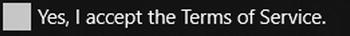
CheckBox (see Figure 3-7) gives a choice of checking or unchecking itself (some check boxes can be in indeterminate states). CheckBox is useful when you want to give not-mutually-exclusive choices to the end user; when the user must answer a question with a yes or no response (e.g., the Terms of Service agreement shown in Figure 3-8); or for a mixed choice with check boxes grouped under another check box that, if checked, selects all or none of the grouped check boxes.

Figure 3-7. CheckBox examples
Figure 3-8. Yes or no response check box
Here are some best practices for CheckBox and its use:
- ToggleSwitch is another control with a behavior similar to CheckBox (discussed in the “New Controls” section). But according to the Windows Store apps guidelines, you must use CheckBox if a manipulation represents a change of status; if your selection represents an action, you must use ToggleSwitch. So if the choice will be part of a submitted form, use CheckBox; if the selection causes an immediate submit, use ToggleSwitch.
- If you want to choose the best control for disabling a feature or to switch something on/off in your app, use ToggleSwitch instead of CheckBox.
- If your purpose is to allow users to check more than one option, use CheckBox because a set of check boxes provides the mental scheme for this goal.
TextBox
A lot of applications work on text, and TextBox (shown in Figure 3-9) is a control that allows users to input text in a single or multiline way. Because you’ll often use a TextBox in your application, you must remember a lot of rules to use it. One of these rules concerns the format of the text. If you need to have text that requires a particular format (e.g., a product key), you should use TextBox to re-create the specific format and not apply a format to the text inside the text box.
Figure 3-9. An example of TextBox
Text input appears to be an easy concept, but you must follow some rules in order to provide a good UX to the user. For example, if the user can input the path of a file directly in a text box, you must provide a button that allows the user to select a correct value. Another interesting example is a complex text format in which the text must be on multiple lines and must be formatted and enriched with styles. In this case, you must use RichEditBox (a Rich text box for HTML) instead.
Another way to use a TextBox is for messaging applications. In this case, you probably will use formatted text. If your application manages short messages with limited length, you must provide a way for users to see how many characters they can still write (see Figure 3-10).

Figure 3-10. Example of limited-length TextBox
TextBox exposes a lot of properties, and some of them must be learned to work better with TextBox (see Table 3-1).
Table 3-1. Main Properties of TextBox
HyperlinkButton
HyperlinkButton helps you create a button with a URI to navigate. Depending on the format of the URI you use, Windows will start the relative software. If you write an URI that starts with http, the default browser will be used; if your URI starts with mailto, Windows will ask users if they want to start Mail software.
HyperlinkButton (shown in Figure 3-11) should be used only for navigation purposes, inside or outside of your application. When you use this control, remember to set a tooltip on the link for users to see, even when they touch the link. You should also put additional information in the tooltip, keeping the text of the link short enough

Figure 3-11. An example of HyperlinkButton with a tooltip
RadioButton is another control that helps with user choice, but unlike CheckBox, RadioButton options (shown in Figure 3-12) are mutually exclusive and grouped. Its name is due to the way the options work, just like presets on a radio, which can be selected only one at time.

Figure 3-12. An example of RadioButton
Because this control has been used since the dawn of the graphical interface, we believe it’s appropriate to describe some best practices for its use. Sometimes we have found applications in which RadioButton was used to collect a choice between two elements (for example, I agree/I don’t agree, Yes/No, True/False). This kind of choice is better expressed with a single CheckBox. You should use a RadioButton when you want to emphasize selectable options, forcing the user to pay attention to the choice. If you don’t need to draw attention to various options, you can use a ComboBox control that helps save space on the UI.
Remember to create a RadioButton that encloses a label inside it, allowing the user to select the element by touching the bullet and by touching the label. When you create two or more RadioButton groups, you should separate them by using a label that indicates their purpose because if you put a group near another group without a logical sense, the user might find it difficult to make the correct choice.
ToggleSwitch
Starting from the first version of Windows Phone, Microsoft has a new control named ToggleSwitch. ToggleSwitch, just like CheckBox, helps you collect user choices; but according to Metro design guidelines, you must use ToggleSwitch when a choice triggers an immediate change. For example, Figure 3-13 shows a ToggleSwitch that allows the user to enable or disable notification from the application. When the user switches between On and Off, the application activates or deactivates the notification system, giving the right feedback to users (they know that when they touch the ToggleSwitch, the relative change becomes effective immediately).

Figure 3-13. An example of ToggleSwitch
On and Off are the default labels for this control, but if you need to use a specific label you can customize it (e.g., Show/Hide), giving the user the right information in context. Of course, if there isn’t a real need to change these labels, consider leaving standard values. And for situations that require a change to the label, make sure that the text does not exceed four characters or else you will have space problems.
ToggleSwitch inherits a lot of properties from the Control class and extends it with a property (see the descriptions in Table 3-2).
Table 3-2. Most Important ToggleSwitch Properties
XAML Property |
HTML |
Description |
|---|---|---|
Header |
title |
A single UIElement that acts as a header of the control (in Figure 3-13, it is the word Notifications). |
HeaderTemplate |
N/A |
With this template, you can bind a DataTemplate as header. |
OnContent |
labelOn |
With this property, you can define a single UIElement that acts as content when the control is in an on state. |
OffContent |
labelOff |
With this property, you can define a single UIElement that acts as content when the control is in an off state. |
OnContentTemplate |
N/A |
With these two templates, you can define how to bind data when the control is in on or off states. |
ToggleButton is a button that can switch between two states (Checked/Unchecked). ToggleButton is the base class of CheckBox and RadioButton (see the class diagram in Figure 3-14). If you need to create a custom control that toggles between checked and unchecked states, use ToggleButton as the base class.

Figure 3-14. ToggleButton class diagram
The ToggleButton control (see Figure 3-15) exposes the IsChecked property that stores the information about the state of the control and the IsThreeState property that, if enabled, allows the control to assume the indeterminate state.

Figure 3-15. How ToggleButton displays
 Note The ToggleButton control is not available for HTML.
When developing new Windows Store apps, you can use two controls to show users that your application is doing something:
- ProgressBar: It’s not a really new control, but it was redesigned from its Windows Phone introduction (see Figure 3-16). This control can be used in two ways:
- To show progress about an operation (e.g., files to download, tasks to complete, and so on)
- Simply to show that something is going on in your application but not provide information about progress (indeterminate, as shown in the bottom left of Figure 3-16)
- ProgressRing: A new control introduced with Windows 8 that shows a dotted ring when activated (see the top right part of Figure 3-16).

Figure 3-16. Examples of ProgressBar and ProgressRing
Following Microsoft best practices about the use of progress controls, you must use these controls for any application operations that need more than 2 seconds to complete. You should not use ProgressBar or ProgressRing to track progress about a task made by a user. To follow the Microsoft guidelines, you should use a “determinate” ProgressBar to track operations with a predictable duration (e.g., file download/upload). The use of an “indeterminate” ProgressBar should be dedicated to operations with an unpredictable duration that don’t require a “block” of UI (e.g., connection to a service that can be cancelled).
Of course, some cases require stopping user interactions while an operation with an undefined duration runs. In these cases, you should use ProgressRing (e.g., installing a new feature). Obviously, we reiterate that your application must be user-centric; if an operation blocks users from performing other things for more than 10 seconds, you must provide a way to cancel this operation.
Per the Microsoft guidelines, when you create a ProgressBar, it must be accompanied by two labels. The first must be placed above the ProgressBar to act as a title; the second is placed below the ProgressBar to display the status of the operation (see Figure 3-17).

Figure 3-17. An example of ProgressBar
Sometimes progress controls are incorrectly used; for example, if your app loads a list of messages from the hard drive while you load the oldest messages, displaying a progress control could be counterproductive because it wastes space on the UI. Background operations that have a little importance for the user (e.g., sending voice messages) don’t need progress control, either. In these cases, Microsoft recommends using ellipses instead (e.g., sending voice message . . .).
When you work with a ProgressBar, you might need to switch between determinate and indeterminate modality—for example, when an action starts with an operation with undefined duration and after information about the progress can be provided from the context. For example, your app executes a download of a file and you can’t predict how long the connection to the server will take, so you start with an indeterminate state. Later, when you are downloading the file from a server, you can switch to determinate modality because you know how much data you have downloaded and how much is left.
When the interaction with an AppBar (discussed in the next section) produces a task that blocks the UI, show the ProgressBar inside the AppBar. If it is clear what is tracked, you can put the ProgressBar in the top of the AppBar without the status and title.
AppBar
Every application needs a menu with some functions that help users interact with elements on the UI. AppBar is the control that makes it easy. When you design your application, you can place the AppBar in the top or bottom of your page using the TopAppBar and BottomAppBar properties of the Page class. (You can easily remember that TopAppBar refers to the AppBar shown in the top of the screen, and BottomAppBar refers to the bottom part of the screen.)
When you choose where to put a button, you must remember that these two positions are conceptually different: you should put the TopAppBar that allows the user to navigate in your app in the top of your application; with BottomAppBar, you will put the classic toolbar with commands and tools.
In Figure 3-18, TopAppBar shows four buttons that refer to the navigation of the application.

Figure 3-18. Example of TopAppBar
In Figure 3-19, the BottomAppBar shows a set of buttons divided by use. On the left side, you can see the buttons that are used to create and modify the set of elements displayed, and on the right side are the controls that interact with items adding additional functionality compared with create, read, update, and delete (CRUD) operations.

Figure 3-19. Example of BottomAppBar
Creating menus for an app is both difficult and easy. It’s easier from the point of view of the developer because the Windows 8 platform allows us to easily create them, but it could be difficult to design a good menu. First, if your app needs a lot of items in a menu, consider grouping them logically. Avoid using labels such as Advanced or More: the first because newbie users might be afraid of it, and the second because it might create confusion about the functionalities exposed in this submenu.
When you design an application, always remember that your app can be executed in portrait and landscape mode or snapped view. If you put up to ten commands in the AppBar, it will be automatically redrawn by the system (adjusting padding and hiding labels) to fit the new space. In snapped view, Windows will create two rows of commands, so if you want to avoid this behavior, you must limit your AppBar to five elements.
You can use AppBar to show contextual commands: you will set the dismissal mode of the AppBar to sticky, which means that your AppBar will remain open until you close it programmatically. For example, you should set sticky mode when users select items from a list to remove them; when they start to select, the AppBar appears with the Remove command available and enabled. When they end by activating the Remove command, you must hide the AppBar programmatically from your code. Be careful when you use sticky mode in a page that requires scrolling horizontally because you must resize the scrolling area in order to put the scrollbar on top of the AppBar.
Another important rule refers to the Login and Logout commands. They must be moved to the Settings charm of your application; if the login is required for your app, consider putting it on the main page.
When you design your AppBar, remember that out of the box you will have a lot of styles for buttons (shown in Figure 3-20) that you can use to provide the same UX across applications.

Figure 3-20. Visual Studio menu of available button styles
AppBarButton, AppBarToggleButton, and AppBarSeparator
Windows 8.1 introduces three new controls to use inside an AppBar control, and it is recommended to use them if your application has Windows 8.1 as its target platform:
- AppBarButton allows you to easily create a button for your AppBar. This control has three properties:
- Label sets the content for the button.
- Icon sets the image for the button.
- IsCompact sets the view mode for the button (with or without showing Label).
Users’ personal information is valuable and should be protected. If your application collects some of this information, the first security block that you can furnish is a password. Everyone from previous versions of Windows development will appreciate our choice to put PasswordBox in the “New Controls” section. Indeed, the Windows Store apps version of PasswordBox has been strongly redesigned, focusing on UX with touch devices. Figure 3-21 shows the new PasswordBox with an eye drawing on the right side. Users with strong passwords might have difficulty writing their passwords onscreen, so they can touch the “eye” to see the written text. And starting from Windows 8.1, you can set a header to the control using the Header property, which does not accept any focus from the UI.
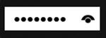
Figure 3-21. An example of PasswordBox
If your app needs the user to log in, you should move the logon UI to the Settings charm (explained in the “Contracts and Extensions” section of this chapter) to keep your app in line with Microsoft guidelines about login controls. Of course, if your app requires that the user have an account and must log in with it, you will show a login UI in your app when it starts the first time. After the login, you must put the logout UI in the Settings charm.
If your app requires access with an account for some functionality about contents shown, you can put the login UI inside the container that you want to use to show contents. When a login UI is optional, put the login UI in the Settings charm to access other functionalities because the user can get a great experience using your app without an account.
The WebView control allows you to use a smart iframe inside code. Starting from Windows 8.1, this control has some advantages, such as the support for HTML5 (but not all features like AppCache or IndexedDB, geolocalitation and Clipboard access), navigation, and capability to display a web site that does not support frame or iframe visualization. A well-known bug called “airspace problem” has been fixed. This problem arose when attempting to overlap XAML elements. Also, WebView now supports history and uses Internet Explorer 11 (IE11) in document mode.
New Controls in Windows 8.1
Windows 8.1 introduces the following new controls:
- DatePicker (XAML)
- TimePicker (XAML)
- CommandBar
- Flyout (XAML)
- MenuFlyout (XAML)
- SettingsFlyout (XAML)
- SearchBox (XAML & HTML)
- Hub (XAML and HTML)
- BackButton (HTML)
- NavBar (HTML)
DatePicker and TimePicker enable you to use a specific control to let users choose date and time (see Figure 3-22). These controls are really useful because they were really difficult to create previously They can receive input by mouse, keyboard or even touch; and are localizable. You can also use pattern to format the date or time and, thanks to the Header property, there’s no need to add a label for them. Now you can use them in your XAML applications.

Figure 3-22. An example of DatePicker and TimePicker
CommandBar lets you easily customize a bottom bar in your applications. It allows AppBarButton or AppBarToggleButton to use glymps for button styles. It can also be compact.
Flyout controls let you show a pop-up with text or other controls inside it that can be easily dismissed by clicking outside of it. It is usually attached to a Button by using Attached Properties. MenuFlyout and SettingFlyout are designed to show a menu of items or a menu of settings (similar to the Setting charm). SettingFlyout now enables you to easily create a panel for setting, saving you from a really bad headache. Figure 3-23 shows an example of Flyout and MenuFlyout.

Figure 3-23. An example of Flyout
The SearchBox control lets you use a search feature inside your app. It can be now included as a control in the markup and supports full templating, styling, and the Input Method Editor (IME). Figure 3-24 show an example of a SearchBox control.

Figure 3-24. An example of a SearchBox control
The Hub control is a great addition to the Windows Store app controls. It allows you to show heterogeneous data provided from different sources in a simple and very spectacular way. It is divided into HubSection controls that define areas with their own data source. It is also possible to create a Hub app using the specific template in the project creation step. A great example of a Hub control is the Bing Sports app shown in Figure 3-25.

Figure 3-25. Bing Sports app: a great example of a Hub app
The BackButton control allows you to easily handle navigation between windows in your app. The BackButton can access the navigation stack to determine whether the user can navigate backward; if not, the button is automatically disabled.
The NavBar control lets you create a top AppBar to provide an easy way to navigate inside your app. The NavBar is built using the NavBarContainer that contains one or more NavBarCommands. This is a very customizable control that also provides paging for NavBarCommand. Figure 3-26 shows an example of NavBar:
Figure 3-26. NavBar example
Regardless of which approach is used to develop Windows Store apps (discussed in detail in Chapter 4), list controls show a list of items placed in different ways, depending on the control used. List controls in Metro style are included in a namespace called Windows.UI.Xaml.Control (XAML) or WinJS.UI (HTML).
For XAML, ItemsControl is the main control to show data collection. Although it’s not commonly used to achieve this scope, all controls used to display collections of data inherit from it. Figure 3-27 shows a class diagram that displays the hierarchy among the list controls of Windows.UI.Xaml.Control.

Figure 3-27. List control class diagram
All the controls inherit from ItemsControl, passing by the Selector class. This class gives you the ability to select items. Figure 3-28 shows a simple example of ItemsControl usage.

Figure 3-28. An example of ItemsControl
This control does not provide an automatic vertical scrollbar for its content; you have to use a ScrollViewer.
Public members of ItemsControl are frequently used in a derived control to set its layout or features. These members are shown in Figure 3-29 (surrounded by red rectangles).
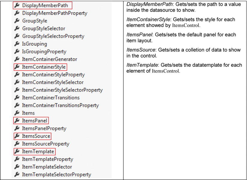
Figure 3-29. ItemsControl public members
HTML and JavaScript (JS) don’t have an ItemsControl class, but they contain all the following controls (the namespace is Win.JS.ControlName). Starting from the left, the first control is the ComboBox control, which displays a read-only text box that, once selected, shows a drop-down list and allows users to select an item inside the list. It is also possible, starting from Windows 8.1, to set an header to the control by using the Header property, which does not accept any focus from the UI.
Figures 3-30, 3-31, and 3-32 show selection examples for a ComboBox control.

Figure 3-30. A ComboBox example

Figure 3-31. Open ComboBox

Figure 3-32. Selected item in ComboBox
The FlipView control allows users to “flip” among data collections. This control is ideal when you need to display pictures (see Figure 3-33).
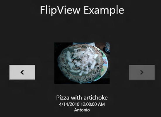
Figure 3-33. FlipView example
The declaration is similar to the other controls because FlipView inherits from the ItemsControl class. So you can use a layout control such as StackPanel inside the DataTemplate, filled by other controls. Figure 3-33 shows an output sample of FlipView. The arrows help navigate between the items.
One annoying problem related to FlipView is the difference of the transition between items. If you use touch, there is a smooth transition; but if you use the mouse and the arrow, or switch among items programmatically, there is no transition. Fortunately, this problem has been solved in the Windows 8.1 version with the UseTouchAnimationsForAllNavigation property.
The ListBox control is represented as a list of selectable items. Figure 3-34 shows a simple example.
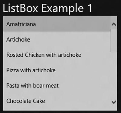
Figure 3-34. ListBox example
You can create a complex structure inside the ListBox with any kind of controls within (see Figure 3-35).

Figure 3-35. A complex structure inside a ListBox
As shown in Figure 3-36, GridView and ListView inherit from ListViewBase. This class contains common features used in both controls and implements ISemanticZoomInterface.
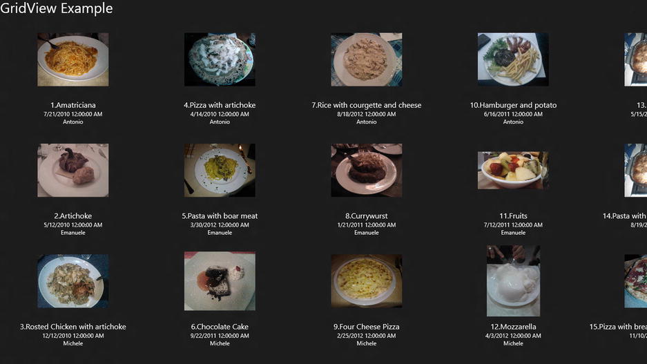
Figure 3-36. Items order inside a GridView
GridView is a data control that shows items in a grid. It provides a definition for columns and rows, and data can be associated using the ItemsSource property. GridView has an high level of customization and also allows grouping and sorting of items. Figure 3-36 shows an example of its usage.
It’s interesting the way GridView lays the object in the output: the number in the title of a picture shows that the placing will be by columns.
ListView, which is the most complete list control, has great flexibility and enables you to represent a complex data layout.
Figure 3-37 shows the result. Although ListView looks very similar to the ListBox control, it is flagged as obsolete, so using ListView is highly recommended. Also, ListView is a touch-and-animation-ready control that provides a touch-spaced layout.
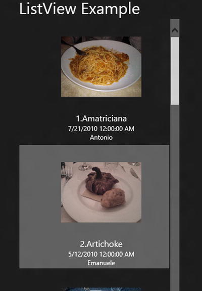
Figure 3-37. ListView example
Orientation and Layout
When you create an application, one of the main problems is how to locate objects inside the application. With Windows 8, you have to consider different aspects, mostly regarding different targeting devices in which this operating system (OS) will run.
Different Screen, Same Windows Version
One of the first goals of Windows 8 is its support for different devices and screen resolutions. Regardless of the device, a UI will always remain the same, thanks to screen–resolution scaling capabilities. So whenever you use a tablet or a multimonitor setup, your UI will be able to adapt its aspect based on the device’s resolution. Windows 8 does the following:
- Provides the same interface on all devices
- Helps developers build their apps that look the same on all devices
Screen devices can be classified in three different ways:
- Screen size: The size of the screen, usually measured in inches (e.g., 13.3” or 15.6”).
- Screen resolution: The number of pixels on a screen (e.g. 1366 x 768).
- Pixel density: The number of pixels within a physical area of the screen, which is usually measured in dots per inch (DPI). The larger the screen resolution, the higher the pixel density.
Regardless of this classification, screen devices can have different ratios. For example, Figures 3-38, 3-39, and 3-40 show how object layouts adapt with different screen sizes and resolutions.
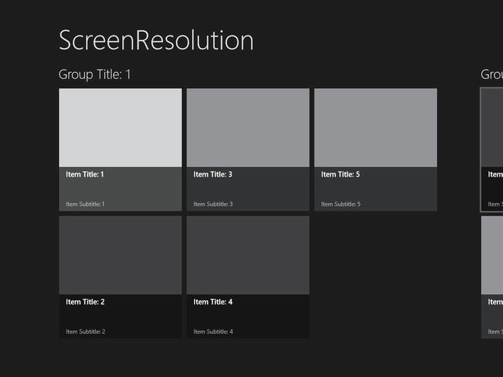
Figure 3-38. Screen size is 10.6”; resolution is 1024 x 768
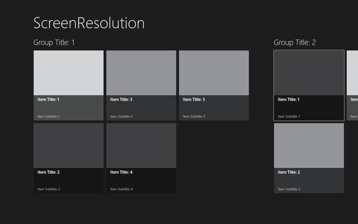
Figure 3-39. Screen size is 12"; resolution is 1280 x 800

Figure 3-40. Screen size is 27"; resolution is 2560 x 1440
Here’s a list of Windows 8–supported screen sizes, default resolutions, and DPI densities:
- 10.6"
- 2560 x 1440 (291 DPI)
- 1920 x 1080 (218 DPI)
- 1366 x 768 (155 DPI)
- 11.6”
- 2560 x 1440 (253 DPI)
- 1920 x 1080 (190 DPI)
- 1366 x 768 (135 DPI)
- 12”
- 1280 x 800 (125 DPI)
- 14”
- 1920 x 1080 (157 DPI)
- 1366 x 768 (112 DPI)
- 15.6”
- 1920 x 1080 (141 DPI)
- 17”
- 1920 x 1080 (130 DPI)
- 23”
- 1920 x 1080 (96 DPI)
- 27”
- 2560 x 1440 (109 DPI)
All these screen resolutions have one thing in common: a minimum resolution of 1024 x 768 (see Figure 3-41).

Figure 3-41. Different screen resolutions with a minimum of 1024 x 768
A minimum resolution is chosen to help developers tailor their applications without regard to the way content fits in resolutions lower than 1024 x 768 and to avoid targeting their applications for a specific resolution.
Choosing a minimum resolution is based on the following:
- It’s the resolution in which Metro UI and its content fits the best.
- Web sites are generally designed for a resolution of 1024 x 768.
- The majority of Windows 7 users don’t use a lower resolution than 1024 x 768 (http://blogs.msdn.com/b/b8/archive/2012/03/21/scaling-to-different-screens.aspx).
- The default or suggested resolution for Windows 8 is 1366 x 768.
Whenever we use a larger screen or a higher resolution, more objects will be filled on the screen (refer to Figures 3-38, 3-39, and 3-40).
In particular, there are two different techniques for settling objects in the UI:
- Adaptive: The higher the screen resolution, the higher number of objects in the UI.
- Scale: The higher the screen resolution, the larger the objects in the UI (games have benefits using this technique).
Pixel density might be a problem, too! Different screen resolutions have different DPIs, so a developer can use three percentages to scale images and ensure that they won’t be blurry:
- 100 percent when no scaling is applied
- 140 percent for HD tablets
- 180 percent for quad-XGA tablets
To help developers create layouts for their applications, Windows 8 developing tools include a set of built-in features such as XAML attributes or CSS3 Flexible Box. And you haven’t heard the last of this!
Visual Studio 2013 provides a simulator with a setting option for the device resolution (see Figure 3-42). Blend for Visual Studio 2013 provides a menu to select both the resolution and DPI of the destination platform (see Figure 3-43). These tools help developers simplify their work.
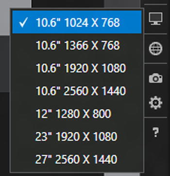
Figure 3-42. Screen resolution setting in Visual Studio 2013 Simulator
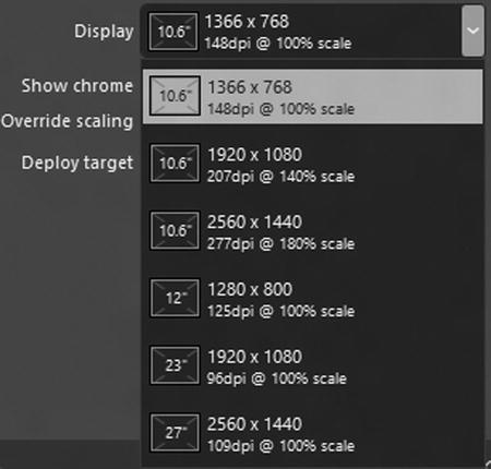
Figure 3-43. Screen resolution setting in Blend 5
Windows 8 also introduces improvements for multimonitor support. A multimonitor setup helps you to be more productive by parallellizing work on different screens. According to recent research, people usually use a first (main) monitor for work; a second monitor for e-mail or web browsing; and a third monitor for news, social networks, and chat. Microsoft has listened to people who have commented on the Windows Feedback Program, designing the best way to support multimonitor setups.
Major features are the following:
- Taskbar on all monitors: This option is fully customizable; you can set ways to show the taskbar on secondary screens.
- Universal access: Now you can use the Start button or charms on every monitor.
- Side-by-side Windows Store apps: You can have multiple Windows Store apps on different monitors.
- Desktop backgrounds: You can set multiple background images or span one image on different monitors.
Layout
In Windows 8 (but not the later version starting from version 8.1), there are three different view states for Windows Store apps:
- Full screen view (see Figure 3-44)

Figure 3-44. An example of full screen view
- Snapped view (see Figure 3-45)

Figure 3-45. An example of snapped and fill views
- Fill view (see Figure 3-46)

Figure 3-46. A screenshot from the Windows Store News app ( full screen view)
Full screen view uses the whole screen to show an application. Snapped and fill views are enabled only if the horizontal resolution is 1366 pixels or greater.
In this view state, 320 pixels are used for the snapped portion (the left side of Figure 3-45); 1046 pixels are dedicated to the fill view (the right side of Figure 3-45). The remaining 22 pixels are used for the splitter.
To make a great app, consider the different view states and follow these rules:
- Don’t change the context; maintain the user state and just resize the app.
- Don’t use controls to modify the view state (this is the splitter’s job!).
- Use the application’s API to understand view state changing.
- Adjust the content in a stack shape (see Figures 3-46 and 3-47).

Figure 3-47. A screenshot from the Windows Store News app (snapped view)
In Figure 3-46, the highlighted section (referring to 1, 2, and 3) is set in a stack layout visible in Figure 3-47. This way, users always have the information needed to maintain the previous state shown in full screen view.
Things have changed in Windows 8.1, however. The snapped and fill views are gone. Every app can be resizable with a default minimum width of 500 pixels that can be reduced to 320 pixels. It is possible to have two Windows Store apps open on the same screen and to resize each one, and an app can open in one or more new windows at the same time. Also, as many as three apps can be on the same full HD (1080-pixel) screen. For this reason, Microsoft guidelines strongly recommend creating apps that work at any available size (especially the low ones).
To improve navigation, it is also recommended to adapt controls such as AppBar, NavBar, SearchBox, or Flyout to lower resolution. There are also few changes in the ApplicationView class: some methods, such as the TryUnsnap or Value properties, no longer work if the target platform is Windows 8.1.
Figure 3-48 shows a screenshot with the new windowing modes:

Figure 3-48. New windowing modes in Windows 8.1
Now that you have a good knowledge of screen settings, you can learn how to set controls in your UI.
Creating a layout means choosing the right container for controls. The choice depends on the type of application that you want to develop. The main layout controls in the control library are as follows:
- XAML
- Canvas
- Grid
- Stack Panel
- Virtualizing Stack Panel
- HTML/CSS
- Combination of HTML5 elements and CSS3 styles
A canvas is a drawing area, and all controls inside a canvas are positioned by absolute value (these values correspond to the distance from the top/left corner). Because of absolute positioning, it cannot be used in applications that need a scalable interface. Figure 3-49 shows an example of positioning a button inside a canvas.

Figure 3-49. A button inside a canvas
The Grid control helps create a grid structure. It can have rows and columns, and a cell can contain any other control. Before you use it, the number of the rows and columns needs to be defined, and there are several ways to set the size of the columns/rows. With the asterisk (*) you can autosize the cells, depending on the space available inside the screen. Figure 3-50 shows an example of a grid declaration.

Figure 3-50. A grid with a text block and one button
StackPanel enables you to position controls consecutively and set directions, such as horizontal or vertical. Figures 3-51 and 3-52 show examples of the StackPanel control.
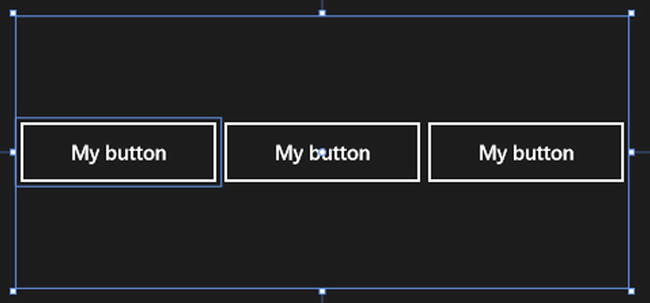
Figure 3-51. StackPanel with horizontal orientation

Figure 3-52. StackPanel with vertical orientation
Orientation
Tablet devices usually provide a gyroscope or an accelerometer to detect screen orientation changes. There are two types of orientation: landscape (see Figure 3-53) and portrait (see Figure 3-54).

Figure 3-53. Landscape orientation
Figure 3-54. Portrait orientation
Developers have to identify orientation changes in their applications, which can be done using media queries in CSS or using managed code catching the OrientationChanged event in the code-behind.
Developers can test orientation while developing the application using Visual Studio 2013 Simulator or Blend for Visual Studio 2013 (see Figure 3-55).

Figure 3-55. Blend view support
Semantic Zoom
Semantic zoom is a new way to use zoom features to display contents. It is a touch-based technique that allows navigation, display, and management of a large set of related data. It uses the pinch and stretch gesture to show more or less information, and to navigate with the help of panning and scrolling gestures.
Two modes (or zoom levels) display the content:
- Zoomed-in: Contents are displayed in details, showing additional information such as photos or item-related data
- Zoomed-out: Contents are summarized into semantic-based groups, allowing the user to quickly navigate them
Figures 3-56 and 3-57 illustrate the difference between the modes.

Figure 3-56. An example of zoom-out on apps

Figure 3-57. An example of zoom-in on apps
In addition to the pinch gesture, you can reach semantic zoom using the mouse or keyboard. With the mouse, you can hold down the Ctrl key while scrolling with the scroll wheel. With the keyboard, you can hold down the Ctrl and Shift keys and press the + or – keys.
Panning and scrolling gestures can help navigation by localizing the content and then zooming in on it.
At first sight, semantic zoom might be confused with optical zoom. Actually, they are different, even though they share the same interactions and behaviors. Optical zoom increases the level of details in a content area; semantic zoom changes the level of details in which they’re shown, giving the data a different perspective.
Here are some recommendations for developers using semantic zoom. First, always define two levels of zoom. It’s important to balance what contents are shown in the different levels to avoid having to repeat information and to simplify the navigation. They must leave enough space among the elements to let the user zoom in or zoom out. Also, the space for the element has to be big enough to use a finger (more information can be found in the touch targeting size section of this chapter).
Developers should organize the content in sorted groups and take advantage of the pages (but being careful not to overdo!). Finally, borders should be used only for semantic zoom control.
Contracts and Extensions
Contracts and extensions are the core of the interaction of an app with other apps or the OS. In this era of social networks, people need to communicate, so when you write an app, don’t consider it stand-alone. Your app must be ready to satisfy users’ needs: they want to tweet what they’re doing now or share what great news they read in your app. You can do this and much more with contracts and extensions. Windows 8 allows you to create applications that define an agreement with the OS or with other apps. When the agreement is made with Windows, it’s called an extension; when the agreement is made with another application, it’s called a contract.
The following sections describe each one and explain what you need to know in order to follow Microsoft guidelines. You’ll learn how to use them while we develop the case study.
A contract defines the interaction between apps (source and target) mediated by a broker (the contract) that defines what is required by your app to participate.
Types of contracts include the following:
- Share contracts
- Search contracts
- Settings contracts
- Play To contracts
- App to App Picker contracts
- Cached File Updated contracts
One of the most important features for a user-centric system is the chance to share contents with other apps and services. Users love to share information, and with Windows 8 the Share charm is always near their fingers.
You can set your application to be a target of the Share contract by adding a Share target contract file to your project. This file allows you to declare the data formats and file types your applications supports. When your application has this contract as a target, remember that when Windows activates your application, it will open in the snapped view state. It is a good practice to specify which page of your application to show.
When you write your app to participate as a target, keep in mind some best practices that help provide a better UX:
- Avoid providing a way to leave the sharing context in your app; if users open your app for sharing, you must hide everything that is not relevant for this function.
- Don’t provide a back button; when activated to share, your app adds a back button that navigates to the share target selection. Avoid using multiple pages when your app acts as a target.
- Put the button that shares the contents in an easily accessible location (normally the bottom-right corner) and provide the simplest UX to the user for sharing contents rapidly.
Of course, if an app acts as a target, other apps can act as a source. In this case, in your application you must declare the type of content shares and how many format types your application supports so it will be more interesting. Source apps should also follow some best practices:
- If your application shares contents available on the Web, share a link to the online content rather than the content itself.
- When you prepare the package to share, respect user selections. For example, if the user wants to share a portion of text, you must share only the selected text, not the entire page or document.
- Provide some additional information (e.g., title, description, link, thumbnail, and so on), which allows the target apps to improve their UX, providing the best look and feel to their users.
- To always provide the same UX, don’t create your own share button in your application.
When users want to share something from your app, they press the Share button in the Charm Bar (shown in Figure 3-58). If your application is a source for sharing, the system will show something similar to the screen shown in Figure 3-59. (Of course, the displayed items may vary, depending on which contents your app shares because only applications that can manage them will be displayed.)

Figure 3-58. Share button in the Charm Bar

Figure 3-59. Share contract in action
Suppose that your app manages contents and you want these contents to be searchable everywhere in the system. This is what a Search contract offers: users can access data located in your app everywhere in the system or on the Web, and you gain a lot of points in the UX. Windows provides a search pane opened by the Search charm that sorts applications by frequency of use (see Figure 3-60).

Figure 3-60. Search button
When you develop an application that participates in a Search contract, you can be sure that the user will find your functionality easy to use and friendly because it is well integrated with the OS and offers a good UX. If you need another good reason to integrate a Search contract in your applications, consider that your app will be more visible to users for more use.
Note You can write an app that participates in a Search contract wherever your app stores data (locally or remotely).
If you use Windows 8 (not 8.1 or later), a pane appears on the right side of the screen when you select the Search charm (see Figure 3-61). If your application is in the foreground, it will be automatically highlighted.

Figure 3-61. The App Store displays suggestions for the search query
Things are different in Windows 8.1: the Search charm has been redesigned. Now when you search something through the Search charm, you can choose where to find it (see Figure 3-62). After you press Enter, another window powered by Bing displays all results from different sources (see Figure 3-63).

Figure 3-62. The App Store displays suggestions for the search query (Windows 8.1)

Figure 3-63. The App Store displays suggestions for the search query (Windows 8.1)
Because the Search contract is part of the UX core provided by Windows 8, you must follow some guidelines when you participate in this contract.
If you are using Windows 8.1, try to integrate the SearchBox control over the Search charm; otherwise, avoid in-app UI elements that provide the same functionalities of the Search charm because your app may become difficult to use. Provide search functionalities directly in your UI only for the Find in Page feature when users expect to remain on the same page (this doesn't happen when they use the search pane that opens a new UI). The Find in Page feature is particularly useful if your application manages documents. UI controls for Find in Page functionalities normally are located in the AppBar, which must stay open (in sticky mode) while the user uses this functionality.
When the Search contract is the main application on the screen, it will be asked for suggestions, depending on the search query. You should always provide a list of suggestions (refer to Figure 3-61).
Your application can provide two types of suggestions:
- Query suggestions: Suggestions for query text that the user inputs
- Result suggestions: Results that match the query actually written by the user
You should always provide search suggestions to speed up query input, providing the same result that a search shows if the user inputs the truncated text. For example, if your app manages messages, and the user searches for “Holidays,” you should provide all messages that contain this word (refer to your relevance algorithm).
Participating in this contract enables your app to provide suggestions about the search query, allowing users to navigate directly to the details of the selected item. It speeds up the navigation, which helps the UX. You should provide no more than five suggestions; if your app provides query suggestions and result suggestions, you must limit the result to one item.
Some best practices to follow when your app participates in this contract include these:
- You should provide a way to see what the user is looking for in the search page.
- Combine the ListView control and the Search contract to provide the same UX of Windows 8 (see Figure 3-64).

Figure 3-64. An example of search results (Windows 8)
- If something is important to show, move it to the left side of the screen because the Search charm appears on the right side over your application, hiding information on the search results page.
- Provide a way to see why an item inside your application matches the search query. If the user looks for “Holidays,” you should show the word Holidays inside the description or the title of the image in your application.
- Provide a way to refine the search in your application. For example, if your application contains images and text, you should provide a set of filters to limit the result to images or text in the search page results.
- When you contact a service to collect suggestions, use the SearchPaneSuggestionsRequestDeferral class, which allows you to signal when your app finishes collecting suggestions.
The user touches the Settings charm (shown in Figure 3-65), and if your app participates in the Settings contract, you can define a Settings page (see Figure 3-66). The Settings contract gives users access to your app’s settings from the Settings charm. The purpose of the Settings contract is to give uniform access to app settings so users feel that the apps are all integrated within the system.

Figure 3-65. Settings button in app charms

Figure 3-66. Example of the Settings pane
To participate in this contract, your application will use the SettingsCommand class that creates a setting entry that you can add to the ApplicationCommands list (you’ll see how to use this class when the application’s setting console in Chapter 7 is discussed). By default, if your application was downloaded from the Windows Store, Windows provides two entries: one for permissions relative to your application; the other to rate and review your application (not available for side-loaded enterprise apps).
We never tire of repeating that UX is the core concept of Windows 8, and to enable the user to obtain the best experience from your application, you must follow some simple rules:
- Choose well when determining the settings to include in the Settings pane, which includes settings that influence the app’s behaviors.
- Use the Settings charm to provide information not accessed very often, such as help or copyright info.
- Group similar settings to reduce entry points. For example, group uncommon settings under one entry point to allow more common settings under their own entry point (e.g., group any About policy support information under the About entry). Remember to limit entry points to four.
- Avoid the use of app settings to change the application workflow; instead, use AppBar for this purpose. Don’t navigate in your application when users press the Settings charm because they must be in the same place where they started when the setting windows close.
- Limit the settings hierarchies to two levels in order to provide an easy-to-use menu.
Imagine that your app shows videos, and your potential users are watching the video on their tablets while riding the subway. They get home and decide to finish seeing the film on their new Digital Living Network Alliance (DLNA)–compatible televisions. If your application participates in the Play To contract, your users can stream the video by simply pressing the Play To charm. It’s easy to accomplish this: you handle only the SourceRequested event of the PlayToManager class, which fires when the user selects the Devices charm, and then pass the media element to the PlayToSourceRequestedEventArgs class.
As with other contracts, you should follow some best practices:
- If your application manages videos, provide a way to stream them.
- Register as the source of this contract only if you have contents to share.
- If you share content with this contract, you must allow the user to continue navigating, providing a way to keep the media element available.
App to App Picker Contract and Cached File Updated Contract
Modern OSs on tablets all have the same core concept: apps. The user needs to have an immersive application, but these apps don’t integrate because every app is stand-alone. To solve this problem in Windows 8, you can participate in the App to App Picker contract, which enables apps to access files inside other apps.
Although the App to App Picker contract provides opening and saving file capabilities, the Cached File Updated contract allows you to update files.
The Cached File Updated contract allows your app to track file changes in order to update these files in a central repository. For example, the SkyDrive application in Windows 8 allows you to share contents with other apps and keep files updated with the SkyDrive service.
Extensions
Although contracts enable interaction with other apps, extensions enable you to integrate with the OS. Extensions available in Windows 8 include these:
- Account Picture Provider
- AutoPlay
- Background Tasks
- Contact Picker
- File Activation
- Print Task Settings
- Protocol Activation
Account Picture Provider
This extension allows users to open an app if they want to change their profile picture. Suppose that your application edits images with some effects. Users of your app would use images edited within your software as profile pictures just by clicking a button.
If your application allows users to change profile pictures, you can use three types of media:
- Small format image
- Large format image
- Video
These three types can be set by your application in the same call, but remember that when you set a large image or a video, you must always associate a small image as a thumbnail.
With this extension, your application can open a device when it is added to the system. For example, if your application edits images, it will be an option when a user connects a new device such as a camera, USB drive, or Secure Digital (SD) card; or when the user starts a share using proximity.
Background Tasks
As discussed earlier, in Windows 8 only one application at a time is executed, reserving available resources for the foreground app. You need some gears to keep the app’s information up to date. One of these gears is the Background Tasks extension that you can use if you want to do work when your app is not active. Although background tasks are very helpful in most scenarios (e.g., downloading e-mail), avoid using background tasks for Search for Extraterrestrial Intelligence (SETI) workloads, for example, because it will drain the battery.
Starting a background task requires an event that triggers and launches the task. The triggers that raise various trigger events are described in Table 3-3.
Table 3-3. Trigger Types
Trigger Type |
Event |
Occurrence |
|---|---|---|
SystemEventTrigger |
InternetAvailable |
When an Internet connection is available |
SystemEventTrigger |
ControlChannelReset |
When a network channel is reset |
SystemEventTrigger |
NetworkStateChange |
When a network state changes, such as when passing from a free to a paid connection |
SystemEventTrigger |
OnlineIdConnectedStateChange |
When the online ID associated with the account changes (refers to the online ID used by Windows Live) |
SystemEventTrigger |
ServicingComplete |
When the system ends to update the application |
SystemEventTrigger |
SmsReceived |
When a new Short Message System (SMS) is received by an installed mobile broadband device |
SystemEventTrigger |
TimeZoneChange |
When the time zone changes on the device (e.g., when the system adjusts the clock for Daylight Saving Time [DST] or when the user moves around the world) |
SystemEventTrigger |
UserAway |
When the user is absent |
SystemEventTrigger |
UserPresent |
When the user is present |
ControlChannelTrigger |
ControlChannelTrigger |
On incoming messages on the control channel |
MaintenanceTrigger |
MaintenanceTrigger |
When it is time for maintenance background tasks |
PushNotificationTrigger |
PushNotificationTrigger |
When raw notifications arrive on the WNS channel |
TimeTrigger |
TimeTrigger |
When a time event occurs |
When you subscribe to a trigger in your task, you can set zero or more conditions to be satisfied in order to start the task. For example, if your app manages e-mail, you can set a condition that an Internet connection must be available. Task conditions are described in Table 3-4.
Table 3-4. Task Conditions
Condition |
Description |
|---|---|
InternetAvailable |
An Internet connection must be available |
InternetNotAvailable |
An Internet connection must be unavailable |
SessionConnected |
The session must be connected |
SessionDisconnected |
The session must be disconnected |
UserNotPresent |
The user state must be set to away |
UserPresent |
The user state must be set to present |
When one of the triggers described here fires, the BackgroundTask infrastructure looks for apps registered for it and launches the background task.
With Background Tasks, you can provide information about updating tiles in your app, and if your app is authorized to publish on a locked screen, you can provide information about the state of your app. For example, if your app manages messages, you can show the number of unread messages. You’ll see how to implement background tasks in Chapter 7, when we talk about how to implement them in an app.
Your app can register to provide contact data so that when an app requires contact information, your application appears as a source. Imagine that you are writing a messaging app with a specific contact list. Other apps on the system can use the list of contacts your app provides, even outside of your own app. This extension is another important part of UX because it provides cross-app integration.
Immersive apps are cool, but when users come from previous versions of Windows, they look for an application that opens certain file types. For this reason, Windows 8 introduced the File Activation extension. When you declare in your app that you can open certain files, the OS lists your app as a possible file destination. When your app has been activated, you can handle the ActivationKind relative to the open file. Of course, because Windows 8 is a user-centric OS, you can’t set the default app to use for a file type within your app, but Windows will ask users to choose the app that they want as the default.
When you think of a personal computer, you associate it with a printer; and when you think of a printer, you think of the software products that manage them. Every printer manufacturer produces its own software to manage the printer, and some of them also tell users about cartridge status.
Windows 8 offers some benefits to manufacturers. The app relative to a device is automatically downloaded from the Windows Store when the user connects the device. Immersive apps for printers can be useful; for example, your application can show the status of the printer in the tile and the cartridge status. Because your app will be distributed through the Windows Store if you produce an update, it will be shown to all users. This is a great leap for the UX because when users connect to a device, they will be immediately ready to work with its software.
Protocol Activation
With Protocol Activation, you can manage particular protocols. For example, consider an application that supports Voice over Internet Protocol (VoIP). With this extension, the app can manage every hyperlink that uses the callto:\ protocol. This extensions works like the File Activation extension: it is activated by the system when the user selects your application to manage a protocol that you should specify in the App.Manifest. You will manage the ActivationKind named protocol while your app handles the activated event.
Conclusion
This chapter helped you create an application with better UX, showed you how to choose the right control from the rich control library to provide a consistent UX between apps, and how to further integrate your app with other apps (and the system).
Chapter 4 introduces you to ways of developing applications for the Windows 8 platform and discusses reasons for choosing one over another.