![]()
Two-Dimensional Graphics. Statistics Graphics and Curves in Explicit, Parametric and Polar Coordinates
MATLAB allows the representation of any mathematical function, even if it is defined piecewise or jumps to infinity in its field of definition. MATLAB makes graphs of planar (two-dimensional) curves and surfaces (three-dimensional), groups them and can overlap them. You can combine colors, grids, frames, etc., in the graphics. MATLAB allows representations of functions in implicit, explicit and parametric coordinates, and is without a doubt mathematical software with high graphics performance. One of their differences with the rest of the symbolic calculation packages is that “animations” can be generated by combining different graphics with slight variations from each other displayed quickly in succession, to give the impression of movement generated from graphs similarly to moving pictures and cartoons.
In addition, MATLAB also allows for typical bar graphs, lines, star graphs and histograms. It also offers special possibilities of representation of polyhedra with geographical maps. In handling of graphics, it is very important to bear in mind the availability of memory on the computer. The graphics drawings consume lots of memory and require high screen resolution.
2.1 Two-Dimensional Graphics (2-D)
The basic commands that MATLAB uses to draw the graph of a function of a variable are as follows:
- plot(X,Y) draws the set of points (X, Y), where X and Y are row vectors. For graphing a function y = f (x), it is necessary to know a set of points (X, f (X)), to set a range of variation for the vector X. X and Y can be matrices of the same size, in which case a graph is made by plotting each pair of rows and on the same axis. For complex values of X and Y, the imaginary parts are ignored.
- plot (Y) draws the vector Y elements, i.e., gives the graph of the set of points (t, Yt) for t = 1, 2,… n where n = length (Y). It is useful for graphing time series. If Y is a matrix, plot (Y) makes a graph for each column Y presenting all on the same axis. If the components of the vector are complex, plot (Y) is equivalent to plot (real (Y), imag (Y)).
- plot (X, Y, S) draws plot(X,Y) with the settings defined in S. Usually, S consists of two symbols between single quotes, the first of which sets the color of the line of the graph, and the second sets the character to be used in the plotting. The possible values of colors and characters are, respectively, as follows:
- y yellow . Point marker
m magenta o Circle marker
c cyan x X marker
r Red + Plus signs
g green - Solid line
b Blue * Star marker
w White : Dotted line
k Black -. Dashes and dots
- Dashed line
- y yellow . Point marker
- plot(X1,Y1,S1,X2,Y2,S2,X3,Y3,S3,…) combines, on the same axes, graphs defined for the triplets (Xi, Yi, Si). It is a way of representing various functions on the same graph.
- fplot(function, [xmin, xmax]) graphs the function for the variation of x over the given range.
- fplot(function, [xmin, xmax, ymin, ymax], S) graphs the function over the range xmin to xmax while limiting the y-axis to the range of ymin to ymax, with options for color, line style, and markers given by S.
- fplot([f1,f2,…,fn],[xmin, xmax, ymin, ymax], S) graphs functions f1, f2,…, fn on the same axes at intervals for the range of x and y specified, and the color, line, and marker styles defined in S.
- ezplot (‘expression’, [xmin xmax]) graphs the expression for the variation of x given in the range.
Let’s see some examples of 2-dimensional graphics:
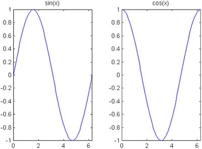
We will begin by representing the function f (x) = (sin(x)) ^ 2 + 2xcos(x) (-2,2):
>> x = [-2*pi:0.1:2*pi];
>> y = sin(x) .^ 2 + 2 * x .* cos(x);
>> plot(x,y)
MATLAB returns the graph that is shown in Figure 2-1. It is worth noting that the definition of the function has been made in vector form, using the notation for vector variables. The range of the trigonometric function is defined in pi radian (in this case -2 pi to 2 pi).

The same graph is obtained using the command fplot with the following syntax:
>> fplot ('sin(x) ^ 2 + 2 * x * cos(x)', [- 2 * pi, 2 * pi])
And the same representation can be obtained by using the command ezplot using the following syntax:
>> ezplot ('sin(x) ^ 2 + 2 * x * cos(x)', [- 2 * pi, 2 * pi])
Observe that in the last two cases functions are expressed symbolically, and not as a vector, as in the form of the first case. (Note the quotes surrounding the function).
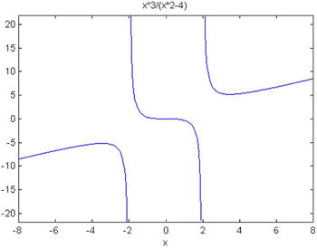
MATLAB draws not only bounded functions, but it also represents features that have asymptotes and singularities. For example, Figure 2-2 shows the graph of the function y = x ^ 3 /(x^2-4) which has asymptotes for x at -2 and 2 in the range of variation of x given by (- 8,8) by using the command:
>> ezplot ('x ^ 3 / (x^2-4)', [- 8, 8])
EXERCISE 2-1
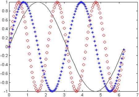
Represent the graphs of the functions Sine(x), Sine(2x) and Sine(3x), varying in the range (0,2p) for x, all on the same axes.
The graphics, generated by the input is represented in Figure 2-3:
fplot (@(x)[sin(x), sin(2*x), sin(3*x)], [0, 2 * pi])

It may be useful to differentiate between curves by their strokes, for instance if you cannot assume that your ultimate user of the graph can print in color. For variety, in Figure 2-4 we represent the first function, Sine (x), with a black line, the second, Sine(2x), using blue star, and the third, Sine (3x), with red circles. We use the following syntax:
>> x = (0:0.05:2*pi);
>> y1 = sin(x); y2 = sin(2*x); y3 = sin(3*x);
>> plot(x,y1,'k-',x,y2,'b*',x,y3,'ro')
2.2 Titles, Tags, Meshes and Texts
The commands available in MATLAB for these purposes are as follows:
- title ('text') adds the text used as the title of the graph at the Top in 2-D and 3-D graphics.
- xlabel ('text') places the text next to the x axis in 2-D and 3-D graphics.
- ylabel ('text') puts the text next to the y axis in 2-D and 3-D graphics.
- zlabel ('text') places the text beside axis z in a 3-D chart.
- text (x, y, 'text') places the text at the point (x, y) within the 2-D chart.
- text (x, y, z, 'text') places the text at the point (x, y, z) in a 3D graphic.
- gtext ('text') allows you to place text at a point selected with the mouse within a 2-D chart.
- grid locates grids in a 2-D or 3-D chart axes. The command grid on places the major grid lines and grid off removes them. The grid command without a parameter toggles the grid between on and off. The command hold keeps the current graph with all its properties, so that subsequent graphs are placed on the same axis overlapping the existing one. The option hold on activates the option and hold off deletes the option. The hold command without a parameter toggles between on and off. Axis autoranging behavior is not affected by the hold command.
EXERCISE 2-2
On the same axes represent the graphs of the functions y = sin (x2)and y = log (sqrt (x)). The text of each equation is properly positioned within the graph.
We get the graph in Figure 2-5 considering the following MATLAB entry:
>> x = linspace (0,2,30);
>> y = sin(x.^2);
>> plot(x,y)
>> text (1,0.8, ' y = sin(x^2)')
>> hold on
>> z = log(sqrt(x));
>> plot (x, z)
>> text (1, - 0.1, ' y = log (sqrt (x))')
>> xlabel('X Axis'),
>> ylabel ('Y Axis'),
>> title('Graphic sine and logarithmic'),

2.3 Manipulating Graphics
Below, are commands that allow you to manipulate the axes of a graph, placement of it within the screen, their appearance, their presentation from different points of view, etc.
- axis([xmin xmax ymin ymax]) assigns the minimum and maximum values for the X and Y axes in the graphic.
- axis('auto') assigns scaling for each axis based upon the actual range of values represented in the plot, which is the default mode i.e., xmin=min(x), xmax=max(x), ymin=min(y), ymax=max(y)
- axis(‘manual’) freezes the scaling of axes to the current settings, so that limits from placing other graphs on the same axes (with hold in on), do not change the scale.
- V = axis gives the vector V of 4 elements the scale of the current graph is [xmin xmax ymin ymax].
- axis('xy') places the graph in Cartesian coordinate mode, which is the default, with the origin at the bottom left of the graph.
- axis('ij') sets the graph to matrix coordinate mode, where the origin is at the top left of the graph, with i being the vertical axis increasing from top to bottom and j being the horizontal axis increasing from left to right.
- axis('square') the plotted rectangle becomes a square, so the figures will absorb the change in scale.
- axis('equal') makes the aspect ratio for all axes the same.
- axis('normal') eliminates the options square and equal.
- axis('off') eliminates labels and brands on the axes and grids, keeping the title of the chart and the text applied using text with gtext.
- axis('on')restores labels, marks and axes grids.
- subplot (m, n, p)divides the graphics window in m x n subwindows and places the current graphic window in the p-th position, beginning the count from the left top and from left to right; then it goes to the next line until it is finished. For example, if m=3 and n=2 then p is expected to be used with values between 1 and 6, with plots 1 and 2 being in the first row, 3 and 4 in the second, and 5 and 6 in the third row.
EXERCISE 2-3
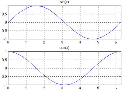
Present in the same figure the graphs of the functions Sin(x) and Cos (x), placed horizontally one next to each other with their names, with the x axis values between 0 and 2 * pi, a shaft, and taking y values between - 1 and 1. Also get the vertical representation, so that they one under the other and use slotted shafts.
MATLAB, we propose the following entry:
>> x = (0:0.1:2*pi);
>> y = sin(x);
>> z = cos(x);
>> subplot(1,2,1);
>> plot(x,y), axis([0, 2*pi, -1, 1]), title('sin(x)')
>> subplot(1,2,2);
>> plot(x,z), axis([0, 2*pi, -1, 1]), title('cos(x)')
The result is presented in Figure 2-6:
We now propose to MATLAB the following entry to shift the Sine curve to the top:
>> x = (0:0.1:4*pi);
>> y = sin (x);
>> z = cos (x);
>> subplot(2,1,1);
>> plot(x,y), axis([0 2*pi -1 1]), title('sin(x)'), grid
>> subplot(2,1,2);
>> plot (x, z), axis([0 2*pi -1 1]), title ('cos (x)'), grid
The result is presented in Figure 2-7:
EXERCISE 2-4
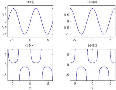
Present in the same figure, graphs of the functions Sine (x), Cos (x), Cosec (x) and Sec (x), placed in a matrix of four graphics, but under each function place its inverse for x ranging from [- 2p, 2p].
We use the command subplot to draw the four functions, in the appropriate order under Sine (x) place Cosec (x), and under Cos (x), place Sec (x). The syntax will be as follows:
>> subplot(2,2,1);
>> ezplot('sin (x)', [- 2 * pi, 2 * pi])
>> subplot(2,2,2);
>> ezplot('cos(x)',[-2*pi 2*pi])
>> subplot(2,2,3);
>> ezplot('csc(x)',[-2*pi 2*pi])
>> subplot(2,2,4);
>> ezplot('sec(x)',[-2*pi 2*pi])
MATLAB offers as a result the graph of Figure 2-8.
2.4 Logarithmic Graphics
The commands that enable MATLAB to represent graphs with logarithmic scales are the following:
- loglog(X,Y) performs the same graphics as plot(X,Y), but with logarithmic scales on the two axes. This command presents the same variants and supports the same options as the command plot.
- semilogx(X,Y) performs the same graphics as plot(X,Y), but with logarithmic scale on the x axis, and normal scale on the y axis (semilogarithmic scale).
- semilogy(X,Y) performs the same graphics as plot(X,Y), but with logarithmic scale on the y axis and normal scale on the x axis (semilogarithmic scale).
EXERCISE 2-5
Present on the same graph the function y = abs (e-1/2 x Sine(5x)) represented in normal scale, logarithmic scale and semilogarithmic scales.
The syntax presented here leads us to Figure 2-9, which compares the graph of the same function for the different scales. The graph is represented in the upper part with normal and logarithmic scales and at the bottom, the two semilogarithmic scales.
>> x = 0:0.01:3;
>> y = abs(exp(-0.5*x) .* sin(5*x));
>> subplot(2,2,1)
>> plot(x,y)
>> title('normal')
>> hold on
>> subplot(2,2,2)
>> loglog(x,y)
>> title('logarithmic')
>> subplot(2,2,3)
>> semilogx(x,y)
>> title('semilogarithmic in X axis')
>> subplot(2,2,4)
>> semilogy(x,y)
>> title('semilogarithmic in Y axis')

2.5 Polygons
MATLAB also allows drawing polygons in two dimensions. To do this, use the following commands:
- fill(X, Y, C) draws the compact polygon whose vertices are pairs of coordinates (Xi, Yi) of the column vectors X and Y. If C is a vector of the same size of X and Y, it contains the color map index Ci for each point (Xi, Yi) as scaled by c axis. If C is a single character, all the points of the polygon will be painted the color corresponding to the character. The Ci values may be: 'r', 'g', 'b', 'c', ', 'y', 'w', 'k', whose meanings we already know. If X and Y are matrices of the same size, several polygons will be represented at the same time corresponding to each pair of column vectors (X.j, Y.j). In this case, C can be a vector row Cj elements determine the unique color of each pair of vectors for polygon column (X.j, Y.j). C can also be a matrix of the same dimension as X and Y, in which case its elements determine the color of each point (Xij, Yij) in the set of polygons.
- fill(X1,Y1,C1,X2,Y2,C2,…) draws multiple compact polygons whose vertices are given by the points (Xi, Yi, Ci), the meaning of which we already know.
EXERCISE 2-6
Represent a regular octagon (square enclosure), whose vertices are defined by pairs of values (Sine (t), Cos (t)), for values of t varying between 8p and 15p/8 separated by 2p/8. Use only the green color and put the 'Octagon' text at the point (-1/4,0) the inside of the figure.
The syntax for Figure 2-10 is the following:
>> t = [pi/8:2*pi/8:15*pi/8]';
>> x = sin (t);
>> y = cos (t);
>> fill(x,y,'g')
>> axis('square')
>> text(-0.25,0,'OCTOGON)'

2.6 Graphics Functions in Parametric Coordinates 2-D
We are going to see now how the program draws curves in parametric coordinates in the plane. We will discuss how you can get graphs of functions in which the variables x and y depend, in turn, on a parameter t. The command to use is Plot and all its variants, conveniently defining intervals of the parameter variation, and not the independent variable, as it was until now.
EXERCISE 2-7
Represent the curve (Epicycloid) whose parametric coordinates are: x = 4Cos [t] - Cos [4t], y = 4Sine [t] - Sine [4t], for t varying between 0 and 2p.
The syntax will be as follows:
>> t = 0:0.01:2 * pi;
>> x = 4 * cos (t) - cos(4*t);
>> y = 4 * sin (t) - sin(4*t);
>> plot(x,y)
The graph is presented in Figure 2-11, and represents the epicycloid.
EXERCISE 2-8
Represent the graph of the Cycloid whose parametric equations are x = t-2Sine (t), y = 1-2Cos (t), for t varying between - 3π. and 3π.
We will use the following syntax:
>> t = - 3 * pi:0.001:3 * pi;
>> plot(t-2 * sin (t), 1-2 * cos (t))
This gives you the graph in Figure 2-12.

2.7 Graphics Functions in Polar Coordinates
MATLAB enables the specific polar command, representing functions in polar coordinates. Its syntax is as follows:
- Polar (a, r) represents the curve in polar coordinates r = r (a), using theta in radians.
- Polar (a, r, S) represents the curve in polar coordinates r = r (a) with the style of line given by S, whose values were already specified in the command plot.
EXERCISE 2-9
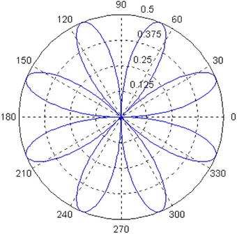
Represent the graph of the curve whose equation in polar coordinates is as follows: r = Sine (2a) Cos (2a) for a between 0 and 2π.
The following syntax leads us to the graph in Figure 2-13:
>> a = 0:0.01:2 * pi;
>> r = sin(2*a) .* cos(2*a);
>> polar(a, r)
EXERCISE 2-10
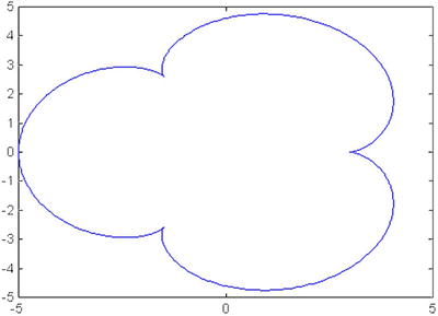
Represent the graph of the curve whose equation in polar coordinates is as follows: r = 4 (1 + Cos (a))for a between 0 and 2π, (called a cardioid).
To get the graph of Figure 2-14, representing the cardioid, use the following syntax:
>> a = 0:0.01:2 * pi;
>> r = 4 * (1 + cos (a));
>> polar(a, r)
>> title('CARDIOID')

EXERCISE 2-11
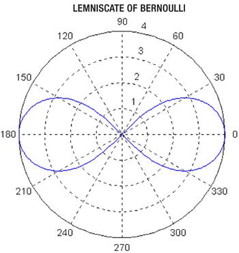
Represent the graph of the Lemniscate of Bernoulli whose equation isr = 4 (cos (2a) ^(1/2)) for 0 and 2, and the graph of the spiral of Archimedes whose equation is r = 3a, -4π<a< - 4π.
The first curve is represented in Figure 2-15, and is obtained by the following syntax:
>> a = 0:0.01:2 * pi;
>> r = 4 * (cos(2*a).^(1/2));
>> polar(a, r)
>> title(' Lemniscate of Bernoulli ')
The second curve is represented in Figure 2-16, and is obtained by the following syntax:
>> a = -4 * pi:0.01*pi:4 * pi;
>> r = 3 * a;
>> polar(a, r)
>> title('spiral of ARCHIMEDES')

2.8 Bars and Sectors Graphics. Histograms
MATLAB constructs bar graphs, sectors, Pareto diagrams and histograms of frequencies through the following commands:
- bar(Y) draws a bar graph relative to the vector of magnitudes Y.
- bar(X,Y) draws a bar graph on the vector of magnitudes Y whose elements are given by the vector X.
- stairs (Y) draws the staggered step graph relative to the vector Y.
- stairs(X,Y) draws the ladder graph relative to the vector Y whose elements are given by the vector X.
- hist(Y) draws a histogram using 10 vertical rectangles of equal base relative to the Y vector frequencies.
- hist(Y,n) draws a histogram using vertical rectangles of equal base relative to the Y vector frequencies.
- hist(Y,X)draws a histogram, using vertical rectangles whose bin center values are specified in the elements of the vector X, relative to the Y vector frequencies.
- foot(X) draws the pie chart relative to the X vector frequencies.
- pie(X,Y) draws the pie chart relative to the X vector frequency leaving out the sectors in which Yi<0.
- pareto(X) draws the Pareto graph relative to the vector X.
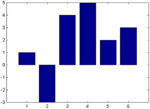
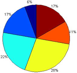
Here are some examples:
>> bar([1 - 3, 4, 5, 2, 3])
>> pie([1, 3, 4, 5, 2, 3])
The graphics are in Figures 2-17 and 2-18.
Below, is a bar chart for 20 values of a normal between - 3 and 3:
>> x = -3:0.3:3;
>> bar(x, exp(-x.^2))
This generates the graph in Figure 2-19.
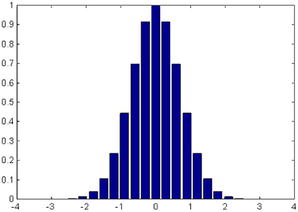
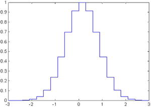
Figure 2-20 represents the step graph corresponding to the previous bar graph whose syntax is:
>> x = -3:0.3:3;
>> stairs(x,exp(-x.^2))
The histogram in Figure 2-21, corresponds to a vector of 10,000 normal random values in 60 bins between the values - 3 and 3 in0.1 increments:
>> x = -3:0.1:3;
>> y = randn(10000,1);
>> hist(y,x)

Figure 2-22 is a pie chart with two of its areas displaced, produced by using the syntax:
>> pie([1, 3, 4, 5, 2, 3], [0,0,0,0,1,1])

2.9 Statistical Errors and Arrow Graphics
There are commands in MATLAB which enable charting errors of a function, as well as certain types of arrow graphics to be discussed now. Some of these commands are described below:
- errorbar(x,y,e) carries out the graph of the vector x against the vector y with the errors specified in the vector e. Passing through each point (xi, yi) draws a vertical line of length 2ei whose center is the point (xi, yi).
- stem(Y) draws the graph of the vector Y cluster. Each point Y is attached to the axis x by a vertical line.
- stem(X,Y) draw the graph of the Y vector cluster whose elements are given by the vector X.
- rose(Y) draws the angular histogram relative to the vector and angles in radians, using 20 equal radii.
- rose(Y,n) draws the vector Y angular histogram, using equal radii.
- rose(X,Y) draws the vector Y angular histogram using radii that are specified in the elements of the vector X.
- compass(Z) carries out a diagram of arrows coming out of the origin and whose magnitude and direction are determined by the real and imaginary components of the vector Z in complex numbers. The complex Zi arrow joins the origin with the value of Zi.
- compass(X,Y) is equivalent to compass (X+i*Y).
- compass (Z, S) or compass(X, Y, S) specifies the line type in S to use on the arrows.
- feather(Z) or feather(X,Y) or feather(Z,S) or feather(X,Y,S) is the same as compass, with the only difference that the origin of the arrows is not at the origin of coordinates, but out of equally-spaced points of a horizontal line.
- legend('legend1', 'legend2',…, 'legendn') situates the legends given in n consecutive graphics.
Here are some examples below:
First of all, let's represent in Figure 2-23 a chart of errors for the density of a normal distribution (0,1) function, with the variable defined in 40 points between - 4 and 4, and errors are being defined by 40 uniform random values (0.10):
>> x  = -4:.2:4;
>> y = (1/sqrt(2*pi))*exp(-(x.^2)/2);
>> e = rand(size(x))/10;
>> errorbar(x,y,e)

We also represent a graph of clusters corresponding to 50 normal random numbers (0.1) by using the syntax below in Figure 2-24:
>> y = randn (50,1); stem (y)

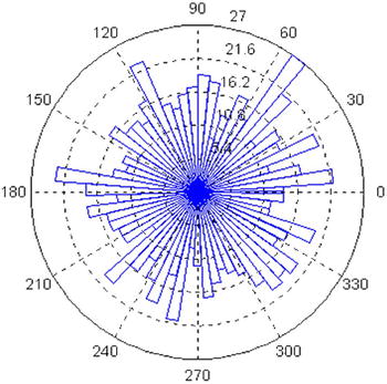
Figure 2-25 is an angular histogram with 1,000 a multiples of as a reason for normal random multiplicity (0.1), obtained from the following syntax:
>> x = 0:0.1:2 * pi;
>> y = randn (1000,1) * pi;
>> rose(y,x)
Now, Figure 2-26 presents a chart of arrows with center at the origin, corresponding to the eigenvalues of a normal (0,1) random square matrix of size 20 x 20. The syntax is as follows:
>> z = eig(randn (20,20));
>> compass(z)

Figure 2-27 is going to represent the chart of arrows in the previous example, but with the origin of the arrows in a horizontal straight line. The syntax is:
>> z = eig(randn (20,20));
>> feather(z)

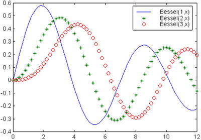
Finally, we will draw on the same axes (Figure 2-28) the bessel(1,x),bessel(2,x)y bessel(3,x) functions for values of x between 0 and 12, separated uniformly in two-tenths. The purpose of the chart is to place three legends and three different types of stroke (normal, asterisks and circles, respectively) to the three functions. The syntax will be as follows:
>> x = 0:0.2:12;
>> plot (x, besselj(1,x), x, besselj(2,x),'*g', x, besselj(3,x), 'dr'),
>> legend('Bessel(1,x)','Bessel(2,x)','Bessel(3,x)'),