
We have long lacked the means to precisely align items in our layouts. Much of the excitement around flexbox has derived from this ability to stretch and align flex items.
In Chapter 3, I showed you some examples of flexbox and CSS Grid Layout. These specifications are pulled together by a third specification—the Box Alignment Module Level 3 (http://bkaprt.com/ncl/04-01/). This module takes the interesting and useful alignment features we find in flexbox and places them in a new specification, where they become available to other specifications. We currently see implementation of these features in CSS Grid Layout.
Aligning Flex Items
We’ve already seen how flex and Grid items stretch to the height of their grid area or flex container, giving us the equal-height columns we’ve always dreamed of! They can do this because the initial value of flex or Grid items is stretch.
In this example, I have four flex items in a container (Fig 4.1). The container is set to 50vh, and the flex items stretch to fill it.
<ul class="cards">
<li>Item 1</li>
<li>Item 2</li>
<li>Item 3</li>
<li>Item 4</li>
</ul>
.cards {
margin: 0 -10px;
display: flex;
height: 50vh;
}

Fig 4.1: The items stretch by default because the initial value of align-items is stretch.
If we add the property align-items to the container, we can specify where the items will align with different values: flex-start will align items at the top of the container, flex-end will send them all to the bottom, and center will center them (Fig 4.2).
.cards {
margin: 0 -10px;
display: flex;
align-items: flex-start;
height: 50vh;
}
Code example: http://bkaprt.com/ncl/04-02/

Fig 4.2: Use the align-items property to set the alignment of all items.
The align-items property works on all the items inside the container. But you can override this by using the align-self property on an individual flex item. This takes the same values as align-items, but sets the alignment on individual flex items rather than on the group as a whole (Fig 4.3).
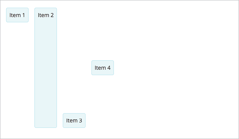
Fig 4.3: The align-self property sets the alignment on individual items.
.cards li:nth-child(2) {
align-self: stretch;
}
.cards li:nth-child(3) {
align-self: flex-end;
}
.cards li:nth-child(4) {
align-self: center;
}
Code example: http://bkaprt.com/ncl/04-03/
Alignment works on items on the cross axis (also known as the block axis in CSS, and as the column axis in the Grid specification). Our flex items are displayed as a row; the cross axis runs across the row vertically, stretching the height of the flex container (Fig 4.4).

Fig 4.4: The two axes.
If we change the flex-direction to column, the cross axis becomes horizontal. Aligning our items to flex-end moves the column over to the right-hand side (Fig 4.5).

Fig 4.5: The items displayed as a column align to the end of the flex container.
.cards {
display: flex;
flex-direction: column;
align-items: flex-end;
}
Code example: http://bkaprt.com/ncl/04-04/
Aligning Grid Items
If you know how to align items in flexbox, you’ll find that it works the same way for Grid.
To demonstrate alignment in CSS Grid Layout, this time I create a four-column and three-row track grid, and lay my items out on the grid using the named areas method I showed you in Chapter 3.
.cards {
display: grid;
grid-template-columns: repeat(4, 1fr);
grid-template-rows: repeat(3, 100px);
grid-template-areas:
"a a a b"
"a a a b"
"c d d d";
grid-gap: 20px;
}
.one { grid-area: a; }
.two { grid-area: b; }
.three { grid-area: c; }
.four { grid-area: d; }
Code example: http://bkaprt.com/ncl/04-05/
The default value for align-items is stretch, just like in flexbox. So if we load this example in a browser, we can see the grid areas we’ve defined (Fig 4.6).

Fig 4.6: A four-column, three-row grid with four grid areas.
A quick tip: as we start to look at more complex examples, it helps to see the grid defined. Firefox DevTools has a grid highlighter tool (http://bkaprt.com/ncl/04-06/). Inspect the element, then click the little grid icon to see your grid (Fig 4.7).

Fig 4.7: Our grid, with the lines and gaps highlighted in Firefox.
We already know from flexbox that align-items works on the cross axis. If we add the align-items property to our grid container with a value of start, the items all line up at the top of their area (Fig 4.8).
.cards {
display: grid;
grid-template-columns: repeat(4, 1fr);
grid-template-rows: repeat(3, 100px);
grid-template-areas:
"a a a b"
"a a a b"
"c d d d";
grid-gap: 20px;
align-items: start;
}

Fig 4.8: The grid with align-items set to start.
The background on the area no longer extends to the end of the grid area; instead, it comes up to sit behind the content.
As we did with flexbox, we can use the align-self property to override alignment on individual items.
.two {
grid-area: b;
align-self: stretch;
}
.three {
grid-area: c;
align-self: flex-end;
}
.four {
grid-area: d;
align-self: center;
}
Code example: http://bkaprt.com/ncl/04-07/
This aligns the items inside their grid area on the block (or column) axis.
Justifying Grid Items

Fig 4.9: The grid items aligning to start, stretch, end, and center of their grid area.
We can also perform alignment of grid items along the row (or inline) axis with the justify-items property, which sets the justify-self value of the individual grid items.
The initial value of justify-items in Grid Layout is stretch, so the items stretch over their entire area. If we set the value to end, the items shift over to the end of their area—to the right when working in a left-to-right language (Fig 4.10).
.cards {
display: grid;
grid-template-columns: repeat(4, 1fr);
grid-template-rows: repeat(3, 100px);
grid-template-areas:
"a a a b"
"a a a b"
"c d d d";
grid-gap: 20px;
justify-items: end;
}
Code example: http://bkaprt.com/ncl/04-08/

Fig 4.10: The items all move to the end-column line of their area.
You can also use the justify-self property with the same values as for justify-items to target an individual grid item:
.four {
grid-area: d;
justify-self: stretch;
}
Justifying Flex Items
The justify-items and justify-self properties do not apply in flexbox because we only have one axis, and the main axis might have multiple items on it. There may be times, however, when we want to space items out on the main axis; to do so, we need to space out the content itself. For this, we use the justify-content property, which affects the entire flex container. The justify-content property acts on the main axis—on the row if our flex-direction is row, on the column if flex-direction is column.
The initial value of justify-content is flex-start. That’s why, when you declare display: flex on the parent, if you do nothing else, your items will line up at the start of the flex container—the left-hand side in a left-to-right language. If you set it to flex-end, your items will line up at the end (Fig 4.11).
.cards {
display: flex;
justify-content: flex-end;
}
Code example: http://bkaprt.com/ncl/04-09/

Fig 4.11: These flex items are set to justify-content: flex-end.
Making space around and between items
The justify-content property is also the property used to space items out along the main axis. The value space-between creates an equal amount of space between our items; space-around creates an equal amount of space around the items. A third value, space-evenly, distributes the items evenly on the main axis.
The simplest way to center a box
You can use align-items and justify-content on the same flex item, which makes it easy to properly center an element. We can place our item into a container, set that container to display: flex, and set align-items and justify-content to center.
.example {
height: 50vh;
display: flex;
justify-content: center;
align-items: center;
}
Code example: http://bkaprt.com/ncl/04-10/
It may seem like overkill to make something a flex item just to center it—and someday we may not need to. The Box Alignment specification details how these alignment properties should work with other layout methods. In the future, we may be able to apply them no matter which layout method our content uses.
The align-content property in flexbox
The align-content property works on the cross axis in flexbox, which will only have free space available if the following conditions are met:
flex-wrapiswrap- the container is taller than the space needed to display the items
If both of these things are true, you can use align-content in the same way as justify content.
In this example, the initial value is stretch, so the items take up the available space in the flex container as they wrap (Fig 4.12).
.cards {
display: flex;
flex-wrap: wrap;
height: 50vh;
}
.cards li {
flex: 1 1 250px;
}
Code example: http://bkaprt.com/ncl/04-11/

Fig 4.12: The cards wrap and take up the space in the 50vh container.
By adding the align-content property with a value of space-between, the items take as much space as they need for their content; then, the remaining space is distributed between the items. This works in the same way as justify-content on the main axis (Fig 4.13).
.cards {
display: flex;
flex-wrap: wrap;
align-content: space-between;
height: 50vh;
}

Fig 4.13: The items now take as much space as they need for their content; the rest of the space is distributed equally.
Aligning and Justifying Grid Tracks
The align-content and justify-content properties affect the grid tracks in Grid Layout. As with align-content in flexbox, you need additional space in the grid container for these to work. You would have extra space in the container if you were using fixed-sized tracks—rather than the fr unit—and these tracks added up in total to a smaller height or width than that set on your grid container.
In my next example, I’ve created grid tracks that are smaller than the total size of the grid container in both dimensions (Fig 4.14).

Fig 4.14: Because the initial value of align-content and justify-content is start, the tracks sit at the top left of the container.
Adding the align-content and justify-content properties with a value of space-between spaces out the tracks in both dimensions (Fig 4.15).
.cards {
display: grid;
grid-template-columns: repeat(4, 15%);
grid-template-rows: repeat(3, 100px);
height: 50vh;
grid-template-areas:
"a a a b"
"a a a b"
"c d d d";
grid-gap: 20px;
align-content: space-between;
justify-content: space-between;
}
Code example: http://bkaprt.com/ncl/04-12/

Fig 4.15: After adding align-content and justify-content.
Extra space when aligning and justifying tracks
The last two figures illustrate that when we use space-between, not only do our grid gaps appear to get wider, but so do any grid areas that span more than one track. That’s because they also span over gaps, so they need to include the extra space. This can result in a fairly dramatic size increase, something to keep in mind if your design makes use of these properties.
Alignment with Auto Margins
It can be helpful, particularly with flexbox, to use the fact that auto margins play very nicely with these alignment values.
We’ve already seen that justify-items is not part of flexbox because of its one-dimensional nature. Sometimes, however, you want to be able to align one item in a row differently to the rest of the row. Enter the auto-margins trick!
If you’ve ever centered a block by setting the right and left margins to auto, you know that auto margins absorb any available space. By setting both at once, we have two margins that both want all the space, so the block ends up in the middle. We can apply that to a list of flex items. In the following example, I have a set of flex items displayed per the initial values of flexbox lined up on the left. If I give last-child a left margin of auto, that margin takes up all the space and pushes that one item over to the right (Fig 4.16).
.cards {
display: flex;
}
.cards li:last-child {
margin-left: auto;
}
Code example: http://bkaprt.com/ncl/04-13/

Fig 4.16: By using the auto-margins trick, we can align one flex item to the right.
Logical vs. Physical Properties
In all of this alignment discussion, it may have occurred to you to wonder why we talk about “start” and “end” of Grid and flex containers, rather than just referring to left, right, top, and bottom, as we do in absolute positioning.
The left, right, top, and bottom properties used as offsets in absolute positioning are known as physical properties: they explain where something is physically located on the screen. In layout, however, the writing mode of the document matters, so with newer layout methods we use logical properties to describe the start edge of our container—wherever that is in terms of the writing mode we are currently in.
We can see a simple illustration of the difference between logical and physical properties and values by taking the last example—auto margins—and adding an rtl value to the dir attribute on the body element.
<html lang="en" dir="rtl">
Here, flexbox uses the logical value of flex-start as the initial value, and arranges the items from that starting point. We used a physical value of margin-left to assign our auto-margin. This now doesn’t work—we would need to go into our CSS and update that to margin-right to get the same effect.
A specification is currently in development that will map logical properties to all of the physical properties we are accustomed to using in CSS (http://bkaprt.com/ncl/04-14/). This should make designing for multiple writing modes easier in the future. For now, if you need to support multiple writing modes with one design, be mindful of where physical properties are used and account for those yourself.

Fig 4.17: The flexbox navigation menu now starts on the right; Item 1 is the farthest to the right.
The more I work with flexbox and Grid Layout, the more I find that an understanding of alignment is key to leveraging the power of these specifications. It’s also a domain we’re very unused to having such control over—so don’t worry if at first you constantly have to look up which axis is which, or remind yourself whether you are aligning content or items this time. In Chapter 5, we’ll explore one area in which this control of alignment is necessary: creating flexible grids and responsive layouts.