
As we start learning how to use our new layout methods, we should also remind ourselves what the existing tools in our CSS layout toolkit are for. We’ve been hacking around with these things for so long that it’s easy to lose sight of the functions they were originally designed for.
In this chapter, I’ll run through the various methods we have for positioning items in CSS. You’ll be familiar with some of these, but I ask you not to skip over what you think you already understand. These older specifications are still being developed, too; we are seeing new values for older properties and greater clarification of some of the magic behind CSS layout.
I’ll also use this chapter to clarify some terminology and basic concepts that are part of CSS layout. Understanding some of the formal terms used in specifications can make it far easier to go right to the source when you want to find out how a particular CSS property or value will behave.
Formatting Contexts in CSS
The CSS Display specification defines the term formatting context like so:
...the environment into which a set of related boxes are laid out. Different formatting contexts lay out their boxes according to different rules. For example, a flex formatting context lays out boxes according to the flex layout rules CSS3-FLEXBOX, whereas a block formatting context lays out boxes according to the block-and-inline layout rules CSS2. (http://bkaprt.com/ncl/03-01/)
We’ll start by looking at something that you probably use all the time, though you may not realize why it works the way it does: Block Formatting Context (BFC).
Block Formatting Context
Creating a new BFC on an element allows you to create an independent layout environment for the children of that element.
A new BFC is created any time an element
- is the root element;
- is floated;
- has
position: absolute, or - has
display: inline-block.
A new BFC is also created if the overflow property has a value other than visible. Flex items, Grid items, and table cells also establish a new BFC for their child elements.
We can see how this works by considering a very simple example. Let’s say I have a container, and inside that container is a box.
<div class="container">
<div class="box">
<p>I am floated left.</p>
</div>
</div>
Code example: http://bkaprt.com/ncl/03-02/
If I float the box, the container collapses (Fig 3.1).

Fig 3.1: The outer container collapses because nothing is holding it open—the float is out of flow.
If I do something that causes the container to create a new BFC, however, it will contain the floats. I can do that in one of two ways. I can set overflow: hidden on the container:
.container {
overflow: hidden;
}
Or, I can float the container (Fig 3.2):
.container {
float: left;
}

Fig 3.2: The float is now contained.
The element that has become a new BFC must contain everything inside it, which is why the overflow: hidden trick works to contain floats.
Because overflow: hidden wasn’t designed as a clearing mechanism, it can cause issues like clipping box-shadows. So, given that creating a new BFC to contain floats has become such a frequent requirement, we now have a new value of the display property designed just to create a new BFC: display: flow-root. In browsers that support this new value, it forces a new BFC with no other unwanted effects. We can add it to an element such as our container from the previous example:
.container {
display: flow-root;
}
Code example: http://bkaprt.com/ncl/03-03/
In flow and out of flow
When we floated the box inside our container (Fig 3.3), I explained that the container collapses because floating an element takes it out of flow. Elements that are in flow appear per their formatting model. The formatting model for block-level elements means they take the full width of the container (if not otherwise restricted) and appear on a new line. Inline elements display next to each other if there is room—just like words in a sentence.

Fig 3.3: The container now acts as a new BFC, containing the float.
If we float an element or set it to position: absolute or position: fixed, we take it out of flow. For floated items, this means the item moves up until it encounters a block-level element; following elements then move up alongside the floated item.
Note that while text appears to wrap around the floated item, it is only the line boxes that are shortened to wrap. If, as in the next example, you have a background color on a paragraph that wraps behind a float, the line boxes wrap, but the background color will extend behind the floated item (Fig 3.4).
.container {
width: 400px;
overflow: hidden;
}
.box {
float: left;
width: 200px;
}
.container p {
background-color: #e5dbff;
}
Code example: http://bkaprt.com/ncl/03-04/

Fig 3.4: The background on the paragraph displays behind the floated, out-of-flow item.
The other method we can use to remove an item from normal flow is the position property, which we’ll look at later in this chapter.
Floats
In Chapter 1, I described the difficulties we encounter when creating multiple-column layouts using floats. Having moved to newer layout methods, you can use float to do the things that float was designed to do.
In my next example, I’ve decided I want to wrap the text around the side of the images—exactly what float was designed to do (Fig 3.5).
<ul class="icon-list">
<li>
<img src="../assets/images/aba-logo_small.png" alt="A Book Apart Logo">
<p>...</p>
</li>
</ul>
.icon-list img {
float: left;
display: block;
margin: 0 10px 10px 0;
}
Code example: http://bkaprt.com/ncl/03-05/

Fig 3.5: Floated items allow text to wrap around. This is still valid usage!
Floats are also important if you wish to use the shape-outside property defined in Level 1 of the CSS Shapes specification. In this version of the specification, and in current browser implementations, you may only use shape-outside on a floated element. In my next example, I have a pleasingly circular image of a hot-air balloon. I’ve floated the image left, then used the shape-outside property with a value of circle(50%) to curve the text around the circle (Fig 3.6).

Fig 3.6: The curved text created by combining a floated element and shape-outside.
.example img {
float:left;
display: block;
margin: 0 10px 10px 0;
shape-outside: circle(50%);
}
Code example: http://bkaprt.com/ncl/03-06/
If all goes well, our use of floats as a method for creating multiple-column layouts will fade away. Don’t forget about the humble float, however—you can still include it in your designs. Using CSS Shapes can be a wonderful way to add a little bit of delight to the otherwise straight lines of many designs.
Positioning
The position property, in particular position: absolute, formed part of our early attempts to do CSS layout. If you used Dreamweaver back in the day, you may remember the ability to draw layers. These were absolutely positioned divs, and many people fell afoul of the overlapping content that resulted from building a website that relied on things staying the same height.
While absolute positioning may not be ideal for multiple-column layouts, it has its uses. There are also newer values of position that are worth investigating.
Static positioning
If you do not apply the position value to an element, it has the initial value of static. Items that have position: static display in flow, in document order. We only tend to use this value if we need to reset the position property on an element.
Relative positioning
Adding position: relative to an item does not cause anything obvious to happen immediately. If you add any of the offset properties of top, right, bottom, and left, you will find that you can push the element around from its default position.
This has limited usefulness. But position: relative has another advantage for us in layout: the item that has position: relative on it establishes a new containing block. This becomes helpful when looking at the next value of position, position: absolute.
Absolute positioning
An absolutely positioned item is taken out of flow, and can then be positioned from the edge of its containing block using the physical offset properties. In my next example, I have a container with a second box nested inside it. The inner box is set to position: absolute.
.container {
width: 400px;
height: 300px;
}
.box {
position: absolute;
top: 10px;
right: 10px;
width: 200px;
}
Code example: http://bkaprt.com/ncl/03-07/
The containing block in this example is the viewport, since there is no other parent element creating a containing block for this element. In my example page, this will make the box overlap the menubar!
If we want this box to be positioned inside the container, and to have the offsets calculated from the edge of the container, we need to establish a containing block on that container. We do this by adding position: relative to .container (Fig 3.7).
.container {
width: 400px;
height: 300px;
position: relative;
}
 Fig 3.7: The absolutely positioned box is now offset from the container.
I have set a height on my container. If I remove that height, the container will collapse, no longer respecting the height of the element inside. That’s because the box has been taken out of flow, so it doesn’t participate in layout decisions made by those elements.
Fixed positioning
When we absolutely position an item, it appears where we positioned it as the page loads. As the document scrolls, the element will scroll with the rest of the content. Fixed positioning enables items to assume a fixed place on screen as the document loads, and then stay in that place instead of scrolling with the rest of the page.
A fixed-position box also uses physical offsets, which position it in relation to the viewport. In my next example, I have a fixed-position box that is one hundred pixels from the top and sixty pixels from the right of the viewport (Fig 3.8).
.box {
width: 200px;
top: 100px;
right: 60px;
position: fixed;
}
Code example: http://bkaprt.com/ncl/03-08/

Fig 3.8: The fixed-position item always remains relative to the position offset from the viewport.
As we scroll, the box remains in that position (Fig 3.8).
A common reason to use fixed positioning is to keep a menu on screen when scrolling through a long document.
Notice that the box is taken out of flow and so will overlap content, as in this example—if the viewport becomes narrower, there isn’t a space in the margin for the box to sit in. If you don’t want overlapping to occur, then you need to manage the layout so there is always a space for the box. This is typically the case for absolutely and fixed-positioned items; once the item is out of flow, you need to have a plan for how to deal with any overlap that may occur.
Sticky positioning
A newer value of position acts like a hybrid of static and fixed positioning. We already know that static positioning is the initial value for everything that loads on your page; static items are in flow and scroll with the document. We have also seen that items with fixed positioning stay in place relative to the viewport while the rest of the document scrolls. An item with position: sticky acts as if it is static until the document scrolls to a certain point—at which time it acts as if it is fixed.
In this example, I have a document with regular paragraph content in it (Fig 3.9). Also in the document is a box to which I’ve given a value of position: sticky. As the document loads, this box seems to have a static position. It appears in the document source before the paragraphs; in flow, the paragraphs know it is there and leave space for it.
.box {
width: 200px;
top: 20px;
position: sticky;
}
Code example: http://bkaprt.com/ncl/03-09/
 Fig 3.9: The sticky box as the page loads, displaying in flow.
As we begin to scroll, the box scrolls in the same way as the paragraphs, which are position: static as they keep their initial value. Once the top of the box is twenty pixels away from the edge of the viewport, however, it “sticks,” and the rest of the document scrolls while it remains in place (Fig 3.10).
 Fig 3.10: As we scroll, the position box “sticks” once it reaches twenty pixels from the top of the viewport.
As a newer method, sticky positioning has less support in browsers than some of the other values of position. It now enjoys support in Firefox and Chrome, though, so it can be a useful effect for your pages. And, as something we have already been doing with JavaScript, it is relatively straightforward to polyfill; a quick search will turn up several available solutions.
If you decide not to polyfill, then the user will simply not get the nice sticky behavior—the element will remain in flow and scroll with the page. This is a great example of a feature that can be added as a nice enhancement without damaging the experience for users of older browsers.
Multiple-Column Layout
Multiple-column layout is a method of splitting up a chunk of content into columns, much as you might see in a newspaper. At first glance, this doesn’t seem to be an appropriate way to display things on the web. But there are good use cases for this specification, beyond making things look as they might appear in a newspaper.
Multiple-column layout is incredibly simple to use. To split content into three columns, I add the column-count property with a value of the number of columns I would like to have (Fig 3.11).
.example {
column-count: 3;
}
Code example: http://bkaprt.com/ncl/03-10/

Fig 3.11: Content wrapped into three columns.
Instead of asking for a fixed number of columns, I can instead ask the browser to display columns of around a certain width. For this, I use the column-width property; the browser will take my specified width as the ideal width for the column. The actual column may be wider or narrower than this ideal to account for the space available in the container. If you add a column-width and a column-count, the column-count will be treated as a maximum number of columns—even if the screen gets wide enough to accommodate more at your requested width.
.example {
column-width: 300px;
column-count: 3;
}
This built-in responsiveness is a key part of multiple-column layout, and it was the first specification in which we started to see this kind of behavior. With column-width, we aren’t able to dictate an exact pixel width. There is tolerance for the possibility of a container that is flexibly sized.
This specification is the only method we have that takes a chunk of continuous content and arranges it into a set of columns. Other methods act on the child elements, rather than flowing content regardless of what it contains.
One way I like to use this specification is in creating a more compact view of interface elements, such as a collection of checkboxes. By giving their container a column-width, I can collapse a long list into something that takes up far less room and requires much less scrolling. Using column-width means that the items display in two, three, or four columns depending on available space, without the need to control that with media queries.
This is a useful specification. It does a few simple things that can be very helpful if put to the right use. Try not to forget about it as a possibility when choosing which layout methods to use.
Flexbox
CSS layout really started to change with the introduction of flexbox, the Flexible Box Module, with features designed for a responsive, flexible web.
As the simplest flexbox example, imagine a list with three items in it (Fig 3.12). By setting the list to display: flex, the list items become flex items and start to take on some initial behavior of flexbox, spacing out in a row and stretching to the height of the flex container. All boxes are the same height, even though one box has more content inside.
.cards {
display: flex;
}
Code example: http://bkaprt.com/ncl/03-11/

Fig 3.12: As soon as we add display: flex to the parent, the child items become flex items and start to use some initial values of flexbox.
If we continue to add list items, then they will add to the number of items in the row (Fig 3.13). Ultimately, the row will overflow because the flex item cannot shrink smaller than its min-content size. In our case, the min-content size is defined by the longest word in the item.
 Fig 3.13: The flex items start to break out of the container.
To prevent this, we can allow our flex items to wrap onto multiple lines with the flex-wrap property.
.cards {
display: flex;
flex-wrap: wrap;
}
Code example: http://bkaprt.com/ncl/03-12/
The items will now stretch out and take up the full width; to see wrapping, we’ll need to add the flex property to the items themselves. I’ll explain this shorthand property and the individual components fully in Chapter 5. For now, know that we are allowing our item to grow and shrink from an ideal width of 200 pixels.
.cards li {
flex: 1 1 200px;
}
With six items in our container, the items wrap neatly into two rows and form a nice tidy grid (Fig 3.14). Don’t be fooled! If we remove one item from the list, the grid effect disappears; the final two items share the space on the final row (Fig 3.15).

Fig 3.14: Our items now wrap onto two lines.

Fig 3.15: Distribution of space happens across the row—our final row now contains only two items.
What happens when flex items wrap onto a new row (or column, if you are working with columns) is that the new row becomes its own flex container. This means that the assigning of available space happens across the individual row. Flexbox won’t try to line the items up with items in rows above or below. We describe this as one-dimensional layout. We are laying out our items in either a row or a column—we can’t control both at once using flexbox.
To try to make flexbox behave more like a grid, we need to prevent some of the flexibility that is key to flexbox. In Chapter 1, we looked at a float-based layout that relied on our calculating the width of columns to make sure that they would fit into our container neatly. We can take the same approach with flexbox.
Give the flex item a width; then, in the value of the flex property, set flex-grow and flex-shrink to 0 and flex-basis to auto. Our boxes will not grow from the percentage width, which means that when we only have two items on the row, they do not stretch out and take up all the available space. As with our floated grid, we need to account for the gutter between items when setting our width.
.cards li {
width: calc(33.333333333% - 20px);
flex: 0 0 auto;
}
Code example: http://bkaprt.com/ncl/03-13/
This is essentially how any flexbox-based grid framework functions, using some variation on the above. These systems use flexbox for the ability to align things and create equal height columns, but avoid using the space distribution features in favor of calculating the widths.
In Chapter 5, I’ll explain more about how the flex properties of flex-grow, flex-shrink, and flex-basis work. They can give you a lot of control over how your flex items behave. That said, if what you really want is a grid, you probably should be looking at the next specification on the list—CSS Grid Layout.

Fig 3.16: By preventing our flex items from growing and shrinking, then setting a width, we can make flexbox behave like a grid.
CSS Grid Layout
As we have seen, flexbox wasn’t designed for grid layouts—but this is where our newest specification is most at home. CSS Grid Layout does exactly what its name suggests: it enables the creation of grid layouts in CSS. This is two-dimensional layout—laying things out as a row and a column at the same time. We’ll go over many more examples of Grid Layout in the rest of this book, but let’s start by seeing how Grid can solve the problem we had with making flexbox display like a grid.
In this example, I’m creating a three-column grid (Fig 3.17). My container has display: grid, and I’ve created three equal-width columns with the grid-template-columns property, plus a new unit created for Grid: a flexible-length unit known as fr. We’ll take a closer look at this unit in Chapter 5; for now, keep in mind that it represents a fraction of the space available in the grid container. With three tracks all set to 1fr each, the available space is divided into three and distributed equally. This is all we need to do to get the direct child of the container to display as a grid. Unlike with flexbox, we don’t need to add any rules to the children; they will just pop themselves into each cell of the grid.
.cards {
margin: 0 -10px;
display: grid;
grid-template-columns: 1fr 1fr 1fr;
}
Code example: http://bkaprt.com/ncl/03-14/

Fig 3.17: The basic grid layout.
As you can see, the items form a strict grid, without us needing to set any widths on them. We can solve another issue that we have with creating a flexbox grid, using properties that are part of the Grid specification. To create gaps between our flex items, in our flexbox example we used margins on the flex items and then needed to add a negative margin on the container to account for the unwanted left and right margin on the far left and right items. CSS Grid Layout includes a grid-gap property to space items out. This property is shorthand for grid-column-gap and grid-row-gap, which can also be specified individually.
To demonstrate how this works, I’ve removed the margins on the items and the negative margin on the container and spaced the items out with grid-gap. You’ll produce the exact same layout as above in the browser, but without the need to mess around with margins and negative margins.
.cards {
display: grid;
grid-template-columns: 1fr 1fr 1fr;
grid-gap: 20px;
}
Code example: http://bkaprt.com/ncl/03-15/
Just as this book was going to print, the CSS Working Group resolved to change the name of the grid-gap properties. grid-column-gap will become column-gap, grid-row-gap will become row-gap, and the grid-gap shorthand will simply be gap. In addition, the definition of these properties has been moved to the Box Alignment Specification. This means that in the future, flexbox may also support gaps in the same way as Grid.
Because browsers have already shipped these properties, they will alias the grid-* names to the new names for the foreseeable future. At time of writing, no browser supports the new property names, so I’ve retained the grid-* versions in these examples. If you want to be sure of supporting both versions, there’s no reason not to list both in your CSS, as in this example:
.cards {
display: grid;
grid-template-columns: 1fr 1fr 1fr;
grid-gap: 20px;
gap: 20px;
}
Positioning items around the grid
We can quickly move away from what flexbox allows us to do by taking advantage of our two-dimensional grid and positioning items on it. The most basic way of doing this is by using line numbers. A grid has numbered grid lines; they start from 1 for both rows and columns. Note that these lines are numbered per the writing mode of the document. Working in English, a left-to-right (LTR) language, column line 1 is on the left-hand side of the grid; row line 1 is at the top. In Arabic, a right-to-left (RTL) language, column line 1 appears on the right of the grid. The far edge of the grid (right in a LTR language and left in a RTL language) is represented by -1.
.cards {
display: grid;
grid-template-columns: 1fr 1fr 1fr;
grid-gap: 20px;
}
.card1 {
grid-column: 1 / 3;
grid-row: 1;
}
.card2 {
grid-column: 3;
grid-row: 1;
}
.card3 {
grid-column: 1;
grid-row: 2 / 4;
}
.card4 {
grid-column: 2 / 4;
grid-row: 2;
}
.card5 {
grid-column: 2 / 4;
grid-row: 3;
}
Code example: http://bkaprt.com/ncl/03-16/
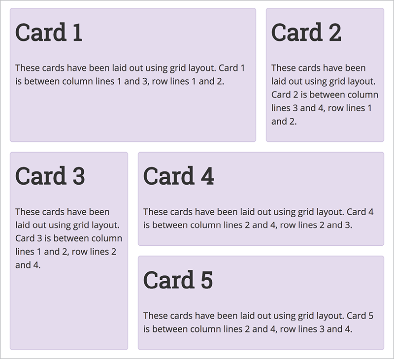
Fig 3.18: Cards placed on the grid by line number.
You can immediately see some of the power of Grid Layout here. We can span columns and rows—something that is hard to do using existing layout methods. The background color of our cards extends to the gutter, even if the content is shorter. It’s also very easy to change how far a block spans—we can even leave white space! If I change the start line of card 3 to row line 3, we get an empty cell (Fig 3.19). Nothing can rise and land in the grid cell; this differs from the behavior of floats, which try to float up and fill the available space.
Another method of positioning items on a grid involves using named areas. This allows you to describe your layout right in your CSS. To do this with our example, we first give each card a name with the grid-area property. I’m just using letters a through e.
.card1 { grid-area: a; }
.card2 { grid-area: b; }
.card3 { grid-area: c; }
.card4 { grid-area: d; }
.card5 { grid-area: e; }

Fig 3.19: White space made easy with CSS Grid Layout.
Next, I add the grid-template-areas property to the container. The value of this property describes what our layout should look like (Fig 3.20).

Fig 3.20: The value of grid-template-areas shows visually what our layout looks like.
.cards {
display: grid;
grid-template-columns: 1fr 1fr 1fr;
grid-gap: 20px;
grid-template-areas:
"a a b"
"c d d"
"c e e";
}
Code example: http://bkaprt.com/ncl/03-17/
There are a few things to keep in mind with grid-template-areas. To span across cells, we repeat the name of the area. Card 1 spans across the first two column tracks; thus a is repeated. The areas must be rectangular in nature—we can’t yet create an L-shaped area.
To leave white space, and to leave a cell empty, use a full-stop character. If you replace the first c with ., that cell will remain empty when the layout is created (Fig 3.21).

Fig 3.21: We now have white space left in our layout.
.cards {
display: grid;
grid-template-columns: 1fr 1fr 1fr;
grid-gap: 20px;
grid-template-areas:
"a a b"
". d d"
"c e e";
}
If your grid-area names are longer than one character, you may want to line up the visual rows and columns in the value of grid-template-areas. This is possible because more than one full-stop character can denote an empty cell—if they have no white space between them. You can also add more than one white-space character to space out grid-area names.
This is a very nice way to work with layouts, given how easy it is to move items around. I enjoy working like this during the prototyping stage—rather than worrying about how to achieve layout, I can figure out the best way for my interface to be presented. Then I can go back to the markup to make sure it’s in a logical order based on those decisions.
With these few examples, you already have enough knowledge to start using Grid Layout, and to make decisions about which layout methods to use. There is more to come, but keep in mind that although the specification is large and can do a lot of things, it is very simple at its core. You can do a lot with very little CSS. As you start building layouts, you will have questions, and will want to achieve more with these layout methods. That’s where the rest of this book comes in!