Chapter 2: Introduction to SAS Graph Template Language
2.2 Creating a Simple GTL Graph
2.7 Titles, Footnotes and Entries and Unicode
2.11 Dynamics and Macro Variables
2.12 Expressions and Conditionals
2.13 Styles and Plot Attributes

The successful warrior is the average man, with a laser-like focus. - Bruce Lee
The SAS Graph Template Language (GTL) is the cornerstone of the ODS Graphics system. As mentioned in Chapter 1, ODS Graphics is an umbrella term that covers the different ways in which you can create modern analytical graphs in SAS. These ways include automatic graphs from SAS procedures and custom graphs using the Statistical Graphics Procedures and the interactive ODS Graphics Designer application.
All of the above ways to create graphs use the GTL as the underlying foundation for defining the structure of the graph (the template). In some cases, you will write the GTL code explicitly; in other cases, the GTL code is generated for you behind the scenes.
2.1 Getting Started
You can use the TEMPLATE procedure to define different types of templates for creating tables, styles, and more. One of the template types that you can create is the STATGRAPH template. This template uses GTL to define the structure of the graph. In this book, we will focus on creating STATGRAPH templates for graphs. We may often refer to a STATGRAPH template as a GTL template.
Creating a graph using GTL is a two-step process:
1. First, you define the structure of the graph in the form of the STATGRAPH template using GTL. The typical syntax is shown below. When you submit this step, the template code is compiled and saved. No graph is created.
proc template;
define statgraph template-name;
begingraph / <options>;
<gtl statements to define the graph>
endgraph;
end;
run;
2. Second, you associate the data with the template using the SGRENDER procedure to create the graph.
proc sgrender data=data-set-name template=template-name;
<other optional statements>
run;
2.2 Creating a Simple GTL Graph
The figure below shows a simple, but useful graph, created using the process that we discussed above. This is a histogram for the MPG_CITY variable in the SASHELP.CARS data set.
|
proc template; define statgraph Histogram; begingraph; entrytitle 'Distribution' ' of Mileage'; layout overlay; histogram mpg_city; endlayout; endgraph; end; run; proc sgrender data=sashelp.cars(where=(type ne 'Hybrid')) template= Histogram; run; |
 |
Key parts of the code are as follows:
1. The name of the template is “Histogram.”
2. The entire GTL code is inside the BEGINGRAPH – ENDGRAPH block.
3. The graph includes a title using the ENTRYTITLE statement.
4. The graph has one data cell, which is defined by the LAYOUT OVERLAY - ENDLAYOUT block.
5. The cell contains a histogram, defined by the HISTOGRAM statement.
6. Running the PROC TEMPLATE step only compiles and saves the template.
7. The actual graph is created by running the PROC SGRENDER step, where the data from SASHELP.CARS is associated with the template Histogram.
2.3 Components of GTL
In section 2.2, we looked at a graph that showed the distribution of mileage for non-hybrid cars using some components of the GTL syntax. In the rest of this chapter, we will take a quick tour of these components. If you need to get to the examples right away, you can skip to Chapter 3, and come back for a complete overview later.
The GTL components are:
1. Plots: GTL supports a large variety of plot statements that you can be combined to create the desired graph. Plots determine how the data is displayed. In Section 2.2 we have used one HISTOGRAM statement.
2. Layouts: GTL supports a variety of containers or layouts. All plot statements must be placed within layouts that determine where the plots are drawn. You can use layouts to manage the graph area, creating single-cell or multi-cell graphs. You can nest the layouts inside other layouts to create complex graphs. But there can be only one root layout statement inside the BEGINGRAPH block. In Section 2.2 we have used one LAYOUT OVERLAY container.
3. Titles, Footnotes, and entries: You can use these components to place textual descriptive information in the graph. Titles and footnotes can only be placed outside of the root layout statement, inside the BEGINGRAPH block. Titles are drawn automatically at the top of the graph and footnotes at the bottom, in the order in which they are provided.
4. Axes: Each cell of the graph can have up to two sets of X and Y axes. The axes for multi-cell graphs can be independent or uniform. Common row and column axes can be used. Axes come in different types such as linear, log, time, and category.
5. Legends: Your graph can have multiple legends, both discrete and continuous. Legends can be inside the cell data area, or outside of the data area. Legends can contain contributions from one or more plots in the graph or predefined LEGENDITEMs.
6. Attribute maps: With SAS 9.3, you can assign visual attributes for plot elements based on data value. For example, you can define a discrete attribute map that specifies which visual attributes are to be assigned for “Drug A,” regardless of its order in the data. Similarly, continuous data ranges can be assigned specific visual attributes.
7. Dynamics and macro variables: You can create templates with specific variable names like the one shown in Section 2.2. In this case, mpg_city is used as the histogram analysis variable. You can make templates more flexible with the use of dynamics and macro variables.
8. Expressions and conditionals: You can use expressions within the GTL syntax to assign derived data to a plot role. Also, the behavior of the template can be controlled by using conditional statements in the template, often using dynamic variables.
9. Styles and plot attributes: Visual attributes for all elements of the graph are derived from the active style for the open destination. Each destination has a default style that has been carefully designed to create an aesthetically pleasing graph. Additionally, you can assign custom attributes to all plot elements using options.
10. Graph: All GTL statements must be placed inside the BEGINGRAPH – ENDGRAPH block. There can be only one such block in the template.
11. In-line draw: With SAS 9.3, you can add arbitrary graphical elements anywhere in the graph using the DRAW statements. The components can be drawn relative to the origin of any container, including the whole graph.
12. Annotations: With SAS 9.4, you can add arbitrary graphical elements anywhere in the graph using the SGANNO data set. This data set contains specific column names for drawing actions, and each observation represents one drawing action.
2.4 GTL Graph Terminology
It will be useful for us to establish a common terminology for referring to various components of a GTL graph listed in section 2.3. The terminology applicable to all graphs is shown below. Graphs can be of the following types:
1. Single-cell graph
2. Multi-cell graph
3. Multi-cell classification panel.

2.5 Plots
The plot statements are one of the key ingredients in every STATGRAPH template. Along with the layout statements mentioned in section 2.6, plot statements are required to create any graph. Plot statements decide how the data is displayed. Layouts decide where the plot is displayed.
You can associate any plot statement with one X axis and one Y axis. The plot statements can be grouped into the following categories, listed in alphabetical order:
2.5.1 Basic Plots
You can use these plots to display each individual observation from the data in the plot without any summarization. The plot statements in this group are:
1. BANDPLOT
2. BLOCKPLOT
3. BUBBLEPLOT (SAS 9.3)
4. DENDOGRAM (SAS 9.3)
5. FRINGEPLOT
6. HIGHLOWPLOT (SAS 9.3)
7. NEEDLEPLOT
8. SCATTERPLOT
9. SERIESPLOT
10. STEPPLOT
11. VECTORPLOT
2.5.2 Categorical Plots
You can use these plots to display a summary statistic of the response variable by the category variable. The plot statements in this group are:
1. BARCHART
2. LINECHART (SAS 9.3)
3. PIECHART (SAS 9.3)
4. WATERFALLCHART (SAS 9.3)
2.5.3 Distribution Plots
You can use these plots to view the distribution of the data. The plot statements in this group are:
1. BOXPLOT
2. DENSITYPLOT
3. ELLIPSE
4. HISTOGRAM
2.5.4 Fit Plots
You can use these plots to fit a curve for the (x, y) data provided. These plots are often used together with a SCATTERPLOT. The MODELBAND statement is used in conjunction with the LOESSPLOT, PBSPLINEPLOT, or REGRESSIONPLOT statement to view the confidence interval. The plot statements in this group are:
1. LOESSPLOT
2. PBSPLINEPLOT
3. REGRESSIOPLOT
4. MODELBAND
2.5.5 Parametric Plots
The data for these plots are in parametric form. For example, instead of (x, y) values for each observation, you may have a slope and an intercept. Often the data extents for the plot cannot be determined from the plot itself, so some of these plots may not be used stand-alone.
Non-summarizing versions of some plot types are also labeled as “PARM”. These plots display the information that you have provided. The plot statements in this group are:
1. BARCHARTPARM
2. BOXPLOTPARM
3. CONTOURPLOTPARM
4. ELLIPSEPARM
5. HEATMAPPARM (SAS 9.3)
6. HISTOGRAMPARM
7. LINEPARM
8. MOSAICPLOTPARM (SAS 9.3)
2.5.6 3-D Plots
You can use these statements to create 3-D plots. The data for these plots is in (x, y, z) form, where z is the axis shown vertically. These plot statements are “parametric” in nature because they plot the data provided without any summarization. The plot statements in this group are:
1. BIHISTOGRAM3DPARM
2. SURFACEPLOTPARM
2.5.7 Other Plots
The plots in this group are used with other plots to provide data-based context. The plot statements in this group are:
1. DROPLINE
2. REFERENCELINE
3. SCATTERPLOTMATRIX
4. AXISTABLE (SAS 9.4)
2.6 Layouts
The layout statements are a key ingredient in every STATGRAPH template. Along with the plot statements mentioned in section 2.4, they are required to create any graph. Plot statements decide how the data is displayed; the layouts decide where the plot is displayed. You can use the layout statements to manage the area available for the graph and to subdivide the graph area into smaller, manageable chunks. The layouts are as follows:
1. The graph container:
a. BEGINGRAPH
2. Single-cell layouts:
a. LAYOUT OVERLAY
b. LAYOUT REGION
c. LAYOUT OVERLAYEQUATED
d. LAYOUT OVERLAY3D
3. Multi-cell ad hoc layouts:
a. LAYOUT GRIDDED
b. LAYOUT LATTICE
4. Multi-cell classification panels:
a. LAYOUT DATALATTICE
b. LAYOUT DATAPANEL
c. LAYOUT PROTOTYPE
5. Other layouts:
a. LAYOUT GLOBALLEGEND (SAS 9.3)
2.6.1 BEGINGRAPH
This is the outermost container for every STATGRAPH template. Every STATGRAPH template must have one and only one BEGINGRAPH block, which must contain all subsequent statements or blocks. There can be only a single nested tree of layouts.
2.6.2 LAYOUT OVERLAY
This is the most commonly used layout for creating a “Single-Cell” graph. You can use this container to manage the contents of one cell. All plot and other components placed in this layout share the same area bounded by the X, Y, X2, and Y2 axes.
This layout can contain multiple 2-D plot statements, nested layouts, and ENTRY and LEGEND statements.

All the plots placed in a LAYOUT OVERLAY are drawn in the common area bounded by the X, X2, Y, and Y2 axes. The plots are drawn in the order in which they are specified in the template; the last graph is drawn on top. Some examples are shown in the figure shown above.
You can combine plot statements freely in the LAYOUT OVERLAY, as long as the data type does not conflict with the current axis type. Often, the first plot is the “Primary” plot, which determines the axis type, labels, formats, and so on.
2.6.3 LAYOUT REGION (SAS 9.3)
This layout is used only with plots that do not have axes such as the PIECHART. This layout can contain a single plot that does not have axes (like pie chart), nested layouts, and ENTRY and LEGEND statements.
2.6.4 LAYOUT OVERLAYEQUATED
This is a special version of the LAYOUT OVERLAY for equated axes. As the name suggests, this layout enforces numeric axes with equal scales. The key feature of this container is that the length (in pixels) of a data interval is the same on both the x-axis and the y-axis.
This layout can contain multiple 2-D plots with numeric data on both x and y axes, nested layouts, and ENTRY and LEGEND statements.

The graph on the left shows City x Highway mileage in a regular LAYOUT OVERLAY. Note that each axis maps the data to its own full length. The line with a slope of 1.0, does not appear at a 45-degree angle in the graph.
The graph on the right shows the same graph in a LAYOUT OVERLAYEQUATED, where the same data range is assigned the same distance in pixels on each axis. Here the line segment with a slope of 1.0 has a slope of 45 degrees in the graph.
2.6.5 LAYOUT OVERLAY3D
This is a 3-D version of LAYOUT OVERLAY and can contain multiple 3-D plots, nested layouts, and ENTRY or LEGEND statements.

The graph on the left shows a surface plot created using a SURFACEPLOTPARM statement in a LAYOUT OVERLAY3D.
The graph on the right shows a bivariate histogram of count by height and weight; it was created using a BIHISTOGRAM3DPARM statement in a LAYOUT OVERLAY3D.
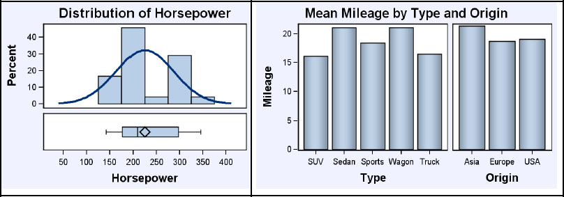
2.6.6 LAYOUT GRIDDED
You can use this layout to manage the graph area by breaking it up into smaller rectangular regions. These regions (called cells) can be populated by a single plot statement, nested LAYOUT statements, and ENTRY or LEGEND statements.

Each cell of this layout can contain any of the components mentioned above, including plots. However, this layout is useful to create small tables of statistics that can be embedded into the graphs as shown on the left in the figure above.
This layout is also useful to group multiple legends together that need to occupy the same position in the graph as shown on the right in the figure above.
2.6.7 LAYOUT LATTICE
Similar to the LAYOUT GRIDDED, this layout is also used to manage the graph area by breaking it up into smaller rectangular regions. These regions (called cells) can be populated by a single plot statement, nested LAYOUT statements, or ENTRY or LEGEND statements.
This layout is particularly appropriate for placing multiple graphs in the graph area. The graph in each cell can be independent with independent axes, uniform axes, or shared axes.
The graph on the left shows a lattice of two rows, with a common X axis. The graph on the right shows a lattice of two proportional columns with a common Y axis and independent X axes.
2.6.8 LAYOUT DATALATTICE
You can use this layout to create a classification panel by row and column. The ROWVAR and/or the COLUMNVAR can be specified to create a lattice of rows or columns or both.
Based on the number of levels of each class variable, this layout automatically creates a regular grid of the appropriate number of rows and/or columns. All the cells of the data lattice have common, external rows, and column axes. Each row has a header at the right, and each column has a header at the top. Every cell of the data lattice has the same type of graph, which is defined by the LAYOUT PROTOTYPE.
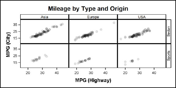
This figure shows a data lattice of two rows and three columns per the levels of the ROWVAR and COLUMNVAR variables.
2.6.9 LAYOUT DATAPANEL
This layout is used to create a classification panel by multiple classification variables. A list of classification variables can be assigned to the CLASSVARS role. There is no limit to the number of class variables, though a practical limit does apply.
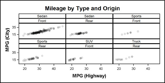
This figure shows a data panel for CLASSVARS=(type drivetrain) for the SASHELP.CLASS data set for a subset of the data. A cell is created for each crossing that has some data, and each cell has a header that shows the value of each class variable.
Each cell contains the same graph as defined by LAYOUT PROTOTYPE as discussed in Section 2.6.10. Common external uniform row and column axes are used for all cells.
In this example, Sedan and Sports have data for both the Front and Rear drivetrains. However, since there are no SUVs with Rear wheel drive, that cell is dropped.
2.6.10 LAYOUT PROTOTYPE
This layout is used in both the DATALATTICE and DATAPANEL layouts to define the graph structure used to display the subset of the data in each cell. This container is similar to the LAYOUT OVERLAY, and the graph can be built by layering multiple plot and basic plot statements like SCATTERPLOT, SERIESPLOT, BARCHART, etc.
Plot statements that process the data using the Statistical Graphics Engine (SGE), such as REGRESSIONPLOT, HISTOGRAM, BOXPLOT, etc., are not supported in this layout. Parametric versions of plot statements such as HISTOGRAMPARM, BOXPLOTPARM, etc. are supported.
2.7 Titles, Footnotes, and Entries and Unicode
You can add titles, footnotes, and entries to any graph. ENTRYTITLE and ENTRYFOOTNOTE statements must be placed in the BEGINGRAPH context, outside the outermost layout container.
ENTRY statements are used to inset textual information inside the graph data area.

The graph on the left shows the use of a title and an entry in a graph.
The graph on the right shows the use of a title and a footnote in a graph. Multiple titles and footnotes can be added. All titles will be positioned at the top and footnotes at the bottom of the graph.
Entries can be placed inside the layout containers, and can be positioned in any of the nine compass locations inside the data area or “wall.” Entries can be located outside the data area in one of four compass locations. Titles, footnotes, and entries support Unicode characters.
2.8 Axes
Each plot can have up to four independent axes as shown this figure. These are:
1. X (bottom) and X2 (top) axes
2. Y (left) and Y2 (right) axes

Each of the X, X2, Y, or Y2 axis can be one of four types. These are:
1. Linear axis for scaled numeric data.
2. Discrete axis for character or discrete numeric data.
3. Log axis for numeric data. Log axis can be Base 10, 2 or e. TICKINERVALSTYLE of LOGEXPAND, LOGEXPONENT, or LINEAR can be used.
4. Time axis for time series data.
The graph on the left shows all four axes. The axes use a concept of “thresholding,” which results in minimum offsets at the ends of the axis. An outer tick value is drawn only if needed. This difference can be noted at the low end of the X and X2 axes.
The graph on the right shows a categorical axis on the bottom X axis. The Y (left) axis is of type log with base=10. The default tick style is LOGEXPAND. Y2 axis is also of type log with base=10 and shows TICKINTERVALSTYLE=LINEAR.
2.9 Legends
Interpretation of plots with grouped data or multiple plots requires the use of a discrete legend. A discrete legend can display the symbols, line patterns, or colors for different levels of grouped data.
You can use one or more discrete legends to display statistical information about fit plots or classification information as shown in the graph below on the left. Entries in the legend can come from plot statements, Legend items, or a Discrete Attribute Map.
Interpretation of continuous response data mapped to a color gradient can be done using a continuous legend as shown in the graph on the right.

2.10 Attribute Maps
Attribute maps are a powerful and flexible way to assign specific visual attributes to group levels or to levels of continuous data. Beginning with SAS 9.3, you can use discrete and range attribute maps to define group attributes based on data values. These work in a way similar to user-defined formats.
By default, visual attributes such as color, marker symbol, etc. for group data are assigned from the GRAPHDATA1 – GRAPHDATA12 style elements based on their order of occurrence in the data. The assignment of the attributes can change from day to day, even for the same type of data based on the order or presence of the group values.
A DISCRETEATTRMAP can be used to define exactly which attributes are to be used for groups by value. You can use this to ensure that specific group values in the data are represented in the graph with specific colors. Also, a discrete attribute map can be referenced in a discrete legend, to display all values defined in the map, regardless of whether the values are present in the data.
Gradient colors for a continuous variable are obtained by default from the THREECOLORRAMP style element. The graph in section 2.9 shows a contour plot that uses a two-color ramp instead, along with the CONTINUOUSLEGEND. You can use a RANGEATTRIBUTESMAP to ensure that specific data values are represented in the graph with specific colors.
2.11 Dynamics and Macro Variables
A GTL template can be defined using explicit values for various roles and options. The graph in section 2.2 creates a histogram of the mpg.city variable. In such a case, the data set used to create the graph in the SGRENDER procedure step must contain a column with this name. Similarly, options may be specified as specific values such as DEGREE=2. Such templates are easy and simple to write, but not very flexible.
Templates can be made more flexible for different column names by using dynamic variables and/or macro variables for various data roles or options. Macro variables used with the standard SAS references are resolved at compile time. Declared macro variables are resolved at run time. Macro variables are defined and initialized in a DATA step or open code. Dynamics are defined by the DYNAMIC statement in the SGRENDER procedure.
2.12 Expressions and Conditionals
GTL templates can leverage features of SAS functions inside the template. The example in section 2.6.6 uses an ENTRY statement with a value that is evaluated using the N() function as follows:
entry halign=left " N = " eval(strip(put(n(mpg_city),12.0)));
You can use the IF-ELSE-ENDIF syntax to make the template more flexible for use with different data sets. Expressions and conditionals are used in the examples that are included in later chapters of this book.
2.13 Styles and Plot Attributes
All components of ODS Graphics including GTL work in conjunction with the ODS Styles. An ODS Style is a collection of style elements. Each style element is in turn a collection of various visual attributes that are used for the rendering of tables and graphs. Each ODS destination has a default active style. The default style for the listing destination is called LISTING. For the HTML destination, the default style in SAS 9.3 is HTMLBLUE. Previously, it was DEFAULT.
Various named style elements are used automatically to render various components of the graph. For example, the GRAPHTITLETEXT element is used to render the ENTRYTITLE statements. The textual style elements are a collection of attributes such as font face, font size, weight, color, and so on. These attributes are used by default to render the title.
Similarly, the GRAPHDATADEFAULT element is used to render non-group plots. This element includes attributes such as color, contrast color, marker symbol, line pattern, , and so on. The appropriate attributes are used to render elements. The color attribute is used for filled areas such as bars, bands, histograms, and so on. The contrast color attribute is used for markers and lines.
2.14 Draw Statements
GTL provides many data driven plot statements, so it is easy to create the graph you need. However, often it is necessary to add custom visual elements to a graph that cannot be added using a plot statement to emphasize some feature of the graph as shown in this figure.
With SAS 9.3, you can use the DRAW statements to add custom annotation to the graph. These statements are graphics-centric and not data-centric. They include statements like DRAWLINE, DRAWRECTANGLE, DRAWTEXT, DRAWARROW, as shown in the graph below.
The shape can be drawn in any one of many contexts such as GRAPH, LAYOUT, WALL, or DATA. Drawing dimensions can be PIXEL, PERCENT, or DATA.

2.15 Annotation
With SAS 9.4, you can add annotations to your graph using the SGANNO data set. This data set contains columns with predefined names that provide information needed for drawing the annotation. Each observation provides the data needed for one individual annotation.
2.16 Summary
In this chapter, we have covered the key components of the Graph Template Language syntax that you can use to create your graphs. GTL is a structured language that uses nested blocks of code. Each template is made up of one BEGINGRAPH – ENDGRAPH block that contains the entire definition of the graph. In addition to titles and footnotes, this block includes one LAYOUT – ENDLAYOUT block that contains plot statements and other nested layouts.
You can use the TEMPLATE procedure to define a STATGRAPH template using a combination of various GTL statements. The layouts determine how your graph area is organized, and the plot statements determine how the data is displayed. You can use other statements as needed. You can refer to variables in the data set directly by name, or indirectly using dynamics. Dynamics, macro variables, and conditional syntax can be used to make your templates flexible and extensible.
After your template is defined and compiled, it is stored in the item store, Templates supplied by SAS are in SASHELP.TMPLMAST. However, most user-defined templates are in SASUSER.TEMPLAT. This can be changed by using the ODS path statement. Running the TEMPLATE procedure step only creates the compiled template. No graph is created in this step.
You can associate data with a compiled template to create a graph using the SGRENDER procedure. If your template uses dynamics, the values for these can be defined in this step.
In the next chapter, we will create a graph from start to finish, step by step. You will see how different statements are used to create a graph.