Chapter 4: Creating Single-Cell Graphs
We are what we repeatedly do; excellence, then, is not an act but a habit. – Aristotle
You can use the GTL syntax to create many types of graphs, generally categorized as single-cell graphs, multi-cell graphs, and classification panels as mentioned in Chapter 2. In this chapter, we will discuss how you can create single-cell graphs using GTL.
A single-cell graph has one cell that displays graphically all the data using one set of common, shared axes. In addition to this, the graph can have multiple titles, footnotes, and legends. This is the most common type of graph that is in use.
4.1 Overview
You can create a single-cell graph by placing one or more compatible plot statements in an overlay container. A single-cell graph consists of the following parts:
1. An overlay container like LAYOUT OVERLAY, with axis options.
2. One or more compatible plot statements like HISTOGRAM, DENSITYPLOT, etc.
3. One or more titles, footnotes, and legends.
The LAYOUT OVERLAY statement defines a common container in which plots can be stacked in layers. The overlay container can have an X, Y, X2, and Y2 axes. The layout statement has options to set the type and other parameters of each axis.
The plot statements such as SCATTERPLOT or HISTOGRAM define how the data should be presented. One or more compatible plot statements can be used together. All plot statements have the following required and optional parameters:
1. Required data parameters like X, Y, CATEGORY, RESPONSE, etc.
2. Optional data parameters like GROUP, XORIGIN, YORIGIN, etc.
3. Optional parameters for plot feature and visual attributes.

You can combine many of the plots with each other as long as their data type is compatible. Plots are drawn in the order in which they are specified as shown in the figure above..
LAYOUT OVERLAY options: AspectRatio, AutoAlign, BackgroundColor, Border, BorderAttrs, CycleAttrs, HAlign, Height, Opaque, OuterPad, Pad, VAlign, WallColor, WallDisplay, Width, X2AxisOpts, XAxisOpts, Y2AxisOpts, YaxisOpts.
Equated Plot
In a regular LAYOUT OVERLAY, the X and Y data ranges are mapped to the length of the axis that is available, based on the width and height of the graph. In this case, if the same variable (for example, the weight variable) is plotted on both axes, and if the graph width is twice the graph height, then the same 10 units of weight get twice as many pixels on the X axis as on the Y axis,.
In such a case, if you draw a line with data slope = 1, then geometrically, the line does not have a 45-degree slope in the graph.
Often you may need to create a graph where it is important to keep the aspect ratio of the X and Y axes uniform. Ten units on the X and Y axis should have equal numbers of pixels. In such a case, a line with data slope = 1 will indeed be drawn at a 45-degree angle on the graph.
You can use the LAYOUT OVERLAYEQUATED container to do this. This container forces the data scale on each axis to have the same mapping to the pixels on the screen. This ensures that the aspect ratio of the data is preserved, regardless of the width and height of the graph. See “Contour Plot” in Section 4.6.4.
LAYOUT OVERLAYEQUATED options: AutoAlign, BackgroundColor, Border, BorderAttrs, CommonAxisOpts, CycleAttrs, EquateType, HAlign, Height, Opaque, OuterPad, Pad, VAlign, WallColor, WallDisplay, Width, XAxisOpts, YAxisOpts.
3-D Plot
GTL supports two 3-D plots, a bivariate histogram and a surface plot. 3-D plot statements must be used in a 3-D container, and cannot be mixed and matched with 2-D statements.
The LAYOUT OVERLAY3D container supports such 3-D plot statements. See examples in sections 4.6.5 and 4.6.6.
LAYOUT OVERLAY3D options: AutoAlign, BackgroundColor, Border, BorderAttrs, Cube, CycleAttrs, HAlign, Height, Opaque, OuterPad, Pad, Rotate, Tilt, VAlign, WallColor, WallDisplay, Width, XAxisOpts, YAxisOpts, ZAxisOpts, Zoom.
Let us now review the individual plot statements as single-cell graphs. We will see the frequently used plot options along with a list of options supported by the plot statement. Later we will view some combination plots.
4.2 Basic Plots
This group of plots displays a graphical element for each observation in the data. The plots that are included in this group are:
• Scatter plot
• Series plot
• Step plot
• Band plot
• HighLow plot
• Bubble plot
• Needle plot
• Vector plot
• Parametric bar chart
• Parametric histogram
• Parametric box plot
4.2.1 Scatter Plot
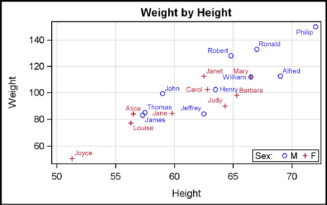
This is a scatter plot of weight by height with “sex” as the group variable. The DATALABEL option is used to display the data label. A legend is placed in the bottom right corner of the plot area.
The scatter plot is a very versatile plot statement. It enables you to draw the data, x and y error bars, and data labels. Data labels use a collision avoidance algorithm to minimize label collision. You can also use the MARKERCHARACTER option to draw textual data from columns to an (x, y) location in the plot.
proc template;
define statgraph Fig_4_2_1;
begingraph;
entrytitle 'Weight by Height';
layout overlay / xaxisopts=(griddisplay=on)
yaxisopts=(griddisplay=on);
scatterplot x=height y=weight / group=sex datalabel=name name='a';
discretelegend 'a' / location=inside title='Sex:' halign=right
valign=bottom ;
endlayout;
endgraph;
end;
run;
proc sgrender data=sashelp.class template= Fig_4_2_1;run;
Frequently used options: ClusterWidth, ColorModel, DataLabel, DataSkin, DataLabelPosition, DataTransparency, DiscreteOffset, FilledOutlinedMarkers, Freq, Group, GroupDisplay, GroupOrder, Jitter, LegendLabel, MarkerAttrs, MarkerCharacter, Name, Url, XAxis, XErrorLower, XErrorUpper, YAxis, YErrorLower, YErrorUpper.
4.2.2 Series Plot
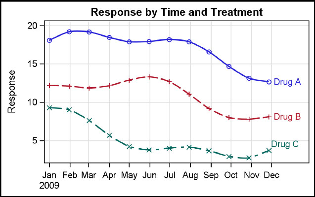
This is a series plot of response by date and treatment. You can use the CURVELABEL option to label the curve for each drug directly and the SMOOTHCONNECT option to draw smooth lines. Marker display is enabled, and the line thickness is set to two pixels.
Starting with SAS 9.4, you can use the SUBPIXEL option to get a smoother rendering of the curves.
proc template; /*--SAS 9.4--*/
define statgraph Fig_4_2_2;
dynamic _title;
begingraph / subpixel=on;
entrytitle 'Response by Time by Treatment';
layout overlay / yaxisopts=(griddisplay=on label='Response')
xaxisopts=(griddisplay=on display=(ticks tickvalues));
seriesplot x=date y=val / group=drug curvelabel=drug
display=(markers) smoothconnect=true lineattrs=(thickness=2);
endlayout;
endgraph;
end;
run;
proc sgrender data=GTL_GS_SeriesGroup template=Fig_4_2_2;run;
Frequently used options: Break, ClusterWidth, ConnectOrder, CurveLabel, CurveLabelPosition, CurveLabelSplit, DataLabel, DataSkin, DataTransparency, DiscreteOffset, Display, Group, GroupDisplay, GroupOrder, LegendLabel, LineAttrs, LineColorGroup, LinePatternGroup, MarkerAttrs, MarkerColorGroup, MarkerSymbolGroup, Name, SmoothConnect, Url, XAxis, YAxis.
4.2.3 Step Plot

This is a step plot of response and limits by date and treatment. Curve labels are displayed at the left side of the curves. Marker display is enabled with filled circle markers, and the line thickness is set to two pixels. Note the gap in the curve for Drug C using the BREAK option.
proc template;
define statgraph Fig_4_2_3;
begingraph;
entrytitle 'Response and CL by Time and Treatment';
layout overlay / xaxisopts=(display=(ticks tickvalues line))
yaxisopts=(display=(ticks tickvalues line));
stepplot x=date y=val / group=drug name='s' errorupper=upper
errorlower=lower lineattrs=(pattern=solid) justify=center
display=(markers) markerattrs=(symbol=circlefilled) break=true
curvelabel=drug curvelabelposition=min;
endlayout;
endgraph;
end;
run;
proc sgrender data=GTL_GS_stepGroup template=Fig_4_2_3;
run;
Frequently used options: Break, ClusterWidth ConnectOrder, CurveLabel, CurveLabelPosition, CurveLabelSplit, DataLabel, DataSkin, DataTransparency, DiscreteOffset, Display, ErrorLower, ErrorUpper, Group, GroupDisplay, Join, Justify, LegendLabel, LineAttrs, MarkerAttrs, Name, Url, XAxis, YAxis.
4.2.4 Band Plot
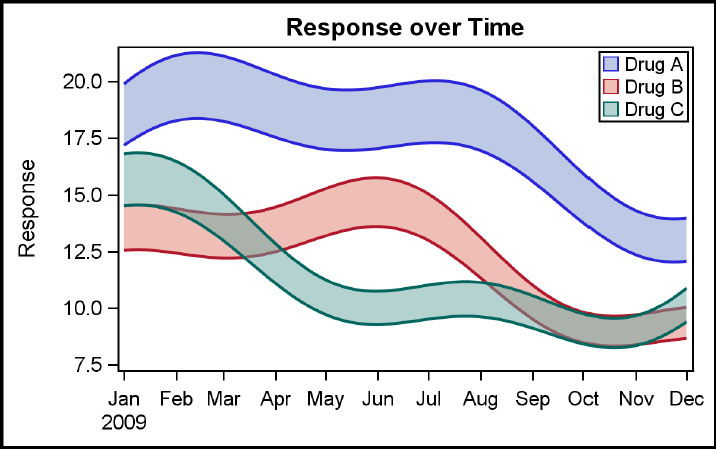
This is a grouped band plot of response range by date and treatment. You can use transparency to see filled regions that have overlaps. Band outline patterns are set to solid. A legend is placed in the top right of the plot area to identify the group values. Starting with SAS 9.4, you can use the SUBPIXEL option to get a smoother rendering of the curves.
proc template; /*--SAS 9.4--*/
define statgraph Fig_4_2_4;
dynamic _title;
begingraph / subpixel=on;
entrytitle 'Response over Time';
layout overlay / yaxisopts=(label='Response')
xaxisopts=(display=(ticks tickvalues));
bandplot x=date limitupper=upper limitlower=lower /
group=drug display=(fill outline)
outlineattrs=(pattern=solid thickness=2)
fillattrs=(transparency=0.5) name='a';
discretelegend 'a' / location=inside
halign=right valign=top across=1;
endlayout;
endgraph;
end;
run;
proc sgrender data=GTL_GS_bandGroup template=Fig_4_2_4; run;
Frequently used options: CurveLabelLower, CurveLabelUpper, DataTransparency, DiscreteOffset, Display, Extend, FillAttrs, Group, Justify, LegendLabel, ModelName, Name, OutlineAttrs, Type, XAxis, YAxis.
4.2.5 High Low Plot (TYPE = Line)
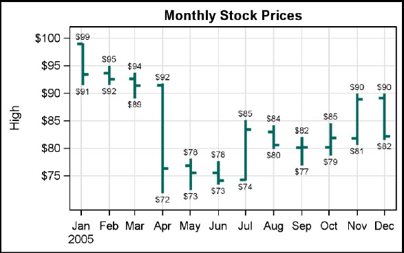
This graph of monthly stock prices is created using a high low plot of type line. The high low plot can be vertical with X, HIGH, and LOW parameters, or horizontal with Y, HIGH, and LOW parameters. The OPEN and CLOSE parameters are optional. You can display the high and low data values using the LOWLABEL and HIGHLABEL options. The line attributes are set to GRAPHDATA3 with a solid pattern and thickness of three pixels. X and Y axis options are used in the BEGINGRAPH statement to customize each axis.
proc template;
define statgraph Fig_4_2_5;
begingraph;
entrytitle 'Monthly Stock Prices';
layout overlay / xaxisopts=(griddisplay=on display=(ticks
tickvalues))
yaxisopts=(griddisplay=on);
highlowplot x=date high=high low=low / open=open close=close
lineattrs=graphdata3(thickness=3 pattern=solid)
lowlabel=low highlabel=high;
endlayout;
endgraph;
end;
run;
proc sgrender template=Fig_4_2_5
data=sashelp.stocks(where=(stock='IBM' and date > '01Jan05'd));
format low high dollar4.0;
run;
Frequently used options: BarWidth, ClipCap, Close, DataSkin, DataTransparency, DiscreteOffset, Display, FillAttrs, Group, GroupDisplay, HighCap, HighLabel, LabelAttrs, LegendLabel, LineAttrs, LowCap, LowLabel, Name, Open, OutlineAttrs, Type, Url, XAxis, Yaxis.
4.2.6 High Low Plot (TYPE = Bar)
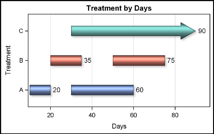
This graph of treatment duration is created using a high low plot of type bar. The high low plot can be vertical with X, HIGH, and LOW parameters, or horizontal with Y, HIGH, and LOW parameters. Labels and caps can be displayed at each end.
You can display the high cap and high label using the HIGHCAP and HIGHLABEL options. The variable “Drug” is used as a group variable, and a data skin is applied. Data label font size is increased.
proc template; /*--SAS 9.4--*/
define statgraph Fig_4_2_6;
begingraph;
entrytitle 'Treatment by Days';
layout overlay / xaxisopts=(griddisplay=on label='Days')
yaxisopts=(label='Treatment'),
highlowplot y=drug high=high low=low / highcap=cap
highlabel=high type=bar group=drug dataskin=sheen
outlineattrs=(pattern =solid) barwidth=0.6
labelattrs=(size=10);
endlayout;
endgraph;
end;
run;
proc sgrender data=GTL_GS_highlow template=Fig_4_2_6;
run;
Frequently used options: BarWidth, ClipCap, Close, DataSkin, DataTransparency, DiscreteOffset, Display, FillAttrs, Group, GroupDisplay, HighCap, HighLabel, LabelAttrs, LegendLabel, LineAttrs, LowCap, LowLabel, Name, Open, OutlineAttrs, Type, Url, XAxis, Yaxis.
4.2.7 Bubble Plot
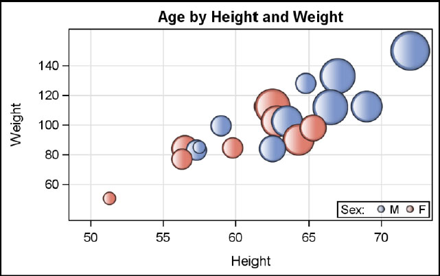
This is a bubble plot of age by height and weight by sex. A data skin is used to draw a shaded bubble. The legend for the group variable is placed in the lower right corner of the data area with a title. Bubble sizes can be relative (default) or absolute. In this (default) case, the lowest response value is mapped to the minimum bubble size (default marker size). The largest response value is mapped to the maximum bubble size (3x default marker size).
You can use the RELATIVESCALETYPE option to get proportional scaling of the bubbles.
proc template; /*--SAS 9.4--*/
define statgraph Fig_4_2_7;
begingraph / subpixel=on;
entrytitle 'Age by Height and Weight';
layout overlay / xaxisopts=(griddisplay=on)
yaxisopts=(griddisplay=on);
bubbleplot x=height y=weight size=age / group=sex
dataskin=gloss name='a';
discretelegend 'a' / location=inside valign=bottom
halign=right title='Sex:';
endlayout;
endgraph;
end;
run;
proc sgrender data=sashelp.class template=Fig_4_2_7;
run;
Frequently used options: ColorModel, ColorResponse, DataLabel, DataLabelAttrs, DataLabelPosition, DataSkin, DataTransparency, Display, FillAttrs, Group, LegendLabel, Name, OutlineAttrs, RelativeScale, RelativeScaleType, ReverseColorModel, Url, XAxis, YAxis.
4.2.8 Needle Plot

This is a needle plot of response over time, with display of markers and data labels. Data label positions have been set to the top, so data label collision avoidance is turned off. X and Y axis options are set to customize the axes.
You can use the BASELINEINTERCEPT option to set a baseline other than zero. In this case, the needles are drawn from the data point to the baseline.
proc template;
define statgraph Fig_4_2_8;
dynamic _title;
begingraph;
entrytitle 'Response over Time';
layout overlay / xaxisopts=(display=(ticks tickvalues))
yaxisopts=(label='Response' offsetmin=0);
needleplot x=date y=a / display=(markers)
lineattrs=(thickness=3) datalabel=a
markerattrs=(symbol=circlefilled size=11)
datalabelposition=top datalabelattrs=(size=5);
endlayout;
endgraph;
end;
run;
proc sgrender data=GTL_GS_NeedleLabel template=Fig_4_2_8;
run;
Frequently used options: BaseLineIntercept, DataLabel, DataLabelAttrs, DataSkin, DataTransparency, DiscreteOffset, Display, Group, GroupDisplay, LegendLabel, LineAttrs, MarkerAttrs, Name, Url, XAxis, YAxis.
4.2.9 Vector Plot
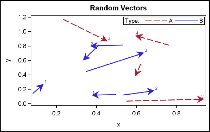
This graph shows grouped vectors with labels. The arrowhead shape and the line thickness of the vectors are set. The discrete legend has been placed in the top right corner of the data area. For vector plot, the XORIGIN and YORIGIN are optional.
proc template;
define statgraph Fig_4_2_9;
begingraph;
entrytitle 'Random Vectors';
layout overlay;
vectorplot x=x y=y xorigin=xo yorigin=yo / group=type name='a'
arrowheadshape=barbed datalabel=label
lineattrs=(thickness=2);
discretelegend 'a' / sortorder=ASCENDINGFORMATTED
title='Type:' location=inside halign=right valign=top;
endlayout;
endgraph;
end;
run;
proc sgrender data=GTL_GS_vector template=Fig_4_2_9;
run;
Tip: Vectors without arrowheads can be used to draw floating line segments.
Tip: Vector plot does not support character variables. You can use numeric variables with user-defined formats to represent character data.
Frequently used options: Arrowheads, Clip, DataLabel, DataLabelAttrs, DataSkin, DataTransparency, Group, LegendLabel, LineAttrs, Name, XAxis, YAxis.
4.3 Categorical Plots
4.3.1 Bar Chart

This graph shows the mean city mileage of cars by origin and type. You can display the group values side-by-side by setting GROUPDISPLAY=CLUSTER. A data skin is applied, and a discrete legend is displayed. Starting with SAS 9.4, you can use CATEGORY and RESPONSE roles instead of X and Y.
proc template;
define statgraph Fig_4_3_1;
begingraph;
entrytitle 'Mileage by Origin and Type';
layout overlay / xaxisopts=(display=(ticks tickvalues))
yaxisopts=(griddisplay=on);
barchart x=origin y=mpg_city / group=type stat=mean
groupdisplay=cluster dataskin=gloss name='a';
discretelegend 'a' / title='Type:';
endlayout;
endgraph;
end;
run;
proc sgrender data=sashelp.cars(where=(type not in ('Hybrid' 'Truck')))
template=Fig_4_3_1;
run;
Frequently used options: BarLabel, BarWidth, BaselineIntercept, DataSkin, DataTransparency, DiscreteOffset, Display, FillAttrs, Group, GroupDisplay, LegendLabel, Name, Orient, OutlineAttrs, Stat, Target, Url, XAxis, YAxis.
4.3.2 Axis Table (SAS 9.4)
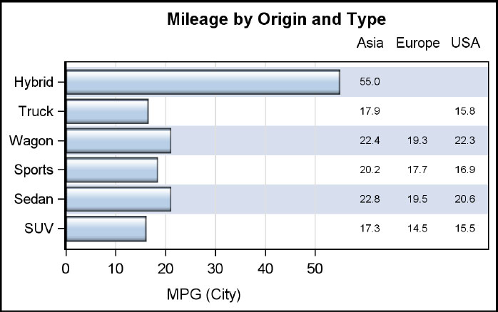
This graph uses an axis table to display the statistics shown on the right side of the horizontal bar chart. The axis table is placed in an INNERMARGIN on the right. The Y role uses the same variable as the category variable for the bar chart. You can display multiple columns by group using the CLASS option. In this case, STAT is set to mean. Note the use of alternate color bands on the Y axis.
proc template; /*--SAS 9.4--*/
define statgraph Fig_4_3_2;
begingraph;
entrytitle 'Mileage by Origin and Type';
layout overlay / xaxisopts=(griddisplay=on)
yaxisopts=(display=(ticks tickvalues)
discreteopts=(colorbands=even));
barchart category=type response=mpg_city / orient=horizontal
groupdisplay=cluster stat=mean dataskin=gloss;
innermargin / align=right;
axistable y=type value=mpg_city / class=origin display=(label)
labelposition=max stat=mean;
endinnermargin;
endlayout;
endgraph;
end;
run;
proc sgrender data=sashelp.cars template=Fig_4_3_2;
format mpg_city 4.1; run;
Frequently used options: Class, ColorGroup, DataTransparency, Display, LabelAttrs, LabelPosition, Name, Position, Stat, TextGroup, ValueAttrs, XAxis, YAxis.
4.3.3 Line Chart
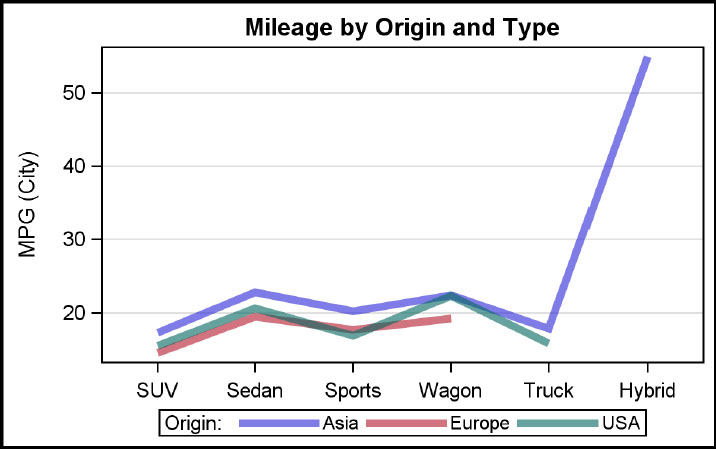
This graph shows a line chart of mean city mileage of cars by type and origin. You can set the line attributes using the LINEATTRS option. Note that the line chart does not set zero as the default baseline on the Y axis. Instead, it uses a value close to the minimum data value.
You can use axis options to customize the axes.
proc template; /*--SAS 9.4--*/
define statgraph Fig_4_3_3;
begingraph;
entrytitle 'Mileage by Origin and Type';
layout overlay / xaxisopts=(display=(ticks tickvalues))
yaxisopts=(griddisplay=on);
linechart category=type response=mpg_city / group=origin
stat=mean
lineattrs=(thickness=5 pattern=solid) datatransparency=0.4
name='a';
discretelegend 'a' / title='Origin:';
endlayout;
endgraph;
end;
run;
proc sgrender data=sashelp.cars template=Fig_4_3_3;
run;
Frequently used options: BaselineIntercept, Break, DataSkin, DataTransparency, Display, FillAttrs, Group, GroupDisplay, LegendLabel, LineAttrs, MarkerAttrs, Name, Orient, Stat, Url, VertexLabel, VertexLabelAttrs, XAxis, YAxis.
4.3.3 4 Pie Chart
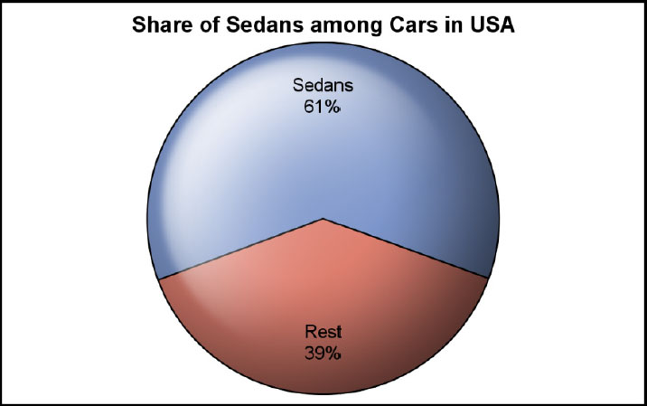
You can use a pie chart to show the share of the cars held by sedans. A pie chart cannot be used in a LAYOUT OVERLAY. Instead, it is used in a LAYOUT REGION container.
A pie chart is generally a very good visual to display part-to-whole relationships, as shown above. Pie charts are less effective when the number of categories (slices) gets large. Generally, a pie chart is not considered to be the preferred visual to view magnitude relationships between slices.
proc template;
define statgraph Fig_4_3_34;
begingraph;
entrytitle 'Share of Sedans among Cars in USA';
layout region;
piechart category=type response=pct / dataskin=sheen
datalabelcontent=(category response) name='a' start=340;
endlayout;
endgraph;
end;
run;
proc sgrender data=GTL_GS_Sedans(where=(origin='USA')) template=Fig_4_3_4;
run;
Frequently used options: DataLabelAttrs, DataLabelContent, DataLabelLocation, DataSkin, DataTransparency, Display, FillAttrs, Group, LegendLabel, Name, OtherSlice, OutlineAttrs, Start, Stat, Type, Url.
4.4 Distribution Plots
4.4.1 Histogram

This graph shows the distribution of mileage for all cars excluding hybrids. By default, a BIN axis is used, which labels each bin. Use of an interval axis can also be specified.
You can overlay one or more density plots on a histogram as shown in Section 4.7.2 and use axis options to customize the axes. You can also overlay additional histograms to see the distribution of multiple variables in one graph. In such a case, you might want to make the plots partially transparent to see the overlaid regions.
proc template;
define statgraph Fig_4_4_1;
begingraph;
entrytitle 'Distribution of Mileage';
layout overlay;
histogram mpg_city;
endlayout;
endgraph;
end;
run;
proc sgrender data=sashelp.cars(where=(type ne 'Hybrid'))
template=Fig_4_4_1;
run;
Frequently used options: BinAxis, BinStart, BinWidth, DataSkin, DataTransparency, Display, FillAttrs, Freq, LegendLabel, Name, NBins, Orient, OutlineAttrs, Weight, XAxis, YAxis.
4.4.2 Density Plots

This graph shows the Normal and Kernel density curves for mileage for all cars excluding hybrids. You can overlay multiple density plots. Here, one plot has the default type of Normal; for the other plot, we have specified the type as Kernel. Kernel options can be specified inside the parentheses.
GRAPHFIT and GRAPHFIT2 style elements are used for each density plot, and a legend is placed inside the plot area to identify each one. Density plots are commonly used with histograms.
proc template;
define statgraph Fig_4_4_2;
begingraph;
entrytitle 'Distribution of Mileage';
layout overlay;
densityplot mpg_city / name='n' lineattrs=graphfit
legendlabel='Normal';
densityplot mpg_city / kernel() name='k' lineattrs=graphfit2
legendlabel='Kernel';
discretelegend 'n' 'k' / location=inside across=1
halign=right valign=top;
endlayout;
endgraph;
end;
run;
proc sgrender data=sashelp.cars(where=(type ne 'Hybrid'))
template=Fig_4_4_2;
run;
Frequently used options: CurveLabel, DataTransparency, Freq, Kernel, LegendLabel, LineAttrs, Name, Normal, Orient, Weight, XAxis, YAxis.
4.4.3 Box Plot – Horizontal - Discrete
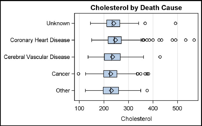
This is a horizontal box plot of cholesterol by death cause. Long category values work better on the Y axis. You can customize the axes by using the axis options.
Starting with SAS 9.3, you can create box plots with cluster groups or box plots on an interval axis as shown in Section 4.4.4. These types of box plots are commonly used in the health and life sciences domain.
proc template;
define statgraph Fig_4_4_3;
begingraph;
entrytitle 'Cholesterol by Death Cause';
layout overlay / yaxisopts=(display=(ticks tickvalues))
xaxisopts=(griddisplay=on);
boxplot y=cholesterol x=deathcause / orient=horizontal;
endlayout;
endgraph;
end;
run;
proc sgrender data=sashelp.heart template=Fig_4_4_3;
run;
Frequently used options: BoxWidth, DataSkin, DataTransparency, DiscreteOffset, Display, DisplayStats, Extreme, FillAttrs, Freq, Group, GroupDisplay, LabelFar, LegendLabel, Name, Orient, OutlierAttrs, OutlineAttrs, Percentile, Weight, WhiskerAttrs, XAxis, Yaxis.
4.4.4 Box Plot – Vertical – Interval with Groups

This is a plot of response over time by treatment. The x axis is an interval time axis. Group display of clusters is used to display the box for each treatment side by side. Axis options are set to customize the axes. The legend is placed inside the data area. When you create a grouped box plot on an interval axis, the width of each box is determined by the smallest interval that is available between the values on the category (x) axis.
proc template; /*--SAS 9.4--*/
define statgraph Fig_4_4_4;
begingraph / attrpriority=color;
entrytitle 'Response by Time and Treatment';
layout overlay / yaxisopts=(griddisplay=on)
xaxisopts=(type=time timeopts=(interval=month)
display=(ticks tickvalues));
boxplot x=date y=response / group=drug groupdisplay=cluster
name='a';
discretelegend 'a' / title='Treatment:' location=inside
halign=right valign=bottom;
endlayout;
endgraph;
end;
run;
proc sgrender data=GTL_GS_IntervalBoxGroup template=Fig_4_4_4;
run;
Frequently used options: BoxWidth, DataSkin, DataTransparency, DiscreteOffset, Display, DisplayStats, Extreme, FillAttrs, Freq, Group, GroupDisplay, LabelFar, LegendLabel, Name, Orient, OutlierAttrs, OutlineAttrs, Percentile, Weight, WhiskerAttrs, XAxis, Yaxis.
4.5 Fit Plots
4.5.1 Regression Plot
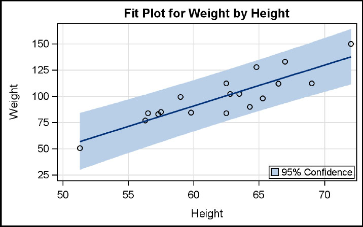
This graph shows a linear regression fit and the 95% confidence band for weight by height. You can display the appropriate confidence band using the MODELBAND statement. This statement is associated with the regression fit statement using the CLI option that has the same name string. The observations are drawn using a scatter plot, and the label for the model band is shown in the legend.
proc template;
define statgraph Fig_4_5_1;
begingraph;
entrytitle 'Fit Plot for Weight by Height';
layout overlay / yaxisopts=(griddisplay=on)
xaxisopts=(griddisplay=on);
modelband 'Reg' / name='band' legendlabel='95% Confidence';
scatterplot x=height y=weight;
regressionplot x=height y=weight / cli='Reg' name='Reg';
discretelegend 'band' / location=inside halign=right
valign=bottom;
endlayout;
endgraph;
end;
run;
proc sgrender data=sashelp.class template=Fig_4_5_1; run;
Frequently used options: Alpha, Cli, Clm, CurveLabel, Datatransparency, Degree, Freq, Group, LegendLabel, LineAttrs, Name, Weight, XAxis, YAxis.
4.5.2 Loess Plot
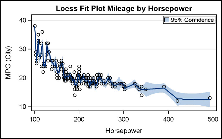
This graph shows a loess fit and the 95% confidence band for mileage by horsepower for sedans. You can display the appropriate confidence band using the MODELBAND statement. This statement is associated with the regression fit statement using the CLI option that has the same name string. The observations are drawn using a scatter plot, and the label for the model band is shown in the legend.
proc template;
define statgraph Fig_4_5_2;
begingraph;
entrytitle 'Loess Fit Plot Mileage by Horsepower';
layout overlay / yaxisopts=(griddisplay=on)
xaxisopts=(griddisplay=on);
modelband 'Loess' / name='band' legendlabel='95% Confidence';
scatterplot x=horsepower y=mpg_city;
loessplot x=horsepower y=mpg_city / clm='Loess' name='Loess';
discretelegend 'band' / location=inside halign=right valign=top;
endlayout;
endgraph;
end;
run;
proc sgrender data=sashelp.cars(where=(type eq 'Sedan'))
template=Fig_4_5_2;
run;
Frequently used options: Alpha, CLM, CurveLabel, DataTransparency, Degree, Group, Interpolation, LegendLabel, LineAttrs, MaxPoints, Name, ReWeight, Smooth, Weight, XAxis, YAxis.
4.5.3 Penalized B-Spline Plot

This graph shows a penalized B-spline fit for mileage by horsepower for sedans. You can display the appropriate confidence band using the MODELBAND statement.
The observations are drawn using a scatter plot. The fit plot supports many options to control the fit including SMOOTH, NKNOTS, MAXPOINTS, etc.
proc template;
define statgraph Fig_4_5_3;
begingraph;
entrytitle 'Spline Fit Plot Mileage by Horsepower';
layout overlay / yaxisopts=(griddisplay=on)
xaxisopts=(griddisplay=on);
scatterplot x=horsepower y=mpg_city;
pbsplineplot x=horsepower y=mpg_city / smooth=1 name='pbs';
endlayout;
endgraph;
end;
run;
proc sgrender data=sashelp.cars(where=(type eq 'Sedan'))
template=Fig_4_5_3;
run;
Frequently used options: Alpha, Cli, Clm, CurveLabel, DataTransparency, Degree, Freq, Group, LegendLabel, LineAttrs, MaxPoints, Name, NKnots, ReWeight, Smooth, Weight, XAxis, YAxis.
4.5.4 Ellipse Plot
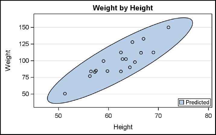
You can display the predicted ellipse around the markers for weight by height using this plot. The ellipse type of MEAN is also supported. The ellipse display options for fill and outline are set.
The ELLIPSE plot computes the predicted or confidence ellipse parameters from the data provided. You can also draw an ellipse of your own choice by using the ELLIPSEPARM plot. In this case, you are expected to provide the parametric values yourself.
proc template;
define statgraph Fig_4_5_4;
begingraph;
entrytitle 'Weight by Height';
layout overlay / yaxisopts=(griddisplay=on)
xaxisopts=(griddisplay=on);
ellipse x=height y=weight / name='e' type=predicted
display=(fill outline) legendlabel='Predicted';
scatterplot x=height y=weight;
discretelegend 'e' / location=inside halign=right valign=bottom;
endlayout;
endgraph;
end;
run;
proc sgrender data=sashelp.class template=Fig_4_5_4;
run;
Supported Options: Alpha, Clip, DataTransparency, Display, FillAttrs, Freq, LegendLabel, Name, OutlineAttrs, Type, XAxis, YAxis.
4.6 Other Plots and 3-D Plots
4.6.1 Reference Line and Drop Line
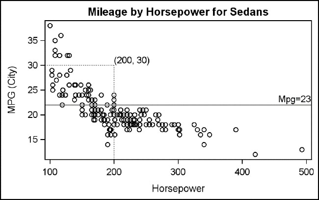
This graph shows usage of a reference line and two drop lines. You can request reference or drop lines for values explicitly provided in the syntax, or from values in a column of the data.
proc template;
define statgraph Fig_4_6_1;
begingraph;
entrytitle 'Mileage by Horsepower for Sedans';
layout overlay;
scatterplot x=horsepower y=mpg_city;
referenceline y=22 / curvelabel='Mpg=23'
curvelabellocation=inside;
dropline x=200 y=30/label='(200,30)' dropto=x
lineattrs=(pattern=dash);
dropline x=200 y=30/label='(200,30)' dropto=y
lineattrs=(pattern=dash);
endlayout;
endgraph;
end;
run;
proc sgrender data=sashelp.cars(where=(type eq 'Sedan'))
template=Fig_4_6_1;
run;
Supported options for reference line: Clip, CurveLabel, CurveLabelAttrs, CurveLabelLocation, CurveLabelPosition, CurveLabelSplit, CurveLabelSplitChar, CurveLabelSplitCharDrop, CurveLabelSplitJustify, DataSkin, DataTransparency, DiscreteOffset, LegendLabel, LineAttrs, Name, XAxis, YAxis.
4.6.2 Heat Map Parametric Plot

This is a heat map of response by x and y. This heat map uses a color response value; each value if drawn as a color uses the default three-color gradient. Axis options are used to customize the axes.
You can create heat maps using either discrete or interval data on x or y axis.
proc template;
define statgraph Fig_4_6_2;
begingraph;
entrytitle "Basic Heat Map";
layout overlay / xaxisopts=(display=(ticks tickvalues))
yaxisopts=(display=(ticks tickvalues));
heatmapparm x=x y=y colorresponse=value / name='a';
continuouslegend 'a';
endlayout;
endgraph;
end;
run;
proc sgrender data=GTL_GS_HeatmapParm template=Fig_4_6_2;
run;
Tip: For linear axes, this plot needs at least two distinct values on the axis to create a graph.
Frequently used options: ColorModel, DataTransparency, Display, FillAttrs, Name, OutlineAttrs, Primary, ReverseColorModel, RoleName, Tip, TipFormat, TipLabel, Url, XAxis, XBinAxis, XBoundaries, XEndLabels, XGap, XValues, YAxis, YBinAxis, YBoundaries, YEndLabels, YGap, YValues.
4.6.3 Line Parametric and Ellipse Parametric Plots

This graph shows overlaid parametric ellipses with a parametric line. A scatter plot has to be used as the base plot because parametric plots must be used with a plot statement with real data. If you don’t want the scatter plot values to be displayed, you can make them fully transparent using the DATATRANSPARENCY option.
proc template;
define statgraph Fig_4_6_3;
begingraph;
entrytitle 'Overlay Ellipses with Line';
layout overlayequated /
xaxisopts=(griddisplay=on display=(ticks tickvalues))
yaxisopts=(griddisplay=on display=(ticks tickvalues));
scatterplot x=height y=weight / markerattrs=(size=0);
ellipseparm xorigin=40 yorigin=100 semimajor=60 semiminor=30
slope=1 / display=(fill outline) fillattrs=graphdata1
datatransparency=0.5;
ellipseparm xorigin=100 yorigin=100 semimajor=60 semiminor=30
slope=-1/ display=(fill outline) fillattrs=graphdata2
datatransparency=0.5;
lineparm x=60 y=100 slope=1 / lineattrs=(pattern=dash
thickness=2);
endlayout;
endgraph;
end;
run;
proc sgrender data=GTL_EllipseParm_Class template=Fig_4_6_3;
run;
Supported options for ellipseparm: Clip, DataTransparency, Display, FillAttrs, Group, IncludeMissingGroup, Index, LegendLabel, Name, OutlineAttrs, XAxis, YAxis.
Supported options for lineparm: Clip, CurveLabel, CurveLabelAttrs, CurveLabelLocation, CurveLabelPosition, CurveLabelSplit, CurveLabelSplitChar, CurveLabelSplitCharDrop, CurveLabelSplitJustify, DataTransparency, Extend, Group, IncludeMissingGroup, Index, LegendLabel, LineAttrs, Name , XAxis, YAxis.
4.6.4 Contour Plot

You can use this plot to draw the contours of lake depth by length and width of the lake. The contours are drawn at equal depths, as marked on each contour line.
Contour can be of type line, gradient, filled or any allowable combinations. In this case, we have used LAYOUT OVERLAYEQUATED, to ensure the aspect ratio of the lake is preserved.
proc template;
define statgraph Fig_4_6_4;
begingraph;
entrytitle 'Lake Depth Contours';
layout overlayequated / equatetype=equate
xaxisopts=(offsetmin=0 offsetmax=0)
yaxisopts=(offsetmin=0 offsetmax=0);
contourplotparm x=width y=length z=depth /
colormodel=twocolorramp contourtype=labeledlinegradient
linelabelattrs=(size=5) reversecolormodel=true;
endlayout;
endgraph;
end;
run;
proc sgrender data=sashelp.lake template=Fig_4_6_4;
run;
Frequently used options: ColorModel, ContourType, LegendLabel, Levels, LineAttrs, Name, NHints, NLevels, XAxis, YAxis.
4.6.5 3-D Surface Plot

You can create a 3-D surface plot of the response variable Z by X and Y using this statement. The surface can be filled, grid, or both as shown here. Note the use of the LAYOUT OVERLAY3D container. The 3-D surface plot can be used together with the bivariate histogram.
proc template;
define statgraph Fig_4_6_5;
begingraph;
entrytitle 'Surface Plot';
layout overlay3d / cube=false;
surfaceplotparm x=x y=y z=z / surfacetype=fillgrid;
endlayout;
endgraph;
end;
run;
proc sgrender data=GTL_GS_Gridded template=Fig_4_6_5;
run;
Supported options: ColorModel, DataTransparency, FillAttrs, LegendLabel, Name, Primary, ReverseColorModel, SurfaceColorGradient, SurfaceType.
4.6.6 3-D Bivariate Histogram

This graph shows a bivariate histogram or count by weight and height. Display of the full 3-D cube frame is disabled. Note the use of the LAYOUT OVERLAY3D container. The bivariate histogram can be used together with the 3-D surface plot.
proc template;
define statgraph Fig_4_6_6;
begingraph;
entrytitle "Bivariate Histogram";
layout overlay3d / cube=false;
bihistogram3dparm x=height y=weight z=count / display=all ;
endlayout;
endgraph;
end;
run;
proc sgrender data=GTL_GS_HeartStats template=Fig_4_6_6;
run;
Supported options: BinAxis, DataTransparency, Display, EndLabels, FillAttrs, LegendLabel, Name, OutlineAttrs, Primary, XValues, YValues.
4.7 Real World Examples
4.7.1 Model Fit Plot
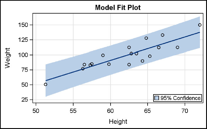
You can create this model-fit plot for weight by height using a combination of plot statements. Here we have displayed the data using a scatter plot along with linear regression fit.
The confidence band is displayed using the MODELBAND statement. Linkage between the fit and band statement is done using the CLI='band' option. This linkage ensures that the properties of the fit line are inherited by the band.
proc template;
define statgraph Fig_4_7_1;
begingraph;
entrytitle 'Model Fit Plot';
layout overlay / xaxisopts=(griddisplay=on)
yaxisopts=(griddisplay=on);
modelband 'band' / display=(fill) name='b'
legendlabel='95% Confidence';
scatterplot x=height y=weight / name='a';
regressionplot x=height y=weight / cli='band';
discretelegend 'b' / location=inside halign=right
valign=bottom;
endlayout;
endgraph;
end;
run;
proc sgrender data=sashelp.class template=Fig_4_7_1;
run;
4.7.2 Distribution Plot
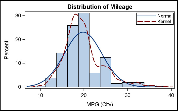
You can create this graph showing the distribution of mileage for all cars excluding hybrids by combining multiple statements. Normal and kernel density curves are added on top of the histogram. Note that the x axis is the standard interval axis, and not every bin of the histogram is labeled.
Often, space is available in the upper corners of a histogram. It is useful to place any needed legend in this area to conserve space using the appropriate options in the DISCRETELEGEND statement.
proc template;
define statgraph Fig_4_7_2;
begingraph;
entrytitle 'Distribution of Mileage';
layout overlay;
histogram mpg_city / binaxis=false;
densityplot mpg_city / name='n' lineattrs=graphfit
legendlabel='Normal';
densityplot mpg_city / kernel() name='k' lineattrs=graphfit2
legendlabel='Kernel';
discretelegend 'n' 'k' / location=inside across=1
halign=right valign=top;
endlayout;
endgraph;
end;
run;
proc sgrender data=sashelp.cars(where=(type ne 'Hybrid'))
template=Fig_4_7_2;
run;
4.7.3 Survival Plot
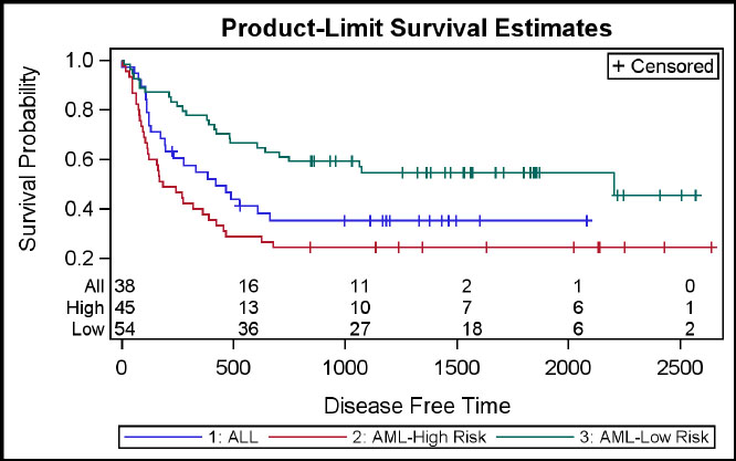
You can create this survival plot to show the probability of survival over time by type by combining multiple plot statements. Censored observations are displayed. Subjects at risk are shown aligned with the time line by type. The data is created using the LIFETEST procedure. An INNERMARGIN block is used to display the “at-risk” data along the lower edge of the plot, using the BLOCKPLOT. With SAS 9.4, you could use the AXISTABLE to do the same.
proc template;
define statgraph Fig_4_7_3;
begingraph;
entrytitle 'Product-Limit Survival Estimates';
layout overlay;
stepplot x=time y=survival / group=stratum
lineattrs=(pattern=solid) name='s';
scatterplot x=time y=censored /
markerattrs=graphdatadefault(symbol=plus) name='c';
scatterplot x=time y=censored / group=stratum
markerattrs=(symbol=plus);
innermargin;
blockplot x=tatrisk block=atrisk / class=stratumnum
display=(values label) valueattrs=(size=8)
labelattrs=(size=8);
endinnermargin;
discretelegend 'c'/ location=inside halign=right valign=top;
discretelegend 's' / valueattrs=(size=8);
endlayout;
endgraph;
end;
run;
proc sgrender data=GTL_GS_SurvivalPlotData template=Fig_4_7_3;
format stratumnum aml.;
run;