
Chapter 5: Creating Multi-Cell Graphs
I have made this letter longer than usual because I lack the time to make it shorter. - Blaise Pascal
In Chapter 4, you learned how to create single-cell graphs, and we reviewed many features of the plot statements as used in those graphs. We also saw how these plot statements can be combined. We will leverage all that we learned in Chapter 4 for creating multi-cell graphs.
In this chapter, you will learn how we create multi-cell graphs. A multi-cell graph has more than one cell that displays the data graphically. Each cell can have its own independent set of axes, or may use common axes that are shared by all the plots in a row or a column. In addition, the graph can have multiple titles, footnotes, and legends. We can also refer to these graphs as “panels.”
5.1 Overview
You can create multi-cell graphs using the following statements:
1. LAYOUT DATALATTICE. This layout always has a regular rectangular arrangement of cells. The number of rows is determined by the number of unique levels in the row variable. The number of columns is determined by the number of unique levels in the column variable. Each row has a common row heading and a common row axis. Each column has a common column heading and a common column axis.
2. LAYOUT DATAPANEL. This layout always has a regular rectangular arrangement of cells. The layout can have one or more class variables. The number of cells in the layout is determined by the number of non-empty crossings of all the class variables. There is no limit to the number of class variables. In practice, a limit may be based on cell size. Each cell has as many headings as the number of class variables, and each cell lists the value of the class variable for the cell.
3. LAYOUT LATTICE. The cells in this layout have an ad hoc arrangement decided by you, and each cell can have different plot types. The axes may be independent or shared. Each cell can have nested layouts, enabling you to create almost any arrangement.
4. LAYOUT GRIDDED. This layout is similar to the lattice except that it does not support common, uniform external axes. This type is generally more useful for creating tables of statistics embedded in a graph.
Each cell of a data lattice or data panel (items 1 and 2 above) contains the same type of plot combination that is determined by an embedded LAYOUT PROTOTYPE. The prototype is like an overlay container that can contain any combination of compatible basic plot statements as shown in Chapter 4. However, the prototype cannot contain a distribution or a fit plot. Only the subset of the data that is applicable to the cell is displayed, and all rows and columns have common external axes.
Each cell of the lattice or gridded layout can contain a single plot or entry statement, or a composite plot that is created using a LAYOUT OVERLAY, as described in Chapter 4. The axes in each cell can be independent or uniform or common. Equated and 3-D plots may also be used with some restrictions.
5.2 Layout Data Lattice
You can create a paneled graph as shown above by using the LAYOUT DATALATTICE. The structure of the statement block is shown below
proc template;
define statgraph templateName;
begingraph;
entrytitle 'Mileage by Horsepower by Type and Origin';
layout datalattice rowvar=var columnvar=var / <options>;
layout prototype;
<GTL basic plot statements>
endlayout;
sidebar / <options>
<GTL statements>
Endsidebar;
endlayout;
endgraph;
end;
run;
proc sgrender data=datasetName template=templateName;
run;
This includes the following:
• The LAYOUT DATALATTICE statement, with row and column axis options. The block is terminated by an ENDLAYOUT statement.
• The LAYOUT PROTOTYPE statement block, with options. This block contains the definition of the plots that appear in each cell. Only basic plot statements are allowed in this block. The block is terminated by an ENDLAYOUT statement.
The panel contains common external row and column axes. These are displayed on the left and bottom of the layout by default. Row headings and column headings are displayed on the right and top by default. The location of these axes can be changed by using the appropriate options. Multiple axes (X, X2, Y, and Y2) are supported.
Column axes have uniform data for all columns. By default, column widths are equal. If the column weight is PROPORTIONAL (SAS 9.4), then each column width is determined by the number of category values in each column. This makes the midpoint spacing for the categories equal across the panel. The same applies for row axes.
SIDEBAR blocks can be added to include displays of additional components such as legends. The default location for the sidebar is BOTTOM, but it can be placed at the top or on the sides.
If only the ROWVAR parameter is provided, a panel of N rows and one column is created. If only the COLUMNVAR is provided, then a panel of N columns and one row is created.
Multiple independent insets can be added to each cell. With SAS 9.4, the inset data can be merged into the data for easier coding.
Layout Datalattice frequently used options: ColumnAxisOpts, ColumnDataRange, Columns, ColumnGutter, ColumnWeight, HeaderLabelDisplay, Inset, InsetOpts, RowAxisOpts, RowDataRange, RowGutter, RowHeaders, Rows, RowWeight, SortOrder.
Layout Datalattice other options: AutoAlign, BackgroundColor, Border, BorderAttrs, CellHeightMin, CellWidthMin, Column2AxisOpts, Column2DataRange, ColumnHeaders, ExtractedHeaderNameAttrs, HAlign, HeaderBackgroundColor, HeaderLableAttrs, HeaderLabelLocation, HeaderOpaque, Height, IncludeMissingClass, Opaque, OuterPad, Pad, PanelNumber, Row2AxisOpts, Row2DataRange, RowHeaders, ShrinkFonts, SkipEmptyCells, Start, VAlign, Width.
Layout Prototype supported options: AspectRatio, CycleAttrs, WallColor, WallDisplay.
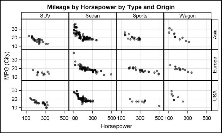
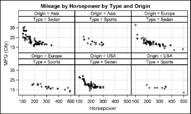
5.2.1 Row and Column Data Lattice

You can create a data lattice panel graph of mileage by horsepower, by origin, and by type as shown above, using LAYOUT DATALATTICE. Origin is the row variable, so one row is created for each value of Origin. Type is the column variable, so one column is created for each value of Type. A cell is created for each crossing of the row and column variable. The contents of the row and column headers can be set using the header label display option. Gridlines are enabled for both the row and column axes. All rows have a data range that is the union of all rows (UNIONALL), and all columns have a data range that is the union of all columns (UNIONALL).
The LAYOUT PROTOTYPE includes only a scatter plot. So all cells in the panel display a scatter plot of mileage by horsepower, and each shows only the observations that fall in that cell.
proc template;
define statgraph Fig_5_2_1;
begingraph;
entrytitle 'Mileage by Horsepower by Type and Origin';
layout datalattice rowvar=origin columnvar=type /
headerlabeldisplay=value
rowaxisopts=(griddisplay=on)
columnaxisopts=(griddisplay=on);
layout prototype;
scatterplot x=horsepower y=mpg_city / datatransparency=0.7
markerattrs=(symbol=circlefilled size=11);
endlayout;
endlayout;
endgraph;
end;
run;
proc sgrender template=Fig_5_2_1
data=sashelp.cars(where=(type not in ('Hybrid', 'Truck')));
run;
5.2.2 Column Data Lattice with Union-All Data Range
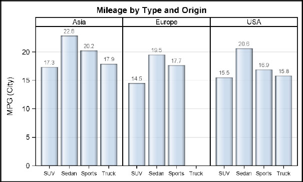
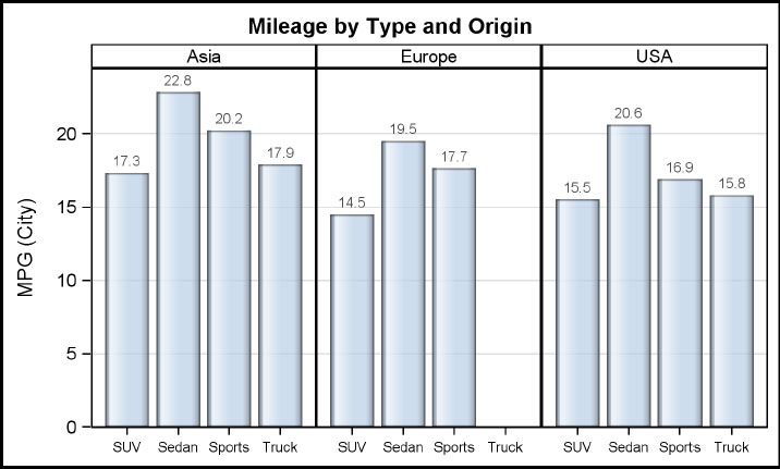
You can create this paneled graph of mean mileage, by type and origin, by using the LAYOUT DATALATTICE. Origin is the column variable, so the panel has three cells. Each cell heading displays the value of the Origin variable.
Each cell contains a bar chart of mean mileage by type, along with bar labels that show the mean value for each bar. Row and column axes are customized using the options. The OFFSETMIN option is used on the row axis options to ensure that the bars sit on the X axis.
Note: Since the default column weight is EQUAL, the default column data range is UNIONALL. This means that all column axes have the same values. So, Europe has a tick for “Trucks.” To avoid this, use COLUMNDATARANGE=UNION. Also see the figures in Sections 5.2.3 and 5.2.4.
proc template;
define statgraph Fig_5_2_2;
begingraph;
entrytitle 'Mileage by Type and Origin';
layout datalattice columnvar=origin / headerlabeldisplay=value
rowaxisopts=(griddisplay=on offsetmin=0)
columnaxisopts=(display=(ticks tickvalues)
tickvalueattrs=(size=7));
layout prototype / cycleattrs=true;
barchart x=type y=mpg_city / stat=mean dataskin=gloss
datatransparency=0.3 barlabel=true;
endlayout;
endlayout;
endgraph;
end;
run;
proc sgrender template=Fig_5_2_2
data=sashelp.cars(where=(type not in ('Hybrid', 'Truck', 'Wagon')));
format mpg_city 4.1; run;
5.2.3 Column Data Lattice with Union Data Range

You can create this paneled graph of mean mileage by type and origin by using the LAYOUT DATALATTICE. Origin is the column variable, so the panel has three cells. Each cell heading displays the value of the Origin variable. Each cell contains a bar chart of mean mileage by type, along with bar labels that show the mean value for each bar. Row and column axes are customized using the options. The OFFSETMIN option is used on the row axis options to ensure that the bars sit on the X axis.
Note: Asia and USA have four bars, and Europe has three. The default column weight is EQUAL. You can set COLUMNDATARANGE=UNION to avoid getting an additional tick for Trucks in the Europe cell. But now, the bar widths are different. Also see the figure in Section 5.2.4.
proc template;
define statgraph Fig_5_2_3;
begingraph;
entrytitle 'Mileage by Type and Origin';
layout datalattice columnvar=origin / headerlabeldisplay=value
columndatarange=union
rowaxisopts=(griddisplay=on offsetmin=0)
columnaxisopts=(display=(ticks tickvalues)
tickvalueattrs=(size=6));
layout prototype;
barchart x=type y=mpg_city / stat=mean dataskin=gloss
datatransparency=0.3 barlabel=true;
endlayout;
endlayout;
endgraph;
end;
run;
proc sgrender template=Fig_5_2_3
data=sashelp.cars(where=(type not in ('Hybrid', 'Wagon')));
format mpg_city 4.1;
run;
5.2.4 Proportional Data Lattice

You can create this proportional paneled graph of mean mileage by type and origin by using the LAYOUT DATALATTICE. Origin is the column variable, so the panel has three cells. Each cell heading displays the value of the Origin variable. Each cell contains a bar chart of mean mileage by type, along with bar labels that show the mean value for each bar. Row and column axes are customized using the options. The OFFSETMIN option is used on the row axis options to ensure that the bars sit on the X axis.
Note: Asia and USA have four bars, and Europe has three. You can set the COLUMNWEIGHT=PROPORTIONAL (SAS 9.4). Now each column weight is proportional to the number of midpoints in the cell, and all bars have the same width.
proc template; /*--SAS 9.4--*/
define statgraph Fig_5_2_4;
begingraph;
entrytitle 'Mileage by Type and Origin';
layout datalattice columnvar=origin / headerlabeldisplay=value
columnweight=proportional
rowaxisopts=(griddisplay=on offsetmin=0)
columnaxisopts=(display=(ticks tickvalues)
tickvalueattrs=(size=7));
layout prototype;
barchart x=type y=mpg_city / stat=mean dataskin=gloss
barlabel=true;
endlayout;
endlayout;
endgraph;
end;
run;
proc sgrender template=Fig_5_2_4
data=sashelp.cars(where=(type not in ('Hybrid', 'Wagon')));
format mpg_city 4.1;
run;
5.2.5 Data Lattice with Side Bar

You can create this paneled graph of mean city and highway mileage by type and origin by using the LAYOUT DATALATTICE. Each cell contains two bar charts: one of mean city mileage by type and one of mean highway mileage by type. You can reduce the width of the second bar chart using the BARWIDTH option. The CYCLEATTRS option automatically assigns increasing graph data style elements to each statement. You can use a SIDEBAR to display the legend.
proc template;
define statgraph Fig_5_2_5;
begingraph;
entrytitle 'Mileage by Type and Origin';
layout datalattice columnvar=origin / headerlabeldisplay=value
rowaxisopts=(label='Mileage' griddisplay=on offsetmin=0)
columnaxisopts=(display=(ticks tickvalues)
tickvalueattrs=(size=7));
layout prototype / cycleattrs=true;
barchart x=type y=mpg_city / stat=mean dataskin=gloss
datatransparency=0.3 name='c' legendlabel='City';
barchart x=type y=mpg_highway / stat=mean dataskin=gloss
barwidth=0.5 datatransparency=0.3 name='h'
legendlabel='Highway';
endlayout;
sidebar / spacefill=false;
discretelegend 'c' 'h';
endsidebar;
endlayout;
endgraph;
end;
run;
proc sgrender template=Fig_5_2_5
data=sashelp.cars(where=(type not in ('Hybrid', 'Truck', 'Wagon')));
run;
5.2.6 Row Data Lattice
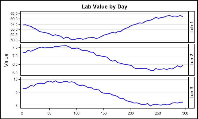
You can create this graph of lab values over time by lab test using a LAYOUT DATALATTICE of one column. Each lab test has response data ranges that are specific to it, and the lab test values can vary significantly from each other. So it is important that the Y axis data range for each row be retained. You can do this by setting the ROWDATARANGE option to UNION.
You can add clinical concern level values to the plot as bands to help in diagnosing the data. The names of the individual lab tests are listed in the row heading on the right. For ease of readability, the Lab name can also be added to each cell of the panel as horizontal text.
proc template;
define statgraph Fig_5_2_6;
begingraph;
entrytitle 'Lab Value by Day';
layout datalattice rowvar=lab / headerlabeldisplay=value
rowaxisopts=(label='Value' griddisplay=on
tickvalueattrs=(size=7))
columnaxisopts=(display=(ticks tickvalues)
tickvalueattrs=(size=7))
rowdatarange=union rowgutter=5;
layout prototype / cycleattrs=true;
seriesplot x=day y=value / lineattrs=(thickness=2);
endlayout;
endlayout;
endgraph;
end;
run;
proc sgrender template=Fig_5_2_6 data=GTL_GS_Labs;
run;
5.2.7 Data Lattice with Multi-Page Output
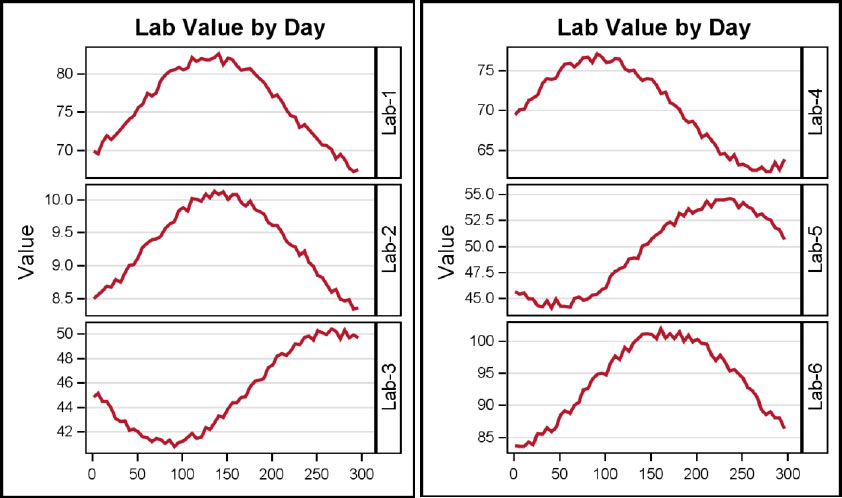
When the number of levels of the row or column variable becomes large, the size of each cell shrinks. At some point, the size of the cell is too small to effectively present the data. In such a case, you can break the panel into smaller parts, thus providing more space to each cell. In this case, the lab variable has distinct levels. Plotting all six cells in the graph would make each too small to be effective. Alternatively, increasing the size of the graph can be a problem to fit on a page of a report. So, in this case, we can split the panel into two by specifying ROWS=3. This can be done with rows and columns.
proc template;
define statgraph Fig_5_2_7;
begingraph;
entrytitle 'Lab Value by Day';
layout datalattice rowvar=lab / headerlabeldisplay=value
rowaxisopts=(label='Value' griddisplay=on
tickvalueattrs=(size=7))
columnaxisopts=(display=(ticks tickvalues)
tickvalueattrs=(size=7))
rowdatarange=union rows=3 rowgutter=5;
layout prototype / cycleattrs=true;
seriesplot x=day y=value /
lineattrs=graphdata2(thickness=2 pattern=solid);
endlayout;
endlayout;
endgraph;
end;
run;
proc sgrender template=Fig_5_2_7 data=GTL_GS_Labs2;
run;
5.3 Layout Data Panel
You can create a panel graph as shown here by using LAYOUT DATAPANEL. The general structure of the statement block is shown below, and includes the following:
• The LAYOUT DATAPANEL statement with the CLASSVARS parameters and options, including axis options. The block is terminated by an ENDLAYOUT statement.
• The LAYOUT PROTOTYPE statement block, with options. This block contains the definition of the plots that appear in each cell. Only basic plot statements are allowed in this block. The block is terminated by an ENDLAYOUT statement.
proc template;
define statgraph templateName;
begingraph;
entrytitle 'Mileage by Horsepower by Type and Origin';
layout datapanel classvars=(var var) / <options>;
layout prototype;
<GTL basic plot statements>
endlayout;
sidebar / <options>
<GTL statements>
Endsidebar;
endlayout;
endgraph;
end;
run;
proc sgrender data=datasetName template=templateName;
run;
A cell is created for each non-empty crossing of all the class variables. Each cell of the panel has N cell headings at the top, where N is the number of class variables that are specified in the statement. Each cell heading shows the variable=value string or just the value of the class variable.
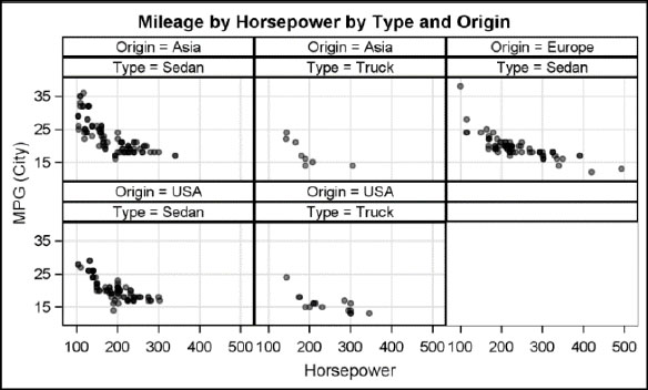
There is no limit to the number of class variables that can be used with this layout. However, each class variable uses its own heading in each cell, taking up space. So, there is a practical limit based on the size of the graph. This layout is useful when the panel is sparse, and not all the crossings of the class variables have data. Only the cells with data are included in the panel, making this arrangement suitable for sparse data.
Column axes have uniform data for all columns if COLUMNWEIGHT=EQUAL. If the column weight is PROPORTIONAL (SAS 9.4), then each column width is determined by the number of category values in each column. This makes the midpoint spacing for the categories equal across the panel. The same applies for row axes.
SIDEBAR blocks can be added to include displays of additional components like legends, etc. The default location for the sidebar is BOTTOM, but it can be placed at the top or on the sides.
Multiple independent insets can be added to each cell. With SAS 9.4, the inset data can be merged into the data for easier coding.
Layout DataPanel frequently used options: ColumnAxisOpts, ColumnDataRange, ColumnGutter, Columns, ColumnWeight, HeaderLabelDisplay, Inset, InsetOpts, Order, RowAxisOpts, RowDataRange, RowGutter, Rows, SortOrder, Sparse.
Layout DataPanel other options: AutoAlign, BackgroundColor, Border, BorderAttrs, CellHeightMin, CellWidthMin, Column2AxisOpts, Column2DataRange, HAlign, HeaderBackgroundColor, HeaderLabelAttrs, HeaderOpaque, Height, IncludeMissingClass, Opaque, OuterPad, Pad, PanelNumber, RoleName, Row2AxisOpts, Row2DataRange, RowAxisOpts, RowDataRange, RowHeight, ShrinkFonts, SkipEmpthCells, Start, VAlign, Width.
Layout Prototype supported options: AspectRatio, CycleAttrs, WallColor, WallDisplay.
5.3.1 Two Class Data Panel
You can create this paneled graph of mileage by type and origin using LAYOUT DATAPANEL. In this graph, origin and type are the two class variables. A cell is created for each crossing of the class variables that have data in the subset. Each cell has headings at the top that indicate the values of the class variable.
The cell headings display the variable and its value. Gridlines are enabled for both the row and column axes. All rows have a data range that is the union of all rows (UNIONALL), and all columns have a data range that is the union of all columns (UNIONALL).
The LAYOUT PROTOTYPE includes a scatter plot only. So all cells in the panel display a scatter plot of mileage by horsepower, and each cell shows only the observations that fall in that cell.
proc template;
define statgraph Fig_5_3_1;
begingraph;
entrytitle 'Mileage by Horsepower by Type and Origin';
layout datapanel classvars=(origin type) / columns=3
rowaxisopts=(griddisplay=on)
columnaxisopts=(griddisplay=on);
layout prototype ;
scatterplot x=horsepower y=mpg_city / datatransparency=0.5
markerattrs=(symbol=circlefilled);
endlayout;
endlayout;
endgraph;
end;
run;
proc sgrender template=Fig_5_3_1
data=sashelp.cars(where=(type in ('Sedan', 'Sports')));
run;
5.3.2 Data Panel with One Class Variable

You can create this paneled graph of mileage by type and origin using LAYOUT DATAPANEL. Origin is used as the class variable. By default, the panel creates three rows. Each cell heading displays the value of the Origin variable. Note that the resulting height of each cell is < 100, and the graph is not drawn, with a log message. We have specified CELLHEIGHTMIN=60 to force the graph to be rendered. Each cell contains a bar chart of mean mileage by type, along with bar labels that show the mean value for each bar. Row and column axes are customized using the options. The OFFSETMIN option is used on the row axis options to ensure that the bars sit on the X axis.
Note: Asia and USA have four bars, and Europe has three. Since the column axis is uniform, a gap is added to the cell for Europe for Trucks.
proc template;
define statgraph Fig_5_3_2;
begingraph;
entrytitle 'Mileage by Type and Origin';
layout datapanel classvars=(origin) / headerlabeldisplay=value
rowaxisopts=(griddisplay=on offsetmin=0) cellheightmin=60
columnaxisopts=(display=(ticks tickvalues)
tickvalueattrs=(size=7));
layout prototype;
barchart x=type y=mpg_city / stat=mean dataskin=gloss
datatransparency=0.3 barlabel=true;
endlayout;
endlayout;
endgraph;
end;
run;
proc sgrender template=Fig_5_3_2
data=sashelp.cars(where=(type not in ('Hybrid', 'Wagon')));
format mpg_city 4.1;
run;
5.3.3 Data Panel with One Class Variable and Number of Columns
You can create this paneled graph of mileage by type and origin using LAYOUT DATAPANEL, Origin is used as the class variable. We have also specified COLUMNS=3. This creates the graph shown above with three columns. Each cell contains a bar chart of mean mileage by type, along with bar labels that show the mean value for each bar. Row and column axes are customized using the options. The OFFSETMIN option is used on the row axis options to ensure that the bars sit on the X axis.
Note: Asia and USA have four bars, and Europe has three. Since all column axes are uniform, a gap is added to the cell for Europe for Trucks.
proc template;
define statgraph Fig_5_3_3;
begingraph;
entrytitle 'Mileage by Type and Origin';
layout datapanel classvars=(origin) / headerlabeldisplay=value
rowaxisopts=(griddisplay=on offsetmin=0) columns=3
columnaxisopts=(display=(ticks tickvalues)
tickvalueattrs=(size=6));
layout prototype;
barchart x=type y=mpg_city / stat=mean dataskin=gloss
datatransparency=0.3 barlabel=true;
endlayout;
endlayout;
endgraph;
end;
run;
proc sgrender template=Fig_5_3_3
data=sashelp.cars(where=(type not in ('Hybrid', 'Wagon')));
format mpg_city 4.1;
run;
5.3.4 Data Panel with One Class Variable, Columns, and Union

You can create this paneled graph of mileage by type and origin using LAYOUT DATAPANEL Origin is used as a class variable. We have also specified COLUMNS=3. This creates the graph shown above with three columns. Each cell contains a bar chart of mean mileage by type, along with bar labels that show the mean value for each bar. Row and column axes are customized using the options. The OFFSETMIN option is used on the row axis options to ensure that the bars sit on the X axis.
Note: Asia and USA have four bars, and Europe has three. Here we have specified the column data range on UNION, so each column axis has its own data range. Hence, Europe has three wider bars.
proc template;
define statgraph Fig_5_3_4;
begingraph;
entrytitle 'Mileage by Type and Origin';
layout datapanel classvars=(origin) / headerlabeldisplay=value
rowaxisopts=(griddisplay=on offsetmin=0) columns=3
columndatarange=union columnaxisopts=(display=(ticks
tickvalues)
tickvalueattrs=(size=6));
layout prototype;
barchart x=type y=mpg_city / stat=mean dataskin=gloss
datatransparency=0.3 barlabel=true;
endlayout;
endlayout;
endgraph;
end;
run;
proc sgrender template=Fig_5_3_4
data=sashelp.cars(where=(type not in ('Hybrid', 'Wagon')));
format mpg_city 4.1;
run;
5.3.5 Data Panel with One Class Variable and Proportional Columns

You can create this paneled graph of mileage by type and origin using LAYOUT DATAPANEL Origin is used as a class variable. We have also specified COLUMNS=3.
Each cell contains a bar chart of mean mileage by type, along with bar labels that show the mean value for each bar. Row and column axes are customized using the options. The OFFSETMIN option is used on the row axis options to ensure that the bars sit on the X axis.
Note: Asia and USA have four bars, and Europe has three. We have specified the column data range on UNION, so each column axis has its own data range. You can make the cells proportional by setting COLUMNWEIGHT to proportional. We have requested proportional column weights (SAS 9.4). Now all bars have the same size, and the cell width for Europe is reduced.
proc template; /*--SAS 9.4--*/
define statgraph Fig_5_3_5;
begingraph;
entrytitle 'Mileage by Type and Origin';
layout datapanel classvars=(origin) / headerlabeldisplay=value
rowaxisopts=(griddisplay=on offsetmin=0) columns=3
columnweight=proportional columnaxisopts=
(display=(ticks tickvalues) tickvalueattrs=(size=7));
layout prototype;
barchart x=type y=mpg_city / stat=mean dataskin=gloss
datatransparency=0.3 barlabel=true;
endlayout;
endlayout;
endgraph;
end;
run;
proc sgrender template=Fig_5_3_5
data=sashelp.cars(where=(type not in ('Hybrid', 'Wagon')));
format mpg_city 4.1;
run;
5.3.6 Data Panel with Side Bar

You can create this paneled graph of city and highway mileage by type and origin using LAYOUT DATAPANEL. Origin is used as a class variable. COLUMNS is set to 2, creating one empty cell.
Each cell contains two bar charts, one of mean city mileage by type and one of mean highway mileage by type. You can reduce the width of the second bar chart using the BARWIDTH option. CYCLEATTRS option automatically assigns increasing graph data style elements to each statement.
We have used a SIDEBAR statement block to display the common legend at the bottom.
proc template;
define statgraph Fig_5_3_6;
begingraph;
entrytitle 'Mileage by Type and Origin';
layout datapanel classvars=(origin) / headerlabeldisplay=value
rowaxisopts=(label='Mileage' griddisplay=on offsetmin=0)
columnaxisopts=(display=(ticks tickvalues)) columns=2;
layout prototype / cycleattrs=true;
barchart x=type y=mpg_city / stat=mean dataskin=gloss
datatransparency=0.3 name='c' legendlabel='City';
barchart x=type y=mpg_highway / stat=mean dataskin=gloss
barwidth=0.5 datatransparency=0.3 name='h'
legendlabel='Highway';
endlayout;
sidebar / spacefill=false;
discretelegend 'c' 'h';
endsidebar;
endlayout;
endgraph;
end;
run;
proc sgrender template=Fig_5_3_6
data=sashelp.cars(where=(type not in ('Hybrid', 'Truck', 'Wagon')));
run;
5.3.7 Data Panel with Multi-Page Output

When the number of levels of the row or column variable becomes large, the size of each cell shrinks. At some point, the the cell becomes too small to effectively present the data. In such a case, you can break the panel into smaller parts, thus providing more space in each cell. In this case, the lab variable has distinct levels. Plotting all six cells in the graph would make each cell too small to be effective. Alternatively, increasing the size of the graph can be a problem for fitting on a page of a report. So, in this case, you can split the panel into three by specifying ROWS=3 and COLUMNS=1. Three separate graphs are created as shown above.
proc template;
define statgraph Fig_5_3_7;
begingraph;
entrytitle 'Lab Value by Day';
layout datapanel classvars=(lab) / headerlabeldisplay=value
rowaxisopts=(label='Value' griddisplay=on
tickvalueattrs=(size=7))
columnaxisopts=(display=(ticks tickvalues)
tickvalueattrs=(size=7))
rowdatarange=union rows=2 columns=1 rowgutter=5;
layout prototype / cycleattrs=true;
seriesplot x=day y=value /
lineattrs=graphdata2(thickness=2 pattern=solid);
endlayout;
endlayout;
endgraph;
end;
run;
proc sgrender template=Fig_5_3_7 data=GTL_GS_Labs2;
run;
5.4 Layout Lattice

You can create this non-regular layout of plots using LAYOUT LATTICE. The Lattice is a flexible layout that enables you to create an ad hoc, multi-cell graph. To do so, divide the available space in your graph into smaller regions in which you can populate the graph of your choice. In the example above, the graph is divided into two equal columns. The cell on the left contains an overlay of a scatter and a fit plot. The cell on the right is further divided into two rows. Each row is populated with a bar chart and a box plot. The graphs on the right have a common external X-axis.
proc template;
define statgraph templateName;
begingraph;
entrytitle ‘Car Statistics’;
layout lattice / <options>;
layout overlay;
<GTL basic plot statements>
endlayout;
layout overlay;
<GTL basic plot statements>
endlayout;
sidebar / <options>
<GTL statements>
Endsidebar;
endlayout;
endgraph;
end;
run;
proc sgrender data=datasetName template=templateName;
run;
You can create complex layouts using LAYOUT LATTICE. Each cell of the lattice can have plot statements or more nested layouts. The layout supports side bar, left row and right row headings, top and bottom column headings, left and right row axes, top and bottom column axes, and cell headings. See the schematic diagram below. See the product documentations for all the details.

Layout Lattice supported options: AutoAlign, BackgroundColor, Border, BorderAttrs, Column2DataRange, ColumnDataRange, ColumnGutter, Columns, ColumnWeights, HAlign, Height, Opaque, Order, OuterPad, Pad, Row2DataRange, RowDataRange, RowGutter, Rows, RowWeights, ShrinkFonts, SkipEmptyCells, VAlign, Width.
The Lattice layout also supports these statement blocks. See the product documentations for details.
• Axis-statement-block(s)
• Cell-statement-block
• Heading-statement-block(s)
• Sidebar-statement-block(s)
5.4.1 Row Lattice with Independent Axes

You can create this multi-cell graph of different plot types by nesting two LAYOUT OVERLAY statement blocks inside the LAYOUT LATTICE block.
Each LAYOUT OVERLAY block defines one cell in the lattice. The default order is ROW, so two rows are created. Each cell has its own independent set of axes. The regions of the two cells are aligned, but there is no other shared feature.
Each cell can contain a compound graph that is created using the LAYOUT OVERLAY statement, or it can contain another nested LAYOUT LATTICE.
proc template;
define statgraph Fig_5_4_1;
begingraph;
entrytitle 'Mileage by Origin and Type';
layout lattice;
layout overlay / yaxisopts=(griddisplay=on);
barchart x=origin y=mpg_city / stat=mean dataskin=gloss
group=drivetrain groupdisplay=cluster;
endlayout;
layout overlay / yaxisopts=(griddisplay=on);
boxplot x=type y=mpg_city / fillattrs=graphdata2;
endlayout;
endlayout;
endgraph;
end;
run;
proc sgrender template=Fig_5_4_1
data=sashelp.cars(where=(type ne 'Hybrid'));
run;
5.4.2 Row Lattice with Common Axis

You can create this graph of two different plot types by nesting two LAYOUT OVERLAY statement blocks inside the LAYOUT LATTICE block. Each LAYOUT OVERLAY block defines one call in the lattice. The default order is ROW, so two rows are created. In this graph, we have set the column data range as UNION. Also, we have a single, shared column axis as specified by the COLUMNAXES block. Each cell can contain a compound graph that is created using the LAYOUT OVERLAY statement, or can contain another nested LAYOUT LATTICE.
proc template;
define statgraph Fig_5_4_2;
begingraph;
entrytitle 'Mileage and Horsepower by Type';
layout lattice / columndatarange=union;
columnaxes;
columnaxis / display=(ticks tickvalues);
endcolumnaxes;
layout overlay / yaxisopts=(griddisplay=on);
barchart x=type y=mpg_city / stat=mean dataskin=gloss
group=drivetrain groupdisplay=cluster;
endlayout;
layout overlay / yaxisopts=(griddisplay=on);
boxplot x=type y=horsepower / fillattrs=graphdata2;
endlayout;
endlayout;
endgraph;
end;
run;
proc sgrender template=Fig_5_4_2
data=sashelp.cars(where=(type ne 'Hybrid'));
run;
5.4.3 Row Lattice with Common Axis and Unequal Weights

This graph displays the distribution of mileage for all vehicles. You can create this graph by using a LAYOUT LATTICE, with two rows and row weights of 80% and 20%. Prior to SAS 9.4, the values provided in the row weights option must add up to 1. The graph uses a common shared X axis. The upper cell contains a single-cell graph similar to the one in Section 4.7.2. The lower cell contains a horizontal box plot. This is similar to the graph that we created in Chapter 3.
proc template;
define statgraph Fig_5_4_3;
begingraph;
entrytitle 'Distribution of Mileage';
layout lattice / columndatarange=union rowweights=(0.8 0.2);
columnaxes;
columnaxis / display=(ticks tickvalues);
endcolumnaxes;
layout overlay / yaxisopts=(griddisplay=on);
histogram mpg_city / binaxis=false;
densityplot mpg_city / lineattrs=graphfit name='n'
legendlabel='Normal';
densityplot mpg_city / kernel() lineattrs=graphfit2 name='k'
legendlabel='Kernel';
discretelegend 'n' 'k' / location=inside across=1
halign=right valign=top ;
endlayout;
layout overlay / yaxisopts=(griddisplay=on);
boxplot y=mpg_city / orient=horizontal;
endlayout;
endlayout;
endgraph;
end;
run;
proc sgrender template=Fig_5_4_3
data=sashelp.cars(where=(type ne 'Hybrid'));
run;
5.4.4 Column Lattice with Column Headings

This graph displays systolic and diastolic blood pressure by cholesterol. You can make the row data ranges uniform, and use one common Y axis on the left. This helps in comparison of values between the plots.
Since each cell has different variables on the Y axis, we used the COLUMNHEADER2 block to define a heading at the top of each cell. This indicates the variable on the Y axis.
proc template;
define statgraph Fig_5_4_4;
begingraph;
entrytitle 'Blood Pressure by Cholesterol';
layout lattice / rowdatarange=union order=columnmajor;
rowaxes;
rowaxis / display=(ticks tickvalues) griddisplay=on;
endrowaxes;
column2headers;
entry textattrs=graphlabeltext(weight=bold) 'Systolic';
entry textattrs=graphlabeltext(weight=bold) 'Diastolic';
endcolumn2headers;
layout overlay / xaxisopts=(griddisplay=on);
scatterplot x=cholesterol y=systolic / datatransparency=0.9
markerattrs=graphdata1(symbol=circlefilled);
endlayout;
layout overlay / xaxisopts=(griddisplay=on);
scatterplot x=cholesterol y=diastolic / datatransparency=0.9
markerattrs=graphdata1(symbol=circlefilled);
endlayout;
endlayout;
endgraph;
end;
run;
proc sgrender template=Fig_5_4_4 data=sashelp.heart;
run;
5.4.5 Nested Lattice

You can use LAYOUT LATTICE to create this graph, a compound display, with one plot on the left and two plots on the right. The graph area is first split into two columns, and a fit plot is added to the first cell using an overlay of scatter and regression fit plots. The cell on the right is split into two rows with a shared X axis. The top cell has a bar chart of mean mileage by origin, and the bottom cell has a box plot of mileage by origin.
proc template; /*--SAS 9.4--*/
define statgraph Fig_5_4_5;
begingraph / subpixel=on;
entrytitle 'Car Statistics';
layout lattice / columns=2;
layout overlay / yaxisopts=(griddisplay=on)
xaxisopts=(griddisplay=on);
scatterplot x=horsepower y=mpg_city / filledoutlinedmarkers=true
dataskin=gloss markerattrs=(size=13 symbol=circlefilled)
markerfillattrs=graphdata1;
regressionplot x=horsepower y=mpg_city / degree=2;
endlayout;
layout lattice / columndatarange=union;
columnaxes;
columnaxis;
endcolumnaxes;
layout overlay / yaxisopts=(griddisplay=on);
barchart x=origin y=mpg_city / stat=mean
dataskin=gloss fillattrs=graphdata3;
endlayout;
layout overlay / yaxisopts=(griddisplay=on);
boxplot x=origin y=mpg_city / fillattrs=graphdata5;
endlayout;
endlayout;
endlayout;
endgraph;
end;
run;
proc sgrender template=Fig_5_4_5 data=sashelp.cars; run;
5.4.6 Gridded Layout with Embedded Statistics Table

This graph of mileage by horsepower includes an embedded statistics table in the top right corner that displays key statistics. You can construct the table using LAYOUT GRIDDED with two columns. The values are defined in a column major format. The first three ENTRY statements are the labels for each statistic. The last three ENTRY statements use the built-in function evaluation to display the N, MEAN, and STDDEV values for the column. Note the use of Unicode strings in the last ENTRY statement.
proc template; /*--SAS 9.4--*/
define statgraph Fig_5_4_6;
begingraph / subpixel=on;
entrytitle 'Car Statistics';
layout overlay / yaxisopts=(griddisplay=on)
xaxisopts=(griddisplay=on);
scatterplot x=horsepower y=mpg_city / filledoutlinedmarkers=true
dataskin=gloss markerattrs=(size=13 symbol=circlefilled)
markerfillattrs=graphdata1;
regressionplot x=horsepower y=mpg_city / degree=2;
layout gridded / rows=3 order=columnmajor border=true
autoalign=(topright topleft);
entry textattrs=(size=10) halign=right 'N = ';
entry textattrs=(size=10) halign=right 'Mean = ';
entry textattrs=(size=10) halign=right {unicode SIGMA} ' =';
entry textattrs=(size=10) halign=left
eval(strip(put(n(mpg_city),4.0)));
entry textattrs=(size=10) halign=left
eval(strip(put(mean(mpg_city),4.1)));
entry textattrs=(size=10) halign=left
eval(strip(put(stddev(mpg_city),4.1)));
endlayout;
endlayout;
endgraph;
end;
run;
proc sgrender template=Fig_5_4_6 data=sashelp.cars;
run;
5.5 Real World Examples
5.5.1 Lab Values by Study Week

You can create this graph using the LAYOUT DATAPANEL, with one class variable. The two label values in each cell are plotted against Y and Y2 axes so that their individual data ranges can be retained. In this use case, it is important to be able to see whether the two tests values move together.
proc template;
define statgraph Fig_5_5_1_Lab_Values;
begingraph;
entrytitle "Lab Values by Study Week";
layout gridded / rowgutter=5;
layout datapanel classvars=(treatment) / columns=1
rowaxisopts=(griddisplay=on)
columnaxisopts=(tickvalueattrs=(size=5) griddisplay=on)
headerLabelDisplay=Value;
layout prototype / cycleattrs=true;
seriesPlot X=visit Y=sgot / primary=true display=(markers)
markerattrs=(size=9px weight=bold)
lineattrs=(thickness=2px) NAME="series1";
seriesPlot X=visit Y=aph / yaxis=y2 display=(markers)
markerattrs=(size=9px weight=bold)
lineattrs=(thickness=2px) NAME="series2";
endlayout;
endlayout;
DiscreteLegend "series1" "series2" /;
endlayout;
endgraph;
end;
run;
proc sgrender data=GTL_GS_Labs_by_Week template="Fig_5_5_1_Lab_Values";
run;
5.5.2 LFT Safety Panel, Baseline versus Study

You can create this graph using a LAYOUT DATALATTICE; the two columns show different graphs, with one common Y axis. A log axis is used for the Relative Risk values.
proc template;
define statgraph Fig_5_5_2_LFT_Lattice;
begingraph;
entrytitle 'LFT Safety Panel, Baseline vs. Study';
layout datalattice rowvar=visitnum columnvar=labtest /
headerlabeldisplay=value
rowaxisopts=(linearopts=(viewmin=0 viewmax=4))
columnaxisopts=(linearopts=(viewmin=0 viewmax=4));
layout prototype;
scatterplot x=pre y=result / group=drug;
referenceline x=1 / lineattrs=(pattern=dash);
referenceline x=1.5 / lineattrs=(pattern=dash);
referenceline x=2 / lineattrs=(pattern=dash);
referenceline y=1 / lineattrs=(pattern=dash);
referenceline y=1.5 / lineattrs=(pattern=dash);
referenceline y=2 / lineattrs=(pattern=dash);
endlayout;
endlayout;
endgraph;
end;
run;
proc sgrender data=GTL_GS_LFT_Lattice2 template=Fig_5_5_2_LFT_Lattice;
run;
5.5.3 Most Frequent On-Therapy Adverse Events by Relative Risk

You can create this graph using a LAYOUT LATTICE; the two columns show different graphs, with one common Y axis. A log axis is used for the Relative Risk values.
proc template;
define statgraph Fig_5_5_1_MostFreqAE;
begingraph / designwidth=8in designheight=4in;
entrytitle "Most Frequent On-Therapy AE Sorted by Relative Risk";
layout lattice / columns=2 rowdatarange=union;
rowaxes;
rowaxis / display=(ticks tickvalues line)
tickvalueattrs=(size=7);
endrowaxes;
layout overlay / xaxisopts=(displaysecondary=(ticks)
tickvalueattrs=(size=7) linearopts=(thresholdmax=0));
referenceline y=refae / lineattrs=(thickness=14)
datatransparency=0.8;
scatterplot x=a y=ae / name='a' legendlabel='Drug A (N=216)'
markerattrs=graphdata1(symbol=circlefilled size=10);
scatterplot x=b y=ae / name='b' legendlabel='Drug B (N=431)'
markerattrs=graphdata2(symbol=trianglefilled size=10);
discretelegend 'a' 'b' / border=false valueattrs=(size=5);
endlayout;
layout overlay / xaxisopts=(label='Relative Risk with 95% CL'
displaysecondary=(ticks) tickvalueattrs=(size=7)
type=log logopts=(base=2 viewmin=0.125 viewmax=64
tickintervalstyle=logexpand));
referenceline y=refae / lineattrs=(thickness=16)
datatransparency=0.8;
scatterplot x=mean y=ae / xerrorlower=low xerrorupper=high
markerattrs=(symbol=circlefilled size=10);
referenceline x=1 /
lineattrs=graphdatadefault(pattern=shortdash);
endlayout;
endlayout;
endgraph;
end; run;
proc sgrender data=GTL_GS_AE_Ref(obs=10) template=Fig_5_5_1_MostFreqAE; run;
5.5 Summary
In this chapter, you learned how to create multi-cell graphs. To create a multi-cell graph, we use special layout statements to break up the graph area into smaller rectangular regions. Then, each region is populated with the same plot types, or different plots types.
Multi-cell graphs come in two types:
1. Classification panels
2. Ad hoc layouts.
Classification panels are graphs with cells that are arranged in a regular row x column layout, which is determined by the class variables. Each cell of the graph contains a plot of the subset of the data that belongs in the cell. The plot type in each cell is the same and is determined by the LAYOUT PROTOTYPE. You can create these graphs using the LAYOUT DATALATTICE or DATAPANEL.
An ad-hoc layout does not need to have a regular rectangular arrangement of cells. The graph area can be divided into unequal rows and/or columns. Each cell can be further subdivided into more cells. Each cell can contain graphs that are completely different from other cells.
You can also use the LAYOUT GRIDDED to create tables of statistics. Plots can also be added to a cell in a LAYOUT GRIDDED. But, generally, the LAYOUT LATTICE is preferred for such a use case because it provides more features.
In Chapter 6, you will learn more details about axes, legends, titles, footnotes, and entries and how you can customize these for your needs.