Chapter 6: Customizing Axes, Legends, and Text
6.4 Adding Titles, Footnotes and Entries
A nickel ain't worth a dime anymore.
- Yogi Berra
With GTL, you can create any graph that you want by using the ability to mix and match different plots and layouts. However, for the graph to be effective and “just right,” you need full control of the components around the graph such as the axes, legends, titles, footnotes, and the textual entries inside the plot.
By default, GTL creates the right set of axes with the optimal formatting and fitting. Nice round numbers are placed on the axis as tick values using a format derived from the column format to suit the axis. However, you can still customize the axis to your needs. Legends can be constructed flexibly and placed where you want. Titles, footnotes, and text entries can be customized, and you can use UNICODE, superscripts, and subscripts to help you create just the right analytical graph that you need.
6.1 Overview

The figure above shows the various components of a good graph. These are as follows:
1. Titles and footnotes that provide important information about the graph.
2. Plots that create the graphical display of the data.
3. Axes with good tick values and formats.
4. Legends that help decode the information in the graph.
5. Text entries that show the key statistics of the data.
In this chapter, you will learn how to use the features of the axes, legends, and text components to customize your graphs. By default, GTL creates good axes. But it also provides you with a ton of features and options. We will cover the most frequently used options in this chapter, and we encourage you to refer to the extensive produce documentation for details.
6.2 Axes
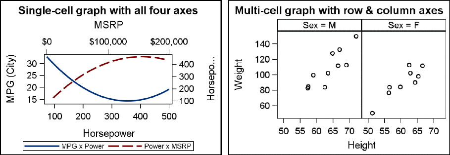
As we have seen in previous chapters, every single-cell graph can have up to four axes at one time as shown in the graph on the left above. These are as follows:
1. The X axis at the bottom and the X2 axis at the top of the graph.
2. The Y axis at the left and the Y2 axis at the right of the graph.
Multi-cell graphs can have common shared axes as shown in the graph on the right above. Row and column axes are shared by all cells in the row or column. These are as follows:
1. The COLUMNAXIS at the bottom and the COLUMN2AXIS at the top of the graph.
2. The ROWAXIS at the left and the ROW2AXIS at the right of the graph.
XAXIS, X2AXIS, YAXIS, and Y2AXIS options: DiscreteOpts, Display, DisplaySecondary, GridAttrs, GridDisplay, Label, LabelAttrs, LabelFitPolicy, LabelPosition, LabelSplitChar, LabelSplitCharDrop, LabelSplitJustify, LinearOpts, LogOpts, Name, OffsetMax, OffsetMin, Reverse, ShortLabel, TickStyle, TickValueAttrs, TickValueVAlign, TimeOpts, Type.
COLUMNAXIS, COLUMN2AXIS, ROWAXIS, and ROW2AXIS options: DiscreteOpts, Display, DisplaySecondary, GridAttrs, GridDisplay, Label, LabelAttrs, LabelFitPolicy, LabelPosition, LabelSplitChar, LabelSplitCharDrop, LabelSplitJustify, LinearOpts, LogOpts, Name, OffsetMax, OffsetMin, Reverse, ShortLabel, TickStyle, TickValueAttrs, TickValueVAlign, TimeOpts, Type.
Axis Types
GTL supports four types of axes: Linear, Discrete, Log, and Time as shown in the figures below.
1. The graph on the left uses a linear Y axis with a discrete X axis.
2. The graph on the right uses a log Y2 axis with a time X axis.
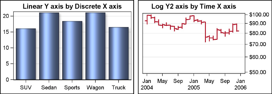
The GTL axis finds round tick values for the linear, log, and time axes. The column format is used, with a modification to reduce decimal values and to allow for format widths larger than specified due to possible data summarizations. This feature is generally referred to as GGOOD or TGOOD formatting. If you need axis settings different from the default, axis options can be used.
The default axis type is determined by the data. The axis type can be changed by setting the TYPE option in the axis options bundle. For the overlay layouts, the axis options bundles are provided in the LAYOUT OVERLAY statement. These are XAXISPOPTS, YAXISOPTS, X2AXISOPTS, and Y2AXISOPTS.
Each axis options bundle has some common options for all axis types, and some specific options that are applicable only to the specific axis type. Suboption bundles are available for each of the axis types. These are LINEAROPTS, DISCRETEOPTS, LOGOPTS, and TIMEOPTS. Any or all of these types can be defined. GTL will use only the one that is applicable to the axis type.
Common Axis Features and Options
• DISPLAY and GRIDDISPLAY
• TYPE
• LABEL, SHORTLABEL, LABELPOSITION, LABELFITPOLICY
• OFFSETMIN and OFFSETMAX
• Visual attributes
All axes support the DISPLAY option, which determines which parts of the axis are to be displayed. The default is to display the axis line, label, ticks, and tick values.
Label and Short label can be set. Short label will be used if the label does not fit. By default, the label is positioned in the center of the full axis, regardless of offsets. SAS 9.4 allows you to position the label in relation to the data extent of the axis by using the LABELPOSITION option. SAS 9.4 also supports LABELFITPOLICY of split, which allows the axis label to be split and displayed on multiple lines if it does not fit in the space available.
Axis offsets are regions on the two sides of the axis where data is not drawn. These values are computed by GTL to accommodate markers and to prevent edge markers from being clipped. You can set offsets to control the region of your plot where data is drawn.
Visual attributes of all axis elements can be set using the LABELATTRS and TICKVALUEATTRS options.
Linear Axis Features and Options
One key aspect of the linear axis is thresholding. This feature determines whether an axis should get a tick mark outside the data values. (See the graphs in Section 6.1.) The X axis has tick marks and values that contain all the data. But on the Y axis, the data values go beyond the tick mark.
Linear axis supported options: Integer, MinorGrid, MinorGridAttrs, MinorTickCount, MinorTicks, Origin, ThresholdMax, ThresholdMin, TickValueFitPolicy, TickValueFormat, TickValueDisplayList, TickValueList, TickValuePriority, TickValueSequence, ViewMax, ViewMin.
Discrete Axis Features and Options
A key aspect of the discrete axis is the tick value fitting. Normally, the tick value strings are drawn horizontally on the X axis. But if the tick values will not fit without colliding, the values are rotated at a 45-degree angle. Other fitting options are available. With SAS 9.4, axis tick values can be split over multiple lines using a split character by default a blank or white space.
Discrete axis supported options: ColorBands, ColorBandsAttrs, SortOrder, TickType, TickValueFitPolicy, TickValueDisplayList, TickValueList, TickValueListPolicy, TickValueSplitChar, TickValueSplitCharDrop, TickValueSplitJustify.
Log Axis Features and Options
Log axis can be used when the data range is positive (that is, greater than zero). Note, with bar charts, a zero baseline forces the axis range to contain zero. To use log axis with a bar chart, use the plot baseline option to set a nonzero baseline.
Log axis supported options: Base, MinorGrid, MinorGridAttrs, MinorTickCount, MinorTicks, ThresholdMax, ThresholdMin, TickIntervalStyle, TickValueList, TickValuePriority, ValuesType, ViewMax, ViewMin.
Time Axis Features and Options
A key feature of the time axis is to split the largest interval and draw it only when it changes. For example, with month and year, the year is displayed on a separate line, only when needed.
Time axis supported options: Interval, MinorGrid, MinorGridAttrs, MinorTickInterval, MinorTicks, TickValueFormat, TickValueList, TickValuePriority, ViewMax, ViewMin.
6.2.1 Common Axis Features

You can set axis options to control the display of the axes as shown below:
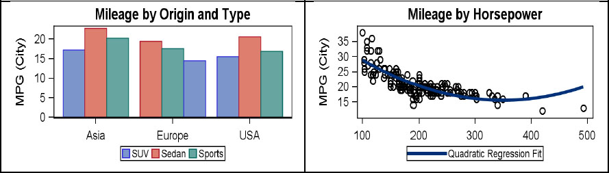
• On the x axis, the DISPLAY option is set to suppress the label and shrink the tick value font.
• On the y axis, the OFFSETMIN option is set to 20% to leave room at the bottom for the statistics. We have set the axis label and drawn it in the middle of the data range.
• We have used the Y2 axis to draw the statistic values using scatter plots. Y2 axis offsets are set to display the statistics only in the lower part of the axis.
proc template; /*--SAS 9.4--*/
define statgraph Fig_6_2_1;
begingraph / subpixel=on;
entrytitle 'Mileage by Type';
layout overlay / xaxisopts=(display=(ticks tickvalues))
yaxisopts=(label='Mean Mileage' griddisplay=on
offsetmin=0.25 labelposition=datacenter)
y2axisopts=(offsetmin=0.05 offsetmax=0.8
display=(ticks tickvalues));
barchart x=type y=mpg_city / stat=mean dataskin=sheen;
scatterplot x=typemean y=NLabel / markercharacter=n
labelstrip=true yaxis=y2;
scatterplot x=typemean y=meanLabel / markercharacter=mean
labelstrip=true yaxis=y2;
scatterplot x=typemean y=medianLabel / markercharacter=median
labelstrip=true yaxis=y2;
endlayout;
endgraph;
end;
run;
ods listing style=analysis;
proc sgrender template=Fig_6_2_1 data=GTL_GS_Cars;
run;
6.2.2 Linear Axis Features

You can customize the x axis values to display only the values between 150 and 350. Only the specified axis tick values are shown in their correct location.
On the Y axis, you can customize the tick values to display values from 0 to 50 by 10. Since the data range is increased beyond what is in the data, we need to set the TICKVALUEPRIORITY option.
proc template;
define statgraph Fig_6_2_2;
begingraph;
entrytitle 'Mileage by Horsepower';
layout overlay / xaxisopts=(griddisplay=on
linearopts=(tickvaluelist=(150 200 250 300 350)))
yaxisopts=(griddisplay=on
linearopts=(tickvaluepriority=true
tickvaluesequence=(start=0 end=50 increment=10)));
scatterplot x=horsepower y=mpg_city;
endlayout;
endgraph;
end;
run;
ods listing style=htmlblue;
proc sgrender template=Fig_6_2_2 data=GTL_GS_Cars;
run;
6.2.3 Discrete Axis Features

In this graph of mileage by make, we have set the discrete options to display only the makes of the cars specified in the TICKVALUELIST. Also, we have used the TICKDISPLAYLIST to rename Mercedes-Benz to Mercedes Benz, with a space. We set the TICKVALUEFITPOLICY to SPLIT (SAS 9.4), causing the long names to be split at the default split character.
proc template; /*--SAS 9.4--*/
define statgraph Fig_6_2_3;
begingraph / subpixel=on;
entrytitle 'Mean Mileage by Make';
layout overlay / xaxisopts=(display=(tickvalues)
discreteopts=(tickvaluefitpolicy=split
tickvaluelist=('Acura' 'Audi' 'BMW' 'Lexus' 'Mercedes-Benz'
'Porsche')
tickdisplaylist=('Acura' 'Audi' 'BMW' 'Lexus' 'Mercedes Benz'
'Porsche')));
barchart x=make y=mpg_city / stat=mean dataskin=crisp
barlabel=true;
endlayout;
endgraph;
end;
run;
ods listing style=htmlblue;
proc sgrender template=Fig_6_2_3
data=sashelp.cars(where=(msrp > 60000));
run;
6.2.4 Log Axis Features
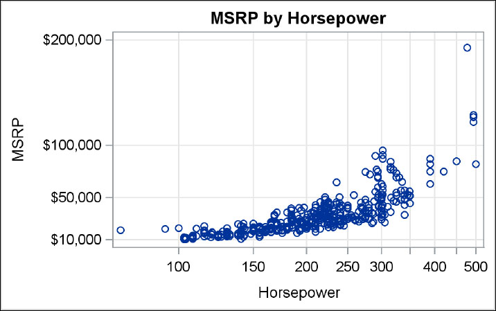
This graph shows the MSRP by horsepower for all vehicles. You can set the x axis to use a log base 2 scale. The ticks shown are not in increments of the power of 2, but instead we have requested the regular, round-number tick values.
On the Y axis, we have set a custom list of tick values and set TICKVALUEPRIORITY since the data range is extended beyond what is in the data.
proc template;
define statgraph Fig_6_2_4;
begingraph;
entrytitle 'MSRP by Horsepower';
layout overlay / xaxisopts=(type=log griddisplay=on
logopts=(base=2 tickintervalstyle=linear))
yaxisopts=(griddisplay=on
linearopts=(tickvaluepriority=true
tickvaluelist=(10000 50000 100000 200000)));
scatterplot x=horsepower y=msrp;
endlayout;
endgraph;
end;
run;
ods listing style=htmlblue;
proc sgrender template=Fig_6_2_4 data=sashelp.cars;
run;
6.2.5 Time Axis Features

In this graph of monthly closing prices, the x axis is automatically set to a time axis by GTL since the x axis variable has a date format. You can suppress the display of the x axis label, set the tick interval to SEMIMONTH, and request minor tick marks.
On the y axis, we have changed the axis label and enabled the grid lines.
proc template;
define statgraph Fig_6_2_5;
begingraph;
entrytitle 'Monthly Stock Prices by Company';
layout overlay / xaxisopts=( display=(ticks tickvalues)
timeopts=(interval=semimonth minorticks=true))
y2axisopts=(label='Price' griddisplay=on);
highlowplot x=date high=high low=low / close=close
yaxis=y2 lineattrs=graphdata2(thickness=3) ;
endlayout;
endgraph;
end;
run;
ods listing style=htmlblue;
proc sgrender template=Fig_6_2_5
data=sashelp.stocks(where=(date > '01jan2004'd));
where stock eq 'IBM';
run;
6.3 Legends
Legends are often necessary to decode the information in a graph. When you create a graph in which the data is classified by a group variable, you may need to convey the color to class value mapping to the reader. Or, you may need to provide some information about the regression fit in the graph. In both cases, a legend is necessary to help decode this information as shown below.
You can use the DISCRETELEGEND to create legends for both these cases. In the syntax shown below, the list of names to the left of the slash (/) are the names of the plot statements that contribute the information.
DISCRETELEGEND ‘name1’ <‘name2’ > / <options>;
Supported options: Across, AutoAlign, AutoItemSize, BackgroundColor, Border, BorderAttrs, DisplayClipped, Down, Exclude, HAlign, Location, Opaque, Order, OuterPad, Pad, SortOrder, Title, TitleAttrs, TitleBorder, Type, VAlign, ValueAttrs.
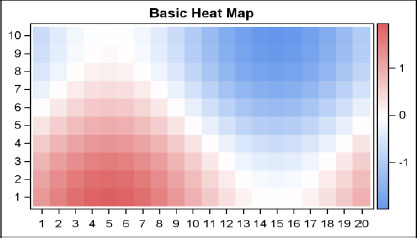
In some cases, you may need to convey the mapping between the response values and the colors in a graph as shown in this heat map graph.
You can use the GRADIENTLEGEND syntax shown below to create this type of legend.
CONTINUOUSLEGEND ‘name1’ / <options>;
Supported options: Border, ExtractScale, HAlign, Opaque, OuterPad, Pad, VAlign, ValueCount, ValueCountHint.
6.3.1 Discrete Legend
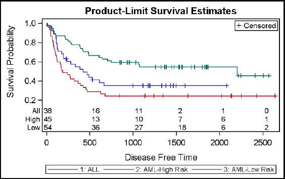
This graph shows the use of discrete legends inside and outside the plot data area. A discrete legend can have contributions from multiple plots listed by name in the legend statement. The items in the legend are in the same order as supplied by each plot statement.
You can use a LEGENDITEM to define custom legend entries. This definition includes the graphical element and the text string. Then, you can insert this into a legend by reference.
proc template;
define statgraph Fig_6_3_1;
begingraph;
entrytitle 'Product-Limit Survival Estimates';
legendItem type=marker name='c' / label='Censored'
markerattrs=(symbol=plus);
layout overlay;
stepplot x=time y=survival / group=stratum
lineattrs=(pattern=solid) name='s';
scatterplot x=time y=censored / group=stratum
markerattrs=(symbol=plus);
innermargin;
blockplot x=tatrisk block=atrisk / class=stratumnum
display=(values label) valueattrs=(size=8)
labelattrs=(size=8);
endinnermargin;
discretelegend 'c'/ location=inside halign=right valign=top;
discretelegend 's' / valueattrs=(size=8);
endlayout;
endgraph;
end;
run;
proc sgrender data=GTL_GS_SurvivalPlotData template=Fig_6_3_1;
format stratumnum aml.;
run;
6.3.2 Continuous Legend
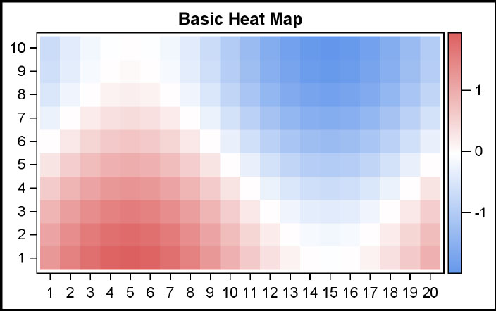
This graph shows a heat map where each cell is colored based on a response value that maps into the default three-color range. In this case, we are using the three colors defined in the THREECOLORRAMP style element in the default style.
The minimum and maximum values of the response variable are mapped to the extreme colors in the ramp. The middle color maps to the average of the extreme values. The continuous color is drawn showing the color ramp and the values.
The continuous color legend can work for only one plot statement, and can be placed on any side of the plot. Legend orientation is determined by its placement.
proc template;
define statgraph Fig_6_3_2;
begingraph;
entrytitle "Basic Heat Map";
layout overlay / xaxisopts=(display=(ticks tickvalues))
yaxisopts=(display=(ticks tickvalues));
heatmapparm x=x y=y colorresponse=value / name='a';
continuouslegend 'a';
endlayout;
endgraph;
end;
run;
proc sgrender data=GTL_GS_HeatmapParm template=Fig_6_3_2;
run;
6.4 Adding Titles, Footnotes, and Entries
You can add textual information to your graphs by using the ENTRYTITLE, ENTRYFOOTNOTE, or ENTRY statement.
All of the ENTRYTITLE and ENTRYFOOTNOTE statements should be outside the LAYOUT block, and multiple instances can be used. All the titles are automatically placed at the top of the graph, in the order in which they are specified. All the footnotes go to the bottom. These statements support three-part text, Unicode, and directives such as superscript and subscript. The syntax is as follows:
ENTRYTITLE <text-item> < text -item> < text -item> / options;
ENTRYFOOTNOTE <text-item> < text -item> < text -item> / options;
Text-item: Each text-item is a combination of HALIGN and TEXTATTRS. For example, a text-item may be provided as follows:
HALIGN=left TEXTATTRS=(weight=bold) ‘This is a Test’
Supported options: BACKGROUNDCOLOR, BORDER, BORDERATTRS, HALIGNCENTER, OPAQUE, OUTERPAD, PAD, SHORTTEXT, TEXTATTRS, TEXTFITPOLICY.
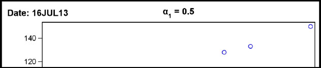
Multiple text-items can be concatenated to create the final text. The items that have the same HALIGN are concatenated. Strings with HALIGN=LEFT or CENTER or RIGHT are justified accordingly. The text-item can contain Unicode symbols, characters, and directives for superscript and subscript. Here is a full example of a two-part title, including macro variable, Unicode and subscripts as shown in the figure in Section 6.4.
ENTRYTITLE HALIGN=left "Date: &sysdate" HALIGN=center {Unicode alpha} {sub '1'} " = 0.5";
The ENTRY statement is used to place text strings inside the layouts. Text strings can be either in a cell of a gridded or lattice layout, or in a particular location in a LAYOUT OVERLAY. The syntax is similar to the one for ENTRYTITLE, with a few additional options.
ENTRY <text-item> < text -item> < text -item> / options;
Supported options: AutoAlign, BackgroundColor, Border, BorderAttrs, Location, Opaque, OuterPad, Pad, Rotate, TextAttrs, VAlign.
6.4.1 Titles and Footnotes
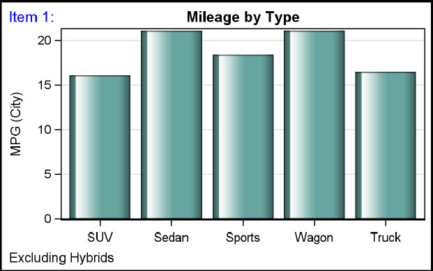
This graph shows the use of titles and footnotes to describe the graph. Both titles and footnotes can have three parts, as determined by the HALIGN option values of LEFT, CENTER, and RIGHT. Rich text is supported, and text strings can be constructed by concatenating text fragments as shown below for the left part of the title.
You can include macro variables and eval expressions that result in a text string into a TITLE FOOTNOTE or an ENTRY. See the example shown for ENTRY in Section 6.4.2.
In this graph, we have used a two-part title, with text attributes for each part and a one-part footnote. Titles and footnotes support UNICODE strings, superscripts, and subscripts. See the syntax for this in graph shown in Section 6.4.2.
proc template;
define statgraph Fig_6_4_1;
begingraph;
entrytitle halign=left textattrs=(color=blue) 'Item 1:'
halign=center textattrs=graphtitletext 'Mileage by Type';
entryfootnote halign=left 'Excluding Hybrids';
layout overlay / xaxisopts=(display=(ticks tickvalues))
yaxisopts=(griddisplay=on);
barchart x=type y=mpg_city / stat=mean fillattrs=graphdata3
dataskin=gloss;
endlayout;
endgraph;
end;
run;
proc sgrender template=Fig_6_4_1
data=sashelp.cars(where=(type ne 'Hybrid'));
run;
6.4.2 Entries

You can use ENTRY statements in a LAYOUT GRIDDED to create the stat table shown in this example. Each string can have rich text, including UNICODE, superscripts and subscripts. See the use of ς1 for illustration of the syntax. Filled outlined markers are a SAS 9.4 feature.
proc template; /*--SAS 9.4--*/
define statgraph Fig_6_4_2;
begingraph / subpixel=on;
entrytitle 'Car Statistics';
layout overlay / yaxisopts=(griddisplay=on)
xaxisopts=(griddisplay=on);
scatterplot x=horsepower y=mpg_city / filledoutlinedmarkers=true
dataskin=gloss markerattrs=(size=13 symbol=circlefilled)
markerfillattrs=graphdata2;
layout gridded / rows=2 order=columnmajor border=true
autoalign=(topright);
entry textattrs=(size=10) halign=right 'N = ';
entry textattrs=(size=10) halign=right {unicode SIGMA}
{sub '1'} ' =';
entry textattrs=(size=10) halign=left
eval(strip(put(n(mpg_city),4.0)));
entry textattrs=(size=10) halign=left
eval(strip(put(stddev(mpg_city),4.1)));
endlayout;
regressionplot x=horsepower y=mpg_city / degree=2
lineattrs=(color=black thickness=4);
endlayout;
endgraph;
end;
run;
proc sgrender template=Fig_6_4_2 data=sashelp.cars; run;
6.4 Summary
After you create a graph of the data, you often need to embellish it to convey the right context to the reader. You may need to provide some acknowledgments to other sources. You may need to customize the axes to reduce clutter, and you may need to provide the user with tools to decode the information in the graph.
To achieve all these goals and more, you can use the ENTRYTITLE, ENTRYFOOTNOTE, and ENTRY statements. You can use the various AXIS statements to customize the appearance of the axes, including creating a common uniform axis. And you can use the DISCRETELEGEND and the CONTINUOUSLEGEND statements to add one or more legends to your graph.
Often the discrete legends can be placed inside the graph’s data area. This helps provide more space for the plots themselves. Judicious use of these features can help you make a good graph.