
In this recipe, we will look at the components of the Tableau interface and use these features in order to create a simple Tableau visualization. In the previous recipe, we connected to data in Windows Azure DataMarket and a local Excel spreadsheet. We will use these data sources in our example here in order to produce a quick and easy data visualization.
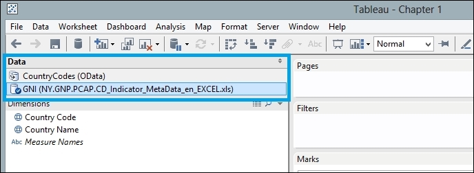
Make sure that you have a copy of the Chapter 1 Tableau data visualization open. You should be able to access both data sources. To do this, click on the Tableau Data connection that you will see in the top left-hand corner of the Tableau interface, as shown in the following screenshot:
You should be able to click on the CountryCodes and the GNI connections alternately, and see the differences in the dimensions and metrics contained in the two data sources.
- In the
Chapter 1Tableau data visualization, click on the GNI data source. This will change the dimensions and measures, which you can see in the left-hand side column of the Tableau interface. An example is shown in the next screenshot:
- You might notice that some of the dimensions are years, but the rest are considered to be metrics. Fortunately, this is very easy to change. You can simply drag the
2014and1961dimensions down to the Measures area. The Tableau interface now looks like the following screenshot: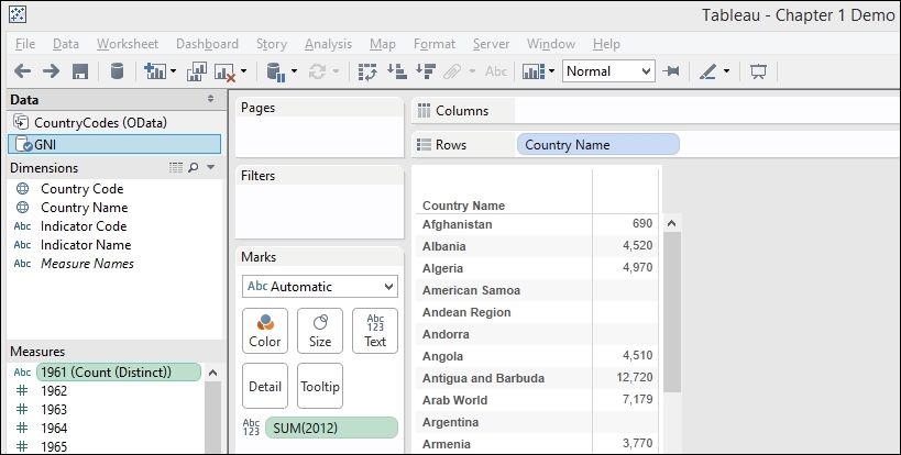
- Now that we see the measures, you can see that they are still specified as a string datatype, and they are specified as Count.
- Fortunately, this is also very easy to change. If you right-click on the measure
1960, a pop-up menu will appear. You can see an example of the pop-up menu in the next screenshot:
- If you do this for both
1960and1961, you can change both the datatypes to number. The result can be seen in the next screenshot:
- Now that the data has been prepared, let's move to visualizing the data.
- Earlier, we were introduced to the Show Me panel. Before we use the Show Me panel, however, we need to put some data on the shelves. This is a location where we drag-and-drop the dimensions and metrics in order to make them part of the data visualization.
- Pick the dimension Country Name and drag it onto the Rows shelf.
- Pick the metric
2012and place it on the Columns shelf. - You can now see that the data visualization has changed from a table to a horizontal bar chart. We can make it look better by sorting the bars in descending order. This allows us to quickly identify the highest GNI amounts for the top n countries.
- To sort in descending order, look for the button that shows a downward arrow next to a horizontal bar chart. When you hover the mouse over it, you will see that it sorts by the metric. An example is shown in the following screenshot:

Once you've sorted the data, it will look neater and easier to understand. We can see this in the following screenshot:

One of Tableau's features is that it works out automatically whether the data is a dimension or a measure. Tableau does this by looking at the datatype in the columns. So, for example, in this case, it has identified text and geographical types as dimensions and integers as measures.
You may be wondering why we have data that has a year for each column rather than a column Year. This is a good question to ask, and we will look at different ways of shaping the data and how that affects the resulting visualization throughout the course of this book.
Tableau has an internal knowledge base that it uses in order to determine the most appropriate visualization for the data it sees. Initially, in this case, it has suggested a horizontal bar chart in blue. Why is this the case?
We have a horizontal bar chart rather than vertical because we can read more easily along rather than up and down. For people in the West, we tend to read left to right, so we see the country name on the left followed by the bar and the value on the right.
By having horizontal bars, it is easy to see how the bars compare within the chart itself. We have the visual information from the bar itself as well as the metrics labeled at the end of the bar.