
This recipe explains how to use simple descriptive statistics and arithmetic as the first step toward analyzing your data. We will also look at ways to import data into Tableau. When we import data, Tableau will create a Tableau Data Extract file behind the scenes. This is also known as a TDE file for short.
Descriptive statistics are a great starting point when analyzing data. They are very helpful in delivering an initial overview of the data to help you interpret it. We can glean information about the spread of the distribution of the data, measures of variability around the mean, and measures of deviation from the normal curve. Descriptive statistics have a variety of uses, for example, to help you identify outliers, which are unusual cases in the data that may warrant further investigation. Missing data points are important as well because missing data can mislead our analysis, and data visualization can help us to profile the data to check for potential instances of missing data.
How do we calculate descriptive statistics? Once the FactInternetSales data has been imported, we will calculate its mean, median, and mode. These are measures of central tendency that allow us to see the shape of the data. Many business questions are quite simple: What are my average sales? What are my total costs? How well can a dataset be summarized by one number?
We can look at the data in order to see how well it can be described by a single number; this is called the measure of central tendency. Often, when we talk about business questions, people listening to us would want to know the average of something. However, when we look at the average, things become more complex. The average may be skewed, for example, by an outlier. We need to know whether our average is representative of a dataset.
The average, median, and mode tell us about the symmetry of our data in terms of its distribution. They give us an initial picture of the data, a simple summary. Further, knowing about the symmetry of the data can help us look at important factors such as probability, which may form part of your analysis.
As you might expect, there are many ways to perform descriptive statistics in Tableau. This recipe will show you how to perform simple and quick descriptive statistics that will help you begin analyzing your data; this will be useful in understanding whether the average is effective in describing the overall data.
In this recipe, we will import some data and look at using some descriptive statistics to describe our data. Firstly, we will calculate the average, which is the most well-known measure of central tendency. Then, we will look at the median and mode.
For this and the future recipes, you will need to download a mix of Excel and CSV files. Perform the following steps:
- Set up a folder on your computer where you can store the files. As an example, you could call it
TableauCookbookDataand locate it onD:. The path for the folder would beD:TableauCookbookData. - Go to http://bit.ly/JenStirrupOfficialTableauBookCode and download the ZIP file.
- Right-click on the ZIP file and select Extract To.
- Extract the files to your folder. So, in our example, you would extract the files to
D:TableauCookbookData.
- Open up Tableau and navigate to File | New.
- Save the file as
Chapter 2. - We will connect to the data and import it into Tableau's internal data store mechanism. To do this, click on Connect to Data, which is in the Data pane on the left-hand side.
- We are going to connect to a text file. To do this, select the link Text File which appears under the heading In a file on the left-hand side. Then, a file browser will appear. Navigate to the folder where you stored the CSV files.
- Navigate to the
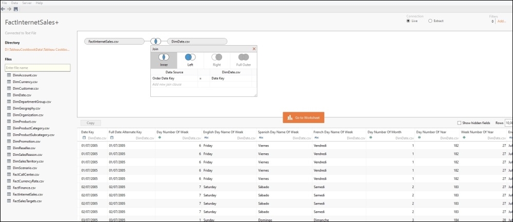
FactInternetSales.csvfile. Select the file and click on Open. - Now, Tableau will open up a data connection canvas. Here is an example of the canvas:

- Now, let's include date information to our dataset. To do this, drag across the
DimDatefile from the left-hand side to the white canvas in the middle. - A table will appear. From the left-hand column under DataSource, select Order Date Key.
- From the right-hand column under DimDate.csv, select Date Key.
Here is how your canvas will look:
- Next, let's add in some customer data. To do this, drag
DimCustomer.csvfrom the left-hand side of the Canvas under Files, and drag it to the white canvas. This time, Tableau will know to use CustomerKey for the join, since it is present in both the FactInternetSales table and the DimCustomer data.Your canvas will now appear as follows:

- Finally, let's add in some geographical data. To do this, drag
DimGeography.csvfrom the left-hand side under Files and drop it onto the white canvas. - Tableau will automatically identify that the tables are related through SalesTerritoryKey. However, the join is actually via the GeographyKey column. Click on the SalesTerritoryKey cell under Data Source, and from the drop-down list, select GeographyKey.
- Under the heading
DimGeography.csv, select the GeographyKey column. The screen will look like this:
- Once you have done this, select the Go to Worksheet button in the middle of the canvas. You will now be returned to the main Tableau canvas.
- Let's play with some data! Firstly, we will calculate the average of the sales amount. Take SalesAmount and drag it to the Rows shelf. You will see that Tableau immediately visualizes the data and turns it into a bar chart with one vertical bar. You can see this in the following screenshot:

- We would like to see the actual figure, so we will turn the data into a table. To do this, click on the Show Me panel at the top-right corner, and select the Text Table option, which is on the top row at the left-hand side of the Show Me panel.
- The SalesAmount pill will disappear from the Rows shelf and will reappear in the textbox in the Marks shelf, since Tableau is now showing a number.
The first visualization that Tableau selects is a sum of SalesAmount. However, since we are interested in the measures of central tendency, we are interested in the average, median, and mode. We will calculate these values to perform a quick summary of the data and also to understand how much we can rely on one number, the mean, to summarize the data.
- To calculate the average, simply click on the SalesAmount pill in the Marks shelf and click on the down arrow to show the menu. You can see this in the following screenshot:
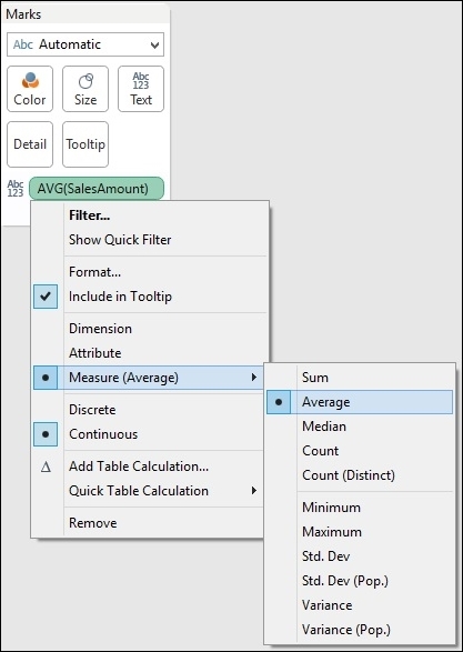
- The average sales amount is $486.09.
- The average is calculated and visualized in a table. However, we would like to see the median as well.
- Right-click on the SalesAmount pill on the Marks shelf and navigate to the Measure option, and slide the mouse along to the right-hand arrow. In the drop-down list, select Median. The median SalesAmount is given as 29.99.
- Next, remove SalesAmount from the Marks shelf so that we have a clean canvas again.
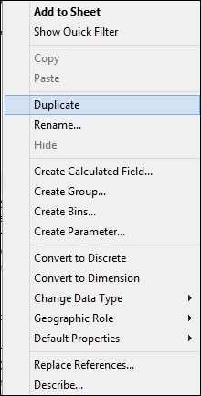
- Then, we need to calculate the mode, which can be defined as the number that occurs most frequently. To calculate the mode, we need to make a copy of SalesAmount and make it a dimension. This is a workaround to help the Tableau user to work out how many times each price occurred. To do this, right-click on the SalesAmount column in the Measures window and select Duplicate. You can see the menu item in the following screenshot:
- Once you have duplicated the SalesAmount figure, you will see that the duplicate is called SalesAmount (copy).
- Next, drag SalesAmount (copy) to the Dimensions shelf in the Data sidebar so that the table works properly.
- Drag the SalesAmount (copy) item to the Rows shelf.
- Next, you can go back to the Measures pane and move the Number of Records pill to the canvas area, next to the SalesAmount (copy) column.
- This will give us the number of records for each sales amount. However, it is quite difficult to work out the most commonly-occurring sales amount from the table simply by looking at it. What we can do instead is sort the data so that the maximum is at the top, and the top item provides us with the mean.
- To sort the data, go to the top of the Tableau interface, and look for the horizontal bar chart symbol with the downward arrow. This will sort the data by the number of records in descending order. You can see this under the Format menu item, as highlighted in the following screenshot:

- Once you've done this, drag the Number of Records item from the Measures pane on to the Color shelf of the Marks shelf. Once this is done, your screen should resemble the following screenshot:

- The mode is actually the topmost number; the highest frequently occurring SalesAmount is $4.99.
To summarize, in this section, we learned the following:
- Basic calculations
- Changing the color
- Basic sorting
We can see that the average and median values are quite different. The mode is $4.99, but the median is $29.99. Since the average is much higher than the median and the mode is different from the other two numbers, the data is not symmetrical. Often, when business analysts look at data, they try to find out whether the data is close to a normal curve or not. The average, median, and mode help us to determine whether the data is close to a normal distribution or whether the data is shaped. Therefore, we can't just simply use the average to summarize the data; we need to know about the other items too. This helps us understand the skewedness of the data, or how far it is from the central measures.
If you are interested in learning more about analyzing data and the normal curve, then you can take a look at http://en.wikipedia.org/wiki/Normal_curve.
If statistics interests you, why not look at doing a Khan Academy course? This is a free facility for learning statistics yourself online; refer to https://www.khanacademy.org/.