
In the first recipe, we specified communication as one of the key features of a dashboard. We need to be able to share the right information with the right audience, at the right time, to the right people, and in the right format.
Sometimes, data needs to be translated so that it matches the business rules and the business understanding of the organization. Tableau offers a number of different ways that help you translate data into something that the business decision makers will understand.
Grouping is one way of making data meaningful to the business. In this recipe, we will look at grouping some dimension members into a single member. Rolling up some of the members in one dimension is a good way of summarizing data for dashboards.
In this recipe, we will look at grouping dimension members; then, we will look at more complex grouping of calculations. The business question is an investigation into the characteristics of customers, for example, those who have children, and those who do not. We will group the Number Children At Home dimension members into the group of customers who have children and those who do not.
Then, we will look at a more advanced example of grouping the data by measure rather than dimension. To do this, we can create a calculation that will distinguish the values that are below the average sales amount and above the average. Results that are classified as above average are labeled Above or Equal to Average, and below average sales are labeled Below Average. We can then use this calculation to convey a visual message to the business user; for example, we could color the above average sales in one color and the below average sales in another in order to make the distinction easily identifiable.
We will need to add in a new data source for this recipe. Note that this recipe has a basic part, and then a more advanced part.
- Click on Ctrl + M to get a new worksheet in Tableau. Alternatively, go to the Worksheet menu item and select New Worksheet.
- Go to the Measures pane and drag Number of Records from the Measures pane to the Rows shelf.
- Go to the
DimCustomer#csvtable, which is under the Measure part of the Data pane on the left-hand side. - Drag the Number Children At Home measure from the Measures pane directly up to the Dimension pane in the Data pane.
- Right-click on Number Children At Home and change data type to String. The next screenshot shows you an example of how your screen will look:

- Drag the Number Children At Home dimension onto the Rows shelf and place it to the left of the NumberOfRecords column. You can see an example in the next screenshot:

- Let's change the visualization to a table. Go to the Show Me panel and click on the Text Table option. When we look at the Number Children At Home dimension, we see the following members and the number of customer records associated with each member:

- We will group the dimension members, so it is easier to see the customers who have children and the ones who do not.
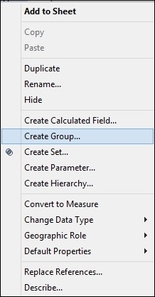
- Go to the dimension called Number Children At Home, right-click on it, and select the Create Group option, as shown:
- This produces the Create Group dialog box, which you can see in the following screenshot:

- In the Field Name field, you will see the name of the field.
- Multiselect the numbers 1 through to 5 by holding the Shift key and clicking to select more than one number at a time.
- Click on Group, rename the group to
Customers With Children, and click on OK. - You can then see the new group on the left-hand side of the Dimensions pane, at the bottom of the list. Drag your new grouping to the Rows shelf.
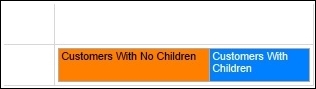
- Remove the Number Children At Home pill that is NOT a group. The Number Children At Home group should be on the Rows shelf. Then, choose Number of Records from the Measures pane and put it into the Columns shelf. You can see that the table now only has two rows in it: one that consists of a zero and another that has Customers With Children.
- In order to make things clear, right-click on the zero and select Edit Alias.
- Rename the zero to
Customers with No Children. Here is an example:
- It is now clear from the chart that over 24,000 sales records involve customers who have children, whereas just over 35,000 sales records involve customers who do not have children. We can visualize this information in a better way, and we will do this for the rest of the exercise.
- To do this, change the visualization to a Stacked Bar chart using the Show Me panel.
- Click on the Swap button so that the bar appears in a horizontal line. You can see that the Swap button is placed under the menu bar. Here is an example:

- We can then change the colors by dragging Number of Children at Home to the Color panel on the Marks shelf.
- Next, click on the downward arrow on the SUM(Number of Records) item under the Marks shelf and you will see the following dialog box:

- For Customers With Children, we will choose blue.
- For Customers With No Children, we will choose orange. Orange is selected for Customers With No Children because there is a greater number of customers who do not have children. Brighter and more intense colors are often used in order to denote higher values.
- Drag the Number of Children at Home dimension to the Label button.
- Your Tableau canvas should appear as shown in the following screenshot:
- Next, we will look at a more advanced example of grouping the data by the measure, rather than the dimension. To do this, we can create a calculation that will distinguish the values that are below the average sales amount and above the average. Results that are classified as above average are labeled as Above or Equal to Average, and below average sales are labeled as Below Average. We can then use this neat calculation as a label to convey a visual message to the business user; for example, we could color the above average sales in one color and the below average sales in another in order to make the distinction easily identifiable.
- To do this, stay in the
Chapter 2workbook and continue to work in the existing worksheet. - Right-click on the SalesAmount measure.
- Select the measure Create Calculated Field that is illustrated in the following screenshot:

- When you select this option, you will get the following dialog box:

- In the Name field, enter the name of the calculated field:
SalesAboveOrBelowAverage. - In the Formula field, we will put in a formula that will calculate whether or not the sales amount is above or below the average amount. The formula is as follows:
IF ( SUM([SalesAmount]) - WINDOW_AVG(SUM([SalesAmount]), First(), Last() ) < 0 )
Then 'Below Average'
Else 'Above or Equal To Average'
END
Tip
Downloading the example code
You can download the example code files for all Packt books you have purchased from your account at http://www.packtpub.com. If you purchased this book elsewhere, you can visit http://www.packtpub.com/support and register to have the files e-mailed directly to you.
- Once you've placed the formula into the calculation editor and clicked on OK, you will be returned to the main Tableau interface. You will see your new calculation on the left-hand side in the Measures pane.
- Remove the Number Children At Home label from the Marks shelf.
- Add SalesAmount to the Columns shelf.
- On the Measures window in the data pane, go to
DimCustomer#csvand look for Number Cars Owned. - Drag the Number Cars Owned measure attribute to the Dimension pane.
- Drag Number Cars Owned from the Dimension pane to the Rows shelf.
- Drag your new calculation SalesAboveOrBelowAverage to the Color button on the Marks shelf.
Your screen should now look like this:

To summarize, we have created a calculation that is meaningful to a business user. It provides the color display of the measure, which helps the business user understand things more efficiently. To summarize, it is simple and effective to conduct a grouping of dimension members into a binary grouping. This is useful for dashboards in order to provide an "at a glance" metric visualization that shows the organization has more customers who do not have children than those who do.
Essentially, this formula uses the
WINDOW_AVG function to work out the average of the values that are in the Tableau view of the data. Basically, this average works out the value of the data that is viewable in the Tableau canvas and does not include data that has been filtered.
It uses First() and Last() to work out the average of all the data shown in the canvas, from the first row right until the last row. The calculation takes the current SalesAmount value and compares it with the average SalesAmount value.
Tableau allows you to group data together by simply arranging fields of your data source on a Tableau worksheet.
When you group fields in a worksheet, Tableau queries the data using standard drivers and query languages (such as SQL and MDX). It then groups data together wherever necessary. Finally, it presents a visual analysis of the data.