
Filters are a useful way of helping users focus on particular aspects of the data that they are most interested in. This helps them to investigate and compare data and perhaps look for outliers and exceptions in the data.
Filtering data is an essential part of a dashboard. Users like to interact with data in order to understand it better, and it is natural to filter data so that users can pinpoint the data that particularly interests them.
Tableau allows users to filter measures, calculations, and dimensions, which is extremely useful in a dashboard. For example, take the case where you need to see the sales figures that are less than the given amount over a period of time.
In this recipe, we will import some more data and look at taking some descriptive statistics. We will also look at filters. Users have a lot of flexibility when it comes to combining filters, which means that you can have a lot of creativity in your analyses.
For this recipe, we will need to have Tableau open and ready to create a new workbook. For the exercises in this chapter, we will import multiple tables into our new workbook as the basis for creating calculations.
Let's create a new folder to store the Tableau workbook. For example, in this book, we will use the Chapter Three folder under D:DataTableauCookbook. Therefore, you will need to have the folder open where you will download the data files. In Chapter 1, A Short Dash to Dashboarding!, we specified D:DataTableauCookbook as an example. We will be importing the following files:
DimProductCategoryDimProductSubCategoryDimProductFactInternetSalesDimDate
- Open up Tableau and navigate to File | New. This will start a new workbook in Tableau.
- Go to File and then click on Save As.
- Save the file as
Chapter Three. - Let's rename the worksheet to
Fun with Filters. - We will connect to the data and import it into Tableau's data store. To do this, select Connect to Data, which you will see under Data.
- Under the In a file heading, select the Text File option.
- Drag the
FactinternetSales.csvfile from the left-hand side onto the canvas. - Next, drag
DimProduct.csvfrom the left-hand side list, onto the canvas. - Then, we will drag
DimProductSubcategory.csvfrom the left-hand side, and place it next toDimProduct.csv. - Next, let's take the
DimProductCategory.csvfile from the left-hand side, and drop it next to DimProductSubcategory. - Finally, let's take
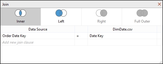
DimDate.csvand drag it onto the canvas. - We will be asked to specify the join between the
DimDate.csvtable and the FactInternetSales file. - For the Data Source column, select the Order Date Key field. For the
DimDate.csvfield, select Date Key.The join should appear as follows:
- Click on the Go to Worksheet button to be taken back to the Tableau main canvas.
- On the Data pane in the Tableau side bar, let's rename the data source to something more meaningful. Right-click on the data source under the Data pane. By default, Tableau will have given it a name that is the same as the first table that was selected. Here, it will be called
FactInternetSales+. Right-click on it and select Rename. - Enter
CombinedProductsWithFactsso we know that this data source is a combination of facts and products. - We can look at putting in dimensions and metrics in order to make a start and be productive straightaway with Tableau.
- Let's visualize a table as the starting point. Take the FullDateAlternateKey field from the DimDate table and drag it onto the Columns shelf. Tableau will automatically recognize that this is a date, and it will aggregate the data according to the year level. Therefore, it will appear as Year(FullDateAlternateKey).
- Next, take the EnglishProductCategory Name attribute from the
DimProductCategorytable and place it on the Rows shelf. - Go to FactInternetSales under the Measures pane, and drag SalesAmount to the canvas.
- Then, we will add a few table calculations as an exercise to explore this concept more while also adding to our filters in this exercise.
- On the Marks shelf, right-click on the Sum(Sales Amount) metric and select the Add Table Calculation option, as shown in the following screenshot:

- When we right-click on the Sum(Sales Amount) metric, we get the Add Table Calculation window, as shown in the following screenshot. For our purposes, we will choose Difference From as the value for Calculation Type.
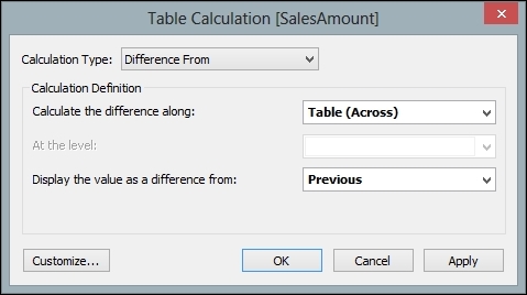
- We will calculate the difference along the table, so we will choose to calculate the difference along with the Table(Across) option.
- In the Calculation Definition panel, we will choose the Previous option under the Display the value as a difference from: dropdown.
- Once these options have been selected, we can customize the table calculation further by renaming the calculation to something meaningful. To do this, click on the Customize button, which can be found at the bottom-left corner of the Table Calculation box.
- After we have clicked on the Customize button, we will get the Calculated Field dialog, which you can see in the next screenshot. The text button at the top is labeled Name: and we can insert a different name in this textbox.
- Here, we will rename the table calculation to
YoY Sales Difference. The formula itself works out the current sales amount and compares it to the previous sales amount. If a null value is found, for example, where there is no previous sales amount available because we are looking at the data for the first year, then a zero is returned; this is the job of the ZN expression. Once you have renamed the table calculation, click on OK.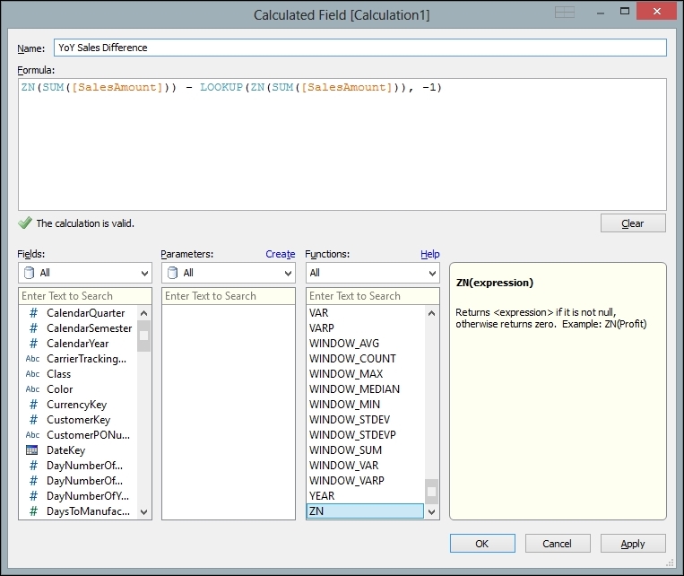
- You are then taken back to the previous window, and you will see a description of the formula in the Description window. You will also see the formula in the Formula box. When you reach this point, click on OK, as shown in the following screenshot:

- Drag Sum(Sales Amount) from the Measures part of the side bar over to the Marks shelf. Here is an example of how the screen should look, so far:

- Drag Sum(Sales Amount) from the Measures part of the sidebar over to the canvas so that it appears in the table, along with YoY Sales Difference.
- Let's change Sales Amount so that it is a currency. To do this, go to Sales Amount on the Marks shelf and right-click to get the pop-up menu. Select the item Default Properties, and then select Number Format.
- On the Default Number Format dialog box, select Currency (Standard).
- In the drop-down list, select your preferred currency, then click on OK. In these examples, we will use English (United States) and the dollar sign.
- Let's repeat these steps the same for YoY Sales Difference so that it has the same currency format as Sales Amount. Right-click on YoY Sales Difference on the Marks shelf.
- Click on Format, and you will see the Format pane appear on the left-hand side of the screen.
- On the Pane tab, go to the Numbers drop-down list.
- Select Currency (Standard).
- Right-click on the Sum(Sales Amount) measure on the Marks shelf and choose the Quick Table Calculation option from the menu list. Then, select the Moving Average option. You can see this in the following screenshot:

- This will create a new measure that shows the moving average. To rename the new calculated measure, right-click on the SUM(SalesAmount) measure in the Measure Values shelf and choose the Edit Table Calculation option.
- In the Table Calculation [Moving Average of SalesAmount] dialog box, select the Customize… option.
- In the Name: box, rename it to
Moving Averageand click on OK. - To summarize, we will now have two measures: one for Year on Year changes and another for the Moving Average Difference over time.
- Our next step is to work out the difference between the two calculations that we have just made. In other words, what is the difference between the year-on-year change and the moving average for the sales amount?
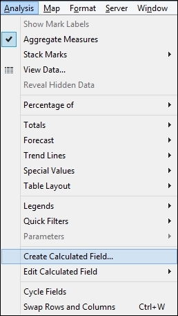
- Our first step in this process is to create a new calculated field that will work out the difference between the year-on-year change and the moving average. To do this, firstly we will need to go to the Analysis tab at the top menu item and select the Create Calculated Field option. You can see this in the menu in the following screenshot:
- We will now get the Calculated Field editor box, and we need to subtract Moving Average from the Year on Year average. We can see this in the following screenshot:

- Click on OK once you have entered in the calculation.
- Now, drag Difference between YoY Sales and Moving Average from the Measures pane to the Measure Values shelf.
- When we place all the three calculations on the table, it looks a little confusing with a lot of numbers, and it is hard to differentiate the difference between patterns and outliers contained in the data. The following is an example:

- We can use our measures in order to filter the data, and it's very simple to do this. Drag the measure Difference between YoY Sales and Moving Average to the Filters shelf on the left-hand side.
- A Filter window will appear; then, an example appears, as shown in the following screenshot:

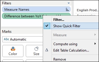
- Once you have created the filter, right-click on it and select the Show Filter option. Here is an example:
- Remove Moving Average and YoY Sales Difference from the Marks shelf.
- Drag Difference between YoY Sales and Moving Average to the Filters area.
- From the Show Me panel, select the Heatmap option from the panel. Your visualization now looks like this:

- Now you can use the slider filter on the right-hand side to filter out some of the data points. As you slide the filter along, you will see that some of the squares disappear and reappear. This allows you to filter out the data points that you don't need.
- If we click on the data points, we can obtain more details of specific values.
To summarize, in this section, we have shown that we can use table calculations and measures in order to filter data to show the information that we would like to see on the dashboard. Here, we filtered using a custom calculation, based on a business rule. This helps to provide the "at a glance" purpose of a dashboard.
Tableau allows you to filter out the data that you don't need, in a way that is intuitively familiar. This means that the important points can jump out at the business user. Further, using tooltips can enhance understanding of individual data points.