
Logical calculations can make your analyses richer. They can also make things easier for a dashboard consumer. For example, logical calculations can help you funnel the analysis to specific dimension members, combine members to follow a business rule, or even remove values that are irrelevant to your investigation.
Normally, when we use filters, we select the attributes within a dimension. In this recipe, we will implement logical calculations so that users can choose different dimensions to describe the data. We will place a small control on the dashboard so that users can simply click to choose the dimension they would like to see, which describes the sales amount data. Users can simply click on which dimension they would like to see, for example, by color, country, or product line.
In this recipe, we will need to make a calculated field using a logical calculation and a number of parameters, amend the colors, and so on. Our sequence is to set up some parameters, a calculated field, and then some filters. So, let's get started!
For the exercises in this recipe, we will continue using the Chapter 5 workbook. There is no need to add any more data. Let's make a copy of the KPI Sparkline worksheet and call it KPI Dimensions. We will also make a copy of the dashboard and call it KPI Dimension Analysis.
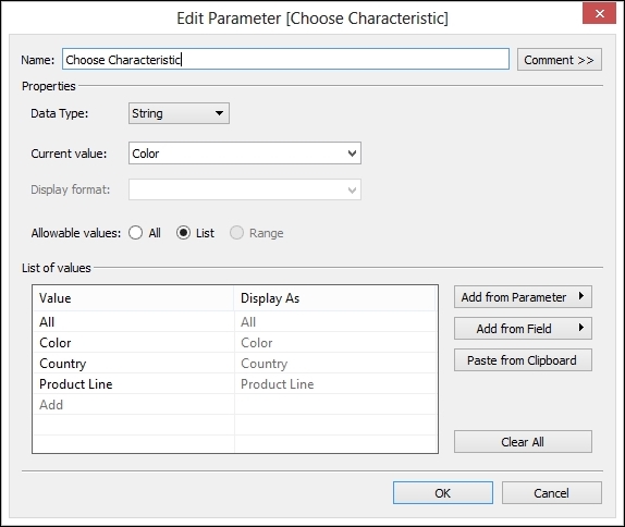
- First, let's set up a parameter so that the user can choose a metric. To set up a parameter, right-click on the Measure box and select the Create Parameter option. Call the parameter
Choose Characteristicand set up a list for each metric. Make sure that you set up List as an allowable value and type each metric name into the list of values.The following is an example of the resulting parameter:
- Next, we need to add a calculation that will help us choose different dimensions. We will use a
CASEstatement, which is simply like lots ofIF…THEN…ELSEstatements strung together. The calculation will execute the first statement that it finds to be true. - We will set up a
CASEstatement that chooses between dimensions dependent on the user selection. We will offer the following choice of different measures so the dashboard consumer can select the measure they would like to see on the dashboard:- Sales amount
- Sales amount quote
- To do this, right-click on the Dimension part of the Tableau workbook and select the Create Calculated Field option. The logical calculation is written as follows:
CASE [Choose Characteristic]
WHEN "All" THEN "All"
WHEN "Color" THEN [Color]
WHEN "Country" THEN [SalesTerritoryCountry]
WHEN "Product Line" THEN [ProductLine]
END
- The
CASEcalculation allows us to simply show all of the data not described by any dimension, or show by color, country, or product line. - The logical calculation can be seen in the calculation editor, as shown in the following screenshot. Simply copy and paste the mentioned calculation into the textbox and call the calculation
Calc_ChooseCharacteristic.
- Once you have clicked on OK, you will see the calculation in the Dimensions pane in the sidebar in the Tableau workbook.
- Now, we need to set up some pills so that our workbook visualization is filtered according to the user-selected dimension. Take the Calc_ChooseCharacteristic filter and drag it to the Marks shelf so that the detail is retained.
- Next, drag Calc_ChooseCharacteristic onto the Color button. This is vital because it tells Tableau that it needs to change the display depending on the selected dimension. The calculated fields implement the logic to denote which dimension should be displayed.
- This selected Dimension value is held in the Choose Characteristic parameter. The color is dependent on the result of the
CASEstatement evaluation in the Calc_ChooseCharacteristic calculation, and this is how Tableau differentiates in the display. You will need to make sure that users can select their preferred dimension, and to do this, they will need to see the parameter control. And you will need to see it in order to test it out! Simply go to the parameter called Choose Characteristic, right-click on it, and select the Show Parameter Control option. - Since we are using Color as a potential dimension, we can make the palette-defined colors match the actual colors of the merchandise. To do this, click on the Color button and select the Edit Colors option. We can then set the color attribute Red to be red, set the color attribute Blue to the color blue, and so on, as seen in the following screenshot:

- To finalize the visualization, ensure that Year(FullDateAlternateKey) is on the Columns shelf and that Sum(SalesAmount) is on the Rows shelf.
- Set Marks to be Circle rather than Automatic.
- We can also add SUM(SalesAmount) so that the diameter of each circle becomes representative of the SUM(SalesAmount) value.
- Let's go to our dashboard called KPI Dimension Analysis, which we copied earlier. Let's remove the KPI Sparkline worksheet and insert the new KPI Dimensions worksheet instead. We will need to show our parameter control; to do this, click on the KPI Dimensions area of the dimension, select Parameters, and select the Choose Characteristic option. We should also add the Calc_ChooseCharacteristic filter, which is under Quick Filters in the same menu. This step is demonstrated in the following screenshot:

- You can also remove the title and any headings to make the most of the space. Overall, in the dashboard, you will need to change the business question that has been posed. Here, we have changed it to
How well did sales perform, by different characteristics? - On the dashboard, look for the drop-down list under Choose Characteristic. Try making different selections between color, product line, all, and country. You'll notice that the screen and the legend change in response to your actions.
You can see the final dashboard and the culmination of this chapter's work in the following screenshot:

The dashboard is now complete, and you can have fun changing the parameters and switching dimensions. This will create interesting patterns in the data for your users.
In this recipe, we implemented logical calculations that allow users to change the dimension that appears on the dashboard. We are now starting to make our dashboards look more interesting and more interactive.
Showing different dimensions helps the dashboard designer to make the most of the space while maximizing the choices available to the dashboard user. Setting up all of the moving parts is not as quick as other visualizations, but it is worth the effort to help users.
For this recipe, we will use the KPI Dimension worksheet and see the result in our dashboard.
In this chapter, we have looked at many different ways to help users to engage with dashboards, such as choosing visualizations and making use of items to help with analysis, such as parameters, Big Data technologies, and conditional logic. These tools will allow us to create dashboards that are powerful and rich, and who knows, maybe even fun!