
We can generate random numbers from a normal distribution and visualize their distribution with a histogram (see https://www.khanacademy.org/math/probability/statistics-inferential/normal_distribution/v/introduction-to-the-normal-distribution). Draw a normal distribution with the following steps:
- Generate random numbers for a given sample size using the
normal()function from therandomNumPy module:N=10000 normal_values = np.random.normal(size=N)
- Draw the histogram and theoretical PDF with a center value of
0and standard deviation of1. Use matplotlib for this purpose:_, bins, _ = plt.hist(normal_values, np.sqrt(N), normed=True, lw=1) sigma = 1 mu = 0 plt.plot(bins, 1/(sigma * np.sqrt(2 * np.pi)) * np.exp( - (bins - mu)**2 / (2 * sigma**2) ),lw=2) plt.show()
In the following diagram, we see the familiar bell curve:
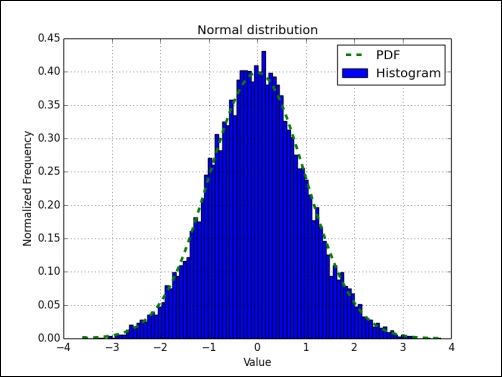
We visualized the normal distribution using the normal() function from the random NumPy module. We did this by drawing the bell curve and a histogram of randomly generated values (see normaldist.py):
import numpy as np
import matplotlib.pyplot as plt

N=10000

np.random.seed(27)
normal_values = np.random.normal(size=N)
_, bins, _ = plt.hist(normal_values, np.sqrt(N), normed=True, lw=1, label="Histogram")
sigma = 1
mu = 0
plt.plot(bins, 1/(sigma * np.sqrt(2 * np.pi)) * np.exp( - (bins - mu)**2 / (2 * sigma**2) ), '--', lw=3, label="PDF")
plt.title('Normal distribution')
plt.xlabel('Value')
plt.ylabel('Normalized Frequency')
plt.grid()
plt.legend(loc='best')
plt.show()..................Content has been hidden....................
You can't read the all page of ebook, please click here login for view all page.