
Let's chart the stock price distribution of quotes from Yahoo Finance.
- Download the data going back one year:
today = date.today()
start = (today.year - 1, today.month, today.day)

quotes = quotes_historical_yahoo(symbol, start, today)
- The quotes data in the previous step is stored in a Python list. Convert this to a NumPy array and extract the close prices:
quotes = np.array(quotes)
close = quotes.T[4]
- Draw the histogram with a reasonable number of bars:
plt.hist(close, np.sqrt(len(close)))
plt.show()
The histogram for DISH appears as follows:
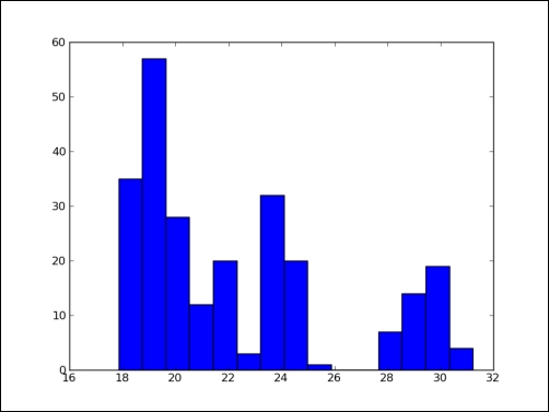
We charted the stock price distribution of DISH as a histogram (see stockhistogram.py):
from matplotlib.finance import quotes_historical_yahoo
import sys
from datetime import date
import matplotlib.pyplot as plt
import numpy as np

today = date.today()
start = (today.year - 1, today.month, today.day)

symbol = 'DISH'

if len(sys.argv) == 2:
   symbol = sys.argv[1]

quotes = quotes_historical_yahoo(symbol, start, today)
quotes = np.array(quotes)
close = quotes.T[4]

plt.hist(close, np.sqrt(len(close)))
plt.show()
..................Content has been hidden....................
You can't read the all page of ebook, please click here login for view all page.