
In this chapter, we will take a closer look at the grammar of graphics as implemented in ggplot2. We will go through the main concepts of the layer approach that will help you to understand and master the full potential of the basic qplot function which we were introduced to in Chapter 2, Getting Started. After a general introduction to the different components of the grammar of graphics, we will go deeper into the faceting, coordinate system, scales, and concept of layers in dedicated sections of this chapter. Afterwards, we will have a look at how you can use the ggplot() function and how its code relates to the one you have already seen used with the simplified qplot() function.
The grammar of graphics is a tool that allows us to effectively describe the components of a graph. In Chapter 1, Graphics in R, we mentioned some of the basic concepts behind the approach implemented in ggplot2 for data visualization. The ggplot2 package is an implementation of the ideas presented in the book, The Grammar of Graphics (Statistics and Computing) by Leland Wilkinson. The goal of the book was to define a set of general unifying principles for the visualization of data. For this reason, the plotting paradigm implemented in the package is based on the idea that, instead of providing many different functions, with each one targeting the realization of one specific type of graph, providing a smaller set of functions defines the different components of a graph and can be combined to generate a large variety of plots.
The grammar of graphics is designed to help in separating and identifying each step of the charting process, helping you to better decide upon the best way to visualize data. Reflecting the structure of a language, each component of the grammar of graphics in ggplot2 has a specific name, and in Figure 3.1, you can find an overall representation of these components:

Figure 3.1: This is the overall diagram of the different components of the grammar of graphics as implemented in ggplot2
If we take as an example a simple scatterplot, what we are plotting is one point representing the value of a variable y corresponding to the value of a different variable x. If the values come from different measurements or experiments, we could also group them and represent them with a different color. If, for instance, we look at the Orange data, which we introduced in Chapter 1, Graphics in R, we have two variables, age and circumference, and a third variable, Tree, identifying the tree from which the measurement was taken. The following code shows this:
> head(Orange)
The output will be as follows:
        Tree      age       circumference
1        1        118              30
2        1        484              58
3        1        664              87
4        1       1004             115
5        1       1231             120
6        1       1372             142
As mentioned earlier, we could represent the circumference of trees (x) against their age (y) and group them by the tree used in the measurement using a different color. These elements, such as the horizontal and vertical position of the points as well as their size, shape, and color, are elements that are perceived in the plot and defined as aesthetic objects. Each aesthetic attribute can also be mapped to a variable to represent a cluster of data or set to a constant value. In this example, that's what we did when mapping the color.
After selecting the data we are interested in representing, we need to choose how to represent them. We could, for instance, use bars, lines connecting the observations, or simply points to represent the observed values on the plot. All these elements (bars, lines, and points) are geometric objects (geom) of the graph. They are independent of the data and several of these components could be applied to the same dataset. The next step would be to actually represent the data, but in order to do that, we would need to convert the actual data contained in the dataset in to elements that the computer can represent (for instance, pixels) and elements that can be mapped to aesthetic units, such as the different colors in our example. These transformations are done by the scales. This scaled data can then be represented in the coordinate system on which we want to plot the data. You can see the different components of the plot representation depicted in the simple example in Figure 3.2.
As you have seen, to create the complete plot in this simple example, we had to go through different steps:
- The data and the geometric elements are combined with the coordinate system to produce the plot
- Together with the x-y variables represented in the plot, additional aesthetic attributes can be assigned, such as the mapping of data to different colors
- Scales are used to transform the data into elements that can be represented and mapped to aesthetic attributes
An additional possibility could be to split the data into different panels in a process defined as faceting or to perform statistical (stat) transformation on the data.
Going back to Figure 3.1, you can now see how a plot is composed of layers containing information about the data, geometric representation, statistical transformation, and aesthetic elements, for instance. The layers are then combined with scales and the coordinate system to represent the graphics object. Optionally, data can be split into facets. One plot can then contain several layers, for instance, if different geometries overlap (points and boxplot in Figure 2.12 of Chapter 2, Getting Started,) or if statistical transformations are included in the data (smooth line in Figure 2.16 of Chapter 2, Getting Started).
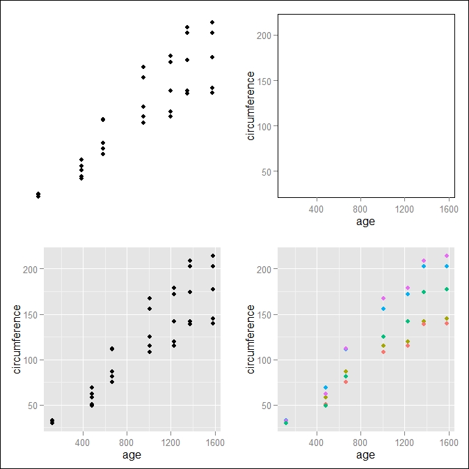
Figure 3.2: This is a representation of the main components of a plot in the grammar of graphics; the data and the geometric elements (top-left corner) are combined with the coordinate system (top-right corner) to obtain the plot (bottom-left corner). Additional aesthetic attributes can be added, for instance, mapping to color to another variable (bottom-right corner)
We will now go into more detail, discussing the different components of the grammar of graphics, as represented in Figure 3.1, in the following sections, and we will discuss in more detail the layers and their individual components in the Layers in ggplot2 section of this chapter.