
In ggplot2, you have access to a series of functions that enable detailed control of plot appearance. These functions are called themes in ggplot2 and can be used to control nondata components of plots, such as the axis font, plot background, and position of the legend. This means that they do not affect how the data is represented in terms of geometry or how it is transformed by the scales. The main function in this respect is the theme() function. This function is very complex since it allows you to specify all the different details contributing to the plot appearance as well as generating your own format and style. In the next few pages, we will see some illustrative examples that demonstrate what you can produce, but for more details, you should definitely have a look at the document page at http://docs.ggplot2.org/current/theme.html.
In ggplot2, you have two built-in themes available that can be applied directly to your plot: theme_grey(), which is the default theme, has a gray background with white gridlines, while theme_bw() has a white background and black gridlines. You can use these predefined themes as normal plot elements that are added on top of the plot. Here, you can see an example of how to use them, and in Figure 5.7, you can see the resulting plots.
myBoxplot + theme_grey()
myBoxplot + theme_bw()

Figure 5.7: Example of the two built-in themes available
If, on the other hand, you want to have different specifications for the themes available, then you will need to use the theme() function and specify the elements that you want to modify. In the theme() function, you will need to specify two things: the element of the plot that you want to modify (for instance, the axis character, background, and so on) and the theme element, which is basically a function that allows you to provide formatting specifications of that particular theme element. You can select three different theme elements depending on what you want to change in the plot. You will be introduced to the different themes available in the upcoming sections.
In our examples, we will take a look at how to use the theme() function to personalize the legend, axis, and plot background. After some examples, you will have a clearer idea of how to use these functions and what kinds of personalization you have available to you when specifying the plot layout.
You can use the theme function to modify legends and specify the legend background, its position, and its margins. For instance, you can add a rectangular box around the legend of our boxplot with the following command; the resulting plot is represented in Figure 5.8(A).
myBoxplot + theme(legend.background = element_rect(color = "black"))
In the preceding command, we used the legend.background() theme element to specify the legend box and its color. To do this, we have used the rectangular theme element element_rect(). This element is often used for backgrounds and borders. Other theme elements available include element_line() for line elements, element_text() for text elements, and element_blank() that does not draw anything and can be used to remove elements.
Note
You are probably wondering why by selecting color="black", we do not end up with a black background. The logic behind this code is the same as for some of the geom as the bar plots and boxplots for instance. You can use the color argument to define the border, while you would use the fill argument to define the filling color of the box. So, for instance, if we want to change the legend background, you can use the following command:
myBoxplot + theme(legend.background = element_rect(fill="gray90"))
As well as the legend background, you can also control the key background, that is, the background of the legend keys, which, by default, in ggplot2, is gray. In order to do that, we would need to use the legend.key argument, as shown here:
myBoxplot + theme(legend.key = element_rect(color = "black"))
myBoxplot + theme(legend.key = element_rect(fill = "yellow"))
In the first example, we included a black box around each legend key, as shown in Figure 5.8(B), while in the second example, we changed the key background, as shown in Figure 5.8(C).

Figure 5.8: Examples using the theme function to modify the legend background and legend keys
You can also combine the element we just introduced to make a nice theme for the legend, where the default key background (gray) is replaced with a white background and the legend box is filled with the same background gray of the plot area. You can see the resulting plot in Figure 5.8(D). The following command shows this:
myBoxplot + theme(legend.background = element_rect(fill="gray90"), legend.key = element_rect(fill = "white"))
You can also control the space around the legend using the legend.margin() argument. For instance, you can increase the area around the legend to 3 cm with the following command:
require(grid)
myBoxplot + theme(legend.margin = unit(3, "cm"))
Just notice that the legend.margin argument needs an object of the unit class that can be created with the unit() function, so you need to load the package grid that contains this function. You can see the resulting plot in Figure 5.9, where you can see how this space is rendered in the plot:

Figure 5.9: Example of legend with increased margin space of 3cm
It is also possible to control the legend text by choosing, for instance, its size, its position, its color, and its font. Here, you can see an example of applying such changes to our plot:
myBoxplot + theme(legend.text = element_text(size = 20, color = "red", angle = 45, face = "italic"))
As illustrated, in this case we had to use the legend.text argument, but in order to modify it, we used the element_text() theme function since, in this case, we are modifying a text element. We were also able to specify the angle at which we can rotate the text; we will see that this option can be quite useful in the next subsection to rotate axis labels. We also used the face argument to specify the font of the text. The same argument can also be used to change a font in another piece of text within the plots, such as the legend title or the axis text. You can see the resulting plot in Figure 5.10.
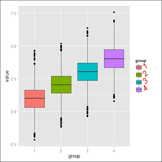
Figure 5.10: Example of legend with modified text in the key labels
Finally, you can, of course, also modify the legend position. In this respect, ggplot2 is really flexible since it allows you to not only choose from different standard positions, but also place the legend within the plot area very easily. In order to do that, we can use the legend.position argument and specify the position desired. You can choose between the traditional positions available in other graphic packages, namely left, right, top, bottom, and none if you do not have a legend. Alternatively, you can specify a vector defining the relative position within the plot area containing values from 0 to 1, with c(0,0) being the bottom-left position and c(1,1) being the top-right position. The following are two simple examples of its application: the first one with the legend at the bottom and the second one with the legend in the centre of the plot area.
myBoxplot + theme(legend.position = "bottom")
myBoxplot + theme(legend.position = c(0.5, 0.5))
You can see the resulting plot in Figure 5.11:

Figure 5.11: Examples of legends with modified positions at the bottom (A) and in the centre of the plot area (B)
The theme function available in ggplot2 also allows you to specify the details of how the axis text elements are represented, for instance, by controlling the type of characters, their size, and position. Here, you can see an example of formatting the axis tick marks, where we change the color of the text to blue and the character to italic.
myBoxplot + theme(axis.text = element_text(color = "blue", face = "italic"))
As illustrated, in this case, we used element_text() since we modified text elements and used the axis.text argument to allow us to modify elements along all axes at the same time. You can see the results in Figure 5.12(A). Generally speaking, within the different arguments that you will have available for the theme() function, you will find arguments that control elements of a certain class. In this case, axis.text affects all axis elements, and further, you will find arguments that can be used to control specific elements within a class as, for instance, axis.text.y, which can be used to modify only the y axis. You can see an example of such a modification in the following command, where we will modify the angle of the text to make the caption of the y axis horizontal and increase size as well:
myBoxplot + theme(axis.title.y = element_text(size = rel(1.5), angle = 0))
The result is shown in Figure 5.12(B):

Figure 5.12: Examples of axis layout modifications—axis tick marks (A) and axis label (B)
The same idea also applies to titles. In fact, you can use the argument title, which allows you to control all the title elements in the plot. This means that you can, for instance, change the axis title, the legend title, and the plot's main title using only one command. This can be quite handy since, in many situations, you will want to have a homogenous layout with all titles formatted in the same way, without using several different functions for the individual elements. So, in the example, we will change size and color of the title elements. The following command shows this:
myBoxplot + labs(title="This is my boxplot") + theme(title = element_text(size = rel(1.5), color="blue"))
On the other hand, if you need to modify only one of the title elements, you have the option to use more specific arguments, for instance, in the following example, we will modify only the main title text.
myBoxplot + labs(title="This is my boxplot") + theme(plot.title = element_text(size = rel(1.5), color="blue"))
The resulting plot of the command prior to the preceding command is found in Figure 5.13(A). You also have the resulting plot of the preceding command in Figure 5.13(B), and as illustrated, the axis titles remain unchanged.

Figure 5.13: Examples of title layout modifications—modification of all title elements (A) and only of the main title (B)
At the beginning of this section, we mentioned the element_blank() function as a way to generate an element that does not draw anything. Keep in mind that you can always use this element to delete components of the plot that you don´t need and that this applies to titles, axis elements, and so on. For instance in our boxplot, we have the grouping information already contained in the legend, so we could think about removing the groups for the x axis so that we can use the blank element to delete them as shown here:
myBoxplot + theme(axis.text.x = element_blank())
As illustrated in the following plot, this produces a plot without the axis text, but the tick marks and the axis title are still there. However, since we have removed the text, we don't actually need these marks, so we can remove both the tick marks as well as the title as shown here:
myBoxplot + theme(axis.text.x = element_blank(), axis.ticks.x = element_blank(),axis.title.x = element_blank())

Figure 5.14: Examples of removing axis elements—only the x axis text (A) and x axis text, tick marks, and title components (B)
The results of both code statements are shown in Figure 5.14. Now you know how you can combine several theme elements on the same call and have also gained an understanding of how you can use the theme() function not only to modify, but also to remove plot components that you don´t need.
We have seen so far how you can modify the text and title of the axis, but as you know, axes are not only composed of these components. We can, in fact, also modify the layout of the axes themselves: the appearance of the line along the plot axis as well as the axis tick marks, which, so far, we have only deleted in the previous example. For instance, we can modify the axis line as shown here to change its color and make it much thicker:
myBoxplot + theme(axis.line = element_line(size = 3, color = "red", linetype = "solid"))
In this case, we had to use element_line() since the axis element we want to modify is a line. You can see the outcome in Figure 5.15(A). We can also apply a modification to the tick marks, as already mentioned. There are several arguments that can control the axis tick marks, but for the most part, the most useful modifications to tick marks are probably margin and length. The length element simply controls the length of tick marks for both axes, and you can provide the length as a unit object from the grid package. The margin, which you can also provide as a unit object, defines the distance between the tick marks and the text of the axis. You can see here an example of these two modifications:
require(grid)
myBoxplot + theme(axis.ticks.length = unit(.85, "cm"),axis.ticks.margin=unit(.85, "cm"))
The resulting plot is shown in Figure 5.15(B):

Figure 5.15: Example modification of axis line (A) and axis tick marks (B)
The theme() function allows you to control the background appearance of the plot. Here, there are a number of aspects that can be useful to modify, but the most important, by far, are background and the panel grid. The panel grid refers to guidelines drawn by default in ggplot2. Using the theme() function, you can, for instance, control the guideline appearance and the color.
Here, you can see two different examples of how to modify these parameters. There is some variability as the grid behavior and appearance depend on the kind of data being represented; for factor data, just as we have on the x axis of our box plot, we only have major grid lines since we do not have intermediate units between the groups. As a comparison, had we applied the same formatting to a more traditional scatterplot, where there is continuous data on both axes, there would be both major and minor gridlines. As an example, we will use the myScatter plot, which we created earlier in this chapter.
# Example with a boxplot
myBoxplot + theme(panel.background = element_rect(fill = "gray80"), panel.grid.major = element_line(color = "blue"), panel.grid.minor = element_line(color = "white", linetype = "dotted", size=1))

# Example with a scatter plot
myScatter + theme(panel.background = element_rect(fill = "gray80"), panel.grid.major = element_line(color = "blue"), panel.grid.minor = element_line(color = "white", linetype = "dotted", size=1))
You can see the resulting plots in Figure 5.16. Changing the appearance of the grids presented in the plot panel may be quite useful when you change the default color of the background since you may end up in the situation where the appearance of the grid does not have significant enough contrast.

Figure 5.16: Examples of modification of panel background and gridlines in a boxplot (A) and a scatterplot (B)
As already discussed, you can also use element_blank() to eliminate the grid if you don't want to have it in the panel. Here, you can find a simple example of how to use this option:
myScatter + theme(panel.background = element_rect(fill = "gray80"), panel.grid.major = element_blank(), panel.grid.minor = element_blank())
Additionally, for the panel background, you also have the option to specify the actual plot background and border. In this case, we would be modifying the area around the plot window using the plot.background argument. In our example, we will modify both the color of this area as well as its border, which corresponds to the border of the plot figure:
myScatter + theme(plot.background = element_rect(fill = "green", color="red", size=2, linetype = "dotted"))
You can see the resulting plot represented in Figure 5.17.
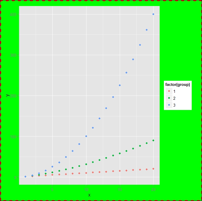
Figure 5.17: Example of plot background and border modification
When using facets, you can apply the same formatting style that we have already discussed, so, for instance, the following command will create a plot where each facet will have a blue background:
myScatter + facet_grid(. ~ group) + theme(panel.background = element_rect(fill = "lightblue"))
On the other hand, you also have additional formatting options available where you make a facet plot. If you are already familiar with the lattice package, you may know that on the top of facets is a title strip area. In the strip area, you can, for instance, control the text as well as the background, as shown here:
myScatter + facet_grid(. ~ group) + theme(strip.background = element_rect(color = "lightblue", fill = "pink",size = 3, linetype = "dashed"))
In this simple example, we have changed the background color of the facet title strip area and its border. You can see the resulting picture in Figure 5.18:

Figure 5.18: Example of modification of color background and border with facet panel strip
If you have a longer title in the strip area, it may turn out to be useful to change the text size and its orientation. For instance, you can use the labeller argument of the facet function to specify a variable name for the labels of the facets, which can be useful in some cases but may increase the text length. For instance, we can then change size and the orientation of such text as shown here:
myScatter + facet_grid(. ~ group, labeller = label_both) + theme(strip.text.x = element_text(color = "red", angle = 45, size = 15, hjust = 0.5, vjust = 0.5))
You can see the resulting plot in Figure 5.19:

Figure 5.19: Example of text modification in the panel strip
Finally, here's another layout property specific to facets is the margin between the panels. In this case as well, you can modify such a space, for instance, to increase or decrease the space between the facets, as shown here:
myScatter + facet_grid(. ~ group) + theme(panel.margin = unit(2, "cm"))
You can see the result in Figure 5.20.
As we did in other examples, space units can be provided to use the unit() function from the grid package. It can also be used to specify the space in different units; more details can be found on the function's help page.
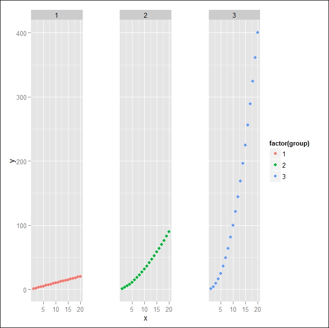
Figure 5.20: Example of facets with increased margin space between the panels
In addition to increasing the space, you can also set the margin space to 0, and in this case, you will have the facets completely connected with each other, providing an interesting effect of a singular plot but with three different x axes that start over after each other. The following command shows this:
myScatter + facet_grid(. ~ group) + theme(panel.margin = unit(0, "cm"))
You can see this alternative plot in Figure 5.21:

Figure 5.21: Example of facets without margin space between the panels