8
User Interface and Menus
The collection of visual information and components laid out across the screen of a video game is known as the User Interface (UI). An intuitive UI and menu system creates an opportunity for your players to have quality experiences. This interactivity and direct influence of a game’s playable outcome is called player agency. Designing for this agency is crucial to creating an intuitive and successful interactive experience within your game world. This agency allows players to interact with the game’s narrative and engage within that game space accurately.
User interfaces and menu systems throughout your game also provide player affordances. Player affordances are the communication with your player about how to use an object within the game, conveying controls, and navigating your game world from start to finish.
Game menu systems specifically give the player agency over the various modes of gameplay. These gameplay modes signal to a player when to start and the options and actions available before, during, and after gameplay. Getting the player into the game is important, but during the game, your interface may be more important to the experience.
There are four forms of user interface: Diegetic, Non-diegetic, Spatial, and Meta. Spending some time breaking down these UI definitions will give a better understanding of how we will be using them in our project. Then we will look into scripting each of them to give an idea of the proper way to implement them.
This chapter will cover the following topics.
- Defining UI
- UI elements
- UI in our project
- Unity Canvas system
- Unity UI objects
Let’s begin by explaining the user interface.
User interface
The need for a user interface is a double-edged sword. You will need to put user interface features in place for the experience to move forward, but this can also easily distract the player from that experience when not done correctly. There isn’t always a mechanic that can be made to teach players how to interact with the world they are playing in. This can break immersion, which isn’t always bad, but there needs to be an understanding of how one can break this immersion without ruining the experience.
We’re going to talk about the four forms of UI, which are broken down across two defined spaces, Narrative and Internal. Narrative lends itself to UI-driven storytelling, whereas Internal is functional UI within the game world itself.
When reading through the various forms of the user interface, realize that these are not exhaustive explanations and will need to be understood more as a tool to help design the right UI for the experience you wish to provide.
While we are going through Diegetic, Non-diegetic, Spatial, and Meta UI forms, we will be explaining how the UI fits into a simple 2x2 diagram of Internal and Narrative functions. The 2x2 grid below, in Figure 8.1, is a visual representation of how to integrate a holistic view of the UI and incorporate it throughout the overall gameplay experience. In the following paragraphs, each section header of the UI forms will also be supplemented with an “if this, then that” double-answer response.
Figure 8.1: 2x2 user interface design
Answering with Yes or No on both Narrative and Internal on the 2x2 grid above helps us to understand what UI form is needed. Follow along as we describe each of these four forms in detail.
Diegetic – Narrative Yes, Internal Yes
A user interface that blends internal and external spaces is called Diegetic. This type of interface commits to not breaking the immersion while providing the information to the player that they need to understand the internal game space.
You may want to convey the location the player needs to go, but you want to give a sense of difficulty. You may, during the story, give the player a direction and provide a compass. When you press a button to pull up the compass, this is giving the player the information without breaking out of the internal space. We will consider this compass when discussing the rest of the four types to see if we can convert it into a different type.
Now that we have explained the Diegetic UI form type, let us take a look at a great example that is within a published game. When explaining Diegetic UI, there is an eerie game that comes to mind, called Dead Space. Electronic Arts (EA)’s Visceral Games studio (dissolved and merged into EA Vancouver and EA Montreal; October 17, 2017) created a gritty, survival cosmic horror video game that drew inspiration from other works of horror such as Resident Evil 4 and the Silent Hill series.
The game designers of Visceral Games needed to think of ways the player could look dead center on the screen and focus their attention there as much as possible. That way the player could simultaneously witness the abominations, jump scares, gore, and horrors of Dead Space’s world, and navigate the narrative of Isaac Clarke. Isaac is the main character of Dead Space and the unfortunate spaceship systems engineer that is thrown into a variety of unfortunate situations over a span of years.
How can you do that in a role-playing game where you have a lot of information that your player needs to know? You put that important player information on the character itself. When done this way, the information becomes 3rd person on the screen, allowing the player to still retain a view of the screen and its environment. Isaac’s health indicators are on a health bar that is integrated into the lit-up nodes on his spine, seen in Figure 8.2, and the stasis meter is incorporated on his right shoulder blade as a partial glowing circular ring. Now the player doesn’t need to look away from the main character to know his health and character statistics.

Figure 8.2: Dead Space health visualization
Non-diegetic – Narrative No, Internal No
Looking at the grid, you may think, how can you have any UI that isn’t in the narrative or the game space? This is a great question and it’s more common than you think! Virtually every menu system and, unintegrated heads-up display (HUD) is non-diegetic, as seen in Figure 8.3. Pressing play in a game isn’t part of the game narrative, but it’s part of the game and an important part too.

Figure 8.3: Forza non-diegetic HUD
Let’s think about the compass and see if we can convert it into a non-diegetic UI element. Its purpose is to help the player know the direction of where to go. Can we do this without the game characters being aware of it? You could make a minimap that shows the direction the player needs to go and shape it like a compass on the screen. With this being defined, we’ve decided that yes, you can convert the compass into a non-diegetic form. There are so many examples of a non-diegetic UI element in production, but one of our favorites is in a racing game UI. Forza has a clean UI that shows the gear you’re in, the speed, and the location in the world to help you along your path on the minimap.
Spatial – Narrative No, Internal Yes
Here is a fun case for user interface design. Spatial UIs exist in the game world, but the characters inside the game are not aware of their existence.
Taking another look at the compass, maybe we want it to be spatial. How can we convey the direction we need to go without the character being aware of it?
There could be a projected compass on the ground that shows the direction of the next waypoint or goal. It only shows up when you look topdown from your character so it doesn’t always disturb the gameplay in general. One of the best spatial UI elements in a game is in Path of Exile. The items that are on the ground have a colored spire to denote certain item types and the names of the items give a description of what the item may be, as seen in Figure 8.4 below.

Figure 8.4: Path of Exile spatial item names
The character in the game doesn’t know about this screen but it is in the game’s space as you need to move your mouse over it to view it.
Meta – Narrative Yes, Internal No
Meta is interesting for a user interface as we can’t have the interface in the game world, but the character needs to have knowledge of it. If we look at our compass example and try to transform it into the meta space, we will need to think a bit harder. Breaking the fourth wall by interacting directly with the user while the character is aware of the scenario is rather unique. Let’s give it a try.
The outer area of the screen houses the compass degrees and follows the character’s rotations. The character looks at their compass and you can see that the direction is or isn’t close to the correct location due to the screen UI. This is cumbersome and doesn’t feel intuitive.
A much better example of meta is in first-person shooter games. Have you ever played an FPS game and were hit? There is a splatter of blood and a red vignette around the screen. The character knows they were hit and generally makes a sound; the meta UI lets the player know the possibility of death if they keep getting hit. The camera showing the player isn’t the player’s vision, and we know this, but our rendering with a bloody vignette that darkens and intensifies gives the sense of dramatic life-ending anxiety.
Figure 8.5: Call of Duty Meta screen UI
What we have just discussed are the design methodologies to understand what your UI elements are displaying for the user. As shown, there are several ways to break down a UI element. We will now go over some common terminology in the UI development for games.
UI elements
There are common UI elements that are used during any game. Whether it’s the main menu, inventory system, health representation, or a spatial item interaction system, they all serve a single purpose: give the player as much information as possible without directly affecting their immersion too much that it pulls them away from the experience.
In the next few sections, we will cover the topics previously mentioned. These are generalized terms for the user interface and are not supposed to be set in concrete. These are design thoughts following common topics that currently exist for the UI portion of game development.
Use these sections as references for design when thinking about your game projects in the future. We will begin with the main menu; coincidentally, this is the menu that will appear first for your players.
Main menu
When a game menu pops up for the first time after loading the game up, this is the first time the developers get to create an emotional response. Is your game a horror game? The font and imagery should reflect this. There are many ways to set up a menu. Do you need a news screen to pop up before you pick your characters when logging in? Does the main menu jump right into gameplay when you press play? Are there several layers of menus that need to be there as the game is focused on menu systems? All of these are legitimate questions.
The simplest way to go about building a menu system is to ensure that it isn’t difficult to play the game with its intended difficulty, or connection if it’s a multiplayer game. We tend to call this “low barrier of entry.” If a player wants to come in and press play without looking into the settings, they should be able to do so. This includes looking at the recommended specs and building the system to allow for that.
The player’s experience shouldn’t rely on them understanding what their system can handle. A good way to think about this is the game experience from arcade machines or consoles. PlayStation and Xbox require game developers to ensure framerates are high, so the experience is of a good standard. This should also be the case for PC as well as mobile.
Inventory systems
There are other forms of menu systems that are similar in nature but not part of the initial player experience. Role-playing games (RPGs) often use an inventory system that shows what you have stored on your character in the form of armor or equipment. This can be used as a bottlenecking system to force players back to the city to sell or upgrade their equipment. It can also be used to help define the experience as the character couldn’t possibly hold 30 sets of armor and 200 weapons on them at once while roaming the world. This is an attempt to straddle the line between breaking immersion and keeping realism in check.
Some interesting forms of inventory systems are quest logs and achievements. A quest log is just an inventory of quests that can be completed or removed by finishing the required quest. Achievements are the opposite in that you gain them by performing certain tasks.
Health representation
Health can be represented by “lives left,” as in Super Mario Bros. It can also be represented by how many more times you can be hit, such as in the Dead Space reference above. It may not even be represented by a specific value, but an amount of blood on the screen, as seen in Call of Duty. Even more abstract is not health, but a timer left on the screen of how much time you have left to complete a quest or level. All of these can be considered health representations and can look different on the screen using any of the forms we previously spoke about.
Item interaction system
There may be items in your game with which your player needs some help to know that they are interactable. There are two main ways to work through this and both of them can be spatial. Sometimes this will be non-diegetic, which we will go over next.
One way is to make a tooltip on the screen that is only available when your mouse or crosshair is covering the item. This is usually when you want something to be contextual to that specific item. This can be done when the tooltip is in the screen space — this means it’s always the same size and is more akin to a floating window. This is the same concept that was shown in the Path of Exile image above. You may also see instead a floating icon around or above the item under the context. This could be for the player to know that they can interact with something. These are similar in nature, but screen space denotes that it’s not part of the world and the character isn’t aware of it either. This makes it non-diegetic. The second example of the icon floating above the item is spatial as it shows itself in the world, but the character doesn’t know about it.
UI in our project
Our project is not user interface-heavy. We purposefully wanted to keep it as light as possible to create a tight immersion within the environment. To keep it as light as possible, we have three major portions to talk about.
- Main menu
- Escape menu
- Spatial UI
To begin, we will talk about the main menu and how that starts our immersion into the game right from the beginning.
Main menu
Our menu is going to be primarily a non-diegetic menu system. From the start of the application, Myvari will be in the woods looking at her book. The menu will be off to the left with the Title, Play, and Quit options available to select. When the Play button is pressed, there will be a camera movement with a small cinematic animation that triggers the beginning of the game. Possession of our character happens right after Myvari starts her idle animation after the cinematic animation finishes from the Play button press. This system gives a feel that it is within the world as the camera is not fading to black for a scene transition, but it is not part of the world or part of the narrative. Myvari doesn’t know the menu system exists and it’s not affecting the game world in any way, therefore it is non-diegetic. The screenshot we are showing below in Figure 8.6 is a mock-up to illustrate the logic without the need for all the art. This is a common tactic when working within game development. In further sections we will go over the implementation of the actual UI.

Figure 8.6: Main menu mock-up
We like the concept of a UI that allows the player to feel like the game they are playing is immediately immersive. When you hit Play, the menu should go away and the camera should move into a position where you then take control of the main character. The goal is to not have a loading screen. Keep the players involved as much as possible.
Escape menu
To give as much immersion as possible, we wanted to utilize one of the core features of our character’s personality: exploration. To us, this means that we needed the book on her right hip to be a feature of her passage through the game experience. We also knew that we would need to have in-game settings somewhere, which we could also place in the book. This is spatial in that it breaks the immersion of the game as the settings aren’t part of the narrative. When Myvari flips to the Options portion of the journal, this will feel disjointed enough but will be familiar to someone who is used to playing games. This portion will be spatial as it is part of the world but Myvari doesn’t know that it’s a menu to close the game. When she is on the left pane, this is all story-driven elements that are part of the world and both Myvari and the player are using it as hints to move forward in the game. In this case, we will call this portion of the menu diegetic as we will be selecting the art to fit as though someone from Myvari’s race made this book.
How we will do this is through a small cinematic animation of Myvari pulling the book out and it opening to the journal, which will have small updates depending on where you have been in the game. The book has art to look as though she didn’t write in it, but another person of her race did. The book is old and has led her to this cave. There will be markers with small notes to help guide the player if need be. This is a linear progression game, so we will update this at every milestone or sub-milestone. If she is standing still, we will also have her get the book out and read from it, which will bring the immersion of the book being her journal into a closer convergence to keep the experience as congruent as possible.

Figure 8.7: Journal UI mock-up
The journal is an interesting menu system for us. It’s acting as an escape menu as well as giving the players more clues about the engagement that Myvari is working through. Figure 8.7 above shows our mock-up, which we use to visualize what it may look like. This helps us understand where to put the camera, as well as helping the animator know how to animate her grabbing her book out of its holster.
Spatial tooltip
When designing feedback to the player, there are quite a few options as we saw with the compass problem. In our case, we thought about how we could best show the ability to interact with the environment. We settled on a spatial system. This system will be in the form of what is called a tooltip. This tooltip is a small icon that is in the world space above the GameObject that is interactable by the player. We chose to use a spatial system to keep the item within the world for spatial context to the UI element; however, we did not want it to be part of the narrative. This allows us to use a slight bit of immersion breaking to be in stark contrast to the rest of the game. When the player sees the tooltip pop up, it will be interesting. We can use this system throughout the entire vertical slice! We are creating a simple key item example, which will be an icon that floats in the game world, but Myvari will not be privy to its existence. This allows us to make a robust system; if we choose to use a different button for a different type of interaction, we can just change out the icon for the correct button to press.

Figure 8.8: Spatial UI mock-up
This very pink circle is just an item placeholder to be our indicator later on. With it being bright pink, there is no mistaking it for a “completed” item later on!
We have gone over the definition of the user interface and explained our project’s use of UI. Now we need to take some time to go over how we actually made the UI work.
Unity UI
Before we dive fully into our implementation of UI in our project, we will go over the basics of Unity’s UI system. This will give you an understanding of what items we are using in our systems as well as a couple that we aren’t using that you could use in your projects later. There are two main parts to make this work:
- Unity Canvas system
- Unity UI components
We need to go over the Unity Canvas system in a bit of detail first before we start implementing the UI with code so you have a good foundation of its inner workings before trying to add art to it.
Unity canvas system
Unity places its UI inside a canvas system. This is a GameObject that has several components on it by default. To make a canvas, right-click in the Hierarchy window and choose UI, then Canvas. This can be seen in Figure 8.9 below.

Figure 8.9: Menu to create a canvas
When this gets created, you will have a Canvas GameObject and an Event System GameObject. If there is already an Event System on that level where it was created, only the Canvas would be created.
The Canvas has a Rect transform, and it also has a Canvas component, a Canvas Scalar component, and a Graphic Raycaster component. We will look into each of these in light detail to explain their purpose.
There is also an Event System that could’ve been created if there wasn’t another in the scene hierarchy already. This will house the messaging for input to the UI.
If you are using the new input system, please make sure to click on this and replace the StandaloneInputModule with the InputSystemUIInputModule. This allows the event system to know which input systems are working in the project.
Why don’t we take a look at the components individually, starting with the Rect transform, Canvas, Canvas Scalar, and then the Graphic Raycaster in more detail?
Rect transform
The canvas itself has a Rect transform, but it’s meant to be a parent of the other UI, so its Rect transform needs to be read-only. Right-click on the canvas and choose UI > Button to make a child button inside the canvas so we can look at the Rect transform clearly.
Below in Figure 8.10, you can see the button’s Rect transform component in the inspector where you may be expecting the regular Transform component. We still have the position, rotation, and scale options in our Rect transform, but we also have the width, height, pivot, and anchors.
When working with UI, it’s best to leave the scale as 1, 1, 1. This allows the canvas to set the scaling if needed. The safest way to make size changes is through the width and height values.
Rotation will rotate from the pivot location, which is a small blue circle and can be changed from the values of the Pivot fields.
Figure 8.10: Rect Transform component
The position fields will set the local location of the GameObject. When you need to make changes to the size of the UI element, it’s best to use the Rect tool instead of scaling. Inside the scene view, there is a Rect tool button, shown in Figure 8.11 below, which will allow you to change the size of the UI, which will update the position, width, and height.
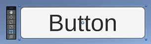
Figure 8.11: Rect tool used on the selected button
The pivot of the UI element is an x or y value that is a normalized value to the width and height of the element. This means that a value of 0.5 in both will place the pivot at 50% of the width and height, or local center, of the item.
The last unique item is the anchors. The anchors are designed to allow the UI elements to remain in place, even if the canvas scales. This could happen if you have multiple devices or resolution changes. There are Anchors options of Min/Max, which will set each anchor to its corresponding normalized value similar to the pivot location. Doing this by hand sometimes takes a little while, so we have a handy tool to make it easier. If you click on the top left of the Rect Transform it opens up a useful tool that allows you to select from common anchor options.
This looks like Figure 8.12 below.
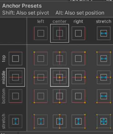
Figure 8.12: Anchor common options
What this tool allows you to do is select the most common anchor positions for the GameObject you are working on. There are two primary types of anchoring: Positional and Stretched. The 3x3 grid in the middle of this tool will make it so the UI in question will be anchored and not stretch or change when the screen resolution is different from what you have built for. This is a good option only if the resolution will not change drastically. The second type is stretching, which is located around the right and bottom edges. If your game is built with 1920x1080 resolution and the player chooses to play on an ultra-wide monitor, you may want to allow for some scaling on certain UI elements. If it is a 4k monitor with a 16:9 aspect ratio, then you will need to think about stretching all your elements; otherwise, the UI will appear very small.
Anchoring is a bit of an art form. The tricks above that were outlined will treat you well. The best way to go about properly anchoring is by playing the game in the editor and resizing it. It may not give you every scenario, but it will give you a good perspective on how the UI elements are reacting to a resolution change.
Canvas component
The canvas component only houses a few options, but they are crucial! In Figure 8.13 below you can see the sections that we will go through.

Figure 8.13: Canvas component
We have Render Mode with a few options below it: Pixel Perfect, Sort Order, and Target Display. After that, we have Additional Shader Channels. Let’s look at these options one by one.
Render Mode
There are three render modes that can be chosen: Screen Space - Overlay, Screen Space - Camera, and World Space. They each have a certain type of use and games can have multiple canvases in their world that fit their needs. As we go through them, think about how we might use them in our current project. After we describe all the features of the Unity UI we will get into the implementation.
Screen Space - Overlay
This is a common canvas rendering mode. What is nice about this mode is that it can be used within its own scene and loaded additively to your game for runtime. This allows you to make mobile menus that are separate from the PC monitor menu systems with ease. This works very well; however, it should only be used with simple UI. If you are going to be dragging around UI elements or animating them from a mouse context, such as rollover, then it’s best to use the Camera option.
A good example of this type of canvas is the main menu or a HUD, which isn’t very interactive.
Screen Space - Camera
As with the overlay option, this is a great mode if you are going to be making functions that utilize the EventTrigger class. You also cannot instantiate this like overlay mode. It must already be in the scene and have a camera that it will be referencing for bounds. It will attach itself to the camera, so if you make this change and it disappears on you, double-click your camera and it will be right there!
A great example of this mode is something similar to an ARPG where you need to drag and drop equipment to equip the items.
World Space
This rendering mode for the canvas is used when you need a menu that is in the world space. The best way to explain this is through best use cases. You would use this when you want chat bubbles over your character’s head in space. You could want landmarks in UI that are selectable, which could potentially use a World Space canvas. It would be best if that landmark had text or another form of UI attached to it as well.
Render Mode options
Underneath the Render Mode are three options:
- Pixel Perfect – This is only used if you are working within 2D space where the UI needs to be exact to every pixel. It helps develop the UI to the constraints of the pixels in creation.
- Sort Order – By default the sort order is set to work through the hierarchy under the Canvas. The higher up an item is on the hierarchy, the sooner it will be rendered. You can overwrite this by typing in a value. Lower values will render first. Higher values are sent lower down the list. This is helpful if you want a single item to always be at the back. Just put
999in for the value and it will always be rendered after the others regardless of the hierarchy order. - Target Display – Should be used if you need another UI for a second display. You can set this up to display only on the second display. This can be used for up to eight displays. The use case for this would be for games similar to racing games, which commonly use three curved monitors.
Additional Shader Channels
When in overlay, the UI generally will not include normals, tangents, and so on. Use dropdown shown in Figure 8.14 to select them.

Figure 8.14: Additional Shader Channel options
These would need to be selected if you specifically need them in your UI elements. Otherwise, leave it on Nothing.
Canvas Scaler
This component is in charge of making sure the scaling is correct for all the child UI objects under the GameObject with this component attached. It is not only in charge of scaling the UI itself, but also the font sizes and any image borders attached to images.
There are several unique parameters with the Canvas Scaler component. They are placed in the window depending on which of the UI scale modes are chosen. There are three UI scale modes.
Constant Pixel Size
This is used when you need to keep the pixel size the same regardless of the screen changing. The use case for this is if you know that you will be playing this game with a single resolution. If your game can be scaled at all, then you must work through dynamically setting the scale factor and ensuring your pixels per unit are the same as well. These parameters are seen in Figure 8.15 below.

Figure 8.15: Canvas Scaler component Constant Pixel Size UI Scale Mode
If you think that your game will be adjusted at any point then consider working with the Scale With Screen Size option.
Scale With Screen Size
When you choose Scale With Screen Size, there are different parameters that pop up than with the Constant Pixel Size option. As seen below in Figure 8.16, we have Reference Resolution, Screen Match Mode, the Match slider, and Reference Pixels Per Unit.

Figure 8.16: Canvas Scaler component Scale With Screen Size mode
- Reference Resolution – The resolution you’d expect the most-used screen resolution to be. From there it will scale down or up from the different resolutions the players may be playing from.
- Screen Match Mode – Contains three options:
- Match Width Or Height – This will allow the application to match a blend of width to height when it’s changed. This works pretty well overall until you hit ultra-wide monitors. This is also the only option where the Match slider is available to change. With the next two options, this slider will not be visible.
- Expand – This means that the canvas will scale up but will be no smaller than the reference resolution. This is excellent as it expands width or height needs. This option is by far my favorite to work with.
- Shrink – This option is just like the Expand option but it will scale down and not get larger than the Reference Resolution. This works well, but you have to work from a large resolution from the start.
- Reference Pixels Per Unit – This option refers to how many pixels are in a centimeter (which is a Unity unit). This is very important to pay attention to when you are making a 2D game with sprite options. If you have your sprite set to 100 pixels per unit and this Reference pixels per unit is set to 50, your sprite will be twice as big as expected.
Constant Physical Size
This is similar to the Constant Pixel Size mode; however, this works with physical units, as seen below in Figure 8.17. You may be comfortable with sizing in these units rather than pixels.

Figure 8.17: Canvas Scaler component Constant Physical Size
If it is the case that these units are better for you to use, then make sure you change the scale of all your fonts to these scales. The list of the physical options is shown below in Figure 8.18.

Figure 8.18: Physical unit options
Working with any of these options will force you to change all of your UI items to fit within the scale units of the same type. For example, it is common for sizing in pixels to be 300 wide, whereas 300 centimeters is massive! The scale should probably be 0.1. For this reason we would recommend that you work through your systems and know which one you will be using if you want to use this scaling mode from the beginning.
The last component is the Graphic Raycaster. This is the second-to-last default item that comes with the canvas. Let’s explain how the Graphic Raycaster works with the canvas.
Graphic Raycaster Component
This component is created on the canvas. The purpose for this is to be the function of what your mouse is clicking on. Below are the available parameters for the Graphic Raycaster, in Figure 8.19:

Figure 8.19: GraphicRaycaster Component
There are three parameters to quickly go over here.
- Ignore Reversed Graphics – This parameter ensures that you cannot click on objects that are turned around. Remember that backfaces are culled in the camera. You can flip elements of the UI off by flipping them around, but they would still be clickable without this being checked.
- Blocking Objects – This allows for items that are 2D or 3D in front of the UI to block clicking the UI. This defaults to
none. - Blocking Mask – This parameter allows you to place layers to block the UI. Since UIs are sprites, they are generally a rectangle and can overlap fairly easily. To get around this you can make a UI block layer, which will allow you to place objects in front to block clicking even if it’s invisible, with alpha being 0.
We took the time to go over these default items as they are the primary items you will see when you start working with Unity’s UI. There are quite a few more options to learn in time as you create more UI, but this foundation will help you get started. Next, we will look into some UI objects to add to your canvas.
Unity UI objects
We now have a canvas! This is great because we’ve learned how it works with dynamic resolutions and how to set it up for your game’s needs. Now we need to add some objects for it to be useful. Unity UI objects are broken up into two types: Visual and Interactive.
Visual elements are what you expect. They are items that are meant to be visual elements only, but they can be attached to interactive items. The following are examples of these objects, including a description and a visual example:
- Image – There are two types of images: Raw Image and Image. Raw Image is only used where you want no border; however, it’s generally best to just use the Image object. Images take sprites and a border can be added to them. You can also tint the sprite within the Image component in the inspector. There is also another UI option named Panel. This is another UI object with an image component attached designed to be a panel of UI. The only difference between Image and Panel is that Panel will be set to stretch and fill in the entire canvas by default.
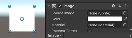
Figure 8.20: Default Image and Image UI component
- Mask – A Mask component will cut out the GameObjects underneath it. This is great for masking out extra items underneath it that may not want to be seen. Below, we added a mask to the image and added another image below it. The outline is the mask; the image that should be a square is cropped on the top and bottom due to the mask hiding it.

Figure 8.21: Masked default image from Figure 8.20
- Text – This is text! Sometimes this is also known as a Label. You are able to add a specific font to your UI if you need it. When you create it, you will see TextMeshPro after the text option. This is due to TextMeshPro (TMP) being so popular that it’s been integrated into the core Unity features.

Figure 8.22: TextMeshPro UI component
Interactive items can house visual elements, but they come with interactive UnityEvents. The following are examples of these, including a description and a visual example:
- Button – This interactive object comes with a label by default in its hierarchy. It also comes with a
UnityEventfor when it’s clicked. It has the ability to be tinted if it’s highlighted, pressed, or disabled. This is a primary function of UI with interaction.

Figure 8.23: Button UI component
- Dropdown – A Dropdown is a user-selectable field of a predefined group of options. When the user makes a change to this value, it will invoke the
OnValueChangedUnityEvent.

Figure 8.24: Dropdown UI component
- Input Field – This is a standard input field where the user clicked into it or “focused” on it. There is an interesting property we’d like to mention called Content Type. This allows the developer to error check without needing to write code. Setting this to Integer Number, for example, will only allow the user to input numbers. This interactable object has two
UnityEvents:OnValueChanged– This will return the string of what value is currently in the input value every time a change has happenedEndEdit– This will return the string once the user clicks somewhere else or otherwise loses focus on that input field

Figure 8.25: Input Field UI component
- Scrollbar – The Scrollbar is used generally in conjunction with a Scroll
Rect. Its purpose is to be a scrollbar for a field if you need something that might be large. The value is from 0 to 1 regardless of how large the scrollbar is, and it can be vertical or horizontal. It also has aUnityEventthat can be used to know theOnValueChanged, so that you can return the value when you move the scrollbar.

Figure 8.26: Scrollbar UI component
- Scroll Rect – This can also be called a scroll view. This can be put in conjunction with two scroll bars to set up vertical and horizontal scrolling if needed. This is also set up with a mask to hide information outside the mask itself. It also has an
OnValueChanged UnityEventon the scrolling of the ScrollRect.

Figure 8.27: Scroll Rect UI component
- Slider – This is a slider that has a draggable object, which will set the value of the slider from a minimum value and a maximum value that you set. It also has a
UnityEvent, which returns a value from that min and max valueOnValueChanged.

Figure 8.28: Slider UI component
- Toggle – This is a checkbox that has a label assigned to it. When clicked, you can use the
OnValueChanged UnityEventto evaluate if it’s on or off.

Figure 8.29: Toggle UI component
- Toggle Group – If you add toggles to a group, you can set this group to allow only one within the group to be selectable. If you select another one in the assigned grouping, it will switch off the previously on toggle and switch on the selected toggle. There is an Allow Switch Off option, which lets you select the currently selected toggle to make none of the groups selected. There is no unique
UnityEventconnected to the group itself; however, each toggle still has its ownOnValueChangedevent that will trigger. One small note, if you are going to make a toggle group, make sure that each toggle has that Group assigned in their Toggle component.

Figure 8.30: Toggle Group UI component
These are all good examples of UI items available for the Unity UI. From here, we need to go through the implementations of the Unity UI to fit our game. We previously went over the design; now we need to look into the code to see how it works when players need to interact with it.
Implementation
We need to now look at our implementation. Knowing what all of the UI objects look like and their purpose is helpful, but we now need to see what it looks like to have them in practice. We will start off with the Main Menu before the game starts for the player. After that, we will break into the journal or escape menu. Then we will finish up with the spatial UI for interaction with the game’s mechanics.
When reading this part, remember that we will not be going over all of the lines of the script as at this point we assume that you’ve gotten comfortable with looking at the code that we have on GitHub.
If at any time you feel confused about how the book is laid out for explaining the code, ensure that you pull up the scripts that are being referenced and get yourself realigned. The primary goal of us explaining code in this manner is to be as concise as possible about what we are doing and why. Seeing every line of code doesn’t help with that!
That being said, let’s get into the main menu implementation.
Main menu implementation
As we wanted this menu to be non-diegetic, but sitting in the world space to give an illusion of space, we chose to go with a World Space canvas. Below in Figure 8.31 is the hierarchy and the inspector with collapsed components that have no changes from the default.

Figure 8.31: Left, hierarchy for MainMenuCanvas; Right, Inspector for Canvas
The MainMenuUIControl.cs script is how we will control our main menu. When working with the UI, you need to make sure that you import the UI library:
using UnityEngine.UI;
When you use the UI library you will be able to access all the UI objects and their methods. Though the next line I’d like to place here isn’t specifically part of the UI, I’d like to show you something we haven’t talked about yet. This method is called FindObjectOfType. We know that there will only be one MyvariThirdPersonMovement class in the scene ever, so we are using this method to get it and then ask for its parent so we know the player root.
playerRoot = FindObjectOfType<MyvariThirdPersonMovement>().transform.parent;
We also need to disable the character and set up listeners for the event system so it knows what to do when we click on the buttons in the canvas.
To disable the character, we have a method we call on awake to turn off what we need to. When using Cinemachine, you want to disable all the cameras that are available or Cinemachine will go to one of the cameras. Then we disable the player’s control script only. This allows the characters’ animations to keep playing in place, but we just can’t control her.
On awake:
SetPlayerEnabled(false);
Separate private implementation on line 50:
void SetPlayerEnabled(bool enable)
    {
        CinemachineVirtualCamera[] cams = playerRoot.GetComponentsInChildren<CinemachineVirtualCamera>(true);
        foreach (CinemachineVirtualCamera cam in cams)
        {
            cam.gameObject.SetActive(enable);
        }
        playerRoot.GetComponentInChildren<MyvariThirdPersonMovement>().enabled = enable;
    }
We’ve set up listeners several times before, but let’s take a look at them as well:
startGameButton.onClick.AddListener(OnStartGameButtonPressed);
quitButton.onClick.AddListener(OnQuitButtonPressed);
What is happening here is that the respective buttons that are in place for startGameButton and quitButton will activate the methods in their listeners when they are clicked.
The OnStartGameButtonPressed method looks like this:
void OnStartGameButtonPressed()
    {
        SetPlayerEnabled(true);
        Cursor.lockState = CursorLockMode.Locked;
        Cursor.visible = false;
        this.gameObject.SetActive(false);
    }
When it’s pressed it sets the character to enabled so we can use the input to move her around, lock and hide the mouse cursor, and disable the main menu so you can’t see it anymore. If you hit the quit button, you will close the application. Unity has an easy way to quit the application:
Application.Quit();
This is the entire main menu! The trickiest part of what we needed to do was to lock the player down. Otherwise, they would’ve been moveable while the main menu is up, which is not what we wanted in this case. Next, we need to work on the journal.
Journal implementation
In most games, there is a common concept of an escape menu. This is to say, when you press the Escape key, you will encounter a menu that generally pauses the gameplay. In our case, we wanted it so when you pressed Escape, our character would open up her book and look at it. This would be good as, it allows the game to pause a bit as the camera moves in to see the book and we can house the normal escape menu options, such as resume and quit the game. There will be some similar concepts from the main menu here in this, such as locking and unlocking the cursor. There is also a player enabling method, which is the same as in the main menu as well.
Below, in Figure 8.32, is another representation of the hierarchy and script in the inspector for the Journal UI. One of the unique items in the public fields is that we are using an input system as opposed to only relying on the mouse inputs.
For us to load up the journal, we can press the letter B or the Escape key.

Figure 8.32: Left, Journal hierarchy; Right, Book inspector panel
This is an interesting turning point in the book for us. All of the coding involved with this script has been done previously. I recommend opening the script and looking at it to help remember the prior coding lessons.
The last piece of UI is the spatial UI that helps players know that the item they are looking at is interactable. Let’s break this implementation down.
Interaction UI implementation
This is unique to set up as there is no canvas for this item. We will have a single GameObject that is in the scene and we will move it to the location that is needed and turn it off or on depending on what we are looking at if it’s intractable. We have a simple GameObject, which is a sphere without a material on it so it’s bright pink.
In the script InteractiveHighlight.cs, on awake we find this GameObject and grab its renderer. If it’s not found, then we have an error that lets us know we can’t find it.
We grab the mesh renderer so that we can disable it when we don’t need to see it.
void Awake()
    {
        highlightIndicator = GameObject.FindGameObjectWithTag("InteractionHighlight");
        if (highlightIndicator == null)
        {
            Debug.LogError("Highlight indicator not found in scene");
        }
        highlightIndicatorRenderer = highlightIndicator.GetComponent<MeshRenderer>();
    }
Now that we have the highlight indicator, we should perform the hiding and movement of the indicator itself. We are using a raycast to know if we are hitting an interactable item or a piece of the game’s puzzle pieces. This is a physics method, so we will put this on the fixed update. This will ensure that the code is run in accordance with the physics update timing that we talked about in Chapter 7, Rigid Bodies and Physics Interaction.
void FixedUpdate()
    {
        Ray ray = new Ray(transform.position, transform.forward);
        if (Physics.Raycast(ray, out RaycastHit hit, maxDistance, rayMask, QueryTriggerInteraction.Collide))
        {
            highlightIndicator.transform.position = hit.transform.position + new Vector3(0f, height, 0f);
            if (!highlightIndicatorRenderer.enable
d)
            {
                highlightIndicatorRenderer.enabled = true;
            }
        }
        else
        {
            if (highlightIndicatorRenderer.enabled)
            {
                highlightIndicatorRenderer.enabled = false;
            }
        }
    }
As stated previously, the fixed update here runs on physics timing and is checking to see if what is raycast from the center of the screen is hitting items on the two masks. If it is hit and it’s within the max distance, then move the highlighted piece and turn on its renderer. If not, then turn it off!
Summary
This chapter was quite meaty with information. Even though we only had three pieces of UI to go over, we needed to break it into all of these pieces to help you with your future projects. You will now also have a strong sense of how other game developers design their UI for their games. During Chapter 12, Final Touches, we will be going over the clean-up of it and how polishing the UI makes a difference to the player’s experience. In the next chapter, we will go over visual effects and some particle systems.