
18
Evaluating Forecasts – Forecast Metrics
We started getting into the nuances of forecasting in the previous chapter where we saw how to generate multi-step forecasts. While that covers one of the aspects, there is another aspect of forecasting that is as important as it is confusing – how to evaluate forecasts.
In the real world, we generate forecasts to enable some downstream processes to plan better and take relevant actions. For instance, the operations manager at a bike rental company should decide how many bikes he should make available at the metro station the next day at 4 p.m. However, instead of using the forecasts blindly, he may want to know which forecasts he should trust and which ones he shouldn’t. This can only be done by measuring how good a forecast is.
We have been using a few metrics throughout the book and it is now time to get down into the details to understand those metrics, when to use them, and when to not use some metrics. We will also elucidate a few aspects of these metrics experimentally.
In this chapter, we will be covering these main topics:
- Taxonomy of forecast error measures
- Investigating the error measures
- Experimental study of the error measures
- Guidelines for choosing a metric
Technical requirements
You will need to set up the Anaconda environment following the instructions in the Preface of the book to get a working environment with all packages and datasets required for the code in this book.
The associated code for the chapter can be found here: https://github.com/PacktPublishing/Modern-Time-Series-Forecasting-with-Python/tree/main/notebooks/Chapter18.
For this chapter, you need to run the notebooks in the Chapters02 and Chapter04 folders from the book’s GitHub repository.
Taxonomy of forecast error measures
Traditionally, in regression problems, we have very few, general loss functions such as the mean squared error or the mean absolute error, but when you step into the world of time series forecasting, you will be hit with a myriad of different metrics.
Important note
Since the focus of the book is on point predictions (and not probabilistic predictions), we will stick to reviewing point forecast metrics.
There are a few key factors that distinguish the metrics in time series forecasting:
- Temporal relevance: The temporal aspect of the prediction we make is an essential aspect of a forecasting paradigm. Metrics such as forecast bias and the tracking signal take this aspect into account.
- Aggregate metrics: In most business use cases, we would not be forecasting a single time series, but rather a set of time series, related or unrelated. In these situations, looking at the metrics of individual time series becomes infeasible. Therefore, there should be metrics that capture the idiosyncrasies of this mix of time series.
- Over- or under-forecasting: Another key concept in time series forecasting is over- and under-forecasting. In a traditional regression problem, we do not really worry whether the predictions are more than or less than expected, but in the forecasting paradigm, we must be careful about structural biases that always over- or under-forecast. This, when combined with the temporal aspect of time series, accumulates errors and leads to problems in downstream planning.
These aforementioned factors, along with a few others, have led to an explosion in the number of forecast metrics. In a recent survey paper by Hewamalage et al. (#1 in References), the number of metrics that was covered stands at 38. Let’s try and unify these metrics under some structure. Figure 18.1 depicts a taxonomy of forecast error measures:
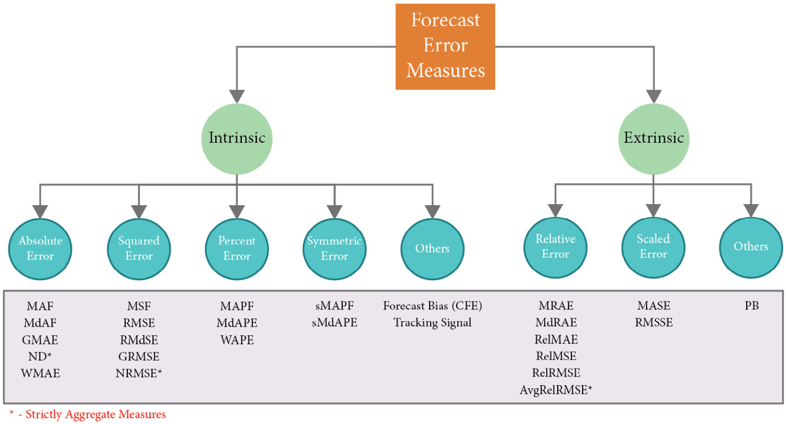
Figure 18.1 – Taxonomy of forecast error measures
We can semantically separate the different forecast metrics into two buckets – intrinsic and extrinsic. Intrinsic metrics measure the generated forecast using nothing but the generated forecast and the corresponding actuals. As the name suggests, it is a very inward-looking metric. Extrinsic metrics, on the other hand, use an external reference or benchmark in addition to the generated forecast and ground truth to measure the quality of the forecast.
Before we start with the metrics, let’s establish a notation to help us understand. ![]() and
and ![]() are the actual observation and the forecast at time
are the actual observation and the forecast at time ![]() . The forecast horizon is denoted by
. The forecast horizon is denoted by ![]() . In cases where we have a dataset of time series, we assume there are
. In cases where we have a dataset of time series, we assume there are ![]() time series, indexed by
time series, indexed by ![]() , and finally,
, and finally, ![]() denotes the error at timestep
denotes the error at timestep ![]() . Now, let’s start with the intrinsic metrics.
. Now, let’s start with the intrinsic metrics.
Intrinsic metrics
There are four major base errors – absolute error, squared error, percent error, and symmetric error – that are aggregated or summarized in different ways in a variety of metrics. Therefore, any property of these base errors also applies to the aggregate ones, so let’s look at these base errors first.
Absolute error
The error, ![]() , can be positive or negative, depending on whether
, can be positive or negative, depending on whether ![]() or not, but then when we are calculating and adding this error over the horizon, the positive and negative errors may cancel each other out and that paints a rosier picture. Therefore, we include a function on top of
or not, but then when we are calculating and adding this error over the horizon, the positive and negative errors may cancel each other out and that paints a rosier picture. Therefore, we include a function on top of ![]() to ensure that the errors do not cancel each other out.
to ensure that the errors do not cancel each other out.
The absolute function is one of these functions: ![]() . The absolute error is a scale-dependent error. This means that the magnitude of the error depends on the scale of the time series. For instance, if you have an AE of 10, it doesn’t mean anything until you put it in context. For a time series with values of around 500 to 1,000, an AE of 10 may be a very good number, but if the time series has values around 50 to 70, then it is bad.
. The absolute error is a scale-dependent error. This means that the magnitude of the error depends on the scale of the time series. For instance, if you have an AE of 10, it doesn’t mean anything until you put it in context. For a time series with values of around 500 to 1,000, an AE of 10 may be a very good number, but if the time series has values around 50 to 70, then it is bad.
Important note
Scale dependence is not a deal breaker when we are looking at individual time series, but when we are aggregating or comparing across multiple time series, scale-dependent errors skew the metric in favor of the large-scale time series. The interesting thing to note here is that this is not necessarily bad. Sometimes, the scale in the time series is meaningful and it makes sense from the business perspective to focus more on the large-scale time series than the smaller ones. For instance, in a retail scenario, one would be more interested in getting the high-selling product forecast right than those of the low-selling ones. In these cases, using a scale-dependent error automatically favors the high-selling products.
You can see this by carrying out an experiment on your own. Generate a random time series, ![]() . Now, similarly, generate a random forecast for the time series,
. Now, similarly, generate a random forecast for the time series, ![]() . Now, we multiply the forecast,
. Now, we multiply the forecast, ![]() , and time series,
, and time series, ![]() , by 100 to get two new time series and their forecasts,
, by 100 to get two new time series and their forecasts, ![]() and
and ![]() . If we calculate the forecast metric for both these sets of time series and forecasts, the scaled-dependent metrics will give very different values, whereas the scale-independent ones will give the same values.
. If we calculate the forecast metric for both these sets of time series and forecasts, the scaled-dependent metrics will give very different values, whereas the scale-independent ones will give the same values.
Many metrics are based on this error:
- Mean Absolute Error (MAE):

- Median Absolute Error:

- Geometric Mean Absolute Error:

- Weighted Mean Absolute Error: This is a more esoteric method that lets you put more weight on a particular timestep in the horizon:

Here, ![]() is the weight of a particular timestep. This can be used to assign more weight to special days (such as weekends or promotion days).
is the weight of a particular timestep. This can be used to assign more weight to special days (such as weekends or promotion days).
- Normalized Deviation (ND): This is a metric that is strictly used to calculate aggregate measures across a dataset of time series. This is also one of the popular metrics used in the industry to measure aggregate performance across different time series. This is not scale-free and will be skewed toward large-scale time series. This metric has strong connections with another metric called the Weighted Average Percent Error (WAPE). We will discuss these connections when we talk about the WAPE in the following sections.
To calculate ND, we just sum all the absolute errors across the horizons and time series and scale it by the actual observations across the horizons and time series:

Squared error
Squaring is another function that makes the error positive and thereby prevents the errors from canceling each other out:

There are many metrics that are based on this error:
- Mean Squared Error:

- Root Mean Squared Error (RMSE):

- Root Median Squared Error:

- Geometric Root Mean Squared Error:

- Normalized Root Mean Squared Error (NRMSE): This is a metric that is very similar to ND in spirit. The only difference is that we take the square root of the squared errors in the numerator rather than the absolute error:

Percent error
While absolute error and squared error are scale-dependent, percent error is a scale-free error measure. In percent error, we scale the error using the actual time series observations:  . Some of the metrics that use percent error are as follows:
- Mean Absolute Percent Error (MAPE) –

- Median Absolute Percent Error –

- WAPE – WAPE is a metric that embraces scale dependency and explicitly weights the errors with the scale of the timestep. If we want to give more focus to high values in the horizon, we can weigh those timesteps more than the others. Instead of taking a simple mean, we use a weighted mean on the absolute percent error. We can choose the weight to be anything but more often than not, it is chosen as the quantity of the observation itself. And in that special case, the math (with some assumptions) works out to be a simple formula which reminds us of ND. The difference is that ND is a metric which aggregates across multiple time series, and WAPE is a metric which weights across timestep:

Symmetric error
Percent error has a few problems – it is asymmetrical (we will see this in detail later in the chapter), and it breaks down when the actual observation is zero (due to division by zero). Symmetric error was proposed as an alternative to avoid this asymmetry, but as it turns out, symmetric error is itself asymmetric – more on that later, but for now, let’s see what symmetric error is:

There are only two metrics that are popularly used under this base error:
- Symmetric Mean Absolute Percent Error (sMAPE):

- Symmetric Median Absolute Percent Error:

Other intrinsic metrics
There are a few other metrics that are intrinsic in nature but don’t conform to the other metrics. Notable among those are three metrics that measure the over- or under-forecasting aspect of forecasts:
- Cumulative Forecast Error (CFE) – CFE is simply the sum of all the errors, including the sign of the error. Here, we want the positives and negatives to cancel each other out so that we understand whether a forecast is consistently over- or under-forecasting in a given horizon. A CFE close to zero means the forecasting model is neither over- nor under-forecasting:

- Forecast Bias – While CFE measures the degree of over- and under-forecasting, it is still scale-dependent. When we want to compare across time series or have an intuitive understanding of the degree of over- or under-forecasting, we can scale CFE by the actual observations. This is called Forecast Bias:

- Tracking Signal – The Tracking Signal is another metric that is used to measure the same over- and under-forecasting in forecasts. While CFE and Forecast Bias are used more offline, the Tracking Signal finds its place in an online setting where we are tracking over- and under-forecasting over periodic time intervals, such as every hour or every week. It helps us detect structural biases in the forecasting model. Typically, the Tracking Signal is used along with a threshold value so that going above or below it throws a warning. Although a thumb rule is to use
 3.75, it is totally up to you to decide the right threshold for your problem:

Here, ![]() is the past window over which TS is calculated.
is the past window over which TS is calculated.
Now, let’s turn our attention to a few extrinsic metrics.
Extrinsic metrics
There are two major buckets of metrics under the extrinsic umbrella – relative error and scaled error.
Relative error
One of the problems of intrinsic metrics is that they don’t mean a lot unless a benchmark score exists. For instance, if we hear that the MAPE is 5%, it doesn’t mean a lot because we don’t know how forecastable that time series is. Maybe 5% is a bad error rate. Relative error solves this by including a benchmark forecast in the calculation so that the errors of the forecast we are measuring are measured against the benchmark and thus show the relative gains of the forecast. Therefore, in addition to the notation that we have established, we need to add a few more.
Let ![]() be the forecast from the benchmark and
be the forecast from the benchmark and ![]() be the benchmark error. There are two ways we can include the benchmark in the metric:
be the benchmark error. There are two ways we can include the benchmark in the metric:
- Using errors from the benchmark forecast to scale the error of the forecast
- Using forecast measures from the benchmark forecast to scale the forecast measure of the forecast we are measuring
Let’s look at a few metrics which follow these:
- Mean Relative Absolute Error (MRAE):

- Median Relative Absolute Error:

- Geometric Mean Relative Absolute Error:

- Relative Mean Absolute Error (RelMAE):
 , where
  is the MAE of the benchmark forecast
 - Relative Root Mean Squared Error (RelRMSE):
 , where
  is the RMSE of the benchmark forecast
 - Average Relative Root Mean Squared Error: Davydenko and Fildes (#2 in References) proposed another metric that is strictly for calculating aggregate scores across time series. They argued that using a geometric mean over the RelMAEs of individual time series is better than an arithmetic mean, so they defined the Average Relative Root Mean Squared Error as follows:
Scaled error
Hyndman and Koehler introduced the idea of scaled error in 2006. This was an alternative to relative error and measures and tries to get over some of the drawbacks and subjectivity of choosing the benchmark forecast. Scaled error scales the forecast error using an in-sample MAE of a benchmark method such as naïve forecasting. Let the entire training history be of ![]() timesteps, indexed by
timesteps, indexed by ![]() .
.
So, the scaled error is defined as follows:

There are a couple of metrics that adopt this principle:
- Mean Absolute Scaled Error (MASE):

- Root Mean Squared Scaled Error (RMSSE): A similar scaled error was developed for the squared error and was used in the M5 Forecasting Competition in 2020:

Other extrinsic metrics
There are other extrinsic metrics that don’t fall into the categorization of errors we have made. One such error measure is the following:
Percent Better (PB) is a method that is based on counts and can be applied to individual time series as well as a dataset of time series. The idea here is to use a benchmark method and count how many times a given method is better than the benchmark and report it as a percentage. Formally, we can define it using MAE as the reference error as follows:

Here, ![]() is an indicator function that returns 1 if the condition is true and 0 otherwise.
is an indicator function that returns 1 if the condition is true and 0 otherwise.
We have seen a lot of metrics in the previous sections, but now it’s time to understand a bit more about the way they work and what they are suited for.
Investigating the error measures
It’s not enough to know the different metrics since we also need to understand how these work, what are they good for, and what are they not good for. We can start with the basic errors and work our way up because understanding the properties of basic errors such as absolute error, squared error, percent error, and symmetric error will help us understand the others as well because most of the other metrics are derivatives of these primary errors; either aggregating them or using relative benchmarks.
Let’s do this investigation using a few experiments and understand them through the results.
Notebook alert
The notebook for running these experiments on your own is 01-Loss Curves and Symmetry.ipynb in the Chapter18 folder.
Loss curves and complementarity
All these base errors depend on two factors – forecasts and actual observations. We can examine the behavior of these several metrics if we fix one and alter the other in a symmetric range of potential errors. The expectation is that the metric will behave the same way on both sides because deviation from the actual observation on either side should be equally penalized in an unbiased metric. We can also swap the forecasts and actual observations and that also should not affect the metric.
In the notebook, we did exactly these experiments – loss curves and complementary pairs.
Absolute error
When we plot these for absolute error, we get Figure 18.2:

Figure 18.2 – The loss curves and complementary pairs for absolute error
The first chart plots the signed error against the absolute error and the second one plots the absolute error with all the combinations of actuals and forecast, which add up to 10. The two charts are obviously symmetrical, which means that an equal deviation from the actual observed on either side is penalized equally, and if we swap the actual observation and the forecast, the metric remains unchanged.
Squared error
Now, let’s look at squared error:
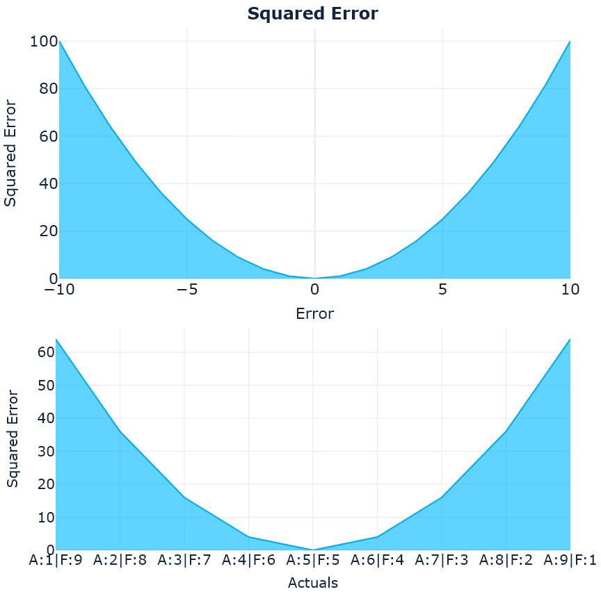
Figure 18.3 – The loss curves and complementary pairs for squared error
These charts also look symmetrical, so the squared error also doesn’t have an issue with asymmetric error distribution – but we can notice one thing here. The squared error increases exponentially as the error increases. This points to a property of the squared error – it gives undue weightage to outliers. If there are a few timesteps for which the forecast is really bad and excellent at all other points, the squared error inflates the impact of those outlying errors.
Percent error
Now, let’s look at percent error:
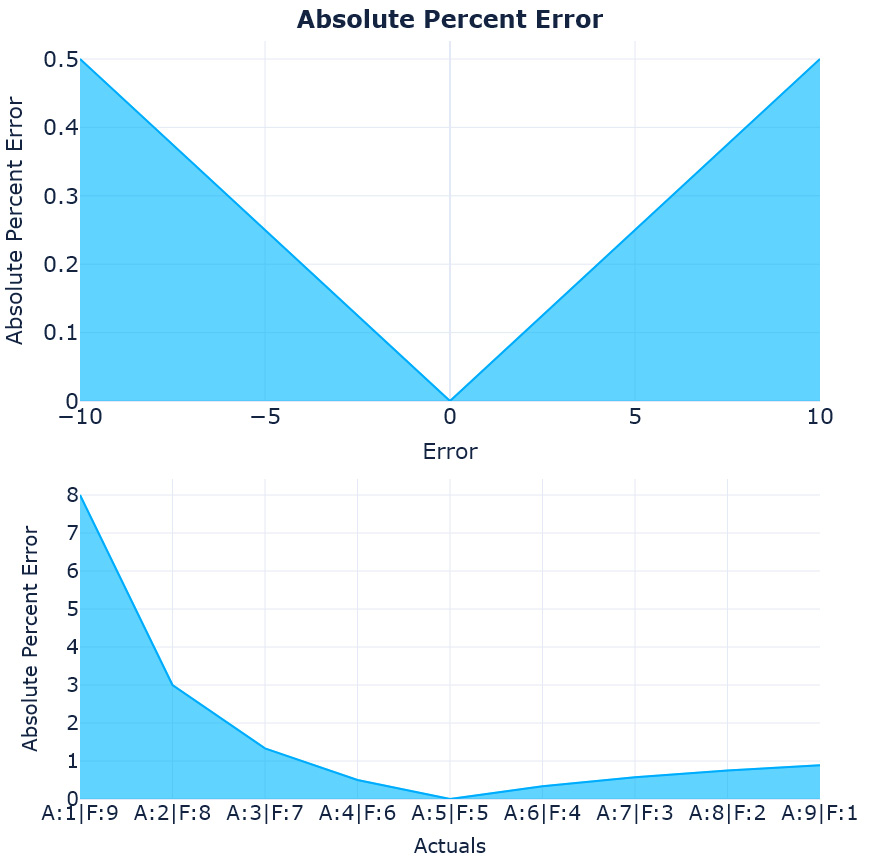
Figure 18.4 – The loss curves and complementary pairs for percent error
There goes our symmetry. The percent error is symmetrical when you move away from the actuals on both sides (mostly because we are keeping the actuals constant), but the complementary pairs tell us a whole different story. When the actual is 1 and the forecast is 9, the percent error is 8, but when we swap them, the percent error drops to 1. This kind of asymmetry can cause the metric to favor under-forecasting. The right half of the second chart in Figure 18.4 are all cases where we are under-forecasting and we can see that the error is very low there when compared to the left half.
We will look at under- and over-forecasting in detail in another experiment.
Symmetric error
For now, let’s move on and look at the last error we had – symmetric error:
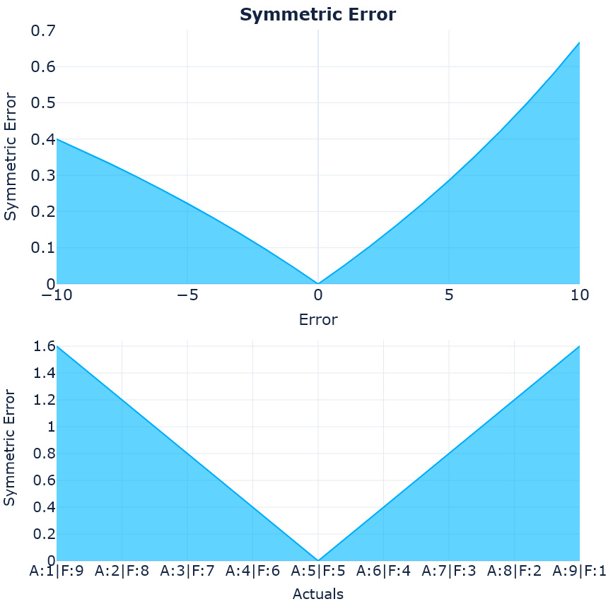
Figure 18.5 – The loss curves and complementary pairs for symmetric error
Symmetric error was proposed mainly because of the asymmetry we saw in the percent error. MAPE, which uses percent error, is one of the most popular metrics used and sMAPE was proposed to directly challenge and replace MAPE – true to its claim, it did resolve the asymmetry that was present in percent error. However, it introduced its own asymmetry. In the first chart, we can see that for a particular actual value, if the forecast moves on either side, it is penalized differently, so in effect, this metric favors over-forecasting (which is in direct contrast to percent error, which favors under-forecasting).
Extrinsic errors
With all the intrinsic measures done, we can also take a look at the extrinsic ones. With extrinsic measures, plotting the loss curves and checking symmetry is not as easy. Instead of two variables, we now have three – the actual observation, the forecast, and the reference forecast; the value of the measure can vary with any of these. We can use a contour plot for this as shown in Figure 18.6:
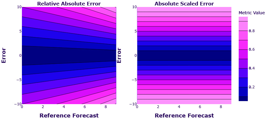
Figure 18.6 – Contour plot of the loss surface – relative absolute error and absolute scaled error
The contour plot enables us to plot three dimensions in a 2D plot. The two dimensions (error and reference forecast) are on the x- and y-axes. The third dimension (the relative absolute error and absolute scaled error values) is represented as color, with contour lines bordering same-colored areas. The errors are symmetric around the error (horizontal) axis. This means that if we keep the reference forecast constant and vary the error, both measures vary equally on both sides of the errors. This is not surprising since both these errors have their base in absolute error, which we know was symmetric.
The interesting observation is the dependency on the reference forecast. We can see that for the same error, relative absolute error has different values for different reference forecasts, but scaled error doesn’t have this problem. This is because it is not directly dependent on the reference forecast and rather uses the MAE of a naïve forecast. This value is fixed for a time series and eliminates the task of choosing a reference forecast. Therefore, scaled error has good symmetry for absolute error and very little or fixed dependency on the reference forecast.
Bias towards over- or under-forecasting
We have seen indications of bias toward over- or under-forecasting in a few metrics that we saw. In fact, it looked like the popular metric, MAPE, favors under-forecasting. To finally put that to test, we can perform another experiment with synthetically generated time series and we included a lot more metrics in this experiment so that we know which are safe to use and which need to be looked at carefully.
Notebook alert
The notebook to run these experiments on your own is 02-Over and Under Forecasting.ipynb in the Chapter18 folder.
The experiment is simple and detailed as follows:
- We randomly sample a count time series of integers with a length of 100 from a uniform distribution between 2 and 5:
np.random.randint(2,5,n)
- We use the same process to generate a forecast, which is also drawn from a uniform distribution between 2 and 5:
np.random.randint(2,5,n)
- Now, we generate two additional forecasts, one from the uniform distribution between 0 to 4 and another between 3 and 7. The former predominantly under-forecasts and the latter over-forecasts:
np.random.randint(0,4,n)# Underforecast
np.random.randint(3,7,n) # Overforecast
- We calculate all the measures we want to investigate using all three forecasts.
- We repeat it 10,000 times to average out the effect of random draws.
After the experiment is done, we can plot a box plot of different metrics so that it shows the distribution of each metric for each of those three forecasts over these 10,000 runs of the experiment. Let’s see the box plot in Figure 18.7:
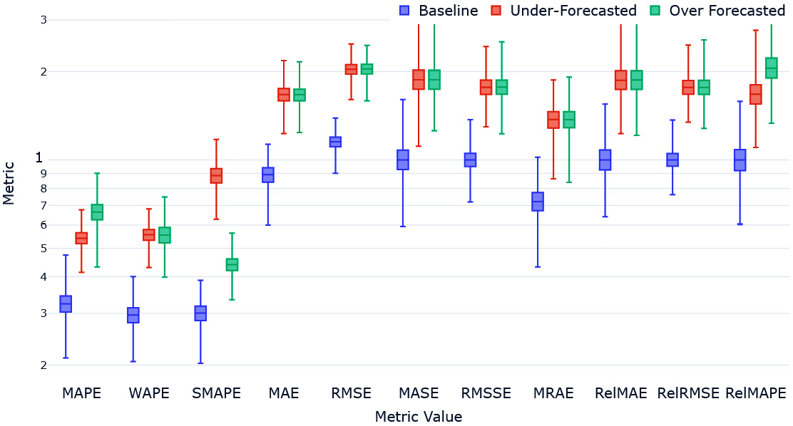
Figure 18.7 – Over- and under-forecasting experiment
Let’s go over what we would expect from this experiment first. The over- (green) and under- (red) forecasted forecasts would have a higher error than the baseline (blue). The over- and under-forecasted errors would be similar.
With that, let’s summarize our major findings:
- MAPE clearly favors the under-forecasted with a lower MAPE than the over-forecasted.
- WAPE, although based on percent error, managed to get over the problem by having explicit weighting. This may be counteracting the bias that percent error has.
- sMAPE, in its attempt to fix MAPE, does a worse job in the opposite direction. sMAPE highly favors over-forecasting.
- Metrics such as MAE and RMSE, which are based on absolute error and squared error respectively, don’t show any preference for either over- or under-forecasting.
- MASE and RMSSE (both using versions of scaled error) are also fine.
- MRAE, in spite of some asymmetry regarding the reference forecast, turns out to be unbiased from the over- and under-forecasting perspective.
- The relative measures with absolute and squared error bases (RelMAE and RelRMSE) also do not have any bias toward over- or under-forecasting.
- The relative measure of mean absolute percentage error, RelMAPE, carries MAPE’s bias toward under-forecasting.
We have investigated a few properties of different error measures and understood the basic properties of some of them. To further that understanding and move closer to helping us select the right measure for our problem, let’s do one more experiment using the London Smart Meters dataset we have been using through this book.
Experimental study of the error measures
As we discussed earlier, there are a lot of metrics for forecasting that people have come up with over the years. Although there are many different formulations of these metrics, there can be similarities in what they are measuring. Therefore, if we are going to choose a primary and secondary metric while modeling, we should pick some metrics that are diverse and measure different aspects of the forecast.
Through this experiment, we are going to try and figure out which of these metrics are similar to each other. We are going to use the subset of the London Smart Meters dataset we have been using all through the book and generate some forecasts for each household. I have chosen to do this exercise with the darts library because I wanted multi-step forecasting. I’ve used five different forecasting methods – seasonal naïve, exponential smoothing, Theta, FFT, and LightGBM (local) – and generated forecasts. On top of that, I have also calculated the following metrics on all of these forecasts – MAPE, WAPE, sMAPE, MAE, MdAE, MSE, RMSE, MRAE, MASE, RMSSE, RelMAE, RelRMSE, RelMAPE, CFE, Forecast Bias, and PB(MAE). In addition to this, we also calculated a few aggregate metrics – meanMASE, meanRMSSE, meanWAPE, meanMRAE, AvgRelRMSE, ND, and NRMSE.
Using Spearman’s rank correlation
The basis of the experiment is that if different metrics measure the same underlying factor, then they will also rank forecasts on different households similarly. For instance, if we say that MAE and MASE are measuring one latent property of the forecast, then those two metrics would give similar rankings to different households. At the aggregated level, there are five different models and aggregate metrics that measure the same underlying latent factor and should also rank them in similar ways.
Let’s look at the aggregate metrics first. We ranked the different forecast methods at the aggregate level using each of the metrics and then we calculated the Pearson correlation of the ranks. This gives us Spearman’s rank correlation between the forecasting methods and metrics. The heatmap of the correlation matrix is in Figure 18.8:
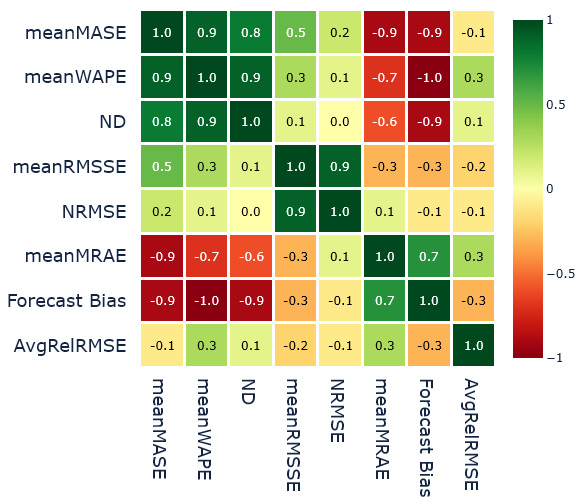
Figure 18.8 – Spearman’s rank correlation between the forecast methods and aggregate metrics
These are the major observations:
- We can see that meanMASE, meanWAPE, and ND (all based on absolute error) are highly correlated, indicating that they might be measuring similar latent factors of the forecast.
- The other pair that is highly correlated is meanRMSSE and NRMSE, which are both based on squared error.
- There is a weak correlation between meanMASE and meanRMSSE, maybe because they are both using scaled error.
- meanMRAE and Forecast Bias seem to be highly correlated, although there is no strong basis for that shared behavior. Some correlations can be because of chance and this needs to be validated further on more datasets.
- meanMRAE and AvgRelRMSE seem to be measuring very different latent factors from the rest of the metrics and each other.
Similarly, we calculated Spearman’s rank correlation between the forecast methods and metrics across all the households (Figure 18.9). This enables us to have the same kind of comparison as before at the item level:
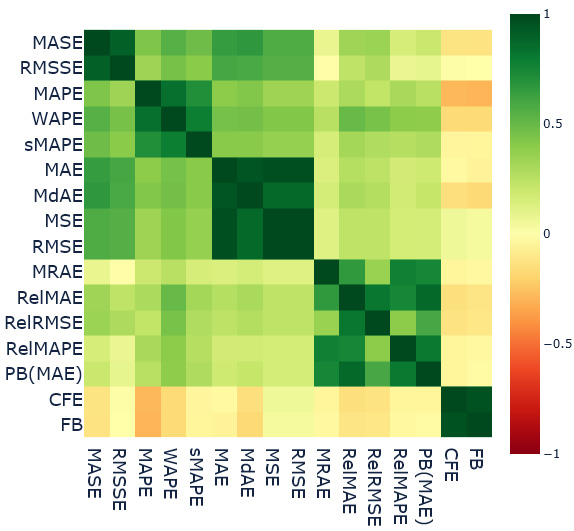
Figure 18.9 – Spearman’s rank correlation between the forecast methods and item-level metrics
The major observations are as follows:
- We can see there are five clusters of highly correlated metrics (the five green boxes).
- The first group is MASE and RMSSE, which are highly correlated. This can be because of the scaled error formulation of both metrics.
- WAPE, MAPE, and sMAPE are the second group. Frankly, this is a bit confusing because I would have expected MAPE and sMAPE to have less correlated results. They do behave in the opposite way from an over- and under-forecasting perspective. Maybe all the forecasts we have used to check this correlation don’t over- or under-forecast and therefore the similarity came out through the shared percent error base. This needs to be investigated further.
- MAE, MdAE, MSE, and RMSE form the third group of highly similar metrics. MAE and MdAE are both absolute error metrics and MSE and RMSE are both squared error metrics. The similarity between these two can be because of the lack of outlying errors in the forecasts. The only difference between these two base errors is that squared error puts a much greater weight on outlying errors.
- The next group of similar metrics is the motley crew of relative measures – MRAE, RelMAE, RelRMSE, RelMAPE, and PB(MAE), but the intercorrelation among this group is not as strong as the other groups. The pairs of metrics that stand out in terms of having low inter-correlations are MRAE and RelRMSE and RelMAPE and RelRMSE.
- The last group that stands totally apart with much less correlation with any other metric but a higher correlation with each other is Forecast Bias and CFE. Both are calculated on unsigned errors and measure the amount of over- or under-forecasting.
- If we look at intergroup similarities, the only thing that stands out is the similarity between the scaled error group and absolute error and squared error group.
Important note
Spearman’s rank correlation on aggregate metrics is done using a single dataset and has to be taken with a grain of salt. The item-level correlation has a bit more significance because it is made across many households, but there are still a few things in there that warrant further investigation. I urge you to repeat this experiment on some other datasets and check whether we see the same patterns repeated before adopting them as rules.
Now that we have explored the different metrics, it is time to summarize and probably leave you with a few guidelines for choosing a metric.
Guidelines for choosing a metric
Throughout this chapter, we have come to understand that it is difficult to choose one forecast metric and apply it universally. There are advantages and disadvantages for each metric and being cognizant of these while selecting a metric is the only rational way to go about it.
Let’s summarize and note a few points we have seen through different experiments in the chapter:
- Absolute error and squared error are both symmetric losses and are unbiased from the under- or over-forecasting perspective.
- Squared error does have a tendency to magnify the outlying error because of the square term in it. Therefore, if we use a squared-error-based metric, we will be penalizing high errors much more than small errors.
- RMSE is generally preferred over MSE because RMSE is on the same scale as the original input and therefore is a bit more interpretable.
- Percent error and symmetric error are not symmetric in the complete sense and favor under-forecasting and over-forecasting, respectively. MAPE, which is a very popular metric, is plagued by this shortcoming. For instance, if we are forecasting demand, optimizing for MAPE will lead you to select a forecast that is conservative and therefore under-forecast. This will lead to an inventory shortage and out-of-stock situations. sMAPE, with all its shortcomings, has fallen out of favor with practitioners.
- Relative measures are a good alternative to percent-error-based metrics because they are also inherently interpretable, but relative measures depend on the quality of the benchmark method. If the benchmark method performs poorly, the relative measures will tend to dampen the impact of errors from the model under evaluation. On the other hand, if the benchmark forecast is close to an oracle forecast with close to zero errors, the relative measure will exaggerate the errors of the model. Therefore, you have to be careful when choosing the benchmark forecast, which is an additional thing to worry about.
- Although a geometric mean offers a few advantages over an arithmetic mean (such as resistance to outliers and better approximation when there is high variation in data), it is not without its own problems. Geometric mean-based measures mean that even if a single series (when aggregating across time series) or a single timestep (when aggregating across timesteps) performs really well, it will make the overall error come down drastically due to the multiplication.
- PB, although an intuitive metric, has one disadvantage. We are simply counting the instances in which we perform better. However, it doesn’t assess how well or poorly we are doing. The effect on the PB score is the same whether our error is 50% less than the reference error or 1% less.
Hewamalage et al. (#1 in References) have proposed a very detailed flowchart to aid in decision-making, but that is also more of a guideline as to what not to use. The selection of a single metric is a very debatable task. There are a lot of conflicting opinions out there and I’m just adding another to that noise. Here are a few guidelines I propose to help you pick a forecasting metric:
- Avoid MAPE. In any situation, there is always a better metric to measure what you want. At the very least, stick to WAPE for single time series datasets.
- For a single time series dataset, the best metrics to choose are MAE or RMSE (depending on whether you want to penalize large errors more or not).
- For multiple time series datasets, use ND or NRMSSE (depending on whether you want to penalize large errors more or not). As a second choice, meanMASE or meanRMSSE can also be used.
- If there are large changes in the time series (in the horizon we are measuring, there is a huge shift in time series levels), then something such as PB or MRAE can be used.
- Whichever metric you choose, always make sure to use Forecast Bias, CFE, or Tracking Signal to keep an eye on structural over- or under-forecasting problems.
- If the time series you are forecasting is intermittent (as in, has a lot of time steps with zero values), use RMSE and avoid MAE. MAE favors forecasts that generate all zeros. Avoid all percent-error-based metrics because intermittency brings to light another one of their shortcomings – it is undefined when actual observations are zero (Further reading has a link to a blog that explores other metrics for intermittent series).
Congratulations on finishing a chapter full of new terms and metrics and I hope you have gained the necessary intuition to intelligently select the metric to focus on for your next forecasting assignment!
Summary
In this chapter, we looked at the thickly populated and highly controversial area of forecast metrics. We started with a basic taxonomy of forecast measures to help you categorize and organize all the metrics in the field.
Then, we launched a few experiments through which we learned about the different properties of these metrics, slowly approaching a better understanding of what these metrics are measuring, but looking at synthetic time series experiments, we learned how MAPE and sMAPE favor under- and over-forecasting, respectively.
We also analyzed the rank correlations between these metrics on real data to see how similar the different metrics are and finally, rounded off by laying out a few guidelines that can help you pick a forecasting metric for your problem.
In the next chapter, we will look at cross-validation strategies for time series.
References
The following are the references that we used throughout the chapter:
- Hewamalage, Hansika; Ackermann, Klaus; and Bergmeir, Christoph. (2022). Forecast Evaluation for Data Scientists: Common Pitfalls and Best Practices. arXiv preprint arXiv: Arxiv-2203.10716: https://arxiv.org/abs/2203.10716v2
- Davydenko, Andrey and Fildes, Robert. (2013). Measuring forecasting accuracy: the case of judgmental adjustments to SKU-level demand forecasts. In International Journal of Forecasting. Vol. 29, No. 3., 2013, pp. 510-522: https://doi.org/10.1016/j.ijforecast.2012.09.002
- Hyndman, Rob J. and Koehler, Anne B.. (2006). Another look at measures of forecast accuracy. In International Journal of Forecasting, Vol. 22, Issue 4, 2006, pp. 679-688: https://robjhyndman.com/publications/another-look-at-measures-of-forecast-accuracy/
Further reading
If you wish to read further about forecast metrics, you can check out the blog post Forecast Error Measures: Intermittent Demand by Manu Joseph – https://deep-and-shallow.com/2020/10/07/forecast-error-measures-intermittent-demand/.