
6
Unsupervised Machine Learning Algorithms
This chapter is about unsupervised machine learning algorithms. We aim, by the end of this chapter, to be able to understand how unsupervised learning, with its basic algorithms and methodologies, can be effectively applied to solve real-world problems.
We will cover the following topics:
- Introducing unsupervised learning
- Understanding clustering algorithms
- Dimensionality reduction
- Association rules mining
Introducing unsupervised learning
If the data is not generated randomly, it tends to exhibit certain patterns or relationships among its elements within a multi-dimensional space. Unsupervised learning involves the process of detecting and utilizing these patterns within a dataset to structure and comprehend it more effectively. Unsupervised learning algorithms uncover these patterns and use them as a foundation for imparting a certain structure to the dataset. The identification of these patterns contributes to a deeper understanding and representation of the data. Extracting patterns from raw data leads to a better understanding of the raw data.
This concept is shown in Figure 6.1:
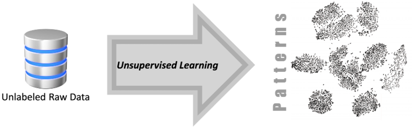
Figure 6.1: Using unsupervised machine learning to extract patterns from unlabeled raw data
In the upcoming discussion, we will navigate through the CRISP-DM lifecycle, a popular model for the machine learning process. Within this context, we’ll pinpoint where unsupervised learning fits in. To illustrate, think of unsupervised learning like a detective piecing together clues to form patterns or groups, without having any predefined knowledge of what the end result might be. Just as a detective’s insights can be crucial in solving a case, unsupervised learning plays a pivotal role in the machine learning lifecycle.
Unsupervised learning in the data-mining lifecycle
Let us first look into the different phases of a typical machine learning process. To understand the different phases of the machine learning lifecycle, we will study the example of using machine learning for a data mining process. Data mining is the process of discovering meaningful correlations, patterns, and trends in a given dataset. To discuss the different phases of data mining using machine learning, this book utilizes the Cross-Industry Standard Process for Data Mining (CRISP-DM). CRISP-DM was conceived and brought to life by a group of data miners from different organizations, including notable names like Chrysler and IBM. More details can be found at https://www.ibm.com/docs/en/spss-modeler/saas?topic=dm-crisp-help-overview.
The CRISP-DM lifecycle consists of six distinct phases, which are shown in the following figure:
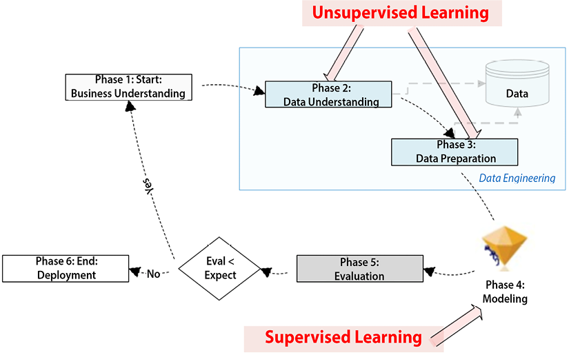
Figure 6.2: Different phases of the CRISP-DM lifecycle
Let’s break down and explore each phase, one by one.
Phase 1: Business understanding
This phase is about gathering the requirements and involves trying to fully understand the problem in depth from a business point of view. Defining the scope of the problem and properly rephrasing it according to machine learning is an important part of this phase. This phase involves identifying the goals, defining the scope of the project, and understanding the requirements of the stakeholders.
It is important to note that Phase 1 of the CRISP-DM lifecycle is about business understanding. It focuses on what needs to be done, not on how it will be done.
Phase 2: Data understanding
This phase is about understanding the data that is available for data mining. In this phase, we will find out whether we have all information needed to solve the problem defined in Phase 1 in the given datasets. We can use tools like data visualization, dashboards, and summary reports to understand the patterns in the data. As explained later in this chapter, unsupervised machine learning algorithms can also be used to discover the patterns in the data and to understand them by analyzing their structure in detail.
Phase 3: Data preparation
This is about preparing the data for the ML model that we will later train in Phase 4. Depending on the use case and requirements, data preparation may include removing outliers, normalization, taking out null values, and reducing the dimensionality of the data. This is discussed in more detail in later chapters. After processing and preparing the data, it is usually split in a 70-30 ratio. The larger chunk, called the training data, is used to educate the model on various patterns, while the smaller chunk, referred to as the testing data, is saved for evaluating the model’s performance on unseen data during Phase 5. An optional set of data can also be kept aside for validating and fine-tuning the model to prevent it from overfitting.
Phase 4: Modeling
This is the phase where we formulate the patterns in the data by training the model. For model training, we will use the training data partition prepared in Phase 3. Model training involves feeding our prepared data into the machine learning algorithm. Through iterative learning, the algorithm identifies and learns the inherent patterns within the data. The objective is to formulate patterns representing the relationships and dependencies among different variables in the dataset. We will discuss in later chapters how the complexity and nature of these mathematical formulations depend heavily on our chosen algorithm – for instance, a linear regression model will generate a linear equation, while a decision tree model will construct a tree-like model of decisions.
In addition to model training, model tuning is another component of this phase of the CRISP-DM lifecycle. This process includes optimizing the parameters of the learning algorithm to enhance its performance, thus making predictions more accurate. It involves fine-tuning the model using an optional validation set, which assists in adjusting the model’s complexity to find the right balance between learning from the data and generalizing to unseen data. A validation set, in machine learning terms, is a subset of your dataset that is used for the fine adjustment of a predictive model.
It assists in modulating the model’s complexity, aiming to find an optimal balance between learning from known data and generalizing to unseen data. This balance is important in preventing overfitting, which is a scenario where the model learns the training data too well but performs poorly on new, unseen data. Hence, model tuning not only refines the model’s predictive power but also ensures its robustness and reliability.
Phase 5: Evaluation
This stage involves evaluating the recently trained model by using the test data derived from Phase 3. We measure the model’s performance against the established baseline, which is set during Phase 1. Setting a baseline in machine learning serves as a reference point, which can be determined using various methods. It could be established through basic rule-based systems, simple statistical models, random chance, or even based on the performance of human experts. The purpose of this baseline is to offer a minimal performance threshold that our machine learning models should surpass. The baseline acts as a benchmark for comparison, giving us a reference point for our expectations. If the model’s evaluation aligns with the expectations originally defined in Phase 1, we proceed further. If not, we must revisit and iterate through all the previous phases, starting again with Phase 1.
Phase 6: Deployment
Once the evaluation phase, Phase 5, concludes, we examine whether the performance of the trained model meets or surpasses the established expectations. It’s vital to remember that a successful evaluation doesn’t automatically imply readiness for deployment. The model has performed well on our test data, but that is not the only criterion for determining whether the model is ready to solve real-world problems, as defined in Phase 1. We must consider factors such as how the model will perform with new data it has never seen before, how it will integrate with existing systems, and how it will handle unforeseen edge cases. Therefore, it’s only when these extensive evaluations have been met satisfactorily that we can confidently proceed to deploy the model into a production environment, where it begins to provide a usable solution to our predefined problem.
Phase 2 (Data understanding) and Phase 3 (Data preparation) of the CRISP-DM lifecycle are all about understanding the data and preparing it for training the model. These phases involve data processing. Some organizations employ specialists for this data engineering phase.
It is obvious that the process of suggesting a solution to a problem is fully data-driven. A combination of supervised and unsupervised machine learning is used to formulate a workable solution. This chapter focuses on the unsupervised learning part of the solution.
Data engineering comprises Phase 2 and Phase 3 and is the most time-consuming part of machine learning. It can take as much as 70% of the time and resources of a typical Machine Learning (ML) project (Data Management in Machine Learning: Challenges, Techniques, and Systems, Cody et al, SIGMOD ‘17: Proceedings of the 2017 ACM International Conference on Management of Data, May 2017). Unsupervised learning algorithms can play an important role in data engineering.
The following sections provide more details regarding unsupervised algorithms.
Current research trends in unsupervised learning
The field of machine learning research has undergone a considerable transformation. In earlier times, the focus was primarily centered on supervised learning techniques. These methods are immediately useful for inference tasks, offering clear advantages such as time savings, cost reductions, and discernible improvements in prediction accuracy.
Conversely, the intrinsic capabilities of unsupervised machine learning algorithms have only gained attention more recently. Unlike their supervised counterparts, unsupervised techniques function without direct instructions or preconceived assumptions. They are adept at exploring broader “dimensions” or facets in data, thus enabling a more comprehensive examination of a dataset.
To clarify, in machine learning terminology, “features” are the individual measurable properties or characteristics of the phenomena being observed. For example, in a dataset concerning customer information, features could be aspects like the customer’s age, purchase history, or browsing behavior. “Labels,” on the other hand, represent the outcomes we want the model to predict based on these features.
While supervised learning focuses primarily on establishing relationships between these features and a specific label, unsupervised learning does not restrict itself to a pre-determined label. Instead, it can delve deeper, unearthing intricate patterns among various features that might be overlooked when using supervised methods. This makes unsupervised learning potentially more expansive and versatile in its applications.
This inherent flexibility of unsupervised learning, however, brings with it a challenge. Since the exploration space is larger, it can often result in increased computational requirements, leading to greater costs and longer processing times. Furthermore, managing the scale or “scope” of unsupervised learning tasks can be more complex due to their exploratory nature. Yet, the ability to unearth hidden patterns or correlations within the data makes unsupervised learning a powerful tool for data-driven insights.
Today, research trends are moving toward the integration of supervised and unsupervised learning methods. This combined strategy aims to exploit the advantages of both methods.
Now let us look into some practical examples.
Practical examples
Currently, unsupervised learning is used to get a better sense of the data and provide it with more structure—for example, it is used in marketing segmentation, data categorization, fraud detection, and market basket analysis (which is discussed later in this chapter). Let us look at the example of the use of unsupervised learning for marketing segmentation.
Marketing segmentation using unsupervised learning
Unsupervised learning serves as a powerful tool for marketing segmentation. Marketing segmentation refers to the process of dividing a target market into distinct groups based on shared characteristics, enabling companies to tailor their marketing strategies and messages to effectively reach and engage specific customer segments. The characteristics used for grouping the target market could include demographics, behaviors, or geographic similarities. By leveraging algorithms and statistical techniques, it enables businesses to extract meaningful insights from their customer data, identify hidden patterns, and group customers into distinct segments based on similarities in their behavior, preferences, or characteristics. This data-driven approach empowers marketers to develop tailored strategies, improve customer targeting, and enhance overall marketing effectiveness.
Understanding clustering algorithms
One of the simplest and most powerful techniques used in unsupervised learning is based on grouping similar patterns together through clustering algorithms. It is used to understand a particular aspect of the data that is related to the problem we are trying to solve. Clustering algorithms look for natural grouping in data items. As the group is not based on any target or assumptions, it is classified as an unsupervised learning technique.
Consider a vast library full of books as an example. Each book represents a data point – containing a multitude of attributes like genre, author, publication year, and so forth. Now, imagine a librarian (the clustering algorithm) who is tasked with organizing these books. With no pre-existing categories or instructions, the librarian starts sorting the books based on their attributes – all the mysteries together, the classics together, books by the same author together, and so on. This is what we mean by “natural groups” in data items, where items that share similar characteristics are grouped together.
Groupings created by various clustering algorithms are based on finding the similarities between various data points in the problem space. Note that, in the context of machine learning, a data point is a set of measurements or observations that exist in a multi-dimensional space. In simpler terms, it’s a single piece of information that helps the machine learn about the task it is trying to accomplish. The best way to determine the similarities between data points will vary from problem to problem and will depend on the nature of the problem we are dealing with. Let’s look at the various methods that can be used to calculate the similarities between various data points.
Quantifying similarities
Unsupervised learning techniques, such as clustering algorithms, work effectively by determining similarities between various data points within a given problem space. The effectiveness of these algorithms largely depends on our ability to correctly measure these similarities, and in machine learning terminology, these are often referred to as “distance measures.” But what exactly is a distance measure?
In essence, a distance measure is a mathematical formula or method that calculates the “distance” or similarity between two data points. It’s crucial to understand that, in this context, the term “distance” doesn’t refer to physical distance, but rather to the similarity or dissimilarity between data points based on their features or characteristics.
In clustering, we can talk about two main types of distances: intercluster and intracluster. The intercluster distance refers to the distance between different clusters, or groups of data points. In contrast, intracluster distance refers to the distance within the same cluster, or, in other words, the distance between data points within the same group. The objective of a good clustering algorithm is to maximize intercluster distance (making sure each cluster is distinct from the others) while minimizing intracluster distance (ensuring data points within the same cluster are as similar as possible). The following are three of the most popular methods that are used to quantify similarities:
- Euclidean distance measure
- Manhattan distance measure
- Cosine distance measure
Let’s look at these distance measures in more detail.
Euclidean distance
The distance between different points can quantify the similarity between two data points and is extensively used in unsupervised machine learning techniques, such as clustering. Euclidean distance is the most common and simplest distance measure used. The term “distance,” in this context, quantifies how similar or different two data points are in a multi-dimensional space, which is crucial in understanding the grouping of data points. One of the simplest and most widely used measures of this distance is the Euclidean distance.
The Euclidean distance can be thought of as the straight-line distance between two points in a three-dimensional space, similar to how we might measure distance in the real world. For example, consider two cities on a map; the Euclidean distance would be the “as-the-crow-flies” distance between these two cities, a straight line from city A to city B, ignoring any potential obstacles such as mountains or rivers.
In a similar manner, in the multi-dimensional space of our data, the Euclidean distance calculates the shortest possible “straight line” distance between two data points. By doing so, it provides a quantitative measure of how close or far apart the data points are, based on their features or attributes. For example, let’s consider two points, A(1,1) and B(4,4), in a two-dimensional space, as shown in the following plot:
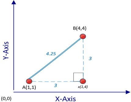
Figure 6.3: Calculating the Euclidean distance between two given points
To calculate the distance between A and B—that is d(A,B), we can use the following Pythagorean formula:
![]()
Note that this calculation is for a two-dimensional problem space. For an n-dimensional problem space, we can calculate the distance between two points, A and B, as follows:

Manhattan distance
In many situations, measuring the shortest distance between two points using the Euclidean distance measure will not truly represent the similarity or closeness between two points—for example, if two data points represent locations on a map, then the actual distance from point A to point B using ground transportation, such as a car or taxi, will be more than the distance calculated by the Euclidean distance. Let’s think of a bustling city grid, where you can’t cut straight through buildings to get from one point to another (like in the case of Euclidean distance), but rather, you must navigate through the grid of streets. Manhattan distance mirrors this real-world navigation – it calculates the total distance traveled along these grid lines from point A to point B.
For situations such as these, we use Manhattan distance, which estimates the distance between two points, traveled when moving along grid-like city streets from a starting point to a destination. In contrast to straight-line distance measures like the Euclidean distance, the Manhattan distance provides a more accurate reflection of the practical distance between two locations in such contexts. The comparison between the Manhattan and Euclidean distance measures is shown in the following plot:
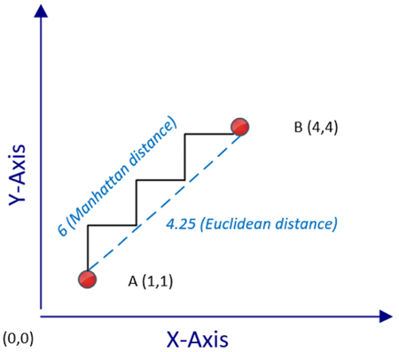
Figure 6.4: Calculating the Manhattan distance between two points
Note that, in the figure, the Manhattan distance between these points is represented as a zigzag path that moves strictly along the grid lines of this plot. In contrast, the Euclidean distance is shown as a direct, straight line from point A to point B. It is obvious that the Manhattan distance will always be equal to or larger than the corresponding Euclidean distance calculated.
Cosine distance
While Euclidean and Manhattan distance measures serve us well in simpler, lower-dimensional spaces, their effectiveness diminishes as we venture into more complex, “high-dimensional” settings. A “high-dimensional” space refers to a dataset that contains a large number of features or variables. As the number of dimensions (features) increases, the calculation of distance becomes less meaningful and more computationally intensive with Euclidean and Manhattan distances.
To tackle this issue, we use the “cosine distance” measure in high-dimensional contexts. This measure works by assessing the cosine of the angle formed by two data points connected to an origin point. It’s not the physical distance between the points that matters here, but the angle they create.
If the data points are close in the multi-dimensional space, they’ll form a smaller angle, regardless of the number of dimensions involved. Conversely, if the data points are far apart, the resulting angle will be larger. Hence, cosine distance provides a more nuanced measure of similarity in high-dimensional data, helping us make better sense of complex data patterns:
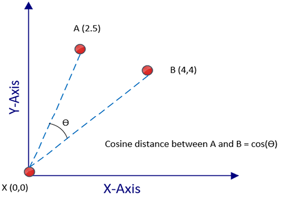
Figure 6.5: Calculating the cosine distance
Textual data can almost be considered a highly dimensional space. It stems from the unique nature of text data, where each unique word can be considered a distinct dimension or feature. As the cosine distance measure works very well with h-dimensional spaces, it is a good choice when dealing with textual data.
Note that, in the preceding figure, the cosine of the angle between A(2,5) and B(4.4) is the cosine distance represented by ![]() in Figure 6.5. The reference between these points is the origin—that is,
in Figure 6.5. The reference between these points is the origin—that is, X(0,0). But in reality, any point in the problem space can act as the reference data point, and it does not have to be the origin.
Let us now look into one of the most popular unsupervised machine learning techniques – that is, the k-means clustering algorithm.
k-means clustering algorithm
The k-means clustering algorithm gets its name from the procedure of creating “k” clusters and using means or averages to ascertain the “closeness” between data points. The term “means” refers to the method of calculating the centroid or the “center point” of each cluster, which is essentially the average of all the data points within the cluster. In other words, the algorithm calculates the mean value for each feature within the cluster, which results in a new data point – the centroid. This centroid then acts as the reference point for measuring the “closeness” of other data points.
The popularity of k-means stems from its scalability and speed. The algorithm is computationally efficient because it uses a straightforward iterative process where the centroids of clusters are repeatedly adjusted until they become representative of the cluster members. This simplicity makes the algorithm particularly fast and scalable for large datasets.
However, a notable limitation of the k-means algorithm is its inability to determine the optimal number of clusters, “k,” independently. The ideal “k” depends on the natural groupings within a given dataset. The design philosophy behind this constraint is to keep the algorithm straightforward and fast, hence assuming an external mechanism to calculate “k.” Depending on the context of the problem, “k” could be directly determined. For instance, if the task involves segregating a class of data science students into two clusters, one focusing on data science skills and the other on programming skills, “k” would naturally be two. However, for problems where the value of “k” is not readily apparent, an iterative process involving trial and error, or a heuristic-based method, might be required to estimate the most suitable number of clusters for a dataset.
The logic of k-means clustering
In this part, we’ll dive into the workings of the k-means clustering algorithm. We’ll break down how it operates, step by step, to give you a clear understanding of its mechanisms and uses. This section describes the logic of the k-means clustering algorithm.
Initialization
In order to group them, the k-means algorithm uses a distance measure to find the similarity or closeness between data points. Before using the k-means algorithm, the most appropriate distance measure needs to be selected. By default, the Euclidean distance measure will be used. However, depending on the nature and requirement of your data, you might find another distance measure, such as Manhattan or cosine, more suitable. Also, if the dataset has outliers, then a mechanism needs to be devised to determine the criteria that are to be identified and remove the outliers of the dataset.
Various statistical methods are available for outlier detection, such as the Z-score method or the Interquartile Range (IQR) method. Now let’s look at the different steps involved in the k-means algorithm.
The steps of the k-means algorithm
The steps involved in the k-means clustering algorithm are as follows:
|
Step 1 |
We choose the number of clusters, k. |
|
Step 2 |
Among the data points, we randomly choose k points as cluster centers. |
|
Step 3 |
Based on the selected distance measure, we iteratively compute the distance from each point in the problem space to each of the k cluster centers. Based on the size of the dataset, this may be a time-consuming step—for example, if there are 10,000 points in the cluster and k = 3, this means that 30,000 distances need to be calculated. |
|
Step 4 |
We assign each data point in the problem space to the nearest cluster center. |
|
Step 5 |
Now each data point in our problem space has an assigned cluster center. But we are not done, as the selection of the initial cluster centers was based on random selection. We need to verify that the current randomly selected cluster centers are actually the center of gravity of each cluster. We recalculate the cluster centers by computing the mean of the constituent data points of each of the k clusters. This step explains why this algorithm is called k-means. |
|
Step 6 |
If the cluster centers have shifted in step 5, this means that we need to recompute the cluster assignment for each data point. For this, we will go back to step 3 to repeat that compute-intensive step. If the cluster centers have not shifted or if our predetermined stop condition (for example, the number of maximum iterations) has been satisfied, then we are done. |
The following figure shows the result of running the k-means algorithm in a two-dimensional problem space:
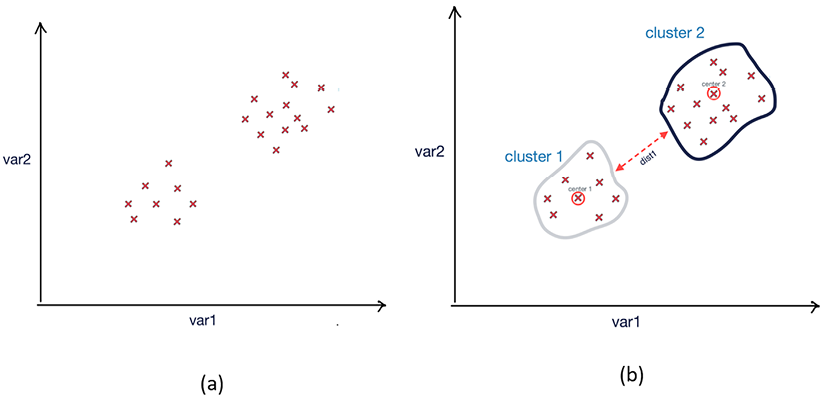
Figure 6.6: Results of k-means clustering (a) Data points before clustering; (b) resultant clusters after running the k-means clustering algorithm
Note that the two resulting clusters created after running k-means are well differentiated in this case. Now let us look into the stop condition of the k-means algorithm.
Stop condition
In unsupervised learning algorithms like k-means, the stop condition plays a crucial role in determining when the algorithm should cease its iterative process. For the k-means algorithm, the default stop condition is when there is no more shifting of cluster centers in step 5. But as with many other algorithms, k-means algorithms may take a lot of time to converge, especially while processing large datasets in a high-dimensional problem space.
Instead of waiting for the algorithm to converge, we can also explicitly define the stop condition as follows:
- By specifying the maximum execution time:
- Stop condition: t>tmax, where t is the current execution time and tmax is the maximum execution time we have set for the algorithm.
- By specifying the maximum iterations:
- Stop condition: if m>mmax, where m is the current iteration and mmax is the maximum number of iterations we have set for the algorithm.
Coding the k-means algorithm
We’ll perform k-means clustering on a simple two-dimensional dataset you’ve provided, with two features, x and y. Imagine a swarm of fireflies scattered across a garden at night. Your task is to group these fireflies based on their proximity to each other. This is the essence of k-means clustering, a popular unsupervised learning algorithm.
We’re given a dataset, much like our garden, with data points plotted in a two-dimensional space. Our data points are represented by x and y coordinates:
import pandas as pd
dataset = pd.DataFrame({
    'x': [11, 21, 28, 17, 29, 33, 24, 45, 45, 52, 51, 52, 55, 53, 55, 61, 62, 70, 72, 10],
    'y': [39, 36, 30, 52, 53, 46, 55, 59, 63, 70, 66, 63, 58, 23, 14, 8, 18, 7, 24, 10]
})
Our task is to cluster these data points using the k-means algorithm.
Firstly, we import the required libraries:
from sklearn import cluster
import matplotlib.pyplot as plt
Next, we’ll initiate the KMeans class by specifying the number of clusters (k). For this example, let’s assume we want to divide our data into 3 clusters:
kmeans = cluster.KMeans(n_clusters=2)
Now, we train our KMeans model with our dataset. It is worth mentioning that this model only needs the feature matrix (x) and not the target vector (y) because it’s an unsupervised learning algorithm:
kmeans.fit(dataset)
Let us now look into the labels and the cluster centers:
labels = labels = kmeans.labels_
centers = kmeans.cluster_centers_
print(labels)
[0 0 0 0 0 0 0 0 1 1 1 1 1 1 1 1 1 1 1 0]
print(centers)
[[16.77777778 48.88888889]
 [57.09090909 15.09090909]]
Finally, to visualize our clusters, we plot our data points, coloring them according to their assigned cluster. The centers of clusters, also known as centroids, are also plotted:
plt.scatter(dataset['x'], dataset['y'], c=labels)
plt.scatter(kmeans.cluster_centers_[:, 0], kmeans.cluster_centers_[:, 1], s=300, c='red')
plt.show()
In the plot, the colored points represent our data points and their respective clusters, while the red points denote the centroids of each cluster.
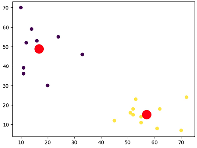
Figure 6.7: Results of k-means clustering
Note that the bigger dots in the plot are the centroids as determined by the k-means algorithm.
Limitation of k-means clustering
The k-means algorithm is designed to be a simple and fast algorithm. Because of the intentional simplicity of its design, it comes with the following limitations:
- The biggest limitation of k-means clustering is that the initial number of clusters has to be predetermined.
- The initial assignment of cluster centers is random. This means that each time the algorithm is run, it may give slightly different clusters.
- Each data point is assigned to only one cluster.
- k-means clustering is sensitive to outliers.
Now let us look into another unsupervised machine learning technique, hierarchical clustering.
Hierarchical clustering
K-means clustering uses a top-down approach because we start the algorithm from the most important data points, which are the cluster centers. There is an alternative approach of clustering where, instead of starting from the top, we start the algorithm from the bottom. The bottom, in this context, is each of the individual data points in the problem space. The solution is to keep on grouping similar data points together as it progresses up toward the cluster centers. This alternative bottom-up approach is used by hierarchical clustering algorithms and is discussed in this section.
Steps of hierarchical clustering
The following steps are involved in hierarchical clustering:
- We create a separate cluster for each data point in our problem space. If our problem space consists of 100 data points, then it will start with 100 clusters.
- We group only those points that are closest to each other.
- We check for the stop condition; if the stop condition is not yet satisfied, then we repeat step 2.
The resulting clustered structure is called a dendrogram.
In a dendrogram, the height of the vertical lines determines how close the items are, as shown in the following diagram:
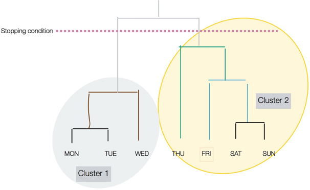
Figure 6.8: Hierarchical clustering
Note that the stop condition is shown as a dotted line in Figure 6.8.
Coding a hierarchical clustering algorithm
Let’s learn how we can code a hierarchical algorithm in Python:
- We will first import
AgglomerativeClusteringfrom thesklearn.clusterlibrary, along with thepandasandnumpypackages:from sklearn.cluster import AgglomerativeClustering import pandas as pd import numpy as np - Then we will create 20 data points in a two-dimensional problem space:
dataset = pd.DataFrame({ 'x': [11, 11, 20, 12, 16, 33, 24, 14, 45, 52, 51, 52, 55, 53, 55, 61, 62, 70, 72, 10], 'y': [39, 36, 30, 52, 53, 46, 55, 59, 12, 15, 16, 18, 11, 23, 14, 8, 18, 7, 24, 70] }) - Then we create the hierarchical cluster by specifying the hyperparameters. Note that a hyperparameter refers to a configuration parameter of a machine learning model that is set before the training process and influences the model’s behavior and performance. We use the
fit_predictfunction to actually process the algorithm:cluster = AgglomerativeClustering(n_clusters=2, affinity='euclidean', linkage='ward') cluster.fit_predict(dataset) - Now let’s look at the association of each data point to the two clusters that were created:
print(cluster.labels_)[0 0 0 0 0 0 0 0 1 1 1 1 1 1 1 1 1 1 1 0]
You can see that the cluster assignment for both hierarchical and k-means algorithms are very similar.
The hierarchical clustering algorithm has its distinct advantages and drawbacks when compared to the k-means clustering algorithm. One key advantage is that hierarchical clustering doesn’t require the number of clusters to be specified beforehand, unlike k-means.
This feature can be incredibly useful when the data doesn’t clearly suggest an optimal number of clusters. Hierarchical clustering also provides a dendrogram, a tree-like diagram that can be very insightful for visualizing the nested grouping of data and understanding the hierarchical structure.
However, hierarchical clustering has its drawbacks. It is computationally more intensive than k-means, making it less suitable for large datasets.
Understanding DBSCAN
Density-based spatial clustering of applications with noise (DBSCAN) is an unsupervised learning technique that performs clustering based on the density of the points. The basic idea is based on the assumption that if we group the data points in a crowded or high-density space together, we can achieve meaningful clustering.
This approach to clustering has two important implications:
- Using this idea, the algorithm is likely to cluster together the points that exist together regardless of their shape or pattern. This methodology helps in creating clusters of arbitrary shapes. By “shape,” we refer to the pattern or distribution of data points in a multi-dimensional space. This capability is advantageous because real-world data is often complex and non-linear, and the ability to create clusters of arbitrary shapes enables more accurate representation and understanding of such data.
- Unlike the k-means algorithm, we do not need to specify the number of clusters and the algorithm can detect the appropriate number of groupings in the data.
The following steps involve the DBSCAN algorithm:
- The algorithm establishes a neighborhood around each data point. The term “neighborhood,” in this context, refers to an area wherein other data points are examined for proximity to the point of interest. This is accomplished by counting the number of data points within a distance usually represented by a variable, eps. The eps variable, in this setting, specifies the maximum distance between two data points for them to be considered as being in the same neighborhood. The distance is by default determined by the Euclidean distance measure.
- Next, the algorithm quantifies the density of each data point. It uses a variable named
min_samples, which represents the minimum number of other data points that should be in the eps distance for a data point to be regarded as a “core instance.” In simpler terms, a core instance is a data point that is densely surrounded by other data points. Logically, regions with a high density of data points will have a greater number of these core instances. - Each of the identified neighborhoods identifies a cluster. It is crucial to note that the neighborhood surrounding one core instance (a data point that has a minimum number of other data points within its “eps” distance) may encompass additional core instances. This means that core instances are not exclusive to a single cluster but can contribute to the formation of multiple clusters due to their proximity to several data points. Consequently, the borders of these clusters may overlap, leading to a complex, interconnected cluster structure.
- Any data point that is not a core instance or does not lie in the neighborhood of a core instance is considered an outlier.
Let us see how we can create clusters using DBSCAN in Python.
Creating clusters using DBSCAN in Python
First, we will import the necessary functions from the sklearn library:
from sklearn.cluster import DBSCAN
from sklearn.datasets import make_moons
Let’s employ DBSCAN to tackle a slightly more complex clustering problem, one that involves structures known as “half-moons.” In this context, “half-moons” refer to two sets of data points that are shaped like crescents, with each moon representing a unique cluster. Such datasets pose a challenge because the clusters are not linearly separable, meaning a straight line cannot easily divide the different groups.
This is where the concept of “nonlinear class boundaries” comes into play. In contrast to linear class boundaries, which can be represented by a straight line, nonlinear class boundaries are more complex, often necessitating curved lines or multidimensional surfaces to accurately segregate different classes or clusters.
To generate this half-moon dataset, we can leverage the make_moons() function. This function creates a swirl pattern resembling two moons. The “noisiness” of the moon shapes and the number of samples to generate can be adjusted according to our needs.
Here’s what the generated dataset looks like:
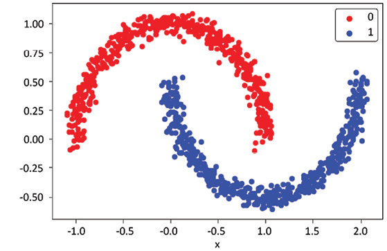
Figure 6.9: Data used for DBSCAN
In order to use DBSCAN, we need to provide the eps and min_samples parameters as discussed:
from matplotlib import pyplot
from pandas import DataFrame
# generate 2d classification dataset
X, y = make_moons (n_samples=1000, noise=0.05)
# scatter plot, dots colored by class value
df = DataFrame (dict (x=X[,0], y=X[,1], label=y))
colors = {0: 'red', 1:'blue'}
fig, ax = pyplot.subplots()
grouped = df.groupby('label')
for key, group in grouped:
    group.plot(ax=ax, kind='scatter', x='x', y='y', label=key, color-colors[key])
pyplot.show()
Evaluating the clusters
The objective of good quality clustering is that the data points that belong to the separate clusters should be differentiable. This implies the following:
- The data points that belong to the same cluster should be as similar as possible.
- Data points that belong to separate clusters should be as different as possible.
Human intuition can be used to evaluate the clustering results by visualizing the clusters, but there are mathematical methods that can quantify the quality of the clusters. They not only measure the tightness of each cluster (cohesion) and the separation between different clusters but also offer a numerical, hence objective, way to assess the quality of clustering. Silhouette analysis is one such technique that compares the tightness and separation in the clusters created by the k-means algorithm. It’s a metric that quantifies the degree of cohesion and separation in clusters. While this technique has been mentioned in the context of k-means, it is in fact generalizable and can be applied to evaluate the results of any clustering algorithm, not just k-means.
Silhouette analysis assigns a score, known as the Silhouette coefficient, to each data point in the range of 0 to 1. It essentially measures how close each data point in one cluster is to the points in the neighboring clusters.
Application of clustering
Clustering is used wherever we need to discover the underlying patterns in datasets.
In government use cases, clustering can be used for the following:
- Crime-hotspot analysis: Clustering is applied to geolocation data, incident reports, and other related features. It aids in identifying areas with high incidences of crime, enabling law enforcement agencies to optimize patrol routes and deploy resources more effectively.
- Demographic social analysis: Clustering can analyze demographic data such as age, income, education, and occupation. This aids in understanding the socioeconomic composition of different regions, informing public policy and social service provision.
In market research, clustering can be used for the following:
- Market segmentation: By clustering consumer data including spending habits, product preferences, and lifestyle indicators, businesses can identify distinct market segments. This allows for tailored product development and marketing approaches.
- Targeted advertisements: Clustering helps analyze customer online behavior, including browsing patterns, click-through rates, and purchase history. This enables companies to create personalized advertisements for each customer cluster, enhancing engagement and conversion rates.
- Customer categorization: Through clustering, businesses can categorize customers based on their interaction with products or services, their feedback, and their loyalty. This aids in understanding customer behavior, predicting trends, and developing retention strategies.
Principal component analysis (PCA) is also used for generally exploring the data and removing noise from real-time data, such as stock-market trading. In this context, “noise” refers to random or irregular fluctuations that may obscure underlying patterns or trends in the data. PCA helps in filtering out these erratic fluctuations, allowing for clearer data analysis and interpretation.
Dimensionality reduction
Each feature in our data corresponds to a dimension in our problem space. Minimizing the number of features to make our problem space simpler is called dimensionality reduction. It can be done in one of the following two ways:
- Feature selection: Selecting a set of features that are important in the context of the problem we are trying to solve
- Feature aggregation: Combining two or more features to reduce dimensions using one of the following algorithms:
Let’s look deeper at one of the popular dimensionality reduction algorithms, namely PCA, in more detail.
Principal component analysis
PCA is a method in unsupervised machine learning that is typically employed to reduce the dimensionality of datasets through a process known as linear transformation. In simpler terms, it’s a way of simplifying data by focusing on its most important parts, which are identified based on their variance.
Consider a graphical representation of a dataset, where each data point is plotted on a multi-dimensional space. PCA helps identify the principal components, which are the directions where the data varies the most. In Figure 6.10, we see two of these, PC1 and PC2. These principal components illustrate the overall “shape” of the distribution of data points.
Each principal component corresponds to a new, lesser dimension that captures as much information as possible. In a practical sense, these principal components can be viewed as summary indicators of the original data, making the data more manageable and easier to analyze. For instance, in a large dataset concerning customer behavior, PCA can help us identify the key driving factors (principal components) that define the majority of customer behaviors.
Determining the coefficients for these principal components involves calculating the eigenvectors and eigenvalues of the data covariance matrix, which is a topic we’ll delve into more deeply in a later section. These coefficients serve as weights for each original feature in the new component space, defining how each feature contributes to the principal component.
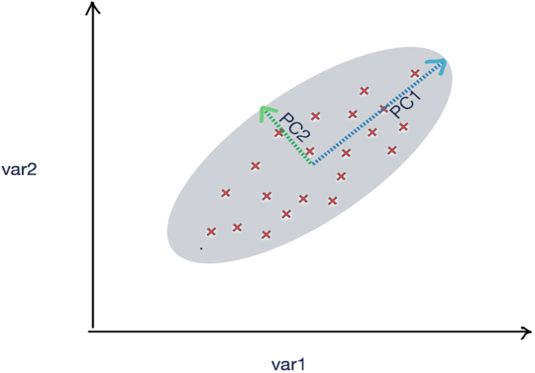
Figure 6.10: Principle component analysis
To elaborate further, imagine you have a dataset containing various aspects of a country’s economy, such as GDP, employment rates, inflation, and more. The data is vast and multi-dimensional. Here, PCA would allow you to reduce these multiple dimensions into two principal components, PC1 and PC2. These components would encapsulate the most crucial information while discarding noise or less important details.
The resulting graph, with PC1 and PC2 as axes, would give you an easier-to-interpret visual representation of the economic data, with each point representing an economy’s status based on its combination of GDP, employment rates, and other factors.
This makes PCA an invaluable tool for simplifying and interpreting high-dimensional data.
Let’s consider the following code:
from sklearn.decomposition import PCA
import pandas as pd
url = "https://storage.googleapis.com/neurals/data/iris.csv"
iris = pd.read_csv(url)
iris
X = iris.drop('Species', axis=1)
pca = PCA(n_components=4)
pca.fit(X)
   Sepal.Length   Sepal.Width    Petal.Length    Petal.Width    Species
0    5.1    3.5    1.4    0.2    setosa
1    4.9    3.0    1.4    0.2    setosa
2    4.7    3.2    1.3    0.2    setosa
3    4.6    3.1    1.5    0.2    setosa
4    5.0    3.6    1.4    0.2    setosa
...    ...    ...    ...    ...    ...
145    6.7    3.0    5.2    2.3    virginica
146    6.3    2.5    5.0    1.9    virginica
147    6.5    3.0    5.2    2.0    virginica
148    6.2    3.4    5.4    2.3    virginica
149    5.9    3.0    5.1    1.8    virginica
X = iris.drop('Species', axis=1)
pca = PCA(n_components=4)
pca.fit(X)
PCA(n_components=4)
Now let’s print the coefficients of our PCA model:
pca_df=(pd.DataFrame(pca.components_,columns=X.columns))
pca_df
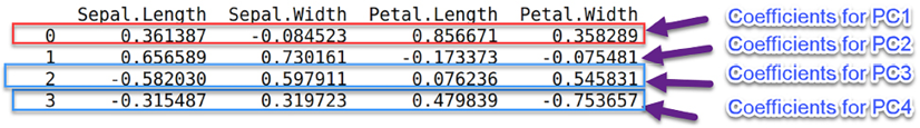
Figure 6.11: Diagram highlighting coefficients of the PCA model
Note that the original DataFrame has four features: Sepal.Length, Sepal.Width, Petal.Length, and Petal.Width. The preceding DataFrame specifies the coefficients of the four principal components, PC1, PC2, PC3, and PC4—for example, the first row specifies the coefficients of PC1 that can be used to replace the original four variables.
It is important to note here that the number of principal components (in this case, four: PC1, PC2, PC3, and PC4) does not necessarily need to be two as in our previous economy example. The number of principal components is a choice we make based on the level of complexity we are willing to handle in our data. The more principal components we choose, the more of the original data’s variance we can retain, at the cost of increased complexity.
Based on these coefficients, we can calculate the PCA components for our input DataFrame X:
X['PC1'] = X['Sepal.Length']* pca_df['Sepal.Length'][0] + X['Sepal.Width']* pca_df['Sepal.Width'][0]+ X['Petal.Length']* pca_df['Petal.Length'][0]+X['Petal.Width']* pca_df['Petal.Width'][0]
X['PC2'] = X['Sepal.Length']* pca_df['Sepal.Length'][1] + X['Sepal.Width']* pca_df['Sepal.Width'][1]+ X['Petal.Length']* pca_df['Petal.Length'][1]+X['Petal.Width']* pca_df['Petal.Width'][1]
X['PC3'] = X['Sepal.Length']* pca_df['Sepal.Length'][2] + X['Sepal.Width']* pca_df['Sepal.Width'][2]+ X['Petal.Length']* pca_df['Petal.Length'][2]+X['Petal.Width']* pca_df['Petal.Width'][2]
X['PC4'] = X['Sepal.Length']* pca_df['Sepal.Length'][3] + X['Sepal.Width']* pca_df['Sepal.Width'][3]+ X['Petal.Length']* pca_df['Petal.Length'][3]+X['Petal.Width']* pca_df['Petal.Width'][3]
X
Now let’s print X after the calculation of the PCA components:
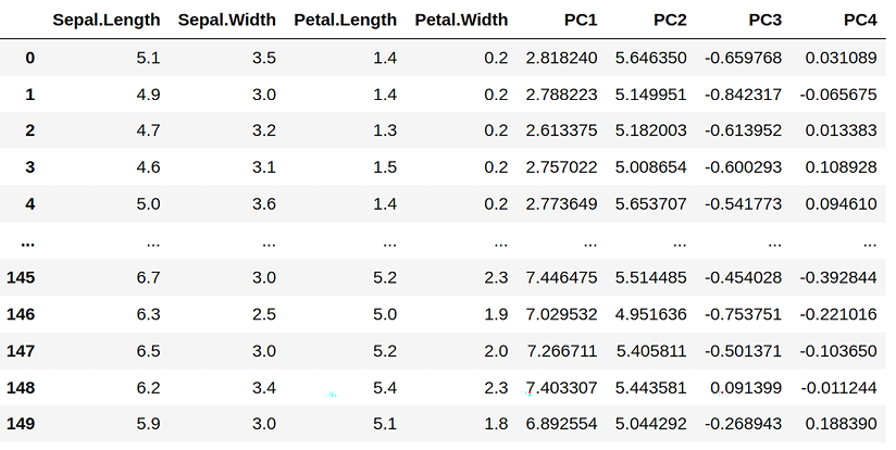
Figure 6.12: Printed calculation of the PCA components
Now let’s print the variance ratio and try to understand the implications of using PCA:
print(pca.explained_variance_ratio_)
[0.92461872 0.05306648 0.01710261 0.00521218]
The variance ratio indicates the following:
- If we choose to replace the original four features with PC1, then we will be able to capture about 92.3% of the variance of the original variables. We will introduce some approximations by not capturing 100% of the variance of the original four features.
- If we choose to replace the original four features with PC1 and PC2, then we will capture an additional 5.3% of the variance of the original variables.
- If we choose to replace the original four features with PC1, PC2, and PC3, then we will now capture a further 0.017% of the variance of the original variables.
- If we choose to replace the original four features with four principal components, then we will capture 100% of the variance of the original variables (92.4 + 0.053 + 0.017 + 0.005), but replacing four original features with four principal components is meaningless as we did not reduce the dimensions at all and achieved nothing. Next, let us look into the limitations of PCA.
Limitations of PCA
Despite its many benefits, PCA is not without its limitations, as outlined below:
- First, PCA is most effective when dealing with continuous variables, as its underlying mathematical principles are designed to handle numerical data. It struggles with categorical variables, which are common in datasets that include attributes like gender, nationality, or product type. For instance, if you were analyzing a survey dataset with a mixture of numerical responses (such as age or income) and categorical responses (such as preferences or options selected), PCA wouldn’t be suitable for the categorical data.
- Furthermore, PCA operates by creating an approximation of the original high-dimensional data in a lower-dimensional space. While this reduction simplifies data handling and processing, it comes with a cost: a loss of some information. This is a trade-off that needs to be carefully evaluated in each use case. For instance, if you’re dealing with a biomedical dataset where each feature represents a specific genetic marker, using PCA could risk losing critical information that might be relevant for a particular disease’s diagnosis or treatment.
So, while PCA is a powerful tool for dimensionality reduction, particularly when dealing with large datasets with many interrelated numerical variables, its limitations need to be considered carefully to ensure it is the right choice for a given application.
Association rules mining
Patterns in a particular dataset are the treasure that needs to be discovered, understood, and mined for the information they contain. There is an important set of algorithms that tries to focus on pattern analysis in a given dataset. One of the more popular algorithms in this class of algorithm is called the association rules mining algorithm, which provides us with the following capabilities:
- The ability to measure the frequency of a pattern
- The ability to establish cause-and-effect relationships among the patterns
- The ability to quantify the usefulness of patterns by comparing their accuracy to random guessing
Now we will look at some examples of association rules mining.
Examples of use
Association rules mining is used when we are trying to investigate the cause-and-effect relationships between different variables of a dataset. The following are example questions that it can help to answer:
- Which values of humidity, cloud cover, and temperature can lead to rain tomorrow?
- What type of insurance claim can indicate fraud?
- What combinations of medicine may lead to complications for patients?
As these examples illustrate, association rules mining has a broad array of applications spanning from business intelligence to healthcare and environmental studies. This algorithm is a potent instrument in the data scientist’s toolkit, capable of translating complex patterns into actionable insights across diverse fields.
Market basket analysis
Recommendation engines, an important topic extensively discussed in Chapter 12, Recommendation Engines of this book, are powerful tools for personalizing user experiences. However, there’s a simpler, yet effective method for generating recommendations known as market basket analysis. Market basket analysis operates based on information about which items are frequently bought together. Unlike more sophisticated recommendation engines, this method does not take into account additional user-specific data or individual item preferences expressed by the user. It’s essential to draw a distinction here. Recommendation engines typically create personalized suggestions based on the user’s past behavior, preferences, and a wealth of other user-specific information. In contrast, market basket analysis solely focuses on the combinations of items purchased, regardless of who bought them or their individual preferences.
One of the key advantages of market basket analysis is the relative ease of data collection. Gathering comprehensive user preference data can be complex and time-consuming. However, data regarding items bought together can often be simply extracted from transaction records, making market basket analysis a convenient starting point for businesses venturing into the domain of recommendations. For example, this kind of data is generated when we shop at Walmart, and no special technique is required to get the data.
By “special techniques,” we refer to additional steps such as conducting user surveys, employing tracking cookies, or building complex data pipelines. Instead, the data is readily available as a byproduct of the sales process. This data, when collected over a period of time, is called transnational data.
When association rules analysis is applied to transnational datasets of the shopping carts being used in convenience stores, supermarkets, and fast-food chains, it is called market basket analysis. It measures the conditional probability of buying a set of items together, which helps to answer the following questions:
- What is the optimal placement of items on the shelf?
- How should the items appear in the marketing catalog?
- What should be recommended, based on a user’s buying patterns?
As market basket analysis can estimate how items are related to each other, it is often used for mass-market retail, such as supermarkets, convenience stores, drug stores, and fast-food chains. The advantage of market basket analysis is that the results are almost self-explanatory, which means that they are easily understood by business users.
Let’s look at a typical superstore. All the unique items that are available in the store can be represented by a set, ![]() = {item1, item2, . . . , itemm}. So, if that superstore is selling 500 distinct items, then
= {item1, item2, . . . , itemm}. So, if that superstore is selling 500 distinct items, then ![]() will be a set of size 500.
will be a set of size 500.
People will buy items from this store. Each time someone buys an item and pays at the counter, it is added to a set of the items in a particular transaction, called an itemset. In a given period of time, the transactions are grouped together in a set represented by ![]() , where
, where ![]() = {t1, t2, . . . , tn}.
= {t1, t2, . . . , tn}.
Let’s look at the following simple transaction data consisting of only four transactions. These transactions are summarized in the following table:
|
t1 |
Wickets, pads |
|
t2 |
Bats, wickets, pads, helmets |
|
t3 |
Helmets, balls |
|
t4 |
Bats, pads, helmets |
Let’s look at this example in more detail:
![]() = {bat, wickets, pads, helmets, balls}, which represents all the unique items available at the store.
= {bat, wickets, pads, helmets, balls}, which represents all the unique items available at the store.
Let’s consider one of the transactions, t3, from ![]() . Note that items bought in t3 can be represented in the itemset t3= {helmets, balls}, signifying that a customer bought two items. This set is termed an itemset because it encompasses all items purchased in a single transaction. Given that there are two items in this itemset, the size of itemset t3 is said to be two. This terminology allows us to classify and analyze purchasing patterns more effectively.
. Note that items bought in t3 can be represented in the itemset t3= {helmets, balls}, signifying that a customer bought two items. This set is termed an itemset because it encompasses all items purchased in a single transaction. Given that there are two items in this itemset, the size of itemset t3 is said to be two. This terminology allows us to classify and analyze purchasing patterns more effectively.
Association rules mining
An association rule mathematically describes the relationship items involved in various transactions. It does this by investigating the relationship between two item sets in the form X ⇒ Y, where ![]() ,
, ![]() . In addition, X and Y are non overlapping item sets; which means that
. In addition, X and Y are non overlapping item sets; which means that ![]() .
.
An association rule could be described in the following form:
{helmets, balls} ⇒ {bike}
Here, {helmets, balls} is X, and {bike} is Y.
Let us look into the different types of association rules.
Types of rules
Running associative analysis algorithms will typically result in the generation of a large number of rules from a transaction dataset. Most of them are useless. To pick rules that can result in useful information, we can classify them as one of the following three types:
- Trivial
- Inexplicable
- Actionable
Let’s look at each of these types in more detail.
Trivial rules
Among the large numbers of rules generated, many that are derived will be useless as they summarize common knowledge about the business. They are called trivial rules. Even if confidence in the trivial rules is high, they remain useless and cannot be used for any data-driven decision-making. Note that, here, “confidence” refers to a metric used in association analysis that quantifies the probability of occurrence of a particular event (let’s say B), given that another event (A) has already occurred. We can safely ignore all trivial rules.
The following are examples of trivial rules:
- Anyone who jumps from a high-rise building is likely to die.
- Working harder leads to better scores in exams.
- The sales of heaters increase as the temperature drops.
- Driving a car over the speed limit on a highway leads to a higher chance of an accident.
Inexplicable rules
Among the rules that are generated after running the association rules algorithm, the ones that have no obvious explanation are the trickiest to use. Note that a rule can only be useful if it can help us discover and understand a new pattern that is expected to eventually lead toward a certain course of action. If that is not the case, and we cannot explain why event X led to event Y, then it is an inexplicable rule, because it’s just a mathematical formula that ends up exploring the pointless relationship between two events that are unrelated and independent.
The following are examples of inexplicable rules:
- People who wear red shirts tend to score better in exams.
- Green bicycles are more likely to be stolen.
- People who buy pickles end up buying diapers as well.
Actionable rules
Actionable rules are the golden rules we are looking for. They are understood by the business and lead to insights. They can help us to discover the possible causes of an event when presented to an audience familiar with the business domain—for example, actionable rules may suggest the best placement in a store for a particular product based on current buying patterns. They may also suggest which items to place together to maximize their chances of selling as users tend to buy them together.
The following are examples of actionable rules and their corresponding actions:
- Rule 1: Displaying ads to users’ social media accounts results in a higher likelihood of sales.
- Actionable item: Suggests alternative ways of advertising a product.
- Rule 2: Creating more price points increases the likelihood of sales.
- Actionable item: One item may be advertised in a sale, while the price of another item is raised.
Let us now look into how to rank the rules.
Ranking rules
Association rules are measured in three ways:
- Support (frequency) of items
- Confidence
- Lift
Let’s look at them in more detail.
Support
The support measure is a number that quantifies how frequent the pattern we are looking for is in our dataset. It is calculated by first counting the number of occurrences of our pattern of interest and then dividing it by the total number of all the transactions.
Let’s look at the following formula for a particular itemseta:
numItemseta = Number of transactions that contain itemseta
numtotal = Total number of transactions
By just looking at the support, we can get an idea of how rare the occurrence of a pattern is. Low support means that we are looking for a rare event. In a business context, these rare events could be exceptional cases or outliers, which might carry significant implications. For instance, they may denote unusual customer behavior or a unique sales trend, potentially marking opportunities or threats that require strategic attention.
For example, if itemseta = {helmet, ball} appears in two transactions out of six, then support (itemseta) = 2/6 = 0.33.
Confidence
The confidence is a number that quantifies how strongly we can associate the left side (X) with the right side (Y) by calculating the conditional probability. It calculates the probability that event X will lead toward event Y, given that event X occurred.
Mathematically, consider the rule X ⇒ Y.
The confidence of this rule is represented as confidence(X ⇒ Y ) and is measured as follows:
![]()
Let’s look at an example. Consider the following rule:
{helmet, ball} ⇒ {wickets}
The confidence of this rule is calculated by the following formula:
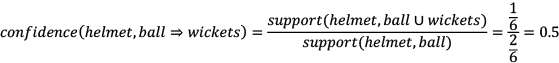
This means that if someone has {helmet, balls} in the basket, then there is a 0.5 or 50% probability that they will also have wickets to go with it.
Lift
Another way to estimate the quality of a rule is by calculating the lift. The lift returns a number that quantifies how much improvement has been achieved by a rule at predicting the result compared to just assuming the result at the right-hand side of the equation. “Improvement” refers to the degree of enhancement or betterment achieved by a rule in its ability to predict an outcome compared to a baseline or default approach. It represents the extent to which the rule provides more accurate or insightful predictions than what would be obtained by making assumptions solely based on the right-hand side of the equation. If the X and Y itemsets are independent, then the lift is calculated as follows:
![]()
Algorithms for association analysis
In this section, we will explore the following two algorithms that can be used for association analysis:
- Apriori algorithm: Proposed by Agrawal, R. and Srikant in 1994.
- FP-growth algorithm: An improvement suggested by Han et al. in 2001.
Let’s look at each of these algorithms.
Apriori algorithm
The apriori algorithm is an iterative and multiphase algorithm used to generate association rules. It is based on a generation-and-test approach.
Before executing the apriori algorithm, we need to define two variables: supportthreshold and Confidencethreshold.
The algorithm consists of the following two phases:
- Candidate-generation phase: It generates the candidate itemsets, which contain sets of all itemsets above supportthreshold.
- Filter phase: It filters out all rules below the expected confidencethreshold.
After filtering, the resulting rules are the answer.
Limitations of the apriori algorithm
The major bottleneck in the apriori algorithm is the generation of candidate rules in Phase 1—for example, ![]() = {item1, item2, . . . , itemm} can produce 2m possible itemsets. Because of its multiphase design, it first generates these itemsets and then works toward finding the frequent itemsets. This limitation is a huge performance bottleneck and makes the apriori algorithm unsuitable for larger items because it generates too many itemsets before it can find frequent items, which will have an effect on the time taken.
= {item1, item2, . . . , itemm} can produce 2m possible itemsets. Because of its multiphase design, it first generates these itemsets and then works toward finding the frequent itemsets. This limitation is a huge performance bottleneck and makes the apriori algorithm unsuitable for larger items because it generates too many itemsets before it can find frequent items, which will have an effect on the time taken.
Let us now look into the FP-growth algorithm.
FP-growth algorithm
The frequent pattern growth (FP-growth) algorithm is an improvement on the apriori algorithm. It starts by showing the frequent transaction FP-tree, which is an ordered tree. It consists of two steps:
- Populating the FP-tree
- Mining frequent patterns
Let’s look at these steps one by one.
Populating the FP-tree
Let’s consider the transaction data shown in the following table. Let’s first represent it as a sparse matrix:
|
ID |
Bat |
Wickets |
Pads |
Helmet |
Ball |
|
1 |
0 |
1 |
1 |
0 |
0 |
|
2 |
1 |
1 |
1 |
1 |
0 |
|
3 |
0 |
0 |
0 |
1 |
1 |
|
4 |
1 |
0 |
1 |
1 |
0 |
Let’s calculate the frequency of each item and sort them in descending order by frequency:
|
Item |
Frequency |
|
pads |
3 |
|
helmets |
3 |
|
bats |
2 |
|
wickets |
2 |
|
balls |
1 |
Now let’s rearrange the transaction-based data based on the frequency:
|
ID |
Original Items |
Reordered Items |
|
t1 |
Wickets, pads |
Pads, wickets |
|
t2 |
Bat, wickets, pads, helmets |
Helmets, pads, wickets, bats |
|
t3 |
Helmets, balls |
Helmets, balls |
|
t4 |
Bats, pads, helmets |
Helmets, pads, bats |
To build the FP-tree, let’s start with the first branch of the FP-tree. The FP-tree starts with a Null as the root. To build the tree, we can represent each item with a node, as shown in the following diagram (the tree representation of t1 is shown here).
Note that the label of each node is the name of the item and its frequency is appended after the colon. Also, note that the pads item has a frequency of 1:
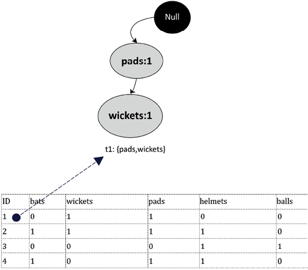
Figure 6.13: FP-tree representation first transaction
Using the same pattern, let’s draw all four transactions, resulting in the full FP-tree. The FP-tree has four leaf nodes, each representing the itemset associated with the four transactions. Note that we need to count the frequencies of each item and need to increase it when used multiple times—for example, when adding t2 to the FP-tree, the frequency of helmets was increased to two. Similarly, while adding t4, it was increased again to three.
The resulting tree is shown in the following diagram:
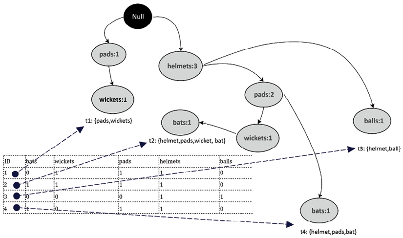
Figure 6.14: FP-tree representing all transactions
Note that the FP-tree generated in the preceding diagram is an ordered tree. This leads us to the second phase of the FP-growth tree: mining frequent patterns.
Mining frequent patterns
The second phase of the FP-growth process is focused on mining the frequent patterns from the FP-tree. Creating an ordered tree is a deliberate move, aimed at producing a data structure that facilitates effortless navigation when hunting for these frequent patterns.
We start this journey from a leaf node, which is an end node, and traverse upward. As an example, let’s begin from one of the leaf node items, “bats.” Our next task is to figure out the conditional pattern base for “bat.” The term “conditional pattern base” might sound complex, but it’s merely a collection of all paths that lead from a specific leaf node item to the root of the tree. For our item “bat,” the conditional pattern base will comprise all paths from the “bat” node to the top of the tree. At this point, understanding the difference between ordered and unordered trees becomes critical. In an ordered tree such as the FP-tree, the items adhere to a fixed order, simplifying the pattern mining process. An unordered tree doesn’t provide this structured setup, which could make discovering frequent patterns more challenging.
When computing the conditional pattern base for “bats,” we are essentially mapping out all paths from the “bats” node to the root. These paths reveal the items that often co-occur with “bat” in transactions. In essence, we’re following the “branch” of the tree associated with “bat” to understand its relationships with other items. This visual illustration clarifies where we get this information from and how the FP-tree assists in illuminating frequent patterns in transaction data. The conditional pattern base for bat will be as follows:
|
Wicket: 1 |
Pads: 1 |
Helmet: 1 |
|
Pad: 1 |
Helmet: 1 |
The frequent pattern for bat will be as follows:
{wicket, pads, helmet}: bat
{pad, helmet}: bat
Code for using FP-growth
Let’s see how we can generate association rules using the FP-growth algorithm in Python. For this, we will be using the pyfpgrowth package. First, if we have never used pyfpgrowth before, let’s install it first:
!pip install pyfpgrowth
Then, let’s import the packages that we need to use to implement this algorithm:
import pandas as pd
import numpy as np
import pyfpgrowth as fp
Now we will create the input data in the form of transactionSet:
dict1 = {
    'id':[0,1,2,3],
    'items':[["wickets","pads"],
    ["bat","wickets","pads","helmet"],
    ["helmet","pad"],
    ["bat","pads","helmet"]]
 }
transactionSet = pd.DataFrame(dict1)
    id    items
0    0    [wickets, pads]
1    1    [bat, wickets, pads, helmet]
2    2    [helmet, pad]
3    3    [bat, pads, helmet]
Once the input data is generated, we will generate patterns that will be based on the parameters that we passed in find_frequent_patterns(). Note that the second parameter passed to this function is the minimum support, which is 1 in this case:
patterns = fp.find_frequent_patterns(transactionSet['items'],1)
The patterns have been generated. Now let’s print the patterns. The patterns list the combinations of items with their supports:
patterns
{('pad',): 1,
 ('helmet', 'pad'): 1,
 ('wickets',): 2,
 ('pads', 'wickets'): 2,
 ('bat', 'wickets'): 1,
 ('helmet', 'wickets'): 1,
 ('bat', 'pads', 'wickets'): 1,
 ('helmet', 'pads', 'wickets'): 1,
 ('bat', 'helmet', 'wickets'): 1,
 ('bat', 'helmet', 'pads', 'wickets'): 1,
 ('bat',): 2,
 ('bat', 'helmet'): 2,
 ('bat', 'pads'): 2,
 ('bat', 'helmet', 'pads'): 2,
 ('pads',): 3,
 ('helmet',): 3,
 ('helmet', 'pads'): 2}
Now let’s generate the rules:
rules = fp.generate_association_rules(patterns,0.3)
rules
{('helmet',): (('pads',), 0.6666666666666666),
 ('pad',): (('helmet',), 1.0),
 ('pads',): (('helmet',), 0.6666666666666666),
 ('wickets',): (('bat', 'helmet', 'pads'), 0.5),
 ('bat',): (('helmet', 'pads'), 1.0),
 ('bat', 'pads'): (('helmet',), 1.0),
 ('bat', 'wickets'): (('helmet', 'pads'), 1.0),
 ('pads', 'wickets'): (('bat', 'helmet'), 0.5),
 ('helmet', 'pads'): (('bat',), 1.0),
 ('helmet', 'wickets'): (('bat', 'pads'), 1.0),
 ('bat', 'helmet'): (('pads',), 1.0),
 ('bat', 'helmet', 'pads'): (('wickets',), 0.5),
 ('bat', 'helmet', 'wickets'): (('pads',), 1.0),
 ('bat', 'pads', 'wickets'): (('helmet',), 1.0),
 ('helmet', 'pads', 'wickets'): (('bat',), 1.0)}
Each rule has a left-hand side and a right-hand side, separated by a colon (:). It also gives us the support of each of the rules in our input dataset.
Summary
In this chapter, we looked at various unsupervised machine learning techniques. We looked at the circumstances in which it is a good idea to try to reduce the dimensionality of the problem we are trying to solve and the different methods of doing this. We also studied the practical examples where unsupervised machine learning techniques can be very helpful, including market basket analysis.
In the next chapter, we will look at the various supervised learning techniques. We will start with linear regression and then we will look at more sophisticated supervised machine learning techniques, such as decision-tree-based algorithms, SVM, and XGBoost. We will also study the Naive Bayes algorithm, which is best suited for unstructured textual data.
Learn more on Discord
To join the Discord community for this book – where you can share feedback, ask questions to the author, and learn about new releases – follow the QR code below: