
Developing CSS3 in Practice: From Design to Deployment
In the previous two chapters, we talked a lot about the theory and concepts behind standards-based front-end web development. You learned why and how to create structured, semantically meaningful HTML5 markup. You also learned how .Cascading Style Sheets work, how web browsers display HTML content by default, and how to apply your own CSS rules to web pages. It’s finally time to bring all your new-found knowledge to bear on a real project and turn your bland, unstyled web page into a beautiful, professionally implemented CSS design.
Since the easiest way to learn CSS-based design techniques is arguably to simply dive right into them, we invite you to think about this chapter as though you were looking over our shoulders while we show how to implement this design in code. We’ll be carrying through the execution of an earlier example in this book: the Summer Smash 2012 registration form. Throughout this chapter, we’ll be making references to topics covered in the previous two chapters, so we strongly urge you to read those chapters before beginning this one.
The visual source: understanding design documents
In any website design process, there always comes a point at which the developer (that’s you!) needs to turn a visually presented layout into a real web page. The designs for websites are typically created in programs such as Adobe Photoshop. These files contain all the specific information about what a design looks like, including what fonts are used for each text element, the physical dimensions of all the items in the design, and the raw assets for each graphic.
As a front-end web developer, you are tasked with translating this design file into HTML and CSS to make your web page’s look and feel match the look and feel of the design document as closely as possible. This is easier said than done because design files aren’t constrained by the same limitations that web browsers are. Many times, design elements may need to be modified in some way, so that they are suitable for the web pages for which they’re destined. For this reason, it really pays off to be familiar with one of these image-editing applications. Such software is beyond the scope of this book, however, so you’ll be focusing solely on implementing a design in CSS in this chapter.
Diving into code: advanced CSS concepts applied
When developing any website design with CSS, you can follow some well-established best practices. Following these guidelines will make your life a lot easier, and they will ensure you end up with well-tested, standards-based code. One of the most important guidelines is to develop your style sheet in whatever browser most strictly adheres to the W3C’s published standards. Since we’re covering how to develop CSS3 now, we’ll be testing our markup in Google Chrome. Whenever we refer to “our web browser” for the time being, that’s the browser we mean. Although it’s a good idea to occasionally check your progress in other browsers, for the sake of clarity in this text, we’ll refrain from mentioning other browsers unless it adds to the discussion.
First things, first: Let’s set up the source code file. In Chapter 4, we developed a basic HTML5 template for the registration page of the Summer Smash website. We saved this template as a plain-text file named registration.html. The content of this file is as follows:
<!DOCTYPE html>
<html lang="en">
<head>
<meta charset="utf-8">
<title>Summer Smash 2010 Registration</title>
<link rel="stylesheet" href="css/style.css">
<script src="js/javascript.js"></script>
</head>
<body>
<div id="pagewrap">
<header>
<a href="/">
<h1>Summer Smash 2012</h1>
<p>This summer's most smashing event!</p>
</a>
</header>
<section id="main">
<section id="registration_form">
<form action="/registration/">
<fieldset>
<legend>Registrant Information</legend>
<ol>
<li class="formitem">
<label for="name">Registrant name:</label>
<input type="text" name="name" id="name" required autofocus />
</li>
<li class="formitem">
<label for="email">Email address:</label>
<input type="email" name="email" id="email" required />
</li>
<li class="formitem">
<label for="phone">Phone number:</label>
<input type="tel" name="phone" id="phone" />
</li>
<li class="formitem">
<label for="party">How many people do you have in your party (including yourself)?</label>
<input type="number" name="party" id="party" min="1" max="10" />
</li>
<li class="formitem">
<label for="dob">Your date of birth:</label>
<input type="date" name="dob" id="dob" />
</li>
</ol>
</fieldset>
<fieldset>
<legend>A few quick questions</legend>
<ol>
<li class="formitem">
Is this your first Summer Smash event?
<ul>
<li>
<input type="radio" name="yes_first" id="yes_first" value="1" />
<label for="yes_first">Yes, this is my first</label>
</li>
<li>
<input type="radio" name="no_first" id="no_first" value="0" />
<label for="no_first">No, I've been to one before</label>
</li>
</ul>
</li>
<li class="formitem">
<label for="how_hear">How did you hear about Summer Smash 2012?</label>
<input type="text" name="how_hear" id="how_hear" list="media">
<datalist id="media">
<option value="Google search">
<option value="Magazine ad">
<option value="A friend told me">
<option value="An enemy told me">
<option value="My dog told me">
<option value="My dead uncle Henry told me">
</datalist>
</li>
</ol>
</fieldset>
<input type="submit" value="Register now!" />
</form>
</section>
<aside>
<h2>Questions about whether Summer Smash is right for you?</h2>
<p>We're here to help! Our team of smashtastic smashers will shatter any doubt in your
mind. Why not give us a call, or send us an email?</p>
<ul>
<li>Call: 1-800-555-5555</li>
<li>Email: <a href="mailto:[email protected]">[email protected]</a></li>
</ul>
</aside>
</section>
<footer>
<p>Summer Smash 2012. A Barker and Lane Production.</p>
</footer>
</div>
</body>
</html>
Recall that we’ve already set up a few rules for this page from the last chapter. For example, we decided to apply a reset style sheet to our page to bring the baseline formatting of all elements across all web browsers to roughly the same point. This reset stylesheet will also provide some older browsers with the ability to handle some of the newer, HTML5 elements we’ve used in our page, even though those browsers don’t support HTML5. We also put in a few other rules while we were playing around in the last chapter, but they were just for the purpose of demonstration, so let’s remove those for now. Our starting CSS file will look like this:
/* RESET STYLES */
html, body, div, span, object, iframe,
h1, h2, h3, h4, h5, h6, p, blockquote, pre,
abbr, address, cite, code,
del, dfn, em, img, ins, kbd, q, samp,
small, strong, sub, sup, var,
b, i,
dl, dt, dd, ol, ul, li,
fieldset, form, label, legend,
table, caption, tbody, tfoot, thead, tr, th, td,
article, aside, canvas, details, figcaption, figure,
footer, header, hgroup, menu, nav, section, summary,
time, mark, audio, video {
margin:0;
padding:0;
border:0;
outline:0;
font-size:100%;
vertical-align:baseline;
background:transparent;
}
body {
line-height:1;
}
article,aside,details,figcaption,figure,
footer,header,hgroup,menu,nav,section {
display:block;
}
nav ul {
list-style:none;
}
blockquote, q {
quotes:none;
}
blockquote:before, blockquote:after,
q:before, q:after {
content:";
content:none;
}
a {
margin:0;
padding:0;
font-size:100%;
vertical-align:baseline;
background:transparent;
}
/* change colours to suit your needs */
ins {
background-color:#ff9;
color:#000;
text-decoration:none;
}
/* change colours to suit your needs */
mark {
background-color:#ff9;
color:#000;
font-style:italic;
font-weight:bold;
}
del {
text-decoration: line-through;
}
abbr[title], dfn[title] {
border-bottom:1px dotted;
cursor:help;
}
table {
border-collapse:collapse;
border-spacing:0;
}
/* change border colour to suit your needs */
hr {
display:block;
height:1px;
border:0;
border-top:1px solid #cccccc;
margin:1em 0;
padding:0;
}
input, select {
vertical-align:middle;
}
/* END RESET */
Now that we’ve made a change to the CSS rules in our style sheet (by removing the extra styles), we can view the change by reloading the registration.html page in our web browser. Each time we save a new change, we typically check to see whether it got applied properly by reloading the web page in the browser. We continue by saving another change, and we repeat the process all over again. We simply lather, rinse, and repeat until the entire design is complete.
This is a good start so far. Let’s begin defining the CSS rules specific to this design.
Page structure: laying out the page
Let’s start by getting things to show up where we want. For the most part, we’re going to be laying out our block-level elements here. Right now, everything is stacked on top of each other, and crammed up into the top-right corner of our page. Most pages these days center their content within the viewport—that seems like a good place to start. We put in a special <div> just so that we can target all of the content on our page:
div#pagewrap {
width: 80%;
margin: 4em auto;
}
We did a couple of things in the preceding code. We set the width of the page contents to occupy 80% of the browser window. Using “80%” rather than “800px” is an important step in coding our page so that it will scale for a range of different devices. We plan on making the Summer Slam registration form work on everything from an iPhone or Android device, through the range of tablet devices, and into desktop computers with (potentially) extremely large and extremely detailed screens.
We’ll talk more about the specifics of this approach in the next chapter on responsive design; but for the time being, we’ll try to use relative or proportional units as much as possible. Moving along, though, let’s take care of our other block-level elements:
header {
padding: 1em 0 2em;
}
section#main {
float: left;
}
section#registration_form {
width: 74%;
float: left;
padding: 0 1% 0 0;
}
aside {
width: 25%;
float: right;
}
footer {
clear: both;
padding: 2em 3%;
}
Let’s take a look at what we’ve done here: for our header, we’ve simply applied a little padding to the top and the bottom of the element to give us some space between its contents and the element below. Once we start applying some background colors and graphics to things, padding becomes a lot more important.
On the #main section, we’ve applied a float. This is actually there so that this element will contain the two child-floated elements, #registration_form and <aside>. If we didn’t float this section, then our footer would creep up and find its way into the #main section.
We want our registration form and our contact information to appear beside each other, so we’ve set our registration form to be 74% wide (with 1% right-side padding) and our aside to be 25% wide. At first glance, this might look confusing: didn’t we set div#pagewrap to be 80% wide? Yes, we did. However, when you’re defining a percentage width, you define it as a percentage of the parent element, and the parent is always 100% wide when you’re inside it.
We’ve floated both the #registration_form and the <aside> to opposite sides, so that they won’t interfere with one another. Finally, we’ve cleared the floats with the footer and applied a bit of padding to it.
OK, our design still isn’t at the point where anyone would accuse it of being beautiful, as shown in Figure 6-1, but at least we’re making some progress. Let’s keep moving and adding style information in. We might come back and revisit some of these rules, but for now we’ve got the basic layout we want.

Figure 6-1. We have the basics of our page laid out, but we can go much further in the style department.
We’ll start at the top of the page and work our way down. Our header right now is pretty plain and not very interesting to look at. It’s really just a couple of links, both with the same font, size, and color. We can do better than that! First up, let’s get those titles looking like titles instead of like text links:
header {
background-color: #333;
}
header a {
text-decoration: none;
color: white;
text-align: center;
}
header h1 {
font-size: 3em;
font-family: Helvetica, Arial, sans-serif;
}
header p {
font-size: 1.2em;
font-family: Helvetica, Arial, sans-serif;
}
OK, again we’re making progress. We gave the header a dark gray background color, removed the underlines from the links, turned them white, and centered them.
We also increased the font size of both our header and our tag line, and changed the font to Helvetica. Figure 6-2 shows the progress we’ve made.
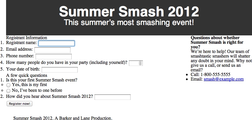
Figure 6-2. Our stylized header without our smashing font selection
Helvetica just doesn’t scream “Summer Smash” to us, though; we need a slightly more creative font for this role. Unfortunately, we can’t really rely on folks to have a copy of our favorite font installed on their machine locally, so we can’t just specify any font we choose. In the old days, this presented a real problem, and designers would frequently turn to displaying type using an image. But that isn’t a very semantic way to do things, is it? There’s got to be a better way!
Thankfully, there is a better way to handle fonts. With modern web browsers, you can specify alternate font faces and provide the fonts to your end user (keeping in mind copyright restrictions on some fonts!). A few sites have popped up online to help with this process, including one from a well-known search giant, Google. At the time of writing, Google has more than 400 fonts on its “Google Web Fonts” website, which allows you to select a font, link to a special style sheet Google hosts for you, and then use that font on your site.
It’s a bit hard to describe what this looks like, so let’s just get right to the code. First, let’s head over to www.google.com/webfonts and select something that will fit the bill for our Summer Smash needs. “Frijole” looks like a contender, so let’s grab that one. Google makes it easy for us from this point; all we do is copy and paste some code it provides for us.
In registration.html, we replace the <head> </head> section with this:
<head>
<meta charset="utf-8">
<title>Summer Smash 2010 Registration</title>
<link href="http://fonts.googleapis.com/css?family=Frijole" rel="stylesheet">
<link rel="stylesheet" href="css/style.css">
<script src="/js/javascript.js"></script>
</head>
Next, we make a couple of tweaks to our CSS styles for the header:
header h1 {
font-size: 3.5em;
font-family: "Frijole", Arial, sans-serif;
color: #eee;
}
header p {
font-size: 1.2em;
font-family: "Frijole", Arial, sans-serif;
color: #ccc;
}
Every font is a little bit different, so we tweaked the size of the <h1> element after settling on a font face. For example, using pure white was a little bit blinding with such a bold font, so we made both the <h1> and the <p> a light gray.
The font-family rule is where the magic happens. We linked in a style sheet directly from Google in the <head> of our document that describes what the Frijole font is; this style sheet provides the necessary files to users who don’t have that font installed on their computer. We can then use font-family to build a stack of fonts that are acceptable here. Check out Figure 6-3 for a far more smashing experience.

Figure 6-3. The Frijole font just screams “Smashing”!
While we’re at it, let’s change the default font for the page over to Verdana (instead of the default Times/Times New Roman that most browsers use):
div#pagewrap {
width: 80%;
margin: 4em auto;
font-family: Verdana, Arial, sans-serif;
}
We’ve got everything roughly laid out now, but let’s put a little space between the elements and make things look a bit nicer. Starting with the header, the page title (<h1>) and the tag line (<p>) look a little claustrophobic. Let’s put a little space between them and also space out the individual characters in the tag line—they look a little mashed together.
header p {
font-size: 1.2em;
font-family: "Frijole", Arial, sans-serif;
color: #ccc;
margin: 0.7em 0 0 0;
letter-spacing: 1px;
}
That’s good enough for now. Now let’s space out the blocks of content a bit:
section#main {
float: left;
margin: 2em 2%;
}
In the preceding code snippet, we’re putting a 2em top and bottom margin on the #main section to give it a little room from the header and footer. We’re also bringing the sides in by 2% on each side. Next, let’s clean up the form a bit:
fieldset {
padding: 0.5em 1% 1em;
}
legend {
text-transform: uppercase;
font-size: 1.2em;
font-weight: bold;
padding-bottom: 3px;
border-bottom: 1px solid #333;
width: 100%;
}
form ol, form ul {
list-style-type: none;
margin: 0 2%;
}
form li {
margin: 0.5em 0;
}
label {
font-size: 0.8em;
}
form ol li label {
display: block;
}
form ul li label {
display: inline;
}
There are a lot of margins and padding declared here. There are also a few other things to note. Both ordered lists <ol> and unordered lists <ul> in our form are being given a list-style-type of none. Even though the form elements are contained within a list, we don’t want that list to have numbers and bullets the way a normal list would.
We’ve changed the display type for labels contained within the ordered list to block, so that the input fields will appear on the line below. We’ve also over-ridden this for labels contained within the unordered list (our radio buttons), so that the form elements appear inline with their labels.
Finally, we’ve styled the <legend> elements to give them a little more prominence and to help them stand out like the section headings that they are. Their text is slightly larger, and they will appear in uppercase and bold. We’ve also put a little 1px border on the bottom of those to give the page a little visual division. Now things are really starting to come together, as seen in Figure 6-4!

Figure 6-4. The page’s formatting nears completion
Give those form elements some style
Our input fields are looking a little drab and boring. Let’s give them a bit of a boost by applying some styles to them:
input[type="text"], input[type="number"], input[type="tel"], input[type="email"], input[type="date"] {
width: 50%;
padding: 0.5em 0.7%;
margin-top: 0.4em;
font-size: 1em;
color: #eee;
border: none;
background-color: rgba(0,0,0,0.6);
-webkit-border-radius: 4px;
-moz-border-radius: 4px;
-o-border-radius: 4px;
border-radius: 4px;
}
Here we’re using an attribute selector (type=) to target everything except the radio buttons (we don’t want them to be 50% wide; we’ll handle those separately). We’ve set the width, font-size, padding, top margin, color, and border on all of these elements—those declarations are pretty straightforward. The background color and last four lines need a little explanation, though.
For our background-color, we didn’t declare a color name (like red or green) or use a hexadecimal value (like #666666). Instead, we used an RGBA value, which is a new color model supported in CSS3. RGBA allows us to say how much red, green, and blue to use (the first three values respectively; in this case, three zeros produce black), as well as to specify the opacity for the color (the final value is set to 60% opacity).
Our number field and our date of birth field look a little funny. though; they’re awfully wide considering the data they’re going to hold. Let’s override those widths:
input[type="number"], input[type="date"] {
width: 20%;
}
Finally, it’s a minor thing, but our submit button looks a little weird because it’s a light gray color compared to the dark gray elements on the rest of the page. Let’s correct that:
input[type="submit"] {
background-color: rgba(0,0,0,0.6);
color: #eee;
padding: 0.5em 0.7%;
font-size: 1em;
border: none;
-webkit-border-radius: 4px;
-moz-border-radius: 4px;
-o-border-radius: 4px;
border-radius: 4px;
margin-left: 2%;
}
There is nothing too strange, here: the code pretty much mimics what we did on our other form elements. We put a left margin on our button as well as brought the submit button into alignment with our other elements. Let’s check on our progress in our browser (see Figure 6-5).

Figure 6-5. Our stylized form
The sidebar for our registration form contains some helpful customer service information. We’ve provided a way for folks to get in contact with us if they have any questions or concerns, but that information needs to stand out a bit:
aside {
background-color: #ccc;
padding: 1em 2%;
-webkit-border-radius: 4px;
-moz-border-radius: 4px;
-o-border-radius: 4px;
border-radius: 4px;
}
When we do this, we run into a little hiccup, and our sidebar ends up being pushed down the page. Remember back to our discussion of the box model? Here, by adding horizontal padding to the aside, we’ve widened that element enough that it won’t fit floated beside our registration form. It’s a simple fix—let’s just subtract some width from our earlier declaration:
aside {
width: 21%;
float: right;
}
Instead of declaring the width to be 25%, we’ve set it to 23% with two 1% paddings (so the aside stays the same width as before). But there’s still more work to do; our text looks terrible all cramped together in our aside. Let’s clean up the various elements:
aside h2 {
font-size: 1em;
line-height: 1.3em;
text-transform: uppercase;
margin-bottom: 1em;
}
aside p {
font-size: 0.8em;
line-height: 1.2em;
margin-bottom: 1.5em;
}
aside ul {
list-style-type: none;
font-size: 0.8em;
line-height: 1.5em;
}
That’s not too bad. We’re not crazy about that e-mail link being the default underlined blue text. Let’s do something special there: we’ll not only change the style of that link, but we’ll add a touch of interactivity, so that when a user mouses-over the link, some animation happens.
Something new in CSS3 is the introduction of transitions. Transitions allow you to animate between two states of an element. What we mean by that is that, instead of having something change immediately from blue to red, you can have it fade through a series of shades of purple until it eventually reaches the red endpoint. Transitions usually come in three parts: the transition-property (what you’re going to change), the transition-duration (how long the change is going to take) and the transition-timing-function (how fast the transition happens over time). Here’s what that looks like:
aside a {
color: #333;
background-color: transparent;
text-decoration: none;
-webkit-transition: all 3s ease;
-moz-transition: all 3s ease;
-o-transition: all 3s ease;
transition: all 3s ease;
}
aside a:hover {
color: #c00;
background-color: black;
font-weight: bold;
}
In our first declaration, we’ve turned off the underlines, set our transitions, and set our link color to dark gray. We’ve also explicitly declared that our background color is transparent (this is required so that this works properly in Firefox) In the second declaration, we’ve used an a:hover pseudo-class to indicate what should happen when a mouse hovers over the link. In this case, we’ve changed the color of the link to red and changed, changed the weight of the typeface to bold, and the background color to black. Colors can have transitions, but font weights can’t—all that means is that, when somebody hovers her mouse over our link, it will instantly become bold, but will fade to red over a half-second duration.
Let’s pause for a second and take a look at these declarations in more detail. First, we’ve made a number of vendor- (i.e., browser-) specific declarations here that all do the same thing. You might be asking yourself why that is, but it’s entirely because CSS3 is still in its infancy. Certain browsers support CSS3 transitions, and others don’t. Here, we’re specifically targeting a number of browsers that do have support, and then ending with the general transition: declaration. As time progresses and browser support improves, we’ll be able to drop the vendor-specific rules; however, for the time being, they’re required.
We should also dissect one of these declarations and explain what’s going on. The first property, all, simply tells the browser to transition between all supported properties. We could also alter the size, rotation, or position of the link; and specifying all would ensure that a smooth transition happens for all of those.
3s indicates the length of time over which the transition should take place. Three seconds is slow enough that we’ll actually be able to see the change. Also, ease indicates the timing function. There are six possible timing functions that can be used here, and the best way to get a feel for what they do is to experiment with them. For example, try swapping out ease for ease-in, ease-out, ease-in-out, linear, or cubic-bezier to see what all of these do. Don’t worry; we won’t go anywhere.
There are other properties you can transition between. Some handy ones include size (you can make things grow and shrink), rotation (make things spin), background colors and opacity (make things appear or disappear).
We’ve finally reached the bottom of our page. The footer of a page is often overlooked because it’s pushed all the way to the bottom. Footers often contain very valuable information, though. In our case, we’re letting everyone know who’s behind Summer Smash 2012—the infamous promoters, Barker and Lane! This calls for some style:
footer {
border-top: 1px solid #666;
color: #c00;
font-family: Zapfino, Verdana, sans-serif;
font-size: 0.8em;
}
We gave our footer a bit of flair by changing the text color to a nice crimson (red). We also decreased the font size a bit—there’s no need to have it jump off the page!—and put in a font stack of Zapfino and Verdana. We didn’t bother to include the Zapfino font as a separate style sheet (as we did with Frijole); this means that, if a person visiting our site has Zapfino installed on their computer, he’ll see our footer in a nice cursive font face. If he doesn’t, it’s no big deal; we’ll just show it to him in Verdana.
Some designers might cringe at this idea. If the font face really is essential to your design, then go the extra mile and include it. In this case, our footer just contains a bit of meta-information, so there’s no real reason to obsess over it. Let’s take one final look at our page now (see Figure 6-6).
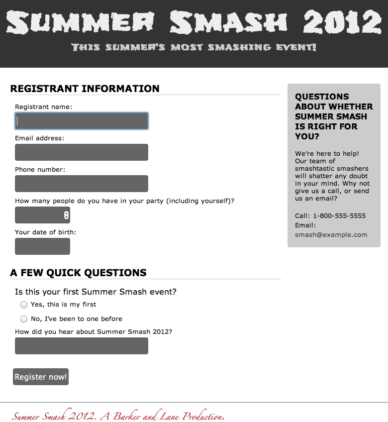
Figure 6-6. The completed page
We jumped around a bit in this chapter, tweaking values here and there, so we thought that we’d give you a complete listing of the style sheet before moving on. Our completed style.css style sheet looks like this:
/* RESET STYLES */
html, body, div, span, object, iframe,
h1, h2, h3, h4, h5, h6, p, blockquote, pre,
abbr, address, cite, code,
del, dfn, em, img, ins, kbd, q, samp,
small, strong, sub, sup, var,
b, i,
dl, dt, dd, ol, ul, li,
fieldset, form, label, legend,
table, caption, tbody, tfoot, thead, tr, th, td,
article, aside, canvas, details, figcaption, figure,
footer, header, hgroup, menu, nav, section, summary,
time, mark, audio, video {
margin:0;
padding:0;
border:0;
outline:0;
font-size:100%;
vertical-align:baseline;
background:transparent;
}
body {
line-height:1;
}
article,aside,details,figcaption,figure,
footer,header,hgroup,menu,nav,section {
display:block;
}
nav ul {
list-style:none;
}
blockquote, q {
quotes:none;
}
blockquote:before, blockquote:after,
q:before, q:after {
content:";
content:none;
}
a {
margin:0;
padding:0;
font-size:100%;
vertical-align:baseline;
background:transparent;
}
/* change colours to suit your needs */
ins {
background-color:#ff9;
color:#000;
text-decoration:none;
}
/* change colours to suit your needs */
mark {
background-color:#ff9;
color:#000;
font-style:italic;
font-weight:bold;
}
del {
text-decoration: line-through;
}
abbr[title], dfn[title] {
border-bottom:1px dotted;
cursor:help;
}
table {
border-collapse:collapse;
border-spacing:0;
}
/* change border colour to suit your needs */
hr {
display:block;
height:1px;
border:0;
border-top:1px solid #cccccc;
margin:1em 0;
padding:0;
}
input, select {
vertical-align:middle;
}
/* END RESET */
/* Layout Block level elements */
div#pagewrap {
width: 80%;
margin: 4em auto;
font-family: Verdana, Arial, sans-serif;
}
header {
padding: 1em 0 2em;
}
section#main {
float: left;
margin: 2em 2%;
}
section#registration_form {
width: 74%;
float: left;
padding: 0 1% 0 0;
}
aside {
width: 21%;
float: right;
}
footer {
clear: both;
padding: 2em 3%;
}
/* Header */
header {
background-color: #333;
}
header a {
text-decoration: none;
color: white;
text-align: center;
}
header h1 {
font-size: 3.5em;
font-family: "Frijole", Arial, sans-serif;
color: #eee;
}
header p {
font-size: 1.2em;
font-family: "Frijole", Arial, sans-serif;
color: #ccc;
margin: 0.7em 0 0 0;
letter-spacing: 1px;
}
/* Form */
fieldset {
padding: 0.5em 1% 1em;
}
legend {
text-transform: uppercase;
font-size: 1.2em;
font-weight: bold;
padding-bottom: 3px;
border-bottom: 1px solid #333;
width: 100%;
}
form ol, form ul {
list-style-type: none;
margin: 0 2%;
}
form li {
margin: 0.5em 0;
}
label {
font-size: 0.8em;
}
form ol li label {
display: block;
}
form ul li label {
display: inline;
}
input[type="text"], input[type="number"], input[type="tel"], input[type="email"], input[type="date"] {
width: 50%;
padding: 0.5em 0.7%;
margin-top: 0.4em;
font-size: 1em;
color: #eee;
border: none;
background-color: rgba(0,0,0,0.6);
-webkit-border-radius: 4px;
-moz-border-radius: 4px;
-o-border-radius: 4px;
border-radius: 4px;
}
input[type="number"], input[type="date"] {
width: 20%;
}
input[type="submit"] {
background-color: rgba(0,0,0,0.6);
color: #eee;
padding: 0.5em 0.7%;
font-size: 1em;
border: none;
-webkit-border-radius: 4px;
-moz-border-radius: 4px;
-o-border-radius: 4px;
border-radius: 4px;
margin-left: 2%;
}
/* Aside */
aside {
background-color: #ccc;
padding: 1em 2%;
-webkit-border-radius: 4px;
-moz-border-radius: 4px;
-o-border-radius: 4px;
border-radius: 4px;
}
aside h2 {
font-size: 1em;
line-height: 1.3em;
text-transform: uppercase;
margin-bottom: 1em;
}
aside p {
font-size: 0.8em;
line-height: 1.2em;
margin-bottom: 1.5em;
}
aside ul {
list-style-type: none;
font-size: 0.8em;
line-height: 1.5em;
}
aside a {
color: #333;
background-color: transparent;
text-decoration: none;
-webkit-transition: all 3s ease;
-moz-transition: all 3s ease;
-o-transition: all 3s ease;
transition: all 3s ease;
}
aside a:hover {
color: #c00;
background-color: black;
font-weight: bold;
}
/* Footer */
footer {
border-top: 1px solid #666;
color: #c00;
font-family: Zapfino, Verdana, sans-serif;
font-size: 0.8em;
}
A quick note about browser compatibility
We put in a disclaimer early on asking you to forget about other web browsers as you work through this chapter and to focus your testing on Google Chrome. The reason we made this request is that, at the time of this writing, Chrome has some of the best support for the new CSS3 properties we’ve discussed. We should really stress here that CSS3 is still a working draft and that CSS3 is not a fully approved standard at this point. We really are working with cutting-edge stuff here. Because of that, browser support will vary quite a bit.
CSS3 is fairly well supported in Safari, Opera, Chrome, and Firefox. Internet Explorer 10 and onwards has decent support as well. You may be asking yourself why on earth we’d consider using this technology that has such spotty support, and the answer is simple: when CSS3 is supported, the results are fantastic. And when it’s not supported, nothing breaks (no harm, no foul). CSS3 provides an enhancement to the user experience when it’s supported. Think of it this way: you, as a developer, are rewarding your end users for using the most up-to-date technology!
CSS media types and creating print style sheets
So far, you’ve seen how you can use CSS to create vivid designs on a computer screen. This is very handy, but CSS can do even more. Since its flexibility comes from its ability to use the same source document and display it in different ways, you can use everything you’ve just learned to create an entirely new look for the page when it’s printed. You do this in two steps:
- Create a new style sheet (or an additional portion on your existing style sheet) and declare it as a print style sheet.
- Simply write new CSS rules that restyle your page in an appropriate way for paper.
To define styles specifically for printed media, you need to use CSS’s predefined media types. Recall that the original style sheet is embedded in your HTML document like this:
<link rel="stylesheet" href="css/style.css">
This style sheet is effectively a style sheet for all possible media types. One of these media types is screen; and another, as you may have guessed already, is print. In other words, the style sheet element actually looks like this to the browser:
<link rel="stylesheet" href="css/style.css" media="all">
If we want to restrict all the CSS rules so they apply only to computer monitors, we could instead define the CSS style sheet like this:
<link rel="stylesheet" href="css/style.css" media="screen">
In fact, this is probably the simplest way to create a printed version of most pages because it will cause the browser to ignore all our CSS rules when the user prints the page, and our design will revert to the unstyled look we had before we started.
Let’s create a new, very short print style sheet for the Summer Smash registration form (some folks don’t like submitting their information online, so we’ll let them print it out and mail it in). This style sheet builds on all the work we’ve already accomplished. We’re not going to go crazy here, just clean up things a bit and remove certain unnecessary elements from the printed view.
With this new style sheet added to the mix, the HTML header of the page now looks like this:
<!DOCTYPE html>
<html lang="en">
<head>
<meta charset="utf-8">
<title>Summer Smash 2010 Registration</title>
<link href="http://fonts.googleapis.com/css?family=Frijole" rel="stylesheet">
<link rel="stylesheet" href="css/style.css">
<link rel="stylesheet" href="css/print.css" media="print">
<script src="/js/javascript.js"></script>
</head>
We don’t want to burn through an entire forest worth of paper, nor do we want to drive ourselves nuts with constant trips to the printer. Thus, while we’re developing our print style sheet, we’ll leave the media="print" attribute out of our code. This will render our print styles on screen, so we can get things looking as we’d like (we can add these styles back when we’re done). Doing this will signal the following to the browser: “This is just another style sheet that isn’t specifically targeted to any medium, so apply it everywhere.”
Let’s create a new file called print.css in our /css directory and start writing new CSS rules to override the rules we already have. Just as we’ve done before, we’ll simply go over the design (and its style sheet) from top to bottom, changing what we need to and leaving the rest the same. At the top, you have the global rules for the background of the page and the colors of the text and links.
Even though most browsers don’t print backgrounds by default, let’s turn off all the background colors and images explicitly. This will save some of your visitors some ink, and it’s better for the environment, too. Also, since the notion of links is somewhat useless on printed pages, let’s make all links look like normal text by turning them black and removing their underlines. After doing this, we can see yet another reason why descriptive anchor text (instead of anchor text such as “click here”) is so important:
html, body {
background-color: #fff;
background-image: none;
color: #000;
}
body {
margin: 0.25in;
}
a {
text-decoration: none;
color: #000;
}
Notice that these CSS rules are overriding only what we have to from the previous rules, and they are ignoring the declarations that we want to keep, such as font sizes and font faces. Also note that, because we are now working on physical media, it makes sense for us to use length values that are native to physical spaces (such as inches).
Next, let’s clean up our header a bit, so that we don’t end up with a big, dark stripe on the page. We can keep the character of our font, but let’s change it over to black text on a white background instead:
header {
background-color: #fff;
}
header h1, header p {
color: #000;
text-align: left;
}
Now let’s clean up some of our blocks and remove the sidebar and the footer from the page—they’re not really necessary for a printed registration form:
div#pagewrap {
width: 100%;
}
aside, footer {
display: none;
}
section#main {
float: none;
}
section#registration_form {
width: 100%;
float: none;
}
Last but certainly not least, those dark gray boxes are going to be a little hard to write on. Usually, paper forms just have solid lines where you’re supposed to write in your answer—that makes better sense here, too.
input[type="text"], input[type="number"], input[type="tel"], input[type="email"], input[type="date"] {
background-color: #fff;
border-bottom: 1px solid #000;
font-size: 1.3em;
-webkit-border-radius: 0;
-moz-border-radius: 0;
-o-border-radius: 0;
border-radius: 0;
width: 100%;
}
input[type="submit"] {
display: none;
}
We made the background color white, put a black border on the bottom, increased the font size (which makes the lines bigger so that somebody has more room to write), turned off the rounded corners, and set the width of the fields to 100%. We also took the opportunity to hide the submit button—that’s really not going to do any good on a printed copy:
html, body {
background-color: #fff;
background-image: none;
color: #000;
}
body {
margin: 0.25in;
}
a {
text-decoration: none;
color: #000;
}
header {
background-color: #fff;
}
header h1, header p {
color: #000;
text-align: left;
}
div#pagewrap {
width: 100%;
}
aside, footer {
display: none;
}
section#main {
float: none;
}
section#registration_form {
width: 100%;
float: none;
}
input[type="text"], input[type="number"], input[type="tel"], input[type="email"], input[type="date"] {
background-color: #fff;
border-bottom: 1px solid #000;
font-size: 1.3em;
-webkit-border-radius: 0;
-moz-border-radius: 0;
-o-border-radius: 0;
border-radius: 0;
width: 100%;
}
input[type="submit"] {
display: none;
}
Our completed print style sheet is only 45 lines long, but it drastically changes the appearance of our registration form when you print it. And wait! Don’t forget to put that media="print" attribute back in, or this style sheet will drastically alter the look of our form everywhere! We should see something similar to Figure 6-7 when we print our registration form.

Figure 6-7. A print preview of our registration form
Designing for other media types and devices
As you can see, creating new style sheets for different media types is fairly painless. All it really requires is an understanding of the destination media and how it works. For printed pages, this should be easy because most, if not all of us, are intimately familiar with what printed pages can and can’t do. It’s the other media types—most notably the handheld media type—that are trickier.
Luckily for us, we’ve been styling a lot of our elements using proportional units (ems and %) as opposed to absolute units. We’ll kick this up a notch in the next chapter as we transform our registration form from one that looks fine on a computer screen to one that “responds” to the device it’s being viewed on. We’ll convert our humble registration form to a registration form that functions perfectly on an iPhone, an Android device, and a tablet (like an iPad or Kindle Fire). It will also continue to keep looking great on a traditional screen.
We won’t develop separate style sheets for each of these devices; instead, we’ll put in a few exceptions here and there to make things look and work great at any resolution. Trust us: we’re already well on our way there.
Summary
As we’ve now seen, the implementation of a design in a CSS style sheet is relatively straightforward, but it can be complicated by numerous factors, such as browser bugs or natural differences in the display medium. With the simple design for Summer Smash 2012, we saw numerous examples of how designing for the web page is drastically different from designing for the printed page. We also saw some examples of common techniques used to leverage the flexibility and fluidity of web pages to maximize the usability of our web pages.
By using dynamic pseudo-classes, we added interactivity that would not have been possible on a printed page. We laid out our page using floated blocks, and further styled our form using CSS rules that aren’t fully implemented by all browsers at this point. Finally, we learned how to take the original style sheet and modify it to create a print-ready version of our page in mere minutes.
Clearly, there’s plenty we can accomplish just by utilizing what HTML and CSS have to offer. However, there’s much more that the web browser has to offer in terms of creating dynamic effects that far exceed the modicum of interactivity that CSS’s dynamic pseudo-classes provide. In later chapters, we’ll cover how to harness the full power of JavaScript, a standards-based, full-fledged programming language that’s embedded directly inside web browsers. This will enable us to take our web pages to a whole new level.