
Chapter 11: k-Nearest Neighbors
Example—Age and Income as Correlates of Purchase
The Way That JMP Resolves Ties
The Need to Standardize Units of Measurement
k-Nearest Neighbor for Multiclass Problems
Perform the Analysis and Examine Results
The k-Nearest Neighbor Regression Models
Perform a Linear Regression as a Basis for Comparison
Apply the k-Nearest Neighbors Technique
Limitations and Drawbacks of the Technique
Introduction
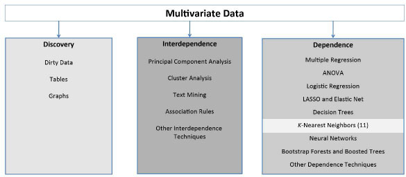
The k-nearest neighbors algorithm is a simple and powerful method that can be used either for classification or for regression and is one of the dependence techniques as shown in Figure 11.1.
Figure 11.1: A Framework for Multivariate Analysis
Example—Age and Income as Correlates of Purchase
As a first example, consider the data in Figure 11.2, which gives Age, Income, and Purchase decision for some product. Two individuals made the purchase, indicated by a plus sign (+), two individuals did not purchase, indicated by a minus sign (−). And a prospective customer is indicated by a question mark (?) because you do not know whether this customer will make a purchase. Your task is to predict whether the prospective customer is a likely purchaser. If this customer is a likely purchaser, then perhaps you will target him or her for special marketing materials. If he or she is not a likely purchaser, you will forgo sending him or her such materials.
Figure 11.2: Whether Purchased or Not, by Age and Income

If you classify this new customer by his or her nearest neighbor, you will consider him or her a purchaser, because the nearest neighbor in this case is the observation at the point (45, 50), Customer C, which is a plus sign. If you use this customer’s two nearest neighbors, you had better do some calculations because eyeballing the second nearest neighbor will be difficult. The distance is calculated by the usual Euclidean metric, in this case as follows:
Table 11.1 gives the data, together with the distance that each observation is from the point (47, 65).
Table 11.1: Customer Data and Distance from Customer E
| Customer | Age | Income | Purchase | Distance from Customer E |
| A | 35 | 45 | Yes | 23.3 |
| B | 49 | 90 | No | 25.1 |
| C | 45 | 50 | Yes | 15.1 |
| D | 65 | 125 | No | 62.6 |
| E | 47 | 65 | ? | 00.0 |
So you see that the second nearest neighbor is the point (35, 45), Customer A, which is also a plus. So if you use the two nearest neighbors to classify the prospective customer, you will label him or her a “plus.”
The Way That JMP Resolves Ties
But first, for the moment, suppose that the second nearest neighbor had been a minus. Then you would have had a tie—one plus and one minus. Ties represent a situation in which there is no good solution, only a variety of less-bad solutions. If the data set is large, then there are not likely to be many ties, and the few ties that exist will not much affect the overall analysis. So you will concern yourself no further with ties except to note that JMP resolves ties by selecting one of the tied levels at random.
The Need to Standardize Units of Measurement
Second, the Euclidean distance is affected by the units of measurement. When the variables are measured in different units, it might be necessary to standardize (subtract the mean and divide by the standard deviation):
1. Select Analyze ▶ Distribution.
2. In the red triangle for the variable in question, select Save and then Standardized).
This method only works for numerical independent variables and perhaps for binary independent variables that are represented as zeros and ones. It does not work for categorical data. Suppose “political affiliation” was a relevant independent variable? It is not immediately obvious how to calculate the distance between “liberal” and “conservative.”
Moving on to the three nearest neighbors, there are two plusses and one minus. Majority vote means that you again classify the prospective customer as a “Yes.” The idea underlying the algorithm should be clear now: Find the k-nearest neighbors, and use those k observations to make an inference. For purposes of classification, you want to choose the value of k that gives the best confusion matrix.
Observe that the data for income is given in thousands of dollars, and the age is given in years. What would happen if, instead, income were measured in dollars and age were measure in months? You would get Table 11.2:
Table 11.2: Customer Raw Data and Distance from Customer E
| Customer | Age (Months) | Income ($) | Purchase | Distance from Customer E |
| A | 420 | 45,000 | Yes | 56,237 |
| B | 588 | 90,000 | No | 26,490 |
| C | 540 | 50,000 | Yes | 17,371 |
| D | 780 | 125,000 | No | 99,074 |
| E | 564 | 65,000 | ? | 0 |
As before, Customer C is still the nearest neighbor to Customer E. However, the second nearest neighbor has changed, and is now Customer B. This dependence on the units of measurement suggests that standardizing the units of measurement might be in order. If you standardize the data in Table 11.1 (subtracting the mean and dividing by the standard deviation) for both income and age, you get Table 11.3.
Table 11.3: Customer Standardized Data
| Customer | Standardized Age | Standardized Income | Purchase | Distance from Customer E |
| A | −1.082 | −0.866 | Yes | 1.315 |
| B | 0.040 | 0.333 | No | 0.671 |
| C | −0.281 | −0.733 | Yes | 0.566 |
| D | 1.322 | 1.266 | No | 2.000 |
| E | 0.120 | −0.333 | ? | 0.000 |
Now you find that the first nearest neighbor to Customer E is Customer C, and the second nearest neighbor is Customer B.
k-Nearest Neighbors Analysis
The k-Nearest Neighbors method is very straightforward to apply, interpret, and use. You first motivate the method using a toy data set, and then move on to analyze a real data set.
Perform the Analysis
Open the toylogistic.jmp file that was used in Chapter 6. It has two variables: PassClass, a binary variable indicating whether the student passed the class (1 = yes, 0 = no), and MidTermScore, a continuous variable. Be sure to turn PassClass into a nominal variable (click the blue triangle and select nominal). Complete the following steps:
1. Select Analyze ▶ Predictive Modeling ▶ Partition.
2. In the Options area of the Partition dialog box, on the Method menu, change Decision Tree to K Nearest Neighbors.
3. Still in the Options area, the default value of Number of Neighbors K is 10, but you have only 20 observations, so change it to 5.
4. Select PassClass, and click Y, response.
5. Select MidTermScore, and click X, Factor.
6. Click OK.
The output window is given below in Figure 11.3. Because the random number generator determines the training and validation data sets, your numbers might be different.
Figure 11.3: k-Nearest Neighbor Output for toylogistic.jmp File

As can be seen, JMP provides a summary for each possible value of k, giving the number of observations, the misclassification rate, and the number of misclassifications. The lowest number of misclassifications in this example is 4, which occurs for k = 4. JMP presents the confusion matrix for this best value of k.
It might sometimes be necessary to save the predicted values for each observation. Perhaps you might wish to do further analysis on the predictions from this model. To do so, on the red triangle select Save Predicteds, and the data table will be augmented with 5 Predicted PassClass columns because you chose k = 5.
Make Predictions for New Data
Making predictions for new data is easy:
1. On the red triangle, select Save Prediction Formula and enter the number of neighbors of the best model. Since your best model was for k = 4, enter 4. The Predicted Formula column now appears in the data table.
2. Suppose a student scores 76 on the midterm, and you want to predict the student’s eventual success in the class. In Row 21, under MidtermScore, enter the value 76, leaving PassClass empty.
3. Click in any other cell, and the prediction will appear in the 21st row of the Predicted Formula column. In this case, the model predicts that a student who scores 76 on the midterm will pass the class.
4. Change the 76 to a 74 and click in another cell. See that the prediction has now changed from a 1 to a zero. The prediction automatically updates when the input data are changed.
You might be tempted to think that if some point B is the nearest neighbor of another point A, then A is also the nearest neighbor to B. However, the nearest neighbor relationship is not symmetrical, as Figure 11.4 makes clear: The nearest neighbor to A is B, but the nearest neighbor to B is C.
Figure 11.4: Example of the Nonsymmetrical Nature of the k-Nearest Neighbor Algorithm

k-Nearest Neighbor for Multiclass Problems
Nearest neighbors can address multiclass problems very easily. To see this approach, use the glass data set.
Understand the Variables
For forensic purposes, it might be of interest to identify the source of a shard of broken glass. Given appropriate chemical measurements on the piece of glass, this becomes a classification problem. By way of technical background, there are two manufacturing processes for producing window glass: float and nonfloat. In the data set, there are six different types of glass whose variable names are given in Table 11.4.
Table 11.4: Types of Glass
| Type of Glass | Category Name |
| Float glass from a building window | WinF |
| Nonfloat glass from a building window | WinNF |
| Glass from a vehicle window | Veh |
| Glass from a container | Con |
| Glass from tableware | Tabl |
| Glass from a vehicle headlight | Head |
Ten measurements are taken on each of 214 pieces of glass. The variable names and definitions are given in Table 11.5.
Table 11.5: Ten Attributes of Glass
| Measured Attribute | Variable Name |
| Refractive index | RI |
| Sodium | Na |
| Magnesium | Mg |
| Aluminum | Al |
| Silicon | Si |
| Potassium | K |
| Calcium | Ca |
| Barium | Ba |
| Iron | Fe |
Perform the Analysis and Examine Results
Follow these steps to analyze the data:
1. Open the file glass.jmp.
2. Select Analyze ▶ Predictive Modeling ▶ Partition.
3. Select type as Y, Response and all the other variables as X, Factor.
4. On the Method menu that shows Decision Tree, choose instead K Nearest Neighbors.
5. Change the Maximum K to10.
6. Click OK.
The results are given in Figure 11.5.
The number of classification errors is minimized when k = 3. The resulting confusion matrix shows that most of the errors are in the lower right corner, where the algorithm has difficulty distinguishing between WinF and WinNF. Of course, the correct classifications are all on the main diagonal from upper left to lower right.
Looking at the data table and running the Distribution option on variables K and Si, you see that the variable K takes on small values between zero and 1, and the variable Si takes on values between 70 and 80. Might this be a partial cause for so many misclassifications? Perhaps scaling is in order. This idea will be explored in the exercises at the end of the chapter.
Figure 11.5: k-Nearest Neighbor for the glass.jmp File

The k-Nearest Neighbor Regression Models
The k-nearest neighbor techniques can be used not only for classification, but also for regression when the target variable is continuous. In this case, rather than take a majority vote of the neighbors to determine classification, the average value of the neighbors is computed, and this becomes the predicted value of the target variable. It can improve on linear regression in some cases.
Perform a Linear Regression as a Basis for Comparison
To see this, return to the Mass Housing data set, MassHousing.jmp, which was analyzed in the exercises for Chapter 7. The goal is to predict the median house price. To establish a basis for comparison, first run a linear regression with mvalue as the dependent variable and all other variables as independent variables. You should find that the RSquare is 0.740643, and the Root Mean Square Error is 4.745298.
Apply the k-Nearest Neighbors Technique
Now apply the k-nearest neighbors technique:
1. Click Analyze ▶ Modeling ▶ Partition.
2. Change the method from Decision Trees to K Nearest Neighbors.
3. Select mvalue as Y, Response and all the other variables as X, Factor.
4. Click OK.
The results are given in Figure 11.6.
Figure 11.6: k-Nearest Neighbor Results for the MassHousing.jmp File

Compare the Two Methods
Observe that the RMSE (and therefore also the SSE) traces out a bowl shape as a function of k, and both RMSE and SSE are minimized when k = 4. Note that the RMSE produced by K Nearest Neighbors is much less than that produced by linear regression. So you could expect that if you had to make predictions, K Nearest Neighbors would produce better predictions than linear regression.
To see more clearly what such a reduction in RMSE means, it is useful to compare the residuals from the two methods. Plot the residuals from K Nearest Neighbors. You will have to create the residuals manually, subtracting predicted values from actual values. To do so, complete the following steps:
1. Click the red triangle next to K Nearest Neighbors.
2. Select Save Predicteds. Doing so will save one column of predicted values for each K (in the present case, ten columns). You will focus on the fourth column of predicted values. (You could use Save Prediction Formula with k = 4 to show only this column.)
3. Create a new variable by right-clicking at the top of a blank column and selecting New Column. Call the new column residuals.
4. Select Column Properties and Formula. On the left side of the new box under Table Columns, click mvalue, and then click the minus sign in the middle of the box,. Then click in the fourth column of predicted values called Predicted mvalue 4. Click OK.
5. Click OK.
6. Select Graph ▶ Overlay Plot. Select residuals and click Y.
7. Click OK.
The results appear in Figure 11.7.
Figure 11.7: Overlap Plot for the MassHousing.jmp File

To get the residuals from the linear regression, complete the following steps:
1. In the regression window, click the red triangle next to Response mvalue, and select Row Diagnostics ▶ Plot Residuals by Row.
2. You might have to scroll down to see this plot, and it might be too tiny to see clearly. To enlarge the plot, right-click on the plot, select Size/Scale ▶ Frame Size, and enter 400 for horizontal and 200 for vertical.
The results appear in Figure 11.8.
Figure 11.8: Residual Plot for Multiple Linear Regression

Comparing these two figures shows how much more variable are the residuals from linear regression. To see this, focus on the range between 100 and 300. In Figure 11.7, the residuals are largely between −5 and +5, whereas in Figure 11.7 they are between −5 and +10 or even +15. As mentioned, you should expect K Nearest Neighbors to yield better predictions in this case.
Make Predictions for New Data
To see how easy it is to make predictions, complete the following steps:
1. Click the red triangle next to K Nearest Neighbors and select Save Prediction Formula.
2. On the data table, in the row directly beneath the last observation, enter the following values: crim = 0.5, zn = 0, indus = 10, chas = 0, nox = 0.5, rooms = 5, age = 50, distance = 3.5, radial = 5, tax = 500, pt = 15, b = 375, and lstat = 15. Of course, no value should be entered for the dependent variable, which will remain a black dot in the last cell.
3. Now, click in any other cell in the data table to see that the K Nearest Neighbors predicts a value of 19.375 for this new observation.
Limitations and Drawbacks of the Technique
It is intuitively obvious that when observations are close together, k-nearest neighbors will work better than when observations are far apart. In low-dimension problems (those with few variables), k-nearest neighbors can work quite well. In higher dimensions (those with a large number of variables), the nearest neighbor algorithm runs into trouble. In many dimensions, the nearest observation can be far away, resulting in bias and poor performance.
The probability of observations being close together is related to the number of variables in the data set. To motivate this claim, consider two points in one dimension, on the unit line (a line that is one unit long). The farthest away that they can be is one unit: Place one point at 0 and the other point at 1. In two dimensions, place one point at (0, 0) and the other at (1, 1): The distance between them is √(2) = 1.414. In three dimensions, place one point at (0,0,0) and the other at (1,1,1); their distance will be √3 = 1.732. As is obvious, the more dimensions in the data, the farther apart the observations can be. This phenomenon is sometimes referred to as “the curse of dimensionality.”
Although k-nearest neighbors requires no assumptions of normality, linearity, and the like, it does have one major drawback: computational demands. Suppose that you want to make predictions for ten new observations. The entire data set must be used to make each of the ten predictions; and the entire data set must be analyzed ten times. Contrast this situation with regression, where the entire data set would be analyzed once, a formula would be computed, and then the formula would be used ten times. So k-nearest neighbors would not be useful for real-time predictions with large data sets, whereas other methods would be better suited to such a situation.
Exercises
1. Is there any point in extending k beyond 10 in the case of the glass data? Set the maximum value of k at 20 and then at 30.
2. Are the results for the glass data affected by the scaling? Standardize all the variables and apply K Nearest Neighbors.
3. Run a linear regression problem of your choice and compare it to K Nearest Neighbors.