Line charts are great for revealing trends and relationships in large amounts of data. Public data is widely available in standard formats, such as CSV and JSON, but usually needs to be downscaled, parsed, and converted to a data format expected by Chart.js before using. In this section, we will extract data from a public data file and turn it into a trend-revealing visualization.
For all examples that use external files, you need to open your files using a web server. Double-clicking on the HTML file and opening it in your browser won't work. If you are not running your files with a web server, see the section Loading data files, in Chapter 2, Technology Fundamentals, on how to configure a web server for testing.
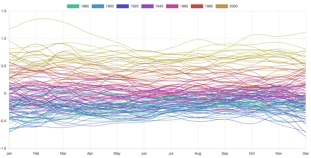
The temperature data in the previous example was extracted from a JSON file obtained from the NASA Goddard Institute for Space Studies (GISS) website (data.giss.nasa.gov/gistemp), which includes monthly measurements for each year between 1880 and 2016. It would be very interesting to plot the numbers for all months in a single chart. We can do by this loading the file and using JavaScript to extract the data we want.
The following is a fragment of the JSON file from the GISS site. It's also available from the GitHub repository for this chapter in Data/monthly_json.json:
[
   {"Date": "2016-12-27", "Mean": 0.7895,  "Source": "GCAG"},
   {"Date": "2016-12-27", "Mean": 0.81, "Source": "GISTEMP"},
   {"Date": "2016-11-27", "Mean": 0.7504,  "Source": "GCAG"},
   {"Date": "2016-11-27", "Mean": 0.93, "Source": "GISTEMP"},
   {"Date": "2016-10-27", "Mean": 0.7292,  "Source": "GCAG"},
   {"Date": "2016-10-27", "Mean": 0.89, "Source": "GISTEMP"},
   /* ... many, many more lines ... */
   {"Date": "1880-02-27", "Mean": -0.1229,  "Source": "GCAG"},
   {"Date": "1880-02-27", "Mean": -0.21, "Source": "GISTEMP"},
   {"Date": "1880-01-27", "Mean": 0.0009,   "Source": "GCAG"},
   {"Date": "1880-01-27", "Mean": -0.3,  "Source": "GISTEMP"}
 ]
Files should be loaded asynchronously. You can use any Ajax library for this (for example, JQuery) or use standard ES2015 features, supported by all modern browsers. In this book, we will use the standard JavaScript fetch() command (in the GitHub repository, there are also JQuery alternatives for most examples).
The fetch() command is reactive. It will wait until the whole file is loaded into memory before moving to the first then() step, which processes the response and extracts the JSON string (using the text() method). The second then() step only starts after all of the contents are placed in a string, made available for parsing in the final step, as follows:
fetch('monthly_json.json')
    .then(response => response.text())
    .then((json) => {
        const dataMap = new Map();
    ...
    });
Before using a JSON file (which is a string), we need to parse it so that it will become a JavaScript object, from which we can read individual fields using the dot operator. This can be done with the standard JavaScript command, JSON.parse(), as follows:
const obj = JSON.parse(json);
If you are using JQuery or some other library instead of fetch(), you might prefer to use a function that loads and parses JSON. In this case, you should not run the preceding command.
The data contains two measurements, labeled GCAC and GISTEMP. We only need one of them, so we will filter only the objects that have GISTEMP as Source. We will also reverse the array so that the earlier measurements appear first in the chart. We can do all of this in one line, as follows:
const obj = JSON.parse(json).reverse()
                            .filter(field => field.Source == 'GISTEMP');
console.log(obj);
The last line will print the following code in your browser's JavaScript console:
 Array(1644)
  [0 ... 99]
 0:{Date: "1880-01-27", Mean: -0.3, Source: "GISTEMP"}
 1:{Date: "1880-02-27", Mean: -0.21, Source: "GISTEMP"}
 2:{Date: "1880-03-27", Mean: -0.18, Source: "GISTEMP"}
 3:{Date: "1880-04-27", Mean: -0.27, Source: "GISTEMP"}
 …
Now, it's easy to select the data we need to build a dataset for each year. The best way to do that is to create a Map storing each value and month, and use the year as a retrieval key. Split the date components to extract the year and month, and then store these values and the temperature anomaly in a new object (with properties: year, month, and value) for each Map entry.
These steps are performed in the following code:
const dataMap = new Map();
obj.forEach(d => {
    const year = d.Date.split("-")[0], month = d.Date.split("-")[1];
    if(dataMap.get(year)) {
        dataMap.get(year).push({year: year, month: month, value: d.Mean});
     } else {
        dataMap.set(year, [{year: year, month: month, value: d.Mean}]);
     }
 });
console.log(dataMap); // check the structure of the generated map!
draw(dataMap);
The resulting map will contain one key for each year in the dataset. The value of each entry will be an array of 12 objects, one for each month. Use your browser's JavaScript console to inspect the generated map.
The draw() function will convert dataMap into a format that Chart.js can use. For each entry it will create a dataset object and add it to the datasets array. Each dataset object contains a data property with an array of data values (one per month), and dataset configuration properties, such as line color and label. The map's key (year) is the label, and the colors are generated in a gradient sequence using the year to change the hue, as follows:
function draw(dataMap) {
    const datasets = [];
    dataMap.forEach((entry, key) => {
        const dataset = {
            label: key, // the year
            data: entry.map(n => n.value),
            // array w temperature for each month
            borderColor:     'hsla('+(key*2)+',50%,50%,0.9)',
            //gradient
            backgroundColor: 'hsla('+(key*2)+',50%,50%,0.9)',
            borderWidth: 1,
            pointRadius: 0 // hide the data points
         };
         datasets.push(dataset);
     });
 ...
Now we can assemble the data object and instantiate the line chart, as follows:
    const months = ["Jan","Feb", ...,"Oct","Nov","Dec"];
    Chart.defaults.global.elements.line.fill = false;
    const chartObj = {
        type: "line",
        data: {
            labels: months,
            datasets: datasets
        }
    };
    new Chart("my-line-chart", chartObj);
 }
The final result is shown as follows. The full code is available in LineArea/line-8-load-fetch.html (fetch version), and LineArea/line-8-load-jquery.html (JQuery Version):

It looks nice, but there is too much information. We could filter out some results, but we can also just reduce the amount of labels. The options.legend.labels.filter property supports a callback function that we can use to filter out selected labels. In the following code, it will only display labels that are 20 years apart:
const chartObj = {
    type: "line",
    data: {
        labels: labels,
        datasets: datasets
    }
    options:{
        legend: {
            labels: {
                filter: function(item, chart) {
                    return new Number(item.text) % 20 == 0;
                }
            }
        }
    }
};
The result is shown as follows and the full code is in LineArea/line-10-filter.html. Now only a few legends are shown, and the colors differ enough to relate them to different parts of the chart. Although there is still a lot of information in the chart, the colors are sufficient to reveal a trend toward increasing temperatures: