
We will create data points using a
sinc() function and add some random noise to it. After this, we will do a linear and cubic interpolation and plot the results.
- Create the data points and add noise to it:
x = np.linspace(-18, 18, 36)
noise = 0.1 * np.random.random(len(x))
signal = np.sinc(x) + noise
- Create a linear interpolation function and apply it to an input array with five times as many data points:
interpreted = interpolate.interp1d(x, signal)
x2 = np.linspace(-18, 18, 180)
y = interpreted(x2)
- Do the same as in the previous step, but with cubic interpolation:
cubic = interpolate.interp1d(x, signal, kind="cubic")
y2 = cubic(x2)
- Plot the results with
matplotlib:plt.plot(x, signal, 'o', label="data") plt.plot(x2, y, '-', label="linear") plt.plot(x2, y2, '-', lw=2, label="cubic") plt.legend() plt.show()
The following diagram is a plot of the data, linear, and cubic interpolation:
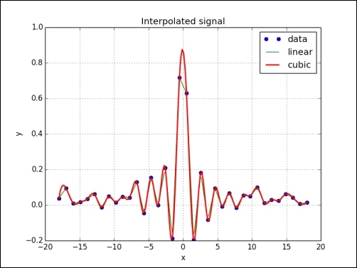
We created a dataset from the sinc() function and added noise to it. We then did linear and cubic interpolation using the interp1d class of the scipy.interpolate module (see sincinterp.py):
import numpy as np
from scipy import interpolate
import matplotlib.pyplot as plt

x = np.linspace(-18, 18, 36)
noise = 0.1 * np.random.random(len(x))
signal = np.sinc(x) + noise

interpreted = interpolate.interp1d(x, signal)
x2 = np.linspace(-18, 18, 180)
y = interpreted(x2)

cubic = interpolate.interp1d(x, signal, kind="cubic")
y2 = cubic(x2)

plt.plot(x, signal, 'o', label="data")
plt.plot(x2, y, '-', label="linear")
plt.plot(x2, y2, '-', lw=2, label="cubic")

plt.title('Interpolated signal')
plt.xlabel('x')
plt.ylabel('y')
plt.grid()
plt.legend(loc='best')
plt.show()..................Content has been hidden....................
You can't read the all page of ebook, please click here login for view all page.