
As already mentioned, understanding data is interleaved with data preparation. In order to know what to do, which variables need recoding, which variables have missing values, and how to combine variables into a new one, you need to deeply understand the data you are dealing with. You can get this understanding with a simple overview of the data, which might be a method good enough for small datasets, or a method for checking just a small subset of a large dataset.
You can get more information about the distribution of the variables by showing the distributions graphically. Basic statistical methods are also useful for data overview. Finally, sometimes these basic statistical results and graphs are already exactly what you need for a report.
R is an extremely powerful language and environment for both visualizations and statistics. You will learn how to:
- Create simple graphs
- Show plots and histograms
- Calculate frequencies distribution
- Use descriptive statistics methods
In R, you build a graph step-by-step. You start with a simple graph, and then add features to it with additional commands. You can even combine multiple plots and other graphs into a single graph. Besides viewing the graph interactively, you can save it to a file. There are many functions for drawing graphs. Let's start with the most basic one, the plot() function. Note that, if you removed the TM dataset from memory or didn't save the workspace when you exited the last session, you need to re-read the dataset. Here is the code that uses it to draw a graph for the Education variable of the TM dataset, which is also added to the search path to simplify further addressing to the variables:
TM = read.table("C:\SQL2016DevGuide\Chapter13_TM.csv",
                sep=",", header=TRUE,
                stringsAsFactors = TRUE);
attach(TM);

# A simple distribution
plot(Education);
The following screenshot shows the graph:

Figure 13.3: Basic plot for Education
The plot does not look too good. The Education variable is correctly identified as a factor; however, the variable is ordinal, so the levels should be defined. You can see the problem in the graph in the previous figure, where the values are sorted alphabetically. In addition, the graph and axes could also have titles, and a different color might look better. The plot() function accepts many parameters. In the following code, the parameters main for the main title, xlab for the x axis label, ylab for the y axis label, and col for the fill color are introduced:
Education = factor(Education, order=TRUE,
                   levels=c("Partial High School",
                            "High School","Partial College",
                            "Bachelors", "Graduate Degree"));
plot(Education, main = 'Education',
     xlab='Education', ylab ='Number of Cases',
     col="purple");
This code produces a nicer graph, as you can see in the following screenshot:

Figure 13.4: Enhanced plot for Education
Now, let's make some more complex visualizations with multiple lines of code! For a start, the following code generates a new data frame TM1 as a subset of the TM data frame, selecting only ten rows and three columns. This data frame will be used for line plots, where each case is plotted. The code also renames the variables to get unique names and adds the data frame to the search path:
cols1 <- c("CustomerKey", "NumberCarsOwned", "TotalChildren");
TM1 <- TM[TM$CustomerKey < 11010, cols1];
names(TM1) <- c("CustomerKey1", "NumberCarsOwned1", "TotalChildren1");
attach(TM1);
The next code cross-tabulates the NumberCarsOwned and the BikeBuyer variables and stores the result in an object. This cross-tabulation is used later for a bar plot:
nofcases <- table(NumberCarsOwned, BikeBuyer);
nofcases;
The cross-tabulation result is shown here:
            BikeBuyer
NumberCarsOwned    0    1
          0 1551 2687
          1 2187 2696
          2 3868 2589
          3  951  694
          4  795  466
You can specify graphical parameters directly or through the par() function. When you set parameters with this function, these parameters are valid for all subsequent graphs until you reset them. You can get a list of parameters by simply calling the function without any arguments. The following line of code saves all modifiable parameters to an object by using the no.readonly = TRUE argument when calling the par() function. This way, it is possible to restore the default parameters later, without exiting the session:
oldpar <- par(no.readonly = TRUE);
The next line defines that the next four graphs will be combined in a single graph in a 2 x 2 invisible grid, filled by rows:
par(mfrow=c(2,2));
Now let's start filling the grid with smaller graphs. The next command creates a stacked bar showing marital status distribution in different education levels. It also adds a title and x and y axes labels. It changes the default colors used for different marital statuses to blue and yellow. This graph appears in the top-left corner of the invisible grid:
plot(Education, MaritalStatus,
     main='Education and marital status',
     xlab='Education', ylab ='Marital Status',
     col=c("blue", "yellow"));
The hist() function produces a histogram for numeric variables. Histograms are especially useful if they don't have too many bars. You can define breakpoints for continuous variables with many distinct values. However, the NumberCarsOwned variable has only five distinct values, and therefore defining breakpoints is not necessary. This graph fills the top-right cell of the grid:
hist(NumberCarsOwned, main = 'Number of cars owned',
     xlab='Number of Cars Owned', ylab ='Number of Cases',
     col="blue");
The next part of the code is slightly longer. It produces a line chart with two lines: one for the TotalChildren1 and one for the NumberCarsOwned1 variable. Note that the limited dataset is used, in order to get just a small number of plotting points. Firstly, a vector of colors is defined. This vector is used to define the colors for the legend. Then, the plot() function generates a line chart for the TotalChildren1 variable. Here, two new parameters are introduced: the type="o" parameter defines the over-plotted points and lines, and the lwd=2 parameter defines the line width. Then, the lines() function is used to add a line for the NumberCarsOwned1 variable to the current graph, to the current cell of the grid. Then, a legend is added with the legend() function to the same graph. The cex=1.4 parameter defines the character expansion factor relative to the current character size in the graph. The bty="n" parameter defines that there is no box drawn around the legend. The lty and lwd parameters define the line type and the line width for the legend. Finally, a title is added. This graph is positioned in the bottom-left cell of the grid:
plot_colors=c("blue", "red");
plot(TotalChildren1,
     type="o",col='blue', lwd=2,
     xlab="Key",ylab="Number");
lines(NumberCarsOwned1,
      type="o",col='red', lwd=2);
legend("topleft",
       c("TotalChildren", "NumberCarsOwned"),
       cex=1.4,col=plot_colors,lty=1:2,lwd=1, bty="n");
title(main="Total children and number of cars owned line chart",
      col.main="DarkGreen", font.main=4);
There is one more cell in the grid to fill. The barplot() function generates the histogram of the NumberCarsOwned variable in groups of the BikeBuyer variable and shows the histograms side by side. Note that the input for this function is the cross-tabulation object generated with the table() function. The legend() function adds a legend in the top-right corner of the chart. This chart fills the bottom-right cell of the grid:
barplot(nofcases,
        main='Number of cars owned and bike buyer gruped',
        xlab='BikeBuyer', ylab ='NumberCarsOwned',
        col=c("black", "blue", "red", "orange", "yellow"),
        beside=TRUE);
legend("topright",legend=rownames(nofcases),
       fill = c("black", "blue", "red", "orange", "yellow"),
       ncol = 1, cex = 0.75);
The following figure shows the big results, all four graphs combined into one:
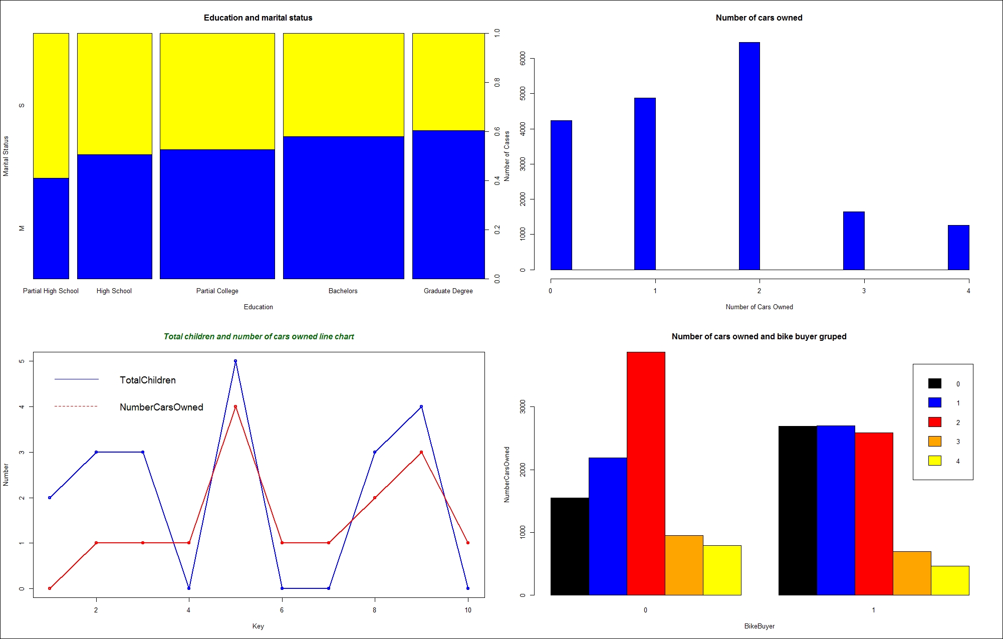
Figure 13.5: Four graphs in an invisible grid
The last part of the code is the cleanup part. It restores the old graphics parameters and removes both data frames from the search path:
par(oldpar);
detach(TM);
detach(TM1);
Sometimes, numbers tell us more than pictures. After all, the name "descriptive statistics" tells you it is about describing something. Descriptive statistics describes a distribution of a variable. Inferential statistics tells you about the associations between variables. There are a plethora of possibilities for introductory statistics in R. However, before calculating the statistical values, let's quickly define some of the most popular measures of descriptive statistics.
The mean is the most common measure for determining the center of a distribution. It is also probably the most abused statistical measure. The mean does not mean anything without the standard deviation or some other measure, and it should never be used alone. Let me give you an example. Imagine there are two pairs of people. In the first pair, both people earn the same—let's say, $80,000 per year. In the second pair, one person earns $30,000 per year, while the other earns $270,000 per year. The mean salary for the first pair is $80,000, while the mean for the second pair is $150,000 per year. By just listing the mean, you could conclude that each person from the second pair earns more than either of the people in the first pair. However, you can clearly see that this would be a seriously incorrect conclusion.
The definition of the mean is simple; it is the sum of all values of a continuous variable divided by the number of cases, as shown in the following formula:
The median is the value that splits the distribution into two halves. The number of rows with a value lower than the median must be equal to the number of rows with a value greater than the median for a selected variable. If there are an odd number of rows, the median is the middle row. If the number of rows is even, the median can be defined as the average value of the two middle rows (the financial median), the smaller of them (the lower statistical median), or the larger of them (the upper statistical median).
The range is the simplest measure of the spread; it is the plain distance between the maximum value and the minimum value that the variable takes.
A quick review: a variable is an attribute of an observation represented as a column in a table.
The first formula for the range is:
The median is the value that splits the distribution into two halves. You can split the distribution more—for example, you can split each half into two halves. This way, you get quartiles as three values that split the distribution into quarters. Let's generalize this splitting process. You start with sorting rows (cases, observations) on selected columns (attributes, variables). You define the rank as the absolute position of a row in your sequence of sorted rows. The percentile rank of a value is a relative measure that tells you how many percent of all (n) observations have a lower value than the selected value.
By splitting the observations into quarters, you get three percentiles (at 25%, 50%, and 75% of all rows), and you can read the values at those positions that are important enough to have their own names: the quartiles. The second quartile is, of course, the median. The first one is called the lower quartile and the third one is known as the upper quartile. If you subtract the lower quartile (the first one) from the upper quartile (the third one), you get the formula for the inter-quartile range (IQR):
Let's suppose for a moment you have only one observation (n=1). This observation is also your sample mean, but there is no spread at all. You can calculate the spread only if n exceeds 1. Only the (n-1) pieces of information help you calculate the spread, considering that the first observation is your mean. These pieces of information are called degrees of freedom. You can also think of degrees of freedom as the number of pieces of information that can vary. For example, imagine a variable that can take five different discrete states. You need to calculate the frequencies of four states only to know the distribution of the variable; the frequency of the last state is determined by the frequencies of the first four states you calculated, and they cannot vary because the cumulative percentage of all states must equal 100.
You can measure the distance between each value and the mean value and call it the deviation. The sum of all distances gives you a measure of how spread out your population is. But you must consider that some of the distances are positive, while others are negative; actually, they mutually cancel themselves out, so the total gives you exactly zero. So there are only (n-1) deviations free; the last one is strictly determined by the requirement just stated. In order to avoid negative deviation, you can square them. So, here is the formula for variance:
This is the formula for the variance of a sample, used as an estimator for the variance of the population. Now, imagine that your data represents the complete population, and the mean value is unknown. Then, all the observations contribute to the variance calculation equally, and the degrees of freedom make no sense. The variance for a population is defined in a similar way as the variance for a sample. You just use all n cases instead of n-1 degrees of freedom.
Of course, with large samples, both formulas return practically the same number. To compensate for having the deviations squared, you can take the square root of the variance. This is the definition of standard deviation (σ):
Of course, you can use the same formula to calculate the standard deviation for the population, and the standard deviation of a sample as an estimator of the standard deviation for the population; just use the appropriate variance in the formula.
You probably remember skewness and kurtosis from Chapter 2, Review of SQL Server Features for Developers . These two measures measure the skew and the peakedness of a distribution. The formulas for skewness and kurtosis are:

These are the descriptive statistics measures for continuous variables. Note that some statisticians calculate kurtosis without the last subtraction, which is approximating 3 for large samples; therefore, a kurtosis around 3 means a normal distribution, neither significantly peaked nor flattened.
For a quick overview of discrete variables, you use frequency tables. In a frequency table, you can show values, the absolute frequency of those values, absolute percentage, cumulative percentage, and a histogram of the absolute percentage.
One very simple way to calculate most of the measures introduced so far is by using the summary() function. You can feed it with a single variable or with a whole data frame. For a start, the following code re-reads the CSV file in a data frame and correctly orders the values of the Education variable. In addition, the code attaches the data frame to the search path:
TM = read.table("C:\SQL2016DevGuide\Chapter13_TM.csv",
                sep=",", header=TRUE,
                stringsAsFactors = TRUE);
attach(TM);
Education = factor(Education, order=TRUE,
                   levels=c("Partial High School",
                            "High School","Partial College",
                            "Bachelors", "Graduate Degree"));
Note that you might get a warning, "The following object is masked _by_ .GlobalEnv: Education". You get this warning if you didn't start a new session with this section. Remember, the Education variable was already ordered earlier in the code, and is already part of the global search path, and therefore hides or masks the newly read column Education. You can safely disregard this message and continue with defining the order of the Education values again.
The following code shows the simplest way to get a quick overview of descriptive statistics for the whole data frame:
summary(TM);
The partial results are here:
 CustomerKey    MaritalStatus Gender   TotalChildren   NumberChildrenAtHome
Min.   :11000   M:10011       F:9133   Min.   :0.000   Min.   :0.000
1st Qu.:15621   S: 8473       M:9351   1st Qu.:0.000   1st Qu.:0.000
Median :20242                          Median :2.000   Median :0.000
Mean   :20242                          Mean   :1.844   Mean   :1.004
3rd Qu.:24862                          3rd Qu.:3.000   3rd Qu.:2.000
Max.   :29483                          Max.   :5.000   Max.   :5.000
As mentioned, you can get a quick summary for a single variable as well. In addition, there are many functions that calculate a single statistic, for example, sd() to calculate the standard deviation. The following code calculates the summary for the Age variable, and then calls different functions to get the details. Note that the dataset was added to the search path. You should be able to recognize which statistic is calculated by which function from the function names and the results:
summary(Age);
mean(Age);
median(Age);
min(Age);
max(Age);
range(Age);
quantile(Age, 1/4);
quantile(Age, 3/4);
IQR(Age);
var(Age);
sd(Age);
Here are the results, with added labels for better readability:
  Min. 1st Qu.  Median    Mean 3rd Qu.    Max.
28.00   36.00   43.00   45.41   53.00   99.00
Mean  45.40981
Median      43
Min   28
Max   99
Range 28 99
25%   36
75%   53
IQR   17
Var   132.9251
StDev 11.52931
To calculate the skewness and kurtosis, you need to install an additional package. One possibility is the moments package. The following code installs the package, loads it in memory, and then calls the skewness() and kurtosis() functions from the package:
install.packages("moments");
library(moments);
skewness(Age);
kurtosis(Age);
The kurtosis() function from this package does not perform the last subtraction in the formula and therefore kurtosis of 3 means no peakedness. Here are the results:
0.7072522
2.973118
Another possibility to calculate the skewness and the kurtosis is to create a custom function. Creating your own function is really simple in R. Here is an example, together with a call:
skewkurt <- function(p){
  avg <- mean(p)
  cnt <- length(p)
  stdev <- sd(p)
  skew <- sum((p-avg)^3/stdev^3)/cnt
  kurt <- sum((p-avg)^4/stdev^4)/cnt-3
  return(c(skewness=skew, kurtosis=kurt))
};
skewkurt(Age);
Note that this is a simple example, not taking into account all the details of the formulas, and not checking for missing values. Nevertheless, here is the result. Note that, in this function, the kurtosis was calculated with the last subtraction in the formula and is therefore different from the kurtosis from the package moments for approximately 3:
  skewness    kurtosis
0.70719483 -0.02720354
Before finishing with these introductory statistics, let's calculate some additional details for the discrete variables. The summary() function returns absolute frequencies only. The table() function can be used for the same task. However, it is more powerful, as it can also do cross-tabulation of two variables. You can also store the results in an object and pass this object to the prop.table() function, which calculates the proportions. The following code shows how to call the last two functions:
edt <- table(Education);
edt;
prop.table(edt);
Here are the results:
Partial High School      High School   Partial College       Bachelors
               1581             3294              5064            5356
    Graduate Degree
      3189
Partial High School      High School   Partial College       Bachelors
         0.08553343      0.17820818         0.27396667      0.28976412
    Graduate Degree
      0.17252759
Of course, there is a package that includes a function that gives you a more condensed analysis of a discrete variable. The following code installs the descr package, loads it to memory, and calls the freq() function:
install.packages("descr");
library(descr);
freq(Education);
Here are the results.
                    Frequency Percent Cum Percent
Partial High School      1581   8.553       8.553
High School              3294  17.821      26.374
Partial College          5064  27.397      53.771
Bachelors                5356  28.976      82.747
Graduate Degree          3189  17.253     100.000
Total                   18484 100.000