
This chapter provides a how-to for the creation of Spotfire Professional Visualizations. By the end of it, the reader should be an independent user of the Spotfire platform, having the required skills to create meaningful Analytics visualizations. However, before actually diving deep into the usage of Spotfire Professional, I would like to emphasize the purpose of Analytics tools.
The discipline of Visual Analytics allows us to understand the what, the why, and the how of raw data. It does so by fostering intuitive data representations, where the multiple dimensions of data are reduced and simplified.
The power and success of Analytics tools is closely related to their capability to summarize big chunks of data, providing interactive visualizations, where filters, rules, and data drill-down can be applied, always in a very attractive and captivating environment.
Users from many disciplines (IT, Scientists, and Statisticians) are allowed to find the correct answers for their most challenging questions, and complex data becomes understandable through analysis, integrated with computational analytics and statistical tools. Reports can be quickly created and distributed, being available on the Web, ready for access from several device types, including mobile.
To demonstrate the power of Visual Analytics, I will now provide an example where a set of data becomes dissectible through the creation of visualizations. This will reinforce the idea of the benefits of Visual Analytics.
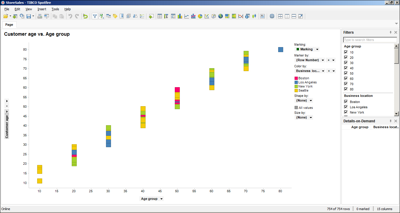
The next screenshot is of a Microsoft Excel file containing sales information. The records contain data, such as customer age, customer gender, city, number of purchases, total spent in purchases, and type of goods.

To the human eye, this raw data is readable, but further analysis would be complex and lengthy. However, importing it to Spotfire Professional allows me to generate in a very short amount of time a set of three visualizations (displayed in the next three screenshots), where distinct trends can easily be identified. These are as follows:
- Which city has the biggest spender? Is this a man or woman?

We can clearly see the biggest spender was a man from Los Angeles—top-right corner of the screenshot. He was not only the biggest spender, but he also did the most purchases (this is clearly the case of an outlier).
- Who buys more often—men or women?

Segregating by gender, we realize we have more records from women—women bought more often. This conclusion is true for the four analyzed locations.
Please also note that although women bought more often, this does not necessarily mean they spent more as well.
- Which age group spends the most?

This pie chart shows the distribution of expenditure between the different age groups. The groups that spend the most are 50s and 60s. Respectively, these groups spent 27.7% and 27.1% of the total spent.
These three visualizations will be recreated in the Visualization types section so the reader can realize how simple their creation was.
I hope that the examples shown here have increased your appetite for the tool, as we will now start with the technical details behind the creation of visualizations. In the next section, we will focus on data sources—which ones can we access and how do we do it?
The first step to start working with Spotfire Professional consists of the loading of data into the application. This data will be fetched from an external data source, and internally (in Spotfire), it will be defined and known as a data table.
Spotfire can create data tables by accessing several types of external data sources:
- Clipboard: Performed through copy and paste operations.
- Text files: These could be plain text (
.txt), comma separated (.csv), or fixed format. - MS Excel files: The supported versions are MS Excel 2000 or later, with extensions
xslxandxls. - SAS files: File extensions for SAS files are
sas7bdatandsd2. - Database: Database tables or views, represented by an SQL query (in SQL-92). Columns can be filtered, and tables joined, allowing for a prehandling of data before the loading. The following vendor databases are supported:
- Microsoft SQL Server
- Microsoft SQL Server Analysis Services
- Oracle
- Teradata
- ADS Composite Information Server
- IBM Netezza
- Oracle MySQL
- PostgreSQL
- SAP® Business Information Warehouse (SAP BW)
- Information link: This consists of a database query, specifying tables, columns, and filters, created in the tool Information Designer (from the Tools menu of Spotfire Professional). The queries are created visually, as opposed to the programmatically in SQL.
- Custom file type: An example of this is XML. Spotfire can be configured to open custom file types.
Tip
Please note that to connect to an Oracle Database, TIBCO recommends users should have installed the Oracle Data Provider for .NET (ODP.NET). To connect to an SQL database, users should have installed the SqlClient Data Provider.
Also, if using a Windows machine, users can create an ODBC data sources in the Windows ODBC Data Source Administrator.
It is also important to differentiate between the the two modes in which Spotfire Professional internally handles the loaded data:
- In-Memory data: In this mode, the tool will load all the data into the working memory, allowing for quicker (and independent) access.
- In-Database data: In this mode, Spotfire Professional does not load all the data into the working memory, but takes advantage of the system that owns this data for processing power (all queries will be run in the source system). This mode should be used in scenarios where there are extremely large data sets, too big to fit into the application's working memory (with this mode, data loading into Spotfire becomes virtually unlimited).
In this section, examples of data loading will be provided. The following data sources will be used: text file, MS Excel file, and database table.
There are two different ways to load the data of a text file into Spotfire. The first consists of using the menu option File | Open or the Open button in the toolbar. Alternatively, the menu option File | Add Data Tables or the Add Data Tables button in the toolbar can be used.
To exemplify, we will load the file C:Program Files (x86)TIBCOSpotfire5.5.0Example DataStoreSalesStoreSales.txt. We will start by clicking on the Add Data Tables toolbar button. A dialog box named Add Data Tables will be opened; this dialog box is presented in the following screenshot:

Navigate to Add | Files. In the file selection window, navigate to C:Program Files (x86)TIBCOSpotfire5.5.0Example DataStoreSalesStoreSales.txt and click on Open.
The Import Settings dialog box will be presented as shown in the following screenshot:

All the contents of the file will be displayed in the section named Data preview:, and several options will be available to the user:
- Defining the separator character (manageable in the Separator character section). This is a generic customization.
- Defining the file encoding (manageable in the Format section). This is a generic customization.
- Defining the data types of the columns. The default data type of a column can be redefined by the user. To apply any change, the user must click on the button Refresh; if there are any issues, such as the impossibility of application of a new data type, an error will be displayed in the problematic records. This is a column related customization. The following screenshot lists the available types to choose from and associate with a column:

- Deciding on the inclusion of a column (manageable in the checkbox on top of each column). This is a column related customization.
- Choosing the definition of the row content. It is manageable in the first column of the Data preview: section. This is a row related customization. The following screenshot lists the available types:

Their meaning is the following:
- Ignore: This means do not include the row in the data table.
- Name row: This indicates that the row content is part of the column name.
- Type row: This indicates that the row content defines the type of the column.
- Data row: This indicates that the row content is actual loadable data.
By clicking on Advanced... (on the top-right corner of the Import Setting dialog box), the user can access the advanced import settings, as for instance, the definition of null values and the first row to read from.
Please leave all the default options and click on OK. A new dialog box will appear, allowing for the setting of a name for this new data table. This is shown in the following screenshot:

Please leave the default name StoreSales and click on OK. Immediately, a Scatter Plot visualization will be generated; this graph can be altered or replaced with a different chart type.
The following screenshot presents this initial default graph:
Visualizations generated from the loaded data are created in a new page with a default name (each page is a tab below the toolbar). To rename a page, right-click on top of its name.
In this example, the new page has name Page; rename it to StoreSales.
Please save the visualization and the data table, as we will continue building it on later. You can save it by navigating to the menu option File | Save or the Save button in the toolbar.
Start by preparing an Excel worksheet similar to the one presented in the following screenshot. Name it Performance.xslx.

Loading the data from an Excel sheet works in a similar way to loading a plain text file (using the option Add Data Tables). Taking this into consideration, please load the data.
You may notice the pop-up is now named Excel Import, and one of the import options available is that the user can now select the worksheet to import. Please see the following screenshot for example:
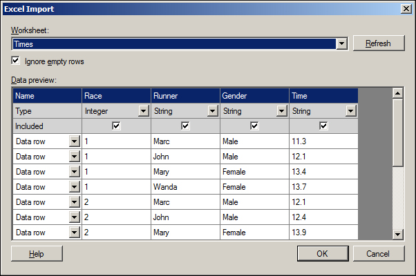
Click on OK, and next, accept the default name for the data table by clicking on OK again. Once again, a default Scatter Plot visualization will be automatically generated for us. Please rename the created page to Performance.
Save the visualization and the data table, as we will continue building it on later.
To be able to load data from a database, you will need to have the right connectors. In this example, we will connect to our local Oracle XE instance, so we will need to have the Oracle Client ODP.NET installed. The 64-bit version installer can be downloaded from http://download.oracle.com/otn/other/ole-oo4o/ODAC1120320Xcopy_x64.zip.
Tip
For this example, we will need to have some loadable data in our local XE database. For simplicity, we will use the Human Resources (HR) example, which comes bundled with the Oracle XE installation (the demo setup scripts can be found at C:oraclexeapporacleproduct11.2.0serverdemoschemahuman_resources).
Although there are many scripts at the specified location, users are solely required to run hr_main.sql. Please make sure that the database objects are created in a schema other than the one created for the Spotfire Server: spotfire schema.
The following screenshot presents the input values that should be used in the dialog generated while running the script hr_main.sql.
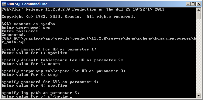
If you used this configuration, a new database user named hr will be created (with the password spotfire). All the demo objects will be created in this user's schema.
To trigger the loading of the data from the database, please click on the Add Data Tables toolbar button. You will be presented with the dialog box Add Data Tables. Navigate to Add | Database. The dialog box Open Database, as shown in the following screenshot, will be presented.

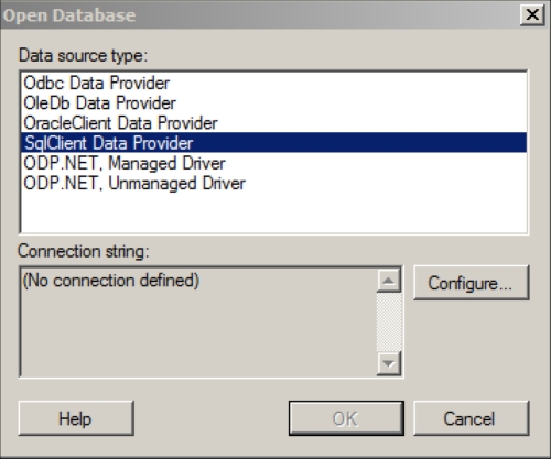
Choose Oracle Data Provider for .NET, and click on Configure.... A pop-up, named Configure Data Source Connection, will be shown. This is presented in the following screenshot:

Fill in the following parameters:
DATA SOURCE:XEUSER ID:hrPASSWORD:spotfire
Tick Allow saving credentials and click on OK.
The dialog box will close and focus will return to the Open Database dialog. You can push OK.
A dialog box named Specify Tables and Columns will be presented; see the following screenshot. This will allow us to choose which database tables or views we want to load into Spotfire.

Drill down
HR and select EMPLOYEES (we will load all the columns from the table). Name the data source as Employees, and click on OK.
Once again, a default Scatter Plot visualization will be automatically generated. Please rename the new page to Employees.
Please save the visualization, so we can build it on later.
Tip
Saving an analysis project does not save the underlying data (this data is not embedded in the project). Users have, however, the option to embed it explicitly while saving.
The impacts of non-embedding (or linking) data are related to the fact that, for visualizations to be available, the underlying data sources also have to be available (this also applies to the system files).
So far we loaded three distinct sources of data into Spotfire Professional, and we made no changes to the default visualizations generated. In the next section, we will start working with several visualization types and we will leverage these default Scatter Plots that we have.