
Details visualizations are a great feature available in Spotfire. They act as daughter visualizations of one or more parent graphs, where the displayed data will have, as source, the marked (Marking) data of the parent(s). The details visualization data table will be the subset of data of the parent's data table selected by the user, which in turn will correspond to the records available to the users in the Details-on-Demand view.
Users can derive details visualizations from other details visualizations in a theoretically unlimited cascade.
We will create one details visualization for the StoreSales page pie chart. This chart displays the percentage of total spending in each location, segregated by men and women. This new graph will also be a pie chart, and will further drill down in to the spending details, by providing information about the customer's age group.
To create the details graph, please follow the following instructions:
- Right-click on top of the Pie Chart visualization and navigate to Create Details Visualization | Pie Chart. We will create a details pie chart.
- Change Color by: to Age group. Drill down on age group.
- Access the chart's Properties dialog box, select the property group Data, and select the value Empty visualization in If no items are marked in the master visualizations, show. With this option, the details table is filled only if there is marked data in the parent visualization (the default option shows all available data if nothing is marked).
- Access the chart's Properties dialog box, select the property group Labels, and then select the checkbox Show in labels under Sector category, in order to display the Color by: category value in the pie slices.
- Access the chart's Properties dialog box, property group Size, and set the Pie size to the maximum, to maximize the chart's size.
If you followed all indications, your visualization should be similar to the one in then select following screenshot:
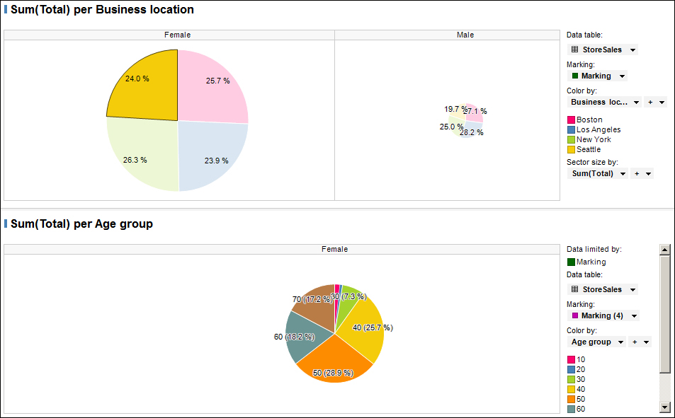
This detailed visualization displays the total spent by the different age groups, solely for the females from Seattle.
To demonstrate the cascading details, we will now create one details visualization for the just created details visualization. It will be a combination chart with the purpose of counting the number of records for each customer age. This chart will be rendered individually for each age group, as it will be a detailed visualization of it.
To create the graph, please follow the following instructions:
- Create a new page to host the new chart as adding a chart to the page StoreSales would make it too confusing. Rename it to
StoreSales – Age Details. - Back on the
StoreSalespage, create a details visualization (of type Combination) for the details pie chart. This new chart will be placed under the parent one. - Drag the new details chart to the created page (
StoreSales - Age Details) and drop it there (charts are dragged by the bar where the chart name is displayed). - For the x axis, select the variable Customer age.
- For the y axis, select the variable (Row Count).
- Define Customer age as Series by:. This assigns a different color to each age of the age group.
If you followed all indications, your visualization should be similar to the following screenshot:

Please note that this chart will only present data if there are markings in its parent chart, which in its turn will also only present data if there are markings in its parent chart.
This details visualization corresponds to the males from Boston marking of the grandparent visualization, and the age group 40 of the parent visualization.
Please save the analysis project.