
In this chapter, we will continue improving our Spotfire skills. We will focus on activities such as data filtering, data manipulation, and library creation.
We will also focus on analysis visualization and interaction, resorting to Spotfire Web Player Server — the reader will become familiarized with the tool's main features. We will focus a bit on this product, as it is a great tool to share analysis with others.
The function of filters is to restrict the data shown in visualizations. This means that the users can limit the records of the visualization's data table that are displayed or used in the visualization itself. The filtering out of data has an impact on visualization aggregations and axis scales, and its application is immediate, as any selection/deselection will be rendered without any delays.
By default, a filter is created by Spotfire for each column of each existing data table, and all filters are available in a panel named Filters, that is presented on the top-right corner of the Spotfire Professional display.
Filters are grouped by data table, and these tables will be sorted chronologically by ascending creation date. Focus will be on the first data table that is used in a visualization of the current page.
The following screenshot is an example of the Filters panel for the visualization of the page Store Sales - Total Sales – StoreSales data table.

This panel also has a search field to allow a quicker finding of filters by their name.
Filter names not matching with the search keyword will be hidden from the user and cannot be applied. To display all filters again, the user must remove all the keywords from the search box.
The following screenshot displays a filter search for the keyword gender.

Two distinct filters were found which match the keyword: one from the data table StoreSales and the other from the data table Performance.
The Filters panel can be moved, closed, and opened. To open and close the panel, users can navigate to the View | Filters menu, or the Filters button on the toolbar. Both the enumerated options are presented in the following two screenshots respectively:

Just as the data columns have an underlying data type, filters also make available several interaction types to improve and facilitate usage. Spotfire offers the following filter types:
- Item filter: This is represented by a slider, which allows the user to select one, none, or all the values. When the slider is on the left, all values are displayed; when the slider is on the right, no values are displayed; and when it is in between, unique values are displayed. The next screenshot presents an example of such a filter type:

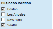
- Checkboxes: There is a set of checkboxes, one for each value of the filter. A user can select none or more checkboxes to filter the displayed values. If there are empty values in the column, an (Empty) checkbox will be available as well. The following screenshot presents an example of such a filter type:
- Radio buttons: These buttons have the same behavior as an item filter, but the display is different. Because radio buttons allow only one choice, the user will also have (All) and (None) options. The following screenshot presents an example of such a filter type:

- Range filter: This type of filter operates with a slider, where two handles exist: one on the left corner and other on the right corner. These handles allow the user to set the ranges that are being filtered. Because this filter type involves the setting of an interval with minimum and maximum value, it is best suited for columns of the type
integerordate(time). The label values above the slider (that represent the interval limits) can be double-clicked and set manually (for date formats, users can simply click on the calendar icon and choose the date from the pop up). The following screenshot presents an example of such a filter type:
- Text filter: This type of filter allows the user to type in a string, which will be used for matching with filter values. Values that do not match will be filtered out. This search is non-case sensitive, white spaces will filter out values without all search strings (OR can also be used for disjunction), and the wildcard
*can also be used. The following screenshot presents an example of such a filter type:
This filtering will filter out the records with Business locations other than Boston and Los Angeles, as only these two match with the expression
*os*(only these two containossomewhere in their value). - Listbox filter: This allows the selection of filter values to apply from a list of values contained in a column box. Multiple selections can be made at a time using the Shift and Ctrl keys. This type of filter also contains an input search field that allows the user to filter the values displayed in the box. The following screenshot presents an example of such a filter type:

By right-clicking on a filter, the user is presented with a filter options menu, which allows manipulation of filters.
The following options are available:
- Filter type: For a certain filter, we can toggle between different filter types.
- Reset Filter/Reset all Filters: It includes options to reset the filters.
- Rename: It is used to change the name of a filter.
- Hide Filter: This option allows the user to temporarily remove unnecessary filters, in order to reduce the amount of data shown in the Filters panel. If this option is used, a warning will appear in the Filters panel as Some filters are hidden. Show all. Clicking on Show all will unhide all the filters. For a finer-grained hiding/showing, users should use the option Organize Filters.
- New Group: Users can create groups to better organize the existing filters. Hierarchically, groups can only be created under data tables, which means each group can only organize filters of one data table.
- Move to Group: This allows the moving of a filter to an existing group.
- Organize Filters: This is a dialog box, which hierarchically displays the data tables, groups, and filters of the analysis, and allows the user to set their sorting and visibility settings. Group creation and deletion are also possible here (although it is not possible to add filters to groups). The following screenshot displays such a dialog box:

Spotfire places a lot of emphasis on its data filtering capabilities.
For increased flexibility, users can create their own schemes, where filters can be applied independently of other schemes.
All schemes will always contain all available filters. It is the application of filters that is independent between the schemes. The following two screenshots demonstrate this independent behavior; although the scheme Filtering scheme 1 has values 10, 20, 30, and 40 filtered out from the filter Age group (of the data table StoreSales ), the scheme Filtering scheme 2 has all the values included.


Any change between schemes has an immediate impact on the displayed visualizations.
To illustrate the application of filters, we will now see the difference between two visualizations with and without filters. The following two screenshots will demonstrate this.
The first screenshot contains the visualizations of the page Store Sales - Total Sales without any filtering:

The following screenshot presents the same visualizations with the following filters applied:
- Age group: 50
- Business location: Seattle
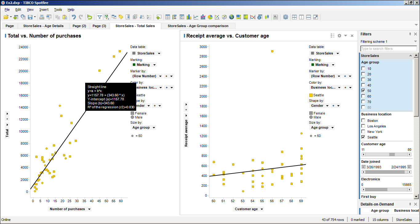
It is curious to realize that the correlation between the variables Total and Number of purchases increases with the application of these filters. With the filtered out data, the direct correlation is of 83 percent.
Hierarchies are a special type of filter, where the filter itself is displayed in a hierarchical format. Conceptually, these filters behave as data trees.
An example of a hierarchy is the definition of a Calendar, divided into years, quarters, months, weeks, and days.
The simplest way to demonstrate this Spotfire feature is to create Date Hierarchy Filter from a Date Range filter type. We will use the Date joined filter from the StoreSales data table.
Right-clicking on the Date joined filter, and then selecting the Insert Hierarchy option, will present a dialog box as shown in the following screenshot:

The default selected columns for hierarchy creation are Year, Month, and Day of Month. The remaining selectable columns are Quarter, Week, Day of Year, and Day of Week. We can add the Quarter column and move it up between Year and Month. The hierarchy configuration will look similar to the following screenshot:
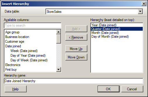
The addition of a column can be done by selecting the column and clicking on Add, and shifting of the column through the hierarchy can be done using the buttons Move Up and Move Down.
Hierarchies also have a name, which can be set during the creation process (in the dialog box) or changed later (by right-clicking on top of the hierarchy).
The created hierarchical filter does not replace the original one. Both will coexist in the analysis. In our example, both the Date joined filter and the hierarchy named Date Joined Hierarchy will be shown to the user.
The following screenshot presents the created hierarchy:

Hierarchies can also be created using two or more data table columns. The only existing limitation is related to the fact that only one data table can be used in one hierarchy.
As already specified, graph elements (displayed data) can be selected, and this is called marking. This action has several purposes, such as updating the details visualization (in the Details-on-Demand panel), copying records, and so on.
The user has a varied set of options available for marking: click on the item, Ctrl + click on the item, Shift + click, Ctrl + Shift + click, Alt + click, and so on. A complete list with detailed descriptions can be found in the Spotfire Professional's Help Topics documentation page, Marking in Visualizations.
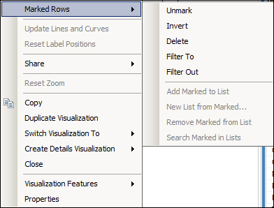
To unmark a selection, users must right-click on the top of the visualization and select Marked Rows | Unmark. Other options will also be offered to the user such as Invert, Delete, Filter To, and Filter Out. The following screenshot lists these options:
The data table records of marked data will be listed in the Details-on-Demand panel of Spotfire Professional. This panel is located by default on the right lower corner of the screen, just below the Filters panel. And just like the filters, it can be moved, closed, and opened. To open and close the panel, navigate to the View | Details-on-Demand menu, or the Details-on-Demand button on the toolbar.
This panel can be customized, by using its Properties dialog box (obtained by right-clicking on the window):
- Appearance: It allows setting the appearence of the panel, in terms of number of rows for header, number of rows for data, show or hide cell borders, and column orientation
- Fonts: It allows selection of font for table text and headers
- Columns: It shows data table columns and their sorting (by default, all are shown). Also allows the specification of a renderer for each column (Link, Text, or Image from URL)
- Sorting: It defines the sorting order by a maximum of three columns in ascending or descending order