
Bins are a simple way of categorizing and bucketing values, depending on the measure value. So, for example, you could "bin" customers depending on their age group or the number of cars that they own. Bins are useful for dashboards because they offer a summary view of the data, which is essential for the "at a glance" function of dashboards.
Tableau can create bins automatically, or we can also set up bins manually using calculated fields. This recipe will show both versions in order to meet the business needs.
In this recipe, we will use the existing workbook that you created for this chapter.
We will use the same data. For this recipe, let's take a copy of the Hierarchies worksheet and by right-clicking on the Worksheet tab, select the Duplicate Sheet option. You can then rename the sheet to Bins.
- Once you have your Bins worksheet in place, right-click on the SalesAmount measure and select the Create Bins... option. You can see an example of this in the following screenshot:

- We will change the value to
5. Once you've done this, press the Load button to reveal the Min, Max, and Diff values of the data, as shown in the following screenshot: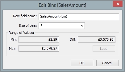
- When you click on the OK button, you will see a bin appear under the Dimensions area. The following is an example of this:

- Let's test out our bins! To do this, remove everything from the Rows shelf, leaving only the Product Category hierarchy. Remove any filters from the worksheet and all of the calculations in the Marks shelf.
- Next, drag SalesAmount (bin) to the Marks area under the Detail and Tooltip buttons. Once again, take SalesAmount (bin) and drag it to the Color button on the Marks shelf.

- Now, we will change the size of the data points to reflect the size of the elements. To do this, drag SalesAmount (bin) to the Size button.
- You can vary the overall size of the elements by clicking on the Size button and moving the slider horizontally so that you get your preferred size.
- To neaten the image, right-click on the Full Date Alternate Key column heading and select Hide Field Names for Columns from the list.
The Tableau worksheet should now look like this:

- This allows us to see some patterns in the data. We can also see more details if we click on the data points; you can see an illustration of the details in the data in the following screenshot:

- However, we might find that the automated bins are not very clear to business users. We can see in the previous screenshot that the SalesAmount (bin) value is #610,298.76. This may not be meaningful to business users.
How can we set the bins so that they are meaningful to business users, rather than being automated by Tableau? For example, what if the business team wants to know about the proportion of their sales that fell into well-defined buckets, sliced by years?
Fortunately, we can emulate the same behavior as in bins by simply using a calculated field. We can create a very simple
IF… THEN... ELSEIFformula that will place the sales amounts into buckets, depending on the value of the sales amount. These buckets are manually defined using a calculated field, and we will see how to do this now. - Before we begin, take a copy of the existing worksheet called Bins and rename it to
Bins Set Manually. - To do this, right-click on the Sales Amount measure and choose the Create Calculated Field option.
- In the calculated field, enter the following formula:
If [SalesAmount] <= 1000 THEN "1000"
ELSEIF [SalesAmount] <= 2000 THEN "2000"
ELSEIF [SalesAmount] <= 3000 THEN "3000"
ELSEIF [SalesAmount] <= 4000 THEN "4000"
ELSEIF [SalesAmount] <= 5000 THEN "5000"
ELSEIF [SalesAmount] <= 6000 THEN "6000"
ELSE "7000"
END
- When this formula is entered into the Calculated Field window, it looks like what the following screenshot shows. Rename the calculated field to SalesAmount Buckets.

- Now that we have our calculated field in place, we can use it in our Tableau worksheet to create a dashboard component.
- On the Columns shelf, place the SalesAmount Buckets calculated field and the Year(Date) dimension attribute.
- On the Rows shelf, place Sum(SalesAmount) from the Measures section.
- Place the Product Category hierarchy on the Color button.
- Drag SalesAmount Buckets from the Dimensions pane to the Size button on the Marks shelf.
- Go to the Show Me panel and select the Circle View option. This will provide a dot plot feel to data visualization. You can resize the chart by hovering the mouse over the foot of the y axis where the
£0.00value is located. - Remove Sales Amount (bin) from the Marks shelf.
- Drag SalesAmount Buckets to the Size button.
- Once you're done with these activities, the Tableau worksheet will look as it appears in the following screenshot:

To summarize, we have created bins using Tableau's automatic bin feature. We have also looked at ways of manually creating bins using the Calculated Field feature.
Bins are constructed using a default Bins feature in Tableau, and we can use Calculated Fields in order to make them more useful and complex. They are stored in the Tableau workbook, so you will be able to preserve your work if you send it to someone else.
In this recipe, we have also looked at dot plot visualization, which is a very simple way of representing data that does not use a lot of "ink". The data/ink ratio is useful to simplify a data visualization in order to get the message of the data across very clearly. Dot plots might be considered old fashioned, but they are very effective and are perhaps underused. We can see from the screenshot that the 3000 bucket contained the highest number of sales amount. We can also see that this figure peaks in the year 2007 and then falls in 2008. This is a dashboard element that could be used as a start for further analysis. For example, business users will want to know the reason for the fall in sales for the highest occurring "bin".