
Charts with dual axes can be a mixed blessing. Adding another axis can help the purpose of comparison. Comparison is one of the essential tools to analyze data. You can often hear it expressed in user questions, such as how does that figure compare to last year's, or where are we in relation to our target?
On the other hand, dual axes are best used where the viewer genuinely understands the data. Dual axes can be very misleading. For example, if we have units on one axis and currency on another, the chart can be hard to understand. Further, if the axes are contracted whereby they don't start at zero, or only show a band of the data, then the naïve user may find it misleading. Normally, due to these issues, dual-axis charts are best avoided where people don't understand the data very well. This is particularly the case for a dashboard, where people are expecting to pick up information very quickly.
In Tableau, however, the use of dual axes can be useful to display the same data in different ways in order to enhance the message of the data. In this recipe, we will look at using dual-axes charts as another neat trick to visualize data.
For the exercises in this recipe, we will build on the existing Chapter 7 dashboard. We don't need to add in any more data for now.
- Start a new worksheet and call it Sales Transactions.
- Drag FullAlternateDateKey onto the Columns shelf.
- Remove the header by right-clicking on the blue pill and deselecting Show Header, as shown in the following screenshot:

- Drag EnglishProductCategoryName onto the Rows shelf.
- Drag SalesAmount onto the right-hand side of EnglishProductCategoryName on the Rows shelf. You should get line charts now.
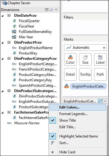
- To change the lines to gray for all the product categories, drag EnglishProductCategoryName onto the Color button and click on the right-hand side downward-facing arrow, and then select the Edit Colors… option, as in the following screenshot:
- Click on each category in turn and select the color to be gray:

- You can see that Bikes has a much higher sales amount than Accessories or Clothing. The sales amount value for Bikes is a behemoth next to the other categories, which unfortunately means that we cannot see the patterns in the data for these categories. To solve this problem, we need to change the axes so that they are synchronized and we can see the patterns. Right-click on the SalesAmount y axis and choose the option Edit Axis.
- In the Edit Axis dialog box that appears, deselect the Include Zero checkbox and select the option Independent axis ranges for each row or column. Then, remove SalesAmount from the Titles textbox and deselect Automatic. Finally, click on Apply and OK, as shown in the following screenshot:

- Next, click on the SalesAmount green pill and uncheck the Show Header option.
- Finally, go to the Columns shelf, click on Year(FullSalesAmount), and select Discrete.
- Right-click on EnglishProductCategoryName and deselect Show Header.
- Right-click on SalesAmount and select Create Calculated Field.
- Next, create a calculated field that calculates whether the latest sales amount is greater than the average amount of sales for each row. In the Name field of the Calculated Field editor, type
Sales Amount Comparison. - In the Text field of the Calculated Field editor, type the following formula and click on OK:
ZN(SUM([SalesAmount])) - Window_AVG(SUM([SalesAmount])). - Let's create another calculated field by right-clicking in the Measures field and selecting Create Calculated Field. Let's call it Latest Sales Amount. The formula should be as follows:
IF (Year([FullDateAlternateKey])) = Year([Max Year])
THEN [SalesAmount] END
- Let's create one more calculated field by right-clicking in the Measures field and selecting Create Calculated Field. Let's call it Diff from All Year's Average. The formula should be as follows:
ZN(SUM([Sales Amount])) - Window_AVG(SUM([Sales Amount]))
- Drag Latest Sales Amount to the Rows shelf.
- Click on Latest Sales Amount on the Marks shelf, and drag SalesAmountComparison onto the Color button.
- Let's use color to highlight the result. We will categorize the color into three types: red for below average, gray for close to average sales amount, and blue for greater than the average sales amount. On the Color mark for SalesAmountComparison, select Edit Colors… from the right-hand side downward-facing arrow button.
- Select Stepped Color and type the number
3to represent three steps. Click on the green box at the left-hand side of the green bar, and a color dialog box will appear. Select blue. Then, select the Reversed option and click on OK. You can see the result in the following screenshot: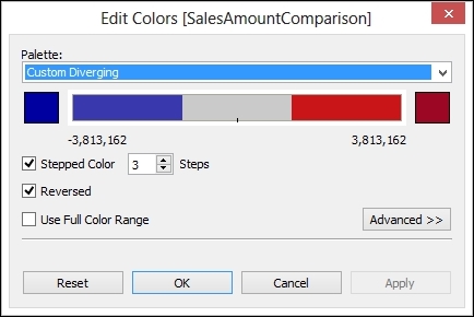
- Finally, hide the field name for the columns by selecting FullDateAlternateKey in the visualization and reselecting Show Header.
- Right-click on Sum(Latest Sales Amount) and select Dual Axis.
- Select each y axis and deselect Show Header.
The result so far should appear as shown in the following screenshot:

- Rename the sheet as
Topic 1 Color Sparkline. - Duplicate the sheet by going to the tab name, right-clicking on it, and selecting Duplicate Sheet.
- Rename the sheet
Topic 1 Color Table. - Go to the Show Me tab and select the table visualization.
- Drag EnglishProductCategory onto the Rows shelf.
- Drag Year(FullDateAlternateKey) onto the Filters shelf and filter by Years so that only data for the year 2008 shows.
- Drag Latest Sales Amount onto the canvas area to show the numbers.
- On the Marks shelf, drag SalesAmountComparison onto the Color button.
- Click on the Color button and choose the Edit Colors… option.
- In the Edit Colors dialog box, choose the Stepped Colors option and enter the number
2. - Choose the Reversed option.
- Select the left-hand side square box, and in the color dialog box, select gray and click on OK.
- Select the right-hand side square box in the color dialog box, select royal blue, and then click on OK. You can see the final settings in the following screenshot:

- Click on SUM(SalesAmount) and sort in descending order.
- Remove all of the headings for the columns by clicking on each header, and deselecting Show Header.
The resulting visualization should look like the following screenshot:

- Now, let's put them together in a dashboard. To create a new dashboard, right-click on the Name tab at the bottom and select New Dashboard.
- On the dashboard sheet, select the Topic 1 Color Sparkline and Topic 1 Color Table worksheets, and put them next to each other on the canvas.
- On the dashboard, hide the title for the Topic 1 Color Sparkline worksheet by clicking on the downward-facing arrow on the right-hand side and deselecting Title.
- Now, hide the title for the Topic 1 Color Average worksheet by clicking on the downward-facing arrow on the right-hand side and deselecting Title.
- Resize the rows on each worksheet so that they match nicely.
- Navigate to Format | Shading.
- To add banding, go to the sheet tab on the format shading series of options that appear on the left-hand side of the screen. Select Row Banding and move the Band Size slider until it is halfway along the slider.
- Navigate to Format | Lines. Set each line to None.
- Now click on the right-hand side visualization in the dashboard and then select the Lines option from the Format menu. In each of the Rows options, select None.
- Now go back to the Format menu item and select the Borders option. On the Sheet menu item, select None for the Row Divider option.
Your completed dashboard should appear as shown in the following screenshot:

Dual axes can be difficult to interpret, particularly if each axis shows different measurements. However, here, dual axes can help us to create a visualization. Using a dual-axis chart here allows us to set the size and color of the circle and the line chart independently.
In this recipe, we used a ZN formula. The ZN formula is used when you want to replace a zero with null values. We saw the impact of null values in an earlier chapter, and this is one option for us.
Tableau has some great functionality, which means that you can have fun with the appearance of sparklines as well as provide more information with them. For example, you could use the Line End option for the label and use advanced editing on the text label to format in order to provide more detail for the dashboard users.