
Pie charts are probably the most ubiquitous data visualization form. However, their effectiveness is often debated. To summarize, humans are not very good at distinguishing and comparing area or angles. Pie charts use both these mechanisms to convey a message about the data.
People are tempted to use lots of pie charts when visualizing data. Why? Because they like them. However, pie charts take up a lot of space on a page to give one message about the data. It isn't possible, for example, to show timelines very effectively, and they can't be used to convey multidimensional data properly.
In this recipe, we will look at creating a pie chart in Tableau, and then we will take a look at a better way of visualizing the same data. This will help you to understand the debate surrounding the humble pie chart and to see when they are most effectively used.
For the exercises in this recipe, we will build on the existing Chapter Seven dashboard.
- Duplicate the
Splomworksheet by right-clicking on the tab and selecting Duplicate Worksheet. - Rename the duplicated worksheet to
Humble Pie. - On the Show Me tab, select the pie chart option.
Your screen will now change to display pie charts. You can see an example in the following screenshot:

You can see that the pie chart doesn't make any sense. Tableau has tried to display different metrics on the same pie chart, and it does not show any meaningful information.
- Let's change the pie chart so that it shows one metric only. Remove everything from the canvas in order to start.
- Drag Year(FullDateAlternateKey) onto the Color button.
- Drag SalesAmount onto the Size button. The data visualization will now look like the following screenshot:

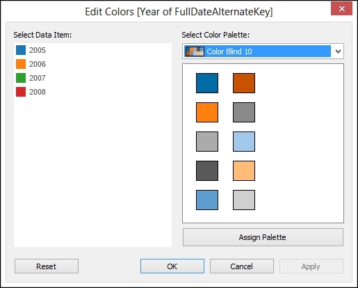
- For some reason, Tableau has put red and green next to each other. Let's change the palette to one that is sensitive to the needs of color-blind people. Go to the Color button and click on it, and select Edit Color….
- In the Edit Colors dialog box, choose Color Blind 10 from the drop-down list, click on Assign Palette, and then click on OK. Here's a screenshot showing the color settings:
You can see the final pie in the following screenshot:

Generally speaking, pie charts are to be avoided. Humans are not accurate when they estimate area.
A key part of data analysis is comparison. Pie charts don't allow easy comparison because we find it harder to compare areas, and it is also harder for us to compare slices that are not next to one another.
So when should we use pie charts? They can be used when the area of the pie chart represents a single measure. If there are fewer slices, and the slices represent a percentage of a single measure, then pie charts can be understood easily and quickly. In the previous examples, we used sales amount as a single metric and showed it sliced by different categories. If we used it for multiple categories, then this would be harder to read. As a rule of thumb, no more than five slices is a good guideline.
Pies are useful when we want to put data on a map. Even then, the guidelines on slices should remain the same.
Pies can be nice as a way of filtering dashboards. So, they could filter dashboards by allowing the user to click on a particular slice to filter the whole dashboard. Pies are useful if you are displaying data on a map, as long as there are not too many slices, or you will lose the value of the data visualization.
- If you want to know more about the use and abuse of pie charts, there are plenty of resources. Stephen Few's blog, Perceptual Edge, is a great place to start. You can view it at www.perceptualedge.com.