Chapter 3
Building Your First Visualization
“If we have made this our task, then there is no more rational procedure than the method of trial and error—of conjecture and refutation: of boldly proposing theories; of trying our best to show that these are erroneous; and of accepting them tentatively if our critical efforts are unsuccessful.”
Karl Popper1
Now that you’ve learned how to connect Tableau to a variety of data sources, you can start building visualizations. In this chapter, you learn about all of the chart types provided by the Show Me button. You will discover how to add trend lines and reference lines and how to control the way your data is sorted and filtered. You’ll see how creating ad hoc groups, sets, and hierarchies can produce information not available in the data source. The chapter covers Tableau’s discrete and continuous data hierarchies, along with how you can alter Tableau’s default date hierarchies by creating your own custom dates.
Fast and Easy Analysis via Show Me
Tableau’s mission statement is to help you see and understand your data by enabling self-service visual analytics. The software is designed to facilitate analysis for non-technical information consumers. This is the concept behind Tableau’s Show Me button. Consider Show Me to be your expert helper. Show Me tells you what chart to use and why. It will also help you create complicated visualizations faster and with less effort. For example, advanced map visualizations are best started via Show Me because Tableau will properly place multiple Dimensions and Measures pills on the appropriate shelves with a single click. If you know what you want to see, Show Me will get you to your desired destination quickly.
New Features
Since the first edition of this book was published, two additional chart types have been added to Show Me: the box plot and the dual axis combination chart. While it has been possible to create these chart types in Tableau for quite some time, their addition to Show Me makes them accessible to novice users. A new Analytics tab has also been added to the Dimensions shelf, providing a more intuitive way for new users to add trend lines, reference lines, or forecasts to visualizations.
How Show Me Works
Show Me looks at the combination of measures and dimensions you’ve selected and interprets what chart types display the data most effectively. Most of the examples in this chapter use a version of the Superstore sales dataset that will not be the same as the version that ships with Tableau. You can download a copy of the workbook used to create all of the figures in this chapter at the book’s companion website (see Appendix F for instructions). Or, you can use the Superstore dataset that shipped with Tableau desktop. Just realize that your results may look different than the figures in the text.
Regardless of which version you decide to use, selecting the Order Date field from the Dimensions shelf and Sales from the Measures shelf and then clicking Show Me will expose the options available for that combination that you see in Figure 3-1.

Figure 3-1: Show Me chart options
Tableau recommends a line (discrete) time series chart in Show Me—denoted with a blue outline. At the bottom of the Show Me area, you also see additional details regarding requirements needed for building any available chart. The time series chart requires one date, one measure, and zero or more dimensions. Selecting the highlighted chart and rotating the axis causes the time series chart in Figure 3-2 to be displayed.

Figure 3-2: Discrete date time series chart
Pointing at other chart options in the Show Me menu changes the text at the bottom of the menu. This text provides guidance on the combination of data elements required for the chart being considered. Clicking on any of the highlighted Show Me icons alters the visualization in the worksheet.
Chart Types Provided by the Show Me Button
Show Me now contains 24 chart types. The most recent additions are the dual axis combination time series chart and the box-and-whisker plot. In Figure 3-3 you can see a blue outline around the symbol map.
At the bottom of the Show Me menu, descriptions of the data elements required for the chart are provided. As you hover over other chart types, these descriptions change. Next you’ll learn about all of the chart types facilitated by Show Me in more detail.

Figure 3-3: The Show Me menu
In the following sections, you will see examples of every chart type that Show Me supports in the order that they appear in the Show Me menu.
Text Tables, Heat Map, and Highlight Table
Text Tables look like grids of numbers in a spreadsheet. These are also referred to as text tables and are useful for looking up values. Figure 3-4 shows a standard text table in the upper left.
The text table in the lower left of Figure 3-4 has been enhanced by adding a Boolean calculation to highlight items with less than 5 percent profit ratio. Individual marks with less than 5 percent profit ratio are orange. You learn how to create calculated values in Chapter 4.
In the upper right of Figure 3-4 is a highlight table. These are similar to text tables but use a color background to help you see the range of values included. The larger values have blue backgrounds with the lower values being displayed with an orange background. The color legend below the highlight table indicates that the full range of values includes a low value of $75,000 and a high value of $396,000. In this way, highlight tables help you see the outliers more clearly than a text table.
The chart in the lower right of Figure 3-4 is a heat map. Heat maps can use size and color to display multiple measures. In the example, sales are represented by the size of the mark and profit ratio is conveyed using color. While the actual numbers aren’t displayed as they are in text tables or highlight tables, heat maps can display a lot of data in a small amount of space.

Figure 3-4: Text tables, highlight table, and heat map
Symbol Map, Fill Map, and Pie Chart
Selecting a field with a small globe icon makes maps available in Show Me. Figure 3-5 shows examples of the two kinds of maps Show Me provides.
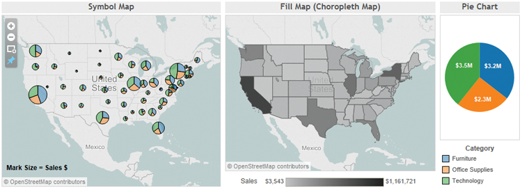
Figure 3-5: Symbol map, fill map, pie chart
Symbol maps are most effective for displaying very granular details or if you need to show multiple members of a small dimension set. The symbol map on the left of Figure 3-5 uses small pie charts to display product category. In symbol maps, it is a good idea to make the marks more transparent and add dark borders because marks tend to cluster around highly populated areas. Using the Color button on the Marks card to do this makes the individual marks easier to see.
Filled maps (also known as choropleth maps—see the glossary for a detailed definition) display a single measure using color within a geographic shape. If you restrict filled maps to smaller geographic areas (state, province), they effectively display more granular areas such as county or postal code.
The pie chart on the right side in Figure 3-5 shows the relative sales values for the three product categories included in the dataset. Pie charts are commonly used to present relative values, but they are not the best choice if precise visual comparisons are desired. A better way to present this data, if more precise comparisons need to be made, is the bar chart covered in the next section.
Bar Chart, Stacked Bar, Side-by-Side Bars
Bar charts facilitate comparisons between different values. Figure 3-6 includes three different examples.

Figure 3-6: Bar chart, stacked bar chart, and side-by-side bar chart
Bar charts are the most effective way to compare values across dimensions, their linear nature making precise comparisons easy. The horizontal bar chart on the left of Figure 3-6 makes precise comparison of the three values displayed easy. You can see that Technology has the most sales while Office Supplies is the lowest. And, even though Furniture sales are nearly the same as Technology, you can see that they are not as big.
Stacked bar charts in the middle of Figure 3-6 should not be used when there are many different dimensions because they can be overwhelming if too many colors are plotted in each bar. On the right of Figure 3-6 is the side-by-side bar chart. This chart type provides a more precise way to compare measures. You can see that it is easier to see the relative values in the side-by-side bar chart than in the stacked bar chart.
Treemap, Circle View, Side-by-Side Circles
Comparing more granular combinations of dimensions and measures in a relatively small space can be done effectively with each of these charts. Heat maps use color and size to compare up to two measures. On the left side of Figure 3-7 is a treemap.

Figure 3-7: Treemap, circle views, side-by-side circles
Treemaps effectively display larger dimension sets in a relatively small space using color and size. The example shows product category, sales value using size, and profit % using color. Labels indicate the product category. When the size of the block is too small, no labels are displayed. The measures and dimensions that make up each block can be displayed in tooltips that pop out when the information consumer hovers over the mark. This is a default behavior in Tableau for any chart type.
Circle views can display data in a small space. The example in the middle of Figure 3-7 shows sales by product category and region. Side-by-side circles can add an additional dimension for comparison. While these examples show a relatively small number of marks (to save space), it is possible to use these chart types to display very granular values.
In the next two sections, you’ll see how to use Show Me to display time series data.
Line Charts for Time Series Analysis
Line charts are the most effective way to display time series data. One variable to consider when presenting time series is the treatment of time as a discrete (bucketed) entity or as a continuous (unbroken) series progression. Discrete line charts place breaks between time units (year, quarter, and month).
Most people are familiar with time series charts that are presented in unbroken lines. The Lines Continuous chart in Figure 3-8 presents a single measure (sales) by year and month using continuous time.

Figure 3-8: Time series presented using continuous time
The chart includes 24 months of history beginning January 2013 and ending December 2014. The Line Discrete chart in the middle of Figure 3-8 shows the same data using a discrete notion of time. Note the thin gray line dividing each year and the broken line. Later in this chapter you learn how to add trend lines and reference lines that take advantage of discrete “panes” of time created in time series using discrete time.
The dual line chart on the right of Figure 3-8 presents two measures (sales and profit) using asynchronous axis ranges. Show Me assumes dual axis charts will be used to present values that are dissimilar and plots the marks using different axis ranges. The left axis displays sales dollars, while the right axis shows profit %. In the next section, you see three additional options for displaying time series data.
Area Charts and Dual Combination Chart for Time Series Analysis
Area charts can provide a visually appealing way to view time series data; however, care must be taken to explain what is actually being conveyed. The area chart (Continuous) on the left side of Figure 3-9 shows sales of three product categories over time.

Figure 3-9: Area charts and dual combination chart
Area charts do this by stacking each dimension member (furniture, office supplies, technology) on top of each other. Area charts use the color-filled area to denote the relative values of the measure. For this reason care should be taken to explain that the height of the colored area represents all three product categories sales and not just the blue area denoting furniture sales. To precisely compare the relative sales value of each product category, the line charts in Figure 3-8 are a better choice.
The area chart (discrete) in the middle of Figure 3-9 shows the same data plotted using discrete time. Area fill charts make very effective sparklines (see glossary). Building sparklines is covered in Chapter 7.
The dual combination chart on the right side of Figure 3-9 is similar to the dual line chart presented in Figure 3-8 but uses a bar to convey one measure and a line to convey another. Using different mark types in this way highlights that the data being plotted are different measures.
Scatter Plot, Circle View, and Side-by-Side Circle Plots
Enabling analysis of fine-grained data across multiple dimensions, the scatter plot is a great tool for exploring datasets. Figure 3-10 shows an example of a scatter plot.
The scatter plot uses two axes for comparing profit and shipping cost. Color and shape provide insight into two dimensions. Size isn’t being used in the example but could be used for a third measure. Each mark represents a customer, and nearly 5,000 marks are plotted in the example. In a relatively small space, you can plot two measures and up to three dimension using color, shape, and size. This is why scatter plots are great for finding outliers in your data.

Figure 3-10: Scatter plot, histogram, and box-and-whisker plot
Histograms are used to display distributions of a single measure over binned ranges of values. The example in the middle of Figure 3-10 shows Product Base Margin in buckets of 10-point ranges. For example, the 50–60% range contains the largest count of transactions (over 3,000). Histograms provide insight in the number of values contained within a specific range of values. Tableau also makes it easy to parameterize these value ranges so that you can alter the size of the bins. You learn how to create parameters in Chapter 4.
Box-and-whisker plots are a new addition to Show Me. The example on the right of Figure 3-10 shows the range of average selling prices by region. The upper and lower values are shown via the reference lines that plot the maximum and minimum values. The gray-shaded areas show the quartile ranges, and the median value is shown via a small blue dot. Box-and-whisker plots are helpful in comparing the dispersion of values within a set of numbers. In the example presented, you can see that the West Region has a much larger range of average selling price than the other regions and that there were no outliers.
Bullet Graph, Packed Bubble, and Gantt Charts
The last three chart types provided by Show Me are completely different tools. Figure 3-11 shows them together, but their uses are very different.
You may have seen Gantt charts being used in project planning. These are particularly useful when you want to visualize the timing and duration of events. In the example on the left of Figure 3-11, the length of the bar color is the duration of time required to complete a shipment. The starting position of the bar is the date the order was received.
Bullet graphs are bar charts that include a reference line and reference distribution for each cell in the plot. In the example, current year sales (green bars) are compared to prior year sales (black reference lines). The color band behind the bar represents 60 and 80 percent of the prior year sales. Bullet graphs pack a lot of information into a small space, which makes them very good candidates for use in dashboards.

Figure 3-11: Gantt chart, bullet graph, and packed bubbles
Bubble charts offer another way to present relative values by using size and color. They can be interesting to look at but do not allow for very precise comparisons between the different bubbles. For this reason, limit their situations that don’t require precise visual ranking of the bubbles.
Show Me is a real time-saver. If you are new to Tableau and don’t completely understand what the shelves do, Show Me will help you build effective charts even if you don’t completely understand how to create the view. In this way, Show Me provides insight into what happens, and the tool will speed your learning. Also, you can leave the Show Me menu open and move it around the screen. This allows you to quickly select different chart types and see the results immediately.
Once you have a chart in view, you can use that chart structure to add additional information. Two common ways to do this is by adding trend lines or reference lines to your chart. The numbers used to derive trend lines and reference lines can come from the view in Tableau itself and don’t necessarily require that the data exist in your data source. You’ll learn about the new Analytics pane along with trend lines and references lines next.
The Analytics Pane
A new feature added in Tableau V9.0 makes it easier to create trend lines, reference lines, and forecasts. The Analytics pane shown in Figure 3-12 eliminates the need to go to a menu or to know the exact place to right-click (Control-click on the Mac) to add trend lines, reference lines, or forecasts.

Figure 3-12: The Analytics pane
This exposes options for summarizing, modeling, and forecasting the data in the view. A linear regression line with confidence lines can be added to your view by double-clicking the trend line option in the analytics. If you want more control over the type of trend line added to the view, drag the Trend Line option from the Analytics pane onto the polynomial option, as you see in Figure 3-13.

Figure 3-13: Adding a polynomial trend line
Dragging the Trend Line option into the view exposes more options. Figure 3-14 displays the resulting polynomial trend line.
A quadratic trend line (degree 2) is fitted to the data in Figure 3-14. Higher-order polynomials can be selected on the Trend Lines Options menu, as shown in Figure 3-15.

Figure 3-14: Polynomial trend line

Figure 3-15: Editing the trend line
The resulting trend line in Figure 3-16 uses 4 degrees of freedom.

Figure 3-16: Polynomial (degree 4) trend line
If you want to add a reference line to a view containing discrete time buckets, dragging the average line from the summarize area of the Analytics pane enables you to define scope, as you see in Figure 3-17.

Figure 3-17: Selecting reference line scope
The resulting average line plot shows the average monthly values for each pane (year), as you see in Figure 3-18.

Figure 3-18: Average by year reference line
How would you add another reference line that provides a different scope and calculation to the data in the plot? Dragging the reference line from the custom area of the analytics pane exposes the Add a Reference Line dialog box. Drag the Reference Line, Band or Distribution icons from the Analytics tab Custom pane will display more options as you see in Figure 3-19.

Figure 3-19: Defining a second reference line
You can see that the scope selected is Entire Table, the value calculation on sales is Median, and the formatting of the reference line has been altered to an orange dotted line to differentiate the median line from the averages already in the view. Figure 3-20 show the median line added to the view.

Figure 3-20: Median reference line added
The resulting view now contains two different reference lines. Notice the median line scope (table) is different than the average line scope (pane). The line color and style are different, and the positioning of the median label is on the far right. You can change the position of that label by pointing at the reference line, right-clicking (Control-click on the Mac), and selecting the Format menu to edit the alignment of the label text.
Add a forecast to the view using the Analytics pane by dragging the forecast option from the model section of the Analytics pane. Figure 3-21 shows the view with a 2016 forecast added.
You will have to edit the Forecast ⇒ Forecast Options menu to get the forecast plot to look exactly like Figure 3-21. To edit the forecast options, point at the forecast line plot, right-click to expose the Forecast menu, and then select the Forecast Options menu, as you see in Figure 3-22.
Tableau assumes that the last month before the forecasted time period contains incomplete information. The default forecast applied ignored the month of December 2015 in the forecast calculation. The dataset used for this view has complete data for that month. Edit the forecast options to ignore the last “0” months, as you see in Figure 3-22, and your view will look like Figure 3-21.

Figure 3-21: Forecast for 2016

Figure 3-22: Editing forecast options
More complex views containing multiple measures result in more options being exposed when you drag more dimensions into the view. Refer to Tableau’s online manual from the Help menu to see more examples. Chapter 6 provides more details on forecasting. Now let’s take a closer look at how trend lines and reference lines help you understand your data.
Trend Lines and Reference Lines
Visualizing granular data sometimes results in random-looking plots. Trend lines help you interpret the data by fitting a straight or curved line that best represents the pattern contained within detailed data plots. Reference lines provide visual comparisons to benchmark figures, constants, or calculated values that provide insight into marks that don’t conform to expected or desired values. Trend lines help you see patterns in data that are not apparent when looking at your chart of the source data by drawing a line that best fits the values in view.
Reference lines allow you to compare the actual plot against targets or to create statistical analysis of the deviation contained in the plot, or the range of values based on fixed or calculated numbers. Trend lines help you see patterns in data that are not apparent when looking at your chart of the source data by drawing a line that best fits the values in view. Figure 3-23 provides examples of a trend line and a reference line.

Figure 3-23: Trend line and reference line
The chart on the left uses a linear regression line to plot the trend for 2015 weekly sales figures. The pattern of sales is volatile—making it more difficult to see the overall pattern. A linear regression trend line has been added to the plot highlighting that the overall trend in 2015 is up. How reliable is the trend line plot? That question can be answered by pointing at the trend line and reviewing the statistical values displayed or by pointing at the trend line, right-clicking, and selecting Describe Trend Model. Figure 3-24 shows the more detailed description of the trend model statistics.

Figure 3-24: Description of the trend model
Describing the trend model exposes the statistical values that describe the trend line plot. If you are a statistician, all the figures will mean something to you. If you aren’t a statistics expert, focus on the p-value and R-Squared figures. They help you evaluate the reliability and predictive value of the trend line plot. If the p-value is greater than .05, then the trend line doesn’t provide much predictive value. R-Squared provides an indicator of how well the line fits the individual marks. The linear regression trend line displayed on the left side of Figure 3-21 is almost certainly not due to random effects (p-value is <0.0001), which implies a confident interval of around 99 percent. The line doesn’t fit the marks particularly well because there is so much volatility in the weekly sales figures. The R-Square value (.295916) is low, indicating that the variation about the regression line is only 30 percent smaller than the variation about the mean.
The chart on the right in Figure 3-23 uses the same data as the chart on the left, but this time a reference line has been applied to show the target value of $85,000. A reference distribution has also been calculated to show two standard deviations from the mean value of the plot. Assuming the data is normally distributed, marks outside of that range indicate abnormal variation that would warrant further investigation to determine the cause of the variance. The points above the two standard deviation band are all in recent weeks. This is expected based on the previous regression analysis, which had a pronounced positive slope.
You don’t need to become a statistics expert to use trend lines and reference lines. But understanding the basics will certainly help you interpret the plots. If you want to learn more about the statistics involved, a web search will provide more details regarding the mathematics.
Trend Lines
You can also add a trend line to your visualization by right-clicking the white space in the view and selecting the menu option Trend Lines ⇒ Show Trend Lines. This adds a linear regression line to the chart. More trend line options are available if you point at the trend line, right-click, and select Edit Trend Lines. This exposes the trend line menu you see in the left side of Figure 3-25.

Figure 3-25: Trend line options
The Trend Lines menu provides options for changing the trend line type. If your chart uses color to express a dimension, you can choose to create separate trend lines for each colored line in the view—or not. Selecting Show Confidence Bands adds upper and lower bounding lines based on the variation of the data. Tableau adds the confidence bands by default. Notice that the confidence bands option is not checked, and the chart on the right side of Figure 3-25 does not include them.
Reference Lines
There are many different options for reference lines, and you have already learned that you can apply more than one reference line to an axis.
Without using the analytics pane, you can add a reference line by right-clicking on the axis from which you want to apply the reference line. Be careful to point at the white space and not at a title or axis label. Figure 3-26 shows the reference line menu selections used to add the standard deviation reference distribution displayed in the time series plot on the right side of Figure 3-23.

Figure 3-26: Reference line menu settings for two standard deviations
The same chart in Figure 3-23 includes a second reference line that displays a constant target value. This was added by selecting the reference “line” type to display a manually entered constant value of $85,000.
Two more reference line examples along with the related reference line menu selections can be seen in Figure 3-27.
The example on the left in Figure 3-27 combines a reference line displaying the median with reference bands for maximum and minimum values. The chart on the right side of Figure 3-27 uses a reference distribution to plot quintile ranges. Note the use of the Symmetric Color option. Selecting this causes the color bands outside of the widest quintile lines to use the same color hue. If Symmetric Color wasn’t selected, the band color would get darker from top to bottom. Alternatively, if the symmetric options were left unchecked and the reverse was selected, the color bands would get lighter from top to bottom.

Figure 3-27: Reference bands and reference distributions
Applying color fill above or below reference lines calls attention to specific areas of your visualization. Use trend lines and reference lines in moderation. They add insight to your visualizations, but too many reference lines can lead to chart clutter and make it more difficult to understand.
Why the Concept of Scope Is Important
Understanding how the scope in trend line and reference line calculations determines the resulting appearance of the line is important not only for the deriving trend and reference lines but for understanding how calculated values and table calculations work in Tableau. We’ll cover these topics in detail in Chapter 4, but the concept of scope (Cell, Pane, Table) that you learn here will help you when you do more advanced calculations later.
Figure 3-28 includes a time series chart on the left that contains two different reference lines, and the bullet graph on the right contains a single reference line for each bar (cell) in the view.

Figure 3-28: Reference lines using Table, Pane, and Cell
The time series chart on the left uses discrete dates to create panes by quarter. Tableau outlines the panes using gray lines. The scope of the calculation Tableau uses to create the orange reference line is Table. It shows the average value for the entire table. The scope of the blue line labeled Pane Average is Pane. By coincidence, the Table Average and Pane Average lines overlap in the third quarter. In all other quarters in the view, the pane average differs from the average for the entire year (table scope). The bullet graph on the right compares current-year values (blue bars) with prior-year values plotted using thick black reference lines. Those reference lines are applied using cell scope. The gray background is a reference distribution using Cell scope and showing 60 and 80 percent of prior year values.
Changing the Scope of Trend Lines
Scope can also be used to change the appearance of trend lines, but this is done in a different way than reference lines. Figure 3-29 shows examples of different trend line scopes applied to the same chart. Each chart is plotting the same time period and detail, but the trend lines use different details for calculating the lines.
Below each of the charts are the related settings for the trend line options. Notice that the scope of the left chart includes quarter, while the right side doesn’t. This results in the right-side chart plotting a more general trend for the entire year, while the left chart is plotting the trend within each quarter. Also note that the default confidence bands have been turned off in both charts. Access the Trend Lines Options dialog box by right-clicking in the view while pointing at white space or at the trend line.

Figure 3-29: Trend lines options
Tableau provides four different kinds of trend lines (linear, logarithmic, exponential, and polynomial). Most people are accustomed to seeing linear (straight) regression lines in time series data. Polynomial regression provides a more curved line. Increasing the Polynomial degree (as you saw in the section “The Analytics Pane”) will make the trend line follow the plot of the individual marks more closely.
Exponential and Logarithmic Regression Lines
One reason for using trend lines is predictive analysis—to help you see a possible future condition. The choice of method for calculating trend lines requires some professional judgment and is dependent on the data. People associate the word “exponential” with rapid growth. A real-world example of this is provided by the rapid advance of computing power over the past 40 years. Plotting numbers that change drastically and making those figures easy to interpret can be challenging. Figure 3-30 shows three different ways to plot a rapidly changing dataset.
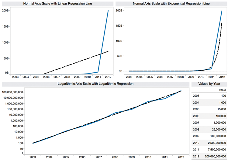
Figure 3-30: Rapidly increasing time series
You can tell by looking at the top two time series plots that the values plotted are increasing very rapidly over a ten-year period. These charts use a linear axis scale. In the top-left chart, a linear trend line is also used to smooth the data. The top-right chart uses an exponential regression line. It’s obvious that the exponential trend line fits the data better. The bottom chart utilizes a logarithmic axis scale, which was altered by right-clicking in the white space of the axis and picking the logarithmic scale option. The trend line is also computed using logarithmic regression.
Tableau’s logarithmic axis scale makes it easier to compare very different values in the same chart. The logarithmic regression line also makes it easier to see what next year’s value might be. If you feel that logarithmic or exponential trend lines might benefit your analysis, you should arm yourself with the technical expertise to explain what the lines mean. As with all statistics, judgment should be applied. History may not repeat.
If you know a friendly statistician, ask them to explain the underlying theory and math. Alternatively, go to Khan Academy’s website at https://www.khanacademy.org/math/probability/regression and watch the videos related to regression, statistics, and probability. Unless you understand the statistics supporting exponential and logarithmic smoothing, you should stick to what you feel comfortable explaining to your audience.
Sorting Data in Tableau
Tableau provides basic and advanced sorting methods that are easily accessed through icons or menus. Sorting isn’t limited to fields that are visible in the chart—any field in the data source can be used for sorting. You can sort in ways that are temporary, or you can define custom default sorting order for your views.
Manual Sorting via Icons
The most basic way to sort is via the icons that appear in the toolbar menu. Sorting via the toolbar icons causes Tableau to sort based on the measure presented in the view. Sorting defined using the toolbar icons or the icons contained within views are temporary sorts. This way of sorting doesn’t override Tableau’s default sorting method. The toolbar menu sort icons provide ascending and descending sorts. Figure 3-31 shows a bar chart in which a manual sort was applied from the toolbar icon.

Figure 3-31: Manual sorting applied from the toolbar icon
Sorting using the toolbar icons provides ascending and descending sorts based on the measure in the view. Tableau also provides sorting icons near the dimension headings in the view. Figure 3-32 shows the three different ways you can apply temporary manual sorts using the icons over the dimension heading.
In the Figure 3-32 example, I duplicated the product category field by right-clicking the product category field on the Dimensions shelf and selecting the Duplicate option. Then I aliased the names of the three members in the product category set, prefixing A, B, and C to make it easier to follow how the sorting is applied. Sorting from the dimension heading column provides an additional sorting option.
The three manual temporary sorts provided by this option are all based on the field. In this example, that is Product Category Alpha. The first sort in Figure 3-32 is the data source order. The second is based on an ascending alphabetical sort of the field members (the same as data source order in this case), and the third is descending alphabetical sort of the field members. It doesn’t matter how many levels of hierarchy are added to the view; you can sort on each level. Experiment by clicking the sort icons above each dimension and note the different outcomes. Note the subtle information contained in the right side of the field pill on the Rows shelf. When data source order is used, the pill doesn’t display any bar chart icon, but when ascending or descending sorts are applied, a small bar chart icon appears.

Figure 3-32: Dimension heading manual sort
Manual temporary sorts can also be applied when you hover the pointer above or below the measure marks in the view. Figure 3-33 displays an example.
Sorting via the measure icon cycles through three sorts: ascending or descending value in the view (in this example, sales) or the data source order of the dimension (in this example, the Product Sub-Category field).

Figure 3-33: Measure icon manual sort
Calculated Sorts Using the Sort Menu
To replace Tableau’s default sort with a custom sort point at a dimension pill, right-click (or select the drop-down arrow in the pill) and select Sort. This exposes the Sort dialog box you see on the right side of Figure 3-34.

Figure 3-34: Defining a custom default sort
The dialog box allows you to redefine the default sort order within the view. In the example, you can see that the view is being sorted based on descending sales. You aren’t limited to sorting based on visible fields in the view. For example, you could also apply Ascending Sort by Average Profit.
Try leaving the Sort menu open and select different fields to base the sort upon. Use the Apply button at the bottom right of the menu to see the result. To save the sort, click OK.
Sorting via Legends
Another useful sort feature is enabled within legends. Figure 3-35 shows two versions of the same bar chart. The right view has the blue delivery truck dimension on the bottom. The chart on the left shows green regular air at the bottom. Reordering the position of the colors displayed within the color legend causes the order of the colors appearing in the bars to change. Reposition the colors within the color legend by pointing at a color, holding down the left mouse button, and dragging the color to the desired position.

Figure 3-35: Reordering the color in charts
The ability to reorder colors in a stacked bar chart is important because precise comparisons are most easily made for the color that starts at the zero point on the axis. All of the other colors are not as easily compared because they don’t start at the same value.
Enhancing View with Filters, Sets, Groups, and Hierarchies
Sorting isn’t the only way to arrange data. Creating drill-down hierarchies is easy in Tableau. Perhaps your data includes a dimension set with too many members for convenient viewing. Grouping dimensions within a particular field is available. Interacting with your data may uncover measurement outliers that you would like to save and reuse in other visualizations. That capability is enabled via sets. Even groups of sets can be created on the fly.
Making Hierarchies to Provide Drill-Down Capability
Hierarchies provide a way to start with a high-level overview of your data and then drill down to lower levels of detail on demand. In Figure 3-33, you see a two-level view of the data that includes product category and then subcategory. That presentation may include more detail than you prefer to see. A hierarchy that combines category and subcategory can address both needs. Figure 3-36 uses a hierarchy to show category first and Subcategory on demand.

Figure 3-36: Hierarchy category and subcategory
The bar chart on the left displays the summary product category. Hierarchy pills have a plus/minus control box preceding the field name. By pointing at the category heading, a small plus sign will appear. Clicking that causes the subcategory level of detail to be exposed. To collapse the hierarchy, point at the category heading again and click the minus sign. You can create as many levels in your hierarchy as you desire.
Hierarchies are created by pointing at a dimension field and dragging it on top of another field. The order of appearance is defined by dragging the field names contained within the hierarchy icon to the desired position. Figure 3-37 shows the hierarchy icon with category and subcategory. You can change the hierarchy name by pointing at the text to the right of the hierarchy icon and typing Product Hierarchy.
Other fields can be added to the hierarchy by dragging them to the desired position inside the hierarchy grouping on the Dimensions shelf.

Figure 3-37: Making a custom hierarchy
Creating and Using Filters
There are a few ways to add filtering to your visualization. Dragging any dimension or measure on to the Filters shelf provides filtering that is accessible to the designer. Make that filter accessible to more people by turning it into a quick filter. This places it on the desktop where it is accessible to anyone—even those reading your report via Tableau Reader or Tableau Server. You can also create conditional filters that operate according to rules you define.
Creating a Filter with the Filters Shelf
In Figure 3-36, the Category and Subcategory view contains seventeen rows of data. Suppose you want to hide five of those rows from view. Dragging the subcategory field from the Dimensions shelf and placing it in the Filters shelf exposes the Filter dialog. Figure 3-38 shows the filtered data with the general tab of the Filter dialog. The subcategories that do not have check marks have been filtered out of view.

Figure 3-38: Applying a filter via the Filters shelf
Notice that there are three other tabs on the Filter dialog. The Wildcard tab is typically used to search for text strings to filter. If you want to filter using another field that isn’t in your view, you can use the Condition tab to select any field in your data source and filter using that field. The Top tab facilitates building top and bottom filtering or filtering requiring other formula conditions. If you use more than one of the filtering options tabs to define your filter, Tableau applies the conditions defined in each tab in the order the tabs appear from left to right. General conditions will be applied first, then wildcard, then condition, and the top tab conditions last.
Below the general field list to the right of the None button is a check box for the Exclude option. If Exclude is selected, the items that include check marks are filtered out of view. Exclude filters can take a little longer to execute than Include filters, especially if your dataset is very large.
Quick Filters
If you want to make the filter available for people who are viewing the report via Tableau Reader or Server, you need to expose the filter control on the desktop. To create a quick filter, point at and right-click any pill used on any shelf in your worksheet; then select the Show Quick Filter option. Figure 3-39 includes quick filters using the category and sales fields.
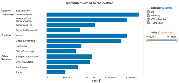
Figure 3-39: Category and Sales quick filters
The default quick filter styles are dependent on the type of field you apply within the Quick Filter control. In Figure 3-39, the discrete category field results in discrete filter options (furniture, office supplies, and technology). Discrete filters are expressed using radio buttons or multi-select boxes. The second quick filter for sales (a continuous range of values) is expressed using slider-type filters. You can edit the quick filter type from inside the control itself. Click the title bar of the filter to expose the available options. Figure 3-40 shows examples of the menus that can be activated from the category and sales quick filter title bars.

Figure 3-40: Editing quick filter types
The menu on the left side of Figure 3-40 relates to discrete category filters. The right menu is for the continuous filters. In addition to controlling the filter style, you can adjust other attributes. The quick filters were modified to include the words “discrete” and “continuous.” Custom colors were applied to each word, and each title was centered in the title block of the Quick Filter. The results of the changes are displayed in Figure 3-39.
These are the Quick Filter menu options (both continuous and discrete):
- Edit filter: Exposes the main filter menu
- Remove filter: Removes the quick filter
- Apply to worksheets: Applies the filter to all or selected worksheets
- Customize: Turns on or off different filter controls
- Show title: Turns off or on the quick filter title
- Edit title: Modifies the text in the quick filter title
- Only relevant values: Reduces the set members displayed in the filter so that only values included in the filtered set are displayed
- Include values: Causes selected items in the filter to be included in the view
- Exclude values: Causes selected items in the filter to be excluded from view
- Hide card: Removes the quick filter from view but leaves it on the filter shelf
These are the Quick Filter menu items that appear only if the quick filter is on a dashboard:
- Floating: If activated, allows the filter to float on top of other worksheet objects
- Select layout container: Activates the layout container in the dashboard
- Deselect: Removes the layout container selection in the dashboard
- Remove from dashboard: Removes the quick filter from the dashboard
The remaining sections of each filter type control the style of quick filter. There are seven styles of discrete and three styles of continuous quick filter types available. One other feature available directly from the quick filter is the ability to control the relevant values displayed directly from the desktop.
Context Filters
One type of filter that many experienced Tableau users are unaware of is the context filter. Context filters do not only filter the data; they also cause Tableau to create a temporary table that contains only the filtered data. For this reason, they execute more slowly than a normal filter. Context filters are denoted by a gray-colored pill. They can be useful if you want to work with a subset to achieve a particular result. Don’t use a context filter if you plan to alter the filter frequently.
Tableau provides robust filtering. In Chapter 8, you learn how to save space on dashboards by making the data panes act as filters.
Grouping Dimensions
When you have a dimension that contains many members and your source data doesn’t include a hierarchy structure, grouping can provide summarized views of the data. You can manually group items from headers or multi-select marks in a chart. Tableau also provides a menu option with fuzzy search that will help you group by searching strings in large lists of values. You can even group by selecting marks in a view. If you need to work with data that isn’t structured the way you want it, grouping allows you to build that structure within Tableau.
Creating Groups Using Headers
Figure 3-41 includes a bar chart that compares product subcategories within each product category. The office supplies dimension has too many small members with very low sales values. Grouping the six smallest categories in office supplies into a single (ad hoc) category creates a grouping that is more comparable to the other subcategories.
There are three ways to group headings. The easiest way is to click the paperclip icon in the tooltip that appears when you multi-select the headers, as you see in Figure 3-41.

Figure 3-41: Grouping from headers
After creating the group, all six members will be combined into a single bar. The name that appears in the heading will be a concatenated list of the individual headings. To rename the combined list heading, right-click while pointing at the new group, choose Edit Alias, and type in a shorter name. The example group will be called “Other office.” The combined members are then displayed, as you see in Figure 3-42.
You can also create groups by selecting marks in the worksheet. This method is a great way to highlight items of interest when you are performing ad hoc analysis. In Figure 3-43, you see a cluster of marks that have been selected.

Figure 3-42: Other office grouping

Figure 3-43: Grouping marks using all dimensions
These marks can be grouped using the paperclip icon inside the tooltip menu that appears when you point at any of the selected marks. Select All Dimensions to create the group. The result is shown in Figure 3-44.
Tableau’s visual grouping causes the selected marks to be highlighted using a different color than the marks that are not included in the group. These methods work well if you have a small number of members to group, or you can easily select the marks that you want to highlight.

Figure 3-44: Manually selecting a group
If you have a very large set of dimensions that you need to group or the grouping must be created using portions of field names, these methods would be tedious. Tableau provides a more robust way to create groups using fuzzy search. Figure 3-45 shows another grouping menu that can be accessed by right-clicking a specific dimension field within the Dimensions shelf.

Figure 3-45: Using string search to group
In this case, the string search is initiated by right-clicking on the product name (group) field. In this dataset, the vendor name is included at the beginning of the product name string. You can use this as a way to group products by vendor. Figure 3-45 shows a search for all products provided by the vendor Bevis.
Clicking the Find button exposes the Find Members search. When “bevies” is entered along with the “contains” option, Tableau executes a string search in all the product names that include that string anywhere in the product name field. After checking to ensure the group contains the correct information, clicking the Group button will create a new grouping of the products. You can also alias the group name within the menu. After completing all the vendor groups you require, selecting the Include Other check box will generate a group that contains all the other items in the dimension that haven’t already been assigned to a vendor group.
Please note that any new group members that are added to your data source after your initial grouping using this method will not automatically appear in the group. You must add them manually the first time they appear in the data source.
Using Sets to Filter for Specific Criteria
Think of sets as special kinds of filters that enable you to share findings made in one worksheet across other worksheets in your workbook. Or, perhaps you want to create an exception report that only displays records that meet specific criteria. Sets can be created several different ways:
- Multi-selecting marks
- Right-clicking a field in the Dimensions shelf
- Combining sets on the set shelf
Constant sets are created by multi-selecting marks in a view and are static. Computed sets are made by defining criteria for inclusion in the set. Because they are defined by formula, they are dynamic, and results can change as your data changes. Keep in mind that computed sets can be defined using only a single dimension.
Creating a Constant Set to Analyze Outliers
A use case for constant sets occurs when you identify outliers in one view that you want to use as a filter in other views. Creating a set by selecting marks in a view is fast and easy. Figure 3-46 shows a scatter plot that is comparing profit and shipping cost. Low profit marks have been selected in the view by holding the left mouse button down and scrolling to highlight the marks to be saved in the set.

Figure 3-46: Selecting marks to create a set
Pointing at any one of the highlight marks causes the tooltip to be exposed that contains the Create Set icon. Selecting the Create Set menu option exposes the dialog box in Figure 3-47.
The scatter plot includes the customer name, order priority (group), and product category dimensions. If you want to exclude any row or column from the set, hovering the mouse over the row or column header exposes a red x. Selecting it removes the content of the item from being included in the set. For this example, all columns in Figure 3-47 will be included. Notice that the set has been named Low Profit Orders.
Clicking OK causes the Sets shelf to appear containing the Low Profit Orders set you see in Figure 3-48.

Figure 3-47: Editing fields included in a set

Figure 3-48: Low Profit Orders set
This set is now available for use in any other worksheet in the workbook. Figure 3-49 shows three different ways to use the Low Profit Orders set.

Figure 3-49: Applying constant sets in views
The first time series on the left of Figure 3-49 displays record count and profit dollars by month for the year 2015 without the Low Profit Orders set being used. Dragging the Low Profit set to the filter will change the view to display only the records included in the set. Notice the middle chart in Figure 3-49 has fewer records, and the Filters shelf for that chart includes the Low Profit Orders set. The profit trend line below the bar chart reflects the sum of only the low profit orders set.
Another way use the set is shown on the right side of Figure 3-49. This view was created by double-clicking the Low Profit Orders set on the Set shelf. This causes the set to be expressed using the Marks card Color option. Low Profit set items are encoded blue while items that are not part of the set are gray.
These constant (static) sets are very useful for preforming ad hoc analysis because you can quickly transfer findings in one view to many other views. But what if you want to create an exception report that requires a cross-section of two dynamic sets? You can accomplish this using computed sets.
Creating Computed Sets
Computed sets can provide a useful technique for creating exception reports that provide updated analysis every time the data source is refreshed. The filtering enabled by the sets can also be used to create individual charts that would be difficult or impossible to present otherwise. They are created using a single dimension. But, you can also join individual dimension sets together to create a combination set.
In the example that follows, you learn how to do this and the importance of validating your work. Computed sets are easy to build but can require more advanced skills to fully appreciate their power. The example steps you through creating, using, and validating the results for a computed set. You’ll be using the World Indicators saved data source that ships with Tableau for this example.
Tableau updates these sample datasets regularly. I suggest you go the companion website at http://tableauyourdata.com/downloads/ and download the Chapter 3 folder. You’ll find the completed workbook along with a Tableau data extract (*.tde) called Connect to the ComputedsetTYD2.tde as the starting point for this example.
The following are the steps you’ll follow to build this example:
- Build some basic views to get an understanding of the dataset.
- Create a field using the combination of the country and year fields.
- Make the child mortality ≤ 1% Set.
- Make the health expense per capita ≤ $1,000 Set.
- Create the combination set using these two sets.
- Test the result in a view.
- Validate that the results are correct.
Unlike constant sets, computed sets require a little more effort to set up and validate. Some of the skills required are a bit more advanced, so don’t get frustrated if you are new to Tableau and some of the concepts in this example aren’t clear to you. The best way to learn Tableau is through examples. If you get stuck, the solution workbook will help. In addition, string calculations will be covered in detail in Chapter 4. Refer to Appendix E for additional examples and explanations.
Get to Know the Data
Once you’ve connected to the sample data, build a couple of views to get familiar with the information that you will be working with. Figure 3-50 shows a scatter plot comparing per-capita health expense with infant mortality rates for every country in the dataset.

Figure 3-50: Health cost versus infant mortality
If you have trouble matching the image in the figure, copy the pill placements that you see on the shelves. Your result should look similar; you should have 185 marks in the view, and you should see the small gray pill in the bottom right of the view that indicates 23 nulls. This means 23 countries in the dataset do not have any data for the year 2010. This is okay for the purpose of this example. Click the pill and select the Filter Data option. This will filter the countries without records out of the view.
What is interesting about this view? I noticed that Norway and the United States have low infant mortality rates but very high per-capita health spending. It is interesting that there is a significant cluster of marks in the lower left of the scatter plot with very low per-capita health cost and low infant mortality.
Building a view to zero in on the cluster of marks that make up countries in the low cost and low mortality rate area of the scatter plot will expose more specific details on those countries and may provide additional insight. Figure 3-51 shows one possible view.

Figure 3-51: Bar charts with filters
The bar charts provide a much more detailed view of the countries with very low per-capita health costs and very low infant mortality. Notice the data is filtered for the year 2010, per-capital health costs of $1,000 or less, and infant mortality of 1.0% or less. Only 22 countries meet this criteria. Four of the six regions are represented. Comparing the scatter plot in Figure 3-50 with the bar chart in Figure 3-51, you can see that no countries in Africa or Oceania met the combination of criteria for inclusion in the bar chart.
Someone responsible for supporting global health initiatives might be interested in monitoring counties that meet these strict criteria to investigate exactly how they achieved these excellent results. Next, you’ll use a computed set to monitor this combination of criteria.
Creating a Field Using Country and Year
Computed sets can be applied only to a single dimension. This data requires that you create a new field that combines the year and country because the source data includes different measures spanning many years.
Your goal is to create a computed set that combines both country and year for the measures of interest. In practice, knowing when and how to create a new field requires some experience along with some trial and error. That is why knowing your data is important. Creating computed sets normally means you realize something is important in your data and you are looking for a way to create specific reporting and analysis that will be used on a continuing basis.
You learn about calculations in Chapter 4. For this example, create a calculated value named Country-Year by copying what you see in Figure 3-52. Go to the Analysis menu and select the Create Calculated Field option to open the calculation window.

Figure 3-52: County-Year calculation
This field is the combination of the Country field and the Year field. You need both in the single field for the computed to provide the correct answer for any year in the dataset. The formula combines country with year. Tableau will not concatenate text with a number, so the string function STR converts the year to a string. The data in the dataset includes full dates, so the DATEPART function (year) converts the date into a year. This provides a single dimension that you’ll utilize to build the computed sets.
Building the Computed Sets
Now that you have a dimension that includes the right combination of fields, you will start by building sets for child mortality and per capita health expense.
You create the sets by pointing at the Country-Year field on the Dimensions shelf and right-clicking; then select Create ⇒ Set, as you see in Figure 3-53.
Once the Create Set dialog box is open, you have several options for defining the set. Pick the Condition option so that you can select and define the two sets needed using the appropriate fields and logical value definitions, as you see in Figure 3-54.

Figure 3-53: Opening the Create Set dialog box

Figure 3-54: Defining the sets
You will create two different sets. On the left side of Figure 3-54 is the definition needed for infant mortality, and the right shows the per capita health set. Explore the Tableau online manual from the Help menu to see additional types of set definitions.
Your objective is to create a set that combines low infant mortality and low per-capital heath cost by country. Next you’ll learn how to define the combination computed set.
Combining Multiple Sets to Create a Combination Set
Tableau has made the creation of combination sets much easier over the past two years. The dialog box used to define set combination logic is more visual and Tableau includes improved definitions for the options. Figure 3-55 shows the completed definition.

Figure 3-55: Combining two sets
To access the Create Set dialog box, right-click one of the computed sets in Data Pane Sets area. Doing that will expose the Create Set dialog box. Enter the name of the set and then use the drop-down selectors to pick the two sets that you want to combine.
Notice that the Shared Members option is selected. Click OK to create the computed set. It should now appear in the Sets area. You can now use the combined sets in views.
Creating Views Using the Combined Set
Creating views using the combined set is easy. Duplicate the views you previously created for Figures 3-50 and 3-51, but remove the sliding filters and replace them with the combination set. The scatter plot in Figure 3-56 shows that the data is filtered for the year 2010 and the combination set for the low infant mortality and low per-capita health cost has been applied to the view.

Figure 3-56: Scatter plot using the combined set
Try adding a quick filter for the year to this view by right-clicking the year Filters sin the filter shelf and following the menu options. You can edit that filter so that it looks like the one you see in Figure 3-57.
Notice that a drop-down style quick filter was added to the view in Figure 3-57 and that the date is filtered for year 2010. An index table calculation was added to the view as well to get a count of the countries in the filtered view. Don’t worry about how that was created now. You’ll learn about table calculation functions in Chapter 4.
If you managed to create these views, try to create the time series chart you see in Figure 3-58 using the combination set filter.
Using the set filter makes it easy to create the chart you see in Figure 3-58. The time series shows the annual figures for the number of countries that make up the low infant mortality and low per capita health cost combined set. The top section shows the number of countries that meet the defined criteria. The next two plots show the average values for annual per-capital health costs and infant mortality for the same countries.

Figure 3-57: Bar chart using combined set

Figure 3-58: Time series using combined set
Best of all, you can combine these filtered views with unfiltered views in dashboards. Figure 3-59 shows one possible way you could show the combined set data with a few that shows all countries.

Figure 3-59: Dashboard analysis
In the upper left of Figure 3-59 of the chart, you can select the year to display in every chart except the time series view that shows all years. The scatter plot in the upper right shows all countries in a particular year and is not filtered using the combination set. The titles are dynamic and will change depending on the year selected. You can click the marks in the views, and the related regions will highlight in all of the charts except for the time series. You will learn how to build dashboards in Chapter 8. The sample data that you downloaded—Computed Sets Example.twbx—includes the dashboard if you want to play with it.
Combination Sets for Early Warning
There are many different ways you can use constant and computed sets for data discovery, reporting, and analysis. Now let’s examine different ways you can use date dimensions with Tableau.
How Tableau Uses Date Fields
Tableau recognizes dates that are contained in your source data and allows you to change the level of detail displayed via an auto-generated hierarchy. It is also possible to rearrange date levels by changing the order of date pills on the Rows or Columns shelves.
Discrete and Continuous Time
You’ve probably noticed by now that some pills are green and others are blue. Similarly, icons can be in blue or green colors. Most beginners believe blue pills and icons denote dimensions, while green pills are used to display measures. While this is frequently the case, the truth is more subtle. Blue pills/icons denote “discrete” fields. Green pills/icons denote “continuous” fields. Dates can be both discrete and continuous. Figure 3-60 shows Tableau’s default way of displaying time—as a discrete time hierarchy.

Figure 3-60: Discrete time series
You can see that time has been discretely segmented in the time series chart by year. Clicking the plus sign in the quarter pill would cause the date hierarchy to expand to include months and panes for each quarter. Continuous dates don’t discretely bucket time but will cause a drill down to a lower level of detail. Figure 3-61 shows a similar time series chart that uses continuous time and the level of detail as month.
The green pill on the Columns shelf in Figure 3-61 indicates the level of detail being displayed. Notice that there are no panes in view. Time is continuously displayed as an unbroken line.

Figure 3-61: Continuous time series
Tableau’s Date Hierarchy
Time can be expanded to more fine or coarse levels by clicking the plus sign within the date pill. Experiment with this and note that you can rearrange time buckets just by changing the order of the pills by repositioning them. It’s also possible to change the level of detail displayed by right-clicking the date pill. If the discrete quarter pill in Figure 3-60 is right-clicked, this exposes the menu in Figure 3-62.

Figure 3-62: Changing the date level of detail
The menu includes two different date sections that start with the year. The first group provides discrete date parts. Notice that there is a check mark by quarter in the discrete date section of the menu. Also note the check mark near the bottom of the menu that confirms a Discrete date has been selected. The second group of date selection provides continuous date values. Figure 3-63 was created by changing the date displayed in Figure 3-60—altering the quarter pill to display the month.
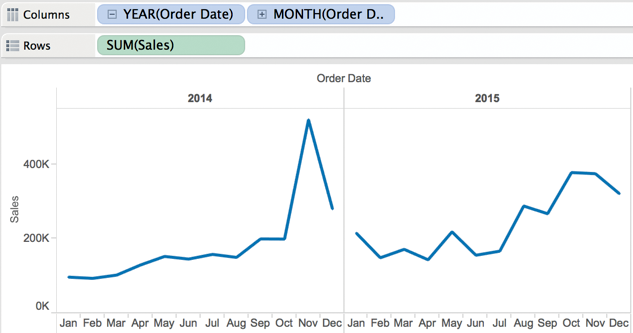
Figure 3-63: Time series displaying discrete year-month
In Figure 3-62, note that the menu option More appears twice. The first time it appears is within the discrete date section of the menu. The second time, it is in the continuous date section. Explore the menu option More in both the discrete and continuous time portions of the menu. The More menu options provide many options for controlling how date and time are presented in your view.
Rearranging Time with Tableau
There are many different date and time combinations that can be displayed. Figure 3-64 rearranges time to display weekday first, then year. Each day is a discrete time bucket. You can also add a reference line by pane that displays the average sales value for each weekday across all four years. This is one of the ways you can leverage discrete time to provide additional information.
If your data supports very fine-grained views of data, Tableau can display details down to the second. This is particularly useful if you need to analyze clickstream data on a website.

Figure 3-64: Rearranging time and applying a reference line
Creating Customized Date Fields
Tableau’s date hierarchy is always available. Even people consuming reports via Tableau Reader or Server can expand time. When hovering your mouse pointer over an axis, you will see a small plus or minus sign appear. Clicking those signs expands or contracts the date hierarchy displayed.
Designers with Tableau Desktop can alter Tableau’s default date hierarchy by creating custom date fields and then building unique date hierarchies. Making custom date hierarchies requires three steps:
- Create a custom date.
- Create the date hierarchy.
- Use the custom date in your view.
To create a custom date, point at a date field on the Dimensions shelf and right-click. This will expose a dialog box that provides a means for defining a custom date or time element, as you see in Figure 3-65.
The two menu windows at the bottom of Figure 3-65 show the custom date definitions for the year and month used in Figure 3-66. Date parts are discrete. Date values are continuous.
Create a custom year date by naming the field Year and defining the date as a discrete year date part. You can also add another discrete date for month. By dragging the custom month on top of the custom year, you can add a new custom date hierarchy. Figure 3-66 shows the resulting date hierarchy.

Figure 3-65: Creating a custom date

Figure 3-66: Custom date hierarchy
You can see the custom hierarchy in Figure 3-66 on the Dimensions shelf. The year and month custom dates are all that will be displayed in this time series chart. In this way, you can change how Tableau expands and contracts the dates used in your visualizations.
Tableau’s date facility encourages explorations of data over different time slices because it is very easy to use and requires no special skill to master. Creating custom date hierarchies can help you control how much space is consumed within a view. This is particularly helpful for dashboards that have limited publishing space.
Taming Data with Measure Names and Values
Sometimes your data isn’t clean and it may not be structured in a way that supports the analysis you need to perform. You might also be looking at a dataset for the first time and want to quickly get familiar with it. Tableau’s Measure Names and Measure Values fields help you with all these tasks.
What Are Measure Names and Measure Values?
Measure names and measure values do not exist in your data source. These fields are generated by Tableau. Measure names hold the names of every measure in your dataset. Measure values hold all of the measures in your data set.
When to Use Measure Names and Measure Values
Any time you need to combine more than one measure on a single axis, measure values and measure names facilitate your analysis. Figure 3-67 displays a summary of all of the measures in the Superstore for TYD2 dataset.

Figure 3-67: Measure names and measure values
The cross tab in Figure 3-67 was created by double-clicking on measure names on the Dimensions shelf, swapping the axis, and adding order date on the Columns shelf. This technique provides a very quick overview of the data. The status bar at the bottom left tells you that there are 32 data marks and 4 years of data. Notice the Measure Values shelf on the right provides details on the aggregation used to display the information. You can change that by right-clicking any of those pills and picking another option.
Another way to use measure names and measure values is to tame data that is poorly structured. Figure 3-68 includes a sales projection in a spreadsheet that isn’t structured in the best way for analysis using Tableau.

Figure 3-68: Sales forecast in spreadsheet form
Each product has unit sales projected in columns for each month in the year. Tableau will interpret each column as a separate measure. In a database, this information would be stored in a structure that looks like Figure 3-69.

Figure 3-69: Sales forecast in a database format
General-purpose databases normally store data in a row-oriented format. Tableau can connect to both kinds of data sources. If your data is more column-oriented, like Figure 3-68, measure names and measure values provide a means for creating views that wouldn’t be supported otherwise. Figure 3-70 shows a time series chart that was built using the spreadsheet data source.

Figure 3-70: Using the spreadsheet data source
Tableau interprets each column in the spreadsheet as a separate measure. A time series chart is used to plot the change in a single measure over time. Look at the Measures shelf in Figure 3-70. Because each month is presented in a separate column in the spreadsheet in Figure 3-69, Tableau is interpreting each month as a separate measure. The columns in the spreadsheet are displaying the same measure for 12 months. Measure names and Measure values allow you to place multiple measures on a single axis. Look at the Rows shelf in Figure 3-70 and the related Measure Values shelf that appears below the Product Name color legend. Tableau uses Measure Names to treat all of the different month Measures like a single measure. Even though the data format in the spreadsheet is not stored like it would be in a database, using Measure Names and Measure Values allows you to achieve the desired presentation quickly.
If your data source is formatted as you see in Figure 3-69 (like a database would store the information) Measure Names and Measure Values would not be required to make the chart you see in Figure 3-70.
The column and row structure you see in Figure 3-69 directly supports the creation of the view without having to use measure names and measure values because the Month-Year is contained in a single dimension and the Unit Forecast is contained in a single measure. Placing the Product name field on the color button within the Marks card would express each product with its own color. Placing the Month-Year field on the Columns shelf puts each month in its own column, and the Unit Forecast can be placed on the Columns shelf. This would replicate the chart you see in Figure 3-70 without using Measure Names and Measure Values. Unfortunately, you may have to deal with spreadsheet structures and build views. Measure names and measure values help you deal with an untidy data structure.
Advanced Uses for Measure Names and Measure Values
Measure names and measure values facilitate more advanced chart types as well. Your spreadsheet includes another tab containing unit price and cost information that looks like Figure 3-71.

Figure 3-71: Unit price and cost data
You can join that tab to the forecasted units tab in Figure 3-69 via the product code key record. This will allow you to create calculated values extending sales, cost, and gross margin dollars. Then you can create a time series view of the three measures, as you see in Figure 3-72.

Figure 3-72: Tableau’s default presentation
Tableau’s default presentation of this information uses a separate axis to display each measure. Using measure names and measure values, you can combine all three measures on a single axis and use color to differentiate the values. Figure 3-73 shows the combined axis time series chart.

Figure 3-73: Multiple measures on one axis
The combined axis chart in Figure 3-73 can be created a few different ways. Using the view in Figure 3-72 as a starting point, the most intuitive way to combine the measures on one axis is to drag each measure to a single axis. Pointing at the cost axis in the upper left makes a green fold mark appear. Pointing at the green fold makes a cross arrow appear. Drag the green fold from the cost axis on top of the sales axis as you see in Figure 3-74.
Repeating the same method, you can relocate the gross margin axis so that all three measures are displayed together on a single axis. Note in Figure 3-73 that the Rows shelf now holds the Measure Values pill. Measure names are on the Marks card for color. The measure values shelf also appears, displaying all three measures. Tableau automatically creates the measure name and measure value pills when a second measure is moved to the same axis. If you are wondering how the labels were made to appear at the beginning and end of each line, explore the Label button on the Marks card.

Figure 3-74: Dragging to combine axes
Measure names and measure values help you contend with poorly formatted data and facilitate creating more advanced chart types. Many beginning and intermediate Tableau users avoid these specific fields because they are unfamiliar. Spend a little time working with them. The added flexibility you gain will be worth the effort.
You’ve seen all the ways that Tableau’s built-in chart types, trend lines, references lines, groups, sets, sorting, and filtering help you add meaning to your data within Tableau. In the next chapter, you learn how calculations provide even more flexible ways to add information to your charts and dashboards.