
4
NOTAN AND THE COMPOSITIONAL STUDY
Good composition isn’t an accident, but the result of deliberate decisions about the structure of the painting. We have to consider the picture window that surrounds the subject and then how the parts of the subject we include relate to one another. The best time to consider these options is at the outset, when the painting is in its most formative stage. Just as a map is an invaluable aid to the explorer heading into unfamiliar territory, so too is a compositional study a way for painters to explore their options before they begin.
Shapes are the building blocks of composition, so any type of compositional study must also be shape-oriented. And no type of study is more shape-oriented than notan. In this chapter, we explore the contemporary approach to notan, which positions it as a tool for identifying shapes and patterns. This will be followed by exercises that show you how to use notan studies in your own work.
Mitchell Albala, Garden Steps in Winter A notan defines the essential shapes and patterns of a composition. When the underlying notan is strong, then the painting that is built upon it, with all its color and detail, is also strong.
Oil on canvas, 28" × 21" | 71 × 53.5 cm
The notan is a bit mysterious. It has an exotic name and is often misinterpreted as a value study—which it is not. Notan is a Japanese word that translates as “light-dark balance.” It is a design principle that suggests that strength and balance in composition are found through a harmonious relationship between light and dark shapes.
Most descriptions of notan are just like the one above. It is defined in terms of “light and dark”—which to painters is the same thing as “values” or “tones.” In my own work with notan, both inside and outside the classroom, I have found that seeing the notan simply as a value study can prevent us from fully appreciating its broader application as a means of defining shapes and patterns, which are the building blocks of composition.
HOW THE NOTAN WORKS
The landscape is a busy place, with elements of all shapes and sizes, innumerable gradations of value and color, and endless detail. All this has bearing on the final painting, but it can also obscure the underlying shapes and patterns that we need to identify at the outset.
In chapter 1, we learned that when we limit ourselves to five values, shapes become more clearly differentiated. With notan, we push the exercise one step further. By using just two or three values, the foundational shapes become even more clearly defined. And the more clearly defined our shapes are, the more we will be able to see aspects of composition such as variation, movement, and negative space. The notan is like a perceptual lens that allows us to explore the composition in its most basic, irreducible shape-terms. It is the most direct method of accessing the underlying energies that animate a composition.
NOTAN IN ACTION
Whenever a student is wrestling with a compositional problem, I do a quick notan study. With a soft pencil, a marker, or a brush, I do a small study with a simplified arrangement of light and dark shapes. Whenever I demonstrate this for the first time, I hear “ah-ha” as they see the basic structure of the composition in a way they could not before. In this scene, the mass of trees on the left is quite busy, with many small shapes and values. My goal isn’t to capture every bit of it, but to reduce it to its most fundamental shape-terms. This means I have to make compromises. The many midvalues will have to be pushed to either white or black, and I have to simplify in the extreme, eliminating nearly all detail.

CONSIDER: A notan study is the first test of the integrity of a composition. If you can’t express the essence of the composition in notan form, that’s valuable feedback from your subject. Is it too complicated? Would another view of the scene offer a better arrangement of shapes?
SHAPE AND PATTERN DEFINITION, NOT VALUE
When most artists are first exposed to notan, they assume it is simply a high-contrast value study, a map of the patterns of light and shadow. This is an easy assumption to make. After all, notan is always defined in terms of “light and dark,” which for painters is synonymous with “values.” In subjects with strong patterns of light and shadow (think: bright sunny days), the black and white of the notan will neatly correspond to the patterns of light and shadow. But most subjects don’t present their values in binary fashion. There are intermediate values that must be considered.
How can a notan study, with just black and white and possibly a middle gray, ever hope to convey all the values in any given subject? It can’t. This is why the notan is not a value study in the traditional sense.
With its ultra-simplified visual shorthand, the notan is more effective at defining the basic shapes and patterns of a composition than it is at articulating a full range of values.
If a composition has a soul, then the notan is the doorway to that soul.
PROGRESSION: FROM NOTAN TO VALUE STUDY

The notan is not a traditional value study. It is best suited to defining the underlying shapes and patterns that drive a composition. This progression shows that as the number of values increases, the study takes on a different meaning.

2-VALUE NOTAN
A black-and-white notan isn’t capable of expressing the range of values found in nature. But it is extremely effective at suggesting the “bones” of the composition, the underlying armature upon which additional colors and values will be laid. Note that some midvalues have been assigned to white and others to black.

5-VALUE STUDY
With 5 values, the study graduates from notan and becomes a full value study. It expresses the value range, structure, and depth found in the subject. We don’t see the foundational structure as readily as we do in the 2- or 3-value notans, but it exists beneath the surface and guides the overall composition. If we begin with a strong notan design, then the painting that is based on it will also have a strong composition.

3-VALUE NOTAN
The addition of a third value makes the study more descriptive, but not by much. A black, white, and gray notan is still “bare bones” enough to effectively express the underlying foundation of the composition.
STRICT AND LIBERAL FORMS OF NOTAN
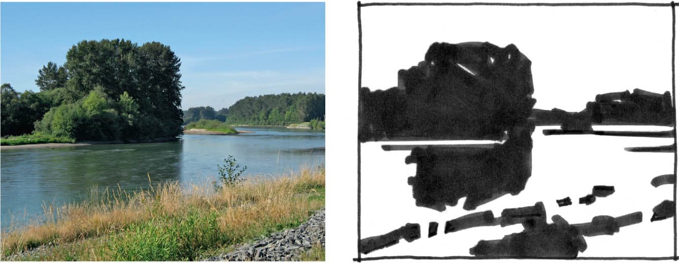
STRICT NOTAN: BLACK AND WHITE
Traditional notan uses black and white with no intermediary grays. The pure and poetic beauty of black and white is undeniable; however, this strict form presents a design challenge. What does a painter do with all the intermediary values, those that are not white or black? Should they be assigned to the white areas or to the black areas? If you squint at the photo, you can see that the values in the water and the foreground are very similar. With only black and white, it’s impossible to separate these. So, I allow the water and foreground to join and imply the separation by playing up the diagonal furrows in the foreground. This is a design choice, a visual compromise that is clarifying an important part of the composition while preserving a healthy balance between light and dark.
CONSIDER: Strict notan works best with subjects that have very strong value contrasts, rooted in clear patterns of light and shadow.

LIBERAL NOTAN: ADDING GRAY
Some subjects don’t translate well into strict notan. For this, we have liberal notan, which adds a middle gray. Parts of the subject that can’t be reconciled with white or black alone can be assigned the midtone. In this scene, the azure hills are an essential part of the overall scene. If they were made black, they would take on too much visual weight. If white, we wouldn’t see them at all. The midtone defines an important part of the composition that would otherwise be lost in a strict notan.
CONSIDER: In notan design, we are not matching values, we are defining shapes. It’s less important that our white, black, or gray values match reality than define the essential shapes of the composition.

Peter Van Dyck, Parking Lot
Oil on rag board, 16" × 20" | 40.5 × 51 cm
Parking Lot is an excellent example of how the notan can be more about shape and pattern definition than value description. Most of the values in Van Dyck’s painting are in the midrange. Thus, the notan study for a piece like this cannot simply identify patterns of light and shadow. Instead, it seeks to identify the main shapes that drive the composition. Here, the parking lot wall forms a strong shape that darts back in sharp perspective. This is captured in the notan and becomes the main event in the painting.


Mitchell Albala, Mountain in Sunlight
Oil on panel, 12" × 12" | 30.5 × 30.5 cm
Mountain in Sunlight is based almost entirely on color contrasts, with only subtle value differences. Yet, its composition is still guided by a clear notan design. The stark contrasts seen in the notan study don’t get carried into the painting—but the shapes and patterns they define do. The sky in the painting is certainly not black, but in the notan, the black represents what will be an important color separation between the mountain and the sky. When we understand notan as being less about identifying values and more about shape and overall pattern, it becomes an extremely versatile compositional aid.

BUILDING A BETTER STUDY: NOTAN TECHNIQUE
In my workshops, I always ask students to do a compositional study before beginning a painting. In the absence of any previous instruction in notan or thumbnails, most will simply do a line drawing. Lines are wonderful . . . but they are not so effective at building masses.
Shapes are the building blocks of composition, so any type of compositional study must also be shape- and mass-oriented.
The two most important goals of a compositional study are that it adequately describes the composition in the simplest terms possible and that it is readable, meaning that your compositional intent is clear to anyone looking at it.

TOOLS FOR MASSING
Doing a mass-oriented compositional study requires that we shift away from thinking in a linear fashion. This can be encouraged by working with tools that make it easier to establish masses and broad coverage, such as soft pencils, markers, or brushes. Super fine-point markers or light pencils don’t work well here. They make lines that are too thin. Pecking away at major shapes with minor tools is not allowed!

FEWER LINES, MORE SHAPES
A shape-oriented study doesn’t mean we can’t use lines. Lines are how we start a drawing: we measure, plot, and properly place our shapes. But outlined shapes should quickly be replaced with value masses. In this study, you can see each individual crosshatched line, but they are grouped in such a way that they form clear masses.

KEEP IT SMALL
Although notan studies and thumbnails are not actually the size of your thumbnail, it makes sense to keep them small, 2 to 4 inches (5 to 10 cm). Relative to the size of a small study, marks or strokes tend to be larger, bolder, and more mass-oriented. You can achieve coverage more quickly. The larger the study, the longer it will take.
KEEP IT SIMPLE
Detail never solved a compositional problem more effectively than a better balance between lights and darks or simpler shapes. In the spirit of a shape-oriented approach, avoid detail. If you are faced with a tricky drawing problem, do a separate study to resolve those issues.

FOCUS ON THE DOMINANT SHAPES
The essence of a composition is ultimately driven by its dominant shapes. These are often the largest shapes, but more importantlythe composition would lose its intent and focus without them. Minor shapes or details, on the other hand, can be eliminated without compromising the composition.
If you like using the computer to support your creative explorations, then you’ll be happy to know that most image editing apps have a feature that can “notanize” your photos. These apps are particularly handy when working in the field beacuse they allow you to easily test different notan designs on the fly.

A QUESTION OF BALANCE
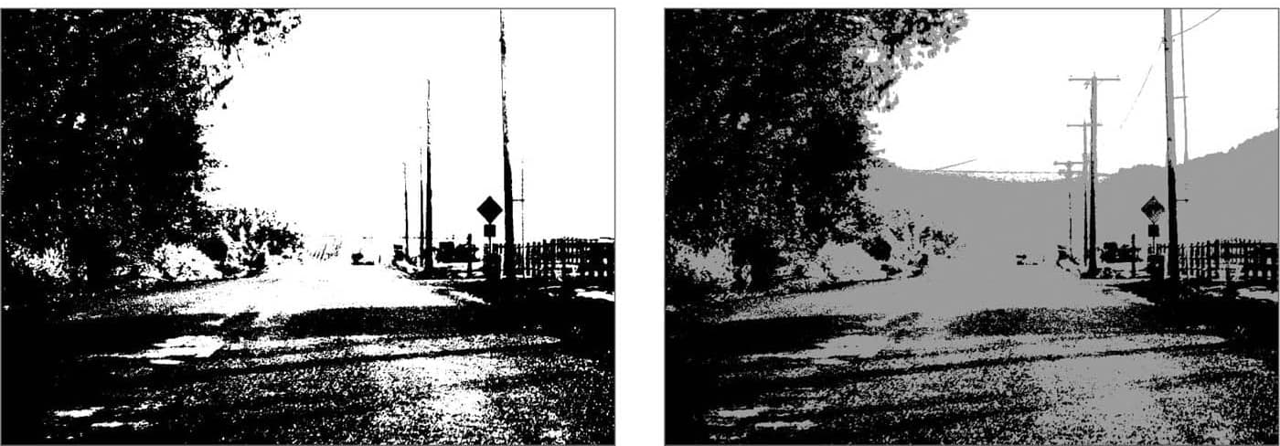
In image editing software such as Photoshop or Affinity Photo, the adjustment used to simulate notan is called Threshold. This adjustment doesn’t simply convert the image to white and black, but allows you to control the balance between those whites and blacks. As you move the adjustment slider left or right, you can see the changing dynamics of light and dark within the notan in real time. There are also mobile apps designed specifically for the notan that go one step further and allow you to convert the image to three values. You can see whether a strict or liberal notan best conveys the essence of the composition.
REVIEW QUESTIONS: NOTAN AND THE COMPOSITIONAL STUDY
Is your notan study simple?
A notan design is never complex; it conveys the most salient aspects of the composition in the simplest terms possible.
Is your notan study readable?
Clarity and comprehension are the most essential requirements of a compositional study. Can your intent be understood in an instant? Or is the study so busy and disorganized that a viewer would have difficulty understanding what’s going on?
How many shapes does the notan have?
Counting shapes is a quick way to check the simplicity of your design. Can the composition be defined with five or seven shapes? With ten? The fewer shapes there are, the more elegant the solution.
Does squinting help you see the notan design?
When you squint, midvalues tend to group with either the light or dark ends of the value range, producing a simplified light-dark view of the subject.
Are you handling the notan in a mass-oriented way?
Is your notan too linear, made up of lots of thin lines? If so, use tools that more easily establish solid masses such as a soft pencil, marker, or brush.
Are you only defining light and shadow in your notan study or shapes and patterns as well?
The lights and darks of notan sometimes correspond to light and shadow—but not always. The notan is ultimately a shape and pattern defining tool. Its lights and darks can correspond to any shape that is integral to the composition.
Does this subject lend itself to a “strict” black and white notan, or is the addition of a third value necessary?
In some subjects, certain areas cannot be resolved with just black and white. The introduction of a third value is necessary.
Are the lights and darks used in the same proportion?
A tenet of good design is that lights and darks should not be used in equal proportion. For greater variation and interest, there should be more of one than the other.
Are white negative spaces just as interesting as black or gray positive areas?
White spaces are an integral part of the design; never think of them as empty or blank.
Do you have a notan app loaded on your mobile device?
When working outdoors, a notan app can help you create digital notan studies on the fly.
OVERVIEW: This first exercise will orient you to “thinking in notan,” defining a composition with just two or three values. By tracing the patterns of light and dark, you will reverse engineer the painting to reveal the underlying notan design. There’s more to this exercise than simply tracing. Most subjects (and paintings) have many intermediary values, and determining whether to assign them to white or black requires judgement. Consider doing a few different notan interpretations of the same painting. You’ll see how changing the balance between light and dark or adding a midvalue affects the composition. Small changes can affect the outcome in noticeable ways.
MATERIALS: Tracing paper | Drawing tools (bold marker, soft pencil) | L-shaped cropping tool | Tape | Ruler
STEP 1: MASTERWORK SELECTION

Albert Bierstadt, Lake in the Sierra Nevada
Oil on canvas, 21 ⅘" × 30" | 55.5 × 76 cm. Courtesy Wikimedia Commons.
Select a painting that has clear patterns of light and dark. The more intermediary values there are, the more challenging the exercise will be. A reproduction between 4 and 6 inches wide (10 and 15 cm) is ideal. (Larger reproductions will force you to spend too much time filling in values.) Resize the reproduction if necessary. For this demonstration, I chose a work by Albert Bierstadt, a leading Hudson River Painter of the nineteenth century. The painting has a full range of values as well as intermediary values with which I will have to contend.
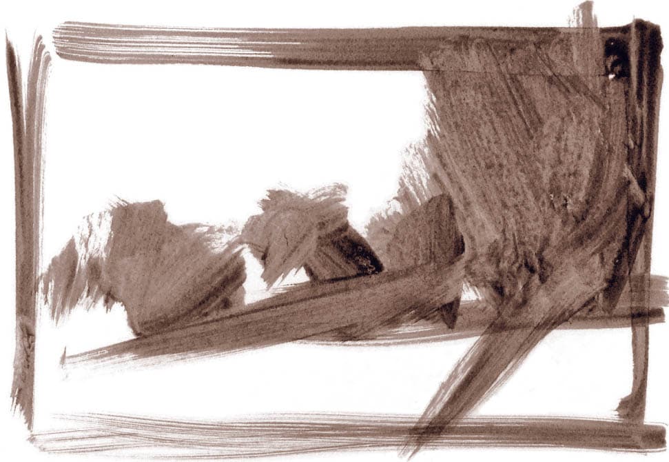
STEP 2: SHAPE- AND PATTERN-FINDING
Place a sheet of tracing paper over the reproduction. Using a marker, as shown here, or a soft pencil, begin tracing. The mountains on the left and the foreground mountains on the right are quite dark and easily interpreted as black. But the clouds and parts of the mountain closest to the sunset are midvalues. Should these passages be assigned to white or black? The goal is to find a balance that indicates the essential character of the subject. There is more than one solution. I’ll do two studies in strict notan and one in liberal notan.


STRICT NOTAN 1
A painting with this many intermediary values is hard to pull off in strict notan. A binary interpretation, with no grays, can’t capture the nuances in the clouds or in the notch between the mountains, which are essential aspects of the subject. I opt to make the clouds black and the notch between the mountains white. On the positive side, this brings out the circular composition Bierstadt employed. On the downside, the composition is overly dark. It feels too heavy and busy.

STRICT NOTAN 2
Next, I try a light-dominant composition. I lose the cloud shape which completed the circular composition, but this version feels lighter and simpler. Overall, it is more readable than the design in Strict Notan 1. It has clearer movement and a better balance between light and dark.

LIBERAL NOTAN
How does the composition change when I add a third value? It helps because the gray speaks for some of the intermediary values. It also reduces the overall heaviness seen in Strict Notan 1, while still revealing the patterns that form the circular composition.
OBSERVE: Neither the strict or liberal notans are able to convey the subtler passages of the subject—but that isn’t the point. Interpreting a composition in this binary way is revealing. It exposes me to options, and exploring those options teaches me about design.
EXERCISE: NOTAN FROM OBSERVATION
OVERVIEW: In this exercise, you’ll learn how to do notan thumbnails from direct observation, which is essential when working in the field. This is more challenging than cropping or tracing a photo because you have to draw and position the elements within an existing window in your sketchbook. To make this easier, I recommend a placement exercise that considers options based on where the major shapes fall within a simple grid.
MATERIALS: Sketchbook | Drawing tools (bold marker, soft pencil, or brush) | Plastic or cardboard viewfinder
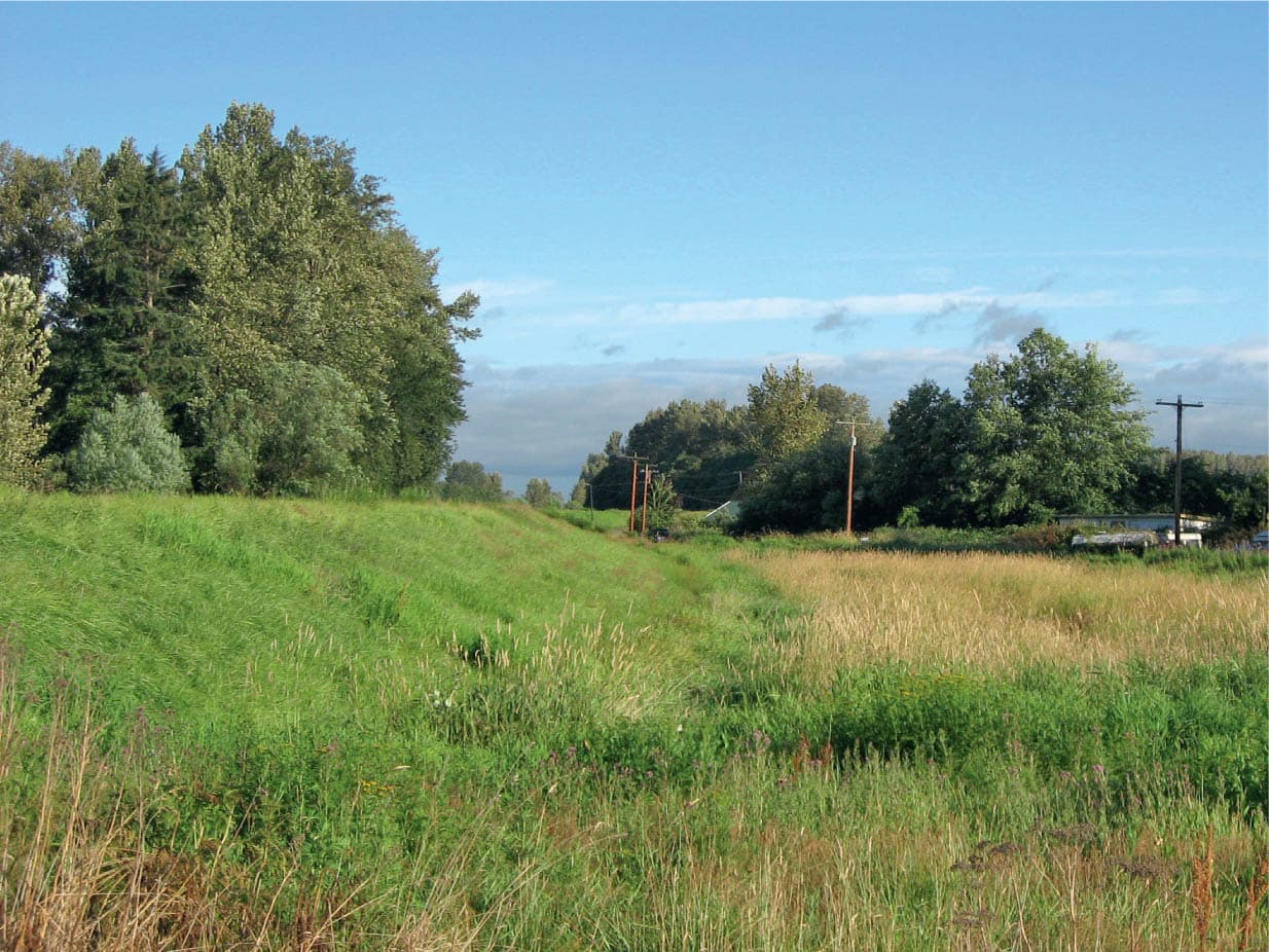
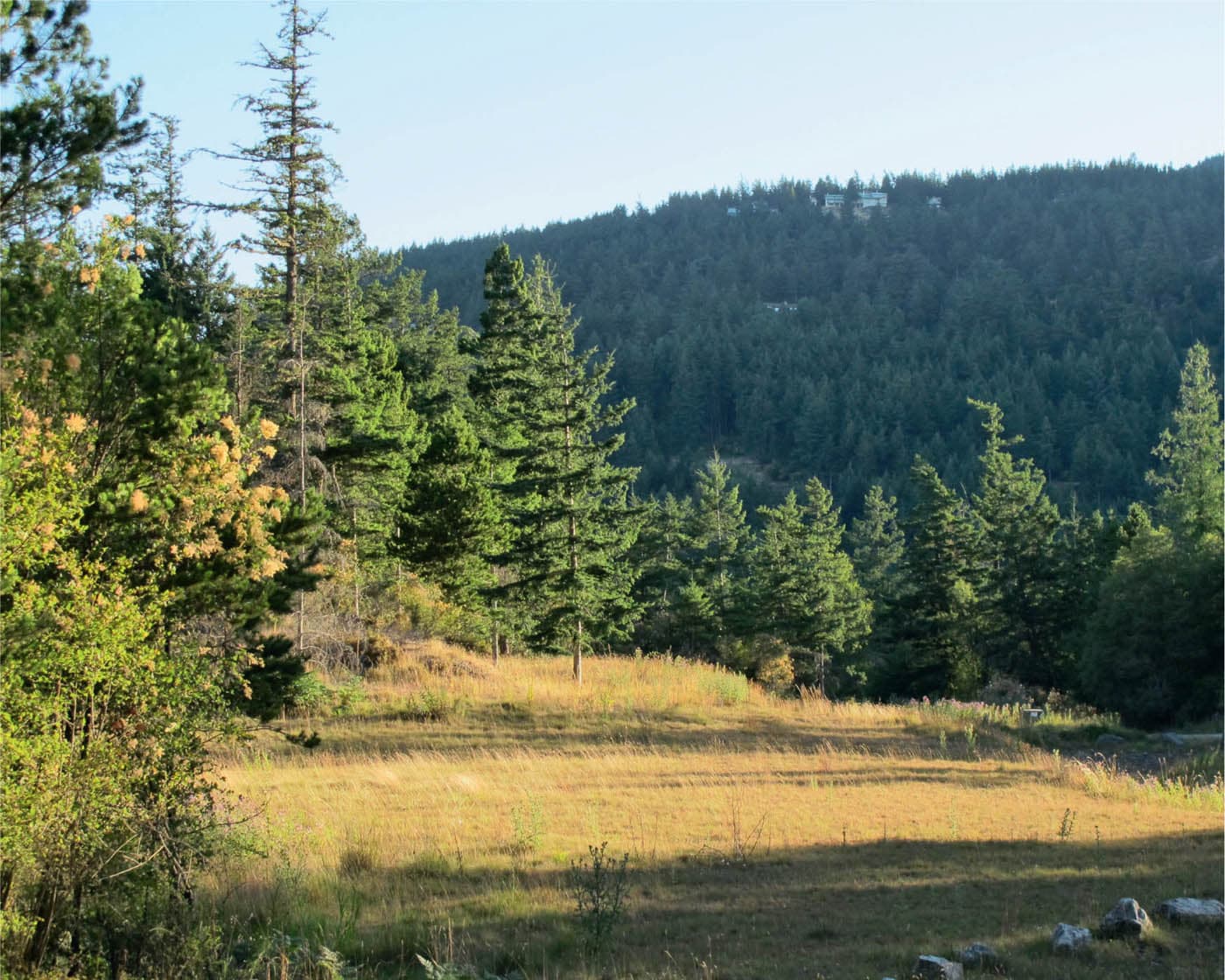
SOURCE PHOTO
Think of the main masses of your composition as blocks. Different compositions are created depending on how much space these blocks occupy within the various quadrants. In this scene, there are four blocks: two stands of trees, a large foreground that advances toward us, and the sky. Begin by looking through your viewfinder. Draw a picture window in your sketchbook and then divide the thumbnail into four quadrants by drawing light horizontal and vertical centerlines (indicated by blue lines in these studies). Consider both horizontal and vertical formats.
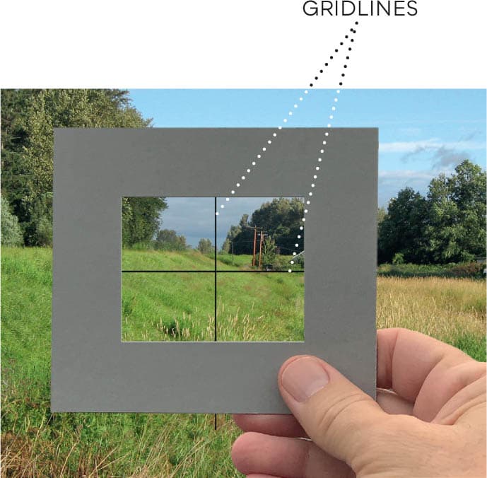
VIEWFINDING
You can purchase clear plastic viewfinders with grid lines already indicated. Alternatively, you can draw the gridlines on a piece of acetate and tape it to the back of your homemade cardboard viewfinder, as shown here.
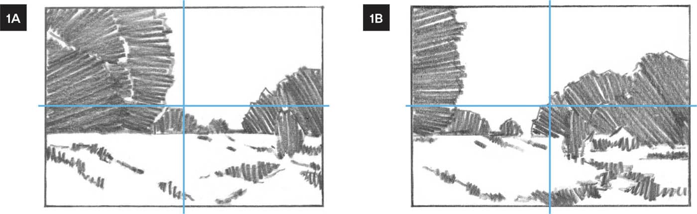
In both 1A and 1B, I have chosen a horizontal format and positioned the ground line below the midline. The foreground is shallow and the sky occupies a larger area. In 1A, the large tree on the left is dominant, and in 1B, the trees on the right become dominant.

In 2A and 2B, still using a horizontal format, the ground line now falls above the midline, so the foreground becomes larger than the sky. In 2A, the left tree is dominant, and in 2B, the trees on the right are more dominant.
OBSERVE: To assert as much variation in shape size as possible, I intentionally make one stand of trees larger than the other and make the composition either sky-dominant or land-dominant.

In a vertical format, the ground line sits well above the midline, creating a deep foreground with good perspective cues. This, in combination with the inward and upward action of the vertical format, gives this version the strongest suggestion of depth.