
Chapter Four. Managing Complexity
 |
Structuring data in order to make useful information
Many Interaction Designers find themselves simultaneously filling two roles: Interaction Designer and Information Architect. The subfield of Information Architecture has gained recognition primarily as a web development discipline, usually associated with mapping out and understanding the connections within large, complicated websites. The discipline and techniques also shape the underlying structure of proper Interaction Design, as the Information Architecture techniques seems to illustrate how a successful Interaction Designer approaches any design problem at all (regardless of medium or intended outcome).
Author Richard Saul Wurman is responsible for coining the phrase Information Architecture in 1975. His background, in the traditional field of Architecture, supports his interest in way finding and navigation. The world of Information Architecture can be thought of as a discipline of map making, but maps need not be related only to geography. People use a map to find their way, and they need to find their way whenever they are lost. Sometimes, however, maps are used in an exploratory manner, simply to discover what is unknown. Clearly, the level of complexity of modern and futuristic products and systems will disorient a great number of people. By understanding—and visualizing—connections between elements and seemingly unrelated systems, the Interaction Designer can provide the common trail toward understanding.
One of the largest and most documented usability issues evident within the structure of the World Wide Web concerns navigation. Specifically, people don't truly understand where they are, where they have been, and where they are going as they traverse the Internet. Nor should they, as the concept of placement within a virtual system is truly foreign, and no matter the metaphor provided, most people don't really understand—or have time to understand—the essence of computing across a large, distributed network. The vastness of the structure of the Internet is simply too large for many people to actually consider. The conceptual undertaking of visualizing something that has no immediate physical manifestation is a difficult task to engage in. While the World Wide Web is an obvious example of this sort of limitless environment, the same general location-based confusion is evident in the menu systems of smaller handheld devices, such as digital cameras and telephones, and in embedded systems in vehicles (intended—ironically—to aid in physical navigation).
Alan Cooper discusses the issue with relationship to permanent objects, or reference points:
“One of the most important aids to navigation is a simple interface without a lot of places to navigate to. By places, I mean modes, forms and major dialogues. Beyond reducing the number of navigable places, the only way to enhance the user's ability to find his way around in the program is by providing better points of reference. In the same way that sailors navigate by reference to shorelines or stars, users navigate by reference to permanent objects placed in the program's user interface.”40
Authors Peter Morville and Louis Rosenfeld agree in their text Information Architecture, but acknowledge that this is easier said than done:
“Many contextual clues in the physical world do not exist on the Web. There are no natural landmarks and no north or south. Unlike physical travel, hypertextual navigation allows users to be transported right into the middle of a large unfamiliar web site. Links from remote web pages and search engine result pages allow users to completely bypass the front door or main page of the web site.”41
Design literature frequently mentions a four-step process taken as individuals gain comprehension. This comprehension could be an understanding of digital-spatial relationships in a complicated system, or the awareness of how to achieve a goal. This four-step process attempts to move from Data to Information, to Knowledge, and finally to Wisdom (DIKW). The path has been routinely analyzed in fields of Information Technology and Knowledge Management, and is mentioned by designer Nathan Shedroff in a brief article titled “An Overview of Understanding.”42 Interaction Designers can think of this DIKW path as a framework for progressive learning. One goal of design may be to assist people through this path as they use designed creations.
Data alone has little value. Although “data” usually implies numbers, it simply represents discrete units of content. This content may be factual or opinion driven, and it may be useful or useless. Creating information out of data may seem a simple task, then: Present to the user the units of data that are relevant and remove the rest. What, though, would be deemed relevant in, say, a painting? Are the marks on the canvas relevant bits of data? What about the absence of marks—the “whitespace”? Or the implied marks, found in the gesture of the applied paint? Making information out of data, a seemingly easy task, is quickly confounded when the designer attempts to integrate elements of aesthetics or emotion.
Information can be thought of as meaningful data. This is usually created “by design”—using the creative process to bring together elements and to form relationships that, perhaps, were previously hidden among the “irrelevant data.” To know that it is raining in Pittsburgh is data. To understand that it has been raining in Pittsburgh for the past week and you are visiting the Steel City tomorrow is informative: You had better pack your raincoat. Information is the organization of data in ways that illustrate meaning. This organization may, in fact, alter the meaning itself. This has an important implication, as the meaning of seemingly objective data is altered by the appearance and structure of that data.
If information is meaningful data, knowledge, then, is a result of the combination of elements of information in order to arrive at a principle, a theory, or a story. While information may be sensory, knowledge seems to be more complicated, and perhaps more experience-driven. Storytelling has a long history as a mechanism of knowledge transfer, and can be considered a rapid immersion in experience: One cannot experience time travel, but one can gain knowledge about the act of time travel through a rich, compelling, and highly experiential story. This idea of knowledge as extended dialogue is highly relevant when considered in the guise of experience and Interaction Design. The design of behavior may, in fact, be the design of action-based knowledge (telling a story through motion).
Wisdom, often thought of as enlightenment, can result from applying knowledge in a new and novel manner. There is wisdom to be found in emotion—in happiness and pain—and even the youngest designer can apply knowledge and emotion in new ways, given the opportunity.
This path from Data to Wisdom may be the underlying goal of all Information Architecture activities. The acquisition of Knowledge obviously occurs over time, and this is where the Interaction Designer excels. Behavior occurs in the fourth dimension, and Interaction Design techniques attempt to understand and, hopefully, shape the way people act over time.
Designing with the fourth dimension in mind
Traditional designers of artifacts—Graphic Designers, or Industrial Designers—typically view the relationships between a product and a person in a very finite sense. A user may interact with a toaster through a discrete set of actions (place toast in toaster, set brownness level, press toast down, wait for toast to pop up, remove toast), and the designer is responsible for creating a product that affords, or encourages, all of these activities. This view of affordance implies ease of use and clarity of task. It needs to be apparent to a user that he has a certain role to play, and if he plays it correctly, he will have a nice breakfast.
While this view is useful for the design of simple and relatively mundane objects, it simply doesn't work for the creation of complicated interfaces that “live” for an extended period of time. Consider the length of an engagement between a person and a Microsoft Outlook Inbox. When first acknowledged (or “installed), Microsoft Outlook is very exacting. Every installation of Outlook will be the same; the toolbars will be in the same place, each element will behave in the same way, and the system is very predictable. If the system is predictable, the dialogue between the system and the user is also fairly predictable. Designers can guess, with a fair degree of accuracy, what will happen. At the very best, this guessing can be substantiated: Designers can, during the creation of this project, do a bit of contextual research and actually watch people go about using a prototype of Microsoft Outlook.
This accuracy quickly diminishes as real life takes over. People set up mail accounts. They receive and respond to mail. They use Outlook to organize their life, rather than to simply organize their mail. They make errors, and customize palettes, and change color schemes. And over time, Micro-soft Outlook becomes a very different product from the original installation. It is very difficult to “model” what might occur even a week past the initial installation of this software, as the complexity of real life makes for an exponential curve of change. Nonetheless, the Interaction Designer may indeed be asked to find a way to model this complicated scenario. This fourth-dimensional pattern of use—understanding how time plays a role in the use of a product—begins to clearly articulate the distinctions between two similarly named and commonly confused activities: User Interface Design and Interaction Design. Both activities are usually performed by the same person, but with dramatically different purposes.
A designer focusing on the User Interface (UI) or the Graphical User Interface (GUI) is generally not concerned with time as a defining characteristic in the use of a product. While he may consider the flow of use on a “page” (used loosely to illustrate one particular chunk of material being presented), and may even think of the flow of use from “page to page,” he is not considering the long-term consequences of use at this stage in design. His focus is instead on widget placement, and button labeling, and pixel-level decisions of screen real estate. Sometimes, the rare software developer with a “visual eye” may take on the role of User Interface Designer. Additionally, User Interface Designers with a particular competency in development may take on the often ambiguous role of “User Interface Developer,” blurring the lines between design and implementation. The expert-blindspot rears its ugly head: Developers are, by definition, aware of technological constraints and will force their design to appease these constraints. While certainly a benefit to short development cycles, this technology-centric attitude will come at the expense of usability. The User Interface Developer will generally not consider conceptual solutions to the problem that, while more usable, may involve dramatic “back end” development changes.
 |
The Interaction Designer shifts to attend to the detail and pragmatic details of UI design only after modeling or understanding the more conceptual behavior—activities or goals—that may drive the usage of a product. Several mapping and diagramming techniques exist to assist Interaction Designers in tracking product use over time. While referenced by various names in various disciplines, they all attempt to create systematic organization amidst complexity.
Using a concept map to understand relationship and vocabulary
A concept map is a visualization of present understanding of a system. It is intended to represent the mental model of a concept—to allow members of the development team to see the “forest and the trees.” Generally, a concept map links nouns with verbs. It provides a visual way to understand relationships through literal connections as well as through proximity, size, shape, and scale. The tool is intended to illustrate relationships between entities. The act of creation is generative in the sense that the designer must make subjective value judgments on the strength of the relationships.
The first step towards creating a concept map is the creation of a concept matrix. This matrix lists all elements relevant to a particular domain (nouns) and attempts to identify which items have a direct relationship. Consider, for example, an analysis of the game of Baseball. One may identify nouns such as Ball, Bat, Umpire, Hot Dog, and Catcher as well as nearly one or two hundred other terms. By creating a matrix to illustrate the connections between these elements, the designer is forced to analyze the extent of the relationship. All of the words are implicitly related, as they all have to do with the overarching domain of Baseball. However, Ball is more closely related to Bat than it is to Hot Dog. By analyzing each and every term's connections to one another, the designer is forced to “zoom in” on the details to such an extent that he gains an intimate understanding of a discipline. He can then begin to understand the (sometimes obvious) hierarchy that exists within a large quantity of data. The elements with more relationships become the main branches on the concept map: They become the “glue” holding together the overarching discipline.
Once the matrix is created and these core concepts are identified, completing the concept map becomes a rather simple activity of connecting nouns with verbs. How are Ball and Bat related? The Ball is Hit with a Bat. How are Catcher and Ball related? The Catcher attempts to Catch the Ball. As these are added to the diagram, the designer—and eventually, the entire development team—can visually trace relationships between entities and understand how a potential change to one aspect of a system may ripple through the system as a whole.
Using a Process Flow Diagram to understand the logical flow of entities
Process Flow Diagrams are another visual form of organizing data into comprehensible systems. Also known as Data Flow Diagrams or Decision Tree Diagrams, these diagrams have traditionally been used in the fields of electrical engineering and in computer science to illustrate the logical flow of data through a system. These diagrams can be created relatively quickly, prior to implementing complicated systems, and then manipulated in order to understand the optimum flow of data. Interaction Designers use Process Flow Diagrams for a similar purpose. These diagrams assist in understanding the discrete rules, and their relationships to one another, that make up an activity. This analysis tool can then be shared with engineers in order to articulate and demonstrate the rationale behind design decisions. It can be used both as a generative exercise as well as an explanatory tool.
To create a Process Flow Diagram, an Interaction Designer first identifies, through various forms of ethnography, the operators in a system and their roles. These operators include many of the nouns as present in the Concept Map. Then, the “logic flow” is mapped out to connect the operators with actions. Take, for example, the phenomenon of a telephone ringing. The phone rings once and there is a clear path of available (and logical) repercussions to this ring. The caller may hang up, the telephone may be answered, or else the phone will ring again. This will happen several times in a row, at which time a new choice becomes available: The call may be answered by a voicemail system.
By creating a Process Flow Diagram, the designer has formed an intimate understanding of the possible logical outcomes of use with a system. While the diagram itself can be useful throughout the project, the act of creating the diagram is of much more importance. Those involved in the production of such a diagram have created a strong mental representation of the boundaries of a complicated system.

The classification of words
Both of the aforementioned diagrams embrace the visual over the textual. While they certainly include written words, the visual arrangement of the content creates an arguably more accessible way of examining a system or artifact. The diagrams rely on the use of words as placeholders for ideas, forms or artifacts. Language affects organization—and therefore, usability—on a very pragmatic and immediate level. Categorization implies the method that is used to group elements within a larger context. People rely on language in design to encourage simplicity, yet language is often ambiguous and many designers are not adequately trained in the nuances the English language presents. Consider the implications of the common word, “cup.” A cup is exactly two half cups, or four quarter cups; a cup of water weighs .521 pounds, and asking for a “cup of coffee” at Starbucks gives you offers of Tall, Grande, and Venti. Cup can be used as a verb (“He cupped his head in his hands”), or as a noun (“Put the cup in the sink”), and can refer to a commonplace drinking vessel, to the intimate inner workings of a piece of women's underwear, or to a hard piece of plastic that protects baseball players from unfortunate accidents. Designers, then, must understand the trivialities associated with the words they select for everything from the labels on a website to the packaging an object comes in.

Adobe Illustrator®, one of the most widely used vector-based graphics programs, has often been analyzed in terms of its complexity and learning curve. Language adds a large degree of complexity to the program, as shown below.

The Type drop down menu presents common choices of Font and Size, but also more ambiguous elements like Glyphs, Threaded Text, Optical Margin Alignment, and Legacy Text. The Effect menu offers choices of Path and Pathfinder, two choices for Stylize, and the ability to “Sharpen Unsharp Mask.” The complexity presented by the words puts the user in the difficult position of having to guess—and anticipate—what a function will do. Only when the feature has been committed to memory will these irrational labels make sense. To an expert, the label is simply a trigger to an already established pathway of understanding. But to a novice, these labels stand in the way of comprehension.
The Interaction Designer attempts to construct meaningful visualizations between individual components in an effort to understand hidden relationships. The ultimate goal of the creation of these visualizations is to understand; by reframing ideas in new and interesting ways, the designer can gain a deeper understanding of the abstract and semantic connections between ideas. This understanding can then be applied to the development of a system, service, or artifact.
Even with the influx of digital communication devices, people still rely on old-fashioned, printed materials to get through their daily life. Poor information design can frustrate and disappoint a user, and often has a larger impact on their lives—people may miss meetings, appointments, or important events if they misjudge or misread a schedule or map. Designers of information-heavy systems need to understand and balance complicated data along with visual design principles to produce legible, comprehensible instruction materials.
Each year, every working adult in the United States must file his or her taxes, and while a number of people utilize online services for this task, millions of people still rely on the printed forms available from the Internal Revenue Service. In fact, in 2003, over 33 million individuals elected to self-prepare their 1040 forms by hand. 43 Students enrolled in a class called Information Architecture at the Savannah College of Art and Design were tasked with redesigning the 1040 United States Individual Income Tax Return form. The goals of the Tax Form Redesign project included conceptual as well as pragmatic outcomes. While an immediate goal was to make sense of complicated, domain-specific information, an implied goal was to understand the balance of visual and statistical data necessary to accurately inform a user.
43The data comes from the IRS, and is even more interesting: 3 million people filed their taxes by telephone in 2003! The average refund was $2,010 and the IRS announced that over 92,000 refund checks were returned as undeliverable. In 2002, over $2 billion went uncollected in refunds.
 |
Stefanie Danhope-Smith and Payaal Patel
Using an iterative, user-centered design process, we have improved the experience of completing the 1040 tax form by restructuring the information in a way that promotes understanding and reinforces accuracy.
In order to redesign the form it is necessary to become a pseudo-expert in tax law and gain a frm grasp on the terminology related to the subject matter; this can be done through standard domain research. However, a much quicker way to establish an understanding is to perform contextual research. This method involves the understanding of work in its natural environment. We observed users completing their individual income tax returns using their own W2 forms. An analysis of the research highlighted problems in the existing forms and therefore shed light on potential solutions.

We feel strongly that visceral stimulations make users happy, which ultimately improves their problem-solving skills. This idea played a key role in the development of our redesign. The goal throughout the project was to keep the users visually stimulated, thereby engaging them in the process, and ultimately resulting in more accurately completed forms. Our concept went through several iterations; each round refined the form, as we moved from wireframe prototypes constructed on paper toward more developed computer models. At each phase in the project, we tested our iterations with real people to ensure that we were increasing usability and not negatively impacting the tax fling process.
The 1040 Individual Income Tax return form is targeted toward a vast mass of users; therefore, it includes a large number of variables—many of which are rarely used. The current form used by the IRS strives to include all the possible options. However, they are presented equally and in such a way that the user must collect information from multiple sources; in the end, they are left unsure of the initial goal. Users often rely on past experiences (sometimes simply copying the previous years' form entries) rather than reacting to the information that is provided by the form itself because they are overwhelmed by the densely packed data, unclear terminology and a poor navigation system.
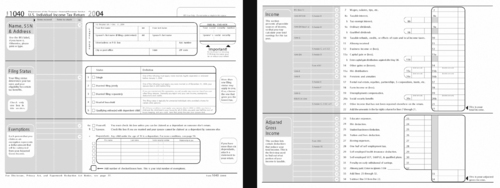
Unlike the old form, our new form allows users with any level of understanding of the tax system to file their taxes. This is achieved by including explicit definitions of the main sections and allowing the users to understand the repercussions of their actions. Visual weight and new elements of aesthetics were added to direct attention. While users will still have to have a small grasp of concepts related to taxes, the new form makes it easier to determine where this information can be found.
 |
..................Content has been hidden....................
You can't read the all page of ebook, please click here login for view all page.