A control interacts with a program or the user through properties, methods, and events. Although each type of control provides different features, they are all derived from the Control class. This class provides many useful properties, methods, and events that other controls inherit, if they don't take special action to override them. The following sections describe some of the most useful of these inherited features.
The following table lists properties implemented by the Control class. All controls that inherit from this class inherit these properties unless they override the Control class's behavior.
PROPERTY | PURPOSE |
|---|---|
| Determines whether the control allows drag-and-drop operations. |
| Determines which of the control's edges are anchored to the edges of the control's container. |
| Determines whether the control automatically resizes to fi t its contents. |
| Determines the control's background color. |
| Determines the control's background image. |
| Determines how the control's background image is used to fill the control. This can be Center, None, Tile, Stretch, and Zoom. |
| Returns the distance between the top edge of the control's container and the bottom edge of the control. This is read-only. Modify the Top and Height properties to change this value. |
| Determines the control's size and location, including nonclient areas. |
| Determines whether the control can receive the input focus. See also the Focus method. |
| Determines whether the control can select. For example, a TextBox can select some or all of its text. See also the Select method. |
| Determines whether the control has captured the mouse. |
| Determines whether the control makes other controls validate when it receives the focus. |
| This Rectangle structure represents the control's client area. |
| This Size structure represents the control's height and width. |
| Indicates whether the control or one of its child controls has the input focus. This is read-only. |
| Determines the context menu associated with the control. |
| Determines the context menu strip associated with the control. |
| This collection contains references to the controls contained within this control. |
| Determines the cursor that the control displays when the mouse is over it. |
| Gets the control's DataBindings, used to bind the control to a data source. |
| Returns the control's default background color. |
| Returns the control's default font. |
| Returns the control's default foreground color. |
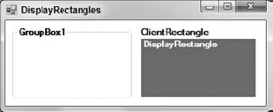
| Returns a Rectangle structure giving the control's display area. Figure A-1 shows two GroupBoxes with the same size. The GroupBox on the right contains two labels that cover its ClientRectangle and DisplayRectangle. |
| Determines the edge of the control's parent to which the control is docked. |
| Determines whether the control will interact with the user. |
| Indicates whether the control has the input focus. This is read-only. |
| Determines the control's font. |
| Determines the control's foreground color. |
| Returns the control's window handle. This is read-only. |
| Indicates whether the control holds any child controls. This is read-only. Also see the Controls property. |
| Determines the control's height. |
| Returns True if the calling code is running on a thread different from the control's thread and therefore must use an invoke method to interact with the control. |
| Determines the X coordinate of the control's left edge. |
| This Point structure determines the position of the control's upper-left corner. |
| Determines the spacing between this control and another control's margin within an arranging container. |
| Determines the control's largest allowed size. |
| Determines the control's smallest allowed size. |
| Indicates what modifier keys (Shift, Ctrl, and Alt) are pressed. This is read-only. |
| Indicates what mouse buttons (Left, Right, Middle, None) are pressed. This is read-only. |
| Returns a Point structure giving the mouse's current position in screen coordinates (the point (0, 0) is in the screen's upper-left corner). This is read-only. |
| Determines the control's name. |
Determines the spacing of the control's contents. | |
| Determines the parent containing the control. |
| Returns a size that is big enough to hold the control's contents. |
| Determines the control's window region. This is the area in which the control may draw. |
| Returns the distance between the left edge of the control's container and the right edge of the control. This is read-only. Modify the Left and Width properties to change this value. |
| This Size structure determines the control's size including client and nonclient areas. |
| Determines the control's position in its container's tab order. If more than one control has the same TabIndex, they are traversed front to back using the stacking order. |
| Determines whether the user can tab to the control. |
| This property can hold an object that you want to associate with the control. |
| Determines the control's text. |
| Determines the Y coordinate of the control's top edge. |
| Returns the control's top-level ancestor. Usually that is the outermost Form containing the control. This is read-only. |
| Determines whether the control is visible. |
| Determines the control's width. |
The following table lists useful methods implemented by the Control class. All controls that inherit from this class inherit these properties unless they override the Control class's behavior.
METHOD | PURPOSE |
|---|---|
| Brings the control to the front of the stacking order. |
| Returns True if the control child is contained by this control. |
| Creates a Graphic object that you can use to draw on the control's surface. |
| Starts a drag-and-drop operation. |
| Draws an image of the control including contained controls onto the Bitmap in the indicated Rectangle. |
| Returns the Form that contains this control. |
| Gives the control the input focus. |
| Returns the control's child that contains the indicated point. If more than one control contains the point, the method returns the control that is higher in the stacking order. |
| If next is True, returns the next control in the tab order of this control's children after control ctl. If next is False, returns the previous control in the tab order. Set ctl?=?Nothing to start from the start/end of the tab order. Returns Nothing when you reach the start/end. |
| Returns a size that is big enough to hold the control's contents. |
| Returns a Type object representing the control's class. You can use this object to get information about the class. |
| Hides the control by setting its Visible property to False. |
| Invalidates some or all of the control and sends it a Paint event so that it redraws itself. |
| Invokes a delegate on the thread that owns the control. |
| Converts a Point in screen coordinates into the control's coordinate system. |
| Converts a Point in control coordinates into the screen coordinate system. |
| Converts a Rectangle in screen coordinates into the control's coordinate system. |
| Converts a Rectangle in control coordinates into the screen coordinate system. |
| Invalidates the control's client area, so the control redraws itself and its child controls. |
| Resets the control's background color to its default value. |
| Resets the control's cursor to its default value. |
| Resets the control's font to its default value. |
| Resets the control's foreground color to its default value. |
| Resets the control's text to its default value. |
| Scales the control and any contained controls by multiplying the Left, Top, Width, and Height properties by scale_factor. |
| Moves the input focus to the control. Some controls have overloaded versions. |
| Moves the input focus to the next control contained within this one. |
| Sends the control to the back of the stacking order. |
| Sets the control's position and size. |
| Displays the control by setting its Visible property to True. |
| Returns a textual representation of the control. This is generally the type of the control followed by its most commonly used property. |
| Makes the control redraw any invalidated areas. |
The following table lists useful events implemented by the Control class. All controls that inherit from this class inherit these properties unless they override the Control class's behavior.
EVENT | PURPOSE |
|---|---|
| Occurs when the control's AutoSize property changes. |
| Occurs when the control's BackColor property changes. |
| Occurs when the control's BackgroundImage property changes. |
| Occurs when the control's BackgroundImageLayout property changes. |
| Occurs when the user clicks the control. This event is at a higher logical level than the MouseClick event, and it can be triggered by other actions than a mouse click (such as pressing the Enter key or a shortcut key). |
| Occurs when the control's ContextMenu property changes. |
| Occurs when the control's ContextMenuStrip property changes. |
| Occurs when a new control is added to the control's contained child controls |
| Occurs when a control is removed from the control's contained child controls. |
| Occurs when the control's Cursor property changes. |
| Occurs when the control's Dock property changes. |
| Occurs when the user double-clicks the control. |
| Occurs when the user drops something on the control in a drag-and-drop operation. This event handler should process the dropped information appropriately. |
| Occurs when the user drags something over the control in a drag-and-drop operation. |
| Occurs when the user drags something off of the control in a drag-and-drop operation. |
| Occurs when the user has dragged something over the control in a drag-and-drop operation. This event fires repeatedly until the user drags off of the control, drops on the control, or cancels the drop. |
| Occurs when the control's Enabled property changes. |
| Occurs when the control is entered. This event fires before the GotFocus event. |
| Occurs when the control's Font property changes. |
| Occurs when the control's ForeColor property changes. |
| Occurs during a drag-and-drop operation to let the drag source control take action. |
| Occurs when the control receives the input focus. This event fires after the Enter event. Generally, the Enter event is preferred. |
| Occurs when the user requests help for the control. For example, if the user moves the focus to a TextBox and presses F1, the TextBox raises this event. |
| Occurs when part of the control is invalidated. |
| Occurs when the user presses a key while the control has the input focus. |
| Occurs when the user presses and releases a key while the control has the input focus. |
| Occurs when the user releases a key while the control has the input focus. |
| Occurs when the control should arrange its child controls. This event occurs before the Resize and SizeChanged events and is preferred for arranging child controls. |
| Occurs when the input focus leaves the control. This event fires before the LostFocus event. |
| Occurs when the control's Location property changes. This event fires after the Move event fires. |
| Occurs when the input focus leaves the control. This event fires after the Leave event. Generally, the Leave event is preferred. |
| Occurs when the control's Margin property changes. |
| Occurs when the control loses a mouse capture. |
| Occurs when the user clicks the mouse on the control. |
| Occurs when the user double-clicks the mouse on the control. |
| Occurs when the user presses a mouse button down over the control. |
| Occurs when the mouse enters the control. |
| Occurs when the mouse hovers over the control. |
| Occurs when the mouse leaves the control. |
| Occurs when the mouse moves over the control. |
| Occurs when the user releases a mouse button over the control. |
| Occurs when the user moves the mouse wheel while the control has the input focus. |
| Occurs when the control is moved. This event fires before the LocationChanged event fires. |
| Occurs when the control's Padding property changes. |
| Occurs when the control must redraw itself. Normally the program draws on the control during this event (if it draws on the control at all). |
| Occurs when the control's Parent property changes. |
| Occurs when something changes during a drag-and-drop operation so that the drag source can decide whether to modify or cancel the drag. |
| Occurs when the control's Region property changes. |
| Occurs while the control is resizing. This event occurs after the Layout event, but before the SizeChanged event. |
| Occurs while the control is resizing. This event occurs after the Layout and Move events. |
| Occurs when the system colors change. For instance, you might want to draw something using the same color that the operating system uses for active forms. If the user changes the system's color for borders, you can use this event to update your application. |
| Occurs when the control's TabIndex property changes. |
| Occurs when the control's TabStop property changes. |
| Occurs when the control's Text property changes. |
| Occurs when the control has successfully finished validating its data. |
| Occurs when the control should validate its data. |
| Occurs when the control's Visible property changes. |
Several situations generate a series of events in a precise order.
When you click a control, the following events are raised in the order shown. The first instance of the MouseMove event can occur any number of times if you move the mouse while holding the mouse button down. The final MouseMove event occurs whether or not you move the mouse.
MouseDown

  [MouseMove]

Click

MouseClick

MouseUp

MouseCaptureChanged

MouseMove
When you double-click a control, the following events are raised in the order shown:
MouseDown

  [MouseMove]

Click

MouseClick

MouseUp

MouseCaptureChanged

MouseMove

MouseDown

DoubleClick

MouseDoubleClick

MouseUp

MouseCaptureChanged

MouseMove