
Histograms are plots used to explore how one or more quantitative variables are distributed. To show some examples of histograms, we will use the iris data. This dataset contains measurements in centimetres of the length and width variables of the sepal and petal, and these measurements are available for 50 flowers from each of three species of iris: Iris setosa, versicolor, and virginica. You can get more details upon running ?iris.
The geometric attribute used to produce histograms is defined simply by specifying geom="histogram" in the qplot function. This default histogram will represent the variable specified in the function on the x axis, while the y axis will represent the number of elements in each bin. One other very useful way of representing distributions is to look at the kernel density function, which represents an approximation of the distribution of the data as a continuous function instead of different bins, by estimating the probability density function.
For example, let's plot the petal length of all three species of iris as a histogram and as a density plot with the following code:
qplot(Petal.Length, data=iris, geom="histogram")  ## Histogram
qplot(Petal.Length, data=iris, geom="density")    ## Density plot
The output of this code is showed in Figure 2.1:

Figure 2.1: This shows a histogram (left) and a density plot (right)
As you can see in both plots of Figure 2.1, it appears that the data is not distributed uniformly, but there are at least two distinct distributions clearly separated. This is due to a different distribution for one of the iris species. To verify that the two distributions are indeed related to species differences, we could generate the same plot using aesthetic attributes and have a different color for each subtype of iris. To do this, we can simply map color to the Species column in the dataset; in this case we can also do that for both the histogram and the density plot. This is shown in the following code:
qplot(Petal.Length, data=iris, geom="histogram", color=Species)
qplot(Petal.Length, data=iris, geom="density", color=Species)
Figure 2.2 is the result of the preceding code:

Figure 2.2: Histogram (left) and density plot (right) with aesthetic attribute for color
As you have seen in Figure 2.2, mapping a categorical variable to an aesthetic attribute has automatically split geom of the plot by that variable. In the distributions represented in our plots, the lower petal lengths are shown coming from the setosa species, while the two other distributions are partly overlapping. This clarifies our question about the distribution of the data, but the plots we have obtained are not really nice, since the color in this case has affected only the borders of the plot elements. In fact, in ggplot2, we have access to the fill argument defining, as you can easily imagine, the filling of the graphical elements. So, let's color the inside of the histogram and the density plot; we are interested in having the inside the same color as the border, so we can also map the fill argument to the Species variable, as we already did for the color argument. The following is the code we built:
qplot(Petal.Length, data=iris, geom="histogram", color=Species, fill=Species)
qplot(Petal.Length, data=iris, geom="density", color=Species, fill=Species)
Figure 2.3 shows the resulting output:

Figure 2.3: This shows the histogram (left) and the density plot (right) with aesthetic attributes for color and fill
As illustrated, the plot we now have is definitely better than the previous one. On the other hand, there is still an improvement that we could make to the graphical visualization of the data. The plot now has quite strong colors, so we could add some transparency to make the plot elements much nicer. In ggplot2, this is done with the alpha argument. This argument can be used to make colors transparent by selecting the degree of transparency between 0 (completely transparent) and 1 (completely opaque). There are many possible applications of this argument, but for the time being, we will use the basic assignment in qplot(). Just remember that since this is an aesthetic parameter, you need to use the I() function, since we are not mapping something, but simply assigning a value of transparency. So in our case, this would be our code:
qplot(Petal.Length, data=iris, geom="histogram", color=Species, fill=Species, alpha=I(0.5))
qplot(Petal.Length, data=iris, geom="density", color=Species, fill=Species, alpha=I(0.5))
In Figure 2.4, we have the resulting plots, and now the result is quite nice:
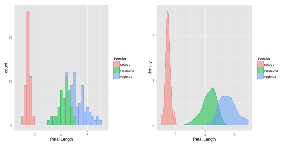
Figure 2.4: This shows the histogram (left) and the density plot (right) with aesthetic attributes for color and fill plus transparency with alpha included
After running the code provided in the previous examples, you would have probably noticed the warning message on the console informing the user that the program is choosing the size of the bins used in the histogram. As an alternative, the bin size can also be also specified in the qplot function using the binwidth argument, which controls the smoothing level of the histogram by setting the bin size. Evaluating different bin sizes can be very important, since it can greatly affect the visualization of your data.