
Box plots, also known as box-and-whisker plots, are a type of plot used to depict a distribution by representing its quartile values. In such plots, the upper and lower sides of the box represent the twenty-fifth and seventy-fifth percentiles (also called the first and third quartiles), while the horizontal line within the box represents the median of the data. The difference between the first and third quartiles is defined as Inter-Quartile Range (IQR), and it is often used as a measure of statistical dispersion of a distribution. The upper whisker represents the higher values up to 1.5*IQR of the upper quartile, while the lower whisker represents lower values within 1.5*IQR of the lower quartile. The pieces of data not in the whisker range are plotted as points and are defined as outliers. You can get additional details and references in the package website shown at the end of the chapter.
In this section, we will see some examples of boxplots using the dataset created in the previous section, myMovieData, so please refer to previous examples of how to create such datasets. In this case, we will have a look at the budget of the movies present in the dataset. More precisely, we are interested in the budgets of different types of movies. In order to produce a boxplot, we will just need to specify a boxplot geometry. As illustrated in the next code, the command is exactly the same as the one used in the bar chart example; we have just chosen a different geometry to represent the data. The following code shows this:
qplot(Type,Budget, data=myMovieData, geom="boxplot")
The resulting plot is represented in Figure 2.8. You probably have seen a warning message appearing on the screen, such as the following:
Warning message:
Removed 49699 rows containing non-finite values (stat_boxplot).
This is simply because in the data, there are many NA values in the column budget, and the function informs us that these values were removed when representing the distribution.
Tip
Removing NA values
When working with data and distributions, you will probably come across the need to exclude NA values from your dataset. You can see an example of how such values could be excluded from the dataset of the previous example, that of myMovieData. The following code shows this:
myMovieData <- myMovieData [!is.na(myMovieData $Budget),]
In the boxplot that we just produced, as outputted in Figure 2.8, we obtained the desired result - the distribution of budget values for the different categories of movies. You can clearly see the outlier values represented as points. Since the budget for the documentaries is very low compared to other movies, we cannot clearly see their values. In such cases, it may be useful to plot the log-transformed data so that, in the plots, the values are easier to compare visually. Of course, you will have to keep in mind that, in this case, the y axis will represent magnitudes in the log scale.

Figure 2.8: This shows a standard box plot of movie budgets for different categories of movies
One option to obtain the log transformation of the data can be to simply use the log() function when recalling the variable to transform and using the log(Budget) code. On the other hand, the more elegant way of plotting log-transformed values is via the log argument of the qplot function. Such an argument can have values of "x", "y" or "xy", which simply indicates which axis you are interested in having log-transformed—whether x, y or both. Just remember that the quotes should be also included in the code. With this option, the scale of the transformed axis is also changed in the log scale. With the alternative coding for direct data transformation, you have probably noted that both options produce the same plot—just with some differences in the y-scale notation. The following code shows this:
qplot(Type, Budget, data=myMovieData, geom="boxplot", log="y")
## Equivalent coding
qplot(Type, log(Budget), data=myMovieData, geom="boxplot")
The preceding code results in the following output:

Figure 2.9: This shows a standard boxplot of movie budgets for the different categories of movies with the y axis in the log scale
As illustrated in Figure 2.9, the resulting plot with the y axis in the log scale shows the movie budgets better distributed in the central area of the plot, allowing a better visual comparison of the data.
A very useful option in boxplots is the ability to visualize actual data points. This is particularly useful since it allows you to see where the observed values are actually located, with respect to the values of the descriptive statistics (median and quartiles). In order to do that in ggplot2, we simply need to add the "point"geometry together with the "boxplot"geometry. The following code shows this:
qplot(Type, Budget, data=myMovieData, geom=c("boxplot","point"), log="y")
Note
Bear in mind that geom attributes in qplot can be combined in vectors using c(). Combining these attributes will also give you the possibility of trying several combinations of attributes in order to create the plot you have in mind. Also, consider that the order of the elements in the vector will define the order of plotting. This means that in our case, with geom=c("boxplot","point"), we will have the points on top of the box plot. You can try to inverse the order and you will see how the points are covered by the boxplot.
The following graph is the output of the preceding code:

Figure 2.10: This shows a standard boxplot of movie budgets for different categories of movies, including data points (y axis in the log scale)
As you can see in Figure 2.10, we now have the data points included in our plot. Although data points in the boxplot are useful in some cases, in this example, this generates a sort of over-plotting, since we have too many data points and we end up with just a sort of vertical bar in the middle of our box plot. This is definitely not very helpful. Having data points a little separated from each other along the x axis could be a good way of improving our visualization. Luckily for us, in ggplot2, we have the option of jittering the data. Jittering is a process of adding random noise to data in order to prevent over-plotting in statistical graphs. As illustrated in the following code, it is done in quite a straightforward way by changing the geometry:
qplot(Type,Budget, data=myMovieData, geom=c("boxplot","jitter"), log="y")
The preceding code results in the following graph (Figure 2.11):

Figure 2.11: This shows the boxplot of movie budgets for different categories of movies, including data points with jittering (y axis in the log scale)
As is clear from the plot we obtained, we are now able to better recognise the position of the individual measurements on the plot. On the other hand, one problem we have now is that the data is almost covering the boxplot, and this is not really what we want. As you already know, we could change the order of the element in the geom vector, so that the boxplot would be drawn on top of the jittering measurements, but in this case, we would simply get the box covering the data. One option to overcome this issue would be to have the boxplot on top of the data, but add some transparency to it, so that the data is still visible. In order to do that, we simply use the alpha argument we introduced in the Histogram section. Just remember that we need to use the I() function in order to fix the transparency to a fixed value. The following data shows this:
qplot(Type,Budget, data=myMovieData, geom=c("jitter","boxplot"),alpha=I(0.6), log="y")
In Figure 2.12, you can see the plot we obtained. Now all the elements are there for a nice visualization of the different budgets. It also shows the individual measurements for each movie type available from the dataset, and which were then used to build the boxplots. For instance, the Animation and Documentary types have a much smaller sample size compared with the other categories, so we can also assume that the descriptive statistics represented in the boxplot may be less accurate.
The preceding code results in the following graph:
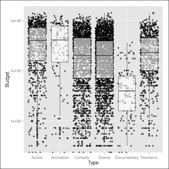
Figure 2.12: This shows a boxplot of movie budgets for different categories of movies, including data points with jittering and transparency on the boxplot (the y axis in the log scale)