Chapter Four
Visualizing Data, Abstract Data Types; Electric Fields of Multipoles
4.1 WHY VISUALIZATION?
One of the most rewarding uses of computers is visualizing the results of calculations. This is done with 2-D and 3-D plots (especially with colored surfaces), with contour maps, and with animations. These types of visualization are sometimes breathtakingly beautiful and often provide deep insight into a problem by letting you see and “handle” the functions with which you are working. Visualization also assists the program debugging process, the development of physical and mathematical intuition, and the all-around enjoyment of your work. Some of the reasons for this may arise from the fact that some large fraction (≈ 50%) of our brain gets involved in visual processing, and if you are able to use this extra brainpower in your scientific work, then you have extended what was otherwise possible with solely logical abilities.
Traditionally, visualization of a scientific problem was the last step in problem solving. After studying tables of numbers for hours and gaining confidence that they are right, a scientist might then go to the trouble of making a bunch of 2-D plots to examine various aspects of the data. Well, in present times computational scientists have demonstrated how much there is to be gained by going beyond 2-D plots. Now it is regular practice to use surface plots, volume rendering (dicing and slicing), and animations (movies). In this chapter we use some of these techniques within the context of visualizing the electric field around charges.

Figure 4.1 Static configurations for two, three, and four electric charges.
4.2 PROBLEM: STABLE POINTS IN ELECTRIC FIELDS
You are given the simple configurations of charges shown in Figure 4.1. The two charges are fixed on a line at coordinates (1,0), (-1,0); the three charges are fixed to the corners of an equilateral triangle at coordinates (0,1), /3 (1/2, -1/2), - /3 (1/2, -1/2); and the four charges are fixed to the corners of a square at coordinates (1,1), (1,-1), (-1,-1), (-1,1). The origin is at the center of each geometric figure. Your problem is to determine the electric potential at the point (x, y) and see if there might be some points in space at which we a free charge at rest will remain even if perturbed. For the equivalent gravitational problem, these stable points are known as Lagrange points and are the location of asteroids for the Earth-sun system.
4.3 THEORY: STABILITY CRITERIA AND POTENTIAL ENERGY
Coulomb’s law tells us that if we have a charge q at the origin, then the electric field E (the force per unit charge) at a distance r from that charge is
![]()
where r is a unit vector in the radial (r) direction.1 Here ke = 8.9875 109Nm2/C2 is Coulomb’s constant in SI units, and the electric field E is directed radially away from the charge. Because E is a vector, the electric force field about a charge is a vector field with both magnitude and direction at each point. However, no information is lost, and it is much simpler if, instead of the electric force field E, we consider the electric potential field
![]()
In the second form of this equation, we have left off the electric constant ke for simplicity; since this affects just the magnitudes of the graphs and not their shapes, it will not change the conclusions we draw. We see that V(r) falls off less rapidly than E and is a scalar, namely, has no direction associated with it.
Our problem requires us to determine the potentials the for two- and three-charge systems shown in Figure 4.2 and then to look for stable points in these potentials. To determine the potential for two charges, we use Pythagoras’s theorem to determine the distance to the charges,
![]()

Figure 4.2 Coordinate systems for two- and three-charge configurations.
and then just add up the potentials from the individual charges:
![]()
For three charges at the corners of the equilateral triangle, we know the coordinates are (0, a), (acos θ, -asin θ), (-acos θ, -asin θ), where θ = 30°. Again we use Pythagoras’s theorem and add the potentials from the individual charges to obtain

These equations for the electric potentials are what we wish to visualize. To make them simpler to visualize, we set a=1 and substitute for θ:

Owing to its two-dimensional nature, a purely mathematical solution for the equilibrium points in these potentials gets complicated. Instead, we will solve it graphically and rely on our intuitive understanding of how balls roll under the action of gravity. Specifically, we know that a ball released on a surface rolls downhill, and that if the ball is placed in a concave depression, it will remain there. Because the gravitational potential near the Earth’s surface is proportional to height, our description of the ball on a surface is equivalent to a description of how a particle behaves in a potential energy field. It therefore follows that charges will “roll down” the electric potential surface and will find a stable position at the concave minimum of the potential. So our problem translates into drawing pictures of the electric potential surfaces and looking for minima at the bottom of hills.
4.4 BASIC 2-D PLOTS: PLOT
Before we get to Maple’s plotting commands, let us examine some general principles. First, keep in mind that the point of visualization is to make the science clearer and to better communicate your work to others. So it follows that when you produce a figure, you should look at it and think if there are some better choices of units, ranges of axes, colors, style, et cetera, that might get the message across better and provide better insight. Taking into account that we are dealing with the complexity of human perception and cognition, there may not be one definite way to do things, and some trial and error is necessary to see what looks best.
Our general recommendation for visualization is to make each figure as clear, informative, and self-explanatory as possible. This means labels for various curves and data points, a title, and labels on the axes. We know, you are thinking this is really a lot of work for a lousy assignment or report, and that you do not need all those time-consuming extras to comprehend what is going on. Yet the more often you do it, the quicker and better you get at it, and the more useful will your work be to others (and yourself in the future).
The convention when plotting is to have the independent variable, say x, along the abscissa (horizontal axis) and the dependent variable, say y = f(x), along the ordinate. (Remember that your mouth spreads horizontally across when you say “abscissa” and that it puckers up vertically when you say “ordinate.”) If you have trouble deciding which variable is independent, think of an experiment in which you measure the position or velocity of a ball as a function of time. Because you are free to pick the times at which you make the measurement, time is an independent variable. However, once you have chosen the time, nature picks what the position of the ball is at that particular time, so position and velocity are dependent variables.
4.4.1 Loading the plots Package
Maple excels at easily producing graphs of all sorts, and indeed, visualization is one of the most valuable aspects of Maple. Although we will discuss and give examples of a number of possible plots, Maple affords more options than we discuss, and we recommend you look at the commands listed after the with(plots) statement and browse the help pages to create just the graph you want. We will first make a simple plot and then embellish it with things like labels and colors.
![]()
[animate, animate3d, animatecurve, arrow, changecoords, complexplot, complexplot3d, conformal, conformal3d, contourplot, contourplot3d, coordplot, coordplot3d, cylinderplot, densityplot, display, display3d, fieldplot, fieldplot3d, gradplot, gradplot3d, graphplot3d, implicitplot, implicitplot3d, inequal, interactive, listcontplot, listcontplot3d, listdensityplot, listplot, listplot3d, loglogplot, logplot, matrixplot, odeplot, pareto, plotcompare, pointplot, pointplot3d, polarplot, polygonplot, polygonplot3d, polyhe-dra supported, polyhedraplot, replot, rootlocus, semilogplot, setoptions, setoptions3d, spacecurve, sparse-matrixplot, sphereplot, surfdata, textplot, textplot3d, tubeplot]
We see that in response to the with(plots) command, Maple displays all of the plotting commands that are available with this package. (We sometimes use with(plots): with a colon rather than a semicolon to avoid the listing.) Now that we have the tools, let us look at the electric potential for a single charge:

You will observe from the first figure that the second argument to the plot command gives the range of values for the abscissa (r in this case). Our interest is really for r between 0 and infinity, but this does not produce such a useful result, since we primarily see the repulsive peak at the origin. In view of that, we get a more revealing plot by not letting r get quite so close to the origin. The second plot eliminates the part of the graph with the infinity at r=0, and so does not fully convey the image that the potential is infinite there. However, we tailor our plot more to our liking by giving some limits to the ordinate (also works if called the generic y):
![]()

As an alternative, it is possible to tell Maple that you want to see the full dependence of the potential from r=0 to ∞, plot (V(r), r = 0..infinity), but then you lose some details. Try leaving off the range for the abscissa to test Maple’s capabilities:
![]()
You see that because Maple was not given a range of r values to plot, it does not think it has anything to plot (empty plot).
The plot above shows the basic physics. If we view V (r) as an equivalent gravitational potential, a small positive charge (mass) placed near the fixed positive charge will be repelled (roll downhill) out to infinity. There are no locations where a charge remains at rest in equilibrium. If we had fixed a negative charge at the origin, the potential would have the opposite sign:

This shows that, regardless of where we place it, our positive test charge will fall into the hole at the origin. As we have just seen by placing a minus sign in front of the first argument to the plot command, it is allowable to have the argument be an expression and not just a function:
![]()
In summary, the first argument to the plot command is the name of the function or expression to be plotted along the ordinate, namely, the dependent variable. The second argument is the range of values for the abscissa, namely, the independent variable. The double period .. is used to specify the range, so -10 .. 10 means from -10 to +10. If the upper end of the range is a decimal value, say .5, then it is clearer to enter it with a leading zero as 0.5, so that the range looks like -10 .. 0.5, and not the confusing (to the reader and to Maple) -10…5.
Before we get on to embellishing the plot command, let us have some fun with the pretty graph you just produced:
• Click on the graph to select it. Inspect how a box is formed around it and that there are dark little nodes at the corners and in the middle of the sides.
• Use your mouse to resize the graph by grabbing one of the nodes and dragging it with the mouse button still depressed. Monitor how when a node is selected, a little arrow appears to show you the direction in which the frame can be resized. Resizing is possible diagonally along the corners or horizontally and vertically along the edges.
• Select the graph, copy it (it is placed on the clipboard), and then paste it back to the worksheet so that you now have two graphs.
• Make one of your graphs wide and short and the other one tall and thin. Check how the tall one emphasizes the variation in the magnitude of V(r), while the tall one emphasizes the range of r values to which V(r) extends. Both are perfectly legitimate ways to view a function, with one emphasizing the singular nature near the origin and the other the long range.
• Another way to view a function, especially one that has orders of magnitude variation in value, is with a semilog or log-log plot (although you need to avoid log(0)). In the execution group below, use the log10 () function to see how a semilog plot changes the appearance of the same f (x) we have been viewing.
• Next try the explicit semilog plot function logplot (), following the instruction in the comments fields below:
![]()

4.4.2 Labels and Titles (the Plot Thickens)
Any plot worth looking at is worth explaining. This is done by placing labels along the axes and by placing a title above the curves:

Take stock of how we just added a comma after the range and then added the options, separated by commas, to produce the labels and title. Because there are two axes, the labels field has an entry for the x axis and then the y axis. The labels and title are enclosed in back quotes in order to delimit the expressions:
> # Enter previous plot using ordinary accents
Modify the previous command so that the words “abscissa” and “ordinate” appear in the appropriate places and so that the actual expression being plotted appears in the title:
> # Plot with your modified labels and title
You may have noticed that we have placed r along the “x-axis” and V (r) along the “y” axis. In fact, there may be cases in which y is the independent variable. Thus you see why it may be better to use the words “ordinate” and “abscissa” than “x” and “y” axes.
4.5 COMPOUND (ABSTRACT) DATA TYPES: [LISTS] AND {SETS}
As we proceed with our exercises in visualization, you will see how to enter arguments to the plot commands using different types of parentheses. We recognize that some users may prefer just following the rules without questioning them. Nevertheless, the commands will make more sense, and will be easier to generalize, if you have some understanding of the method behind the madness. And so we now take a little excursion in which we define some terms that are frequently used in mathematics and computer science and employed by Maple commands.
We have already seen a number of ways in which Maple displays data. At times there is just a single symbol, sometimes there is a bunch of symbols separated by commas, sometimes there is a bunch of things in parentheses, and sometimes the symbols are in quotes. To illustrate, in Chapter 5 you will see that when you solve an equation that has several solutions, Maple separates the solutions with commas:

Take note of two types of parentheses here and the different forms given for the solutions.
Abstract, compound data types: An object in computer science denotes a data type with multiple parts. It may also be called an abstract data type, or a compound data type. Here the word “abstract” means that there is more to something than meets the eye; namely, the data type may contain multiple parts. Many of the individual symbols or variables used in Maple can be replaced by objects. We will discuss objects in more depth when we study Java, which is known as an object oriented language.
Data types: In specifying labels for the plot command, we placed the x and y labels in square parentheses [..]. These are called “brackets.” Maple also uses standard parentheses and curly parentheses called “braces.” Brackets and braces are used to construct abstract data types or objects from the more elementary data types we have already seen.
Sequence: A collection of variables (objects or data types) separated by commas is called a sequence. As a case in point, the arguments given to the solve command above, and indeed to most Maple commands, are variables separated by commas, and, hence, form sequences. While we are speaking of sequences, we may as well indicate that when we give arguments to a Maple command as a comma-separated list, the parenthesis indicate sequence. It is often convenient to let Maple form a sequence for you with the seq command:
![]()
List: A list is a sequence of numbers, or abstract data types, separated by commas and placed within square brackets.The order matters for a list, while it does not for a set (to be defined soon). We use a list when we issue the plot command:

Now we try creating the plot again, this time changing the order of the list:
> # Plot with reordered list
Clearly order matters here, as we would not want the labels for the abscissa and ordinates interchanged! You may enter the elements of a list by hand, as in

The individual elements of a list are referenced via Maple’s square bracket notation (a standard way of indicating subscripts):
![]()
1, 2, 3, 4
Set: A set is a well-defined collection of related objects or elements with no repeated element [Fral 76]. In contrast to a list, the order of the elements in a set does not matter. Sets are also used as arguments to Maple commands, but only in cases where the order of the elements does matter, for example, a set of equations to be solved. Sets are usually described by enumerating their elements, separated by commas, as a sequence within braces. To prove the point, the sets of equations and solutions used when solving simultaneous equations:

Seeing that lists and sets both contain comma-separated sequences within them, we emphasize that it is legal for the same element to occur more than once in a list, with the order of the elements in the list part of its definition. As an example, if we define a set with repeated elements in arbitrary order, then Maple will remove the repeats and reorder for us:

Arrays: Another data type related to vectors and matrices are arrays. We discuss them in Chapter 7.
4.5.1 Several Curves on One Plot, Sets
We have seen that the first argument to the plot command is the function to be plotted. As a case in point, imagine that as part of our charge problem, we want to compare, in a single plot, the r dependence of the potential and the magnitude of the electric field due to both positive and negative charges. Seeing that Maple treats the argument as an object, we substitute the set ![]() as the first argument to the plot command. The fact that we use a set as the object to plot rather than a list
as the first argument to the plot command. The fact that we use a set as the object to plot rather than a list ![]() makes sense since order does not matter and there is no point in plotting identical functions on top of each other:
makes sense since order does not matter and there is no point in plotting identical functions on top of each other:
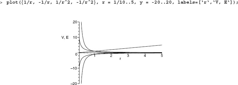
If you are reading the electronic version of this book, you will notice that Maple has chosen a different color for each of the functions. Experiment now with using a list as the first argument and noting how the colors assigned to the curves differ:
![]()
4.5.2 Using the Figure Toolbar
The colors and line formats that Maple picks for graphs may look great on your screen but may not print out or project well (green and yellow are often barely visible). In the next subsection we discuss how to customize the colors to your preference. In this subsection we will explore some of the options using the figure toolbar.
• Select the graph with your mouse (you should notice a box appearing about the graph after it is selected).
• While selected, observe that the second line of the toolbar at the top of your screen now contains icons for graphical options. Explore what each of these icons does. This is both useful and fun.
• Go to the Style pull-down menu and, under Line Width, select Broad. Observe especially the difference it makes for the yellow and green curves. Go to the Legend menu and enable Show Legend.
• Again go to the Legend pull-down, and select Edit Legend. Change the legends so they are V (r), -V (r), E(r), -E(r), and r for the appropriate curves.
• Explore how the different buttons controlling the placement of the axes work.
4.5.3 Customizing Colors and Line Types
Maple automatically chooses different color multifunction plots. You control the color of your graphs by adding the color option to the end of the plot command:

Taking into account that options are objects with multiple parts permitted, you enter a list (order matters) of colors to specify the colors of each curve:
![]()
Likewise, you choose different styles for each curve (like dashed and solid) to help tell the curves apart, even in basic black. You do that with the linestyle option, which may also be a list for each curve:

An especially effective way to distinguish different curves on the same plot without the use of color, is to draw them with different thicknesses. Apply this change with the thickness = n option, where again, a list for the curves is a legal option. The possible values for thickness are: n = 0, 1, 2, and 3, where 0 is the default thickness.

4.5.4 Legends, Titles, and Labels
Legends explain to the reader just what is being plotted with each curve. They are invaluable and do wonders for your presentation. When presenting several curves in one plot, it is important that the viewer not only be able to tell them apart by the different color or line style used for each, but also be given information as to what the different curves represent. It is good practice to explain in the caption below a graph what each curve means, as well as in the text (or in your talk) when the graph gets referenced. However, it is also good practice to have a legend in the plot itself explaining what each curve means. Captions and your explanations may get removed, but it is a lot harder to remove a legend.
The legend option specifies a single string or a list of strings in the same order as the curves with a legend for each curve:

4.5.5 Other Options
As we have said, there are many ways to customize your graph, and Maple’s Help pages are a good place to find out about them. Once in a while your graph may not show the features you want, because one function gets very large and Maple automatically adjusts the ordinate range to accommodate that. Here are a number of ways to limit the range of the ordinates:
![]()

There are occasions when a function falls off slowly, and so you might want to see its behavior for values of its argument from -∞ to +∞. It is clear that Maple is not afraid of big numbers, yet it is nice to see that it makes this type of graph in a finite amount of space:

Look at the second plot and its labels along the axes, rather than horizontal. This was accomplished with the commands

4.6 3-D (SURFACE) PLOTS OF ANALYTIC FUNCTIONS
We have examined the potential field V (r) = 1/r surrounding a single charge as a function of r. A 2-D plot is fine for this, since there is only one independent variable r. However, when the same potential is expressed as a function of the Cartesian coordinates x and y,

we have two independent variables, x and y, and so need a 3-D visualization. We get that by creating a world in which the z dimension (mountain height) is the value of the potential, and x and y lie on a flat plane below the mountain. Because the surface we are creating is a 3-D object, it is not possible to draw it on a flat screen, and so different techniques are used to give the impression of three dimensions to our brains. We do that by rotating the object, shading it, employing parallax, and so forth.
The command plot3d makes a 3-D plot and is just like our old friend plot:

The first plot is a fairly interesting, but it primarily shows the singular nature of the potential near the origin. As seen in the second plot, we get a more useful visualization if we limit the maximum value of V to 2.5 and add labels:
![]()
We try to make this plot more intuitively informative by making the color red correspond to the highest values of the potential, blue smaller, and green cooler still. Color may be specified as the option color = red or with a number. Consequently, we try to be clever and use the actual value of the potential V (x, y) as the color of the graph with color = V(x,y) option (yet we minimize the maximum value of the V in order to keep the singularity from confusing the color function). Seeing as how the potential varies continuously, this means that the color will as well:
![]()
Even though there are many options possible as part of the plot3d command, it is both easier and more fun to first make a basic plot and then use Maple’s graphical user interface (GUI) to modify the plot:
• Select this surface with your mouse (a box with filled little squares on the perimeter should appear).
• Grab the surface by depressing your left (or only) mouse button and holding it down. Now as you move your mouse, the surface will rotate in three dimensions. Make sure to move both right to left, and up and down, in order to get your brain to see the object as three-dimensional.
• With the surface still selected, notice the extra buttons that appear on the control panel. You should experiment and try to make sense of them. Remember that if you hold down a button, a message with the purpose of the button appears at the bottom of the screen. In particular, note:
a. the different ways to draw axes,
b. the different ways to render the surface, and
c. how contour plots compare to the actual surface.
4.6.1 Contours and Equipotential Surfaces
To further help your mind understand that different colors mean different potential values, and that the surface is three-dimensional, we now include the style = patchcontour option. This adds contour lines that show different levels of the potential:


In analogy to gravity, contours lines may be viewed as lines of equal elevation, which means that walking along a contour line does not change your elevation. For our electrical potential, the contours are called equipotential surfaces.
The contourplot command also supports the option of making only a 2-D contour plot of the surface (we prefer the 3-D contours to be shown soon). Because the contours are not being projected onto a curved surface or being viewed obliquely, these have the potential of being more precise:

However, we see in the left plot that the equipotential surfaces appear as ellipses, and not the circles to be expected for the symmetric case of a single charge. The reason is that the viewing screen tends to be broader than higher, and so plots are spread out that way. To get a plot with the same scales along the ordinate and abscissa, as done on the right, we add the scaling = constrained option:
![]()
This produces a more symmetrical figure, but still not round. Apparently, the rapid rise of the potential near the origin is not being handled well by Maple, and so we exclude it by use of the min function:
![]()
To produce the circles on the right plot, we actually had to use the grid = [75,75] option to increase the default grid Maple uses to evaluate the potential, from the default 25 × 25 to a finer 75 × 75.
The contours we have just drawn have all been projected onto the x-y plane. The command contourplot3d draws the same contours on a 3-D surface that can be rotated as well for better visualization (looking straight down produces 2-D contours). Actually, contourplot3d is faster and more accurate than the 2-D contourplot as a consequence of it being written in the compiled language C:

4.7 SOLUTION: DIPOLE AND QUADRUPOLE FIELDS
We have used a number of visualization tools to examine the potential field surrounding a single positive and a single negative charge. The tools only showed us what we probably knew already, namely, that the potential field does not have concave areas in which a charge may remain stably at rest. This was as intended; it is a good idea to learn about new tools by applying them to problems for which you know the right answer. We are now in the position to finally investigate the electric potential due to a dipole and tripole. We start with the dipole configuration shown in Figure 4.2:


Now we visualize a dipole with one positive and one negative charge:

If you grab and rotate this plot you will see that wherever you place a charge, it will either roll downhill away from the positive charge or fall into the hole of the negative charge. There is no stable equilibrium. For that reason enter the commands to look at two charges of the like sign:
![]()
The figure resulting from these commands looks like a saddle. There is a region between the two peaks where it appears that a charge will remain at rest, and where it will roll back towards the midpoint if it is displaced along the positive or negative x axes. However, due to the saddle, if the charge is displaced in the y direction, then it rolls away to infinity. The charge is thus stable for x displacements but unstable for y displacements. This type of equilibrium point is known as a saddle point, and occurs for two positive or two negative charges. If the charges have unequal values but the same sign, then the shape gets distorted but still has the same property.
As a check on our analysis, look at the contours for this surface:
![]()
You should see the saddle point structure as a single point where two equipotential surfaces cross.
Now we look at the quadrupole potential (we leave the tripole for you). Our intuition tells us that the high degree of symmetry here must lead to a stable position at the center. We define the potential and then we plot it as a 3-D surface and as 3-D contours:

Indeed, we do see a large central, flat region surrounded by a lip to hold the charge in. We check this out further by looking at some slices through the central region:
![]()

So we see that the central portion of this potential is indeed a flat region with a “lip” all around it. Consequently, a charge placed there will be have no force on it (the flatness) and will be stable for small displacements (the lip).
4.8 EXPLORATION: THE TRIPOLE
Repeat the analysis carried out for the dipole and quadrupole now for the tripole. Be sure to make a 3-D plot with labels and title as well as including contours. Slice your plot through its center to verify that you have found a stable point.
4.9 EXTENSION: YET MORE PLOT TYPES*
4.9.1 2-D Animations
We have just seen that surface-rendering techniques permit us to create images from mathematical functions that give the impression of viewing a true three-dimensional object. This literally gives a new dimension to our visualizations. In addition, if we have plots that show the behavior of some quantity as a function of space, and if this behavior changes gradually with time, then the observation of a sequence of plots of the spatial dependencies, each one for a slightly different time, gives the impression of a continuous evolution of the spatial function in time. The function appears to be alive and, indeed, creating a series of snapshots in time is known as animation.
To produce animations, we add the dimension of time to our 2-D plots. To name an instance, let us say we wanted to show the changing temperature distributions along the x direction of a metal bar as it cools with increasing time t. We could plot T1(x) and then T2(x) and so forth, where the subscript indicates the time. It is more elegant and concise to envision a single function T(x, t) that contains both the space and time dependencies.
By way of example, if the bar was initially hot in the center, a possible temperature distribution is [Krey 88]
![]()
We make a 3-D surface plot of this function from t = 0 to 20 and x = 0 to π:

Observe that it is important to label the axes so that you know which variable is time and which is space. Go ahead and grab, enlarge, and rotate the left plot.
The plot on the right uses animate to animate this function:

Whereas the plot on the right does not look different from a static 2-D plot, if you are reading the electronic version of this book, then you make it come alive by selecting it with your mouse. Then a bunch of buttons appear on the control bar on top that permit you to “play” the animation as you might a CD. Do it now! Investigate the buttons for stop, forward, reverse, fast forward, and fast reverse. However there is also a button that lets the animation loop around and thus play continuously. We recommend that.
An animation works by displaying (flipping through) a sequence of slightly modified images. In movie parlance, these images are called frames, and the more you have of them the smoother and slower will be your animation:
![]()
4.9.2 3-D Animation
Well, if you have been reading and executing up to this point, it is fairly clear what 3-D animations are about. If you have a function of two space coordinates that also varies in time, then you make a 3-D surface plot to visualize the space dependence at any one time, or an animation to visualize the time dependence of the surface. For example, assume the temperature distribution is now a function of two space coordinates as well as time:
![]()
This is complicated enough that we will define a Maple function rather than try to stuff it into a command. Other than using the name animate3d, the format of the command is the same as before. We start with the function T(x, y, t), then give the ranges for each variable, and then the labels:

Again, if you are reading the electronic version, then select this plot, play it, and even rotate it while it is vibrating (it looks like a vibrating drum head).
4.9.3 Phase-Space (Parametric) Plots
In science we often encounter several physical quantities that are simultaneous functions of the same variable. For instance, the position x(t), velocity v(t), and acceleration a(t) of a mass undergoing simple harmonic motion are all trigonometric functions of time:
![]()
We easily plot the position and velocity on the same graph; for example,

We observe the position and velocity as out of phase, but with the same period.
A more direct way to observe the relation of two dependent variables (x and v in our example) as a function of the same independent variable t is known as a phase-space or parametric plot. These types of plots have now proven themselves to be highly illuminating and valuable. Phase space is an extension of the usual space of position that also includes velocity as if it were a new dimension, along with position. Explicitly, we plot x(t) along the abscissa as if it were the independent variable and V (t) along the ordinate. In a sense then, a phase-space plot is a plot of v(x).
Recognizing that it might be impossible, or very complicated, to analytically eliminate the time dependencies permitting two functions to be expressed in terms of each other, it is still fairly easy to do this graphically. Explicitly, Maple breaks up the total time interval into a number of steps and then records the pair of values (x, v) for each time step. These values then get plotted as v(t) versus x(t):
![]()

Observe that all we have done here is use a list (square brackets) as the function argument and included the range of time values as part of the list. The general syntax for a two-dimensional (2-D) parametric plot is plot ([x(t), y(t), t = a..b], options), where t is known as the parametric variable or simply parameter, and x(t) and y(t) denote the horizontal and vertical functions, respectively.
As far as the output goes, this phase-space plot looks like an ellipse. Yet it has properties that agree with the observations we have made before: when the mass is at its maximum positions, at the extreme right and left edges of the ellipse, the velocity is zero. When the mass has it maximum speed, at the top and bottom of the ellipse, it has zero position, namely, it is passing through its equilibrium position. So while a harmonic oscillator is described via a complicated set of position, velocity, and acceleration functions versus time, in phase space its motion is an elliptical orbit on which the mass passes over and over.
You may be wondering in looking at this graph just how we hit upon the exact range of wt values for which the graph exactly closes on itself. Well, we really did not. In fact, our plot covers two full cycles and plots them on top of each other (which you cannot see). If, on the other hand, your phase-space plot did not form a closed figure, then you would need to run for more values of the time. Try out smaller and smaller ranges for the phase wt in the plot command until you are able to generate 1/2 and 1/4 of an elliptical orbit:
![]()
As you see from looking at the monitor in front of you, visual displays tend to be broader than they are high. For this reason graphs tend to get stretched horizontally (“scaled”) in order to fill the screen. As long as the graph looks good this is not normally a concern, yet it is if you are trying to determine the proper shape of a geometrical figure. For this reason Maple has the scaling = constrained option to avoid undue stretching:
![]()
4.9.4 Energy Conservation and Implicit Plots
In our discussion of parametric plots, we looked at the position x(t) and velocity v(t) of an oscillator as functions of time. Maple solves numerically for the function x(v) or v(x). There may also be cases where you know some functional relation between two variables, say x and v, and wish to make a plot of x versus v. To cite an instance, let us say that we have a spring with a nonlinear force law so that the potential energy stored in it is
![]()
The kinetic energy of a mass attached to this spring is, as always,
![]()
We know that the sum of kinetic plus potential energy is conserved, which means we have an implicit relation between position and velocity, namely,
![]()
This last equation permits us to make a parametric plot even though we do not have explicit solutions for x(t) and v(t). We do it with the implicitplot command that plots x versus v given the equation relating the two:

See how this phase-space plot changes if the potential energy varies as x5.
4.9.4.1 Implicitplot3d
In analogy to the 2-D implicit plots we just made for a nonlinear oscillator, the implicitplot3d command plots the 3-D surface defined by some explicit relation between x, y, and z:

As with other 3-D plots, it is possible to grab and rotate the electronic plot.
4.9.5 Vector Fields: fieldplot and fieldplot3d*
Consider again the electric dipole shown in Figure 4.2. The problem we examined dealt with the electric potential for this type of system. Even though potentials are easier to compute and visualize than fields, it is usually fields that are related to the forces and measured in experiments. As an extension of our charge problem, we now visualize the electric field vector E(x, y) for the dipole,

where the E and r’s in this equation are all vector quantities. Mathematically, we determine the electric field as the derivative of the potential using the techniques of vector calculus and then plot the individual components. This is complicated, so let us have Maple do the work.
We start with the x and y components of the electric field E:

We visualize the components in two surface plots (we show only one on paper):
![]()

Although this plot shows Ex at each point in space, it is rather hard to get a good feel for the magnitude and direction of the field. For this purpose there is the fieldplot command:

This plot shows the direction of the field as given by direction of arrows, and the magnitude as given by the length of the arrows.
You may not know it from elementary physics classes, but the real world is actually three dimensional. Because of this the electric field actually has a z component as well:

Here we visualize a 3-D vector field with the fieldplot3d command:

Regardless of how good you might think this plot looks on paper, it truly comes alive when you grab and rotate it electronically.
4.9.6 Polar Plots
Polar coordinates describe a 2-D plane in terms of radius r and orientation θ, rather than the more common Cartesian coordinates x and y. A polar plot is a representation of the function r(θ) created by placing a point a distance r(θ) from the origin for each angle θ. They are illuminating because the angle on the plot corresponds to the actual angle of the function’s argument, and so the shape of the plot lets you visualize the variation of the function in actual space. If r were independent of θ, then the polar plot would be a circle. Other dependencies are less obvious.
Making polar plots with the plot command is similar to making parametric plots, only now we add a coord = polar option and use theta instead of time as the parametric variable. Or do it directly with the polarplot command:
![]()
To get a feel for how this works, let us make a polar plot of a function that is independent of θ and has r=1:
![]()

As a more realistic example, consider the expression for the intensity of low-energy X-rays scattered off a reflecting sphere as a function of the scattering angle:

You intuitively feel where the scattering is large and where it is small.
4.9.7 Surface Plots of Complex Functions*
In Chapter 14 we give a review of complex numbers in preparation for representing them as objects in Java. If you are not familiar with complex numbers, then you may want read that review in order to better understand this section.
Maple has the commands complexplot and complexplot3d for visualizing complex functions. We have found complexplot3d the more useful of the two, and will discuss only it. We start with the complex function f of the complex argument z = x + iy,
![]()
The command complexplot3d makes a 3-D visualization of a complex function or expression. The form of the visualization differs if the input is a implicit function of a complex argument z or an explicit function of the real and imaginary parts x and y. In the latter case complexplot3d plots the Ref while coloring the graphic using the Imf. As an instance, consider the complex function

Here the height of the plot is the value Ref = x2 -y2, changing sign along the line x= y, while the color is controlled by Imf = 2xy. We obtain the same plot as before using explicit functions of x and y:

The other approach to visualizing complex functions is to enter complex numbers directly. In this case, complexplot3d plots the magnitude of the function and colors the resulting surface with the phase θ, defined as tan-1(Ref/Imf), of the function:
![]()

A more realistic example is the complex function
![]()
that describes a resonance as a function of E that may occur in a circuit containing a resistor, inductor, and capacitor in series (discussed in Chapter 16) or in setting up standing waves in a tube. Regardless of the fact that experiments are done only at pure real values of E, this function has a pole (equals ∞) at a complex energy E = 2-i. To help understand the visualization, we rewrite f in a form with a real denominator (multiply the numerator and denominator by the complex conjugate of the denominator):

We visualize f(z) using the different forms of complexplot3d:

Inasmuch as there are no sign changes here, it must be the modulus of the function that is being plotted. If we look at (4.20) we see that the modulus does have a maximum when x = 2 and when y = -1, and that the modulus falls off in value as we get away from the pole position. As expected, we see those features on the plot. We visualize the real and imaginary parts of f(E) separately:

As we see in the plot, there is a sign change at 2 along one of the axes. Consequently, that must be the x axis and the function plotted must be Ref (Imf does not have a sign change). Check next that Ref does not change sign as a function of y, but does have a maximum at y = -1 where the denominator gets small. In fact at (x, y) = (2,-1) there is a pole, yet it has residue 0, which we see as a very large oscillation in Ref. To see how the Imf varies as a function of complex energy, we reverse the real and imaginary parts in the argument call:
![]()
4.9.8 Plotting Lists and Sets: pointplot*
If you do measurements in a real lab or run numerical simulations in a virtual lab, you will end up with some numerical data to plot. The data are of the form
![]()
We will now generate such points, both so that we will have some data to plot, and as a further exercise with sets (not ordered), lists (ordered), and sequences. First we generate a sequence of ordered pairs (each a sublist in square brackets) with the seq command:
![]()
If we store this sequence in a list, then the order is preserved, yet if we store it as a set, then the order is not:

The difference becomes evident when we plot the set and list using the pointplot command and the connect = true option to connects the points. If the points are sequentially ordered, then the list should yield a single-valued function, otherwise the curve will loop back upon itself:
![]()
4.9.9 Creating Simple Figures: pointplot, pointplot3d*
Here we give some examples of the use of pointplot and pointplot3d to create simple figures of a barbell (we use the figures in Chapter 7). There are three steps involved. First we plot just the data points using circles for the points. Then we plot lines connecting the data points. Finally we use Maple’s display command to display both the points and lines on the same graph. In 2-D, the left plot below, we give points as a list of doublets [x,y]:

In 3-D, the right plot above, we give the points as a list of triplets [x,y,z]:

4.9.10 Plotting Vectors: arrow*
Maple’s LinearAlgebra package is discussed in Chapter 7. That package permits us to define vectors, matrices, and arrays of arbitrary sizes and dimensions (although matrices are always 2-D). There you will find some easy-to-use tools for visualizing vectors and matrices. The arrow command plots a 3-D vector as an arrow and lets you grab it and rotate it. If the vector is 2-D, then the arrow cannot be rotated. The display command lets you place several arrows together. Notwithstanding vectors having more than three components, the arrow command works only for 2-D and 3-D vectors.

Once we have visualizations of the vectors L and Omega, we place them on the same graph (the right plot above, which can be grabbed electronically) by assigning objects (named variables) to each arrow, and then displaying the arrows:
![]()

We also use the arrow command to plot several arrows (or sequences of arrows) at one time. To illustrate, here are the familiar three unit vectors:

Study our creation of arrows with the options to control the color and shape of the arrows (see Help arrow for other properties). Although there are limited options for the arrow command, the display command supports the usual ones, such as labels and titles.
4.10 VISUALIZING NUMERICAL DATA
4.10.1 2-D Plots of Data
Most realistic computations in science produce numerical output, not analytic functions. Possibly in view of the fact that there is more work involved in plotting numerical data than there is for an analytic function, Maple has a number of ways to make 2-D plots of numerical data.2 In fact, the various packages that are used to extend the basic Maple capabilities, such as those for statistics or linear algebra, often have their own plotting techniques. Here we demonstrate the use of listplot from the plot package and scatterplot from the statistical package.
4.10.2 Numerical Plots: listplot
The listplot command creates a 2-D plot from a list of numerical data values. If only y values are given, say as the four-element list,
Ydata := [1, 8, 27, 100],
then listplot will assign x values by counting from 1 to 4 to produce
{(1, 1), (2, 8), (3, 27), (4, 400)}

The same plot is obtained if y is entered as a list:

If you want to give explicit x values to your data, then you place each (xi, yi) value in its own two-element list, and make a big list up of these sublists. This placement and listing produces the left plot below:

To get the plot to close on itself and thereby form a geometric figure (right plot), we repeat the first point:
![]()
The above samples are basic commands. There are options for plotting only points, for controlling their size and color, and with connect = true, to connect the points in the true order in which they are plotted.
4.10.3 Numerical Plots: scatterplot*
A scatter plot is a plot of points in which the points are not connected. To use the scatterplot command, we give as arguments a list of the x values of our data, and a corresponding list of y values:

4.10.4 Histograms and Box Plots*
Here we make a histogram and then a box plot of some random data:

data: = [-2., -0.8, 2., 0., -0.5, -0.5, 1.6, 0.8, 0.5, -0.5, -0.2, -0.2, 0.2, -0.1]

A histogram is used to create bins or bars, with the height of the bar proportional to the number of events that occur within the x values covered by the bar. A box plot is seen to contain a central line showing the median, a lower line showing the first quartile, and an upper line showing the third quartile.
4.10.5 Surface Plots of Data: listplot3d*
We have already seen how to make 3-D or surface plots z = f(x, y) of analytic functions of two variables. Here we describe how to make the same kind of plot from a table of numbers. In Chapter 11 we describe how to use the free, plotting program gnuplot to make surface plots of numerical data (we find gnuplot easier).
Most often, realistic calculations produce numerical data rather than analytic functions as their output. This type of output is a consequence of the real world being less simple than the assumptions made in those models that lead to purely analytic answers. In realistic cases, the resulting equations may still be solved, only they must be solved numerically. Trying to understand if there is meaning in long lists of numbers obtained as output is quite the challenge, yet this point is exactly where visualization tools are most valuable.
While yet to be discussed (we do in Chapter 7), the use of matrices and arrays makes the bookkeeping for multidimensional data rather straightforward. Hence, you may want to review matrices and then return to this subsection.
As with all 3-D visualizations, we want to create a surface in 3-D space that represents our data. Picture data describing the temperature T(x) as a function of distance x along a one-dimensional bar. However, the bar is cooling as a function of time, so there is a temperature distribution for each time that we put together as a function of both time and position T (t, x). Consequently, we will make a graph of T(t, x) with T as the vertical distance above the plane formed by the time t as one horizontal coordinate and with position x as the other horizontal coordinate. The fact that this 3-D surface does not truly exist in nature is one reason this approach is called “visualization.”
The plotting of numerical data is done in two steps. First we read the data into a matrix, with one index for position and other for time. Then we plot the matrix. We have placed some sample T (t, x) data in the file EqHeat z.dat on the CD, and you should read that file into a convenient location now.
It seems obvious that the data file should contain x and t values with the associated T(t, x) value. Nonetheless, the problem is made simpler by just giving T values, indicated by the subscript z in the file EqHeat z.dat. The assumption is that these T values correspond to a rectangular array of uniformly spaced x and t values, and we do not need to know the actual spacing to make the visualization. To see how this works, here are the first three lines in EqHeat z.dat:
0. |
100. |
100. |
100. |
100. |
100. |
100. |
100. |
100. |
100. |
0. |
0. |
32.5 |
59.8 |
78.9 |
89.5 |
92.8 |
89.5 |
78.9 |
59.8 |
32.5 |
0. |
0. |
22.7 |
43. |
59.0 |
69.1 |
72.5 |
69.1 |
59. |
43. |
22.7 |
0. |
Think of each line of data as a row of a big matrix. Whereas the number of digits used for each number may differ, and so the length of each line may differ, each row has the same number of entries or columns. These data are values of the temperature for increasing x values along the rod. Explicit values of the time are not given, however, subsequent lines (rows of the matrix) contain the temperature distributions for later and later times. In other words, the full matrix is
![]()
where each new row corresponds to the next value of the time. As no explicit values are given for the time or the position, the plotting program will assume uniform spacing and time steps and will assign each integer values, 1, 2, 3. .. for the plot. Think of these as “the first, second, et cetera” times and the “first, second, et cetera” positions.
The data are read into Maple with the readdata command. We view each row of the matrix as a list (order matters)
![]()
and the collection of rows as a list of lists (listlist):
![]()
Once we know how many rows or columns there are, it is easy to build the matrix with all the elements in their correct rows and columns. We will show you how to make an explicit matrix up out of these data soon, but first we will work with just the z values as a list of lists.
We use the variable numcols to tell Maple the number of elements (columns) in each row, and then have Maple count the number of rows:
![]()
The data (values of z) are read into the variable (object or abstract data type) that we name data with Maple’s readdata command. Because files are stored on your individual computer using the local operating system’s conventions for files, just how you specify the file name depends somewhat on the computer system you are on and where the file is on that system. For all but the simple Unix version, we have placed a # sign in front of the command so that Maple will treat the command as a comment. Examine the use of left quote or accent grave, ‘ as opposed to the normal, ’ in the command to delineate the name of the data file. To see what works for you, try deleting the comment symbol and seeing if the command completes with no error message:

As you see here from the Maple output, the variable data is a data object composed of a list [.. .] containing other lists [[.. .], [.. .], . ..] . Each sublist is the temperature all along the bar at a different time. To look at any individual part of this list, for example, the second row (the second list):
![]()
In case you have trouble reading these files, you may input the data by hand with the list of lists format, data: = [[…], […], …].
4.10.6 listplot3d
The listplot3d command creates a 3-D plot of a list of lists of numeric values. Remaining arguments are interpreted as plot options. See the plot3d help menu for a list of possible options.

4.11 PLOTTING A MATRIX: MATRIXPLOT*
Another way to make a 3-D plot is with the matrixplot command. Though this is an easy command to use, we first need to place the data in a matrix. In Chapter 7 we discuss matrices and give examples of plotting matrices and vectors as well. If you have trouble following the procedure below, you may want to learn some more about matrices in Chapter 7.
We start by reading in the data file. In order to figure out how many rows there are in the matrix without our doing the counting, we use the nops (number of operands) command:

We now convert the list named data to the matrix named data matrix with the convert command:
![]()

As a check, you should determine the individual element in row 5, column 2. Here we do it for the fifth elements in the second row:
![]()
4.11.1 Surface Plots with matrixplot*
An entire 2-D matrix is visualized in one step with the matrixplot command. This provides a plot that may be grabbed and rotated, which is useful for finding missing elements. The options are much the same as those for plot3D:

When working with data, the hard part is clearly getting the matrix into Maple. Plotting with the matrixplot command is easy. For our data, different rows correspond to different values for the time t, and different columns correspond to different positions x along the bar. The rows will be plotted along the x and y axis in the plot, namely, along the base of the solid figure. The temperature will be plotted as the height of the surface above the base. To help with the visualization, we will also use the color of the surface to convey the temperature (ideally with red being hot and blue cold). We vary the color by using the shading option, with its value set equal to hue; this varies the color through the entire spectrum as a function of the z value:

You should see is a colored 3-D surface with many curves drawn on the surface. This is interesting but not necessarily an effective visualization. You are probably the best judge of effectiveness, and to do that you need to try out the options and see what works. So here is another command-line version of matrixplot with many options for things like tick marks at informative places, contours, and better fonts and sizes for the labels:

At a Maple prompt, try including and removing some of these options in order to see the effects. Go back to the simplest version of the matrix plot command matrixplot(data) and obtain similar options from within Maple’s graphical user interface. In particular, notice how the 3-D effects depend on having made a good choice for the orientation angle.
4.11.2 Non-Uniform x-y Grid with surfdata
The matrixplot command assumes the grid spacing is uniform, namely, that the x and y values are uniformly spaced. If they are not, then you need to provide information about how the grid spacing depends on grid location (column and row number). An alternative approach is to read in the set of values (x, y, z) so that you effectively have the function z(x, y). The surfdata command is used to plot a surface from a set of (x, y, z) data.
To make a surface plot of data we need data. To start we make a list data_list of uniform (x, y) values using the sequence command seq. As before, we make each set of (x, y) values into a list and then place all of these sublists into a list of lists. For our temperature example, this placement means we will represent time with the row index, position with the column index, and temperature with the z coordinate. Rather than read in a big file of (x, y, z) values, we will add explicit (x, y) values to our list of data values. We start with the seq command that creates a sequence of integers. First we get a sequence of x values from 0 to 100 in steps of 50, and then a sequence of [x, t] with x running from 1 to 1,000 in steps of 100:

Each point to plot is a set of (x, y, z) values that we are representing in Maple as a sublist. For example, for row 1 and column 2 there is the list
![]()
We now plot the graph with the surfdata command, first in simple form, and then with labels and contours:
![]()

Reading in (x, y, z) Data Sets
In a more realistic case our data might be the result of a numerical simulation or a measurement and would reside in an external file. For this purpose we supply the file EqHeat xyz.dat on the CD. We read in these data as before with the readdata command, but now with three columns for the values of (x, y, z):

where we have tested if data matrix is an array, and if data is an array. We then convert from a list of lists to a matrix with the convert command:


4.12 ANIMATIONS OF DATA*
Below we present an animated plot of the wave motion resulting from plucking a string. The string is hanging under its own weight and is affected by friction.3 This animation comes from a numerical simulation [CP 05] that outputs its results to a file in the gnuplot format used for surface z(x, y) plots. As described in §4.10.5, the data are in the form of a matrix of z values, with the rows of the matrix separated by blank lines. The first row corresponds to time 1, with the place in the row corresponding to different x values. The second row contains all the z values for time 2, and so forth. As we see in the figures, the surface plot shows many ripples corresponding to oscillations of the string, but it is not nearly as effective a visualization as playing the animation below.

In this section we indicate the steps needed to input numerical data in surface
plot format and convert it into an animation. We start by forming a very long list of data named data from the file function.dat (Unix reads from the present directory, Windows requires the full path name):

We next break up the array DATA into a list of sublists. The first sublist funct[1] corresponds to row 1 of the original matrix, the second sublist, funct[2] corresponds to row 2 of the original matrix, and so forth:

As a check, we print out the sublist func[1]. It is the first row of input and will be the first frame of the movie:
![]()
Now that we know that the data look good, we plot several of the frames we will put together to form the movie:

To create the movie, we use the display command. Yet, if we try to display several frames together, we just get multiple frames on top of each other. In order not to display all of the frames on top of each other, we use the seq command to form a time-ordered sequence of plots. Hence, we have created an animation.
![]()
4.13 KEY WORDS AND CONCEPTS
abstract |
data type |
abscissa |
animation |
contour plot |
dependent variable |
implicit plot |
independent variable |
list |
matrix |
nonlinear functions |
ordinate set |
sequence |
surface plot |
2-D plot |
parametric plot |
polar plot |
potential energy |
1. Is there a direct way of measuring potential energy in nature?
2. Is there a reason electric charges occur always in integer values?
3. How does an abstract data type differ from an algebraic symbol?
4. How do you decide if a variable is independent or dependent?
5. When might it be a bad idea to use color in your plotting?
6. List three ways in which you may change the interpretation of data by changing the way in which it is presented.
7. What might be a dishonest way of presenting your data?
8. Give examples of the type of data that may be appropriate for 1-D, 2-D, 3-D, and 4-D visualizations.
9. When are animations a useful way to display data?
10. How, in a mathematical sense, does a phase-space (parametric) plot differ from an ordinary 2-D plot?
11. What is the difference between a list and a set?
12. How is a table of numerical data similar to, and different from, a mathematical function?
13. Give an example or two of the types of functions that would be visualized best with each of the following plots:
a. 2-D plot
b. 3-D plot
c. multifunction plot
d. parametric plot
e. animation
f. 3-D animation
14. Explain in just a few words what is meant by
a. an abstract data type
b. a parametric or phase-space plot
c. a function of three variables
d. a set of three variables
e. a list of three variables
4.14 SUPPLEMENTARY EXERCISES
1. On a single graph, display the functions x3 sin(x), x3 cos(x), and x log(x), each in a different color. Use an equal negative and positive x range, and pick that range to obtain the most interesting comparison of the three functions.
2. A graphical approach to solving equations plots the right- and left-hand sides of an equation as two separate functions, and then finds the solution as the value of the abscissa at which the two curves intersect. Use Maple’s ability to plot several functions in the same graph to determine the approximate solutions of the following equations:
a. sin(x) = x2,
b. x2 +6x+1 = 0,
c. H3 -9H2 +4 = 0.
3. Do a graphical experiment in which you prove to yourself these very useful mathematical facts:
a. The exponent ex grows faster than any power xn.
b. The logarithm ln(x) grows slower than any power xn. Hint: To avoid overflow problems with very large x values, you may want to make semi- log plots.
4. Do a graphical experiment to find the value of n for which these equations are true:
a. n sin(2 x) = sin(x) cos(x),
b. n cos(x)2 = 1 + cos(2 x).
5. If two tones very close in frequency are played together, your ear hears them as a single tone with an oscillating amplitude. Make plots as a function of time of the results of adding the two sine functions
sin(100 t) + sin(bt).
Make a series of plots for b in the range
90 < b < 100.
Make sure to plot for a long enough range of t values to see at least three cycles of any periodic behavior.
6. Here are nine measurements given in the form (x, y):
(0, 10.6), (25, 16.0), (50, 45.0), (75, 83.5), (100, 52.8), (125, 19.9), (150, 10.8), (175, 8.25), (200, 4.7)
Make a plot of these data points.
7. The orbits of planets and comets are known to follow conic sections. Conic sections are the 2-D curves formed when a cone is cut (sectioned) by a plane and are given by the parametric equations in which s is the parameter:
a. Hyperbola: (x(s), y(s)) = (4 cosh(s), 1.4 sinh(s))
b. Ellipse: (x(s), y(s)) = (4 cos(s), 1.4 sin(s))
c. Parabola: (x(s), y(s)) = (s cos(θ)-s2 sin(θ), s2 cos(θ)+s sin(θ)), θ = arbitrary parameter
Make parametric plots of these conic sections. Cover as much range as is needed for the parameter s in order to obtain the full shapes.
8. Planetary orbits are best described by the polar-coordinate form of the conic section:
![]()
where ε is the eccentricity and 2α is the lataus rectum of the orbit. An ellipse occurs when 0<ε<1, a hyperbola for ε>1, and a parabola for ε=1. Make polar plots of these three kinds of orbits by using different values of ε. Try also various values for the parameter α (it is inversely proportional to the total energy of the planet).
9. Make a surface plot of the potential:

10. Make a contour plot of this same potential.
11. A standing wave on a string is described by the equation
![]()
where x is the distance along the string, y is the height of the disturbance, and t is the time.
a. Create an animation of this function.
b. Create a surface plot of this function, and see if you agree with us that it is not as revealing as the animation.
12. A traveling wave on a string is described by the equation
![]()
where x is the distance along the string, y is the height of the disturbance, and t is the time.
a. Create an animation of this function.
b. Create a surface plot of this function, and see if you agree with us that it is not as revealing as the animation.
13. Plot the function f(x) = sec(x) + 4 over the interval [0, 4π]. Seeing that Maple’s automatic scaling does not work well here, you will need to specify a range for the ordinates to obtain a useful visualization.
14. Given the points (1, 0.53), (1.5, 0.65), (2, 0.91), (2.5, 0.95), and (3, 1.10), create a plot containing these points as well as the functions ![]()
![]() . Which function fits the data best?
. Which function fits the data best?
1A vector is a mathematical object with both magnitude and direction[Ser 00]. They are discussed further in Chapter 7.
2David McIntyre assisted with methods for plotting data.
3We thank Juan Vanegas for this example.