In the world of design, color is one of the most important elements. When you’re creating a brochure, advertisement, or banner using Photoshop Elements, good use of color attracts the attention of the viewer. It also helps draw the elements of your design into one cohesive unit. Color is a strong motivator and is used in all aspects of our daily life.
Since color is so important to design, Photoshop Elements lets you use industry-standard color sets, or you can create and save your own customized color palettes. You can also color correct a photograph by removing the color entirely or selectively remove colors from portions of the image. In addition, Photoshop Elements gives you ways to select areas based on color, and then fill those areas with any color you choose.
Not only is it important to understand how color is used, it’s also important to understand how Photoshop Elements manages color information. Channels are where color information is stored. The number of channels in an image is based on its color mode, or color model, such as RGB (Red, Green, Blue). A firm understanding of channels and color modes, and their function in Photoshop Elements will go a long way in helping you control and manage color.
When adjusting your image, you can use various commands—Auto Contrast and Color, Curves, Color Balance, and Brightness/Contrast, Saturate and Desaturate, just to name a few. You can also use the Match and Selective Color adjustments to further fine-tune your image. Photoshop Elements also provides a photo filters adjustment, as well as a shadow and highlight adjustment to correct those over or under-exposed images. With all of the commands and adjustments available, the real dilemma will be where do you begin?
Color modes define the colors represented in the active document. Although you can change the color mode of a document, it is best to select the correct color mode at the start of the project. Photoshop Elements’ color modes are Bitmap, Grayscale, Indexed Color, and RGB (Red, Green, and Blue). See “Selecting Color Modes and Resolution” on page 138 for information on best use for each color mode. The number of channels in an image depends on its color mode. For example, CMYK image contains at least four channels, one for each color.
Color modes determine the number of colors, the number of channels, and the file size of an image. For example, a RGB image has at least three channels (like a printing plate), one for each red, green, and blue color information. Color modes not only define the working color space of the active document, they also represent the color space of the output document. It’s the document output (print, press, or monitor), which ultimately determines the document color mode. Color modes do not just determine what colors the eye sees; they represent how the colors are mixed, and that’s very important because different output devices use different color mixes.
Therefore, when selecting a color mode, know the file format of the document, and where it will be used. An image taken with a digital camera, and then opened in Photoshop Elements would most likely be in the RGB color mode. An image displayed on a monitor would be RGB, or possibly Indexed Color. If you were creating a Photoshop Elements document from scratch, the color mode chosen would represent the eventual output of the document, such as a web page, inkjet printer, or a 4-color press.
Unfortunately, images do not always arrive in the correct format. For example, you take several photographs with your digital (RGB) camera, but the images are being printed on a 4-color (CMYK) press, or you want to colorize a grayscale image. Changing color modes is a snap, but changing the color mode of an image isn’t the problem. The problem is what happens to the digital color information when you change color modes. Some of the color information is changed or lost. See topics in this chapter for specific steps to switch between color modes.
It’s all about the numbers, and that’s a fact. The number of colors available for displaying or printing each pixel in an image is called color depth—also known as pixel depth or bit depth. A higher bit depth means more available colors and more accurate color representation in an image. A bit depth setting of 2-bit displays 4 colors; 4-bit displays 16 colors; 8-bit displays 256 colors; 16-bit displays 32,768 colors; and 24-bit and 32-bit, both of which display 16.7 million colors. Normal digital images have 8-bits of data per channel. For example, an RGB image with 8-bit channels is capable of producing 16.7 million colors (a 24-bit RGB image: 8 bits x 3 channels) possible colors per pixel. While that may seem like a lot of color information, when it comes to color correction and adjustment, it isn’t. You can change an image’s bits to 8 bits by displaying the image, clicking the Image menu, pointing to Mode, and then clicking 8 Bits/Channels.
The RGB color mode is probably the most widely used of all the color modes. RGB generates color using three 8-bit channels: 1 red, 1 green, and 1 blue. Since each channel is capable of generating 256 steps of color; mathematically that translates into 16,777,216 possible colors per image pixel. The RGB color mode (sometimes referred to as Additive RGB) is the color space of computer monitors, televisions, and any electronic display. This also includes PDA’s (Personal Digital Assistants), and cellular phones. RGB is considered a device-dependent color mode. Device dependent means that the colors in images created in the RGB color mode will appear different on various devices. In the world of computer monitors and the web, what you see is very seldom what someone else sees; however, understanding how Photoshop Elements manages color information goes a long way to gaining consistency over color.
The grayscale color mode utilizes an 8-bit pixel (8 on/off light switches) to generate 1 black, 1 white, and 254 shades of gray. Although scanning and working on old black and white images might seem the obvious reason for using the grayscale color mode; the speed and power of Photoshop Elements, combined with faster computer systems, has prompted most photo restorers to switch to the RGB color space because of its greater versatility, and its ability to generate millions of colors (or shades of gray). Yet despite the move to RGB, the grayscale color mode is still used extensively on black and white images, where file size is a consideration (grayscale images are 2/3rds smaller than RGB), and where output to rag style papers, such as newsprint, lack the ability to produce the detailed information available with RGB.
 In the Editor, open an image.
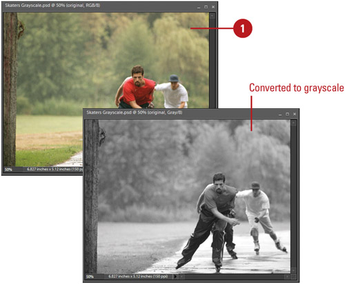
 Click the Image menu, point to Mode, and then click Grayscale.
The image is automatically converted into the grayscale color mode.
 If prompted, click Flatten or Merge to merge multiple layers into one.
 Click OK to discard color information.
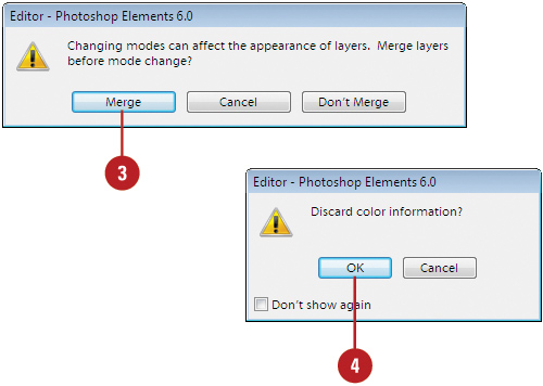
Did You Know?
You can colorize a grayscale image. In the Editor, convert the image into the RGB mode, create a new layer above the image layer, and then select a color, brush, and brush size on the Options bar. The trick is to change the blending mode of the brush on the Options bar to Color. Then, as you paint on the image, the selected color will replace the original grays. When you paint, the color is applied and controlled in the new layer, and you have the additional option of using layer opacity to control the intensity of the effect.
Bitmap images consist of two colors: black and white. Bitmap images are sometimes referred to as 1-bit images. Think of a bitmap as a light switch with two positions, on and off. Each pixel in a bitmap image is either on or off, black or white. Because they are only 1-bit, the file size of a bitmap image is typically very small. Bitmap images have limited use, but are employed for black and white ink drawings, line art, sketches, and for creating halftone screens.
- In the Editor, open an image.
- Click the Image menu, point to Mode, and then click Bitmap.
- If prompted, click OK to convert the image to grayscale before it can be converted to a bitmap.
- Enter a value for Output Resolution.
 Click the Use list arrow, and then select from the available options:
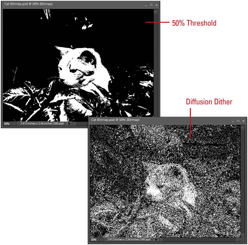
50% Threshold. Converts pixels with gray values above the middle gray level (128) to white and below to black. The result is a high-contrast, black-and-white image.
Pattern Dither. Converts an image by organizing the gray levels into geometric patterns of black and white dots.
Diffusion Dither. Converts pixels with gray values above the middle gray level (128) to white and below to black using an error-diffusion process. The result is a grainy, film like texture.
 Click OK.
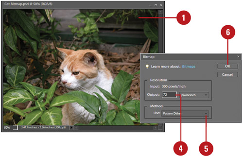
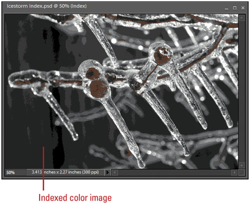
The indexed color mode gives you two advantages. You can create images as small as grayscale (8-bit pixels), and you get color instead of shades of gray. Its small file size, and its ability to generate color make it a winning color mode for images displayed on web pages, as well as graphics used in computer-generated presentations. Its one drawback is the number of colors generated, indexed images generate a maximum of 256 colors (the same as the steps of gray in a grayscale image). The good news is you get to choose the colors. When you convert an image into the indexed color mode, Photoshop Elements creates a color lookup table (CLUT) to store the images color information. When a color in the image cannot be found in the lookup table, Photoshop Elements substitutes the closest available color.
- In the Editor, open an image.

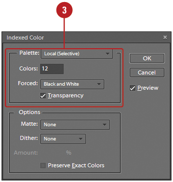
- Click the Image menu, point to Mode, and then click Indexed Color.
- Select from the following Indexed Color Mode options:
Palette. Click the list arrow to choose from the available color palettes, or click Custom and create your own palette.
Colors. Select the number of colors for the lookup table (9 to 256).
Forced. Force the lookup table to hold specific colors. Black And White adds a pure black and a pure white to the color table; Primaries adds red, green, blue, cyan, magenta, yellow, black, and white; Web adds the 216 web-safe colors; and Custom allows you to specify your own colors.
Transparency. Select the check box to preserve transparent areas of the image (if there are no transparent areas, this option is disabled).
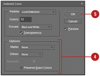
- Select from the following options:
Matte. Click the list arrow to fill transparent areas of the original image with a specific color.
Dither. Click the list arrow, and then select a pixel-mixing (dither) scheme. Dithering helps transitional areas of the image (shadows, light to dark) appear more natural.
Amount. If the Dither option is selected, the Amount instructs Photoshop Elements how much color information to use in the dithering process (0 to 100).
Preserve Exact Colors. Select the check box to hold exact color measurements in the lookup table.
- Click OK.
Did You Know?
You can adjust the color lookup table (CLUT) of an indexed image. In the Editor, click the Image menu, point to Mode, and then click Color Table. Click the Table button, click Custom, and then click on one of the colors in the table. Photoshop Elements opens a color picker dialog box, and lets you change the selected image color.
You can use a predefined indexed color table. In the Editor, click the Image menu, point to Mode, and then click Color Table. Click the Table list arrow, select a color table (Black Body, Grayscale, Spectrum, and System—Mac OS or Windows), and then click OK.
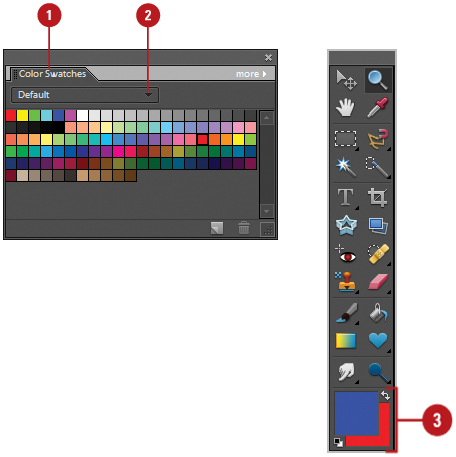
Photoshop Elements not only lets you select virtually any colors you desire, it also lets you store those colors for future use. For example, you create a color scheme for a recurring brochure and you want a way to save those colors, or you’re working on an Internet graphic and you need a web-safe color palette. Whatever your color needs, Photoshop Elements stands ready to meet them. The Color Swatches palette gives you access to 7 different color palettes and options that lets you create your own custom color palettes. The Color Swatches palette lets you select virtually any color you need.
- In the Editor, display the Color Swatches palette.

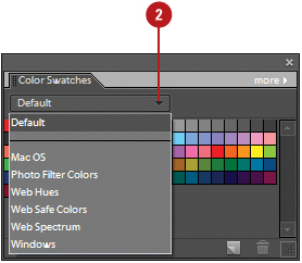
- Click the Swatches list arrow, and then select from the following color palettes:
Default. Displays a color palette of RGB and pure colors.
Mac OS. Displays a color palette designed for the Mac; uses hexadecimal values.
Photo Filter Colors. Displays a color palette of warming and cooling filtered colors.
Web Hues. Displays a color palette of hues for use on the web (Mac OS or Windows); uses hexadecimal values.
Web Safe Colors. Displays a color palette of 216 colors for use on the web (Mac OS or Windows); uses hexadecimal values.
Web Spectrum. Displays a color palette for use on the web (Mac OS or Windows); uses hexadecimal values.
Windows. Displays a color palette designed for Windows; uses hexadecimal values.
- Click the Swatches list arrow, and then select the color swatch you want.
- Select a color, and then change the any of the following:
Foreground. Change the color by clicking on any color in the Swatches palette.
Background. Change the color by holding down the Ctrl key, and then clicking on any color in the Swatches palette.
- In the Editor, display the Color Swatches palette.
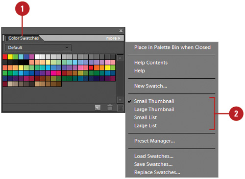
- Click the More Options button, and then select from the following color palettes:
Small Thumbnail. Displays small color squares (default).
Large Thumbnail. Displays large color squares.
Small List. Displays small color squares with a color name in a list.
Large List. Displays large color squares with a color name in a list.
Photoshop Elements not only lets you select virtually any colors you desire, it also lets you store those colors for future use. In addition to letting you select any color you need, the Color Swatches palette lets you add colors to a color swatch and save it as a custom color swatch that you can load and reuse later on this or any other computer.
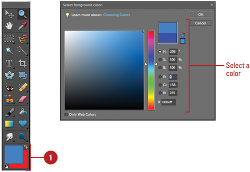
- In the Editor, set the foreground color in the toolbox to the color you want to add.
- Display the Color Swatches palette.
- Click the Swatches list arrow, and then select the swatch you want to use.
- Move the cursor below the last swatch color until it resembles a paint bucket; resize the palette, if necessary.
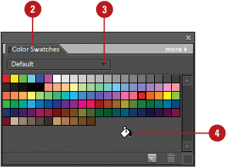
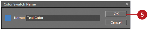
- Click once, name the color, and then click OK.
Did You Know?
You can delete a color from a Color Swatches palette. In the Editor, display the Color Swatches palette, click the Swatches list arrow, select the color swatch with the color you want to delete, hold down the Alt key, and then click the color you want to delete, or drag it to the Trash button.
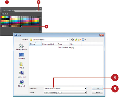
- Create a customized swatch palette by adding and/or deleting colors from an existing palette.
- Click the More Options button, and then click Save Swatches.
- Enter a name for the set (with the .ACO extension) in the File name box.
The default folder location appears, displaying Adobe/Photoshop Elements 6.0/Presets/Color Swatches.
When you store a color swatch palette in the default folder, it appears in the Swatches menu.
- Click Save.
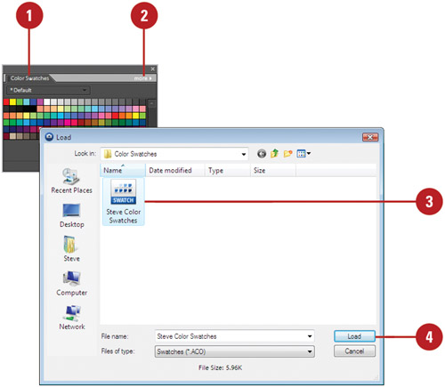
- In the Editor, display the Color Swatches palette.
- Click the More Options button, and then click Load Swatches.
The default folder location appears, displaying Adobe/Photoshop Elements 6.0/Presets/Color Swatches.
- Select the swatch palette file (.ACO) you want to load from the Color Swatches folder.
- Click Load.
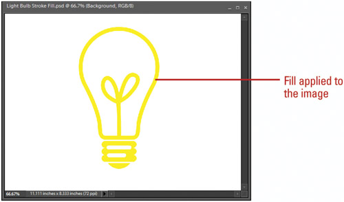
Photoshop Elements gives you many choices when it comes time to add or modify the colors of a document—paint brushes, airbrushes, and drawing tools, just to name a few. Two little used but powerful tools are the Stroke Selection and Fill Layer Commands, which work with selection tools. For example, you may want to create a unique stoke around an object, or fill a specific area of a document with a color or pattern. If that’s the case, then the Stroke Selection and Fill Layer commands are the best and quickest ways to perform those operations.
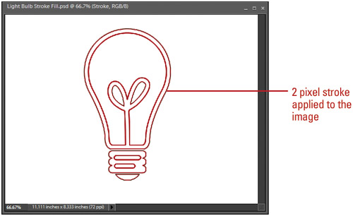
- In the Editor, create a selection using any of the selection tools, or really get fancy and make a selection from one of the Shape drawing tools.
- Click the Edit menu, and then click Stroke (Outline) Selection.
- Enter a Width value (1 to 250) for the stroke.
- Click the Color box, and then select a color (the color box defaults to the foreground color).
- Select a location option (Inside, Center, or Outside) for the stroke of the selection marquee.
- Click the Mode list arrow, and then select a blending mode.
 Enter an Opacity percentage value (0 to 100) for the stroke.
 Select the Preserve Transparency check box to protect any transparent image areas (if there are no transparent areas, this option is disabled).
 Click OK.
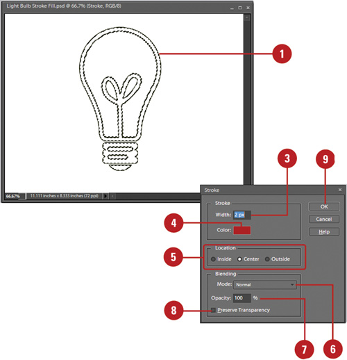
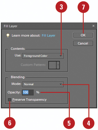
- In the Editor, create a selection using any of the selection tools.
- Click the Edit menu, and then click Fill Layer.
- Click the Use list arrow, and then select a fill option:
Foreground Color
Background Color
Color
Pattern
History
Black
50% Gray
White
- Click the Mode list arrow, and then select a blending mode.
- Enter an Opacity value (0 to 100) for the stroke.
- Select the Preserve Transparency check box to protect any transparent image areas (if there are no transparent areas, this option is disabled).
- Click OK.
Did You Know?
You can use the Fill Layer command for more than filling an area with a solid color or unique pattern. For example, selecting a sepia color, and changing the Fill Blending mode to Color, tints the selected area with sepia, creating an old-style, sepiatoned image. Experiment with the Fill blending modes to create unique image effects.
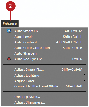
The automatic lighting and color commands make it easy to correct lighting and color problems in your photos. The Auto commands receive their adjustment queues from information within the active image, including any erroneous color information. For example, if the image contains a large border (typically white), the Auto commands will factor that information into the correction of the image. It’s best to correct any dust, and scratch problems, and crop out any borders before applying the Auto Contrast and Color commands.
- In the Editor, open an image.
To adjust a specific area, select it with one of the selection tools.
- Click the Enhance menu, and then select one of the following Auto commands:
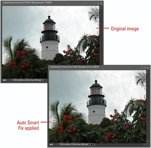
Auto Smart Fix. Corrects overall color balance of an image.
Auto Levels. Adjusts the overall contrast of an image and may affect its color. This maps the lightest and darkest pixels in each color channel to black and white.
Auto Contrast. Adjusts the the overall contrast of an image without affecting color. This maps the lightest and darkest pixels to black and white.
Auto Color Correction. Adjusts the contrast and color of an image. This neutralizes the midtones and sets the white and black points using set values.
Auto Sharpen. Adjusts the sharpness of an image.
Auto Red Eye Fix. Detects and removes red eyes in an image.
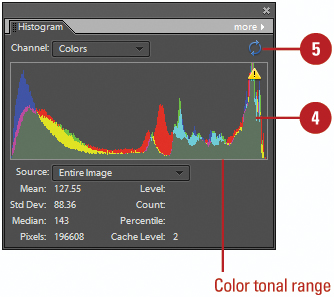
The Histogram palette gives you many options for viewing tonal and color information about the active image. The Histograms default display is the tonal range of the entire image. However, you can use any of the selection tools, select a portion of the active document, and display a histogram for that portion of the image. The tonal range and color values for an image are vitally important to generating great graphics, and the Histogram palette is a great resource for instant up-to-date information. You can view information about a specific pixel or range using the Histogram palette. To view information about a range of values, drag in the histogram to highlight the range.
- In the Editor, display the Histogram palette.
Click the Window menu, and then click Histogram.
- Click the Channel list arrow, and then select the color channels you want to view:
RGB. Displays the tonal range for all Red, Green, and Blue colors.
Red, Green, or Blue. Displays the tonal range for either Red, Green, or Blue.
Luminosity. Displays the tonal range for luminosity (lightness).
Colors. Displays the tonal range for all colors (in color).
- Click the Source list arrow, and then select an image source: Entire Image, Selected Layer, or Adjustment Composite.
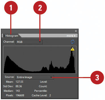
- To view information about a range of values, drag in the histogram to highlight the range.
- To refresh the image cache (rescans the image), click the Uncached Refresh button.
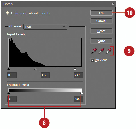
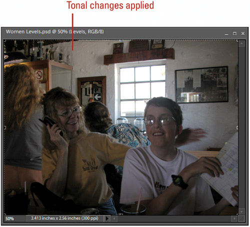
Through interactive feedback using a Histogram, the Levels adjustment gives you live information about the tonal values in the active image. It’s an excellent tool to perform overall tonal adjustments, and some color correction. Auto Levels is considered a quick fix color adjustment which, in some cases, works just as well as manually correcting color. However, with all the problems that exist in the average photo, it’s always best to manually adjust an image. The Levels adjustment lets you adjust the tonal range of an image by giving you three sliders—shadows, midtones, and highlights. Dragging the sliders precisely adjusts the tonal ranges of an image. In addition, the Output sliders lets you adjust the ink percentages used for the output to print. By adjusting the output ink levels, you avoid the overly black images that sometimes accompany printing images using high dot-gain papers.
- In the Editor, open a document in which you want to change the tonal range.
- Click the Enhance menu, point to Adjust Lighting, and then click Levels.
- Select the Preview check box to view the adjustments directly in the active document window.
- Click the Channel list arrow to select whether to work on the entire image, or just one of the images default color channels (useful for color correction).
- Drag the Shadow input slider to the right to adjust the balance of black in the image.
- Drag the Midtone input slider left or right to lighten or darken the midtones of the image.
- Drag the Highlight input slider to the left to adjust the balance of white in the image.

- Drag the Black and White Output Levels sliders left and right to adjust the percentage of ink used in printing the image.
- Use the eyedropper tools to select black, white, and midtone points directly within the active image.
 Click OK.
Photoshop Elements uses the Levels adjustment layer to apply the tonal changes to the image.
Did You Know?
You can apply the same Levels adjustments to an adjustment layer. In the Editor, display the Layers palette, select the layer you want to change, click the Create Fill Or Adjustment Layer button, and then click Levels. Make your adjustments using the Levels options, and then click OK.
You can view the Levels Histogram anytime. In the Editor, click the Window menu, and then click Histogram. Photoshop Elements opens a Histogram palette that lets you view tonal changes to the image as you make them.
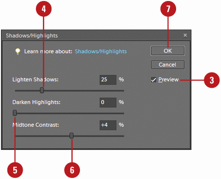
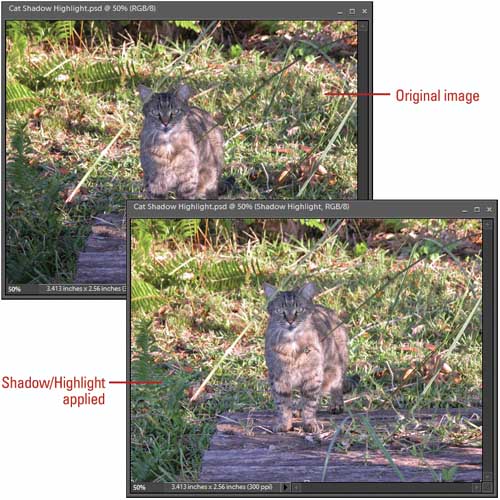
The Shadows/Highlights adjustment lets you quickly correct the problems associated with the over and under-exposed areas of an image such as deep shadows or bright highlights. In addition, the Shadows/Highlights adjustment makes quick work out of images that have really dark shadows or overexposed areas by adjusting the problem areas without changing the middle range of the image.
- In the Editor, open an image.
- Click the Enhance menu, point to Adjust Lighting, and then click Shadows/Highlights.
- Select the Preview check box to view changes to the active image.
- Drag the Lighten Shadows slider right or left to adjust the lighten shadow areas of the active image.
- Drag the Darken Highlights slider left or right to adjust the darken highlight areas of the active image.
- Drag the Midtone Contrast slider left or right to decrease or increase the color saturation values of the adjusted areas of the image.
- Click OK.
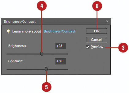
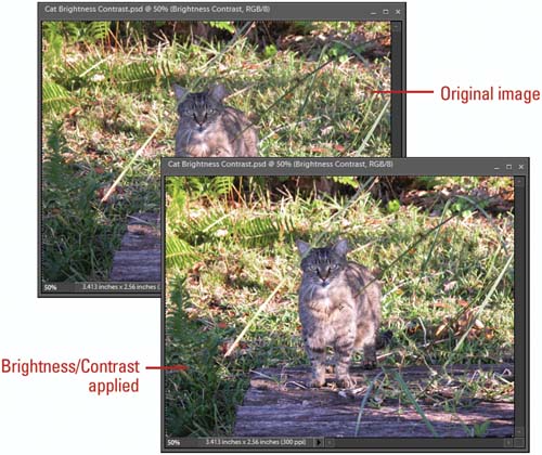
The Brightness/Contrast adjustment changes an image by an overall lightning or darkening of the image pixels. While good for special effects, its linear way of changing an image’s brightness and contrast do not lend themselves to photo restoration. Curves and Levels are much better for this type of work. The Brightness/Contrast adjustment performs linear adjustment to an image (New!). For example, moving the brightness slider to the right will increase the brightness values of all the pixels in the image equally. Since photographs are not linear in nature, the Brightness/Contrast adjustment is not recommended for use on images. For images, use the Levels, and Curves (non-linear) adjustments, and use Brightness/Contrast for clipart, text, and non-photographic images.
- In the Editor, open an image.
- Click the Enhance menu, point to Adjust Lighting, and then click Brightness/Contrast.
- Select the Preview check box to view changes to the active image.
- Drag the Brightness slider left to decrease the brightness values or right to increase the values of the colors in the active image.
- Drag the Contrast slider to the left to decrease the color steps or left to increase the steps in the image.
- Click OK.
Did You Know?
You can use selection to control the Brightness/Contrast adjustment. In the Editor, use any of the selection tools to isolate a portion of the image before using the Brightness/Contrast adjustment, and then only the selected areas will be adjusted.
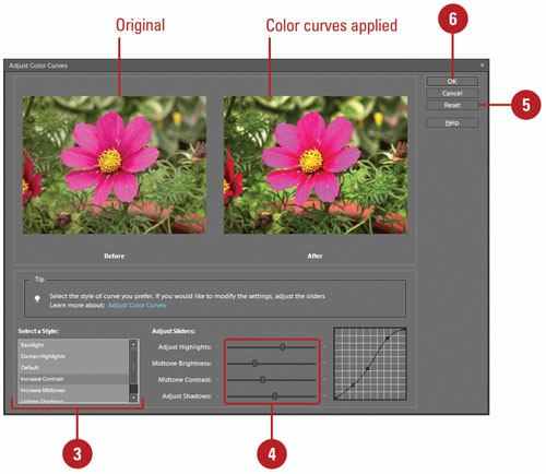
The Color Curves adjustment (New!) lets you adjust tonal ranges in the image without changing image exposure. Curves is an excellent adjustment for lightening the dark shadows of an image to bring out detail, or for creating special effects like solarization. During the adjustment process you can control how individual settings (Highlights, Brightness, Contrast, and Shadows) are converted. If you’re not sure how or where to start, you can select a preset style designed for a specific use. The styles include Backlight, Darken Highlights, Default, Increase Contrast, Increase Midtones, Lighten Shadows, and Solarize. A before and after preview appears in the Adjust Color Curve dialog box, where you can compare the results to the original image.
- In the Editor, open an image.
- Click the Enhance menu, point to Adjust Color, and then click Adjust Color Curves.
- Select a style for the color curve you want.
Each style provides a preset amount of highlights, brightness, contrast, and shadows.
- Drag the Adjust Highlights, Adjust Brightness, Adjust Contrast, and Adjust Shadows sliders to the level you want for your image.
- To reset the options back to the original settings, click Reset.
- Click OK.
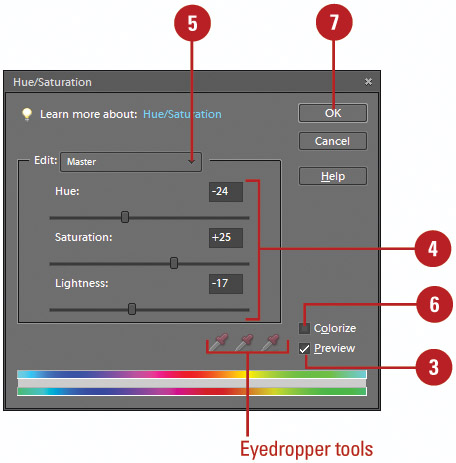
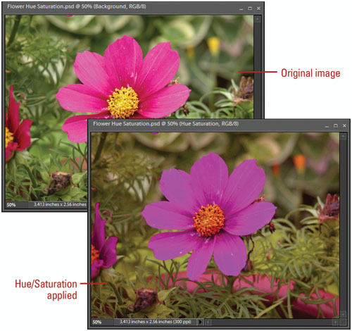
The Hue/Saturation adjustment gives you separate control over an image’s Hue, Saturation, and Lightness, and its Colorize option lets you apply a color cast to an image that’s similar to a duotone effect. The Remove Color command removes all the color from an image, which preserves the Hue and Lightness values of the pixels, and changes the Saturation value to zero (desaturate). The result is a grayscale image.
- In the Editor, open an image.
- Click the Enhance menu, point to Adjust Color, and then click Adjust Hue/Saturation.
- Select the Preview check box to see how your image looks.
- Drag the Hue, Saturation, and Lightness sliders to the level you want for your image.
- Click the Edit list arrow, select a color, and then click inside the active image with the eyedropper tools to adjust the Hue/Saturation.
- Select the Colorize check box to color tint the image with the current foreground color.
- Click OK.
Did You Know?
You can saturate or desaturate selected areas of an image using the Sponge tool. In the Editor, click the Sponge tool, select Saturate or Desaturate on the Options bar, and then drag to slowly remove color from the image.
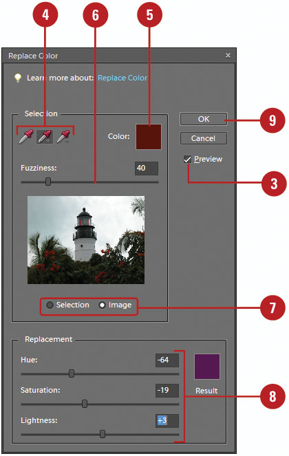
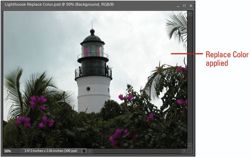
The Replace Color command lets you create a selection, based on image color, and replace that color selection with any other color. The Replace Color adjustment accomplishes this by giving you access to the three items that control color: Hue, Saturation, and Lightness. Hue gives you the ability to change the images physical color, Saturation controls the amount of color, and Lightness determines how bright the color is, based on its Hue and Saturation.
- In the Editor, open a color document.
- Click the Enhance menu, point to Adjust Color, and then click Replace Color.
- Select the Preview check box to view the changes in the active document.
- Click on the active document using the Selection eyedroppers to select, add, or subtract colors.
- Click the Color box to select a specific color for the selection.
- Drag the Fuzziness slider to increase or decrease the sensitivity of the eyedropper tools.
- Click the Selection or Image option to toggle between a view of the selection mask and the active image (white areas of the mask represent selection).
- Drag the Hue, Saturation, and Lightness sliders to change the selected areas.
- Click OK.
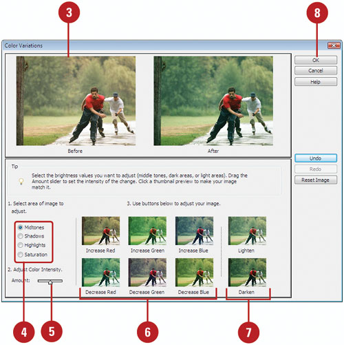
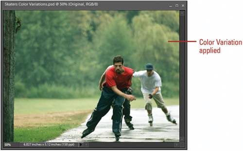
The Color Variations adjustment gives you a look at how working with analogous and complimentary colors impacts the color in a document. For example, if an image has an overall green cast, it needs additional magenta. Understanding how colors interact and work to produce different colors helps you decide the correct course of action to take, and the Variations adjustment is an excellent teacher.
- In the Editor, open a document.
- Click the Enhance menu, point to Adjust Color, and then click Color Variations.
The Original and Current Pick are displayed in the upper-left portions of the Variations dialog box.
- To restore the image, click Before any time during the adjustment process.
- Click the Shadows, Midtones, Highlights, or Saturation options to apply a color shift.
- Drag the Amount slider to determine how much change occurs with each adjustment.
- Click the color thumbnails surrounding the image to add specific colors to the After image.
- Click Lighten or Darken to change the brightness of the After image.
- Click OK.
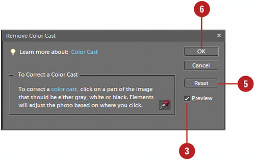
A color cast is an incorrect color shift in a photo. Typically, you notice a color cast in the form of too much yellow in a photo. The Remove Color Cast command changes the overall mixture of colors to remove color casts from a photo. All you need to do to use the Remove Color Cast command is click the area with the color cast that should be white, black, or neutral gray. Photoshop Elements changes the image based on where you click to remove the color cast.
- In the Editor, open a color document.
- Click the Enhance menu, point to Adjust Color, and then click Remove Color Cast.
- Select the Preview check box to view the changes in the active document.
- Click the area with the color cast that should be white, black, or neutral gray.
The image changes based on where you click to remove the color cast.

- To reset the options back to the original settings, click Reset.
- Click OK.
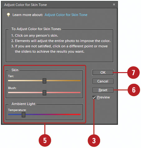
The Adjust Color for Skin Tone command lets you subtly adjust the overall color in a photo to adjust the color for skin tone. You can automatically adjust skin tones and other colors in the photo or manually adjust the brown (Tan) and red (Blush) colors using sliders to achieve the results you want. You can adjust the overall color of skin tones using the Temperature slider.
- In the Editor, open a color document.
- Click the Enhance menu, point to Adjust Color, and then click Adjust Color for Skin Tone.
- Select the Preview check box to view the changes in the active document.
- Click the area of skin you want to correct.

- Drag any of the following sliders to fine-tune the skin tone:
Tan. Increase or decreases the level of brown in skin tones.
Blush. Increases or decreases the level of red in skin tones.
Temperature. Changes the overall color of skin tones
- To reset the options back to the original settings, click Reset.
- Click OK.
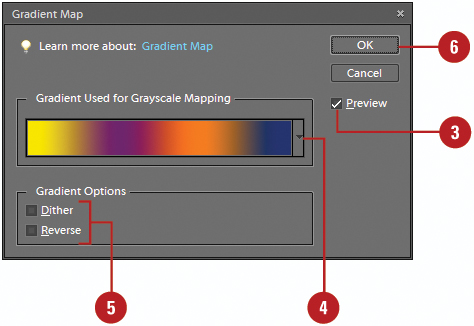
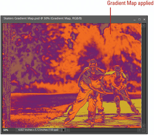
The Gradient Map adjustment replaces the tonal values of the image with the colors supplied by a gradient. It’s a great tool for generating special color effects. In addition, the Gradient Map adjusts the active image’s colors to the colors of the selected gradient; taking the shadows of the image and mapping them to one endpoint of the gradient, and the highlights to the other point.
- In the Editor, open an image.
- Click the Filter menu, point to Adjustments, and then click Gradient Map.
- Select the Preview check box to view changes to the active image.
- Click the Gradient Used For Grayscale Mapping list arrow to adjust the gradient.
- Select or clear the Dither or Reverse check boxes for the Gradient Options.
- Click OK.
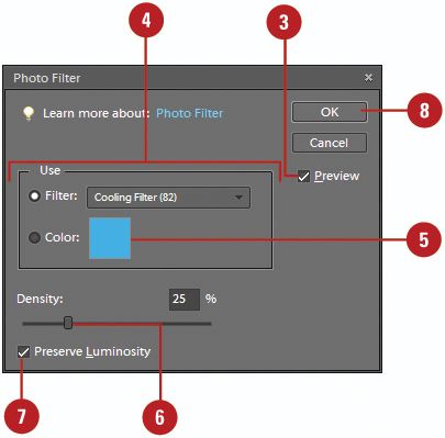
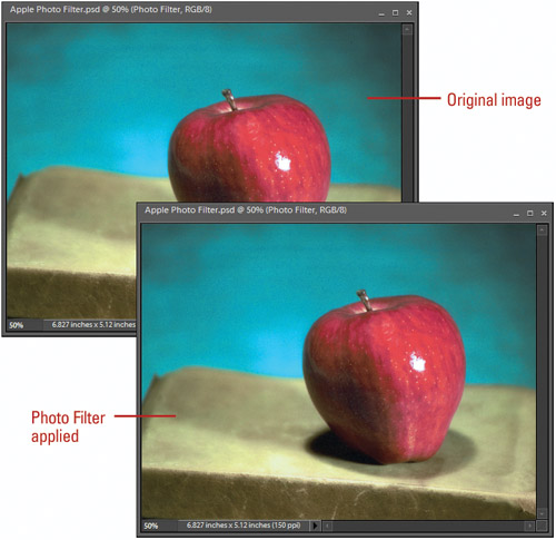
The Photo Filter adjustment lets you apply a specific filter or color to an image. Applying the Photo Filter adjustment to an image is similar to placing a colored filter in front of a camera lens. Photographers use filters to help correct color problems associated with unique lighting conditions—early morning sunlight or indoor florescent lighting—you can use Photo Filter adjustments to get the same results.
- In the Editor, open an image.
- Click the Filter menu, point to Adjustments, and then click Photo Filter.
- Select the Preview check box to view changes to the active image.
- Click the Filter option, click the Filter list arrow, and then select from the available color filter options.
- Click the Color option to select a user-defined color filter.
- Drag the Density slider left or right to adjust the intensity of the filter effect on the active image.
The higher the value, the greater the effect.
- Select the Preserve Luminosity check box to preserve the color of the image highlights.
- Click OK.
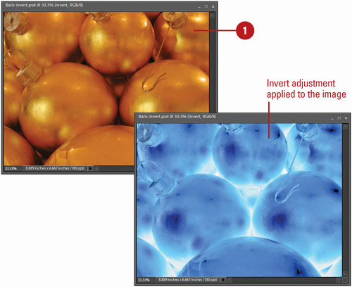
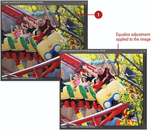
The Invert command reverses the colors and tonal values to their opposite values; in effect creating a negative. The Equalize command exaggerates the contrast between similar color values. It’s useful in finding stray pixels in a seemingly solid color area, or for a special color effect.
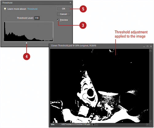
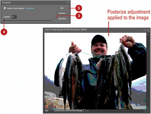
The Threshold adjustment splits an image into black and white, based on the original brightness levels of the pixels. It’s useful for locating the darkest and lightest pixels in an image, or for creating some great looking black and white special effects. The Posterize adjustment creates a simpler image by reducing the number of colors. It’s useful for creating an image with a clipart look, or for reducing the number of colors in preparation for the web.
- In the Editor, open an image.
- Click the Filter menu, point to Adjustments, and then click Threshold.
- Select the Preview check box to view changes to the active image.
- Drag the Threshold slider to the right or left to change the point in which black and white are defined.
For example, setting the threshold slider to a value of 75 creates an image where all pixels with a brightness value of 75 or less are black, and all pixels with a value of 76 or higher are white.
- Click OK.
- In the Editor, open an image.
- Click the Filter menu, point to Adjustments, and then click Posterize.
- Select the Preview check box to view changes to the active image.
- Drag the slider to select a Levels value (2 to 255) to define the number of colors used.
Lower values produce less colors, and more visual contrast.
- Click OK.
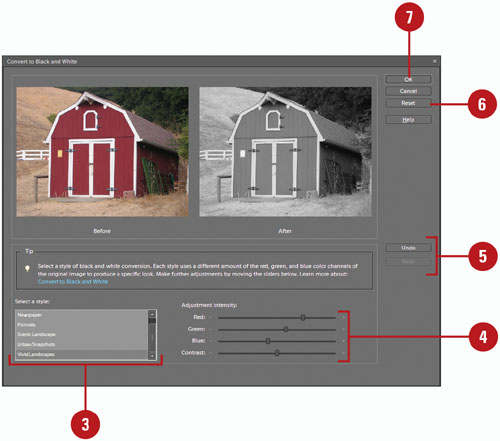
The Convert to Black and White adjustment allows you to convert a color image to grayscale. During the adjustment process you can control how individual colors (Reds, Greens, and Blues) are converted. You can also adjust the color contrast. If you’re not sure how or where to start, you can select a preset style designed for a specific use. The styles include Newspaper, Portraits, Scenic Landscape, and Urban/Snapshots (New!). A before and after preview appears in the Convert to Black and White dialog box, where you can compare the results to the original image.
- In the Editor, open an image.
- Click the Enhance menu, and then click Convert to Black and White.
- Select a style for the black and white conversion.
Each style provides a preset amount of the red, green, and blue color channels.
- Drag the Red, Green, Blue, and Contrast sliders to the level you want for your image.
- To undo/redo the previous adjustment, click Undo or Redo.
- To reset the options back to the original settings, click Reset.
- Click OK.