IF YOU EVER DOUBT THE MAGIC of mid-range, look no further than Tenmoku Gold. A versatile glaze, it looks amazing all by itself: you can get lost staring at its golden crystals floating in an amber sea. Tenmoku Gold also plays well with others. Used over another glaze, it often adds depth with those wonderful crystals. However, as a base glaze in the tests run for this book, I found it combined with several other glazes in surprising ways—creating iridescent purples and blues the likes of which I have never seen come out of an electric kiln. It is simply amazing!
Although this glaze was one that called to me when reading TheComplete Guide to Mid-Range Glazes, I have scoured dusty tomes, the far corners of the internet’s ceramic groups, and opened my personal notebooks to bring you a variety of glazes at cone 6 that truly shine—on their own and with each other.
Laurie Caffery Harris
WHY MID-RANGE?
First let’s set some parameters: cone 6 is a loose term that refers to the final firing temperature of mid-range stoneware, which could vary from cone 3 (2106°F/1152°C) to cone 7 (2262°F/1239°C). Although mid-range might be more accurate, cone 6 has become a catchall term, similar to cone 10 for high-fire or cone 05 for low-fire. In reality, you will find that most of these glazes have a firing range of 1 to 2 cones or more. In fact, depending on the effect you want, altering the final firing temperature and/or rate of climb can result in several different looks from the same glaze.
I find the mid-range spectrum to be tremendously fascinating—and perhaps the fastest expanding field of glaze study. Cone 6 oxidation firings can produce bright, bold colors; crystals; and some truly dynamic combinations (here). Cone 6 reduction firings remain less explored, but as such have vast potential for never-seen-before combinations. As opposed to cone 10, cone 6 conserves energy while still producing a vitrified clay body with a wide range of functional uses. (For more on oxidation and reduction see here.)
Cone 6 works by (clockwise from top left) Nich Daunis, Laurie Caffery Harris, Kathleen Lizzul, Anja Bartels, and Allison Cochran
For these mid-range glazes, my goal is to provide a variety of base glazes from matte to high gloss and from transparent to opaque, which you can alter to suit your needs using the testing procedures laid out shown here. At the same time, I will provide a rainbow of color choices plus clear, white, black, brown, and grey. This is by no means an exhaustive search, but rather a range of possibilities available in a model of what you might find in a well-equipped community studio. I also provide several indispensable “modifier” glazes that you can use to create variation, movement, and effects on top of a base glaze.
I systematically tested each of the glazes in combination (here to here), and showcase the three, four, and five glaze combinations that emerged out of this initial set of tests (here to here).
NOTEA variety of factors, including your clay body, the chemicals in the water you use to slake your glazes, the consistency from batch to batch of dry materials, and any differences in firing schedule may all cause some deviation from the pictured images, but they should act as practical starting points for your own investigation.
DEVELOPING AN AESTHETIC
Most people have a firm opinion when it comes to their favorite colors, textures, and patterns. This personal aesthetic is an ever-evolving reflection of our worldview and affects what we think of as “beautiful” or “ugly.” The differences in these values for every individual are part of the beauty of ceramics; each of us can contribute uniquely to the conversation. Certain glazes will give you the power to express what you find beautiful. Hopefully you will find many of them in this book!
Some glazes soothe and create a sense of calm . . .
. . . while others excite and create a sense of action.
There are also glazes and combinations that you will dislike, though even these can be useful in making certain types of artistic statements. In certain types of art, sometimes “ugly” is the goal! It is okay to not like certain glazes or to not pursue them any further. Do remember that glazing, and the appreciation of glaze, is a highly personal matter. Just because a particular result makes you want to cry doesn’t mean someone else won’t treasure it.
CREATING ACTION
I have noticed that pots fresh out of the bisque kiln can speak. I ask each pot how it wants to be glazed and if I listen carefully, it whispers to me. Some forms call out for a single coat of well applied glaze to accentuate their design. Pieces that have intricate carving, elaborate surface decoration, or are simply stunning forms unto themselves may ask for this—needing only a single coat of simple glaze to look their best. Other forms ask to be a canvas for the playful interactions of glaze you have discovered.
Without the added visual effects provided by atmospheric glazing or reduction, the ceramic artist working in oxidation at cone 6 relies on layering glazes and combinations to create a stunning surface. Here are some glazing tips and techniques that will help you create action on the surface of your work.
THE KEYS TO SUCCESSFUL LAYERING
Layering glazes is a passion! If you engage in careful glaze preparation, skillful application, and detailed note-taking, you can create a nearly infinite variety of combinations. If you stocked only five glazes, you could layer them in 3,125 different ways! It should be noted, however, that color combinations do not work according to the traditional color wheel, (e.g., red plus blue does not necessarily make purple). Additionally, the combinations of ingredients in the different glazes may intermingle in interesting ways. For example, a combination of two matte glazes, such as Strontium Crystal Magic and Gen’s Satin Matte, can run down the side of a pot. For this reason, always use a cookie and/or wadding (see here) underneath any new (or known runny) combinations to minimize the need for grinding and potential damage to kiln shelves.
When layering glazes, first apply a base coat through dipping, pouring, brushing, or spraying. Allow it to dry to the touch before adding a second layer. The second and subsequent layers of glaze should be slightly thinner, achieved either by using a shorter count or decreasing the specific gravity. I have found that it’s best to wait two to three hours before applying a third or fourth coat—sometimes even overnight. To play it safe on new combinations, aim for the second glaze to go no lower than one-third of the way down the pot and for the third coat to go no more than one-quarter of the way down the pot. Once the degree of melt can be observed, you can adjust for the next firing. Some four and five glaze combinations, such as those shown here through here were developed in this manner.
Dipping the whole piece in the first glaze
NOTEThe use of glaze trailer can add a bit of color to set a combination off (see images on this page and here). To make a glaze trailer, simply mix one part underglaze to one part clear glaze by volume.
Inverting the pot and dipping the second glaze one-third from top
Applying glaze trailer for an additional pop of color
Applying a fourth coat of glaze at the lip
When layering glazes, you may find that some glazes layer poorly, flaking off the glaze below it. A possible cause is a difference in clay content in the glazes. When a glaze with a high clay content is applied over a glaze with a lower one, the glaze with more clay can have a tendency to flake off when it shrinks. Reversing the order of application can solve the problem, but it will give a different look to the layering. Alternatively, try adding 1 percent CMC gum or 2 percent bentonite clay to the low-clay content glaze. A glaze that has sat unused for some time and had a chance to flocculate may also have a tendency to flake. If so, add one drop of the deflocculant Darvan 811 per cup and mix until the glaze noticeably thins.
MID-RANGE GLAZE RECIPES
SUNSHINE
Cone: 6
Atmosphere: Oxidation
Surface: Semigloss
Color: Yellow
INGREDIENTS
AMOUNTS
Potash Feldspar
45.37%
Silica
24.74%
Whiting
14.43%
EPK
6.19%
Zinc Oxide
5.15%
Lithium Carbonate
4.12%
Total
100.00%
Also Add
Mason Stain 6479
12.37%
Bentonite
2.06%
NOTES Sunshine is a remarkably “happy” glaze, suggesting springtime, flowers, and a bright sun on a cloudless day. Sunshine works well as a relatively glossy base glaze, is very stable, and does not move. Sunshine can look good on top of other glazes, but sometimes the yellow gets eaten up by stronger colors.
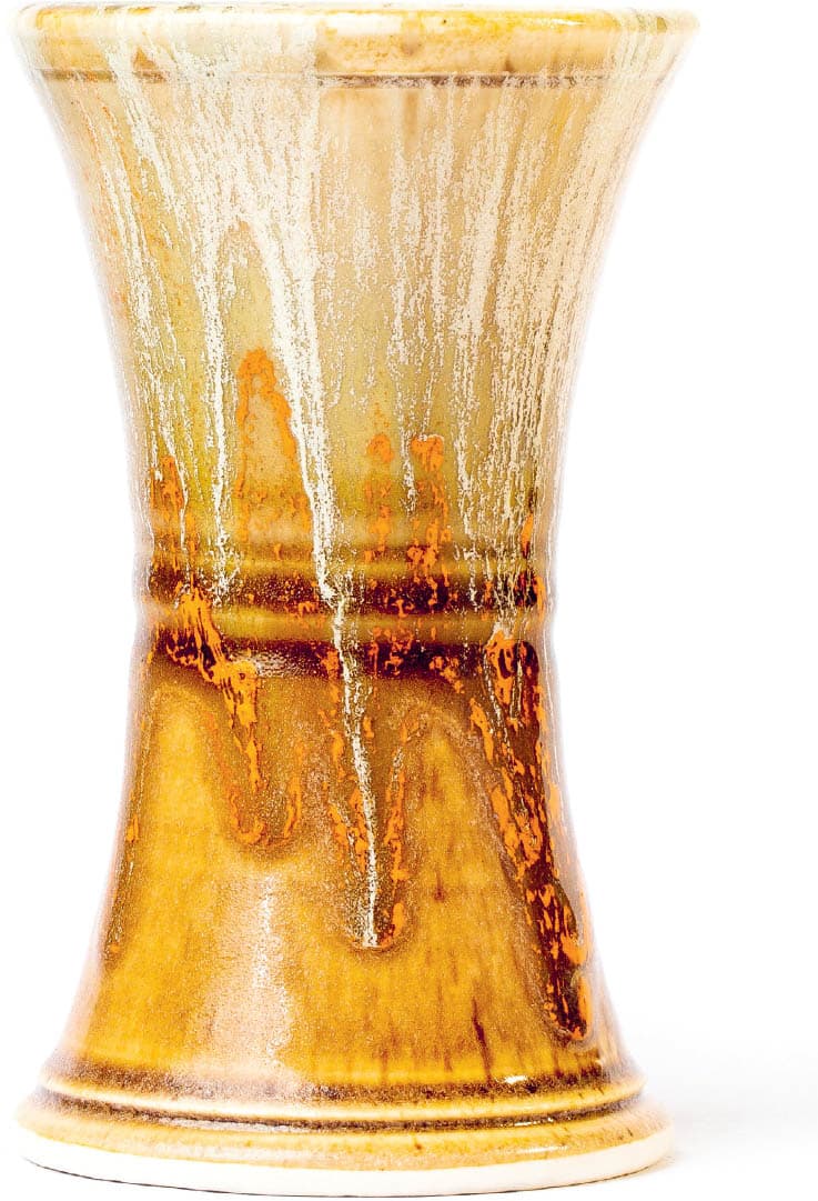
OATMEAL
Cone: 6
Atmosphere: Oxidation
Surface: Semimatte
Color: Mottled Orange
INGREDIENTS
AMOUNTS
EPK
30.00%
Wollastonite
29.00%
Ferro Frit 3195
20.00%
Silica
17.00%
Nepheline Syenite
4.00%
Total
100.00%
Also Add
Dark Rutile
6.00%
Manganese Dioxide
4.00%
NOTES Oatmeal is a versatile glaze that has a “reduction” look. Oatmeal suggests fall colors, forms a wonderful two-glaze combination with Campana Grey, and looks great with the Orange Trailer.
TICKLED PINK
Cone: 6
Atmosphere: Oxidation
Surface: Gloss
Color: Light Pink
INGREDIENTS
AMOUNTS
Wollastonite
25.00%
Silica
20.00%
EPK
20.00%
Frit 3134
20.00%
Custer Feldspar
15.00%
Total
100.00%
Also Add
Tin Oxide
5.00%
Chrome Oxide
0.02%
NOTES Tickled Pink is a revelation of a glaze. Many members love it at my studio. Yes, the formula is correct: 0.02% Chrome Oxide. Not 0.2% or 2.0%. A 10,000 gram batch will have 2 grams of chrome in it. This tiny pinch, combined with the tin, makes an amazing, delicate, and beautiful pink glaze. The base is very stable, and Tickled Pink combines well with other glazes.
PIKE’S PURPLE
Cone: 6
Atmosphere: Oxidation
Surface: Semigloss
Color: Purple
INGREDIENTS
AMOUNTS
Minspar
37.40%
Silica
22.70%
Talc
13.60%
Gerstley Borate
12.70%
Dolomite
6.40%
EPK
4.50%
Zinc Oxide
2.70%
Total
100.00%
Also Add
Cobalt Oxide
2.00%
Bentonite
2.00%
NOTES This glaze has a very different feel from other glazes. You will notice when you mix it up that it takes up more room in the bucket than most glazes, and also takes longer for the glaze to dry on your pots. This is perhaps due to the higher concentration of Gerstley Borate, which can give glazes a more gelatinous feel. That being said, Pike’s Purple combines in interesting ways with some of the other glazes listed here, especially Tenmoku Gold where it encourages additional crystal growth (here).
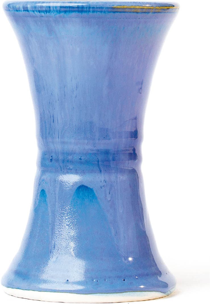
ISA’S BOMB BLUE
Cone: 6
Atmosphere: Oxidation
Surface: Gloss
Color: Variegated Blue
INGREDIENTS
AMOUNTS
Custer Feldspar
54.00%
Gerstley Borate
18.00%
Whiting
8.00%
Silica
9.00%
EPK
5.00%
Zinc Oxide
4.00%
Strontium Carbonate
2.00%
Total
100.00%
Also Add
Light Rutile
3.00%
Bentonite
2.50%
Cobalt Oxide
2.00%
Zircopax
2.00%
Titanium Dioxide
2.00%
NOTES A smooth blue that breaks over texture, Isa’s Bomb Blue really shines as a modifier glaze on top of Tenmoku Gold and in combinations with other blue glazes such as Chun Celadon.
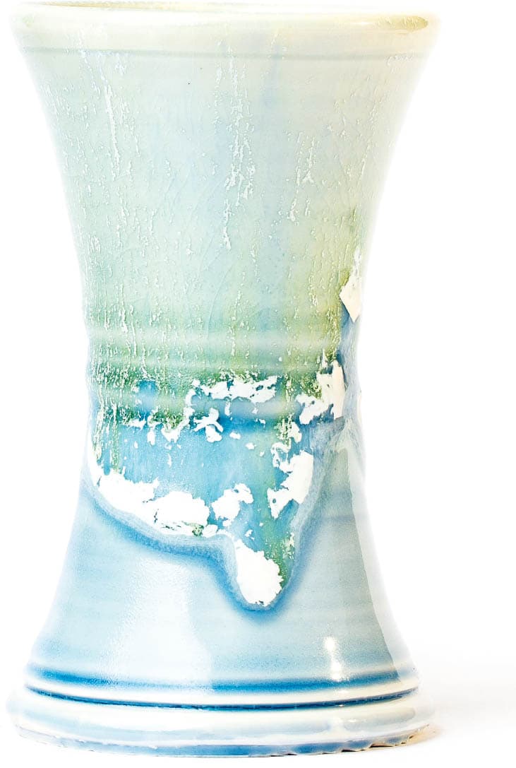
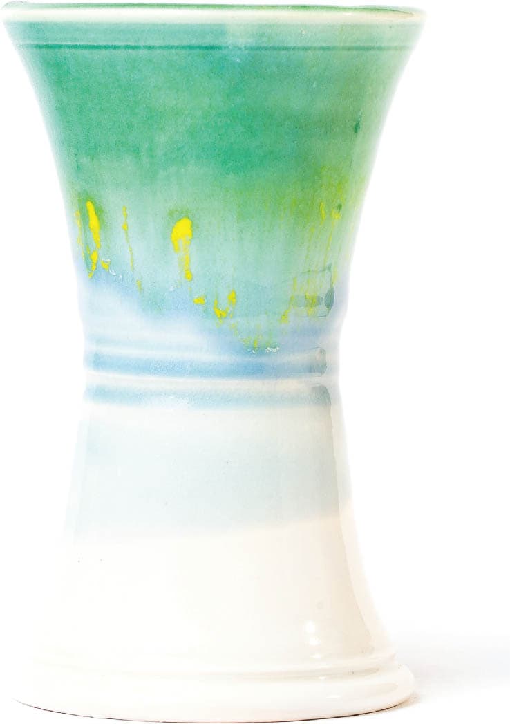
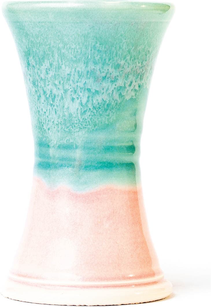
SPEARMINT
Cone: 6
Atmosphere: Oxidation
Surface: Matte/Semimatte
Color: Green with Crystals
INGREDIENTS
AMOUNTS
Wollastonite
28.00%
EPK
28.00%
Ferro Frit 3134
23.00%
Silica
17.00%
Nepheline Syenite
4.00%
Total
100.00%
Also Add
Light Rutile
6.00%
Copper Carbonate
4.00%
Bentonite
2.00%
NOTES One of my favorite glazes of all time, Spearmint is an amazing base glaze that loves Chun Celadon and 5x20 Clear over top of it to start. A less opaque version can be made by cutting the rutile in half. Slow cooling of Spearmint can encourage crystal growth while a fast firing results in a more uniform, glossier surface.
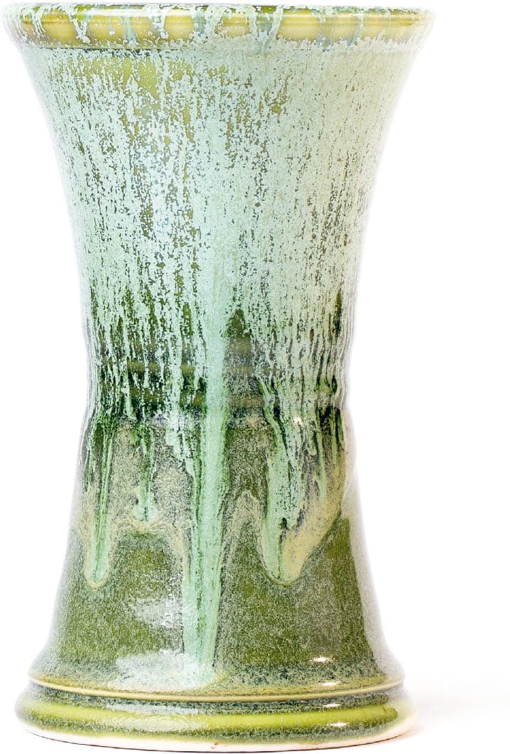
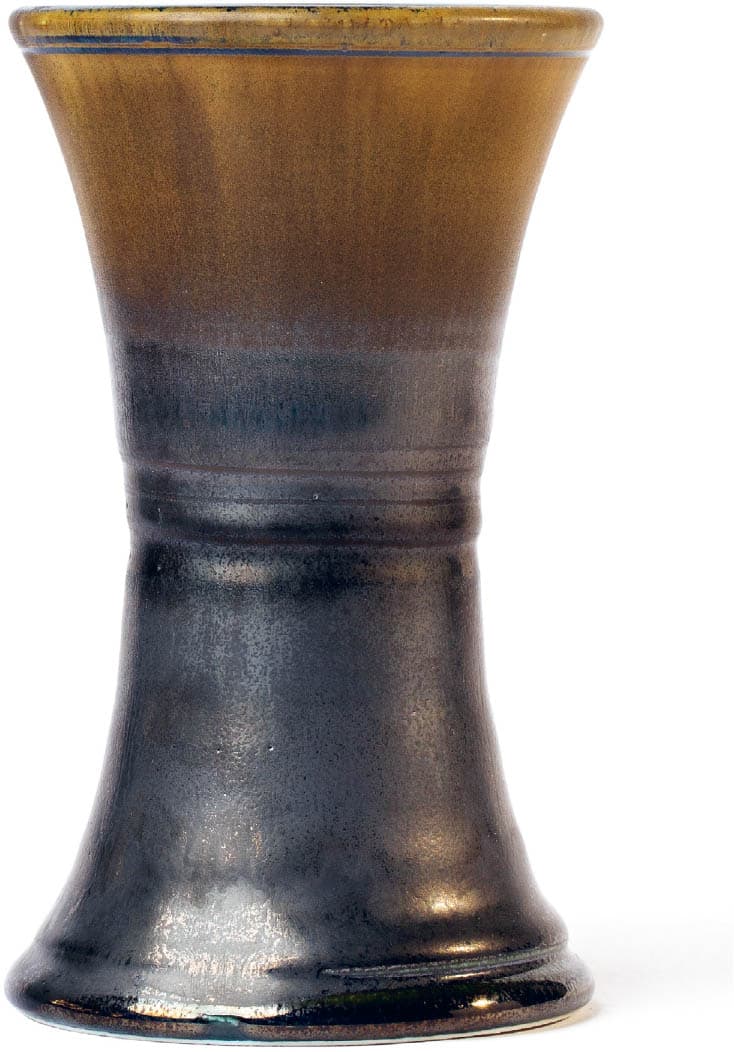
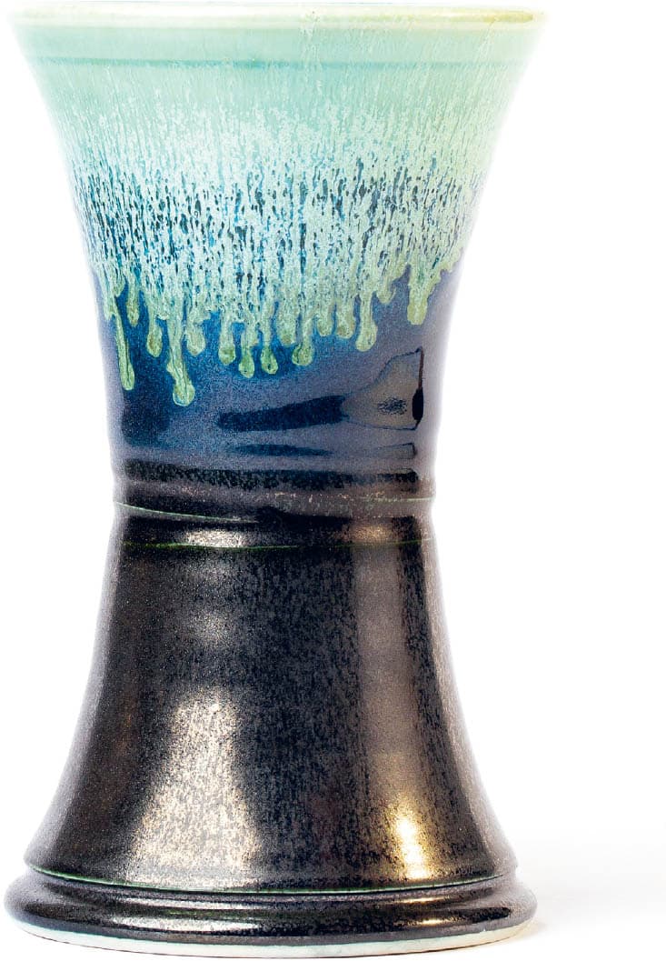
TENMOKU GOLD
Cone: 6
Atmosphere: Oxidation
Surface: Gloss
Color: Variegated Brown
INGREDIENTS
AMOUNTS
Cornwall Stone
67.40%
Whiting
9.00%
Dolomite
7.80%
Silica
6.20%
Lithium Carbonate
6.20%
Gerstley Borate
3.40%
Total
100.00%
Also Add
Red Iron Oxide
11.20%
Bentonite
2.00%
NOTES A beautiful glaze all by itself, Tenmoku Gold also combines in interesting ways with Pike’s Purple, Silky Black, Strontium Crystal Magic, and Gen’s Satin Matte.
5X20 CLEAR
Cone: 6
Atmosphere: Oxidation
Surface: Gloss
Color: Transparent
INGREDIENTS
AMOUNTS
Custer Feldspar
20.00%
Frit 3134
20.00%
EPK
20.00%
Wollastonite
20.00%
Silica
20.00%
Total
100.00%
NOTES This is an excellent, all around clear at cone 6 that fits porcelain well, works with underglazes, and looks great as a modifier glaze on top of the other glazes listed here. It’s potentially a great base glaze to color and/or opacify.
ODYSSEY GLOSS WHITE
Cone: 6
Atmosphere: Oxidation/Reduction
Surface: Glossy
Color: White
INGREDIENTS
AMOUNTS
Silica
30.00%
Nepheline Syenite
30.00%
Gerstley Borate
20.00%
Wollastonite
10.00%
EPK
10.00%
Total
100.00%
Also Add
Zircopax
6.00%
NOTES This is a great liner glaze that is smooth, stable, and clean looking. This glaze can crawl when too thick, though, so keep the SG at around 1350–1400.
SILKY BLACK
Cone: 6
Atmosphere: Oxidation
Surface: Semigloss
Color: Black
INGREDIENTS
AMOUNTS
Nepheline Syenite
33.11%
Minspar
16.79%
EPK
12.57%
Silica
7.97%
Gerstley Borate
7.50%
Whiting
7.13%
Zinc Oxide
6.19%
Talc
5.45%
Dolomite
3.29%
Total
100.00%
Also Add
Black Copper Oxide
5.63%
Red Iron Oxide
5.63%
Cobalt Oxide
1.88%
NOTES Silky Black is a gorgeous, smooth black glaze that plays well with others but can be a little runny in combinations, so put a cookie underneath your work. Because this glaze is so dark, sometimes I will use it only three-quarters of the way up on the outside of a piece and line the pot with a lighter glaze that also spills out over the lip and top one-quarter of the pot, overlapping with Silky Black in some interesting ways and creating a lighter visual effect overall.
CAMPANA GREY
Cone: 6
Atmosphere: Oxidation
Surface: Gloss
Color: Grey
INGREDIENTS
AMOUNTS
Frit 3134
21.00%
EPK
20.00%
Silica
20.00%
Wollastonite
20.00%
Spodumene
11.00%
Zinc Oxide
8.00%
Total
100.00%
Also Add
Manganese Carbonate
1.80%
Copper Carbonate
0.60%
Cobalt Carbonate
0.15%
NOTES This gorgeous, fluid, grey/blue glaze breaks beautifully over texture and pools in low-lying areas. Campana Grey works well on top of other glazes, but can be very runny, so put cookies under these pots.
MODIFIER GLAZES
I have found these glazes to be indispensable at cone 6 in creating action on top of a base glaze.
CHUN CELADON
Cone: 5–6
Atmosphere: Oxidation
Surface: Glossy
Color: Celadon
INGREDIENTS
AMOUNTS
Minspar
38.00%
Silica
30.00%
Whiting
14.00%
Zinc Oxide
12.00%
OM-4 Ball Clay
6.00%
Total
100.00%
Also Add
Copper Carbonate
2.25%
Bentonite
1.00%
NOTES This glaze is great by itself, but plays well with others, providing a glossier, darker version of the glaze below it. Other glazes love Chun Celadon. It pairs tremendously with Strontium Crystal Magic and most other glazes, either above or below them, and is used as the base for the cone 6 trailers.
GEN’S SATIN MATTE
Cone: 6
Atmosphere: Oxidation
Surface: Semimatte/Crystalline
Color: Off-White with Pink Specks
INGREDIENTS
AMOUNTS
Custer Feldspar
34.90%
Zinc Oxide
25.80%
Silica
22.60%
Whiting
12.60%
EPK
4.10%
Total
100.00%
Also Add
Bentonite
2.00%
Light Rutile
6.50%
NOTES This is semimatte when cooled slowly and crystalline when cooled quickly. This glaze provides a field of small crystals when cooled quickly and creates interesting effects when used with Strontium Crystal Magic (see images on this page). It’s very runny in combinations! Use toward the top of the piece and allow to flow into a base glaze. The combo pools into Silky Black in a remarkable manner and was discovered by Michael Conway in an Amazing Glaze workshop at Odyssey.
STRONTIUM CRYSTAL MAGIC
Cone: 6
Atmosphere: Oxidation
Surface: Matte
Color: Variable
INGREDIENTS
AMOUNTS
Custer Feldspar
46.00%
Whiting
17.20%
Tile 6
14.90%
Strontium Carbonate
12.70%
Lithium Carbonate
4.60%
Ferro Frit 3124
4.60%
Total
100.00%
Also Add
Titanium Dioxide
12.00%
Bentonite
2.00%
NOTES This is an extremely active modifier glaze that creates movement and flow in eutectic with other glazes. Strontium Crystal Magic can look like snow, a waterfall, or a wave crashing, depending on the combination, and can also produce tiny crystals in a slow cool. It’s very runny in combination with other glazes. SCM loves Chun Celadon, Gen’s Satin Matte, and Van Guilder Blue Ash.
VAN GUILDER BLUE ASH
Cone: 6–10
Atmosphere: Oxidation/Reduction
Surface: Ash Rivulets
Color: Grey/Blue
INGREDIENTS
AMOUNTS
Whiting
31.00%
Tennessee #10 Ball Clay
24.00%
Silica
22.50%
Unwashed Wood Ash
15.00%
Custer Feldspar
5.00%
Dolomite
2.50%
Total
100.00%
Also Add
Light Rutile
4.00%
Red Iron Oxide
0.75%
Cobalt Carbonate
0.50%
NOTES This very runny ash glaze provides tons of melt and action, including rivulets. The combination of Strontium Crystal Magic (SCM) and Van Guilder’s Blue Ash can make for some very exciting surfaces (see here and here). Van Guilder Blue Ash has a wide firing range and can also be used at cone 10.
TWO-GLAZE COMBINATIONS
Here’s where the fun begins! To get your bearings in any new studio, or with any new set of glazes, you first want to test each glaze in combination with every other recipe in the set. For each glaze, I dipped ten of the tiles for a two-second count in the same glaze. I then inverted the piece and dipped the top one-quarter of the tile in in a different glaze. With 11 base glazes, I ran a total of 110 two-glaze combination tests to see how each glaze operated with every other glaze in the group. (Note: We began adding the modifier glazes and trailers later in the “three or more glaze combination” section.)
The results of the two-glaze combinations tests were, as one should expect, not all spectacular. In fact, some of the tests were downright ugly by anyone’s standards! This is important information. Knowing which combinations do not reflect your aesthetic vision can be as important to honing your palette as knowing which ones represent you well.
In any case, these two-glaze combination tests will show you how the glazes perform with each other, including degree of runniness in each combination. You can use this information to make decisions about how much of the first glaze you want to show on the outside of your pot. If a combination doesn’t move that much, you now know that you can dip the second glaze farther down the piece to create a different look. Similarly, for the very runny combinations, you now know that you should keep the second glaze toward the top of your pot to allow it to run.
Silky Black, for example, really moves a great deal when applied on top of another glaze. Though the glaze may be applied at the top one-quarter of the pot, it will often move at least halfway down the tile (as with Tenmoku Gold) if not farther (as with Campana Grey shown here).
Although many of the best combinations at cone 6 come from three or more glazes (which helps build depth and variation), I discovered several really striking two-glaze combinations. These combinations look great as they are, but also served as the basis for the next set of more complex tests. On the following pages are the best of the two-glaze combinations.
NOTEUnless you have a photographic memory, take detailed notes when you run your tests! If you discover something amazing, you want to be able to replicate it and tell your friends what you did. Conversely, you’ll redden with embarrassment if someone asks you how you got that beautiful combination and you can’t remember. It is similarly a shame to repeat an ugly combination because you can’t remember if you had tried it before.
TWO-GLAZE COMBINATIONS
Campana Grey + Pike’s Purple
Tickled Pink + Spearmint
Sunshine + Oatmeal
Pike’s Purple + Spearmint
5x20 Clear + Silky Black
Spearmint + 5x20 Clear
Tenmoku Gold + Silky Black
Tickled Pink + 5x20 Clear
Silky Black + Isa’s Bomb Blue
Isa’s Bomb Blue + Campana Grey
Sunshine + Odyssey Gloss White
Tenmoku Gold + Spearmint
Campana Grey + Silky Black
Oatmeal + Spearmint
5x20 Clear + Campana Grey
Tenmoku Gold + Pike’s Purple
Spearmint + Isa’s Bomb Blue
Pike’s Purple + Tickled Pink
Tickled Pink + Campana Grey
5x20 Clear + Isa’s Bomb Blue
Tenmoku Gold + Isa’s Bomb Blue
Campana Grey + Odyssey Gloss White
Silky Black + 5x20 Clear
Oatmeal + Campana Grey
Sunshine + Spearmint
5x20 Clear + Spearmint
Tenmoku Gold + 5x20 Clear
THREE OR MORE GLAZE COMBINATIONS
For the three or more glaze combination tests starting shown here, I dipped the entire tile in the first glaze for two seconds, let it dry, and then inverted the piece and dipped it in a second glaze for one second. The pieces were then given several hours to dry under a fan, at which point a third glaze was applied by inverting the pieces and glazing the top one-quarter of the tile for one second. I also mixed up six glaze trailers (see here) in white, blue, green, orange, red, and purple. For some pieces, these were applied toward the top of the pot. Finally, for certain combinations, a fourth glaze was applied at the very lip of the pot by inverting the piece and dipping it in glaze for one second.
NOTEYou can, of course, achieve additional variation in these combinations by altering the application method. My combinations were applied using dipping to make it easier for readers to replicate, but brushing, pouring, and spraying the layered glazes will result in lovely subtleties and nuances.
SECRET TECHNIQUE FROM THE ODYSSEY VAULT
THREE OR MORE GLAZE COMBINATIONS
Isa’s Bomb Blue + Chun Celadon + Strontium Crystal Magic
Odyssey Gloss White + Campana Grey + Pike’s Purple
Silky Black + Chun Celadon + Strontium Crystal Magic
Tenmoku Gold + Silky Black + White Trailer + Isa’s Bomb Blue
Sunshine + Spearmint + White Trailer + Chun Celadon + Strontium Crystal Magic
Tickled Pink + Odyssey Gloss White + White Trailer + 5x20 Clear
Campana Grey + Pike’s Purple + White Trailer + Van Guilder Blue Ash
FEATURED ARTIST
Robin MacKay: From Raku to Mid-Range
Working with clay gives you a wonderful opportunity to explore. There is always another combination to investigate, another topic of interest, another means of expressing our ever-evolving relationship to the world. In ten lifetimes, you could never cover it all! The earth is continually producing clay, and for millennia we humans have found ourselves drawn to it over and over and over again. Perhaps it is because clay allows us to forge an expressive bond between ourselves and the planet that sustains us.
Robin MacKay’s work embodies this principle with style and grace. Robin is one of my “Clay Heroes.” Both a potent potter and a savvy businesswoman, Robin’s gentle advice helped guide my pursuit of a career in clay. Thinking back, there was a piece of Robin’s work sitting on my best friend’s end table in Savannah, Georgia, that made a huge impact on me as an artist, even before I got the chance to meet her. It was a precisely thrown and expanded vase with a narrow foot and bright trails of perfectly applied, geometric arcs of red glaze (see photo shown here). To create the graduated effect, Robin had trailed five different commercial low-fire reds onto her piece with a precision only possible from years of practice. She then raku (see here) fired it to create a uniform, matte, black background accentuating the glossy red glazework. It was simply stunning: a masterwork in raku.
Silky Blue Matte Oil Spot Tea Bowl. Matte, blue underglaze left unglazed, and a runny, drippy oil spot offer contrasting textures and colors.
We got the chance to meet shortly thereafter at the Dragonfly Studio on Tybee Island, where I had begun to make pottery. Robin took me under her wing and shared stories of traveling the country selling pots in the 70s and 80s. She also gave me a master class in raku and the design for a folding set of pedestals with which to display work at craft shows. Twenty years later, I still use that same set of shelves! I was in my early twenties, post-graduation but pre-apprenticeship, a case study in wild-eyed, enthused energy. I made pots relentlessly, but without a cohesive bond among the pieces. Robin helped me focus that energy, telling me, “you’ve proven that you can make a decent pot, now what do you have to say?”
Robin once told me she loved raku until she didn’t. She took nearly ten years off from making pots, but happily the call of the wheel and kiln have recently seen Robin return to clay. Robin finishes her work differently now, no longer working with the live flame and reduction buckets of the raku kiln, but instead investigating the possibilities of cone 6 oxidation firing on her tightly thrown porcelain forms. An aspect of Robin’s work I admire is the variety of color and texture on a single pot. Robin begins on the potter’s wheel, throwing and trimming her porcelain with precision. As they’re drying, she begins to make decisions on how they will be glazed. Some bowls will get underglaze at the foot at the leather-hard stage, some will be left bare for glazes after bisque. The bigger pieces are sorted and glazed in a variety of preplanned combinations to create groupings. The end results, I think you will agree, are pots that are dynamic, color-filled, and vibrantly energetic, much like the woman herself.
Red Gradient Bottle.Careful application of a single motif results in an energetic pattern.
Starry Night Covered Jar.Glaze suggests the cosmos in this Starry Night Covered Jar. This piece feels timeless.
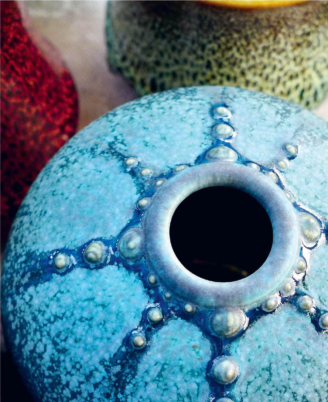
Deep Sea Orb. Cascading movement, crystal growth, and bold colors accentuate the round form.
Deep Sea Orb, detail.Glaze breaking nicely over slip trailed decoration
Winter Landscape Tea Bowl. A glaze drip perfectly frozen in time adds character to this footed bowl.