
Lesson Files | Lessons > Lesson_16 > 16_Cylinder Chart.numbers |
Lessons > Lesson_16 > 16_Error Bars.numbers Lessons > Lesson_16 > 16_Mixed Chart Type.numbers Lessons > Lesson_16 > 16_2-Axis Chart Type.numbers Lessons > Lesson_16 > 16_Trendlines_Scatter.numbers | |
Time | This lesson takes approximately 60 minutes to complete. |
Goals | Customize a bar chart’s display options Combine two sets of data into a single bar Display a margin of error Explore several data display methods |
When building a chart, your objective is to make complex data easy to understand. At times, however, multiple data sets seem impossible to represent in a simple chart. Fortunately, the sophisticated charting tools shared by all iWork applications will help you do the impossible. Using a wealth of chart types and visual styles in iWork, you can turn intricate data relationships into clear, quickly comprehensible imagery.
In this lesson, you’ll use Numbers to explore the many chart types in iWork and build charts with five of the most powerful charting options.
Choosing the Right Chart for the Job
So far, you’ve looked at the most common chart types: bar, column, and pie. But iWork offers much more. You’ll find 19 different chart types inside iWork: 11 two-dimensional and 8 three-dimensional. Knowing which type of chart to use can be tricky as certain charts are designed for certain situations or data types.
<division> <title>Column and Stacked Column</title>The column chart is a popular option and is frequently used to present data that was arranged in the rows and columns of a table or spreadsheet. This chart type is excellent when showing changes in data over time, such as comparing year-end financial results over a decade. The most common column layout places categories of information along the horizontal (x) axis with the value entries along the vertical (y) axis.

A bar chart can translate data from rows and columns into plotted bars, a useful design when comparing two or more individual items. The bar chart is a suitable choice when you must display long axis labels or when you are comparing duration values. You can also combine multiple values for a single period into a stacked bar.

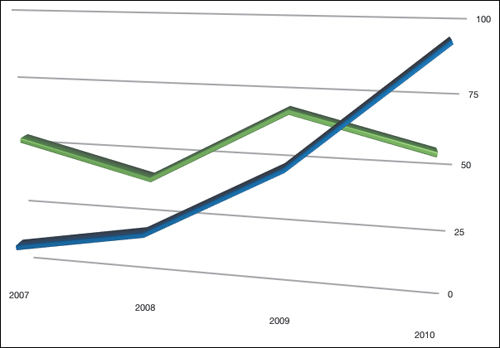
Like column charts, line charts work well for data that is arranged in columns or rows. What differentiates line charts is that they are effective for displaying continuous data over a range of time, which makes them excellent for charting trends. For a line chart to work effectively, category data must be available in even increments (such as months or quarters) and be represented along the horizontal axis. The value data is also evenly represented along the vertical axis. The points on the graph are connected with a line, and multiple colors are used to distinguish between multiple trends.
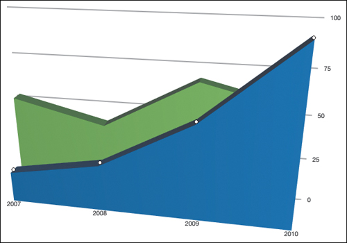
Area charts also clearly show data from rows and columns but are particularly well suited to track the magnitude of change over time, which makes them appropriate for showing financial or population growth. An area chart can convey both the change in individual values and a cumulative change in total value.
A pie chart works well to show the proportionate relationships of data in a single column or row of a table, such as the results of a survey. The pie chart represents individual data values as a percentage of the whole pie (which adds up to 100 percent). A pie chart works very well when the goal for the chart is to show a relationship between entries (such as the results from a survey). Pie charts can be displayed in 2D or 3D, depending on the style of your slides.

To create a scatter chart, you will require at least two columns or rows of data, which makes the scatter chart a useful way to represent the relationships between the values of one or more tables, such as comparing statistical or scientific data. A scatter chart uses a two-value axis with number values on both the x- and y-axes. Before creating a scatter chart, make sure you’ve entered x and y point values for each of the data series you want to plot. The data tends to be displayed in uneven intervals (scattered) across the chart.
Mixed charts are preferred for combining two series of data in a single chart and displaying them in different chart types. For example, you may choose to display one set of data as a line chart and use columns for the other data series. In a Mixed chart, each chart type used can represent only one data series. This is a good way to compare actual versus estimated data (such as projections).
Charts with two axes can be easily charted with iWork. A 2-axis chart is really a Mixed chart with different values for each chart’s y-axis. For example, you may chart data such as temperature and snow accumulation over a period of time.
While a standard bar chart allows you to compare two sets of data represented by multiple bars, the stacked bar chart lets you combine two or more sets of data into a single bar.
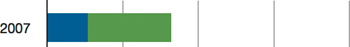
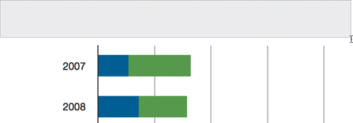
In this exercise, you’ll analyze a restaurant’s delivery fleet over a four-year period, creating a stacked bar chart that shows how many motorcycles and scooters are in service. At the same time, your chart will compare the total vehicles in use for each year. Using Numbers, you’ll chart two sets of data in one bar and then customize the bars to achieve a 3D look.
In Numbers, choose File > Open and open Lesson_16 > 16_Cylinder Chart.numbers.
You’ll find a table showing the yearly count of scooters and motorcycles in the delivery fleet.

Select the table. In the toolbar, from the Charts pop-up menu, choose Stacked Bar.
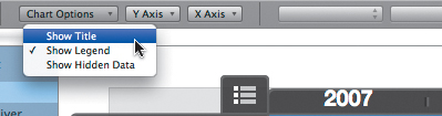
The chart is assigned a default title, which is centered above the chart. These default titles work well, but Pages also allows you to add additional text boxes as desired.
In the format bar, click the Chart Options pop-up menu and select Show Title to deselect it and remove the default title.
You can create a text box in which to freely position a title.
In the toolbar, Option-click the Text Box button.
Option-clicking lets you drag in the canvas to choose where the text box should be placed.
Double-click in the new text box, and type Delivery Vehicles in Corporate Fleet.
You have created a text box for your chart title so that you can customize the font settings in the format bar and drag the title into a new position.
Format the text box to use Helvetica Neue, Bold, 24 pt.
Resize and position the title, legend, and chart. You can use the following figure for guidance:

While 2D charts are clear, 3D charts use the added feature of depth to display your Numbers data. They offer more display options and can add a sense of perspective that makes your data easier to understand.
Select the chart on the canvas.
In the format bar, from the Chart Type pop-up menu, choose 3D Stacked Bar.

The chart changes to a 3D representation. Let’s customize its appearance.
Open the Chart inspector; then click Chart and make the following changes:
Bar Shape—Cylinder.
Lighting Style—Soft Fill.
Drag the arrows in the 3D Scene controller or 3D Chart arrowhead on the canvas to change the viewing angle.
Adjust the size and position of the chart so that it resembles the following figure:
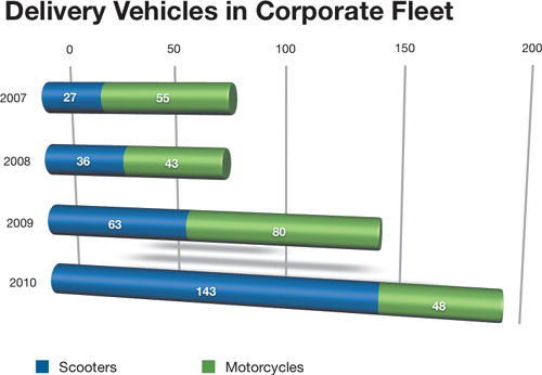
To ensure that the numbers of scooters and motorcycles are clearly understood, you can insert the actual data values inside each cylinder.
Open the Chart inspector and click Series.
Select the Value Labels checkbox and choose Center for Position. You may change the labels, but you must select them.
Click the motorcycle label on a bar, then Shift-click the scooter label so that both objects are selected.

You can use keyboard shortcuts to quickly reformat the text.
Press Command-B to make the text bold; then press Command-+ (plus sign) four times to increase the point size from 11 pt to 15 pt.
A few more refinements could make the chart more visually compelling.
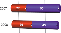
To customize the cylinder colors for each data set, click a cylinder for the first data set; then, in the format bar, click the Fill well. Set Scooters to red and Motorcycles to purple.
Let’s make a few more changes to improve the chart’s appearance. A trend in modern graphic design is a subtle use of opacity.
Open the Graphic inspector and lower the Opacity to 70%.

The lines behind the cylinders seem to be visible through the shapes. Let’s also make the cylinders bigger and easier to read.
Open the Chart inspector and click Chart. Change the Gap between bars to 50%.

This makes the bars bigger and reduces the space between each bar. For additional clarity in reading the data, you can add another set of gridlines.
Select the entire chart by clicking it in the Sheets pane.
In the format bar, from the Y Axis pop-up menu, choose Show Gridlines.
You’ve created and formatted a stacked bar chart using advanced 3D controls. For reference, you can compare your chart with the chart on the second sheet.
Save your work and close the document.
When dealing with survey-based data, you’ll often have a margin of error, a number that indicates the amount of error possible in a random sample. A common situation in which you have to deal with margin of error is when processing surveys or polls. The greater the margin of error, the less accurately the data represents the real-world values. To fully represent a survey, you’ll want to display that error margin in your chart.
Using Numbers, you can place error bars around data points in all 2D charts (except pie charts) to indicate how much error might surround a particular data point.
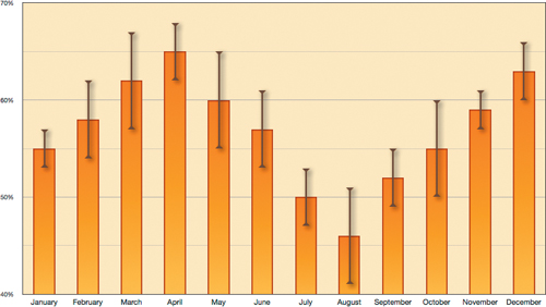
Open Lesson_16 > 16_Error Bars.numbers.
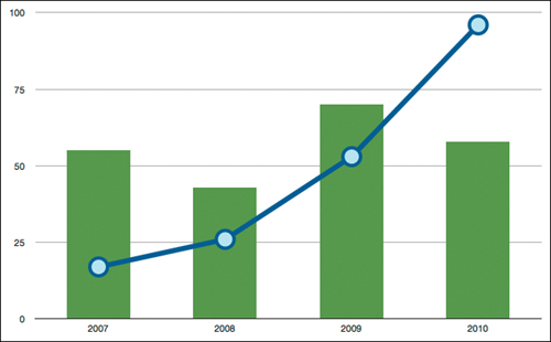
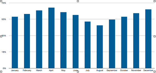
This table includes two columns of percentages: Approval Rating and +/–. You will use this polling data to create a chart showing a politician’s approval rating by month, along with the monthly margin of error. A column chart with error bars will fit the bill.
Select the B column header; then, in the toolbar, click the Charts button and choose Column.
Drag the chart’s edges to resize as desired.
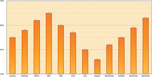
Numbers allows you to customize several display parameters. Let’s start by changing the chart grid and background.
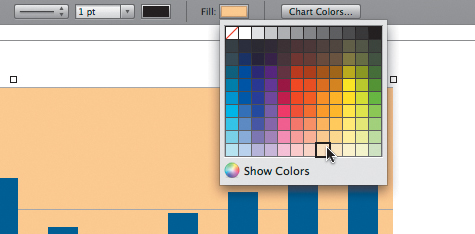
With the chart selected, click the Fill well in the format bar and choose a bright color such as a light orange.
To add a border to the chart, in the format bar, click the X Axis pop-up menu and choose Show Chart Borders.
In the format bar, click the Y Axis pop-up menu and choose Show Minor Gridlines.
When displaying the full data range between 0 and 100%, the chart could be hard to read. You can narrow the chart’s data range to focus on just the active area (between 40 and 70 percent).
In the Chart inspector, click Axis; then enter the following values for Value Axis (Y):
Max—0.7
Min—0.4
Steps—3
Format—Percentage

Now that the chart is tighter in focus, let’s improve its appearance. One way to enhance the look of a 2D chart is to use gradient fills instead of solid colors.
Select the data series by clicking any column in the chart.
Open the Graphic inspector; then, from the Fill pop-up menu, choose Gradient Fill.
Click each color well and choose the desired colors.
For this chart, use a dark and light orange, as in the following figure:

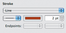
In the Stroke area, choose Line from the pop-up menu. Set a point size of 2 pt and choose a dark red color.
The results should resemble the following figure:
Now that the chart appears more polished, let’s create the error bars for each month. Margin of error is generally expressed as a +/– value, which means that the actual data value may be above or below the displayed value within a certain percentage. Adding an error bar visually shows that range on the chart.
In the Chart inspector, click the Series button. Near the bottom of the inspector window, click the disclosure triangle to open the Advanced section.
Click the Error Bars button; then, from the Error Bars pop-up menu, choose Positive and Negative.
To use margin-of-error values from the table, change the next pop-up menu (currently labeled Fixed Value) to Custom.
Click the Positive text field; then, in the table, drag over the +/– cells from January to December to select them.
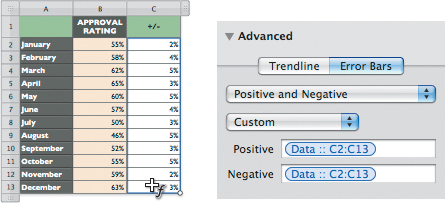
Click in the Negative text field; then click in the table and drag across the same +/– cells from January to December.
You can customize the look of the error bars, including color, size, and endpoints.
Click any error bar in the chart to select all of the error bars.
In the format bar, increase the Stroke to a size of 3 pt (points) and change the Stroke Color Well to a dark brown.
From the “Error bar” pop-up menu, choose the arrowheads.
Select the Shadow checkbox.

For reference, you could compare your chart with the one on the second sheet.
Close your document and save your work.
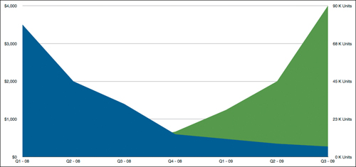
Let’s look at another advanced chart type that works well for comparing similar units on one chart. In a quarterly sales meeting, management needs to compare projected shipments with actual shipments. Both values can be expressed by the same value type, number of units. You compare both data sets within the same chart using a Mixed chart type.
Open Lesson_16 > 16_Mixed Chart Type.numbers.
This file contains a table and a column chart. The table includes three years of quarterly projected shipment and actual shipment data. The chart, however, displays only the projected shipment values. You will use the actual shipment values to chart a second data series.
Select the chart and verify that the data series in the table is highlighted. Drag the fill handle to expand the data series to include the Actual Shipments cells.

Click in the legend and rename the second data series Actual Shipments. Resize and reposition the legend as necessary.
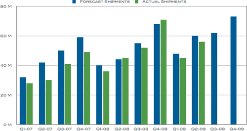
Your chart currently displays both data series as columns. To further distinguish one data set from another, let’s change the chart to overlay the data series on top of each other in contrasting chart types.
Select the entire chart; then, in the format bar, click the Chart type pop-up menu and choose Mixed.
In the chart, select the Forecast Shipments data series.
In the format bar, change the Series Options pop-up menu to Line.
In the chart, select the Actual Shipments data series.
In the format bar, change the Series Option pop-up menu to Column.

When you created the 3D cylinder bar chart earlier in this lesson, the two data sets (numbers of scooters and motorcycles) were organized by year, and both data sets were expressed in whole numbers. But what if the data sets utilized two different value types, such as currency and percentages? If you wish to chart this style of relationship, Numbers includes a 2-axis chart to compare data of two different types.
Open Lesson_16 > 16_2-Axis Chart Type.numbers. In the toolbar, click Charts and choose 2-Axis.

This table contains two data series (Unit Cost and Unit Sales). Though both series are categorized quarterly, the two series utilize different data values: dollar amount and thousands of units. This is the perfect situation in which to use a 2-axis chart type.
Select the data in the table.
In the toolbar, click the Charts button and choose 2-Axis.
Numbers displays the two data sets in a 2-axis chart; first seen as in the left chart below and, after formatting, as in the right chart.
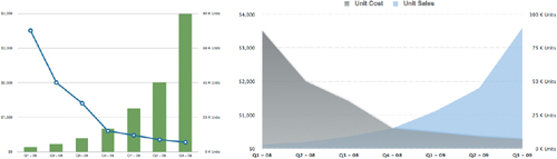
Notice that the 2-axis chart maps the Unit Cost values in the left axis (Y1) and the Unit Sales values in the right axis (Y2).
If you’d like more practice with 2-axis charts, here are a few tips for modifying this table:
The settings in the Chart inspector and the format bar influence both data series when you select the chart. You can customize each series separately by selecting an individual data series in the chart before making changes.
In the Chart inspector, you can choose Column, Line, or Area from the Series Type pop-up menu.
Customize the Value Axis (Y1 and Y2) by choosing Minimum and Maximum values and the number of steps.
When using the Area plot type, you can include data points by selecting a data series; then, in the Chart inspector, click the Data Symbol pop-up menu and choose a symbol.
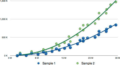
There’s one more advanced chart type to explore: the scatter chart. A scatter chart can be used to visualize multiple data sets, each represented by a different symbol; and it can include any number of data points. You’ll use a scatter chart when you want to show possible relationships between two variables.
Open Lesson_16 > 16_Trendlines_Scatter.numbers.
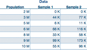
Here you see the number of successful sales listed by population. Two samples were taken within the population.
Select the table.
In the toolbar, click Charts and choose Scatter.
To add trendlines, open the Chart inspector. Click Series, then click the disclosure triangle to open the Advanced section near the bottom of the Inspector window.
Click Trendline and click the Trendline type pop-up menu to select the shape for the trendline.
Numbers displays the data as a scatter chart. With some additional formatting, your chart can resemble the following figure:

Here are a few tips to use when working with a scatter chart:
A data pair is required for positioning a data point. You can share a single column or row as the X value for multiple Y values, as seen with this chart.
Select a symbol or line before trying to change its look in the format bar or inspector. Some items are altered in the Chart and/or Graphic inspectors.
You can include trendlines, error bars, and connect points of a series using the Chart inspector.
You have utilized the advanced features of Numbers for creating sophisticated charts. Remember that you can copy a chart from Numbers and paste it into a Keynote presentation or Pages document. In fact, charts pasted from your saved Numbers document are linked so that you can then click the Refresh button to implement those changes in Pages or Keynote. Knowing how to harness the full charting abilities of Numbers will help you to create clear and attractive charts in iWork.
If you’ve worked your way through the complete book, then this brings your journey to an end. While you may have completed this first journey, there’s a lot more to discover. The best thing about iWork is as you grow stronger in one application, you grow stronger in all three. Be sure to explore the many options and paths iWork offers.