
The new network visualization is useful to detect a relationship between two attributes, or the lack thereof. It shows circles (or nodes) representing elements of the attributes and lines (or edges) connecting elements to each other depending on the value of a metric.
To make an example we will review the connection between employees and products in our ResellerSales cube; this will give us an idea of which type of product each employee sells. To do that, we can use the Employee and Product Subcategory attributes and associate them with the Sum OrderQuantity from FactResellerSales metric.
We want to look at the relationship between our employees and the products they sell:
- From My Reports in the Web Interface, run the analysis 57 Visual Insight Analysis.
- Hit the top-right blue plus button right next to the Grid and Graph tab (tool tip: Add Layout).
- A new layout is created with a blank visualization, click on Select a Visualization and from the dialog box choose the last thumbnail (tool tip: Network).
- Close the Filters pane by clicking on its small X button near the title.
- There's a pane named Network, open its context menu and click on Show Properties; this is the Properties pane for the network visualization:

- Check the Show node label setting. Open the context menu and click on Show Properties once again to go back to the Network pane.
- From the context menu of the Network pane, select Remove All Objects and confirm with OK when prompted.
- Now enable the Page-by row by clicking on the fourth button in the toolbar (tool tip: Show Page-by).
- Drag the Product Category attribute to the Page-by row:
- Add the following objects to the Network pane:
- Employee into NETWORK | From item area
- Product Subcategory into NETWORK | To item area
- Sum OrderQuantity from FactResellerSales into COLOR AND SIZE | Node Size
- When you hover the cursor over a node, the corresponding edges are highlighted to show which products each employee has a relation to.
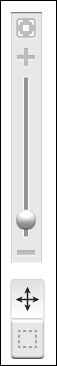
- You can use the tool on the left of the visualization to pan and zoom:
- Move the mouse cursor over employee Syed Abbas. Mmmmh, looks like he's not selling any Road Bike. This requires more investigation and maybe a call to Syed's manager.
The network visualization needs at least two attributes and one metric. You may add up to two additional metrics and use them to change the color and the size of the lines.
If you click on the Select button, the dashed rectangle in the visualization tool, you can draw a selection area. The nodes inside the area will be highlighted and a small down arrow button will appear when you hover on one of them: click on that button to filter on the selection. In the context menu that appears, you can choose to keep only, or exclude, those elements.
To clear the filter, click on the small funnel icon on the left of the visualization title bar.
Additionally, you may want to try the Layout button of the network visualization to change from circular to linear to "spider web" views. This last one is very popular for social network and marketing data. This is shown in the following image:

- The Creating an Express account recipe in Chapter 13, MicroStrategy Express