
Visual Insight or VI is a new technology intended to empower business users and give them the ability to analyze and explore data without the intervention of IT people. It allows them to manipulate grids, graphs, and advanced visualizations and to see immediate results without the need to go back and forth between design and run mode.
VI can use cubes as a dataset in order to achieve high performance during the process of discovering and designing graphical data analysis.
The aim of this technology is to change the classic data reporting workflow that involves asking the IT group for data, manual extraction, spreadsheet distributions, and other sometimes non-standard practices.
VI and In-Memory cubes are intended to offer an easy, fast, reliable mechanism to manipulate large datasets, create interactive visualizations, and distribute them.
Being more visual and immediate, Visual Insight analyses have a lower time-to-proficiency factor. I mean, it takes less time to get to the point where you can produce good results.
We are creating a new analysis based on 54 ResellerSales Cube:
- In the Web Interface, go to My Reports folder and right-click on the cube number 54, then select Create Analysis (Create Dashboard starting from 9.3.1) from the context menu.
- When the Select a Visualization dialog appears, click on Grid.
- The analysis is prepopulated with some objects, but we want to remove them. Starting from the left of the screen, note there's a Filter pane and a Grid pane.
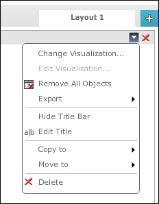
- Hover with the mouse on the header of the Grid pane until a small down arrow button appears. Click on that button to open the context menu:

- Choose Remove All Objects and click on OK when prompted "Are you sure…?".
- The result pane is now empty. Move the cursor to the toolbar and click on the second button from the left (tool tip: Show Dataset Objects). A new pane appears on the left with all the attributes and metrics in the cube.
- Now hide the Filters pane by clicking on the small X button (tool tip: Close) on its header.
- Select the Product Category attribute in Dataset Objects, drag-and-drop it onto the Rows area in the Grid pane. Notice that the cursor changes to a black arrow with a green plus marker.
- Similarly, drag the Sum USD SalesAmount from FactResellerSales metric to the Metrics area in the Grid pane.
- See that the results are immediately visible, with no need to switch from design to view.
- Hover the mouse on the name of the metric in the Grid pane until a small down arrow icon appears:

- Click on the arrow to open the context menu and select Rename, in the textbox type
Salesand hit Enter. - We can also rename the visualization title, which is now Grid. Open the context menu of the result pane in the top-right corner just below the Layout 1 tab:
- Click on Edit Title, type
Sales by Category, and hit Enter. - Now move the cursor to the toolbar and click on the last button before Tools (tool tip: Insert Visualization).
- A new Visualization2 pane appears, click on the big Select a Visualization image.
- When the Select a Visualization dialog appears, click on the Vertical Bar – Standard thumbnail, the first one in the matrix of bar graphs group (refer to the following screen capture):

- The graph is automatically populated with some data and what before was the Grid pane has changed to the Graph Matrix pane with the settings for the chart.
- Open the context menu of the Graph Matrix pane and click on Remove All Objects. Click on OK on the confirmation message.
- Click-and-drag the Product Subcategory attribute to the Graph Matrix | MATRIX | Rows area and drop it.
- Open the context menu for the recently added attribute and rename it
Subcategory. - Click on the Month attribute, drag-and-drop it into the Graph Matrix | GRAPH AXIS | X Axis area. Note how the chart changes instantly, but we're not done yet.
- Drag the Sum USD SalesAmount from FactResellerSales metric in the Graph Matrix | GRAPH AXIS | Y Axis area and rename it
Sales. - Drag the Product Subcategory attribute from the Dataset Objects onto the Graph Matrix | MARKER | Color By area.

- At this point we have a graph matrix that (for each subcategory) shows a bar chart with the sales by month giving each subcategory a different color marker. Yet, it is difficult to read.
- Open the context menu of the first visualization pane named Sales by Category, by clicking on the small down arrow in its title bar, and click on Use as filter….

- In the Filtering Options dialog that appears, select the Vertical Bar – Standard checkbox. Then open the Also filter targets when selecting elements of combobox and pick Product Category. Check the option Allow users to clear all selections and confirm with OK.
- Now click on the Bikes element in the Sales by Category grid. Bingo! The chart automatically filters only the selected category; still we can improve a little more the visibility.
- Move the cursor and place it between the two panes, exactly on the white space that separates them. Notice that it changes to a double-arrow shape; click-and-drag to the left to resize the left pane.
- Move to the legend on the right pane and hide it by clicking on the small gray arrow (tool tip: Hide Legend).
- Save this analysis. Click on the Save As… button in the MicroStrategy toolbar on the top of the screen, and name it
57 Visual Insight Analysis. Click on OK and again on Run newly created analysis.
The chart we used in this analysis is different from the standard charts we saw earlier, in the fact that it is indeed a matrix of several charts stacked onto each other. We can partition the matrix by rows and columns using attributes; in this recipe we used the subcategory. Inside the matrix, every single chart has an X and Y axis, where usually the Y represents a metric and the X an attribute. The marker in this case is a bar and we assigned a different color to a different subcategory.
The marker has a Size by property, useful to represent another metric. If you want to try it, drag the Sum OrderQuantity from FactResellerSales metric to the Graph Matrix | MARKER | Size By area. The bars now have different widths, representing the number of ordered quantity: thin bar = low quantity and thick bar = high quantity. Cool!
We can further improve the usability of the visualization with a page-by control.
- On the toolbar, click on the fourth button from the left (tool tip: Show Page-by).
- From the Dataset Objects, drag the Year attribute and drop it in the Page-by row. A series of buttons is created.
- Hover on the Layout 1 tab, open its context menu and rename it
Grid and Graph. - Save the analysis, overwriting the existing one, and run it.